‘Red,’ the conclusion of Krystof Kieślowski‘s ‘Three Colors Trilogy’ ends the series solidifying the conceit that people are all connected, no matter the distance, physical and emotional, the previous films displayed.
Kieślowski’s trilogy explores the dynamics of a seemingly disconnected society — how a collection of disparate people exist internally and how that affects the overall external world. Valentine, our protagonist, is a model alone in the city — her boyfriend only available via telephone. The film focuses on the seemingly simple task of communication, revealing the true cause of lies, secrecy, and misunderstanding — human frailty.
Illustrator Victo Ngai understands what Kieślowski’s films are saying. The films require a patient mind, and Ngai obliges, making her illustrations for ‘Red‘ and the previous films ‘Blue‘ and ‘White‘ as human as the performances in Kieślowski’s trilogy.

Photo by Jeffrey Lo

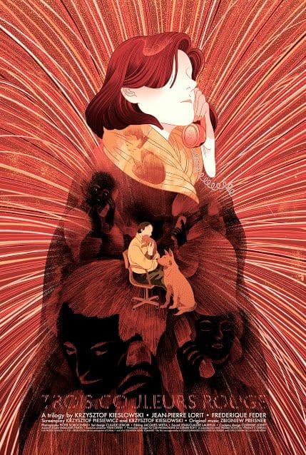
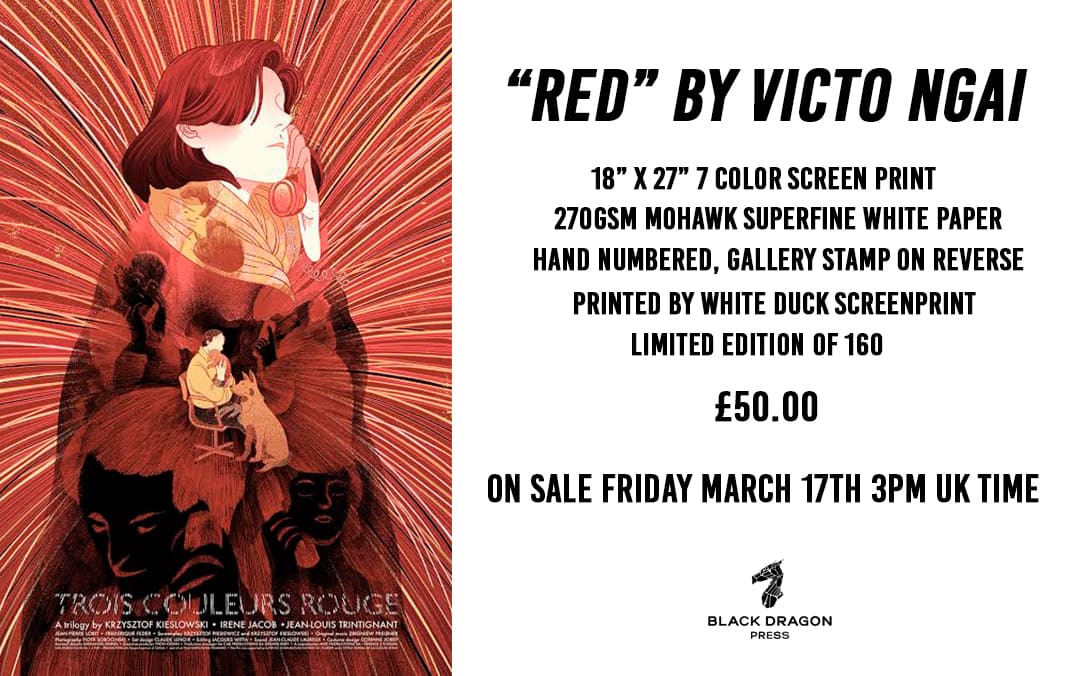
‘Red’ by Victo Ngai for Black Dragon Press’ ‘Three Colours Trilogy’
CJ: When you were approached by Black Dragon Press about doing the Kieślowski series, had you seen the films?
VN: I hadn’t seen the movies before the commission but I trust James‘ taste and his movie / artists pairing sensibility. It’s pretty cool that I am being introduced to great films by working with him.
Were there immediate images that stuck with you or was the series more research heavy?
I would say these images are more analytical than gut-reaction, but of course I have given my own take after seeing the films rather than relying only on the readings I did on Kieślowski and these films.
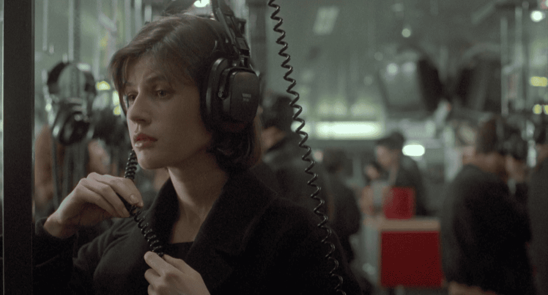
Irène Jacob (Valentine) in Krzysztof Kieślowski’s ‘Red’
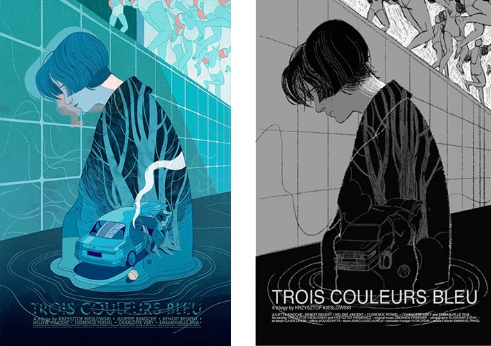
In your ‘Red’ illustration, neither Valentine nor Kern has eyes, yet the ghost images of the strangers on the phone calls do. It’s an interesting distinction – Valentine and Kern disappear as they eavesdrop, while the strangers become more real. Looking back, you did the same to the main figure in ‘Blue.’
It’s something that didn’t hit me until I saw all three of your illustrations – there is no direct likeness to the physicality of the actors or actresses, which puts the focus on the mood and emotion of the characters. Is this a legal issue in terms of likeness rights or an artistic decision?
In all honesty, it’s because of the legal issue in terms of likeness rights, but you did bring up an interesting point. When I am working on book covers and other editorial projects, unless specifically asked, I do prefer to have the heroes facing away, having their face obscured or keeping the face generic. Personally, I think that would make the stories or the article more relatable as the audience can easily imagine themselves being in the character’s place when the characters don’t look like any particular person. Also I like to give the readers’ some room for imagination, I know it throws me off when my beloved book characters get turned into a movie and the cast look nothing like what I thought they would.
‘Blue’ final and sketch by Victo Ngai for Black Dragon Press’ ‘Three Colours Trilogy’
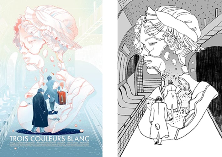
‘White’ final and sketch by Victo Ngai for Black Dragon Press’ ‘Three Colours Trilogy’
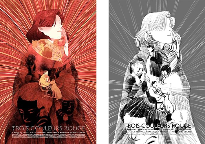
‘Red’ final and sketch by Victo Ngai for Black Dragon Press’ ‘Three Colours Trilogy’
‘Red’ has fewer visual hallmarks than the other films in the trilogy. The few images that standout are the dogs, the phones – the photographs of Valentine. As far as the trilogy goes, was ‘Red’ the toughest film for you to visualize?
‘Red’ is actually my favorite film from the trilogy. It may have fewer visual hallmarks but I think it has a very clear thread running through it — the human connection, whether it’s visible or hidden, and that’s what I decided to focus on.
Unlike the swimming pool in ‘Blue‘ and Poland in ‘White,’ there’s no significant locations in ‘Red’ that plays an active and symbolic role in the film’s storytelling. The locations in ‘Red’ are merely stages for the human dramas, the story can happen in another place and still remain intact. Therefore ‘Red’ differs from the other two posters that its characters are not framed in an actual space, but rather tangled in a web of telecommunication cables, which was shown in the very beginning of the film, as telephones connects and brings all of them together.
Irène Jacob (Valentine) in Krzysztof Kieślowski’s ‘Red’
The film is the final act to the series with callbacks to the previous film’s characters and motifs. You stayed away from commenting on those, sticking to the film at hand. Were there any thoughts about including hints at ‘Blue’ or ‘White’ in this final illustration as Kieslowski did in the films? Was it an easy decision to keep this piece purely on the film and not the trilogy as a whole?
I think Kieślowski’s choice of bringing back the earlier characters at ‘Red’s final scene is more than just an easter-egg for the fans, or a nice bow to tie up the trilogy, but rather hitting home the center theme of ‘Red‘ — the human connection, how everyone’s life, including those of complete strangers, are tangled and linked, whether they are aware of it or not.
To me, it also echoes and bookends the opening scene of telecommunication cables. We the audience get to see the drama played out from god’s perspective. We see how the lives of the characters, within Red and those from the earlier two movies, are intertwined while they are oblivious to that fact; just as how we were shown the usually hidden cables exposed in the film’s beginning. So for me, the choice of what to depict is very simple. The cable net is a metaphor, and the the blurry faces within can be anyone, including Julie, Olivier, Dominique, Karol.
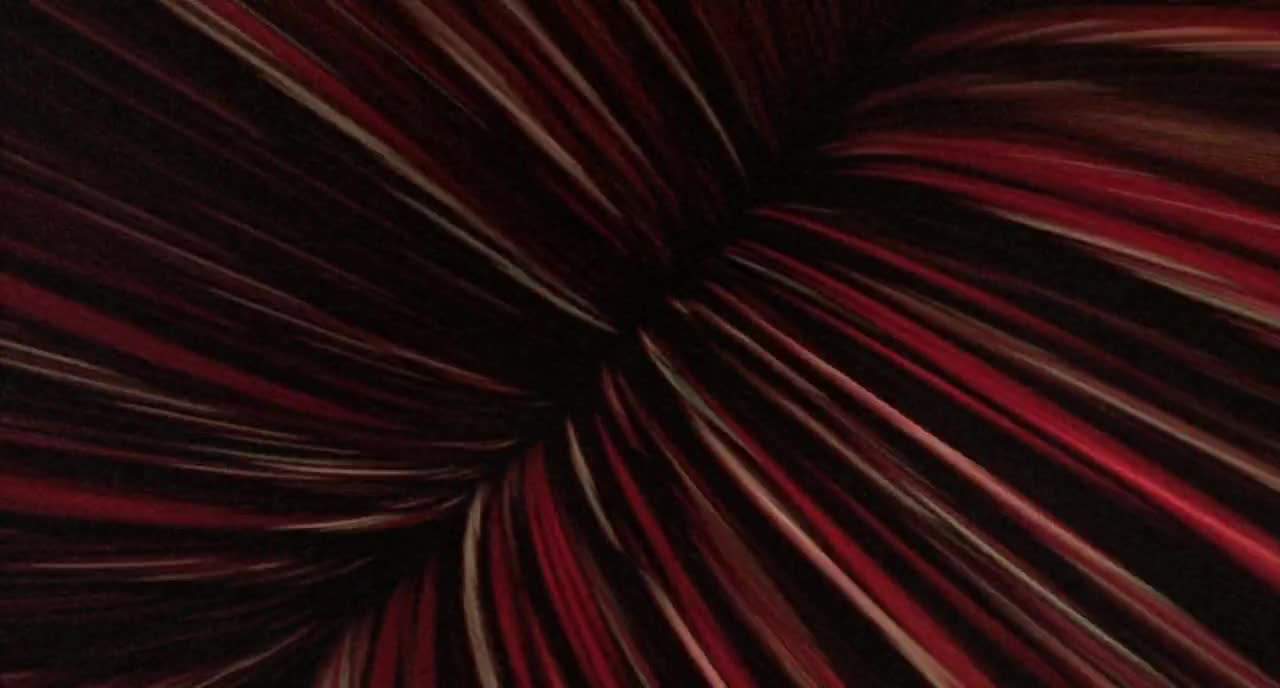
Opening image of telephone cables in Krzysztof Kieślowski’s ‘Red’
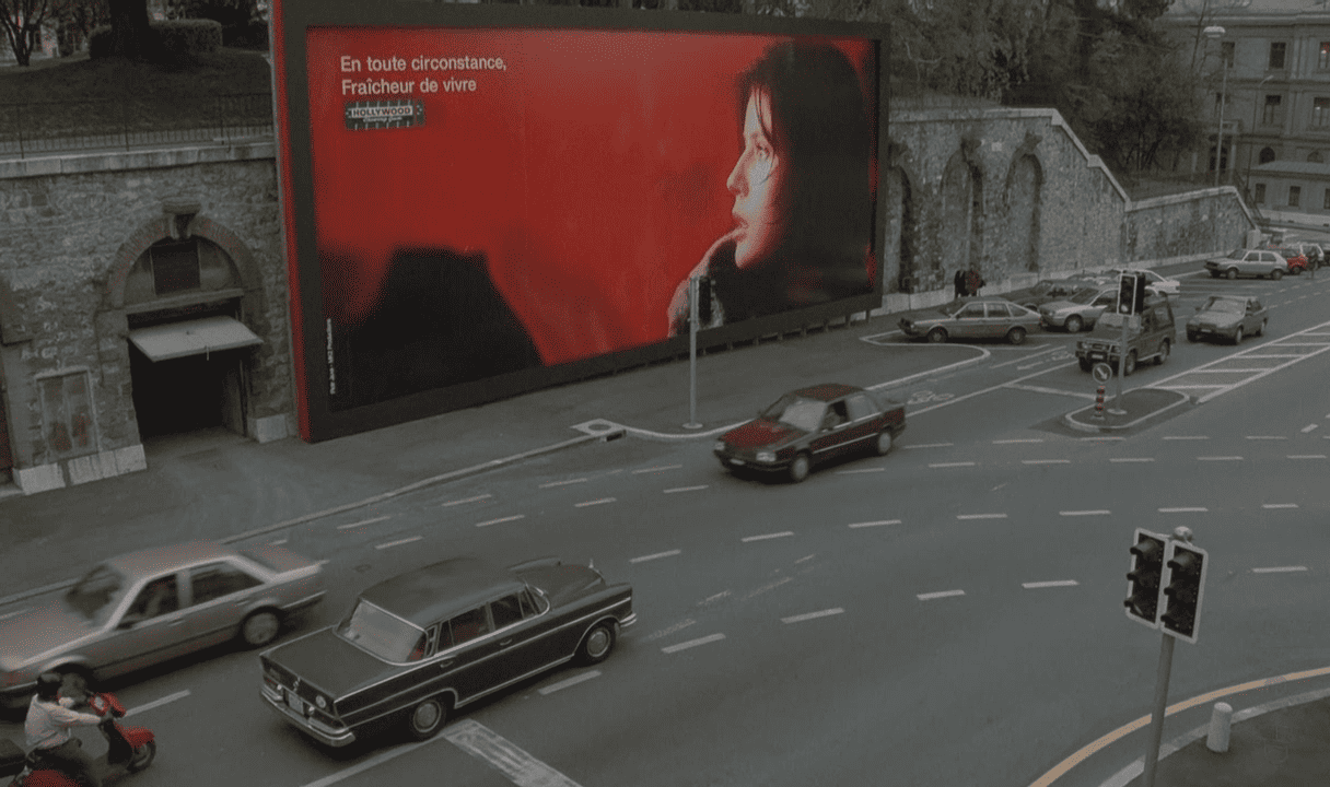
Billboard of Irène Jacob (Valentine) in Krzysztof Kieślowski’s ‘Red’
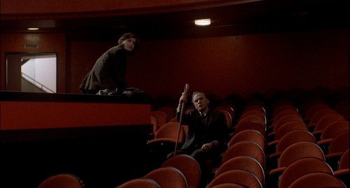
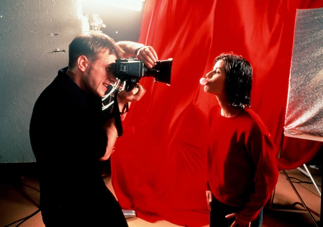
Irène Jacob (Valentine) and Jean-Louis Trintignant (Kern) in Krzysztof Kieślowski’s ‘Red’
There’s a moment in ‘Red’ that I always think about, when Valentine and Kern are in the theater after her show, she tells him that she feels there is something very important going on around her that she does not know or understand, and it scares her. Your illustration perfectly captures that sense of someone trying to catch up, to stay a part of their own existence. When working on a films such as ‘Red,’ are you looking for single moments that resonate with you as an artist?
I agree with you that’s a very powerful and memorable scene, but when I work on a movie poster rather than picking single moments that resonate with me, I try to portrait the overarching theme of the movie, which is similar to a book cover. If ‘Red’ was a book and I were to do the interior illustrations, those would probably be more of the single moments.
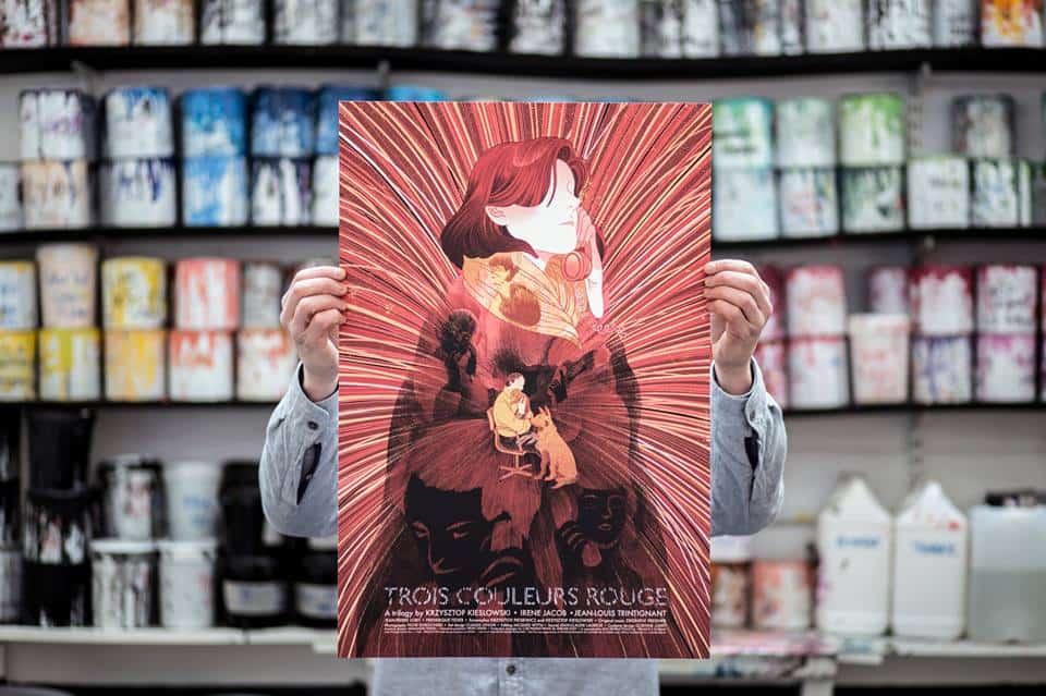
‘Red’ by Victo Ngai for Black Dragon Press’ ‘Three Colours Trilogy’