In 1994 Polish filmmaker Krzysztof Kieślowski released ‘White,’ the second entry in his ‘Three Colors Trilogy.’ The film follows Karol Karol, a Polish hairdresser living in Paris who is recently left by his wife. Following the dissolution of his marriage, the rest of his life falls apart as well — he has no money, no job, and no place to live. Like the film ‘Blue‘ before it, Kieślowski guides us through Karol’s journey of strangers who become friends and allies, and some, enemies. There is an intimacy that Kieślowski’s camera is able to capture, where the slightest smile or gesture from a character carries an accurate weight.
Kieślowski’s work follows a tacit agreement to find the truth in all things — there is a documentarian’s eye for the honest emotional state of the character’s in his fiction. Karol Karol may not be a real man and his situation is one calculated in script drafts until it reads authentic, but Kieślowski never treats his subjects anything other than real. This approach is matched in the work of Illustrator Victo Ngai, the artist behind UK based print house Black Dragon Press‘ series of limited edition posters for Kieślowski’s ‘Three Colours Trilogy.’ Ngai’s work mixes the factual with the interpretive — a moment is given, an event in history or fiction and she will bring the core beauty and truth to the canvas.
This is the second of three interviews ETDC will conduct with Ngai, the final will debut with the release of Ngai’s take on the third film of Kieślowski’s trilogy, ‘Red.’
Photo by Jeffrey Lo

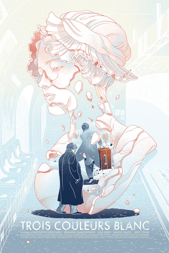
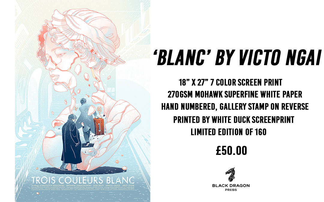
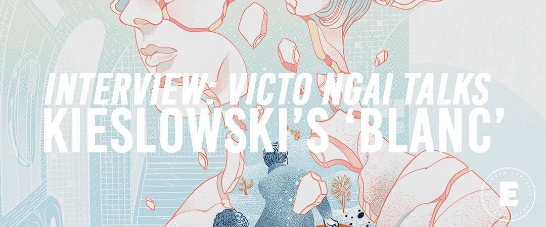
‘Blanc’ by Victo Ngai for Black Dragon Press’ ‘Three Colours Trilogy’
CJ: Like ‘Bleu’ before it, ‘Blanc’ focuses its central struggle on familial love – instead of missing someone you love that has passed away, ‘Blanc’ shows us missing someone you love that does not love you back. Karol’s divorce from Dominique is sad and humiliating but it pushes him into becoming a more dynamic, if not dangerous, person.
Your illustration shows the tenderness we see in Karol in the first act, but also how his decision to run away disrupts and changes his future. There is no commentary on his growth into a businessman, his faked death, or desire for revenge, but you give the start of that descent. With such a large scope of a man’s change in personality on display in the film, how did you bring that down into a single image?
VN: Excellent question. It’s true that Karol has gone through tremendous changes throughout the movie but all of which were motivated by one thing, his obsession with his ex-wife, Dominique. It is this obsession that motivates him to get back on his feet, engages in dangerous endeavors which are not within his previous character, and discovering the other side of himself along the way.
I think the bust he stole is the tangible embodiment of this obsession, a motif that strings along the whole transformation. We see Karol projecting all kinds of emotion for Dominique on this bust, including the protective tenderness when he is gluing the broken bust back together, which I think draws an interesting parallel with his broken marriage and later Dominique wanting to reconcile at the end of the film.
As I mentioned in the ‘Bleu’ interview, illustration is the story-telling in one frame, so I want to focus on the tipping-point, showing Karol’s first determination to take charge of the situation he passively and unwillingly ended up in, in the quest of revenge or mending his failed marriage.
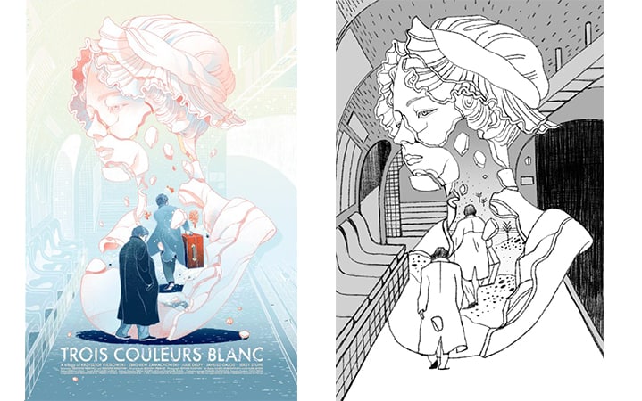
‘Blanc’ final and sketch by Victo Ngai for Black Dragon Press’ ‘Three Colours Trilogy’
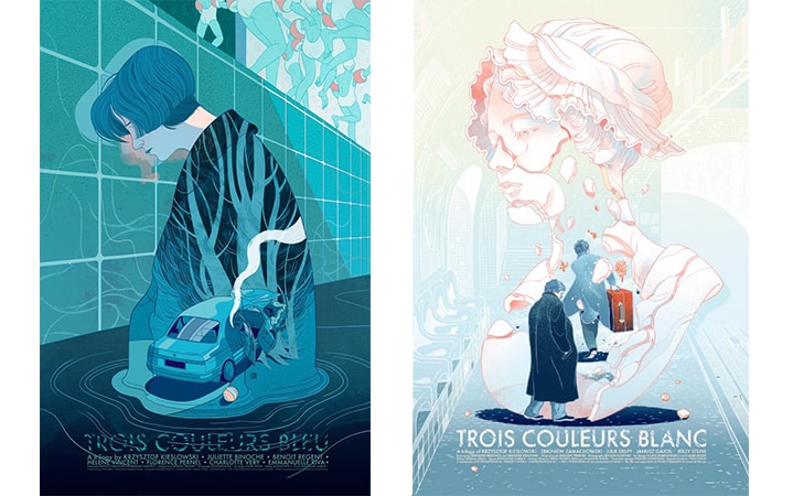
‘Bleu’ & ‘Blanc’ by Victo Ngai for Black Dragon Press’ ‘Three Colours Trilogy’
Compositionally ‘Blanc’ is not an exact replica of ‘Bleu,’ but both have similarities within them – a female figure holds them both down, action unfolds around. The central figure is not Karol, but his bust that represents Dominique. Had you sketched out ‘Bleu’ and ‘Blanc’ at the same time (and possibly ‘Red’) or was ‘Bleu’ finished before you even started on ‘Blanc’?
Each poster is done after the previous one and we do try to keep their compositions similar to each other for a couple reasons. First, since the three films belong in a trilogy, we would like the three posters to compliment each other visually as a set as well.
Second, all three movies are very humanistic with a central female character driving the plots, even in the case of ‘Blanc’ when the story was told from Karol’s perspective and Dominique only appears in the beginning and the end of the film, her presence was felt all along through the proxy of the bust, therefore it seems fitting to have a big central female figure in all of them.
Is a consistent look between the trio of posters important? This question is in line with a question one could ask of Kieslowski himself — if they were three separate films not intended to comment on each other, would they still have worked on their own?
Yes and yes. I think maintaining the duality of ‘series’ and ‘individual’ is one of my objectives when creating these posters as well. They should fit as a set but still has a life and be interesting on their own.
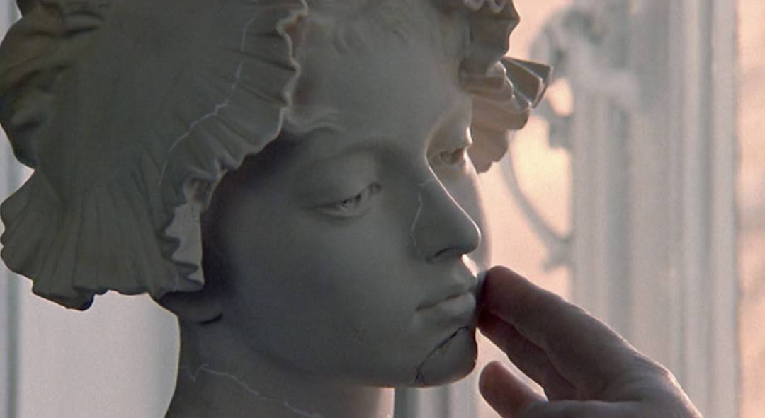
From ‘Blanc’ by Krzysztof Kieslowski
The color palette for ‘Blanc’ brings in the trio of colors used by Kieslowski, which in hindsight were all present in your illustration for ‘Bleu’ as well. ‘Blanc’ seems to open itself up more to using both blue and red more than ‘Bleu’ was tied to its color. It’s interesting that in doing a film titled ‘Blanc’ based on that color, Kieslowski didn’t opt for a simple two-color scheme like black and white. Did you pull colors from the film itself or accept a more interpretive approach? (Again, this is probably similar to ‘Bleu’ where you had that core color chosen by the filmmaker.)
Obviously, we won’t be able to create an illustration or movie by religiously using only ‘Blanc.’ Even with the route of going monochromatic, it will still require black. I think the color white is used more symbolically and less literally in ‘Blanc’ compared to the other two, it mostly references Karol’s marriage (white bridal gown) and his snowy hometown.
Therefore I took a bit liberty with the color choices, I want the overall feeling to be light and whitish while giving a nod to the other two colors. Also, this way when the posters are viewed as a set, ‘Blanc’ will serve as a nice visual transition from ‘Bleu’ to ‘Red’ as well.
‘White’ will go on sale Friday December 9th at 3pm UK time (GMT) from The Black Dragon Press Store
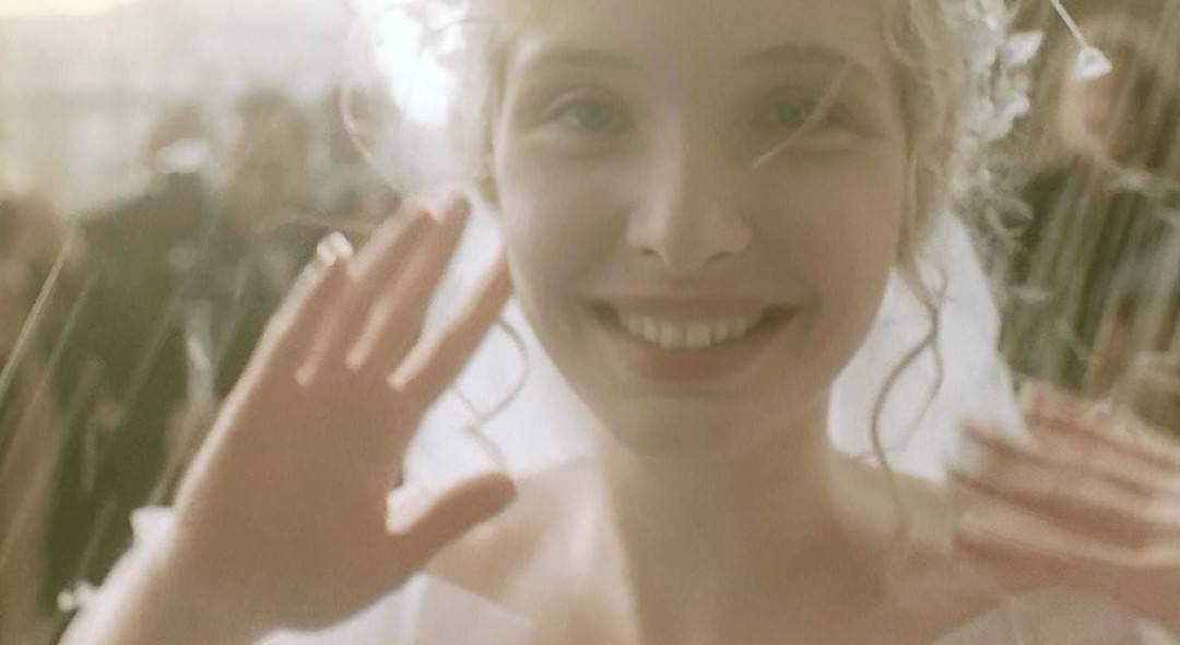
From ‘Blanc’ by Krzysztof Kieslowski