Polish filmmaker Krzysztof Kieślowski was a steady observer of the everyday. The commonalities of living. He wrote of the pain of loss and joys of love, as well as the struggles of both. In his series of films the ‘Dekalog‘ he connected the lofty tenets of the Ten Commandments to the lives of common citizens in Warsaw. Kieślowski’s films delve into the cracks in each of us, revealing the emotional urges and needs that join us and tear us apart.
Kieślowski’s ‘The Three Colours Trilogy‘ found the filmmaker exploring tragedy (‘Blue‘), comedy (‘White‘), and romance (‘Red’) through his unique brand of realistic fiction. In the tragedy at the center of ‘Blue,’ the first of the series, Kieślowski does not give the audience a set of rules for dealing with death and loss — he lays bare the tender fabric of love and family, our internal identification within those we love. A husband makes a wife and a child makes a mother, but when those connections pass on, you still feel the roles given to you. The film acts as the beginning of a conversation, leaving the viewer exposed.
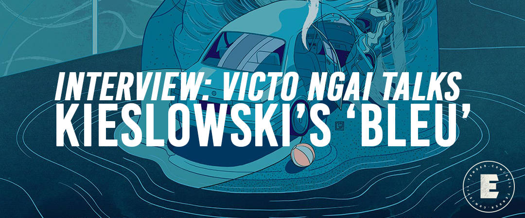
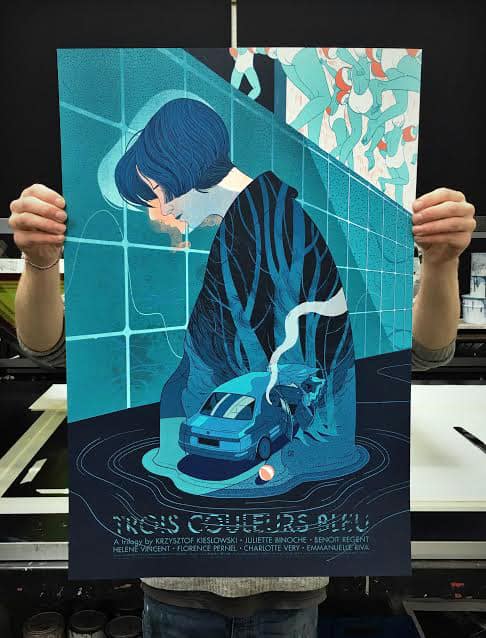
Los Angeles based illustrator Victo Ngai has joined Kieślowski’s conversation. Through UK based print house Black Dragon Press, Ngai has set out to create illustrations for each of Kieślowski’s films in the ‘Three Colours Trilogy,’ her first, ‘Blue‘, is a beautifully somber take on the film. Ngai approaches Kieślowski’s text with the same respect that the filmmaker gave his subject. Her poster for ‘Blue’ finds the hope and growth that Kieślowski shared with his tale of Julie, a woman lost after the death her husband and young daughter. There is weight to the journey Kieślowski is taking us on and Ngai’s image carries that load with sophistication and introspection. Her poster is truly at service to the heart of Kieślowski’s vision.
Photo by Jeffrey Lo

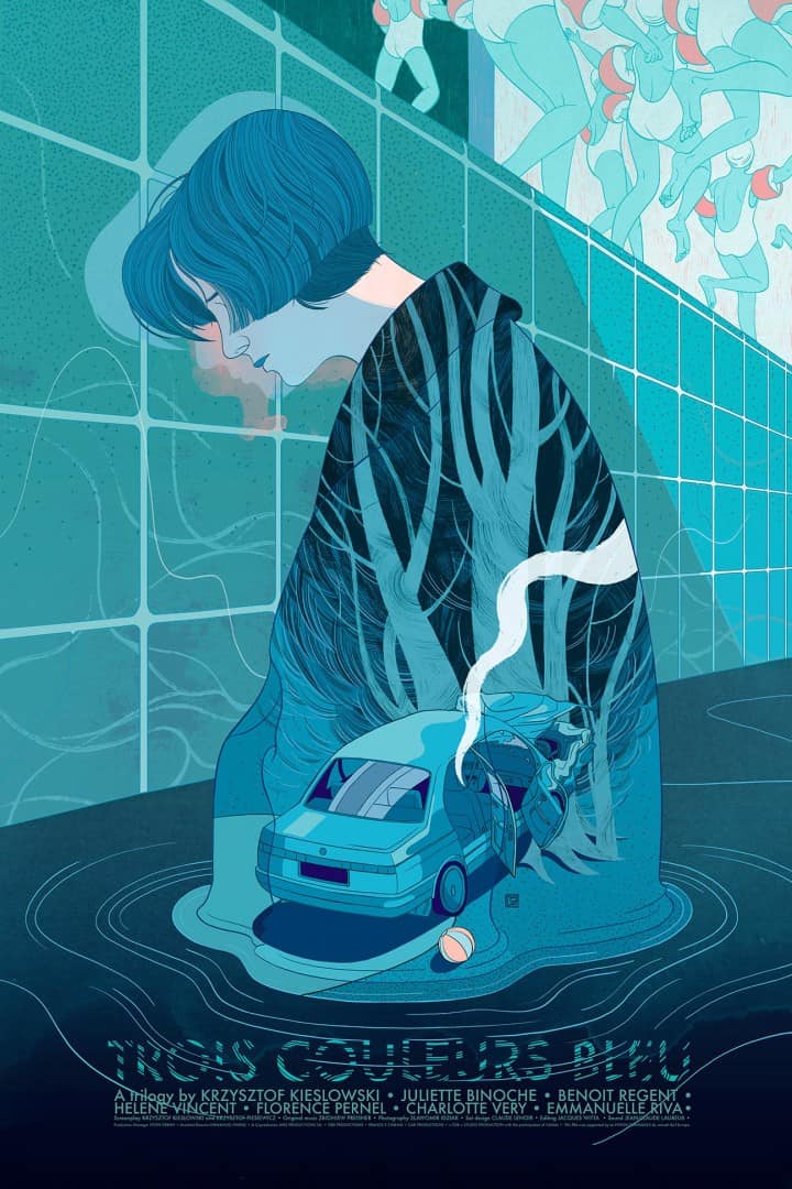
‘Bleu’ by Victo Ngai for Black Dragon Press
CJ: ‘Bleu’ is an incredibly harrowing film – the first act is especially raw and emotionally brutal. Your illustration has a wonderful balance between the pain and healing of the film’s lead, Julie. With a film that focuses so much on heartache and mourning, you crafted a wonderfully sublime piece that shows that pain but also the growth. How do you avoid making a depressing illustration for a subject matter like the death of one’s family?
VN: I agree that ‘Bleu’ is a harrowing film but one that’s not without hope. Pain does play a big part but more as a catalyst for growth. Julie’s path of healing lacks no heartache and struggle, but as we follow her baby-steps of recovery, we see that she eventually grows into a woman who is capable of loving her late-husband’s mistress and their unborn child, as well as falling in love once again herself. I want be true to this overall mood and structure of the film, as well as Julie’s humanistic strength and dignity within the one frame.
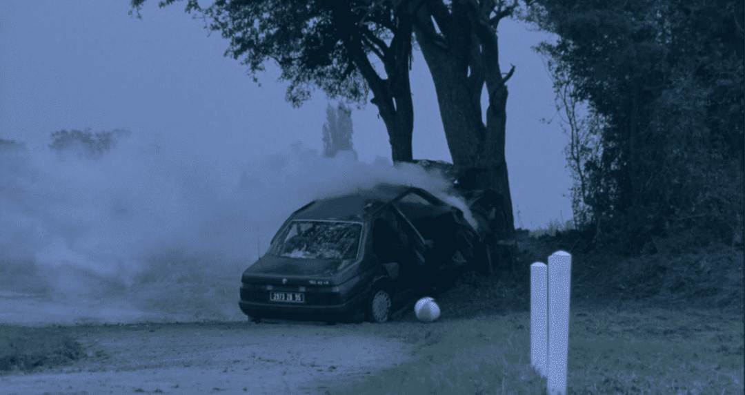
The car crash scene is quite an undramatized one, being framed within Julie, who’s processing the pain in a similarly quiet and inward manner. The spare use of orange is intended to create a relationship between the playful children by the poolside and Julie’s dead child’s beachball. I hope to suggest just how hard it is to get over the death of one’s family, how everything seems to remind Julie of her loss. However, despite the devastating situation Julie is holding on and learns to slowly let her sorrow melt away into the swimming pool, a safe haven where she healed and grew.
‘Bleu’ by Krzysztof Kieslowski
‘Bleu’ by Krzysztof Kieslowski
‘Bleu’ by Krzysztof Kieslowski
‘Bleu’ is laid out like a diagram of her life and like Julie herself, the true hurt is self-contained — hidden. This is something you do quite a bit in your work – all elements of a story are laid out at once, flowing into one another. There is a connection between Kieslowski’s storytelling and your own – you both are able to put quite a bit of abstract information on screen that is both emotionally telling as well as propels the story. With the bulk of your work being editorial and book illustrations, does your approach change much when it comes to a film?
Both films and illustration are vehicles for visual storytelling but unlike films, illustration doesn’t have the element of time and the story needs to be told within just one frame, this constraint happens to be why I love illustration.
When approaching a project such as this one, there are an enormous amount of informational and visual elements available and need to be sieved through. it’s quite interesting, and flattering, that you think I have laid out all the elements of the story, when in fact I have included only 4 things: Julie, the car-crash scene, children and the pool. It’s like a puzzle game trying to pick out a few pieces and lay them out strategically to form meanings and emotions. I follow a very similar approach when tackling book projects, the only difference being having more freedom with the appearances of the props, stage and characters. When it comes to editorial, the mindset is essentially the same but instead of harvesting elements from a narrative, I would create my own elements, then group them into narratives or metaphors to convey the abstract concept that’s required to communicate.
‘Bleu’ by Victo Ngai for Black Dragon Press
Victo Ngai’s sketch for ‘Bleu’
Each film in Kieslowski’s ‘Three Colors’ trilogy has that central color at the core of its visual identity and while using following suit you were also able to bring your own voice into the piece. With color being such a major part of an illustration, did having that component dictated by the film make it easier on you? Was that a frustration to work around?
It’s true that since the core colors play such important roles in the ‘Three Colors Trilogy’ it wouldn’t make sense (and can even be confusing) to use different colors in the posters. But I don’t find that frustrating as the core colors are so inherently tied to the emotions and plots of each film, it feels only natural and right to use them if I want to capture the spirit of the films. That being said, I still get to play with the hues of blues and the secondary colors.
‘Bleu’ has a strong flow of repeating images; the color itself, the mice, the lamp – with music also playing a major role in the film. It’s interesting that the illustration avoids any nods to the music. Was that a decision made early on in the process?
Music and sound are powerful tools in movies but they are very hard to be translated well into illustrations. A direct visual representation of another sensory stimulation often doesn’t yield very elegant solutions as much is lost in translation. Just as we can’t depict wind literally without resorting to highly stylized rendering of air movements, we can’t illustrate music literally without using the representations such as musical notes and piano.
However, we can convincingly convey the feeling and effect of winds, whether it’s a hurricane storm or a summer day breeze, by drawing the objects that’s being affected by them. To me, the music in ‘Bleu’ mostly serves as a inner dialogue of Julie, a way to show the hidden dramas under her unriled surface, much like the roles played by the leitmotifs in Wagner’s ‘Ring Cycle,’ and I have found another way to convey this inner struggle visually.
How closely was James (of Black Dragon Press) involved?
James is amazing to work with as he’s quite hands-off and really respects the decisions of the artists. Although this is a commercial commission, it doesn’t change the fact that it’s my personal interpretation of film. And I am really glad that James lets me focus on the things which interest me and move me the most.
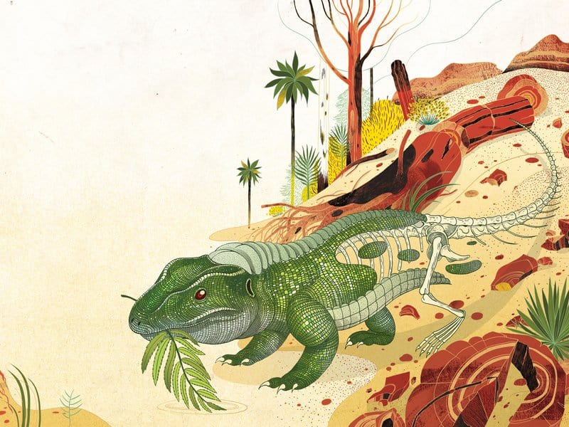
‘When Dinosaurs Roamed the (Not Yet) Petrified Forest’ from Smithsonian Magazine’s April 2016 Issue | illustration by Victo Ngai
The writing of the concerto and the music itself is an action that pushes the film, but not as much as Julie’s own mourning. The film focuses more on the emotional state of the main character rather than the events taking place, which seems quite different than your work for the science and science fiction world where events and facts are priority. Is there a difference? Is it wrong to think that ‘Bleu’ would take a different part of the brain that say your Smithsonian Magazine illustration on the dinosaurs of the Petrified Forest?
You are right that the two projects are vastly different but I think the ideation process is quite similar, after all I am still the same person and unfortunately haven’t learned how to split my brain yet!
Of course there are some compositional and execution differences ,with ‘Bleu’ the approach is more lyrical and ‘emotional’; while with the Petrified Forest, the priority was to make sure I get my references right as the readership would know, and get annoyed, if I drew the dinosaur bones wrong.
Although ’Emotion’ becomes a much more secondary concern in Petrified Forest than ‘Bleu’, I still had to make sure it has the right tone. Since the article belonged to a bigger series which promotes evolution-tourism, the image should look inviting and positive.
