‘Best Of’ lists act as a cultural marker for the end of the year. The year is over and the ‘Best Of’ list looks back and says, ‘Wasn’t so bad, was it?’
The following list is not a ‘Best Of’ — there are no rankings. One is not better than the rest. These are the works that pop to the forefront of my brain when I think back on 2013. They are pieces that I’m not done talking about, or haven’t had a chance to visit in any sort of long-form discussion. It’s the work that made me think — moved me. Hit me in the guts.
Goodbye 2013 may 2014 be a continued wealth of the brilliant, the genius, and of course, the awesome.
________________________________________________________________________________________________________________________________________
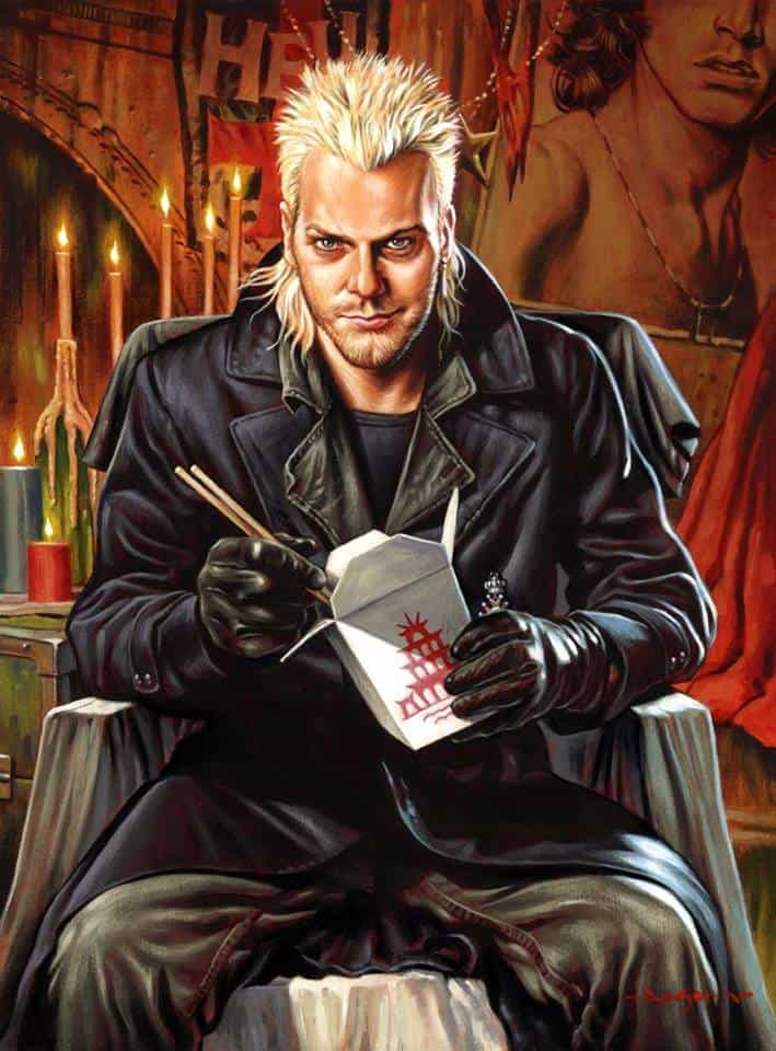
‘Maggots’ by Jason Edmiston
Illustrator Jason Edmiston has a love for the sinister and evil, and blends that adoration of the villainous into wonderful portraits of some of the most charmingly arrogant bastards.
‘Maggots‘ is a look at one the ’80s most attractive antagonists. Kiefer Sutherland’s David is so attractive and deceitful, wicked and charismatic — everything Tom Cruise’s Lestat should have been.
As a painter Edmiston has great patience and with ‘Maggots‘ he took his time getting inside of David. There is not one single aspect that makes this a great painting, it’s the stacking of perfect little touches — even the title, ‘Maggots‘, is a great nod to the film.
Previously on Evil Tender — Interview: Jason Edmiston, King of the Monsters!
________________________________________________________________________________________________________________________________________
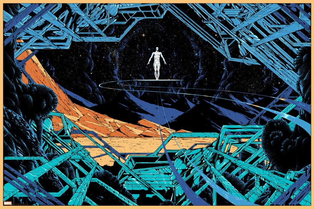
‘Silver Surfer’ by Kilian Eng
The work of Swedish illustrator Kilian Eng runs wild through science fiction, ignoring the stereotypes of the genre to create his own language. Eng invents a strange universe illuminated by the organic — technology falls into the mountains, the sand.
Eng’s ‘Silver Surfer‘ is the roaming herald. He taps into the nobility and the vastness of the Surfer’s station. Here he is, living with the loneliness and solitude of being the Silver Surfer.
Previously on Evil Tender — Interview: The Inspired Future of Kilian Eng
_______________________________________________________________________________________________________________________________________
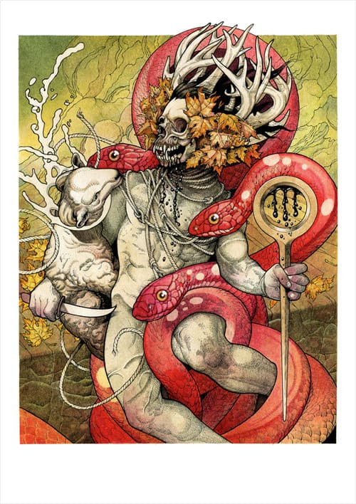
John Dyer Baizley’s cover art for Skeletonwitch’s ‘Serpents Unleashed’
Besides being the frontman for the band Baroness, John Dyer Baizley brings sophisticated illustration to the world of heavy metal. I’ve been inspired to buy plenty of records based solely on his cover illustrations.
Metal as a genre has always had a strong relationship with talented artists, and that coupling grew stronger in the early 2000s with folks like Paul Romano, Richey Beckett, and John Dyer Baizley.
With ‘Serpents Unleashed,’ Baizley created his own skeleton witch — skull and muscle, snake and goat. It’s beautifully drawn to the point of tenderness with the focused brutality of the music matched by Dyer’s precision execution.
________________________________________________________________________________________________________________________________________
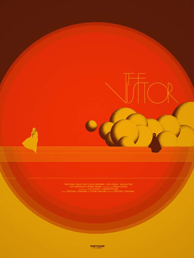
‘The Visitor’ by Jay Shaw
Jay Shaw is a unique type of brilliant, and that’s the best kind to be. I hadn’t heard of Michael J. Paradise’s 1979 film ‘The Visitor‘ before seeing Shaw’s interpretation, and like his poster for 2012’s ‘Bullhead‘, it drew me into hours of research on the film. I was excited to explore what could have possibly inspired him.
Shaw approaches his compositions through the darkened cracks of the films and even when he takes on a film like ‘Rocky III‘ head on, you get direct images from the film through a distorted yet truthful lens.
You can always count on Jay Shaw to draw you into something you have never seen before.
Previously on Evil Tender — Interview: The Strange Magic of Designer Jay Shaw
_________________________________________________________________________________________________________________________________
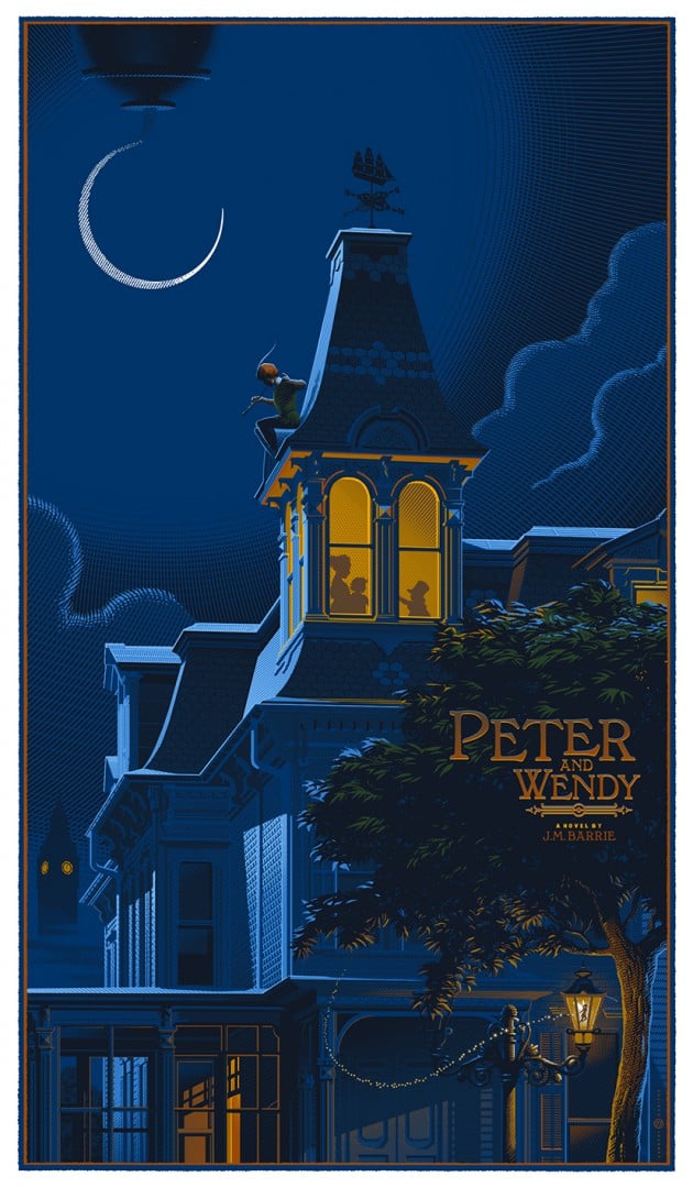
‘Wendy & Peter’ by Laurent Durieux
Illustrator Laurent Durieux has a technical prowess that can construct entire vistas of skyscrapers, planes, and cars that will take you to another place entirely.
His work for Dark Hall Mansion‘s ‘Seminal Films Series‘ continues to bridge the gap between illustration and fine art, where he digs deep into existing properties like ‘Metropolis‘ and ‘The Phantom of The Opera‘ and reveals a new beauty — a new heart.
Like his ‘Wolf Man‘ piece from 2012, ‘Peter & Wendy‘ finds a quiet moment for a troubled hero and puts the magic on display. A genius level of design and composition at times can overshadow Durieux’s other gift for weaving an emotional tether for the audience to anchor itself to.
Most of all, Durieux’s ‘Peter & Wendy’ makes me smile. Makes me believe magic can happen.
Previously on Evil Tender — Interview: The Beauty & Design of Laurent Durieux
________________________________________________________________________________________________________________________________________
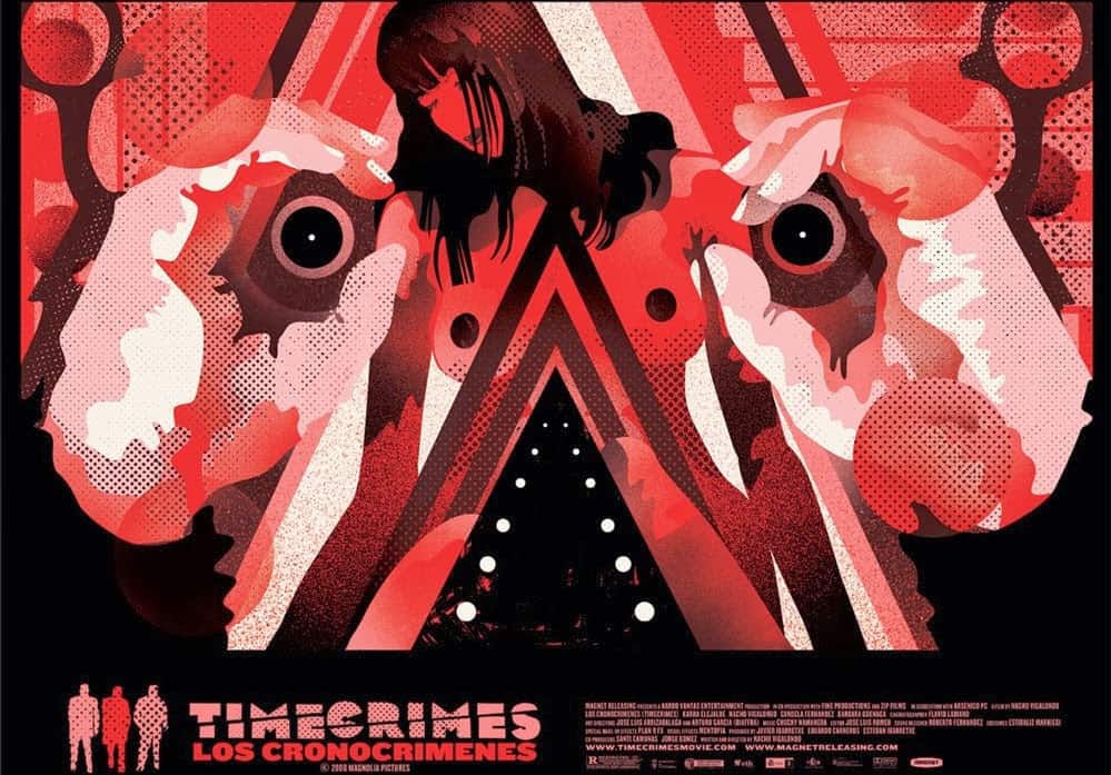
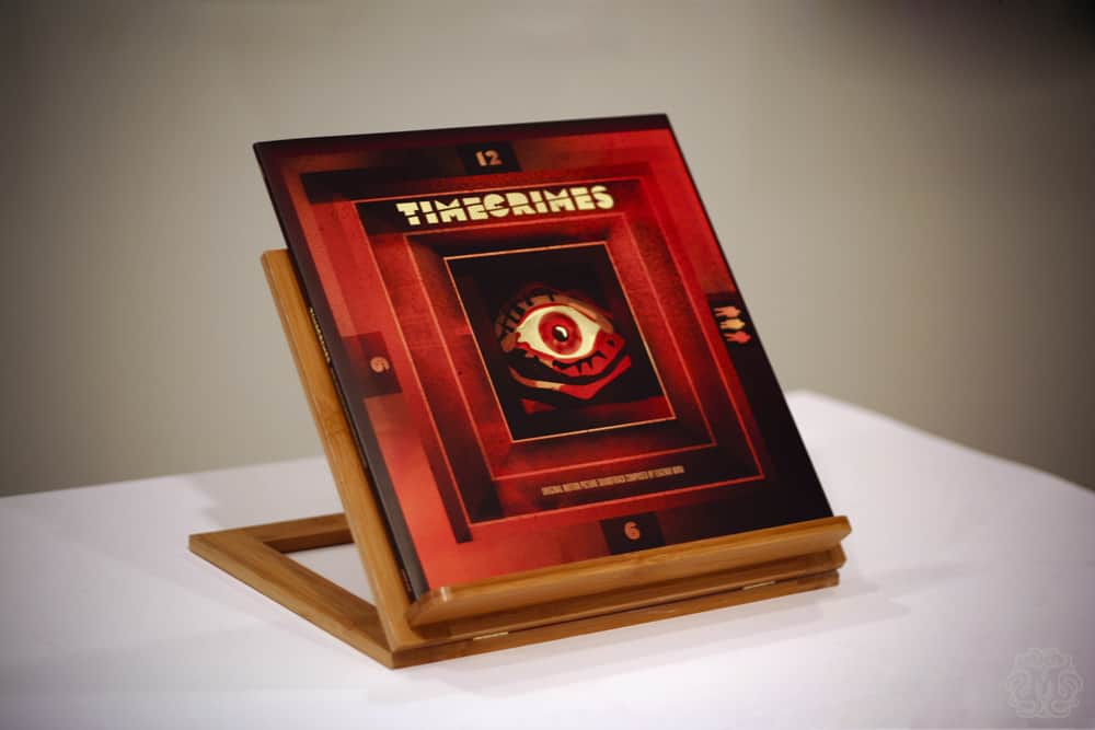
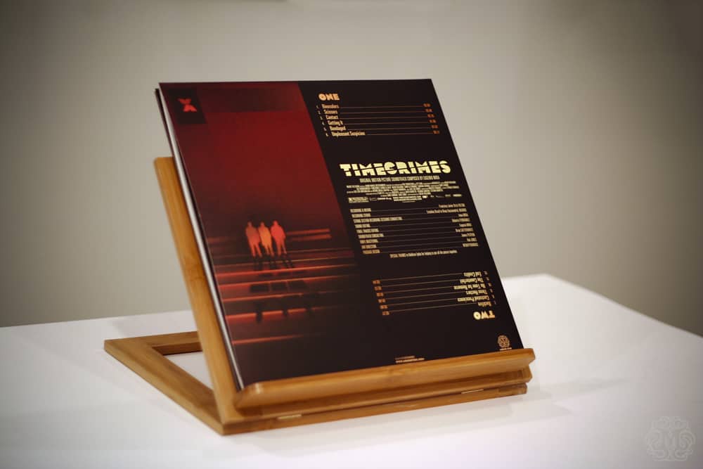
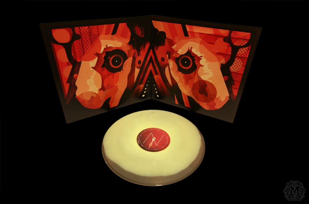
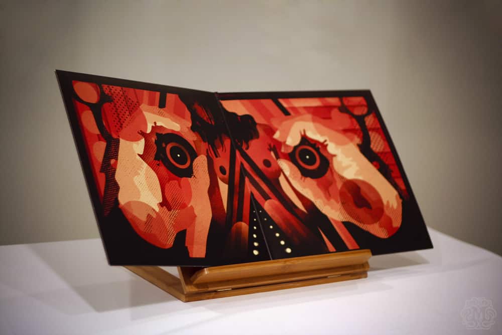
‘Timecrimes’ Original Soundtrack Vinyl LP designed by We Buy Your Kids
Sonny Day and Biddy Maroney of We Buy Your Kids create some of the most insanely brilliant illustrations out there. I had no clue what ‘Timecrimes‘ was but from seeing the cover I HAD TO HAVE IT and oh Lord, once I opened it and saw that gatefold illustration I was far beyond giddy. This is one of the finest vinyl packages I’ve seen.
The soundtrack is a dark and murderous cacophony of synth and drone, and the film itself is a deceptively wondrous slab of science fiction. WBYK pulled all of the tones, textures, and mood of the film and score and churned out a psychedelic masterpiece.
I pull the record out on a regular basis just to look at it — set up the cover as office distraction, I just stare at this thing. Mesmerized.
I will buy anything that We Buy Your Kids make. Still waiting for their online store to be updated but once that happens, well, let’s just say I’ll go broke.
Previously on Evil Tender — Interview: The Visceral Design of We Buy Your Kids
________________________________________________________________________________________________________________________________________
‘Sensily’ by Ruben Ireland
The women in Ruben Ireland‘s portraits are trance-like. All alien beauty, the work of a fantasist. With each new portrait he acts as photographer that is creating his own non-existent tribe.
These are not angels or waifs, but ethereal warriors. Cosmic.
________________________________________________________________________________________________________________________________________
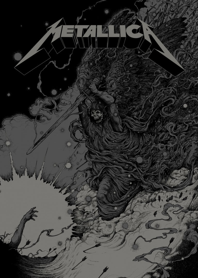
‘Phantom Lord’ by Richey Beckett
UK based illustrator Richey Beckett knows his tools and he knows them well. Pen and paper and not much else. He was a perfect match to illustrate the song ‘Phantom Lord‘ for Metallica‘s 30th anniversary of the album ‘Kill ‘Em All.’
Beckett’s ‘Phantom Lord’ is his ghostly variation of Michelangelo’s ‘Creation of Adam’ — instead of an epic beginning, it tells of a horrible end. That’s the beauty of Beckett’s work. Not only is it narrative by nature, but the story that unfolds reads ancient, born of the Earth.
‘Phantom Lord’ is devastatingly immaculate in execution. Beckett’s skill runs deep. His drawings bring you in with, ‘how the hell did he do that?’ and leaves you hypnotized. Greatness right here.
Previously on Evil Tender — Of The Dirt, Of The Wood: Interview with Artist Richey Beckett
________________________________________________________________________________________________________________________________________
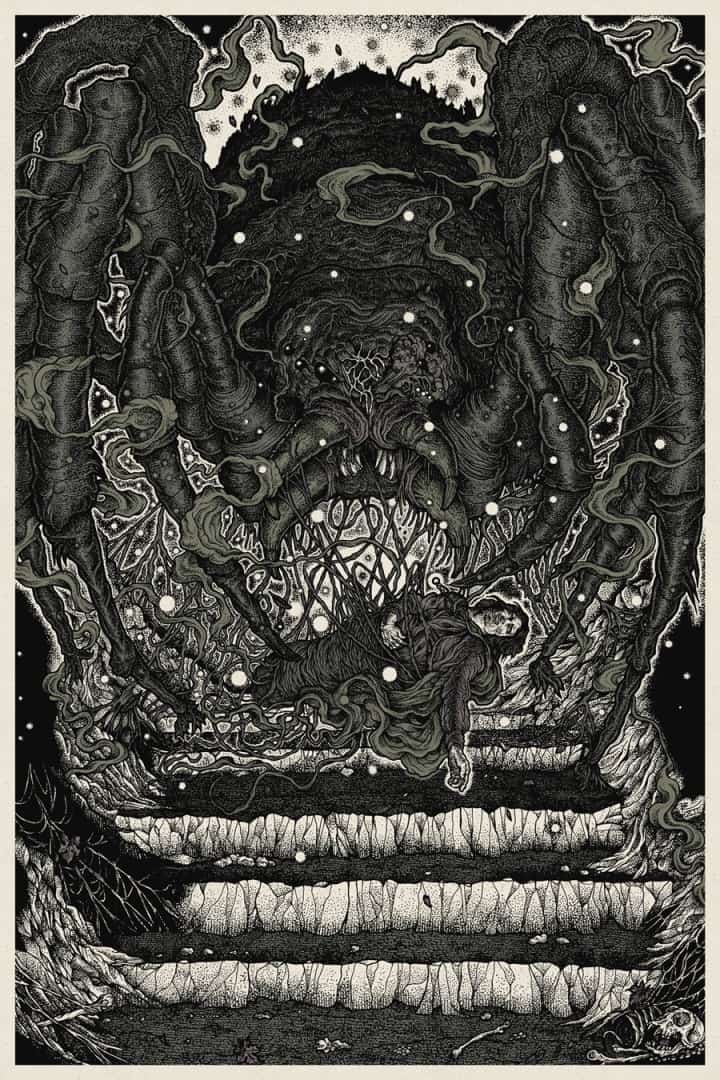
‘Shelob’s Lair’ by Richey Beckett
Another from Richey Beckett. Beckett’s ‘Shelob’s Lair‘ hangs in my office and it always gets my attention. It’s a work that is a gift to have on the wall.
Beckett’s depiction of the Frodo, so close to his goal and now being sucked away, hidden and almost killed by the giant spider Shelob, contains all the danger and frustration that Tolkien wrote about and Peter Jackson couldn’t quite accomplish with all the CG in the world.
I’ve written about ‘Shelob’s Lair‘ before but I’ll say this again — Beckett’s work is all consuming. It demands that you give it time to reveal itself and when you do you’re in.
Previously on Evil Tender — A Brief Look: Richey Beckett’s ‘Shelob’s Lair’
________________________________________________________________________________________________________________________________________
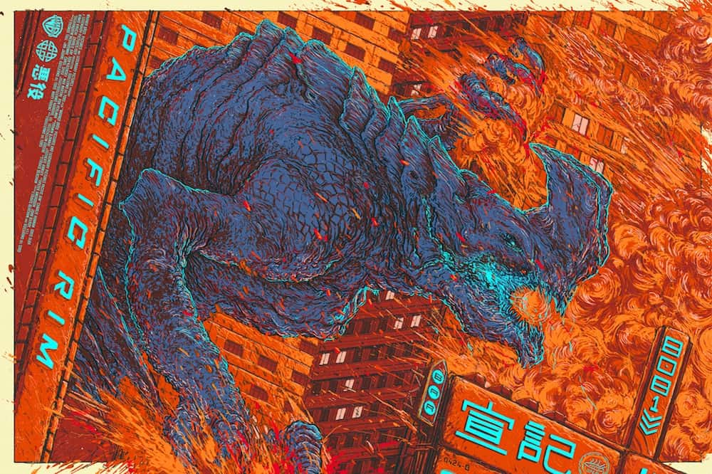
‘Pacific Rim – Kaiju’ by Ash Thorp
Designer Ash Thorp‘s Kaiju from ‘Pacific Rim’ is explosive and fluid. There’s so much movement and what structure there is, Thorp was smart enough to push the Kaiju through it, the monster destroys its way across the composition.
Thorp made bold color choices for the painting itself. There is very little black to contain it all, only the slightest of black gives the buildings and the beast an idea of shape. It’s the orange and reds that spiral out that blow out that rigidness, while the pale blue lettering and blood sparks through the chaos.
The whole canvas feels like it’s being swallowed, consumed and about to fall into itself. It’s as blissfully in love with monsters and destruction as the film it was drawn from.
Previously on Evil Tender — Story & Movement: Interview with Designer Ash Thorp
________________________________________________________________________________________________________________________________________
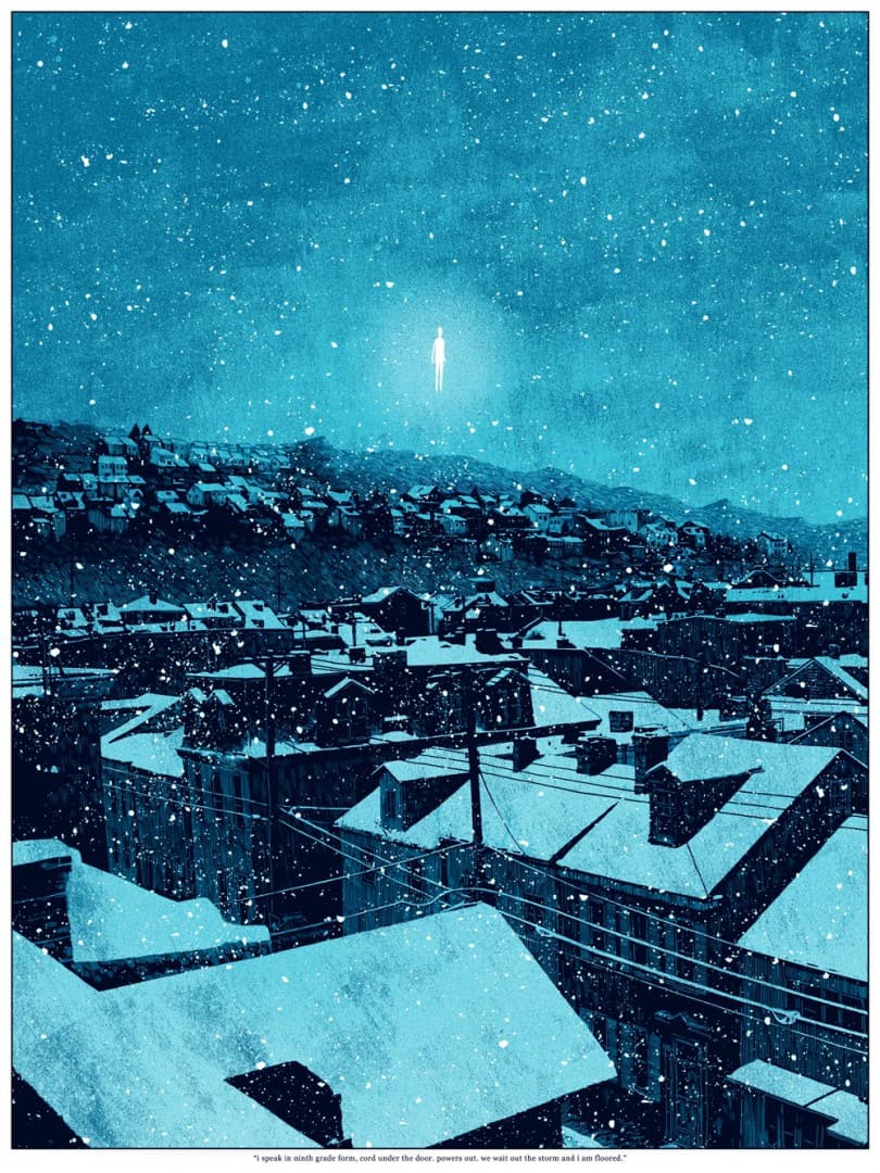
‘we wait out the storm’ by Daniel Danger
Daniel Danger‘s work is all about mood. His designs feel like they exist in a similar place, like Stephen King’s novels. Danger pulls the beauty out of mystery, fear, and alienation.
The figure floating — an alien abduction? A soul rising to the heavens? What is it? The fact that this questions exists in his painting does something wonderful by allowing us inside and now, we’re all sharing this moment.
For me I see ‘we wait out the storm‘ as a painting about discovery, and in that Danger touches on hope.
________________________________________________________________________________________________________________________________________
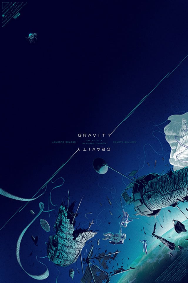
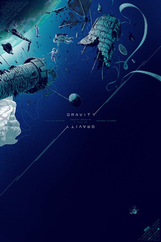
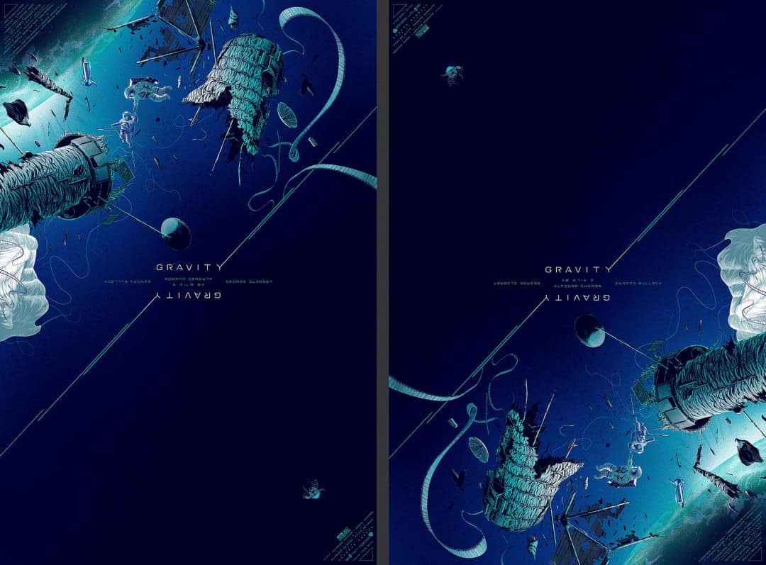
‘Gravity’ by Kevin Tong
Kevin Tong is a problem solver. When tasked with creating a poster for ‘Gravity‘ he designed the concept of the film into the poster itself. No true orientation, Tong’s ‘Gravity‘ has weight — it’s all falling to the ground or drifting up, away from the viewer.
He’s filled posters with great detail and textures before, and now with ‘Gravity‘ he’s pushed his own creativity to new directions and came up with a brilliant solution.
Not only do you grasp the level of despair and isolation of the film’s characters, but he managed to incorporate that difficult theme of being lost, drifting, along with the beauty and danger of space.
Previously on Evil Tender — Interview: The Focused Illustrations of Kevin Tong
________________________________________________________________________________________________________________________________________
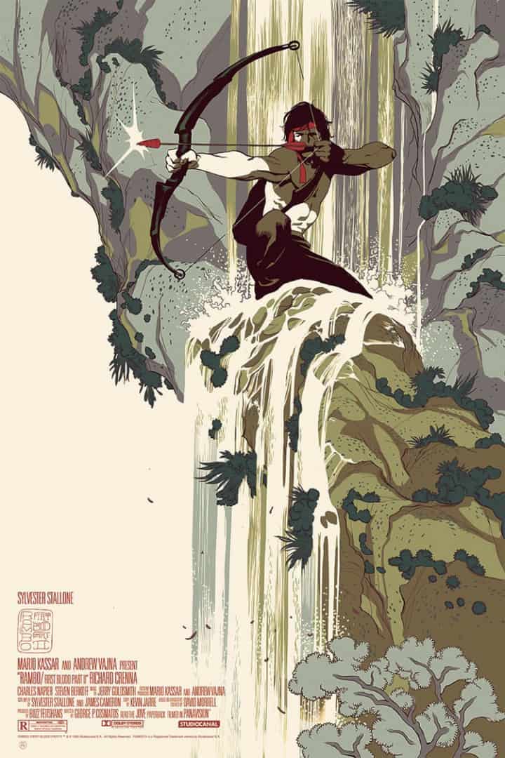
‘Rambo: First Blood Part II’ by Tomer Hanuka
At the heart of the character John Rambo is a man reckoning with a world that doesn’t need his skills anymore. He’s no longer seen as a hero but a killer — a savage. His soldier status reduced to madman. Illustrator Tomer Hanuka gives Rambo respect and pays homage to the setting of the character’s violent history.
By time ‘Rambo: First Blood Part II‘ came out the character hadn’t quite devolved into the Hollywood action superhero he was by Rambo III, where all lines of reality erased and covered in glistening sweat and barrel smoke. Here, Hanuka envisions Rambo as the peaceful warrior — killing only to protect. The silent mercenary. An inspired take on a film associated more with mindless violence than the thought provoking essay on veterans and war that the original novel established.
As an illustrator Hanuka can do no wrong. He elevates every project and property he works with. The fact that he was able to lift Rambo above the Hollywood muck and place him in a composition of noble grace speaks of Hanuka’s amazing craftsmanship.
Previously on Evil Tender — Interview: The Calm & Chaotic Art of Tomer Hanuka
________________________________________________________________________________________________________________________________________
This list is not exhaustive at all. Just look through the ETDC archives and it won’t be difficult to find more work that can be placed on a list like this.
Still, a huge thank you to all of the illustrators and creative folk out there who continue to make amazing work whoever the client is. Those freelancers who don’t just sit back, turning out the same work over and over, but work nonstop to make each job a creative challenge.
Damn, you all make every day exciting. Looking forward to seeing what 2014 brings.

2 thoughts on “Evil Tender’s Favorite Posters of 2013”