Kevin Tong is an illustrator in control of his craft. He’s thoughtful. Deliberate. His posters are gorgeous in design and execution. Tong’s visual language has depth and movement. Every element perfected to lead the audience through a concisely drawn vignette. The simple fact is this — Kevin Tong is a phenomenal storyteller.
When we did our first interview back in November of 2012 the focus was on the how behind his work, so I approached him to discuss the why. I’m pretty thrilled to say that he agreed.
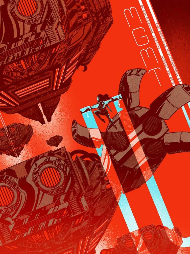
CJ: The majority of your work has a strong focus on narrative. You have an incredible knack for finding the most compelling way to visualize a particular situation. In your MGMT poster, the scene is quite simple – a girl in a jet pack flies over a squad of robots. That scenario can be attacked in so many different ways. Your decision to take the perspective high above the action and look down creates this epic quality to a comic book-like scene.
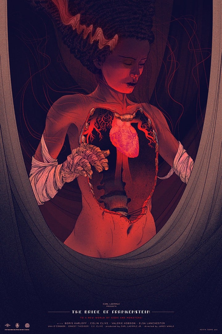
One of my all-time favorite posters is your ‘Bride of Frankenstein’, where the bride is there, heart exposed, with surgical tape framing her like a grand theater. It’s such a gorgeous presentation of a tragic character. As the illustrator you control what the viewer sees and how they see it. What feeling they get from an image – how do you decide what the focus should be?
KT: The focus is typically the first thing I see when I visualize the illustration in my mind. It’s almost like the rest of the image gets built around it. Generally, the focus is the focal point for communicating the idea and narrative.
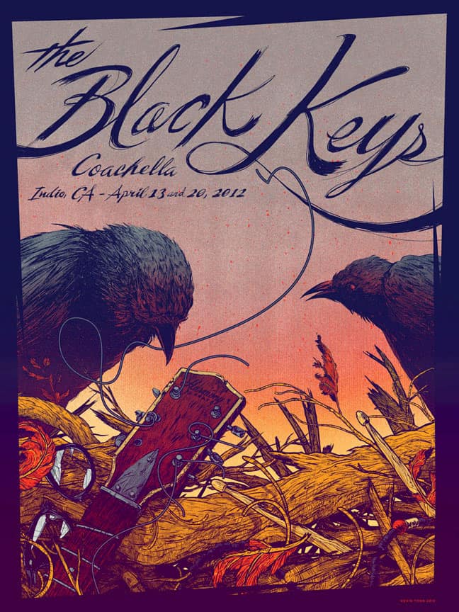
Unlike a film poster, you don’t have an existing narrative to pull from when doing band and art prints, but you have such a strong focus on story in your posters. What’s your approach when you get a job like the MGMT poster? Do you pull images from the music? Is there a notebook of potential scenarios you keep?
Band posters for me are usually unrelated to the lyrics. The main thing I try to keep in mind is to make the imagery match the mood/spirit of the music. My approach is typically to come up with a strong image that will grab people’s attention, then use a style that fits the band. Most of the ideas only exist in my head and I only start sketching the one I plan to go with, so no, I don’t keep a notebook of potential scenarios.
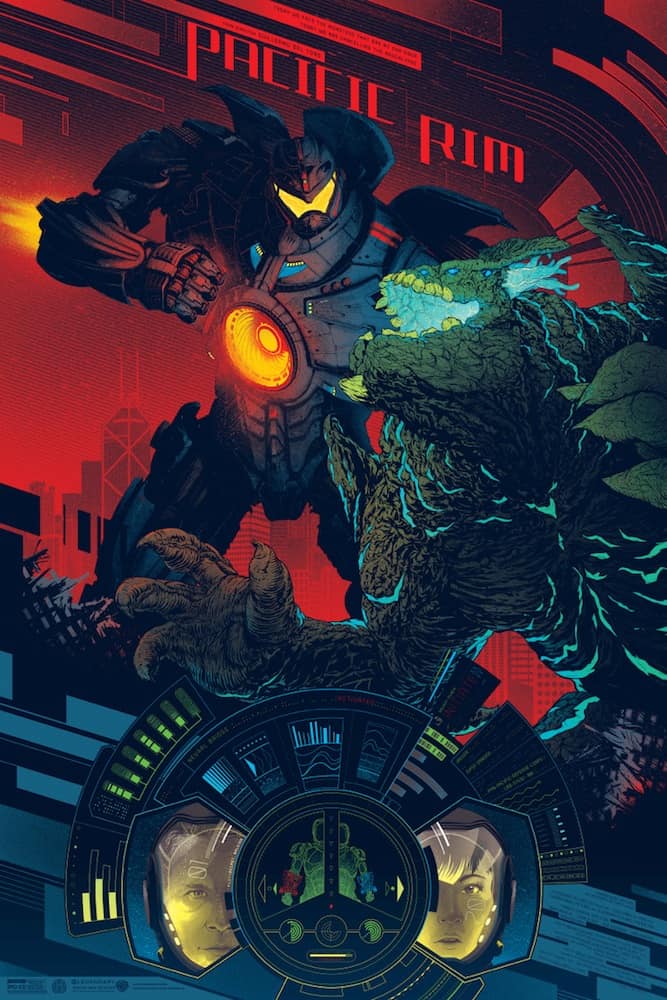
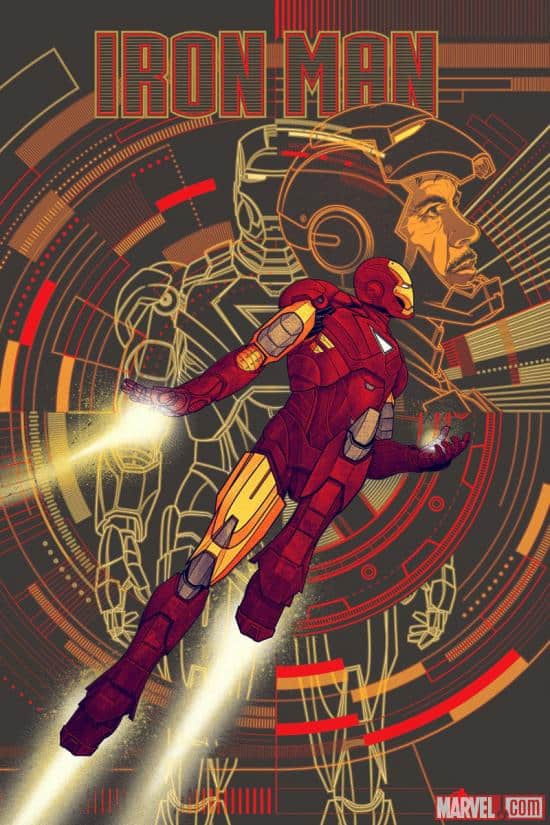
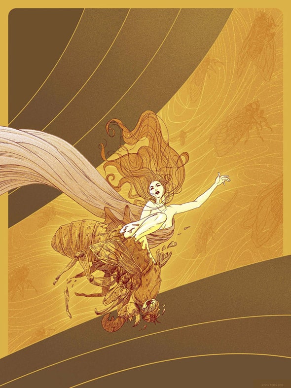
With your focus on story, there’s not a lot of portraiture in your work. It’s interesting to see how your figurative work changes once you need to create a specific character – Iron Man and the human figures from ‘Pacific Rim’ shift in style compared to the figure from ‘The Visitation.’
When I do my own thing, I try not to make the figures too specific so that many people can relate to them. In my art prints, usually the figures are less detailed and smaller, often just silhouettes. They’re really just there to provide a human element to the work. With a movie, the visuals are already established, so it’s completely the opposite. The characters are essential and often up close and detailed.
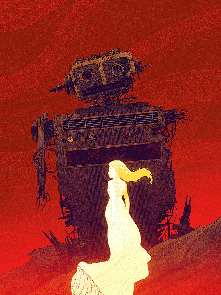
Is there a different process to drawing the figure from ‘Exoskeleton’ and say Robert Downey, Jr. from your ‘Iron Man’ poster?
Yeah, portraiture is a lot harder. When trying to capture a likeness, I have a harder time making it stylized.
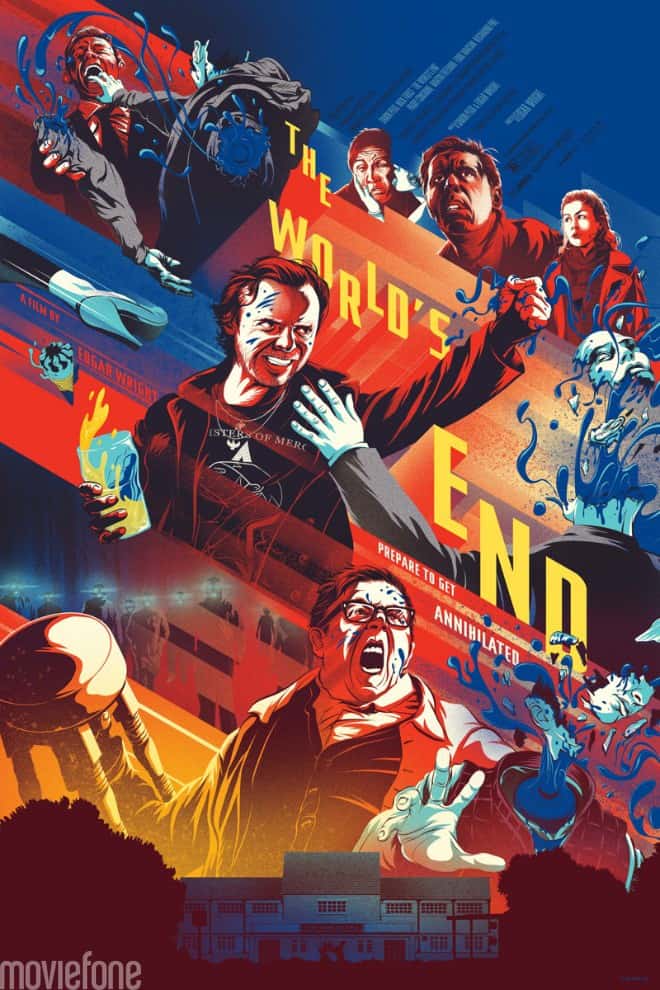
Your poster for Edgar Wright’s ‘The World’s End’ is awesome and also unique in your catalog. It almost doesn’t look like a Kevin Tong poster. There’s a totally different feel to the figures and the over all design.
Sure, if you insist. Historically, I think most can agree I try different styles more than a lot of artists.
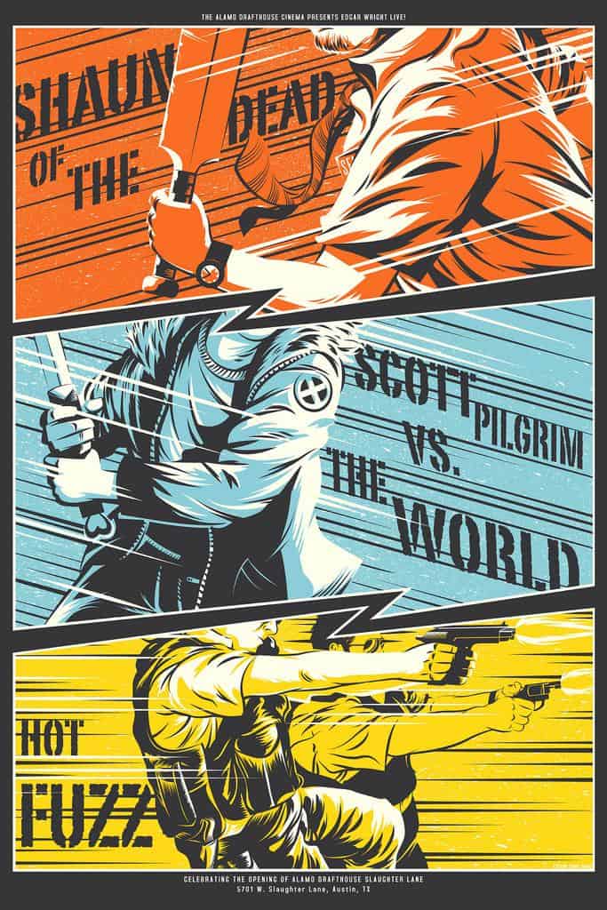
Maybe what I’m responding to is the way your two Edgar Wright posters play against each other. ‘The World’s End’ is stylistically consistent with the 2012 ‘Edgar Wright Triple Feature’ poster that you did for Wright’s ‘Shaun of The Dead,’ ‘Scott Pilgrim Vs. The World,’ and ‘Hot Fuzz.’
It feels like you took the opportunity to try new things in these posters. Is there something about Edgar Wright’s films that require you, or maybe inspire you, to come at them from a different angle?
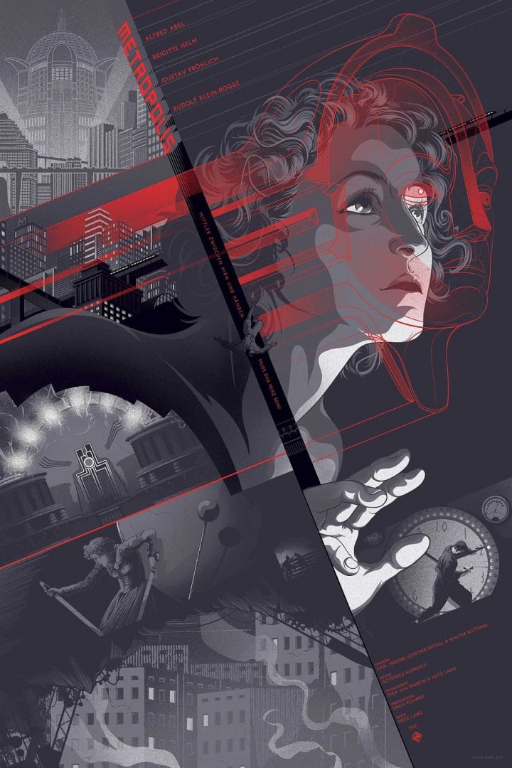
That’s a pretty astute observation. Edgar Wright and my fans loved the 2012 poster, so I took it to mean that the style was successful. Over the course of a year, however, I learned a lot, so it wouldn’t do to mimic the style exactly, so I tried to push it a little more and merge it with some new things I’ve learned, especially from the Metropolis poster.
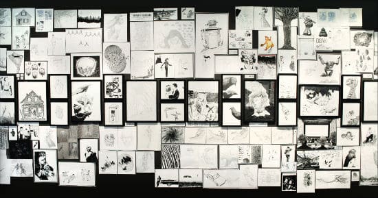
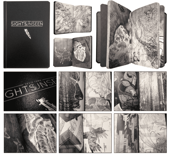
Your solo show ‘Sights Unseen’ was a showcase of all the drawings and sketches that had gone into your work up to that point in time. Was it a relief to be able to display it all, and emotionally let it go? It seems like it was set up as a line in the sand, the work of Kevin Tong before ‘Sights Unseen’ and the work that come after. Was there a desire for closure?
For me, it wasn’t as big a deal as everyone made it out to be, the act of selling all my originals that is. Never a sentimentalist, it seemed a better idea than to let them sit in a pile somewhere. People have always been asking for me to sell/display my originals, and I have a reputation as the process guy, so it seemed like a good decision. When I was drawing all those, I never intended to sell or display those drawings because they weren’t the finished product. How things change after a while.
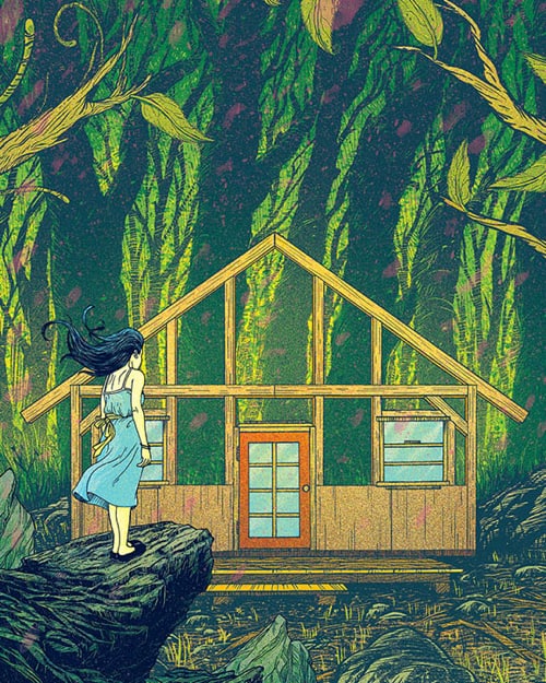
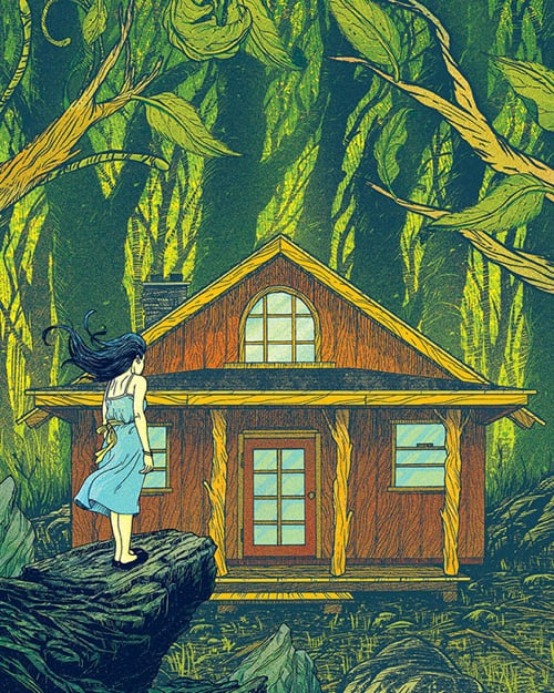
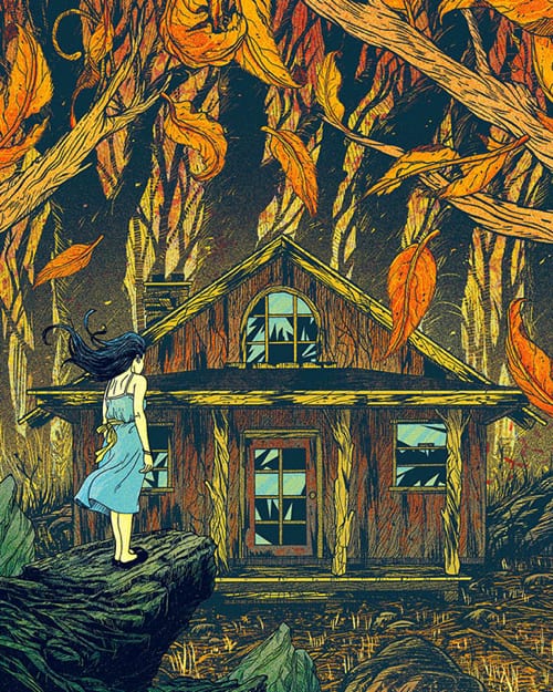
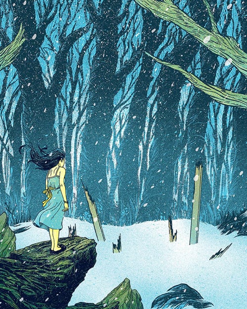
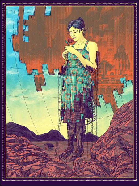
The series you created for ‘Sights Unseen’, ‘These Moments Never Stay,’ fits thematically into that idea of closure. Again, you’ve used a simple motif and created a beautiful narrative – a young girl watches as a house is built, finished, left behind, and finally eroded away through the span of the seasons. In the scope of the show, this young girl is like you — you’ve both watched something being built, used, then left behind. The show and this series is almost a celebration of that concept.
You corrected me last time I called you ‘an artist,’ saying, ‘I call myself an illustrator, not an artist. All that self-expression crap is for a museum brochure.’ Even if it’s not intentional, or maybe not even there, I still see a fine art streak to your work. What sort of goals do you set for projects like ‘These Moments Never Stay’ and ‘Exoskeleton’? Am I (the viewer) forcing self expression on your work because I want to see it there?
Hah. That sounds like something I’d say with a few beers in me! Really, I just don’t want to make myself out to be more important than I really am, which is another guy exercising his trade and trying to gain mastery over it. Artists with inflated egos are lame to me.
Despite all the time I put into coming up with the ideas and narratives, I try not to explain myself and leave the interpretation up to the viewers. It’s also not a secret, if they ask, I’ll tell. If the viewers perceive what I wanted them to see, then I consider the work a success. If not, then that’s something for me to consider for the next time. It gives me a reason to keep changing up my approach and style.
Yeah, I get what you’re saying. But your work just has so much heart to it. But it is better that I say that than you, the illustrator. No one wants to hear an ‘artist’ say, ‘my work has so much heart to it.’
Along with the prints for ‘Sights Unseen’ you also made a book compiling all of your sketches. What was your process of organizing that book? Your work is far too deliberate to imagine you just threw it together, but hey, maybe you did.
It was literally thrown together! The book is page after page of my drawings collaged. Once we (me and the gallery) had all the art scanned, I started cutting it apart and collaging 2 – 5 per page. The only method was to try and re-purpose those drawings to tell a different story. I didn’t even know if I had enough drawings, I was just winging it.
Really? Damn fine work for winging it. A lot of the collages work so well together I just imagined you spent weeks toiling over each page, but I guess not!
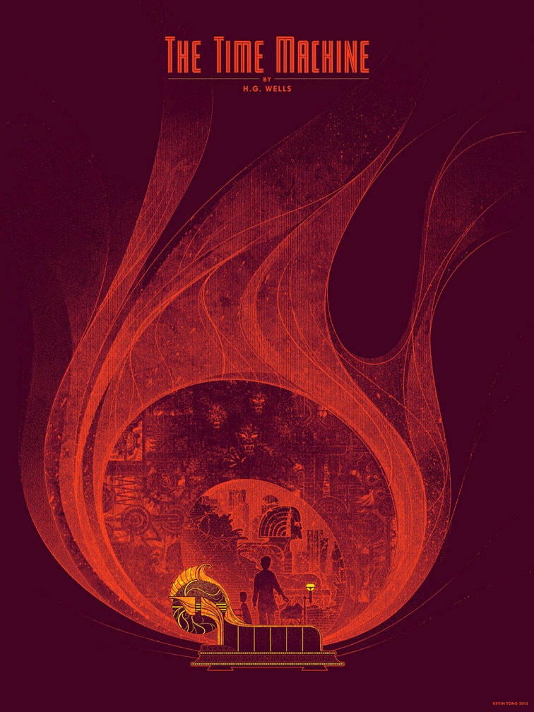
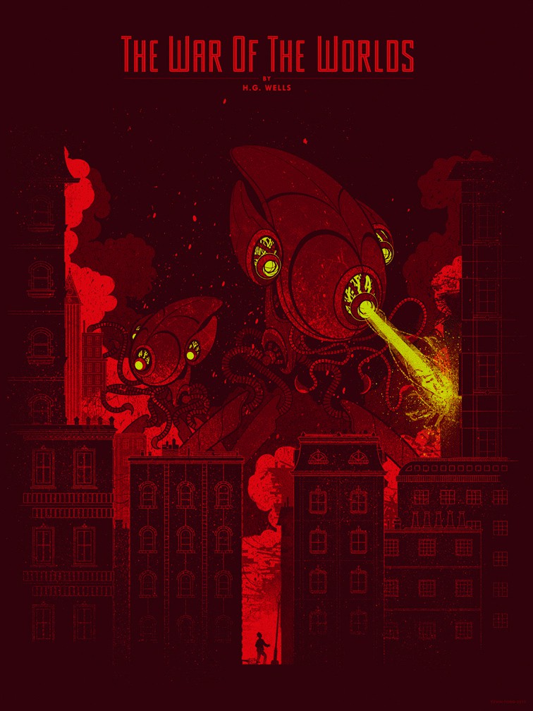
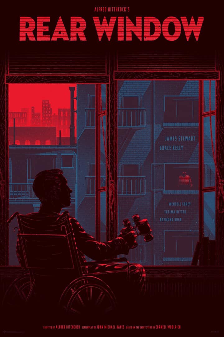
There’s a common color palette of red and black in a lot of your recent posters like ‘Rear Window,’ ‘Pacific Rim,’ and ‘Beyond Good and Evil.’ It’s there when you look back a year or two to your H.G. Wells’ prints for ‘The Time Machine’ and ‘War of the Worlds’, as well as ‘The Visitation’ and ‘The Bride of Frankenstein.’
You accomplish a lot within that simple color wheel. What about those colors do you find appealing? Were they just the right color choices for the job?
Most artists use a color palette of some kind, I’m no different. Some artists purposefully use the exact same colors over and over again (not a bad thing). In screen printing, if you use lots of colors, it kind of defeats the purpose. I like the challenge of limited colors. Also, I find using just a few colors makes the image bolder and creates more contrast. Too many colors gets muddy. Red gets used a lot because red is alive. It’s the color of life and against black and gray, it really stands out.
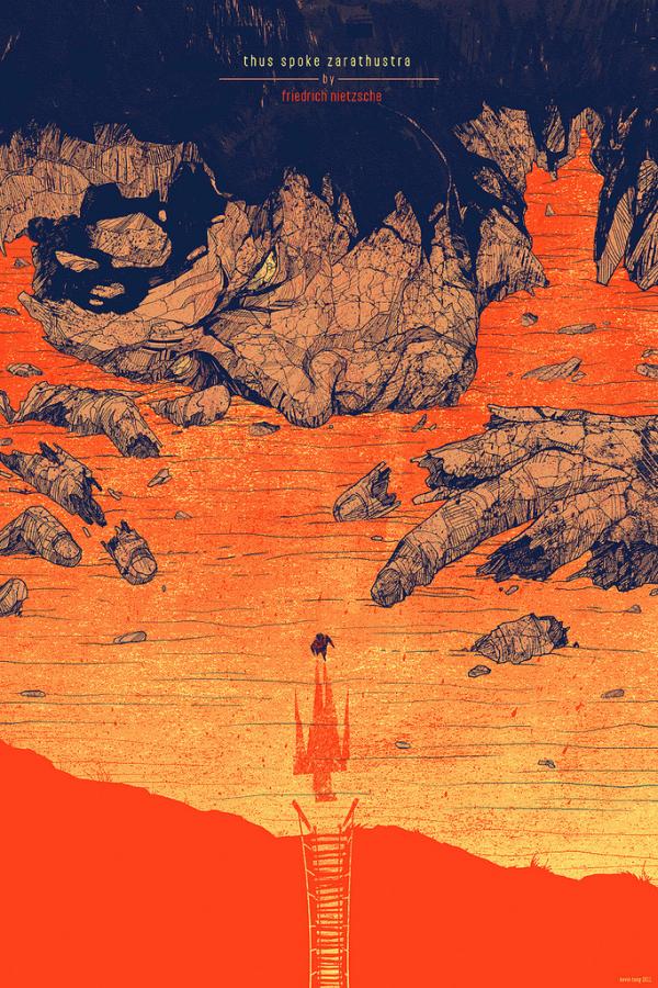
You debuted a few new posters at this year’s Comic-Con, one of them was your incredible design for the Friedrich Nietzsche book ‘Beyond Good and Evil.’ This was your second poster for a Nietzsche book. The first, ‘Thus Spoke Zarathustra’ captures that book brilliantly. The man walking from the ruins, possibly Nietzsche’s Übermensch, his shadow sprawled on the ground like an angel. Just great stuff. What brought you to work in the world of Nietzsche not once, but twice?
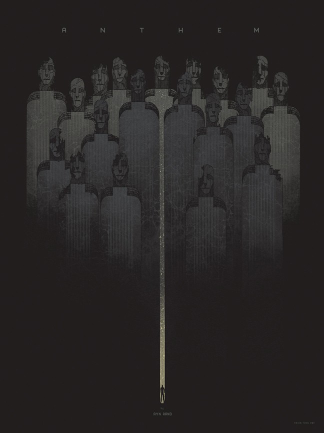
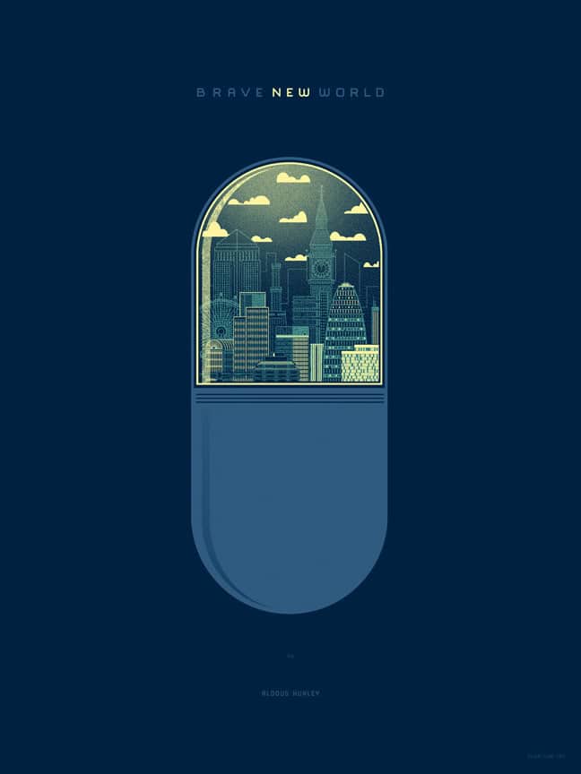
Philosophy and books, in general, is a great visual playground for me because many of those ideas are familiar to people, but a visual identity as solid as a poster has never been attempted. With Nietzsche, I’m more familiar with his work than other philosophers, but I’ve done others like Ayn Rand and Aldous Huxley. I’d love to make posters for George Orwell books, but those aren’t in the public domain.
In your description of ‘Beyond Good and Evil’ you mentioned the symbolism running through the design, and you get that right away. The construction of elements reads like a mural. When dealing with Nietzsche’s work, how do you decide on the visual language to get his ideas across?
Nietzsche is great for imagery because he’s a historical philosopher. He uses various moments in history and the present as examples of his ideas and his ideas cover humanity as a whole so almost anything can be used to symbolize those concepts.
There were lots of things to choose from, but I went with imagery familiar to most people (angels, demons, spear, modern civilization) because many people haven’t read ‘Beyond Good and Evil.’
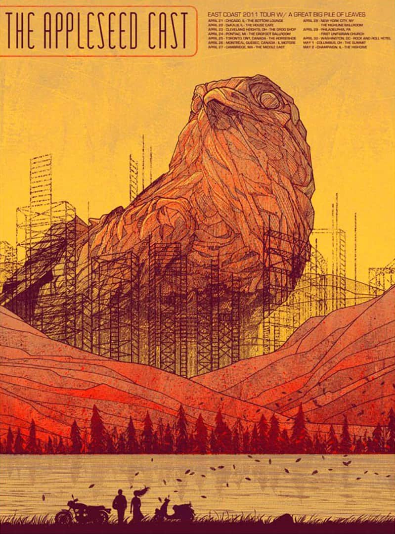
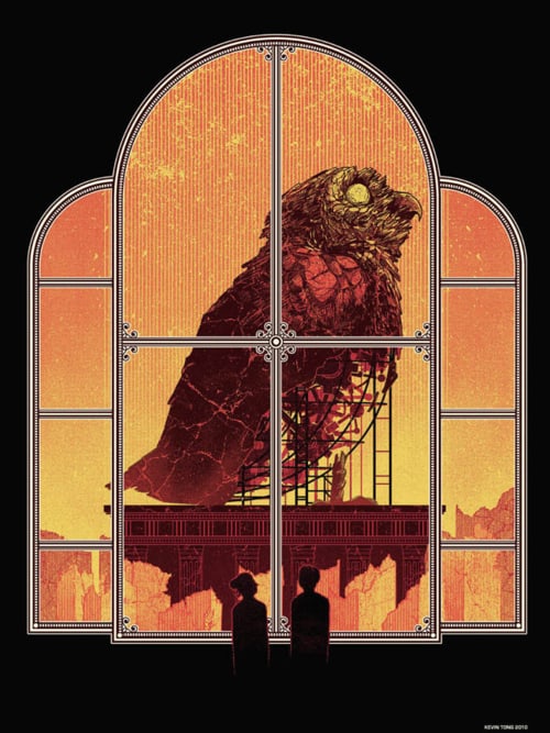
It’s interesting to see the similarities between your ‘Zarathustra’ print and some of your other designs. Your Appleseed Cast poster, ‘Athena Ex Machina’ and ‘A World For Two’ deal with the construction of large scale monuments of sorts. In Zarathustra there’s destruction and rebuilding.
Are these themes you’re conscious of working with, or is it simpler than that, that you just like drawing large structures?
The monolithic stone images I like to draw work on a few levels. Stone statues are reminiscent of antiquity and it creates a narrative, that people long ago built the statue to worship something important to them. Usually, those stone monoliths of mine are contrasted by something modern (windows, cityscapes, motorcycle). Making them falling apart or incomplete reinforces the antiquity feelings and also gives a sort of ‘motion’ to something motionless.
You take your work out into the world quite a bit. You have booths and Comic-Con and the Renegade Craft Fair and later this year you’ll be in Leeds for the Thought Bubble Festival.
What role do these conventions play in your career? Do you like going out and meeting fans and making new ones?
So much of my business is online that the live events are financially insignificant. You’re right, I do them for other reasons. Nothing can ever replace face to face human interaction and being self employed, I don’t get a chance to do that as often as other people. It’s all about the people. Always has been and always will be.
Previously on ETDC – Posters & Process: Interview with Illustrator Kevin Tong

6 thoughts on “Interview: The Focused Illustrations of Kevin Tong”