Poster designer Jay Shaw has a strange sort of magic — he can take a film with thousands of images and sum it up in one simple graphic.
His poster for ‘Rocky III’ isn’t accurate to what the film is on paper, the facts of the story — but what that film and franchise has become to our modern world. It’s a silly superhero boxing movie with a song that you cannot escape. However crude or beautiful, he finds the true memory of the film. His work is intimidating. Bold and intelligent. Shaw is not afraid to take his designs into the realm on nonsense — silliness. His designs have an other-worldly delight, a stream of consciousness tone. His ideas seem birthed from some brilliant unknown place.
Going through his catalog of posters at first you think you see a pattern to his style, then he changes. Drawings. Photos. Collage. He uses them all with equality. As he explains, ‘The poster is the art…Why limit yourself to one medium when there are so many available?’
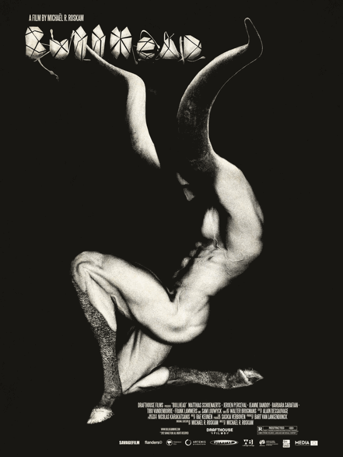
‘Bullhead’ by Jay Shaw
ET: Your work can be very deceiving. When I saw your poster for ‘Bullhead’ my first thought was, ‘how did he get that image?’ Photo collage? Model?’ I later read somewhere that it was a drawing, and then a sketch of your design surfaced. That poster is such a strong image – absolutely in your face, an unknown evilness to it. Your designs mix photographs and drawings so well sometimes I have no clue what’s what.
Like in your ‘Killing Them Softly’ poster, I can pretty much guess that those are photographs, but then seeing your drawings I have to stop myself and think, ‘well, maybe not.’ How much are your designs hand drawn versus photo collage? What dictates which way you go?
JS: With ‘Bullhead’ that was a mix of a bunch of things. The body is a 3D model I drew on top of, the legs were drawn looking at various animal references. A lot of the credit for how good some of this stuff comes out goes to the tools in use. I could never create something so photorealistic on a piece of paper. I’m just not that technically skilled. Custom Photoshop brushes and endless levels of “undo” are the real artists there.

Cover to vinyl release of the ‘Maniac’ soundtrack. Design by Jay Shaw.
On ‘Killing Them Softly’ I went over photos of the actors the studio sent for us to use. Again, I can’t freehand a perfect Brad Pitt likeness on paper. There’s really no one method or technique for achieving whatever aesthetic I’m aiming for. If there’s a great photograph out there (Maniac LP) I’ll use that, if it makes more sense to break out the watercolors (Halloween blu-ray) I’ll go that route. I’m of the mindset that my job as a designer is to satisfy the subject (and client) using any resource available.
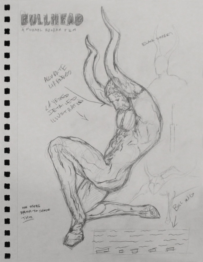
Jay Shaw’s sketch for ‘Bullhead’
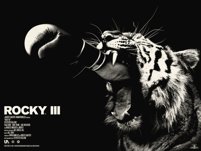
‘Rocky III’ by Jay Shaw
There’s a strong streak of humor in your work with an almost absurdist bent that is pretty brilliant. Your poster for ‘Rocky III’ isn’t necessarily tackling the film itself, but rather what the Rocky franchise has become in society. A fighter’s fist coming out of a tiger’s mouth is almost mocking the film, but really it’s hitting exactly what ‘Rocky’ is to a modern audience – a blunt slab of popcorn entertainment.
There’s bravery on your part for that image. It’s funny, but not too hilarious – it still makes the audience think about how it all works together. How aware are you that line between a joke that an audience laughs at and moves on versus chuckles at and thinks about for weeks later?
I’m not sure if I’d call it bravery. It’s really just foolishness. That damned Survivor song is so molded into the film it becomes impossible to avoid it. I watched the movie a couple of times and thought, ‘he’s either going to be riding a tiger, punching out of a tiger, or wearing a tiger’s head for a hat.’
I actually came up with a better idea for Rocky III a few months ago so if the opportunity strikes I’d love to take another crack at it. As far as the absurdist approach to film art it’s something I’m always trying to get right. When you work like I do in minimal and often crude imagery you’ve got to have some sort of punchline.
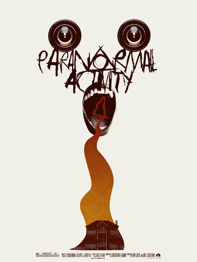
‘Paranormal Activity 4’ by Jay Shaw
I saw your posters at the Mondo gallery last time I was in Austin and it was awesome seeing them. Most art isn’t meant to be consumed in a string of tiny jpegs, but in person. Do you keep in mind the fact that most of your work is going to sit online for the bulk of your audience? Are you concerned with how your work is consumed?
I work with the intended output in mind. If it’s a screen printed poster I want it to look best that way. If it’s an album cover I come from that angle. Some of what I do translates fine to online thumbnails and some of it gets pretty lost but I don’t take that into consideration at all when I’m working on a piece.
Quite frankly I’m just happy my work is consumed by anyone so I’m not terribly concerned with where people see it.
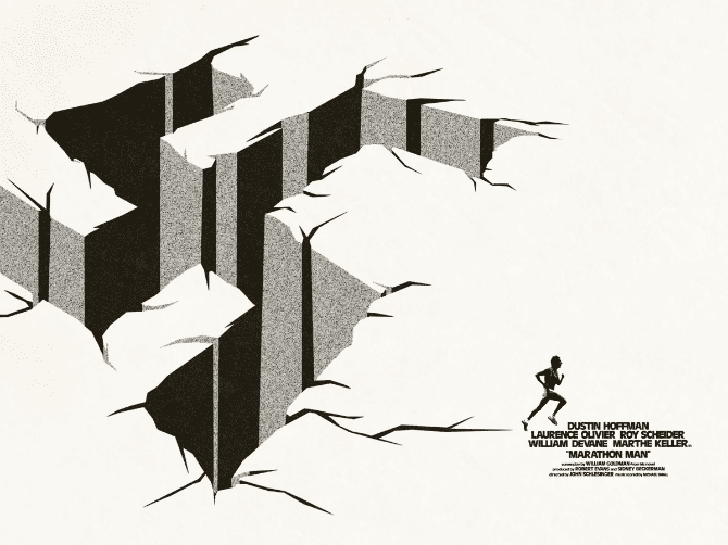
‘Marathon Man’ by Jay Shaw
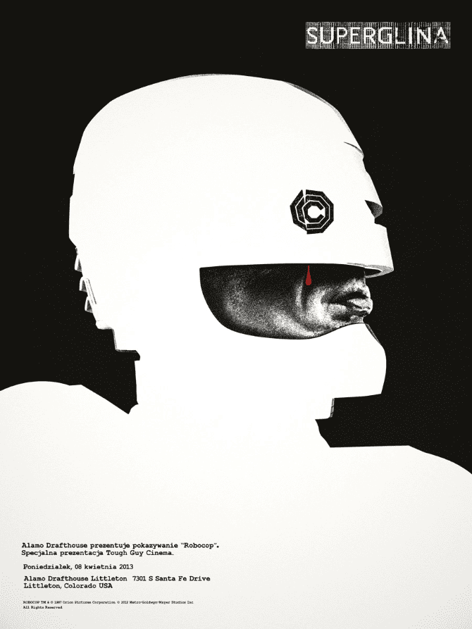
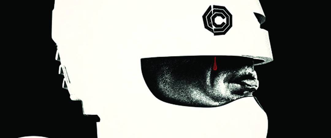
‘Superglina (RoboCop)’ by Jay Shaw
You’ve referred to your style as utilizing ‘one central crazy-looking thing to get the point across’ and that’s absolutely true. In your ‘Marathon Man’ poster, you get the film across in a simple black and white image, without any of the actor’s faces or tag line. The film’s title isn’t even prominently displayed. From ‘The Conversation,’ ‘Rocky III,’ and ‘Repo Man, you’ve shown an incredible knack for finding that ‘central crazy-looking thing.’ I mean, look at ‘Robocop’ – that bloody tear makes that poster. It makes you go, ‘Oh, he’s still human and cares, loves. He lives.’
What’s your process for finding that central image? How familiar do you have to be with the film to find it? Is it easier if you’ve only seen the film once and use the first thing you recall or do you want a heartfelt reaction?
That method of conceptualization, finding or creating an iconic image to represent an entire story, is obviously nothing new. Artists have been doing that forever. It’s the thing that most drew me to the Polish school of design I lovingly ape today. It’s also what comes naturally to me. I don’t think I could lay out a poster with the main characters and primary settings of a film represented. That’s just a puzzle I can’t solve.
It makes sense to watch a film and say, ‘the story is about that so this image should communicate that idea well.’ Every idea can be broken down to some base image, it’s just a matter of figuring out what the image is. Sometimes I do that correctly, sometimes I completely miss it.
I usually watch a film once and the poster is in my head before the credits roll. The tough projects are films I’ve seen a bunch of times. Especially if it’s something that made an impact when I was young. Nostalgia and over-familiarity cloud up my thought process a bit.
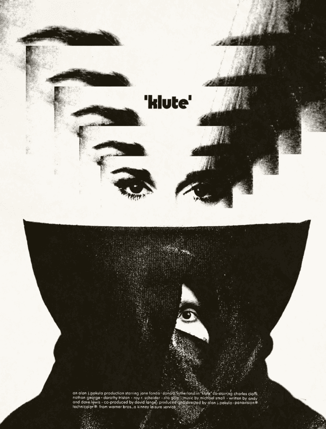
‘Klute’ by Jay Shaw
What sort of source material are you working from? Do you photograph live models for something like ‘Bullhead’? Screen grabs for a poster like ‘Klute’? You mentioned that you weren’t a big fan of technology, but with some of your work like your ‘Summer Camp at The Hollywood’ poster there has to be some Photoshop or Illustrator work going on. How true do you stay to the roots of analog?
I’m not a fan of technology in the sense that I get really tired of people pulling out their goddamn computer phones and checking Facebook while we’re in the middle of a conversation. I’m also getting old so new things confuse me and I get frustrated about it so I lash out. As for technology in art, I’m a big fan. I can’t believe some of the things I can accomplish with such a limited skill set.
That said a lot of what I do calls back to an older method of design so I try to stay rooted there wherever possible. I’ll avoid drawing a black circle in Photoshop and instead cut out a circle from a print and scan it in and use that instead. I love textures like that.
I really don’t use Illustrator much but I probably should. On the ‘Summer Camp’ poster, I did the whole thing in Photoshop, even though it would’ve made a lot more sense to do it in vectors. That one is a bit of an anomaly though. My stuff rarely looks like that but I thought it’d be fun to do something that resembled the cover to an old camping guide.
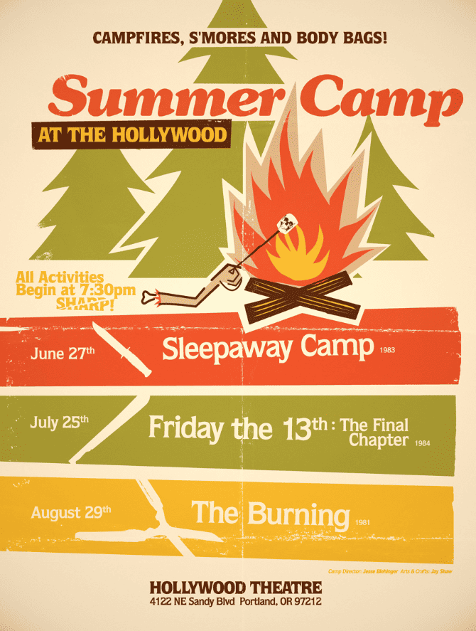
‘Summer Camp at The Hollywood’ by Jay Shaw
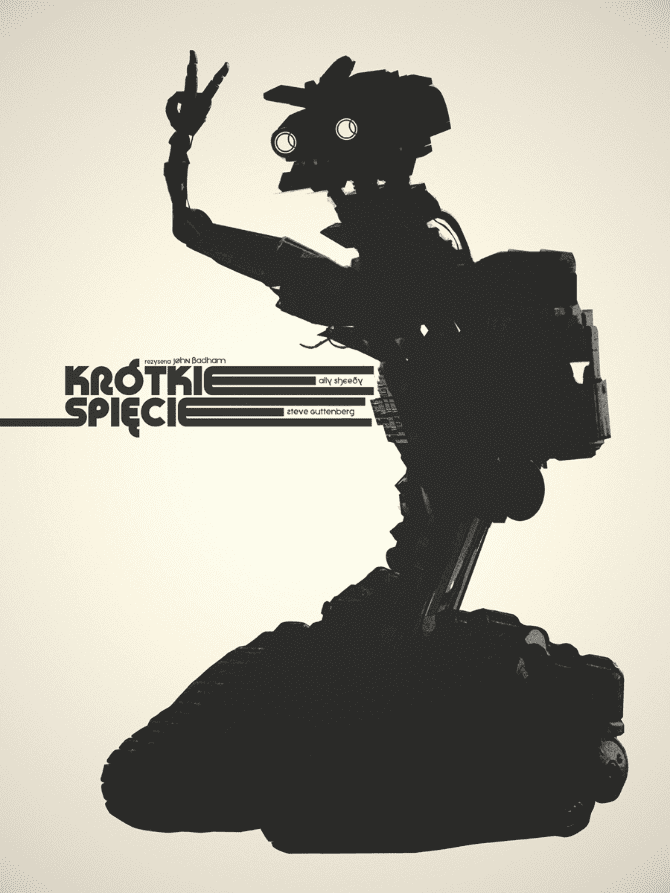
‘Short Circuit’ by Jay Shaw
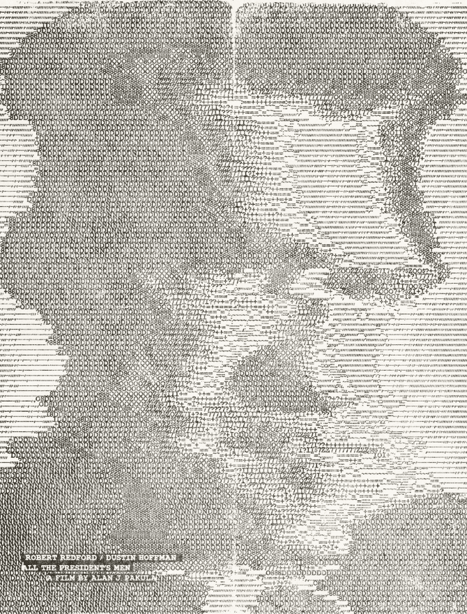
‘All The President’s Men’ by Jay Shaw
I love your poster for ‘Short Circuit.’ It almost goes out of its way to NOT be about the film ‘Short Circuit,’ which makes it delightfully at odds with the purpose of a movie poster altogether. You didn’t even put the title in English! I don’t know why but I love that part the most. It’s almost like you re-imagined the film as European art-house cinema.
For as much as you mess with the films you do posters for, there’s also a sense that you truly care about them all equally. This might be a vague and useless question – but do you see genres of films? Is ‘Short Circuit’ as a valid of a film as ‘All the President’s Men’ or in the same pool?
I most certainly see genres and I recognize shit from Shinola but I love them all equally. Every piece gets the same treatment. I think if you’re going to work on someone’s project you have to respect the subject or you’re the wrong person for the job. It can’t be a thing you feel like you’re above. Luckily I’ve never seen a film I feel superior to so I’m open to pretty much anything. I’m one of the people that didn’t mind when Criterion put out ‘The Rock’.
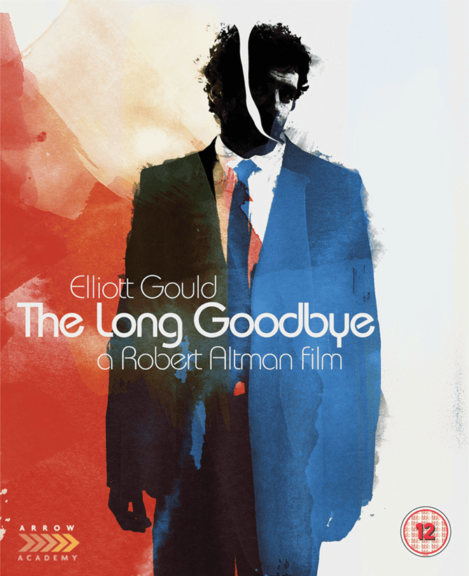
‘The Long Goodbye’ by Jay Shaw
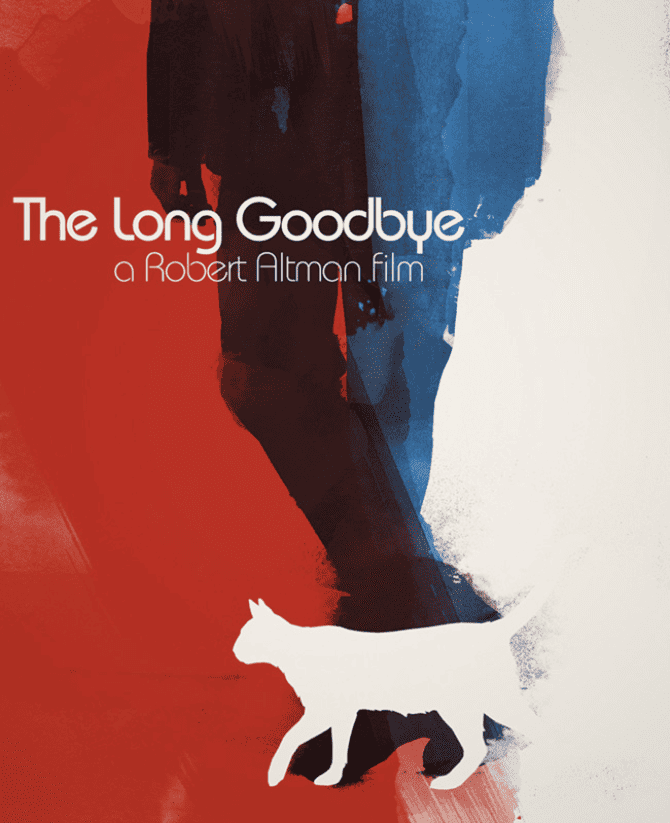
‘The Long Goodbye’ by Jay Shaw
Your style is so specific — that particular voice you have is so recognizable. I called your ‘Rocky III’ poster brave and you said it was just foolishness that had you put it out. I still think it’s bravery, or at least confidence. The tools you use have turned out some excellent results. Is there any impulse to change what you do? Introduce new elements to your work process or visual style?
Oh sure. I’m always trying out new ways of getting an idea across. If you compare ‘Rocky III’ with ‘The Long Goodbye’ they incorporate wildly different styles. That’s one of the benefits of not being great at any one thing, you can explore all of it. I feel bad for folks like Martin Ansin or Aaron Horkey or Tyler Stout. Dudes like that are so good at what they do they’re almost trapped by it.
No way Ansin’s just gonna say ‘fuck it, I’ll use this old polaroid I found.’ His fans would freak out. People who dig my stuff tend to dig the ridiculous. When I try some new technique the feedback is almost always positive.
I totally get what you’re saying about artists being trapped by a specific style, especially for someone who has collectors buying anything they put out but expecting a certain look.
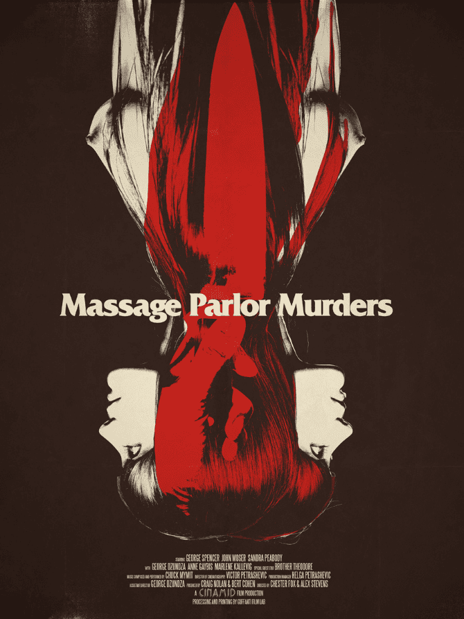
‘Massage Parlor Murders’ by Jay Shaw
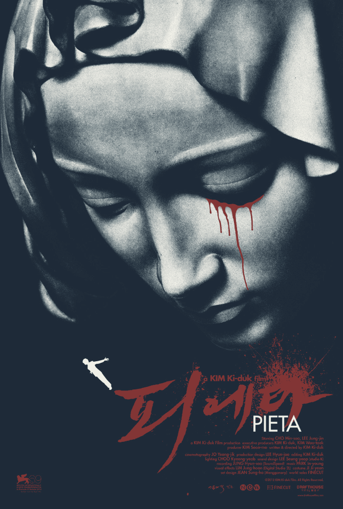
‘Pieta’ by Jay Shaw
One thing I was always curious about — when you create so much stuff that’s based on existing properties, do you ever just want to do something from your own brain, not based on a film or a band? I look at your more cultish film posters as that extension.
I know a bit about movies, but some of the films you work on, like ‘Bullhead’ or ‘Massage Parlor Murders’ I’ve never heard of, so to me, they’re totally your creations. Absolutely new and original.
Are you able to get your personal ideas into your commissioned work enough that you don’t need to do something like make a graphic novel or some other form of art?
Honestly, I work best when I’m on a commercial project. Design is just problem-solving. If I’m presented with a problem (convey the essence of a film with an image) then I’m excited to try and solve it. If I try to dig around in my head for unattached art I come up with an incoherent mess. There’s a part of a pure artist’s brain that wants to tell a story.
That element isn’t necessarily present in every commercial artist. It certainly isn’t in me. It’s actually helpful that I don’t have a narrative of my own when I’m working. My job becomes a lot easier. There’s definitely a certain amount of creative liberty I take with my stuff but it all comes back to the subject. Without that, I get a bit lost.
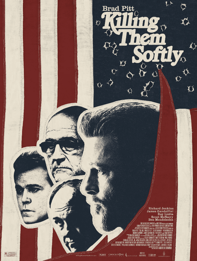
‘Killing Them Softly’ by Jay Shaw
Using both photo collage and hand drawn elements, do you ever feel that using photos make the poster feel less ‘real’ than if it were drawn? How do you approach using the images from the film’s themselves? Where’s the line between your art and using someone else’s?
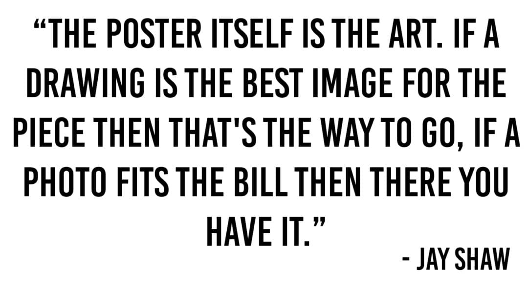
The poster itself is the art. If a drawing is the best image for the piece then that’s the way to go, if a photo fits the bill then there you have it. I’m not sure if there’s any commercial artist out there who feels differently. Some folks have a set method for creating their work but I don’t know anyone who feels that one way is somehow less ‘real’ than another.
My favorite movie poster ever is the one-sheet for ‘Putney Swope.’ It’s a photograph of a hand holding up a middle finger but the middle finger is this gorgeous soulful woman. The tagline reads ‘Up Madison Ave.’ It’s brilliant. You wouldn’t draw that poster, it needs to be those two photos. Neil Kellerhouse is one of my favorite film artists right now and he almost exclusively works with photos. So much of the impact of his work would be lost if it were illustrated. Why limit yourself to one medium when there are so many available?
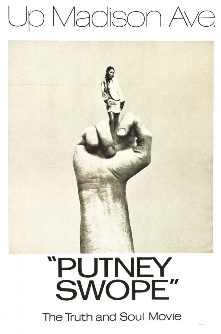
Poster for Robert Downey, Sr.’s 1969 film ‘Putney Swope’
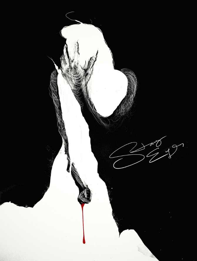
‘Starry Eyes’ by Jay Shaw
Your poster for the upcoming film ‘Starry Eyes’ was a part of the film’s Kickstarter campaign. How did you get involved in that? What did you have to go on for a film that wasn’t even made yet?
The filmmakers of ‘Starry Eyes‘ are the same folks who run Chuck Palahniuk’s website. They contacted me last year to do a poster and shirt for Chuck’s novel ‘Survivor’. We got along really well on that project so they asked if I’d like to do something for ‘Starry Eyes’.
They sent me the script so the method was exactly the same as if I’d seen the film. Most of my work is based on the story, not visuals from the film. From what I’ve seen that film looks really great so I’m going to try and convince them to let me work on the key art for it.
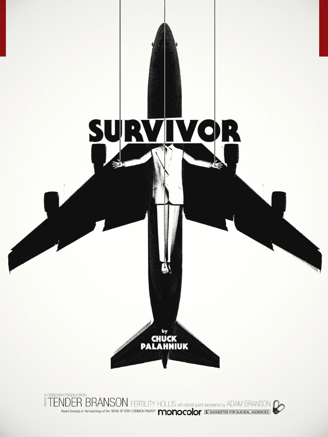
‘Survivor’ by Jay Shaw
With your work being in such high demand, is there a level of client that you wouldn’t take? Can a film production or band be too small for you?
Oh no, not at all. My only requirements for taking on a project are that it’s something I’m interested in and that I have time to do it. I love working on tiny independent productions. There’s an intimacy in the creative process you can’t get from larger studio work.
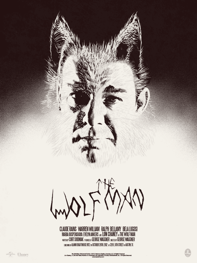
‘The Wolf Man’ by Jay Shaw
One of the first posters of yours I saw was ‘The Wolf Man’ for Mondo’s ‘Universal Monsters’ show. That being one of my all-time favorite films I was a little upset with your portrayal of Larry Talbot / The Wolf Man. It was your capturing him in that mid-transition, looking like a doofus with just his Wolf Man peach fuzz on his face that got me. I see him as a sad and tragic figure, and you showed him in between those two points.
The poster grew on me and also made me stop and really consider the image and reconsider the movie, but it also felt like you were messing with the audience, and that’s one of the aspects of your work that I grew to expect and admire. Your willingness to create exactly what you want, how you want. What made you choose this exact moment of Chaney’s classic transformation?
That poster really split the audience. Some people dug it, some hated it. I just loved the idea of Talbot tormented the way he is. He can never fully be man or wolf. There’s probably a better way to get that across but my solution was a silver wolf overlay.
What’s the approval process for someplace like Mondo? When you sent in your ‘Wolf Man’ image did you get that same split reaction from them?
With Mondo, there are a couple of layers of approval. In my case, the first layer is getting the idea past Rob Jones. He’s just about the best checkpoint an artist could ask for. I consider him my harshest critic as well as a friend. If what I’m doing is any good he’ll encourage it, if it’s a terrible idea (a lot of them are) he’s the first to say so. I can’t count how many missteps have been avoided by having Jones put his eyes on something. Once something gets through Mondo internally it goes to the studio for approval.
A lot of times they’re mostly concerned with what elements from a film are being portrayed and how that works within the contractual boundaries of the project. Sometimes an actor doesn’t want their likeness used, sometimes they insist upon it. Sometimes a director doesn’t want to see certain themes explored, sometimes they’ve got something they really want to see.
Everyone at Mondo is smart enough to know who to put on what project so there isn’t usually a ton of back and forth between them and the studios. Once they’ve got an image they’re happy with the studio tends to give it the ok.
On ‘Wolf Man’ we had to go through the Lon Chaney Jr. estate to get permission to use his likeness. They weren’t completely on board at first but Justin Ishmael explained the piece and they signed off on it. He’s great at that sort of thing.
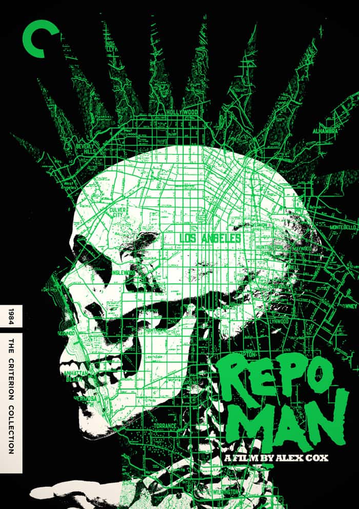
‘Repo Man’ Criterion Collection design by Jay Shaw
The Criterion edition of ‘Repo Man’ features both your work and Tyler Stout’s. How close did you work with Tyler on that project? Was there someone there to make sure your work and Tyler’s melded together as well as it does?
It couldn’t have been a coincidence that both of your efforts on that packaging worked so well together. Did you discuss who would use what images from the film?
Tyler and I really didn’t have much collaboration during that project. We probably exchanged two emails. Rob Jones was the brains behind the whole thing. He and I were working on the cover and he decided to bring Tyler on board to create the inner sleeve cover.
The aesthetic on the ‘Repo Man’ packaging is a hodge podge of imagery unified by the radioactive green and black color scheme. It all works well together because none of it is really supposed to if that makes sense. We never discussed who would use what from the film as my cover doesn’t use anything from the film other than the title so he had free reign there.
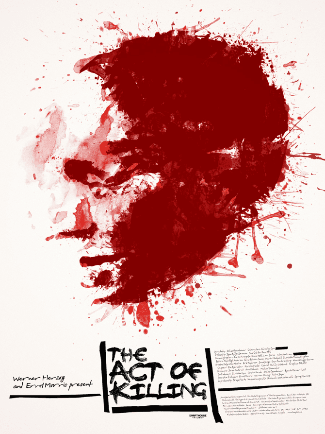
‘The Act of Killing’ by Jay Shaw
You seem to pretty level headed about the work you do. Is there a moment of anxiety or concern when one of your posters is released about whether it will sell out or not? Do you care about that sort of thing?
In the beginning that’s all that mattered. It’s really the only measure of success in the collectible screen printed poster arena. As I’ve gotten more comfortable in my career and expanded my client list it matters less and less. It feels good to see a thing I made do well commercially but it feels a whole lot better to know that I created a unique piece of film art, no matter how fast it sells.
I also find myself working more and more on key art and media packaging so the idea of something ‘selling out’ doesn’t really play into it. If a blu-ray I worked on isn’t available on shelves that’s an inventory problem, not a badge of honor. Most of the time I don’t know if a poster sells out until someone from Mondo tells me about it later.
Of course, if I had a Tyler Stout or Olly Moss appeal then my answer to that question would be completely different but I’m happy sitting at the weirdo table in the lunchroom.
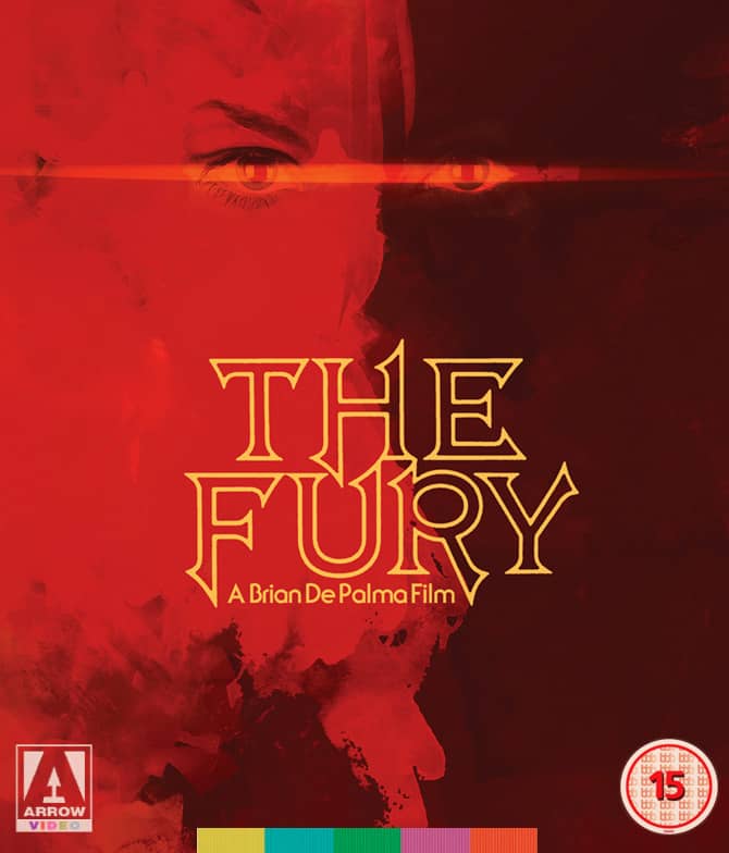
‘The Fury’ by Jay Shaw
I’m a bit out of the loop — what is key art?
Key art is the art used in primary advertising for a film. Anything from theatrical one-sheets to billboards to blu-ray packaging to the covers you see in iTunes. I’ve been fortunate enough to create key art for some really cool upcoming releases.
Oh, that makes sense that that type of work would have a specific term. Do you make time to create art just for yourself? What’s your personal work like?
For me creating art outside of work is like a prostitute having sex just for fun. I do it all day every day so when I’m “off the clock” I’d rather do anything else. I’m working on a number of art prints for a small subscriber package but that’s about it outside of commissioned work. Actually the prostitute analogy isn’t accurate. I don’t think prostitutes enjoy their jobs very much. I actually love what I do but it takes up so much of my day I can’t imagine designing anything in my very limited free time.
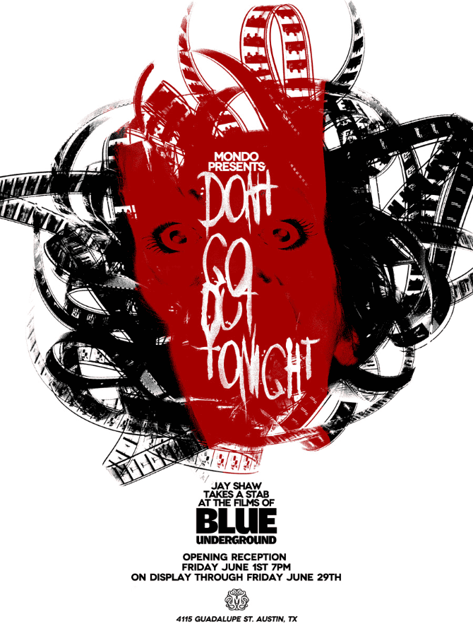
Jay Shaw’s solo show ‘Don’t Go Out Tonight’ at Mondo
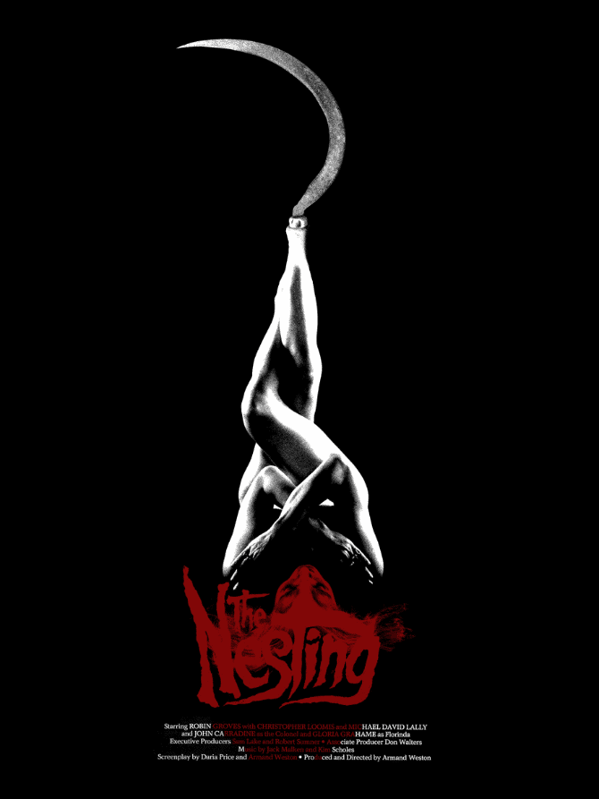
‘The Nesting’ from Jay Shaw’s solo show ‘Don’t Go Out Tonight’ at Mondo.
Your solo Mondo show ‘Don’t Go Out Tonight’ was a series of awesome film posters of ‘Blue Underground’ releases. How did that show happen? I have a few of their Jess Franco releases but their library is so huge — did Mondo or Blue Underground have a say in the films you chose to work on? I noticed your design for ‘The Nesting’ is a bit of an homage the ‘Putney Swope’ one-sheet you mentioned. I’m guessing that was intentional?
Mondo has a really great relationship with Blue Underground. William Lustig had expressed interest in Mondo doing posters for some of the less exposed titles on the label and it seemed like a good fit. They pretty much gave me access to the entire catalog. I wanted to do another dozen posters for that show but I ran out of time.
The ‘Putney Swope’ homage definitely wasn’t intentional but I’m sure it was there in my subconscious. My stuff is always influenced by some great thing I’ve seen or read or listened to.
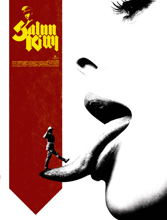
‘Salon Kitty’ from Jay Shaw’s solo show ‘Don’t Go Out Tonight’ at Mondo.
I’m constantly impressed seeing guys like you who not only do amazing work but are also freelance with a family. How do you create that balance? If your kids want to goof off and play with dad, do you just go for it and work late? How regular is your work day schedule?
My work schedule is pretty absurd. I always think I’m going to take time off and I never get to. I work pretty much every day morning till night. My kids are my favorite people in the world so I take breaks to hang out with them as much as possible. It’s a tough balance though because my tendency is to work until I can’t keep my eyes open but then I wind up missing out on time with my family. That’s the one thing I miss about having a gig where I clock in and clock out. With that once you’re done for the day that’s it.
In the work I do I might get an email at 10pm asking for revisions on a thing immediately and I’ve got to do it. One of my big goals for next year is to settle into more of a groove with this stuff. I think that was also last year’s goal for this year though. Who knows, I’m sure I’ll be bagging groceries one of these days so I try to avoid getting comfortable.
Your approach to your work is inspiring and has turned out some incredible pieces. For as successful as you are, do you really worry about ending up bagging groceries one day? Are you afraid of enjoying success, then having it all gone? What does ‘getting comfortable’ mean to you?
I’m terribly insecure when it comes to this stuff. I try not to worry about career longevity but it’s tough not to. When you’re pushing 40, covered in shitty tattoos and are only really good at one thing you sometimes wish you’d pursued a degree in accounting.
I think it’s good though. It keeps me just paranoid enough to wake up when the alarm clock goes off and push to get jobs done on time. Also, there’s a “too good to be true” element to this whole thing. Is this really what I do for a living? This isn’t normal. If it all ended tomorrow and I was bagging groceries I wouldn’t complain one bit though. It’s been a blast.
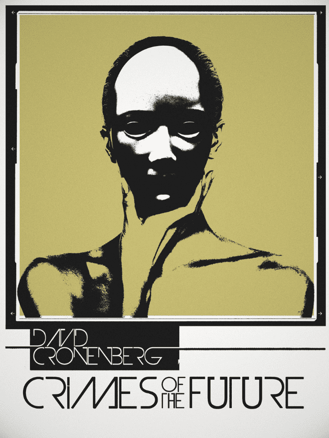
‘Crimes of the Future’ by Jay Shaw
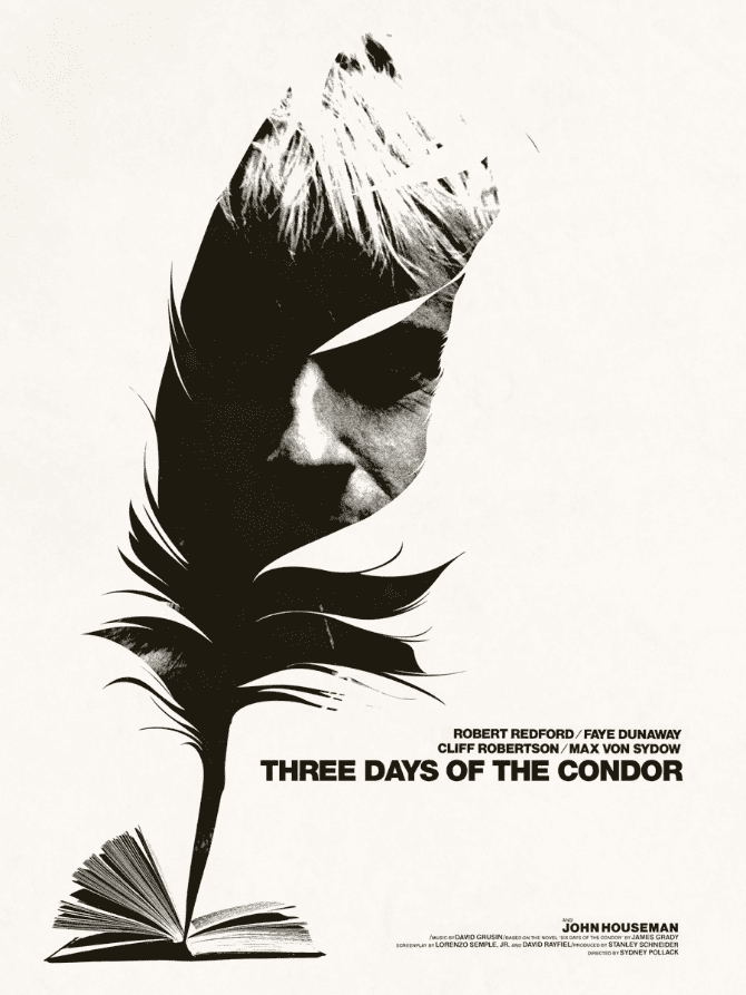
Three Days of the Condor’ by Jay Shaw
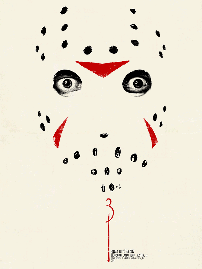
‘Friday the 13th – 3’ By Jay Shaw
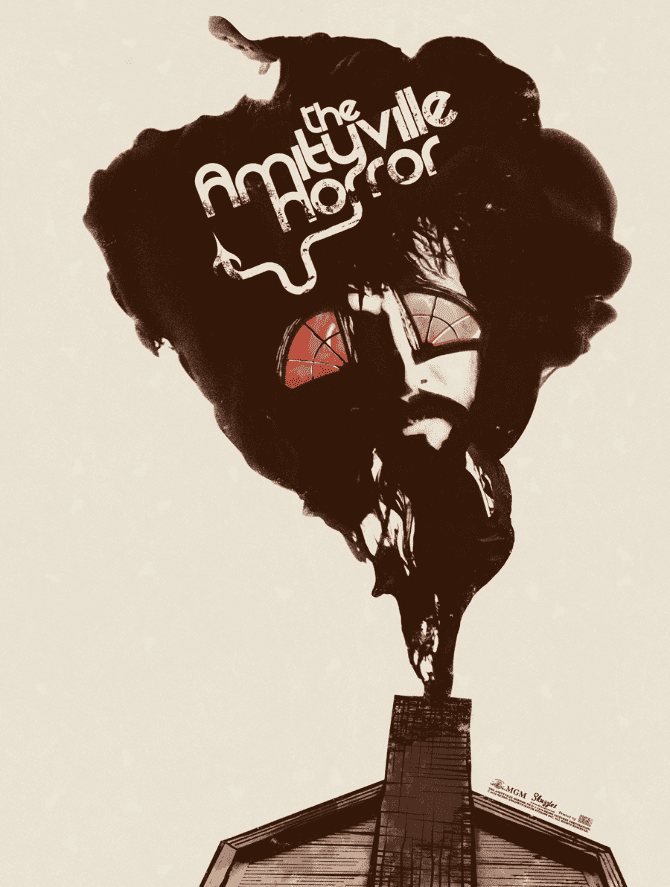
‘The Amityville Horror’ by Jay Shaw
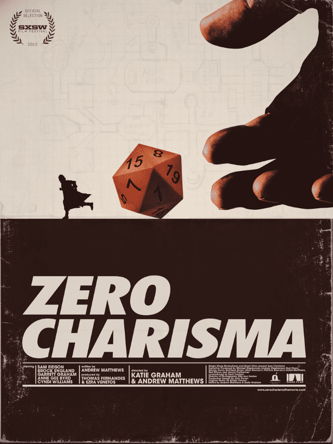
‘Zero Charisma’ by Jay Shaw
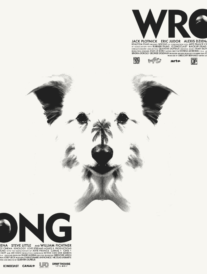
‘Wrong’ by Jay Shaw
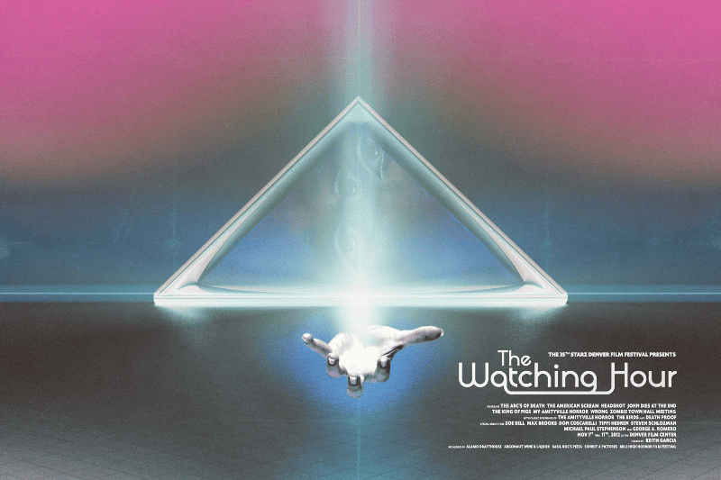
‘The Watching Hour’ by Jay Shaw
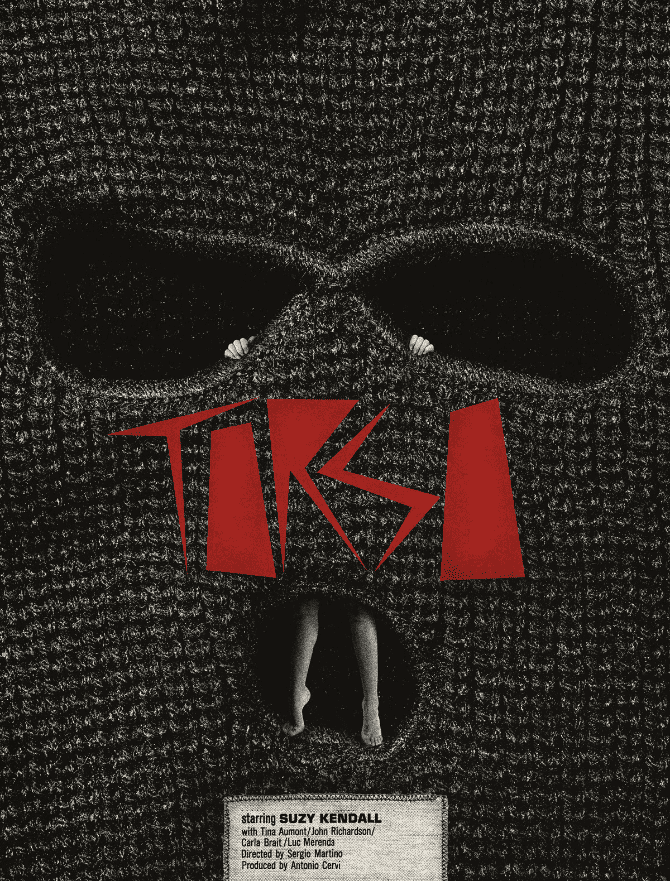
‘Torso’ from Jay Shaw’s solo show ‘Don’t Go Out Tonight’ at Mondo.
‘Tombs’ from Jay Shaw’s solo show ‘Don’t Go Out Tonight’ at Mondo.
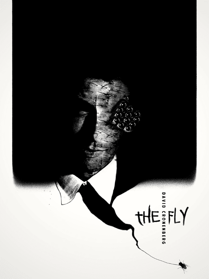
‘The Fly’ by Jay Shaw
‘Q’ from Jay Shaw’s solo show ‘Don’t Go Out Tonight’ at Mondo.
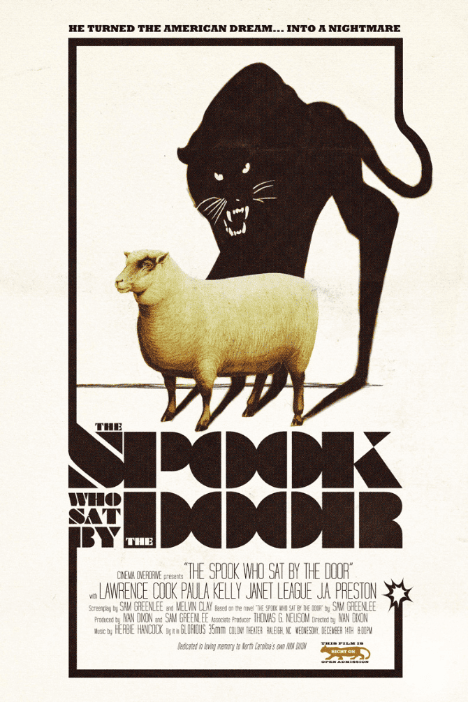
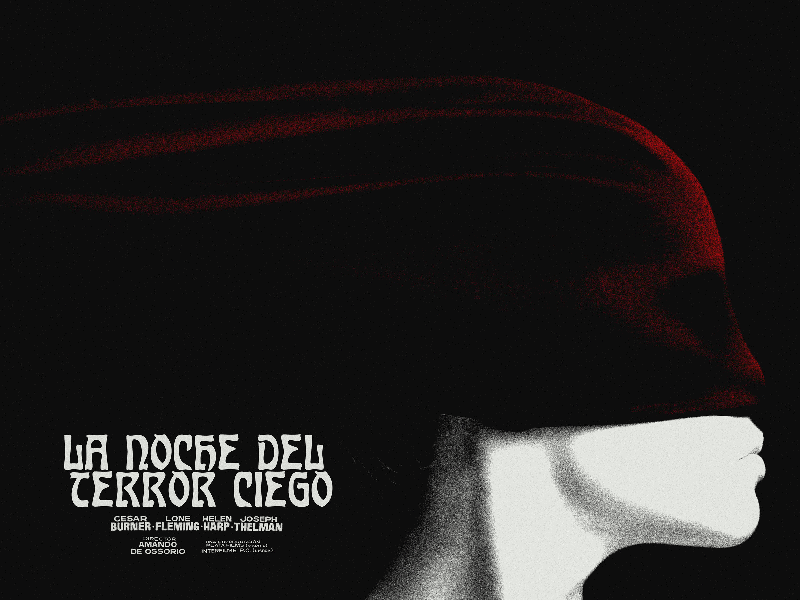
‘The Spook Who Sat By The Door’ by Jay Shaw
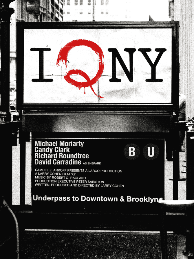
‘Q’ from Jay Shaw’s solo show ‘Don’t Go Out Tonight’ at Mondo.
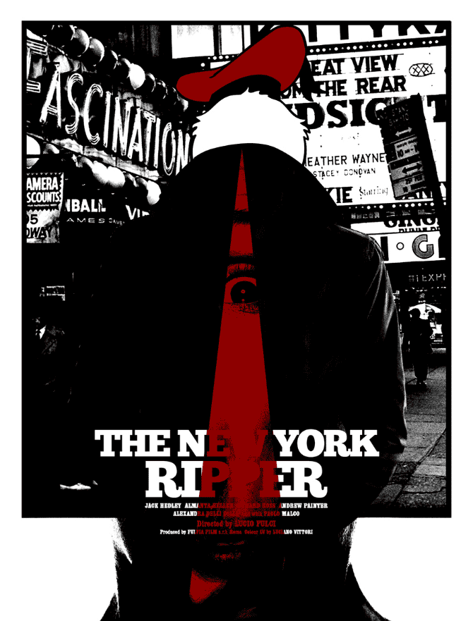
‘The New York Ripper’ from Jay Shaw’s solo show ‘Don’t Go Out Tonight’ at Mondo.
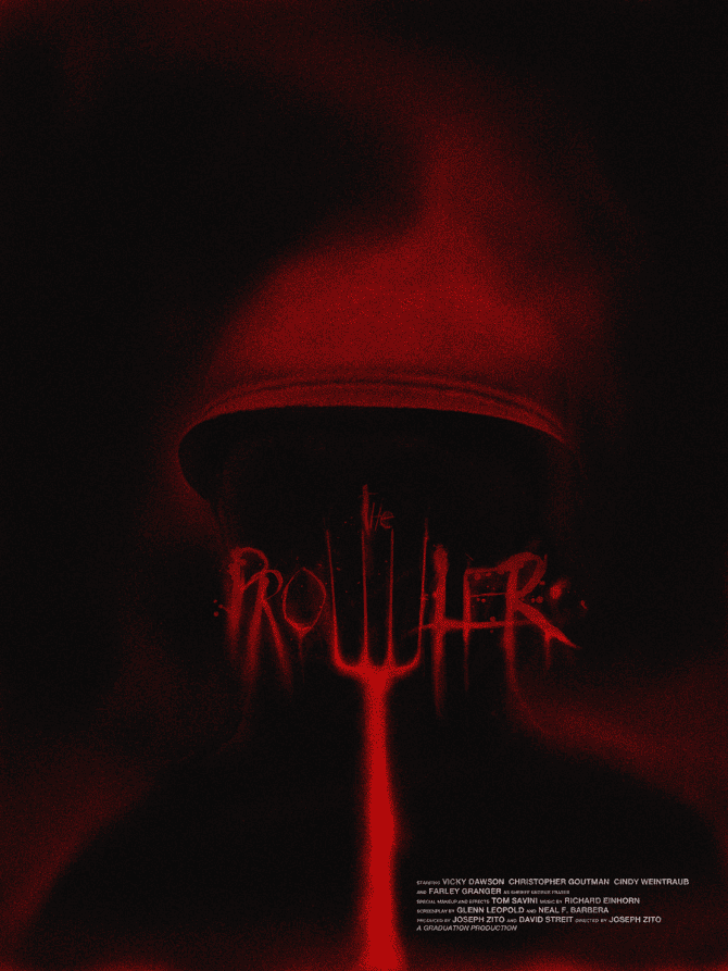
‘Prowler’ from Jay Shaw’s solo show ‘Don’t Go Out Tonight’ at Mondo.
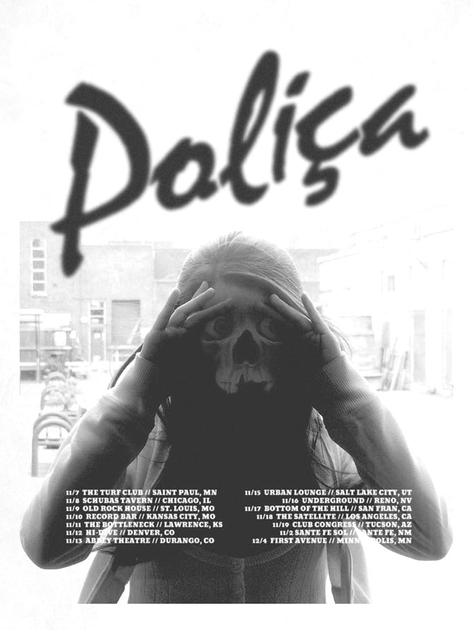
‘Polica’ by Jay Shaw
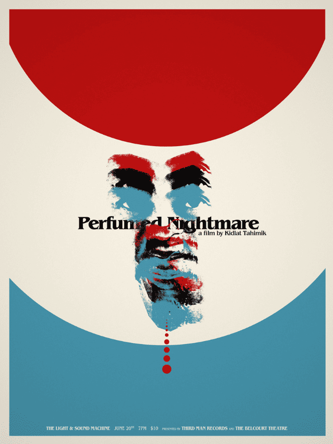
‘Perfumed Nightmare’ by Jay Shaw
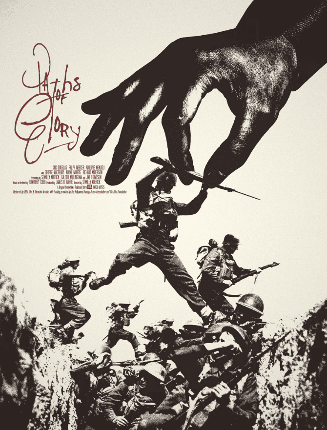
‘Paths of Glory’ by Jay Shaw
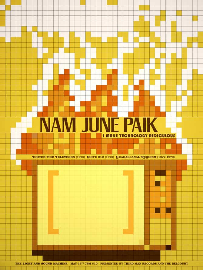
‘Nam June Paik’ by Jay Shaw for Third Man Records
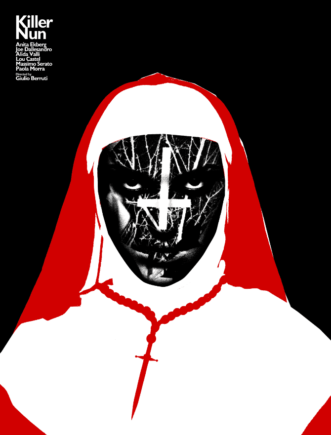
‘Killer Nun’ from Jay Shaw’s solo show ‘Don’t Go Out Tonight’ at Mondo.
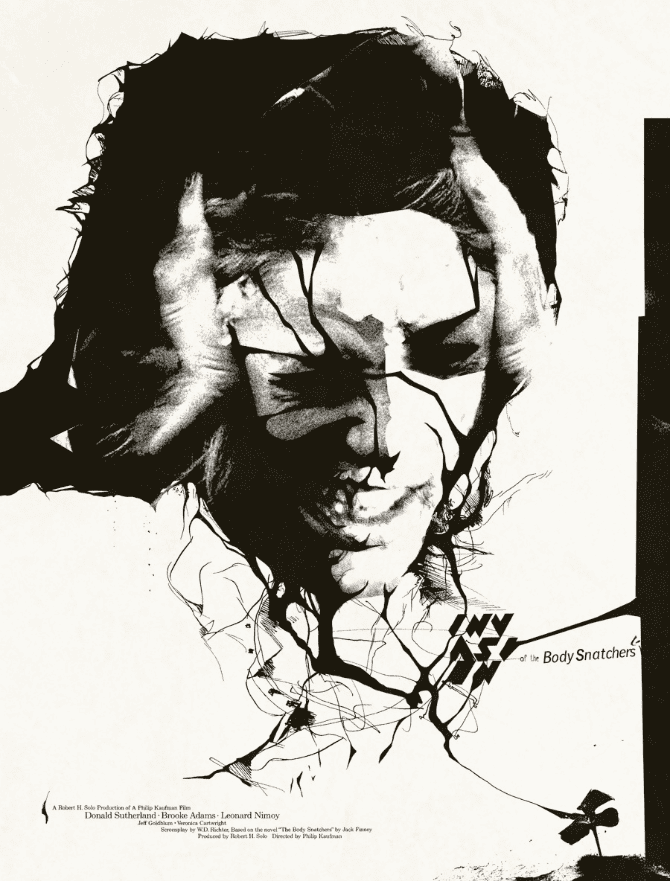
‘Invasion of the Body Snatchers’ by Jay Shaw
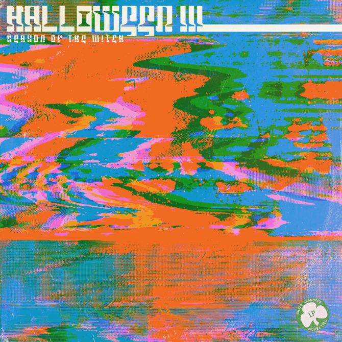
‘Halloween III’ by Jay Shaw
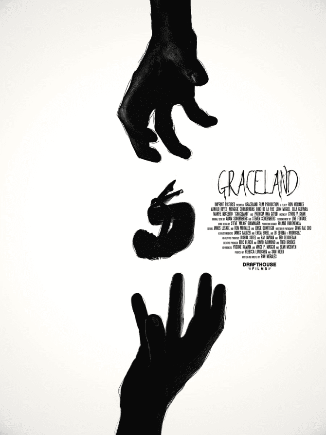
‘Graceland’ by Jay Shaw
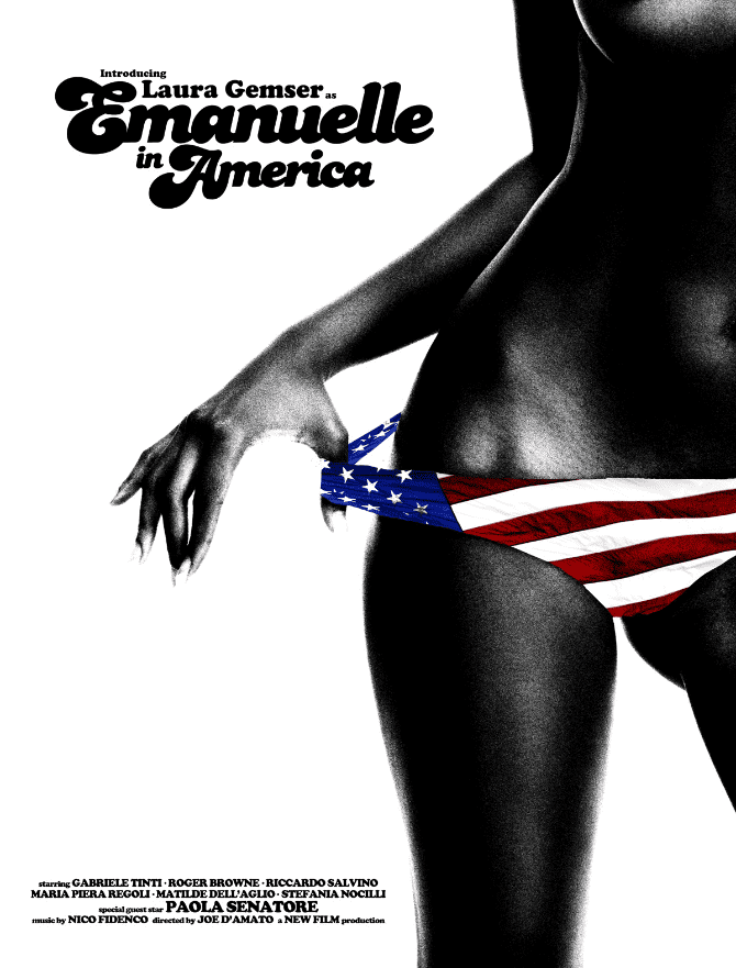
‘Emanuelle in America’ from Jay Shaw’s solo show ‘Don’t Go Out Tonight’ at Mondo.
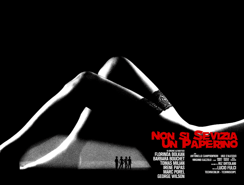
‘Duckling’ from Jay Shaw’s solo show ‘Don’t Go Out Tonight’ at Mondo.
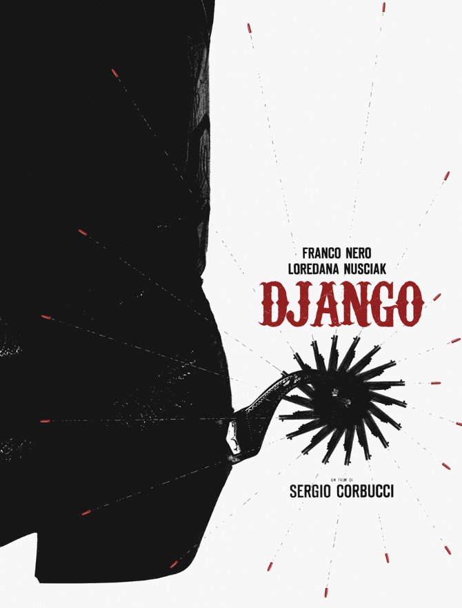
‘Django’ from Jay Shaw’s solo show ‘Don’t Go Out Tonight’ at Mondo.
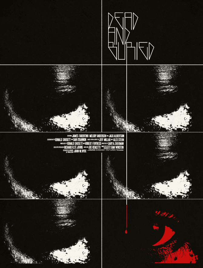
‘Dead and Buried’ from Jay Shaw’s solo show ‘Don’t Go Out Tonight’ at Mondo.
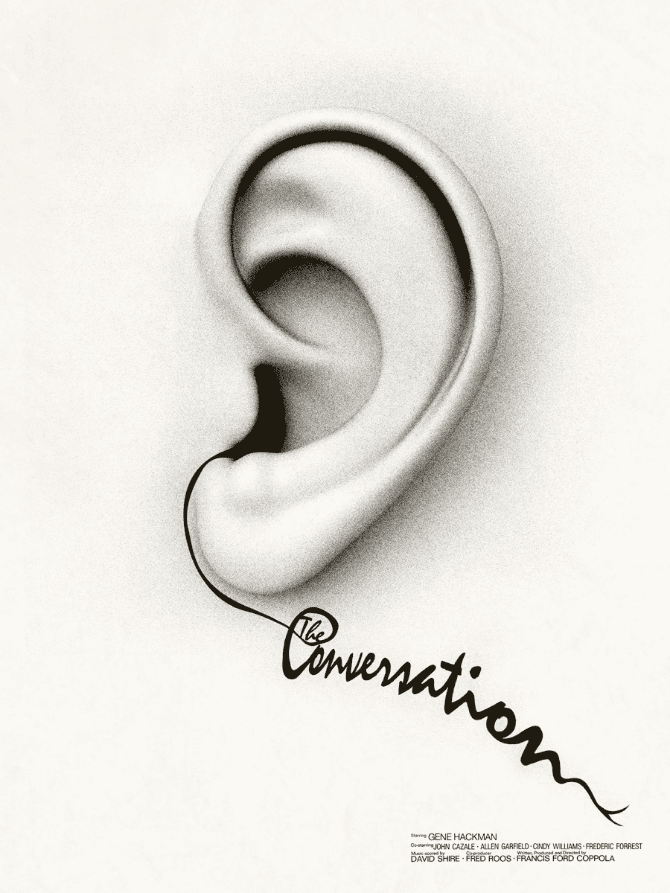
‘The Conversation’ by Jay Shaw
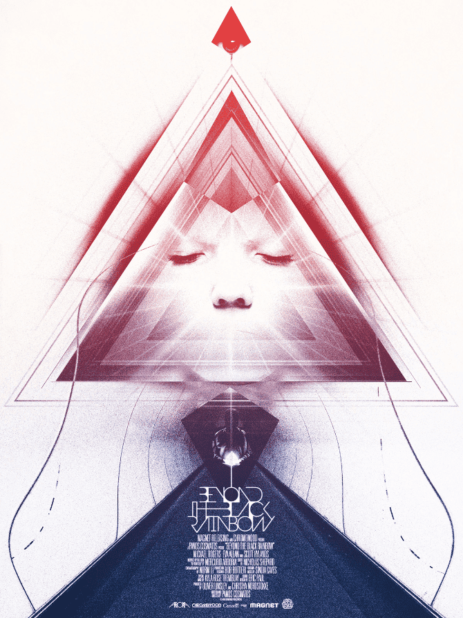
‘Beyond the Black Rainbow’ by Jay Shaw
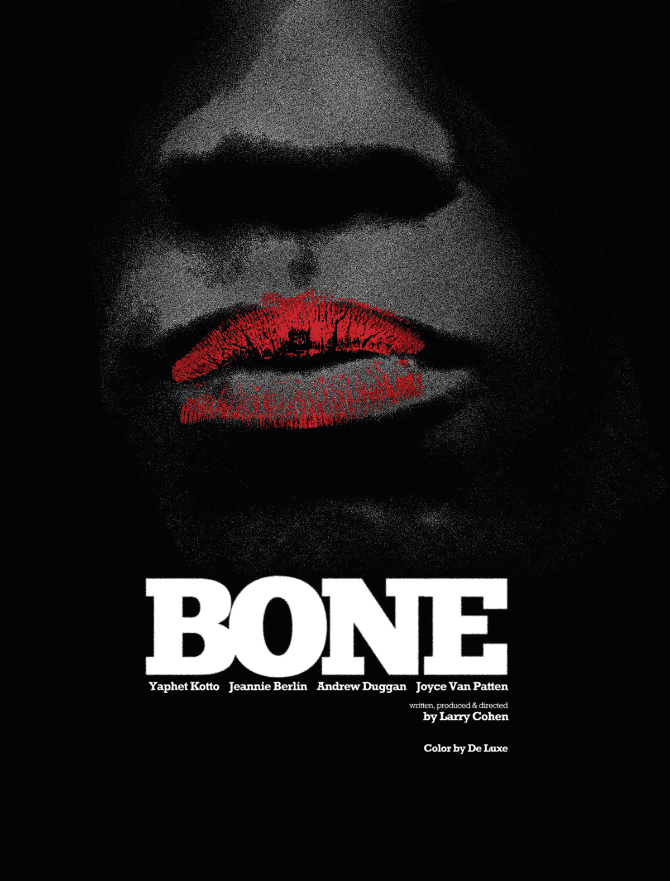
‘Bone’ from Jay Shaw’s solo show ‘Don’t Go Out Tonight’ at Mondo.
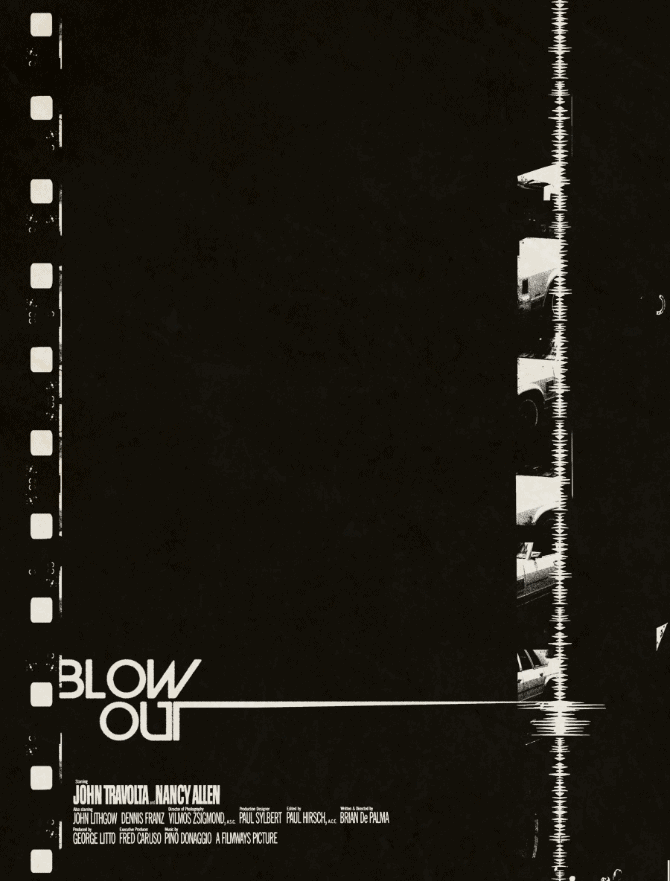
‘Blow Out’ by Jay Shaw
‘Blade’ from Jay Shaw’s solo show ‘Don’t Go Out Tonight’ at Mondo.
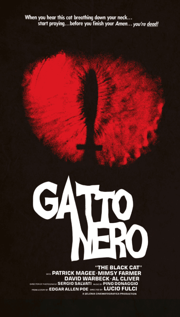
‘Black Cat’ from Jay Shaw’s solo show ‘Don’t Go Out Tonight’ at Mondo.
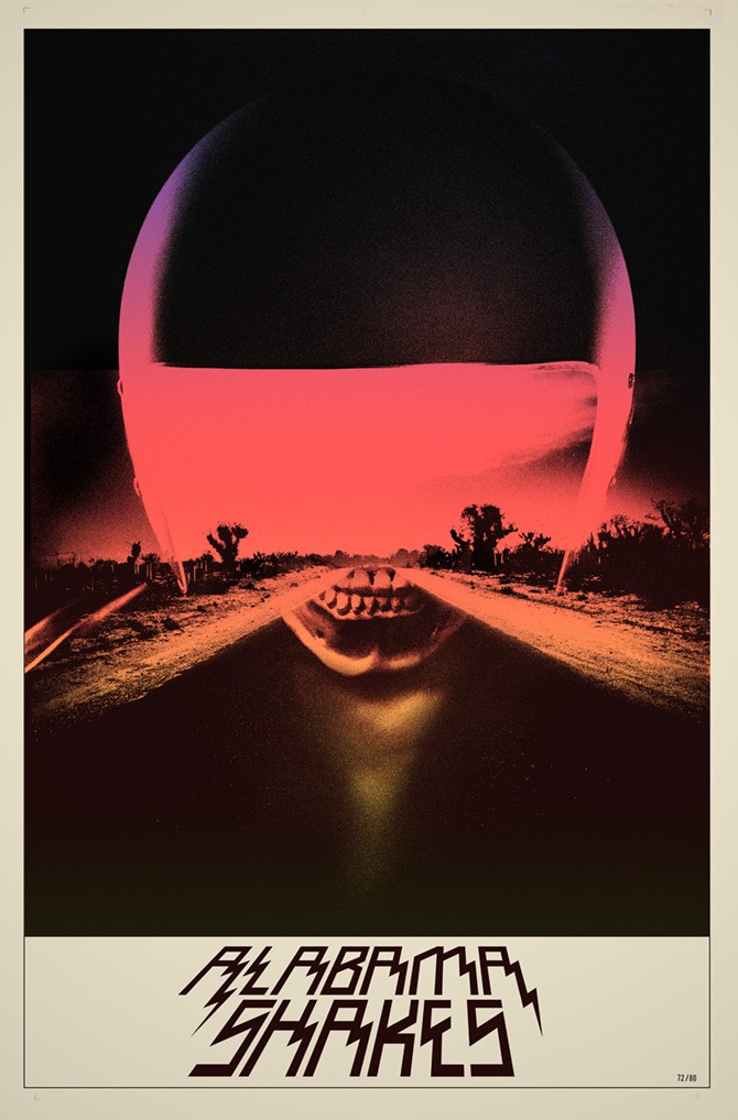
Poster for the band Alabama Shakes by Jay Shaw.
![]()
“It’s a silly superhero boxing movie”
and… that’s where *everyone* should have left this interview, unfortunately.