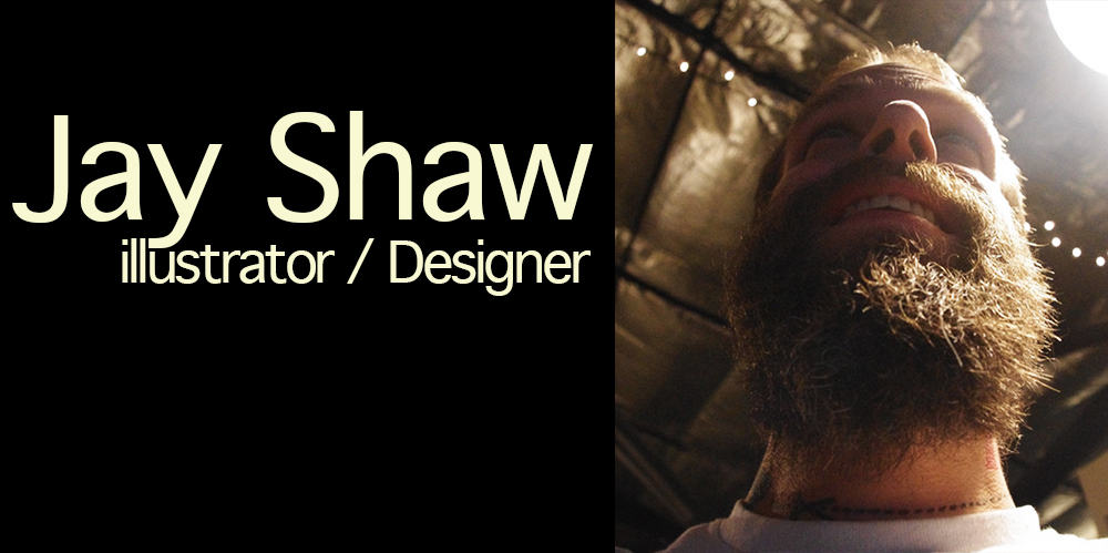
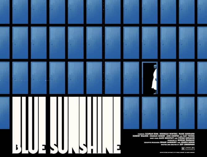
Illustrator Jay Shaw‘s art for the Mondo release of the soundtrack, VHS, and poster for the 1978 film ‘Blue Sunshine‘ is a wonderfully odd co-mingling of beauty and paranoia. The film itself is just that. A strange treasure of ’70s cult cinema — it’s not a horror or a thriller, but then again it’s both of those and so much more.
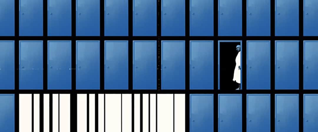
Having never seen the seen the film I was struck by Shaw’s design — a single figure, deranged, in a field of closed doors. I immediately ordered it all and found the film on DVD to watch the next day.
As a designer this is what Shaw often works in — films with that hidden mark of cult status. Works where the audience is small, but rabid. He’s there to create images for a film you’ve never seen and make you want to see it, live in it, and that’s where Shaw succeeds. I’ve explored more new and unknown (to me at least) films due to Shaw’s brilliant way of tapping into the mood and theme of a movie.
His work often pushes against what the audience has grown accustomed to in poster art — Shaw’s designs are a blend of the dark, the dumb, and the intelligent — often at the same time. There’s a timelessness to what he creates, he sifts through styles and mediums until he’s found the best way to communicate.
Shaw is a unique and skilled designer who I’ve had the privilege to chat with before, but after my fandom grew I thought it was time to catch up with Jay about his work on Mondo’s ‘Blue Sunshine’ release and the countless posters and vinyl releases he’s since worked on.
___________________________________________________________________________________________________________________
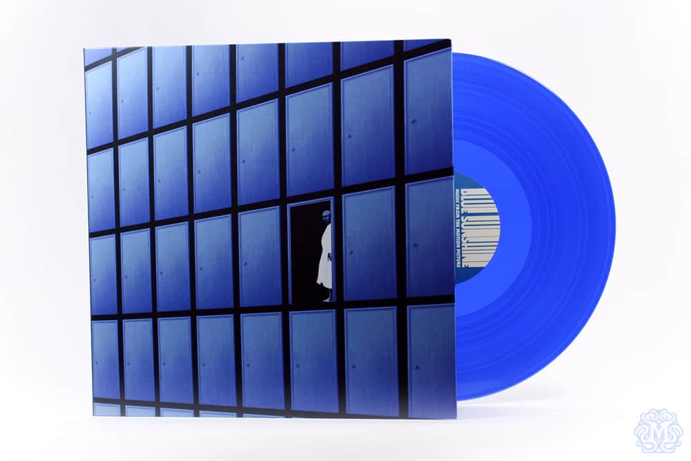
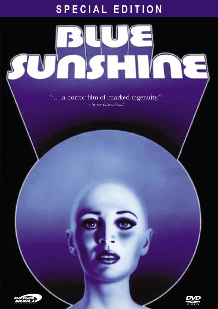
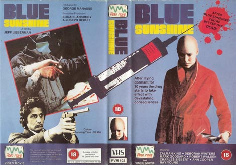
‘Blue Sunshine’ soundtrack Mondo vinyl release designed by Jay Shaw
‘Blue Sunshine’ soundtrack Mondo vinyl release designed by Jay Shaw
‘Blue Sunshine’ on VHS Mondo release designed by Jay Shaw
When I saw that Mondo had release the soundtrack to ‘Blue Sunshine’ on vinyl as well as a limited number of VHS copies, I wasn’t surprised to see that you got tapped for the job. There’s something about your sensibilities that make obscure films accessible and incredibly interesting. With each new vinyl or film poster you design, I know I’m going to be lead towards something I need to see and hear.
Both of your posters for ‘A Field in England’ make me want to see that film and know everything about it. Your poster design has more of an impact on my desire to track it down than the quote from Martin Scorsese calling it a ‘…stunning cinematic experience.’
You’ve done a handful of big films, but most of your work is for obscure, or lesser-known films. Is that a position you put yourself in, or just a coincidence? Would you want to create a poster for a Hollywood tent pole film like ‘Captain America’ or ‘The Hobbit’?
I love big goofy movies as much as anyone else but I have no desire to create posters for them. The audience for a film like ‘Captain America’ would hate whatever I did for that film.
I’d rather hang around the less popular neighborhoods of ‘movie town.’ I’m much more comfortable there.
‘Blue Sunshine’ poster designed by Jay Shaw
How familiar were you with the film when you got the job for the design for the Mondo release of ‘Blue Sunshine’? For an obscure cult film like this, how much discussion is there between you and Mondo before any visuals are sketched out?
I actually approached Mondo about doing the project initially. I’ve loved ‘Blue Sunshine’ ever since I first saw it sometime in the ’80s.
Turns out Tim League (Alamo Drafthouse CEO) is good friends with the director, Jeff Lieberman, so when it was mentioned that a Mondo artist really wanted to do something for the film Mr. Lieberman was more than happy to oblige. From there Rob Jones (Mondo Creative Director) and I bounced ideas back and forth until we came up with the door concept.
When you brought up ‘Blue Sunshine,’ the first thought was for a vinyl release? Was that what you were most excited about? Did the showing of ‘Blue Sunshine’ in 35mm at the Alamo Drafthouse come after it was decided to release the soundtrack?
Yeah, they didn’t have a screening scheduled or anything. Once we started on the vinyl release and we realized Mr. Lieberman was so enthusiastic about everything a screening / release party made perfect sense.
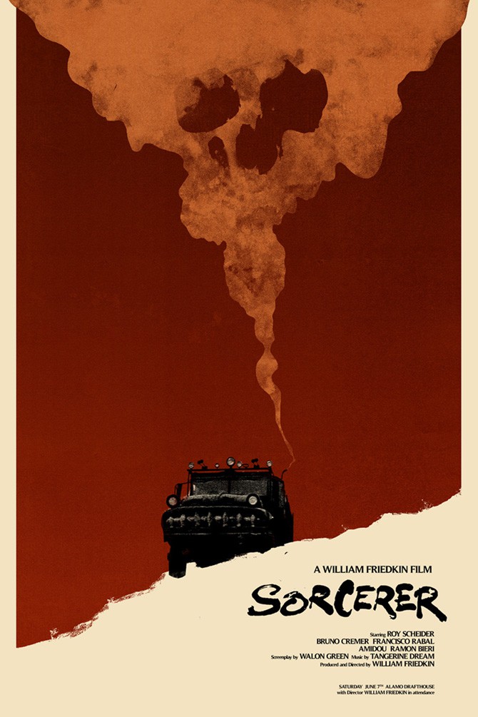
Jay Shaw designed poster for William Friedkin’s ‘Sorcerer’
That’s one of the coolest things about working with Mondo. They’re part of the Alamo (Drafthouse Cinema) family so you can do things like play a film and invite a director to attend. William Friedkin hosted a screening of ‘Sorcerer‘ last weekend where I had a Mondo poster released. How rad is that?!
That’s definitely one of those special bonuses is to the Mondo / Alamo connection. They’ve done an awesome job of connecting a film to its makers and the fans.
Original design for the 1978 release of ‘Blue Sunshine’
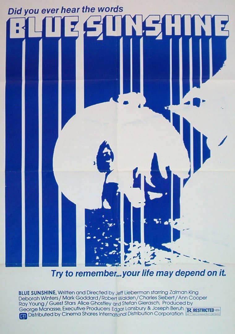
Original design for the 1978 release of ‘Blue Sunshine’
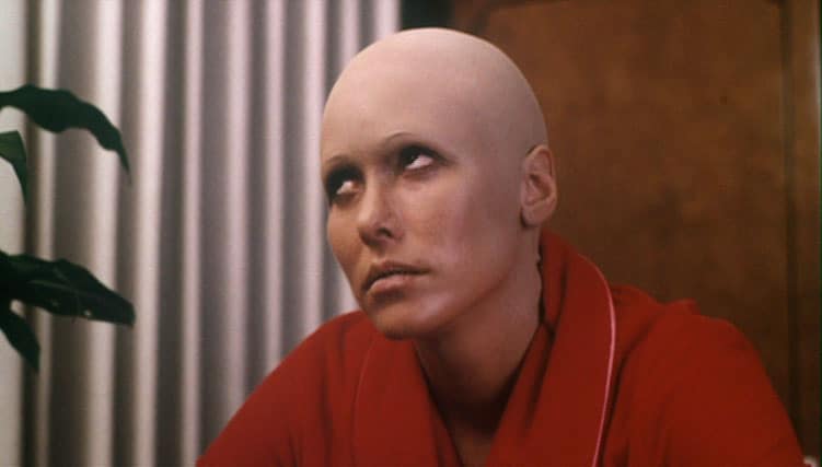
Scene from ‘Blue Sunshine’
Scene from ‘Blue Sunshine’
Early VHS release of ‘Blue Sunshine’
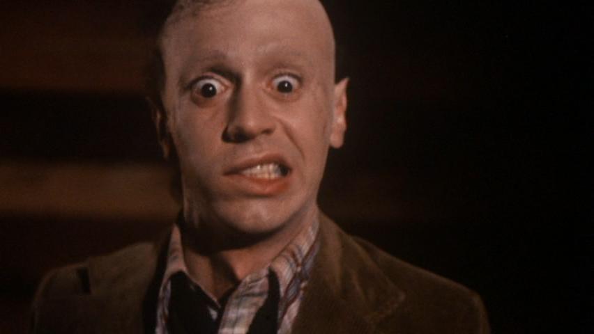
Scene from ‘Blue Sunshine’
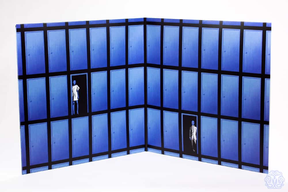
The overall design of ‘Blue Sunshine’ sticks with the theme of the posters from the film’s original 1978 release. You kept the dominant blue and the bald murderers front and center. The film is loaded with other strong visuals – the red parrot flying out of the room, Jerry’s affinity for suits, clumps of hair in the hands of panicked characters.
When dealing with a property that has such obvious visual cues like bald psychopaths and ‘blue’ in the name, is it even worth trying to go against that? I always think of your ‘Rocky III’ poster, where there’s no boxing or Sylvester Stallone in sight, but you totally ‘get’ Rocky from that. How was the direction for the design decided on?
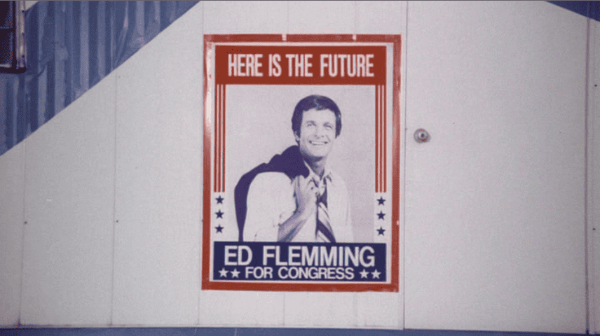
We had a few ideas in the beginning that never really came to pass. Originally I wanted to do something interesting with the Ed Fleming campaign posters you see in the film. I think the tagline is ‘Here is the Future’ or something like that. Very ominous.
Everything I came up with there was silly though. Also Ed isn’t one of the affected people so playing it that way doesn’t make a ton of sense. We also bounced around this thing with the moon phases and a sheet of acid but it never really worked out.
Rob and I were tossing ideas back and forth and he said ‘hey man, you know that Blue Oyster Cult record cover with all the doors on it? What if we did something like that?’ I actually have that record so I pulled it out and I thought the idea was really cool. Have an infinite plane of doors and one of them open to reveal a ‘Blue Sunshine freak.’ Could be your neighbor, could be your babysitter. That kinda thing.
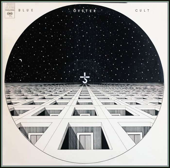
Blue Oyster Cult’s eponymous 1972 debut album cover
You decidedly went against doing an ironic or mocking send-up for ‘Blue Sunshine.’ The release could have easily gone the irony route, but the overall design stayed true, almost treating it as if it were a completely new film. Irony or humor could have sold the film to an audience who likes that sort of thing, but you didn’t – do you set out with an audience in mind? Current fans of the film? Horror fans that don’t yet know the film?
With everything I do I try to act as if I’m working on the original advertising campaign for the film. I’m not always successful in that regard but it’s always my intention. I also don’t ‘ironically’ love ‘Blue Sunshine.’ It’s a phenomenal piece of ’70s paranoia horror. Everyone should see it twice.
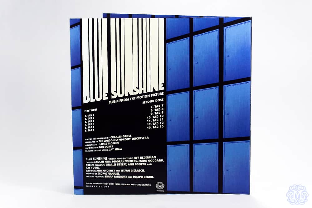
‘Blue Sunshine’ soundtrack Mondo vinyl release designed by Jay Shaw
I love the door motif for ‘Blue Sunshine.’ The film is loaded with these odd suspenseful cuts – close ups of the bald Wayne Mulligan, the bald and deranged crooner behind the curtains. The parrot from the door.
The lone bald psychopath on the cover is very telling of the film. The repetition of closed doors and then – BAM! Crazed killer. It looks how the soundtrack sounds. What are you following when working on a design that will be a VHS cover, vinyl package, and poster? Is one of those end products a priority?
With this we were originally focused on the soundtrack art. After that was finished and the screening at Alamo was locked we decided to adapt the design for a VHS cover and a poster.
The poster was the biggest challenge as I’d originally shifted the doors to taper away from the viewer. For some reason it didn’t translate well to a poster design. Rob came up with the idea of doing a quad style thing and just having the doors lay flat.
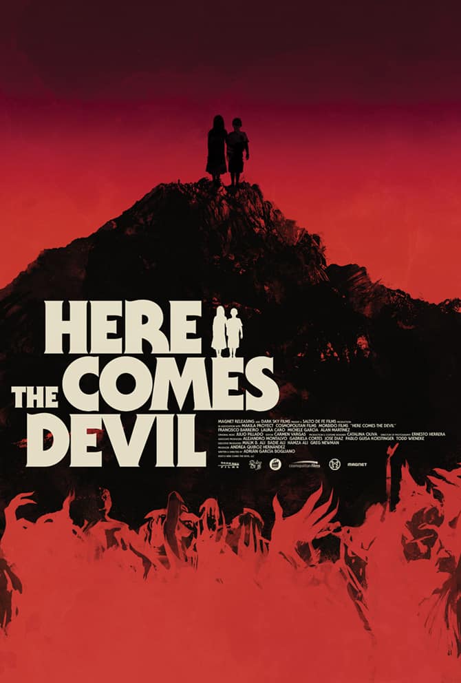
‘Here Comes the Devil’ design by Jay Shaw for the Mondo release of the soundtrack and poster
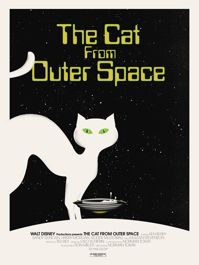
‘The Cat from Outer Space’ by Jay Shaw for Mondo’s Disney show
When I heard that Mondo was doing a Disney show and then saw your name on the handbill, yours was the print I was most excited to see. It was the most unexpected, which of course is always going to be exciting. Your ‘The Cat from Outer Space’ did not disappoint. It looks like it could be a VHS from the original pressing, a total awesome touch.
You did what you do best and you shined a light on a forgotten classic from a media empire that shouldn’t have any forgotten classics. Out of all the Disney properties you could have gone with, why this one? Were you seeking out the obscure and unknown?
I really love ‘The Cat from Outer Space.’ I watched it a bunch when I was a kid. When I was talking to Mondo about the Disney show and they asked if I’d like to contribute I asked for that title specifically, partly because I really like the film and partly because I know better than to go for ‘The Lion King’ or ‘Little Mermaid.’ I’d turn in something weird, it’d be rejected and I’d waste everyone’s time.
I actually went pretty straightforward with ‘Cat’ though. Originally I wanted to do something with a constellation (or cat-stellation, if you will). When I pitched the idea to my kids they kinda shrugged it off. We brainstormed a bit and came up with the ‘flying saucer of milk’ thing.
I think you could have done amazing things with some of their bigger films, but I see what you’re saying. Maybe next time we’ll get ‘The Little Mermaid’ by Jay Shaw.
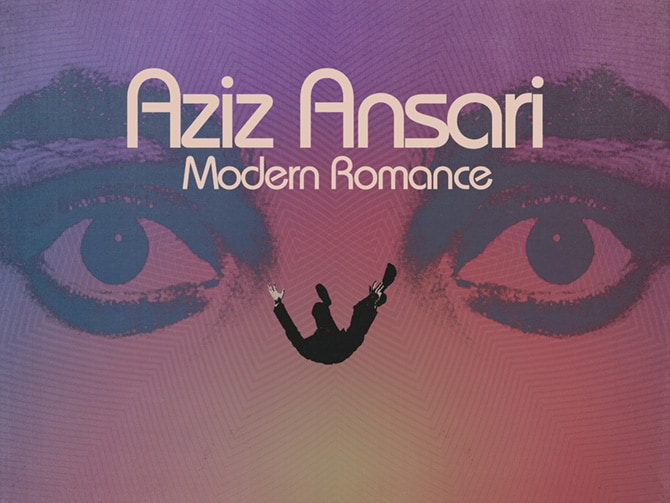
Poster for comedian Aziz Ansari’s ‘Modern Romance’ tour designed by Jay Shaw
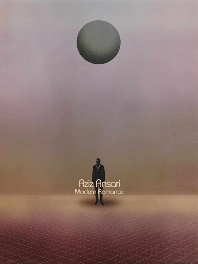
Poster for comedian Aziz Ansari’s ‘Modern Romance’ tour designed by Jay Shaw
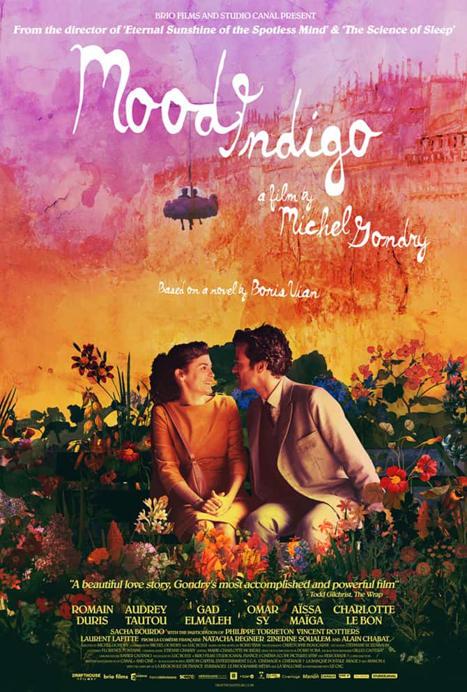
‘Mood Indigo’ by Jay Shaw
Your design for Michel Gondry’s ‘Mood Indigo’ is incredibly sweet and alive and features something unique to a Jay Shaw print – full color images of the actors. It’s a totally visual delight as a design and has the tone of a great combination of Michel Gondry’s style and your own. Was he involved in the poster at all or was it between you and Drafthouse Films?
That one was mostly between me and Drafthouse Films. Gondry had final say with the art and contributed feedback toward the end but conceptually that was all us. From the start Drafthouse said they wanted the poster to be flooded with color and vibrancy. That was a fun project to work on.
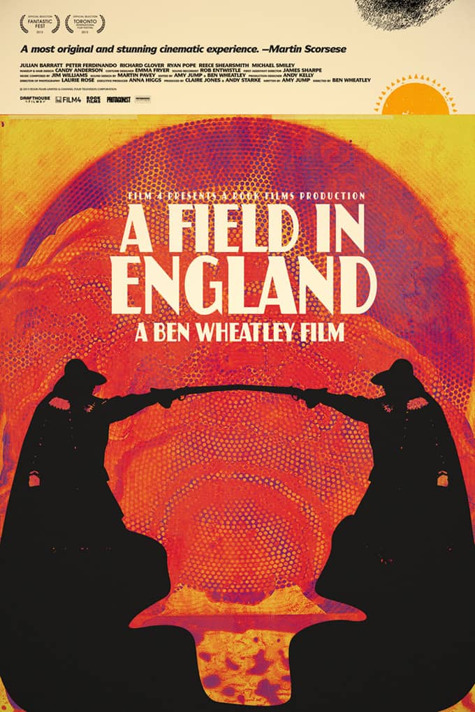
Jay Shaw designed poster for Ben Wheatley’s ‘A Field in England’
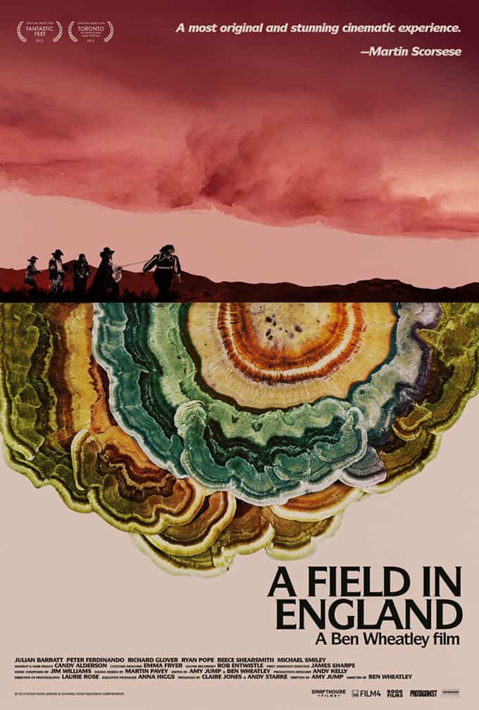
Jay Shaw designed alternative poster for Ben Wheatley’s ‘A Field in England’
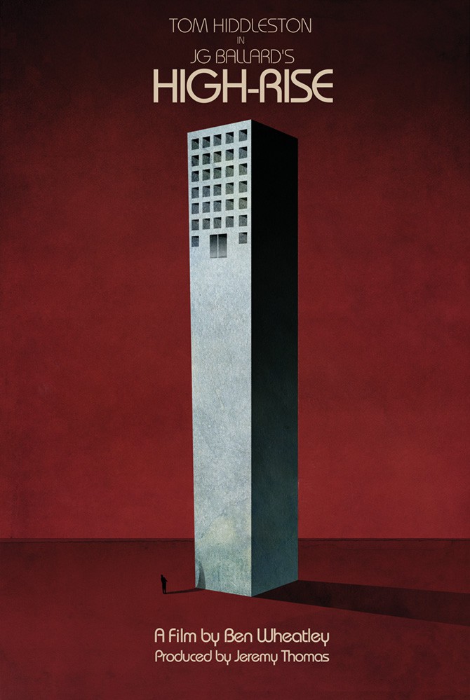
Jay Shaw designed poster for Ben Wheatley’s ‘High-Rise’
You’ve done two posters for films by writer / director Ben Wheatley – ‘A Field in England’ and the upcoming ‘High-Rise.’ You also donated the first print for the film ‘Starry Eyes’ through the filmmaker’s Kickstarter and ended doing the final poster as well. Is this rare for you, to work on more than one project by a filmmaker? Is that something you do, or would, seek out?
When it comes to Ben Wheatley I’m just incredibly lucky that he likes my posters. He’s easily one of my favorite working filmmakers. Any time I get the opportunity to work on a project of his I dive in.
‘Starry Eyes’ Kickstarter art print by Jay Shaw
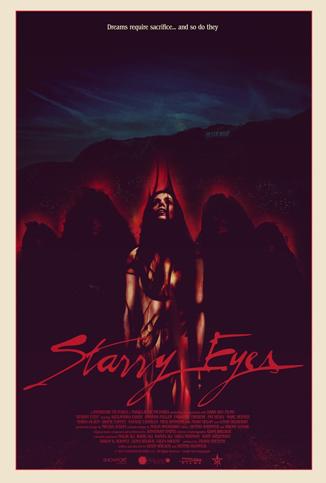
‘Starry Eyes’ official one sheet by Jay Shaw
The ‘Starry Eyes’ guys have become friends of mine so I kind of stuck my nose in and said ‘hey, let me do the one sheet too, I swear it’ll be cool.’
Repeat clients are a real blessing in this business. You know what to expect from them, they know what to expect from you. The more you work together, the easier the job becomes. When you have to acclimate to entirely new people it can be a tougher process.
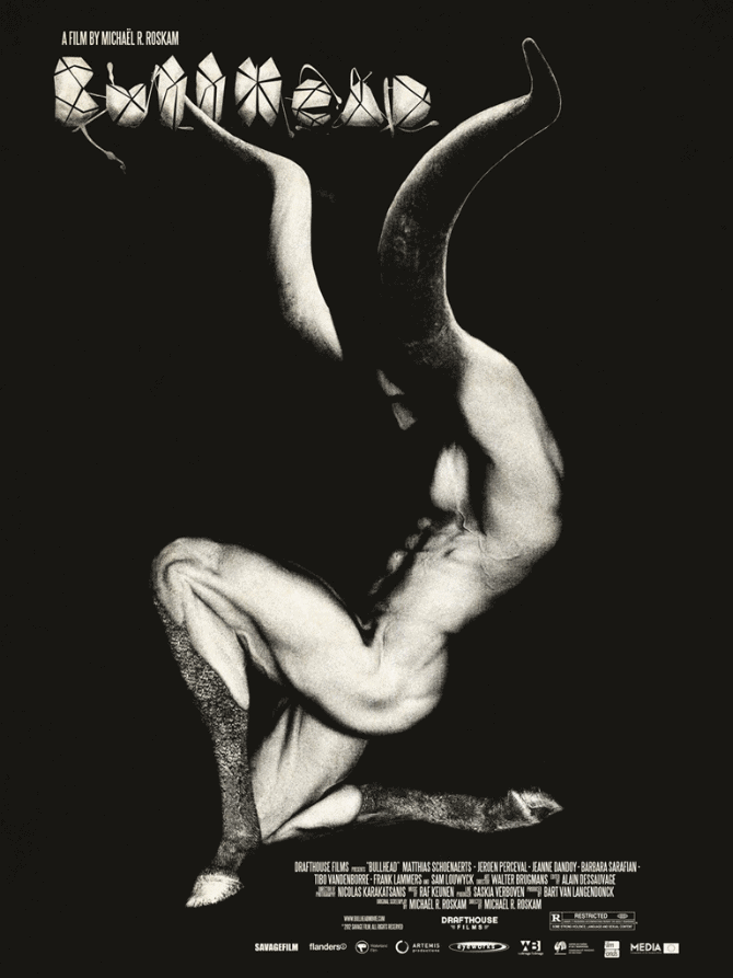
‘Bullhead’ by Jay Shaw
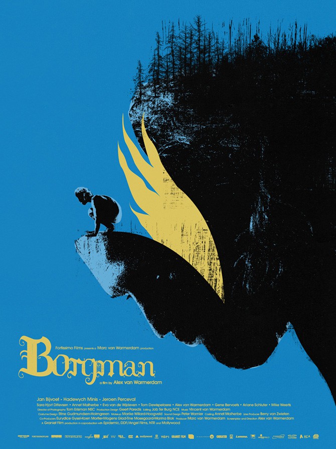
‘Borgman’ poster by Jay Shaw
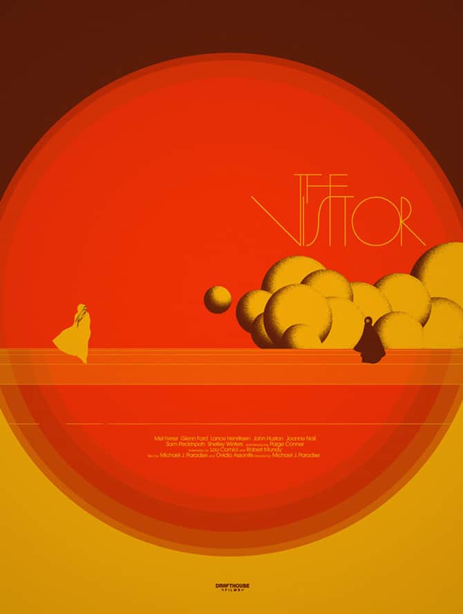
‘The Visitor’ by Jay Shaw
One of my favorite designs of yours is for ‘The Visitor.’ Like so many of your projects I had no idea what the film was because I’m a bit of a bonehead. But I’m always drawn in by your posters and end up spending hours reading about the film, researching the filmmakers, and finding a way to watch the movie. Like with your ‘Bullhead’ poster, you didn’t necessarily give the movie away, but you nailed the mood and tone of the movie beautifully.
When it comes to a film like ‘Captain America’ or any big film, you can always draw from the most minor of details and the audience will get it. There’s that shared experience of films like ‘Lord of the Rings’ or ‘Jurassic Park.’ Films my dad knows as well as a fifth grader. When you take on a lesser-known film you can’t really pull from that same minor detail, that inside joke or memorable image.
You mentioned that you treat a film like ‘Blue Sunshine’ as if you were doing the original campaign, but what goes into that for you for? Your designs don’t tend to sell a movie through its stars, but something bigger. What are you looking for when you start sketching out a design?
A film is just a story and a story can be digested into a base theme. The idea is to take that theme and create an image from it. What’s the thing about? Is there a relatable image I can use to convey this idea? Those are the questions that begin the process. Once I’ve got an answer I try to figure out the best way to communicate it. Will a simple drawing work? Should it be painted? Is there a cool photographic solution?
Honestly the last thing I want to do is pull something directly from a film. If I do that I’m probably out of ideas.
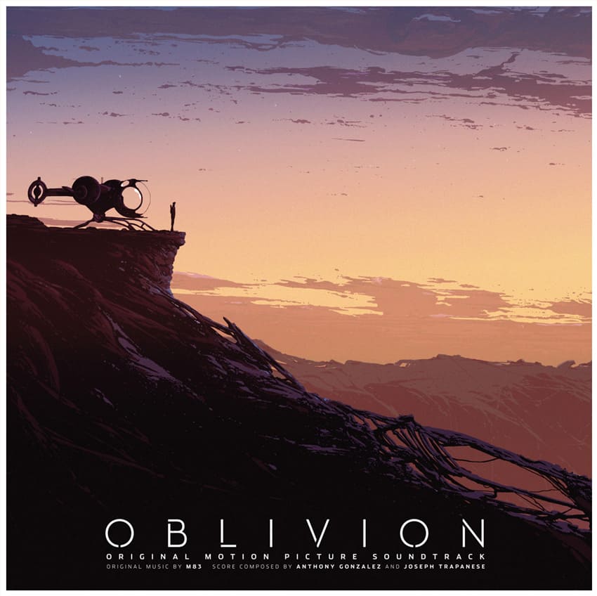
Kilian Eng’s cover for the double vinyl Mondo release of the ‘Oblivion’ soundtrack, text layout by Jay Shaw
I’ve noticed that for a lot of the Mondo vinyl releases you get credited with ‘layout.’ For a package like ‘Oblivion’ where Kilian Eng did the artwork, at what point are you coming in to do your part of the job? Are you specifically handling text?
Hah. I wondered when someone would notice my name on all of those. With a lot of the Mondo vinyl releases they’ll ask me to handle copy / layout work. It’s something I love to do while a lot of other artists find it laborious.
I’m also fairly quick so when studios have changes to legal lines and credits it’s good to have a dude like me a phone call away. I rarely sleep.
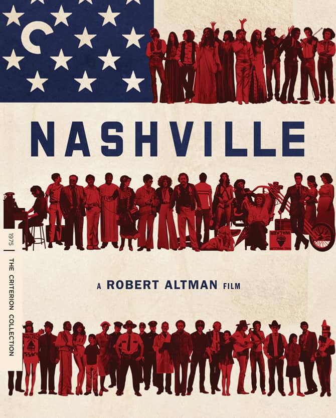
The Criterion Collection cover design for the release of ‘Nashville’ by Jay Shaw and Rob Jones
The package design for ‘Nashville’ from the Criterion Collection is totally straightforward but packed with great little treats. You captured the scope of the film, the characters laid out as the American flag is damn brilliant. It’s one of those designs that just totally work. The art credits for that DVD package have a few more names than just yours – were you involved in the menu design or just the physical packaging?
Rob Jones was all over that release. He came up with the cover idea and I put it together. Rob and Criterion were responsible for the menus and interior stuff. I just contributed art.
I haven’t looked at the art credits but I’m sure the fine folks at Criterion have their names listed. They certainly should.
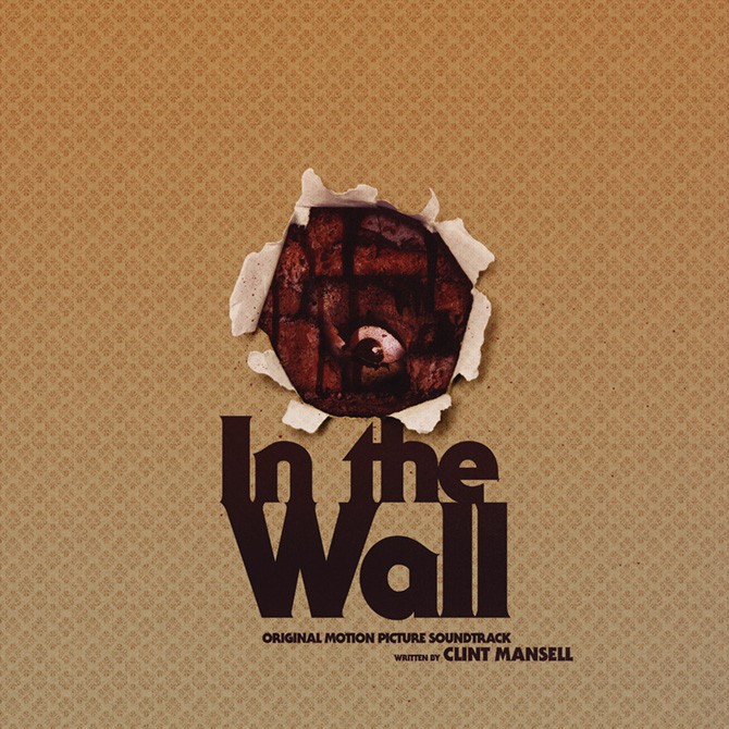
‘In the Wall’ vinyl soundtrack release by Deathwalz Recording Company designed by Jay Shaw
For find more of Jay Shaw’s work find him at these handy links —
Jay Shaw’s Kingdom on Nonsense Dot Com
Previously on Evil Tender — Interview: The Strange Magic of Designer Jay Shaw
Previously on Evil Tender — Interview: Illustrator Rob Jones Dreams of Pakistani Goats
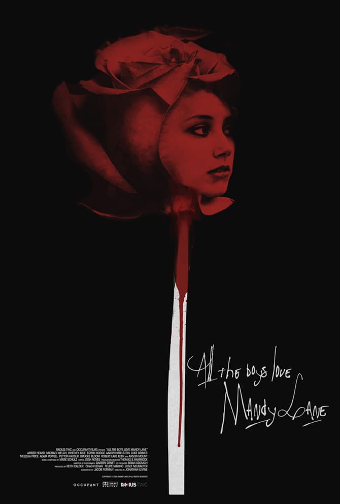
‘All the Boys Love Mandy Lane’ poster designed by Jay Shaw