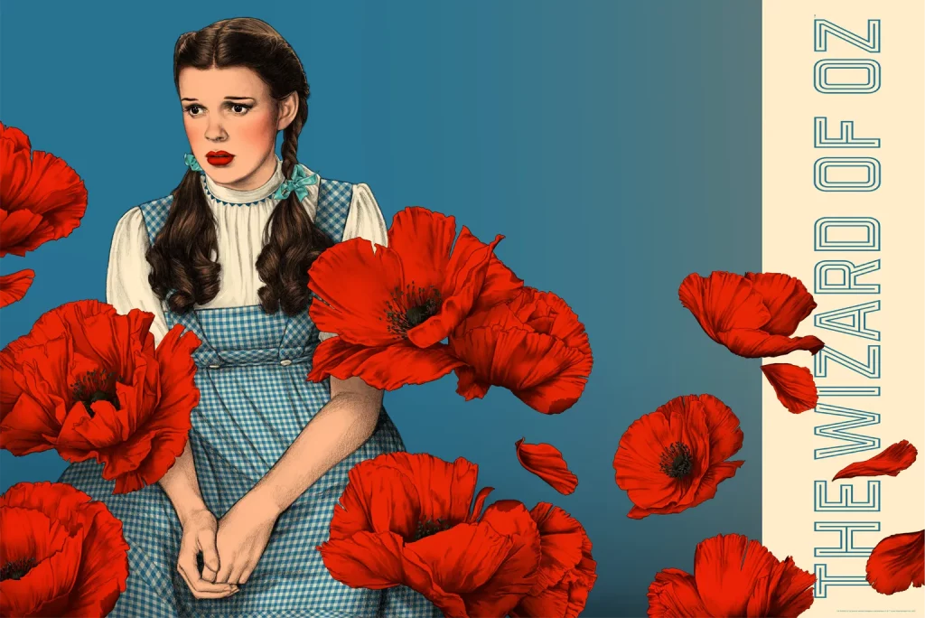
The face is rendered exact in soft graphite. The girl’s face is pensive, a gentle arch at the hood of the eyes and a subtle pout of the mouth. Illustrator Jennifer Dionisio‘s drawings of Judy Garland in her landmark role as Dorothy Gale in the 1939 classic The Wizard of Oz are full on magic. The fact that these pieces are done in pencil and are not photographs is an incredible feat. Dionisio’s duet of The Wizard of Oz posters published by Mondo are expertly crafted examples of what a large format screenprinted poster can achieve.
In each piece, Dionisio takes the viewer directly into her subject’s face, where the narrative unfolds. In her poster for Disney’s WandaVision, the anxiety and desire for a sense of normalcy are present in Wanda’s eyes and in the tension set around her mouth. This is Dionisio’s gift, the ability to convey the slightest of emotion on a large scale.


‘Closer Still’ by Jennifer Dionisio
CJ: A face has very few elements to it — nose, eyes, mouth, etc., and any misstep in the drawing can make for an inaccurate likeness. Are you starting with any distinctive features to nail first, or are looking at the face as a whole?
JD: I try and work left to right to limit smudging, but I do like starting with the eyes. While drawing I get very close to the paper, and I also prop it up and stand back and look from far away.
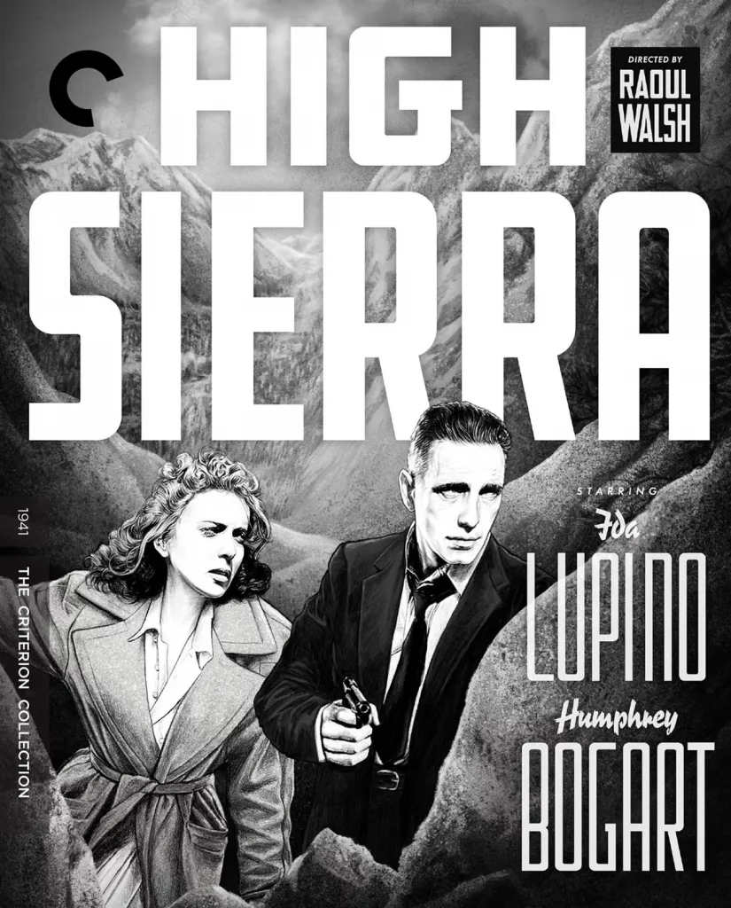
‘High Sierra’ by Jennifer Dionisio
Someone like Humphrey Bogart has a very distinct face and your artwork for High Sierra perfectly captures him. It’s also a high-contrast piece, Ida Lupino is wonderfully blown out with light. Are you adjusting your lighting schemes to better reveal the features, or is that just an element from the film that worked too well to not use?
I was given a collection of stills from the film and worked with those as well as screenshots. The ones I used for reference for Ida’s face were quite washed out. It’s always easier for me to take away shading then add it, so I made Bogart match by lightening some of the shading on his face as compared to the references. The characters needed to look like they existed in the same space and the high contrast worked well for cohesion and feels true to the era and the film.
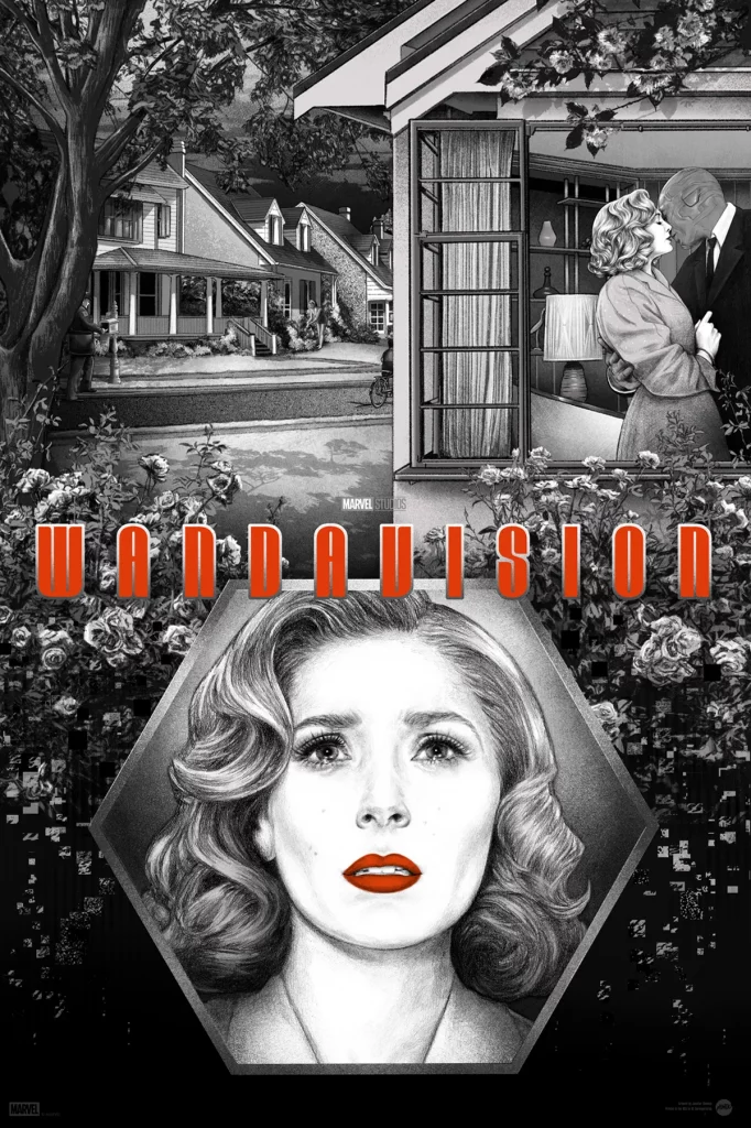
‘WandaVision’ by Jennifer Dionisio
Your style is very crisp and clean — the pencil work is so sharp and perfect. Looking at Wanda in your WandaVision poster, there’s quite a bit of white from the paper showing through with the softest of shapes at the cheekbones and eyes. What’s your approach to really locking in those shapes so the drawings reads “Wanda” up close and from far away? Does your approach change knowing that the poster would be printed at 24” x 36”?
To get the detail right for Wanda I used several screenshots from the show for reference, with one in particular that captured the facial expression I wanted. When I know a piece will be printed at 24” x 36” I draw at a larger size to begin with so that it’s as detailed as possible up close.
I always go over the drawing very carefully in Photoshop and clean any unwanted marks as well as lightening some shading. I do this with a lot of intention when I know the image will be large.
When you took on WandaVision, did you know how you were going to bring in the alternate world Wanda was creating? Did you start with the portrait and build from that?
’50s – ’60s imagery from the earlier episodes are the perfect juxtaposition to Wanda’s depth of despair. The happy suburban life that never actually existed in the way it was sold on TV. It was always a dream. It’s a perfect allegory in the context of the show, as well as in real life. So that’s the angle. Show the vintage setting in all its picturesque idealism and then show it dissolving and disintegrating. It’s as beautiful as you wish it was, but it’s not real. So that’s why it felt right to have a central portrait of Wanda, so that the world could fall away around her.
Jack White’s ‘Fear of the Dawn’ cover art by Jennifer Dionisio
In your cover for Jack White’s Fear of the Dawn album, you have quite stylized shapes going on around Jack, yet he is as crisp and perfectly “Jack.” It’s a wonderful balance of shapes and also a pretty dark piece. How closely were Jack and Rob Jones working with you to ensure the likeness is correct and also all other elements tell the story he is trying to tell?
We worked closely and went back and forth; it was very collaborative. Before I created a draft Rob gave me some very good descriptors. I created a rough of Jack’s likeness based on those and then we all fined tuned it together.
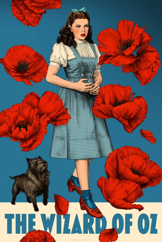
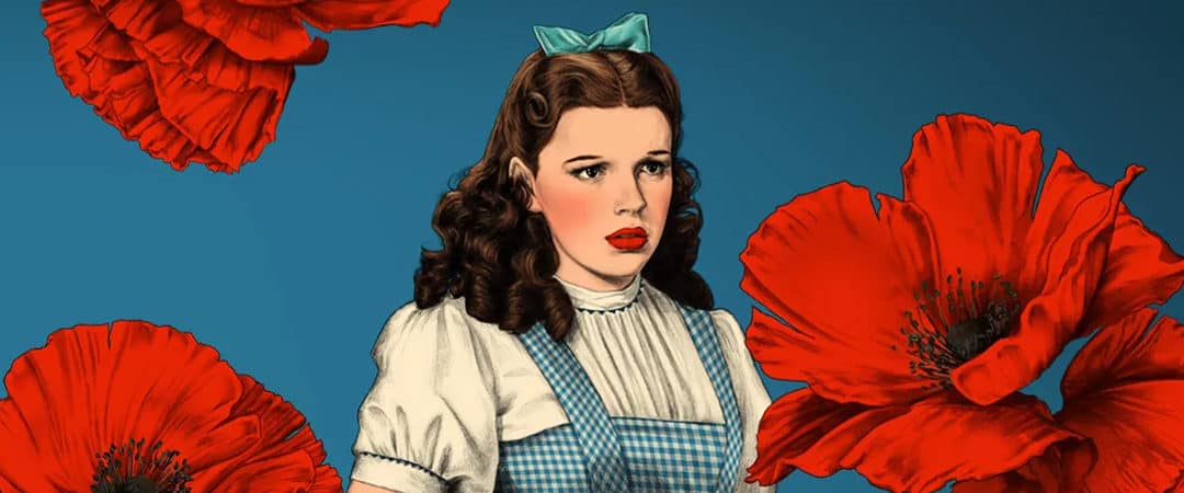
‘The Wizard of Oz’ by Jennifer Dionisio
You captured two wonderfully subtle Judy Garland expressions for your duet of Wizard of Oz prints. How many rounds of drafts are you doing to get the right look? Were you given approved reference images, or were you able to move freely through the film to find what suited you? Judy has a very distinct nose, and you drew it from two different angles — was one version of her easier to capture than the other?
I only created one draft for each of these designs. There weren’t any restrictions on what I could use for reference. I went through the film and made a million screenshots and picked out exactly the moments I wanted to draw in Dorothy’s face. Along with screenshots I used some nice promotional images from the studio as well.
There were challenges with both facial expressions – I had to work on the eyes and lips to get them to read the way I wanted them to. The horizontal portrait was a little more difficult in defining the jawline.