In a career that has paid equal time to the likes of ’90s comedies Encino Man and the Bill & Ted trilogy to more harrowing subject matter like Black Swan and The Vvitch, Canadian-based illustrator Matt Ryan Tobin’s posters have to begin with a connection to the subject. A reason for it to exist. On Tobin, fellow illustrator Jason Edmiston explains, “There are two types of artists that I’ve encountered in this business: those that can take constructive advice and implement it, learning something along the way, and those that keep doing what they’ve always done, and don’t learn anything new, and don’t grow in any way. Matty is from the first group. He’s never satisfied with good enough, always searching for ways to improve himself.”
Tobin’s early work can seem like it was born from another artist. Bright colors and crisp black lines, a plethora of characters and visuals from the film. Soon, the color grew darker and the lines disappeared — each illustration a simple harbor of pure concept. he can pull light from the deepest levels of black, make human and real the most internal-living figures of pop culture.


RITUAL
CJ: Before fronting your current band RITUAL you were in the equally excellent Dead & Divine. You’ve mentioned that music is your top priority with music-making taking up almost two decades of your life before illustration became a job. What was the shift between touring and making art for your own band, to doing illustration for outside clients?
MRT: I didn’t know in 2015 how much my life would change for the better in just two short years with the birth of my daughter and one more year would bring on the birth of my son. So it’s safe to say music has taken a far back seat in my life as of late. That being said, music is still very much like oxygen to me. There is always music in our house and in my life and I’m always working on new music when I can.
Once D&D started touring outside of Canada, I started picking up merch design gigs with a lot of bands we shared the road with. It was a pure snowball effect after that. The tours got bigger, the bands we toured with were bigger and lots of word of mouth had a big hand in how I got into graphic design as a job while I toured. In most cases more or less becoming the exclusive designer for a handful of large metal bands.

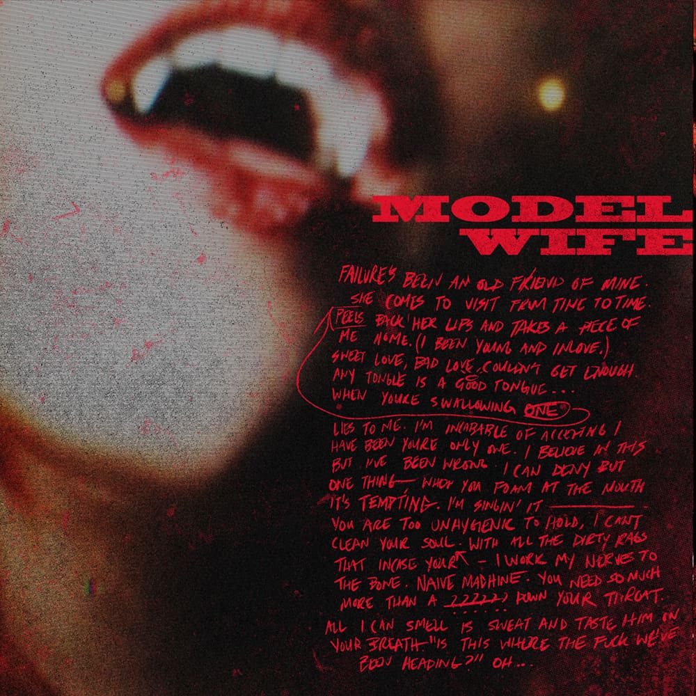
Cover art for RITUAL’s self-titled debut album by Matt Ryan Tobin

Cover art for Dead & Divine’s album ‘Antimacy’ by Matthew Portland Hay
The album art for your first band Dead and Divine was based in photo collage and image manipulation, something you haven’t done in a long time. The imagery fits the mood of the music, but I was curious where your drawing was at during the time of Dead and Divine’s album ANTIMACY and prior?
I’ve always been more a fan of photo-centric album art rather than illustrative when it comes to bands. I can’t explain it. Just a preference I think. I saw a lot of album art in that era that was illustrated and just came off silly to a degree. I take my music very seriously and I think thematically, as a companion to the music — I like the album art for my band to reflect that. I’ve always loved the work of Frank Maddocks, Invisible Creature, and Matthew Portland Hay. I was lucky enough to work with Matt on almost all of our records.
At the time of ANTIMACY I was integrating illustration into more of my work. Frankly, because around that time, a lot of popular merch designs were in fact illustrated. It’s what bands wanted. I quickly realized the limitations of only working in graphic design and image manipulation and picking up drawing again opened a lot of doors for work as well as personal creative doors.
Art for RITUAL’s self-titled debut album by Matt Ryan Tobin
Art for RITUAL’s self-titled debut album by Matt Ryan Tobin
I love Frank Maddocks’s stuff, especially his work with Deftones. They’re from my hometown of Sacramento and started around the same time I was playing in bands. Do you see photo manipulation playing a future role in your film posters?
White Pony (which happens to be my #3 record of all time) introduced me to Frank’s work! You can see his influence even 15 years later in the RITUAL album art.
As a kid growing up in snowy Canada, skateboarding and loving music, I often looked at Sacramento as a dreamscape. The culture and vibe just looked so awesome. When I was younger, I always felt I was born in the wrong place at the wrong point in time.
I don’t see photo manipulation in future posters, no — but album artwork perhaps. The next RITUAL record will definitely have a consistent vibe to the first from an album art standpoint.

Cover art for He Is Legend’s ‘White Bat’ album by Matt Ryan Tobin
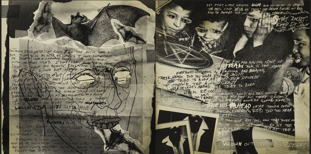
Design and layout for He Is Legend’s album ‘White Bat’ by Matt Ryan Tobin (handwritten lyrics and polaroids by Schuylar Croom)
Where were you with your drawing around the time of ANTIMACY? Doing it daily or was it a skill you had but rarely used?
I was only introducing illustration into my merch design work for bands/brands. I kept illustrations out of my band’s own album art. I have only done artwork for a handful of albums for other bands but really felt creatively constrained during most of those projects. Just cause a band can write a great album, doesn’t always mean they can conceptualize great album art. I did however take on an album art project for a band called He Is Legend a couple of years back. Huge fan of the band but it was their album concept/story and music that really inspired me. They essentially gave me carte blanche to do whatever I wanted and I got their vocalist Schuylar involved in the process by providing hand-made components. I got to work in many different mediums on that artwork. It was so creatively fulfilling. Great fucking album, too. It’s called WHITE BAT – Check it out.
At the point of ANTIMACY, I was doing probably 50/50 illustrative work and graphic-based work for bands. I do remember a few years prior when I picked up a cheap small Wacom tablet for the first time to draw digitally. It felt like I had to learn how to draw all over again. I hadn’t drawn since high school. There was a hard learning curve there…especially disassociating my eyes from my hand.
The RITUAL video for PISCES has a color palette very close to your own. The depth of shadow and high contrast areas of neon-esque color against black. Having a voice in the album art, were you able to influence the visuals of the public media like the videos?
Regretfully, I had no real creative say in the video for PISCES in terms of the treatment. Which was hard for me. RITUAL was my chance to do everything I wanted to do creatively in music without four other voices objecting. The bandmates I recruited totally let me run with my vision. They let me do my thing, which was so freeing. They’re the best dudes…and patient as all hell.
I did the album artwork for the record before the record was even recorded. I had entire visuals planned out for everything right down to a fluid color palette. The performance aspects of the video were shot in Toronto by a good friend who nailed what I wanted for those moments. I had specifics right down to what lens I wanted used. The spooky b-roll bits were filmed elsewhere on location and I had to kind of entrust the director with his ideas for those. There are some cool shots but the video has zero to do with the song and I always feel a little weird watching it. The video looks cool but…feels disjointed from the song. I’m like, “I’ll just speak out louder on the next video,” but the next video never happened.
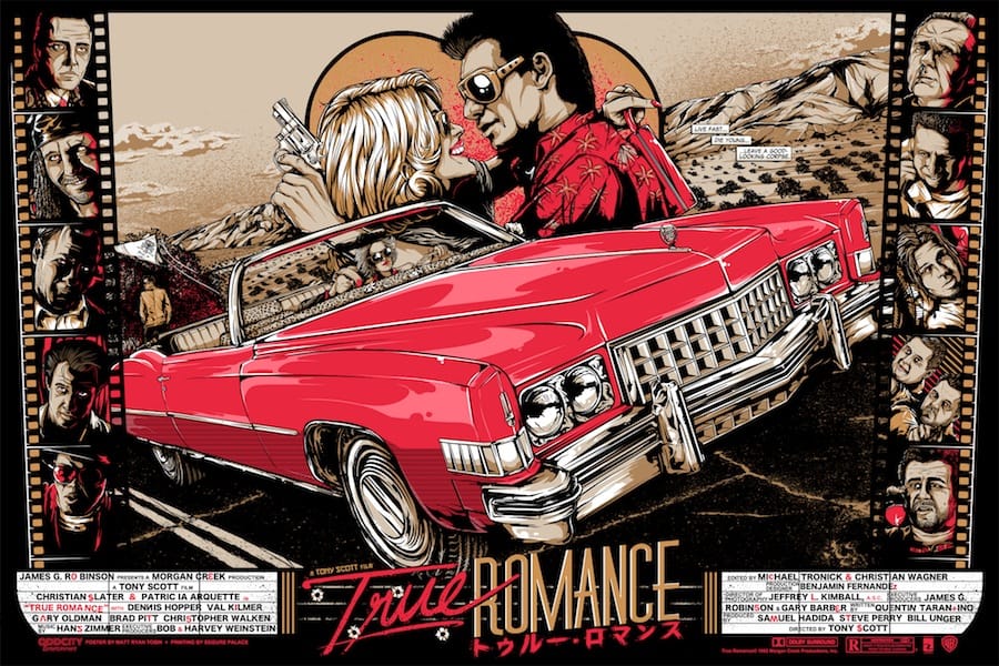
‘True Romance’ by Matt Ryan Tobin
Prior to music, were the visual arts even a thought in your brain as a possible career? When the music career took off, did you already have a background in Adobe programs like Illustrator and Photoshop or did you learn on the job?
Before the band took off, I was on a path to work in film. I love cinematography. I was interning at a film studio in Toronto as part of a high school careers program. The studio mainly focused on commercials, music videos, and short films. Not to oversell it by any means, I literally fetched executives coffee and ran errands all day, but It seemed like an actual possible career choice right out of high school.
I’ve been into visual arts my whole life, so this was just one of the many extensions of that. I had my foot in the door if I wanted it. I also had the option to go on tour with my band instead…and I took it. I dabbled a lot in Adobe and Flash in my early teens. Just for fun. You can take it back as far as MS Paint, really. I learned it all by the seat of my pants — a hobby, really. I never knew I would/could ever make a career out of it. The first time I ever designed anything for print was for D&D — we needed merch designed and couldn’t afford to pay someone else to do it. The local printer walked me through prepping designs to be screen printed — very painstakingly might I add — and here we are.
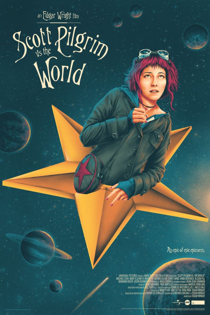
‘Scott Pilgrim Vs The World’ by Matt Ryan Tobin
Was leaving a potential career in film a hard choice to make?
Not in the slightest. At the time it wasn’t even my priority. Music had my heart and soul bar none. I could pick up a gig being a runner on production sets any day. It’s not a particularly glamorous job but it’s where most start. Having the opportunity to tour across the world playing music was an easy choice. I’d be stupid to miss that chance. I would love to be involved in film as a writer. I’ve had a couple of ideas for films over the years…and I miss writing. I still do, in terms of lyrics — but it’s very chaotic and scattered mostly.
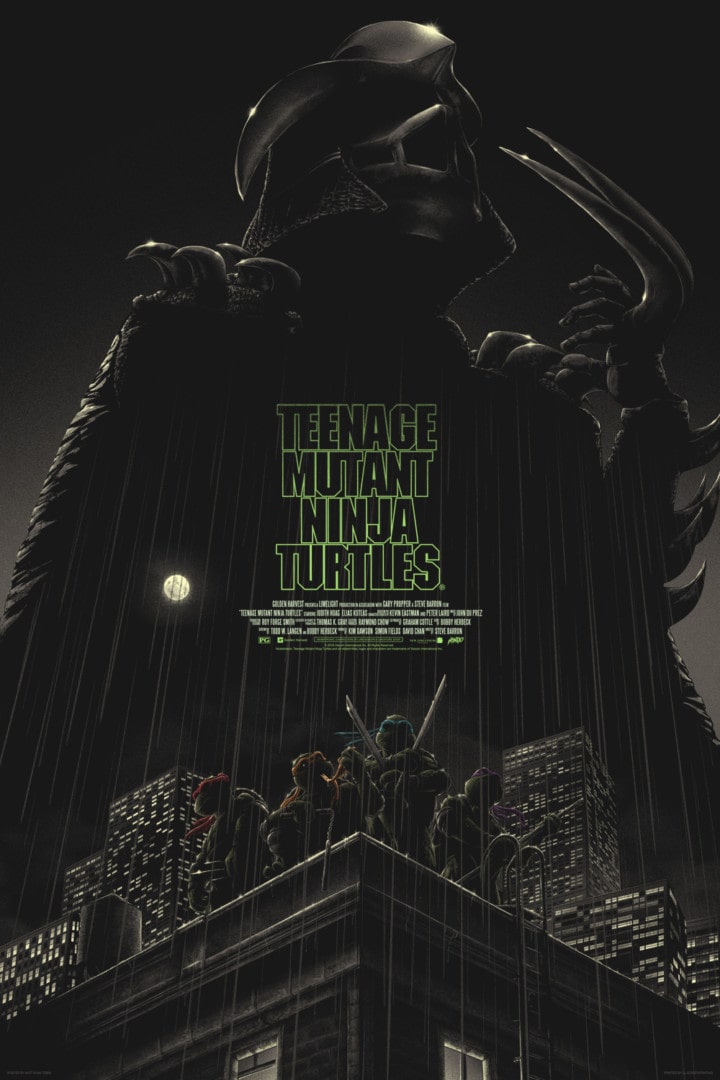
‘Teenage Mutant Ninja Turtles’ by Matt Ryan Tobin
Having multiple loves — music, film, and illustration, that are each a career path of their own — were you ever told to pick one and stick with it? Have you had equal support for each potential path? Did you struggle between them?
I am very lucky to have parents who rooted for me in the things I took interest in from a very young. We didn’t have the easiest life nor were we afforded many luxuries growing up, not to mention I had a hard time in school in terms of bullying. I was a bit of an outcast everywhere I went. So, my parents just wanted me to succeed in anything, I think. Develop confidence in something. So, when I was passionate, they did their best with what we had to nurture it.
Music was an easy sell for them. Both my parents live and breathe music, so picking up the guitar was something they really supported. I bet they’re over the moon that I was never into sports haha. My dad is a bit of a dreamer who wears his heart on his sleeve, while my mom is much more of a realist and a gifted academic – but both are the hardest working people I’ve ever known and both very creative.
When I didn’t finish high school to pursue my music career it really let my mom down…for like…years. She wanted me to have that piece of paper so badly…as a parent now — I kind of understand. Whereas my dad’s perspective was, “Go. Go now. This may be the only time you ever do.” Which I still think I understand far more. At the end of the day, I think my band’s success put an end to any concern they had. Like a, “He’s gonna be alright” type of thing.

‘From Dusk Till Dawn’ by Matt Ryan Tobin
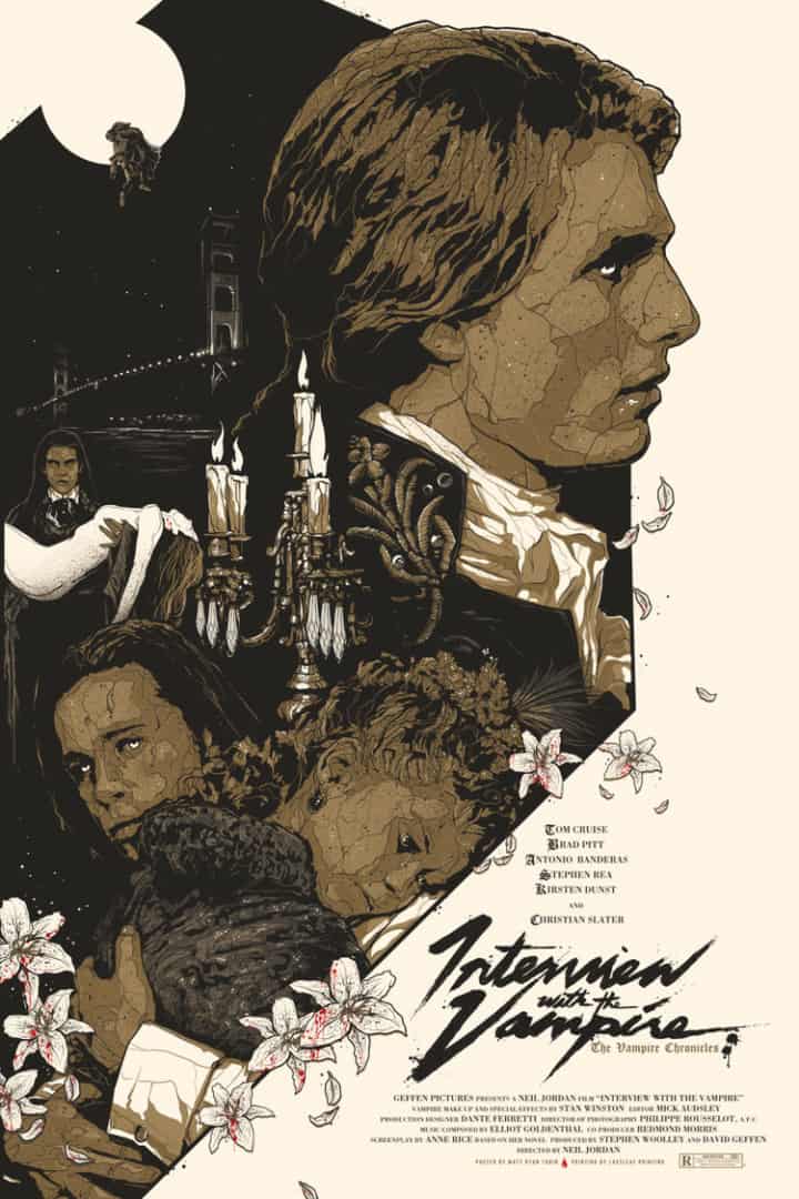
‘Interview with the Vampire’ by Matt Ryan Tobin
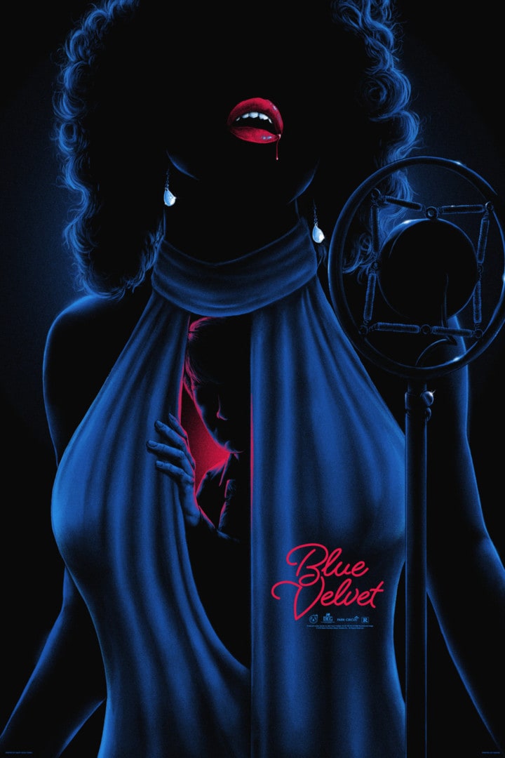
‘Blue Velvet’ by Matt Ryan Tobin
In your recent work, whether the subject matter is horror or comedy, your posters seem to work from a point of pure black, with the subject matter pulled through the shadows with pops of color and incredible tonal changes. Something that has developed over time. Early prints like From Dusk Till Dawn and Interview with The Vampire sit on solid cream paper. Was this a conscious shift or a slow development?
I think it’s a bit of both. Back when I was doing posters like Dusk or Interview I was trying to find my voice in the poster world. Most artists just create lesser versions of the work of the artists they admire until you develop a style that is inherently ‘you’. I’m no different. A sum of my influences. The posters in the early days were also me more so trying to appease the commission groups or a gallery. I wanted to get my foot in the door and build up a body of work that could hopefully afford me the choice in properties I was really passionate about and art that was more concept-based.
Pieces of mine like Blue Velvet that are highly conceptual are what I really love. There’s substance there. There are layers there. I really enjoyed playing around in deep shadows and highlighting cause it creates a mood…so I’ve kind of made it my ‘thing’ I guess, in a way. However, I’ve never wanted to be limited creatively. I take on projects like Scott Pilgrim vs. The World and The Sandlot because they bring me equal satisfaction and let me play outside the box rather than literally drawing myself into one.
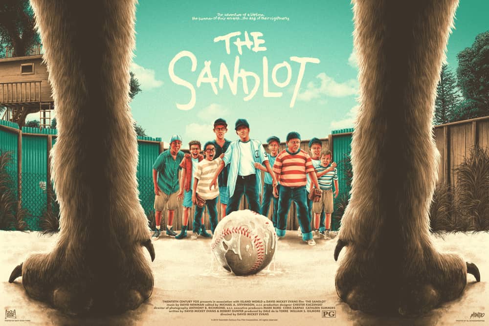
‘The Sandlot’ by Matt Ryan Tobin
I can totally feel your comment, “most artists just create lesser versions of the work of artists they admire…” Who were you looking to in the beginning?
In terms of poster work Justin Erickson, Gary Pullin, Jason Edmiston, James Rheem Davis, Mark Arminski, Ken Taylor all got me right in the beginning. I was coming up in the band merch world with a lot of brilliant artists. I never really knew many artists by name until I was introduced to my contemporaries in the designer communities.
Prior to poster work and still very much now…I could really go on forever but Matthew Skiff, Kyle Crawford, Richey Beckett, Craig Robson, Pitchgrim, Christopher Lovell, Cutty Bage, Rob Borbas…the list goes on. How many hours can you spare? They inspired me all the time to be a better, more thought-provoking artist. As of this moment, my favorite artists have to be Tula Lotay, Leslie Herman, and Ryan Gajda. Just…stunning work.
‘Silent Knight’ by Matt Ryan Tobin

‘Miss Kitty’ by Matt Ryan Tobin
‘I Am Not A Human Being! I Am An Animal!’ by Matt Ryan Tobin
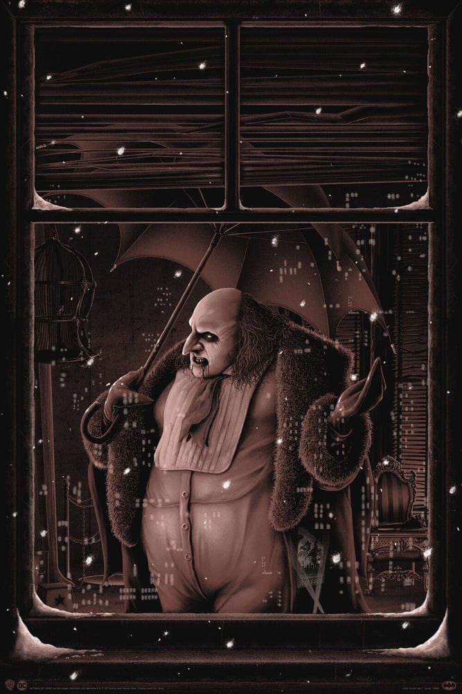
Your series of posters for Tim Burton’s Batman Returns perfectly captures the tone of those films, and Burton’s imagery and mood are a perfect fit for your taste of comedy, horror, and drama. You compose the villains framed in windowpanes – treating the audience as voyeur, with Batman reflected in the Bat-Signal, the only way the audience could ever reach the hero.
With a lack of titles and credits, the posters are 100% the character. They place each figure, heart and soul, on a single sheet of paper. They really highlight that this comic book movie is a film about people – good, bad, and in between. These posters are glorious. When you took on the job for Bottleneck, was a trio of character pieces your goal, or did the project morph over time?
There was never a plan to make a series originally, no. I just wanted to draw Catwoman. I thought the composition would look really great as a print. The frame within a frame. You don’t always need to have a clever hook. I felt this approach was a solid enough depiction of an iconic character in an iconic moment. It didn’t need much else. Not unlike my poster for The Crow, sometimes it works well enough to be direct and not always needing everything shrouded in metaphor or symbolism. I think it shows in my posters for Catwoman and The Crow that they were very passion-fuelled, as simple as they are. That’s the most important thing for me — that I care about what I’m making.
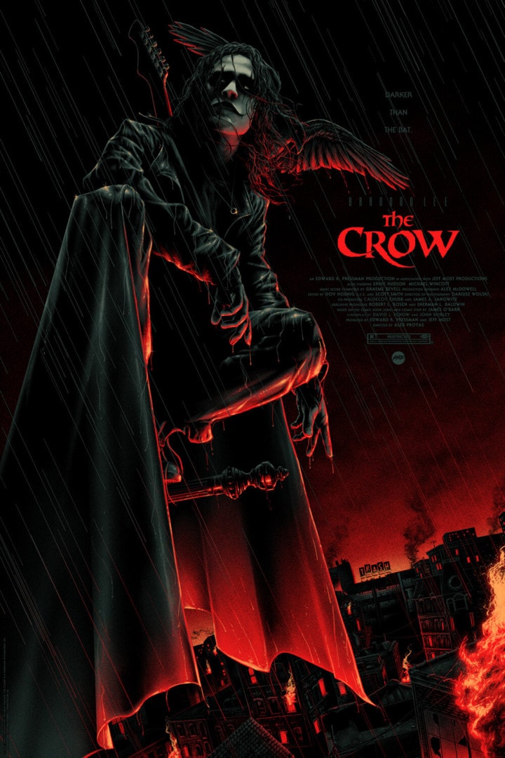
‘The Crow’ by Matt Ryan Tobin
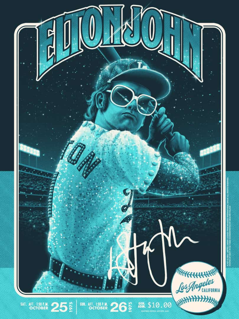
‘Elton John 1975’ by Matt Ryan Tobin
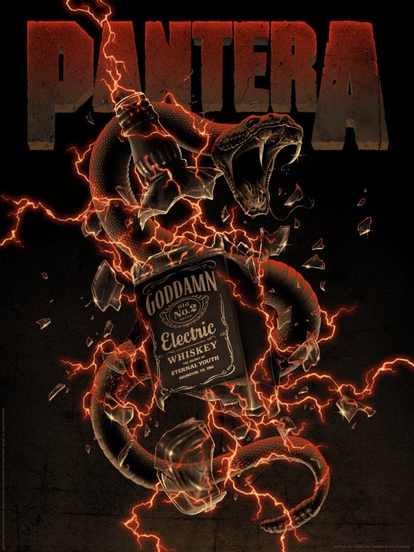
‘Pantera: Reinventing The Steel 20 Years’ by Matt Ryan Tobin
Each of your interpretations of the music of others is tied as much to the music itself as it is to your own personal relationship to it – each band or song represented in these posters is like a reflection of you and the music together. When taking on a poster for the likes of Pantera, Smashing Pumpkins, or the Bill & Ted trilogy, are you reaching for your own immediate gut reacti0n to what the music is to you? Do you need that connection to a property to take on a gig?
I need a connection to every project I take on. It doesn’t necessarily have to be tied to nostalgia or be deep-rooted in my life for me to have that connection though. I can connect to a project like Elton John because it sparks a great idea. I have a tendency to be very hesitant about working on a project if I can’t connect to it. In regards to Pantera — Goddamn Electric is just a damn good song. I don’t myself, actively listen to Pantera, but I know Goddamn Electric well and it’s the best of Pantera I have heard. It inspired what I think is a great concept — so I had to bring that idea to life.
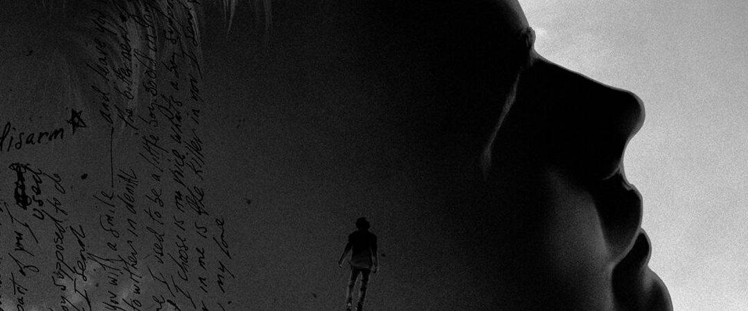
Smashing Pumpkins and Bill & Ted are in my DNA. I’m a product of both of those things. I could trace everything I do in my life to that band and those films. That is 100% me diving deep into my love of them and pulling those ideas out. Especially with my poster for Disarm. That was such a cathartic process working on that. That song changed my life.
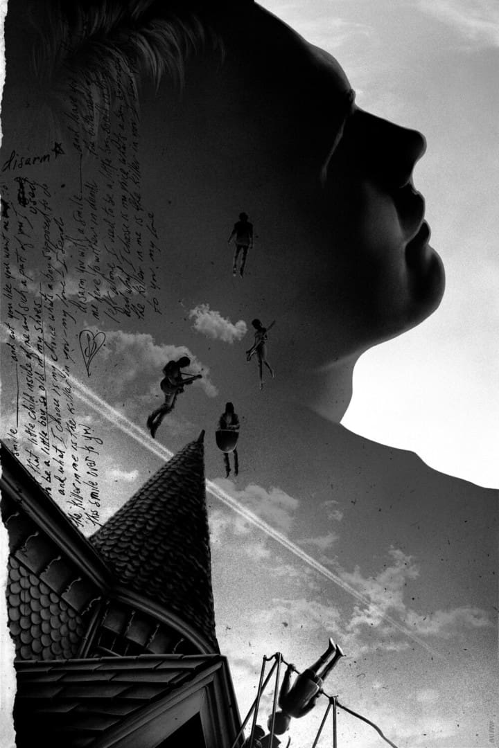
‘Disarm’ by Matt Ryan Tobin
What is your relationship to Disarm, what about it and the time you heard it struck a lifelong chord?
I was approximately 7 or 8 years old when I first heard Disarm. I think Rocket was the first Smashing Pumpkins song I ever heard though. It pulled me in with its whimsey, stellar, colorful pop-rock sensibility. ’94 I think. I got my hands on the Disarm Single CD titled SMILE. I was forbid the full album no thanks to the colorful song title Silverfuck.
I took the CD home and I listened to Disarm on an endless loop. The hair on my skin stood up and a lump formed in my throat and stayed there until I fell asleep. The amount of emotion that song made me feel is and has since been unparalleled. I couldn’t understand why I felt such upset and such relief at the same time. It was a very bizarre feeling to have at that age. It’s never left me, even when I hear it now.
My best comprehension of that is that I always kind of felt alone. Don’t get me wrong, my parents are the most loving people on the planet and my childhood was, for the most part, great but maybe it was partly due to my lack of friends growing up in addition to my parents split around that time and me just generally not having a grasp on the feelings I felt. The song was expressing in some way how I felt — at least in my personal interpretation — when I didn’t even understand the words at the time.
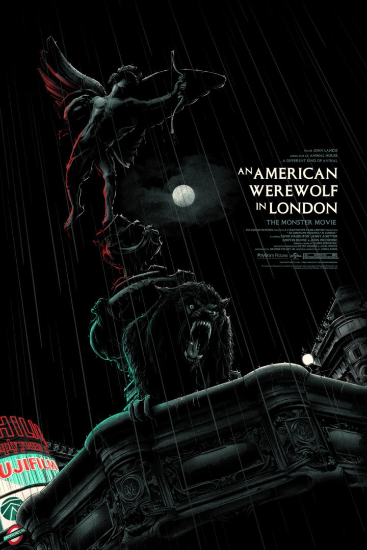
‘An American Werewolf In London’ by Matt Ryan Tobin
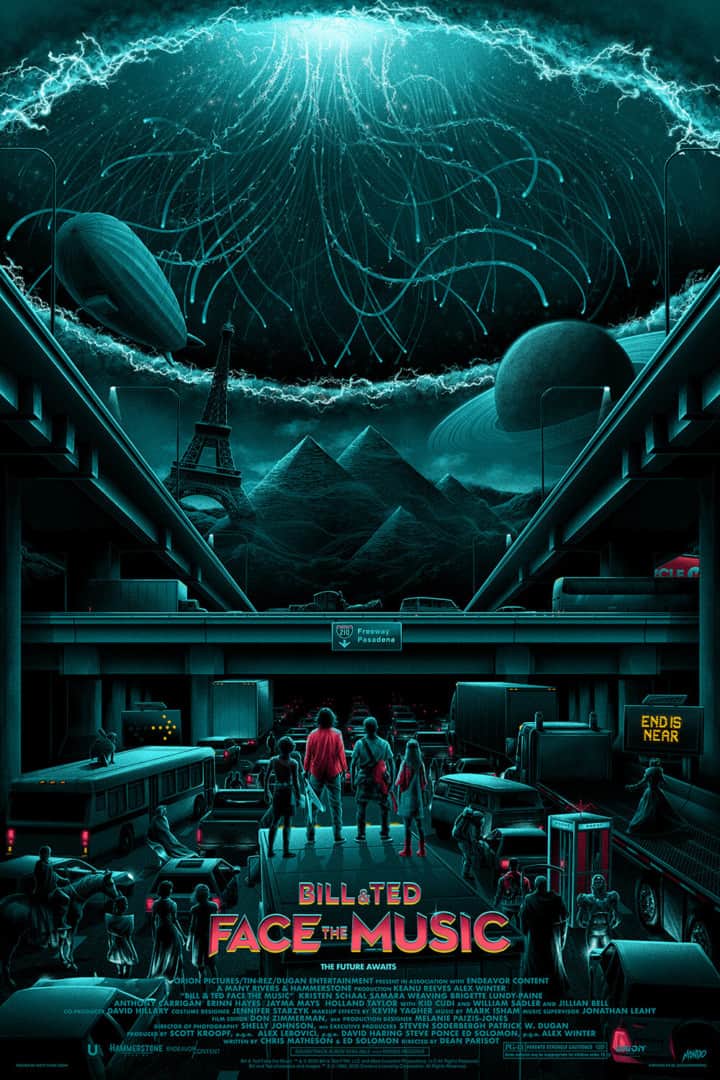
‘Bill & Ted Face the Music’ by Matt Ryan Tobin
Canada is rich with illustrators, and horror-centric illustrators especially. Had you known Jason Edmiston, Justin Erickson, Gary Pullin, Sara Deck, and crew in your music days, or was it not until your illustration work took off? Is there a sharing of works in progress amongst you all?
I’ve said it before but I don’t think I’ll ever tire saying so and that’s that I would not have a career if not for those people. They helped me out early on and continue to champion everything I do. I really am beyond lucky to have them in my life. They are the best of the best — not just as artists but as human beings. I met all of them from attending conventions as a fan to then exhibiting at the same conventions, to wedging myself into their lives.
Not everyone can say they’ve made life-long friends with their idols. We’re always sharing work and helping each other out. It’s a family for sure. Everyone is always pushing each other to be the best they can be and sings each other’s praises all along the way. I’ve missed them dearly over the last year and a bit.
‘No Buds Chill’ By Matt Ryan Tobin

‘The Vvitch’ by Matt Ryan Tobin
Your earliest film posters were born in private commission groups and group shows. Your work went from a classic hard black outline with pops of color like in 2013’s No Buds Chill, to a more subdued and subtle drawing of 2014’s From Dusk Till Dawn, and by 2016’s The VVitch you were at the cusp of your current style. With each poster, do you feel a sense of defining a style, or broadening whatever your current visual language is? Can it be both?
Haha, No Buds Chill. Digging up the oldies, are we? It can be both, for sure. I don’t think I have ever made a conscious decision to make my whole body of work look any one way as much as the concepts guided my hand. Certain concepts call for different approaches. I’m always trying to convey a feeling and feelings aren’t one-dimensional. As people, we have a core self but if we’re really in touch with ourselves we don’t shy away from growth or fear change. We should always embrace new things and flip our perspectives in life and that applies to art as well. Broadening your visual language is a great way to put it.
I can’t tell what my style is, per se. I can’t define it, personally. People have told me they can tell when a piece is mine. Probably comes down to specifics in my choices in color or rendering or something I don’t know. I’m often not thinking in those terms. I just really admire artists who aren’t afraid to go somewhere else. An incredibly versatile artist like Akiko Stehrenberger is a great example. I think that’s why the Smashing Pumpkins have been such an influence on me. Their music is a journey; ups, downs, lefts, rights. Sweet, Sad, Joyful, Angry. All the ranges of emotion. Never tethered to one sonic sound or approach to convey them from one song to the next. Songs XYU and We Only Come Out At Night are back to back, on the same album somehow. But it’s flawless.
I had to mention No Buds Chill! If I saw it fresh, without any knowledge of who made it, I don’t think your name would come to mind. Does that make sense?
Haha yeah, that was my second gallery submission ever. Early, early days. It does show where my heart lies, though — even back then. You’d think I’d opt for a more popular title for my first outing with Bottleneck Gallery…nope. Encino Man. I still hope to one day make a licensed poster for that film. In the chaos of that print lies a good idea…I think. Maybe. The same goes for Little Monsters. One day.
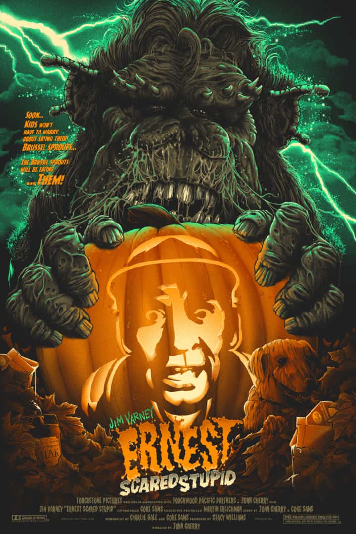
‘Ernest Scared Stupid’ by Matt Ryan Tobin
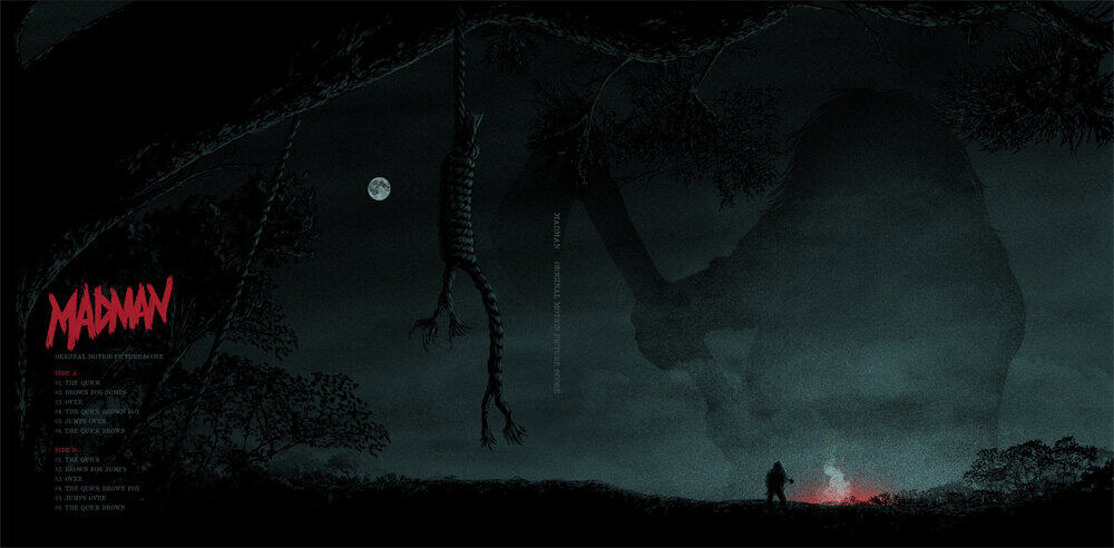
‘Madman’ Vinyl Illustration by Matt Ryan Tobin
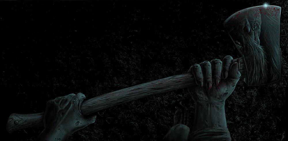
‘Madman’ Vinyl Illustration By Matt Ryan Tobin
Your package illustrations for the Madman vinyl are sincere and beautiful. You can do something special – make horror and broad comedy completely human. There’s a romanticism about your posters that I would think comes from your connection to each property. From Pee-Wee to Ernest to Bill & Ted to Hellraiser, you craft each piece from a personal perspective. You give each poster their own inside jokes and Easter eggs, but in the end, each poster or vinyl package design gives the impression that the person who made them thinks very highly of the property. Do you approach a comedy differently than horror or a videogame?
I have to feel something for it. The art — whether it be for a comedy or horror film — might be different aesthetically but it all comes from feeling — so it’s essentially the same approach. Whether that’s an old feeling or a new one…it has to inspire me and I usually immerse myself in a project pretty deeply when I’m working on it. I do deliberately try to steer clear of how any one property has been done before or one that’s been done too much. Titles like Alien or The Thing come to mind. The world is filled with so many great artists now more than ever so it becomes a bit of a challenge to make your own individual mark with a certain film. It’s a challenge I welcome, though. It’s one that I think makes for some of the greatest work. It forces you to be creative.
On the other side though, unless there’s something worthwhile to say, I’d rather give a film that hasn’t had a light shone on it enough the attention it deserves. Films like Freaked that you don’t see much art for, that is screaming for it. I haven’t found anything new to say about RoboCop that hasn’t already been said and most likely better than I could say it!
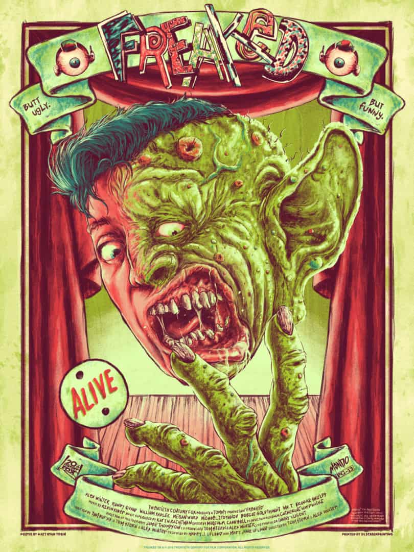
‘Freaked’ by Matt Ryan Tobin
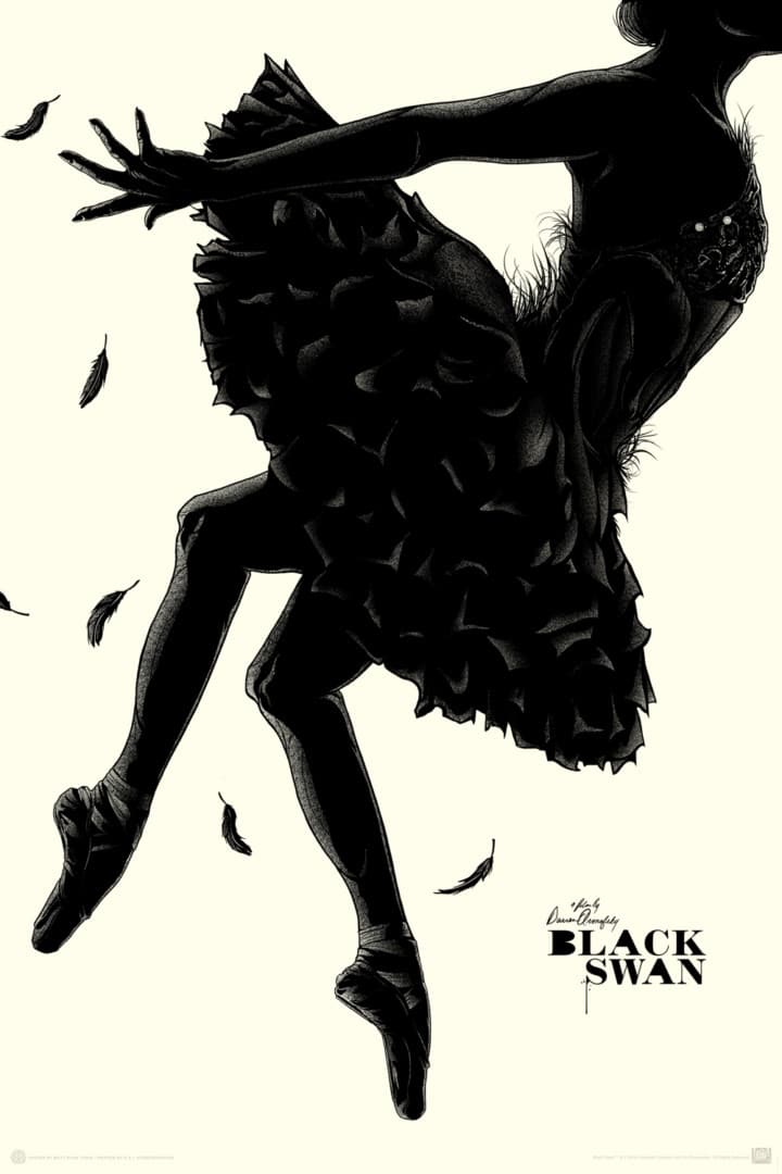
‘Black Swan’ by Matt Ryan Tobin
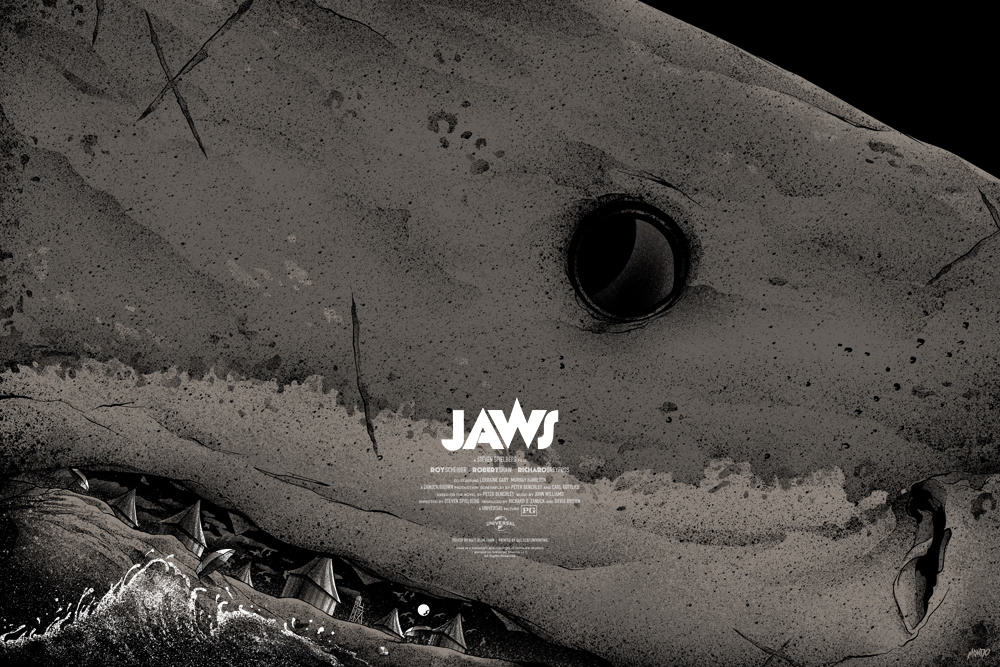
‘Jaws’ by Matt Ryan Tobin
Your posters for Jaws and Black Swan share a common visual theme – a focus on a single object with everything else falling away. How do you balance this approach with wanting to put in every detail, moment, and feeling that you find enjoyable to the movie?
Less is more. Always. At least in my brain. I prefer to focus on a single thing or few things to create imagery that gives a glimpse into the story. I have never felt satisfaction from, or a desire to jam pack a poster like a series of storyboards. There are artists that seamlessly do that brilliantly, though.
That’s not to say I haven’t done it but if that’s the case, usually I was obligated to do so, or in a rare case — it worked for a specific film. Looking back on some of those types of posters I’ve done i.e., Con Air or Last Action Hero — I know now how I could reduce those down to something far more simple, thought-provoking even — that hits way harder and lands cleaner…but most artists say that about a lot of their older work. We would love to go back and revise our past work if we could…that doesn’t mean we should.
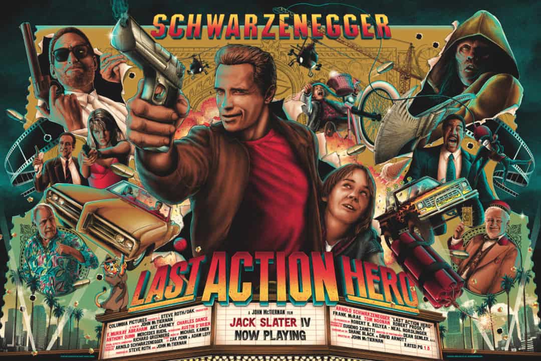
‘Last Action Hero’ by Matt Ryan Tobin
