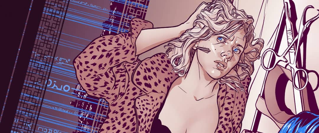
The lines are clean. The likeness of the lone figure, a well-known actress, is drawn with only a fistful of lines, and it should be stated—it’s perfect. The illustration, colored in crisp sepia tone with pops of electric blue, accompanied the 2014 review in The New Yorker of the drug-fueled sci-fi thriller Lucy by French auteur Luc Besson.
Neither illustration nor film is a landmark in the career of their respective artist, but both showcase the casual yet workman-like skill of each. A piece of art held together by incredible craft and skill. This is the core ethos of illustrator Martin Ansin’s work.
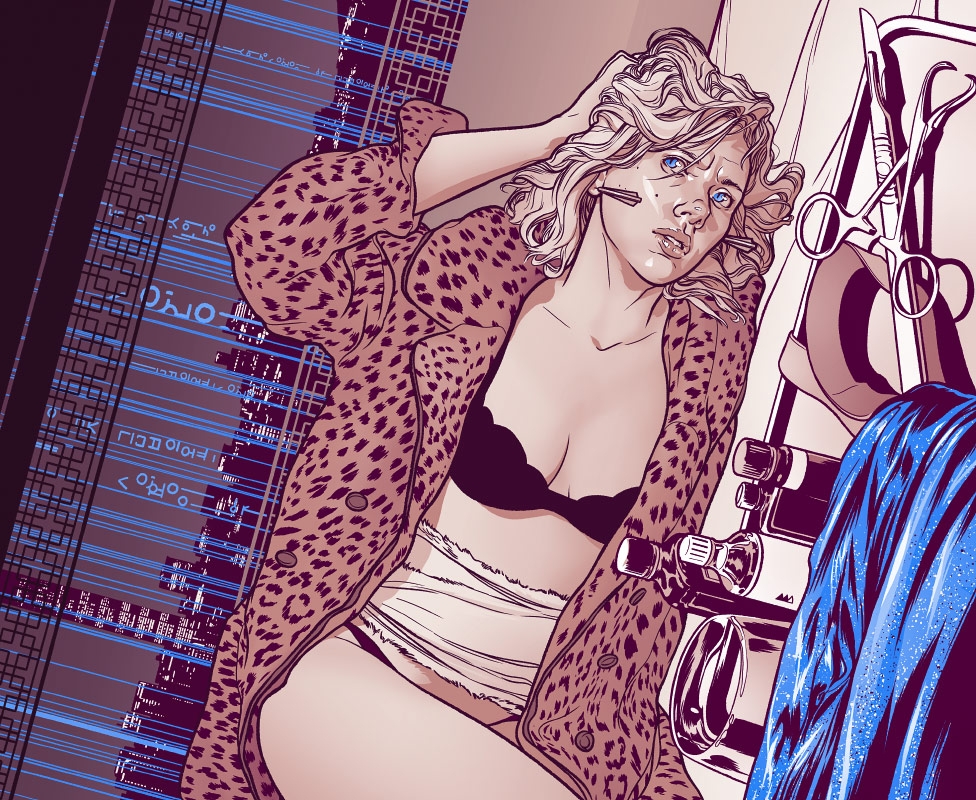
Illustration by Martin Ansin for Richard Brody’s The New Yorker review of Luc Besson’s “Lucy”, starring Scarlett Johansson.
Ansin is often called on to take on the world of science-fiction, and his portfolio is rich with the best the genre has to offer: the Star Wars universe, Ridley Scott’s Alien franchise, Mamoru Oshii’s seminal anime Ghost in the Shell, and countless others.
His illustrations don’t reduce the depth of narrative and world-building these films create; just the opposite—he includes every detail at once. “Those sci-fi movies from the end of the seventies and the eighties had a common visual theme running through, that ‘lived-in universe’ look that started with Star Wars. Those places in the future looked rusted and dirty, so as a kid I loved the notion that the characters that lived in them were probably just a small part in the long life of that city or spaceship. Little details to look at everywhere. I like sci-fi as a tourist destination I guess. I’d totally live in Sean Connery’s apartment in Outland.”
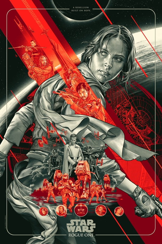
‘Rogue One: A Star Wars Story’ by Martin Ansin for Mondo

‘The Rocketeer’ by Martin Ansin for Mondo
Ansin is rarely seen outside of his native Montevideo, Uruguay. For an artist widely known for his high-profile editorial work, it may seem odd that he is not located in a more metropolitan setting, and at a certain point in his career, Ansin agreed, living in New York City to be close to clients, both potential and realized. Later, moving back to his hometown of Montevideo was an easy decision, as Ansin explains: “I get distracted easily. When you’ve got to get work done, Montevideo just gets out of the way.”
Ansin’s career drifts between work for clients like The New Yorker, Entertainment Weekly, and Rolling Stone into the relatively new realm of alternative movie posters, a move that was somewhat decided for him, as Ansin explains: “Editorial work is not as active as it used to be, at least for me. I still do magazine commissions from time to time, but the requests have been fewer and budgets smaller for a couple years at least. […] There’s also an on/off cycle regarding illustration styles, and I’ve seen most of the ADs aiming toward styles that are a little less representational, a little more loose.”
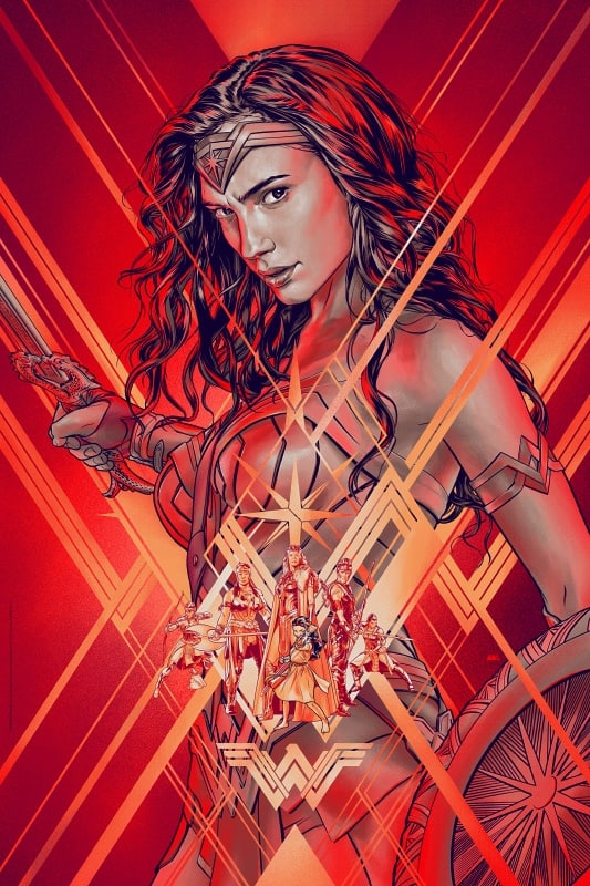
‘Wonder Woman’ by Martin Ansin for Bottleneck Gallery

‘Avengers: Age of Ultron’ by Martin Ansin for Mondo
For creative directors like Mitch Putnam from collectibles creator Mondo, the concerns of the editorial world are not shared with the niche market of pop-culture collectibles. “We have a lot of different artists working in different styles within Mondo, and our fanbase seems to accept a pretty broad range of looks. The editorial world is a different beast altogether. On top of changing tastes, you also have an entire industry that’s rapidly changing to survive, so I imagine it’s hard to pin down.”
When Mondo needs someone to collapse the cacophony of action contained in a film like Marvel’s Avengers: Age of Ultron into a 24”x36” poster, Ansin is brought on board. He eschews the common floating head design of modern film posters and places each character into a hierarchy of action—each figure supported by the next, the negative space held together by design elements that are so perfectly ingrained in the overall composition they seemingly disappear.

Variant cover art by Martin Ansin for DC Comic’s ‘Batman Beyond: Rebirth’ series

‘Ghost in the Shell’ by Martin Ansin for Mondo
Ansin starts and ends each illustration in the digital realm. Pixels over pencil and paint. “I used to work the old-fashioned way, pencil and ink on paper. Acrylics and watercolor too. Once the digital tools came in place I switched into them just because it’s a more predictable outcome. I was always making the mistake of trying to have physical media look like something else. Trying to lay down watercolor paint in flat tones, for instance. Total waste of time. I think it’s great that in digital you can have things look the way you need them to, but I don’t find that texturing or adding effects to make it look analog helps it at all, it’s just adding noise.”
The process lends itself to absolute control. In Ansin’s hands, Superman’s cape hangs weightless in space, a painter’s touch to the fabric. Each major player in the film is present with all eyes leading to the Man of Steel. Each line cutting across the page in an impossible timeline, pushing and pulling. Pure movement.
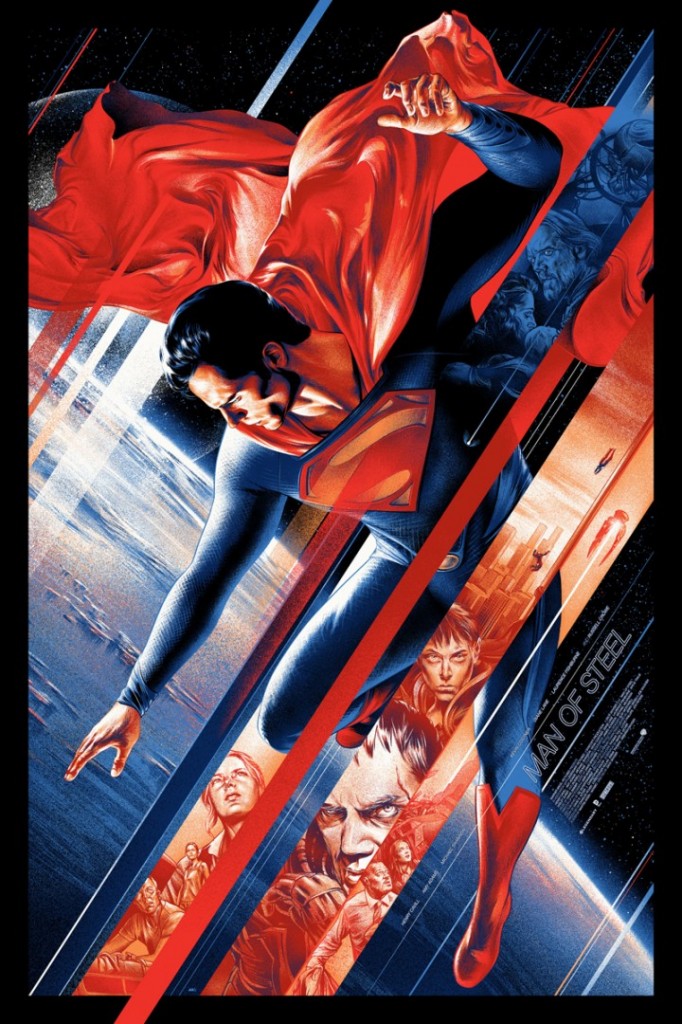
‘Man of Steel’ by Martin Ansin for Mondo

‘Citizen Kane’ by Martin Ansin for Mad Duck Posters
At the heart of Ansin’s work is his loyalty to both subject matter and task at hand. For his take on Orson Welles’ classic film Citizen Kane, his first with print publisher Mad Duck Posters, Ansin put all of Kane’s massive story into a one-sheet. Having Ansin take on Citizen Kane, a decidedly non-sci-fi property, was of no concern to creative director Brad Crites, who says, “Martin has a diverse body of work. I wanted to tap into that ‘vintage’-style approach with the classic feel, and Martin delivered huge.”
Putnam echoes Ansin’s boundless abilities: “He’s kind of got it all. He’s great at drawing likenesses, he has an unbelievable sense of composition, and he’s a master of modern typography. Seriously, it’s easier to ask what I don’t see as his specialty.”
Article originally published on HOWDESIGN.COM
