The portfolio of Winchester, UK–based Olly Moss is barely a decade old and already spans multiple creative disciplines: T-shirt design, limited-edition posters, comic books, video games, websites, branding and more. Between the larger, more prominent entities you’ll find a sprinkling of odd commercial jobs. For every Batman or Star Wars project in his portfolio, design work for a small indie film or a logo peeks in.
When discussing his body of work, Moss is quick to brush off its depth. “I think you can look at any piece of work that I’ve done and reverse engineer it, in terms of its intent. There’s no real deeper meaning, it’s just a thing that I thought was good so I did it. There’s not really much more to say than that with most of it.”
Moss is in a unique position for a freelance designer. The work finds him—and with good reason. As illustrator and Mondo Gallery art director Rob Jones puts it, “Solutions flit around like butterflies in his head at all times, and he just effortlessly nets one when needed.”
His relationship with clients begins with his sketches. In an interview with film and game concept designer Ash Thorp on Thorp’s “The Collective Podcast,” Moss said, “I love pitching [concept art] for free. It frees you from any assumed expectations that you have. You have the brief, but when you really want the job, you’re so focused on giving [the client] what you think they want rather than what they actually want from you, which is you. So I think, what do I want from this job? What do I want to give them? They’ve come to me because they’ve seen my portfolio and all the things I put there because I thought they were good; all the client work that I hate is not there. They’ve come to me for those reasons, and I want to give them more of that. I want to pitch you the weird thing. I will send you a sketch that will take me eight hours to think of and five minutes to do.”
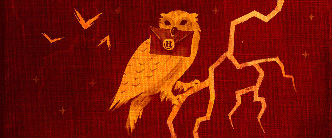
Harry Potter book covers for the official digital release by Olly Moss
For his work with publisher Pottermore Limited on the cover illustrations for the 2015 worldwide digital release of J.K. Rowling’s Harry Potter book series, Moss was asked for a single sketch, yet turned in five separate approaches with sketches for each of the seven books. “I pitched harder for that than anything I’ve ever pitched in my life. I wanted it so badly. They were my books growing up. I loved Harry Potter and I still love Harry Potter so much. I wanted that job.”
The approach that was chosen was Moss’s second favorite, leaving his preferred illustrations to disappear on a hard drive of unused work. “They felt the closest to what I wanted to do with Harry Potter as a fan,” Moss explains. But because the illustrations were intended for a digital release that would most likely be seen on black-and-white e-reader screens, Pottermore decided that his choice of seven illustrations with only minor element changes to a landscape of Hogwarts wouldn’t be as useful as designs that remained impactful at any size and in both grayscale and full-color. “They were like, ‘What can we do with these [other cover concepts]?’ And I was like, ‘Well, I have a little side line in posters.’”
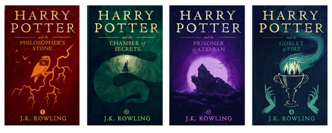
Harry Potter poster series by Olly Moss

That “side line” in poster design has been a mainstay in Moss’ career. In 2007, while he was still a student at the University of Hertfordshire, Moss began submitting designs to the site Threadless.com, an internet-based T-shirt company that allows the audience to rate submitted designs, and those with the highest ratings are turned into a tee and sold on the site, with a portion of profit going to the creator of the winning design.
For Moss, the immediate feedback and critique on his work, or lack thereof, would determine the next design. “If the vast majority of people are saying it’s good, you can figure out why this particular piece is working or why another doesn’t get an immediate response. You know it’s bad when you put something up and nobody comments or cares about it. That’s the real alarm bell.”
These early designs were bright, with Moss’s ever-present intelligent absurdity. “Spoilt,” one of his more popular Threadless shirts, is a text-based design spoiling Hollywood’s most regarded film twists: “Darth Vader is Luke’s father,” “Bruce Willis is a ghost in The Sixth Sense,” etc.

‘Spoilt’ for Threadless.com by Olly Moss
Moss readily admits these illustrations for Threadless were not well-executed, but as he explained in his talk at the 2012 Offset conference: “It just sort of hit me really quickly that a weak execution can be overcome by a strong concept. Any concept at all can elevate a terrible execution.”
Through his self-assigned series of red and black film posters, Moss put his concepts to the test. The series found Moss removing elements, simplifying. As he defined each concept, the audience for his work grew. Early coverage of the posters online recognized the simplicity of his execution and the brawn of his concepts, filled increasingly with sharp illusions that require a double-take to fully comprehend.
At Offset, Moss explained the impetus for the self-assigned series: “I was always using movie references in my work, but I never thought of doing something actually based on a movie. I thought about my desire to keep simplifying my work, and putting the meaning and the concept as the focus, and just really wanting to have a go at something like this. These film posters are the first things I remember people blogging about or me getting inquiries about. They wanted to see work like this.”
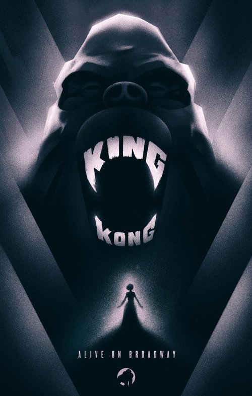
Illustration for the Broadway production of ‘King Kong’ by Olly Moss
Those early internet rumblings were followed by a call from Los Angeles—an offer for a position at visual effects house Prologue, creators of title sequences and graphics for films including Iron Man, Superman Returns and Star Trek Beyond. Moss, then an expat in Los Angeles, lasted a short time at Prologue, but that time was impactful.
It was there that he worked on concept design for the titles of the 2010 film The Losers, which introduced him to the work of New York Times bestselling comic book artist Jock, as well as other creatives, like Thorp, with whom he would work later. It was also there that he realized the pace of Hollywood was not for him. “It’s like boot camp,” Moss says. “You go and you learn so much so quickly because there are so many talented people around you doing great stuff. It was a really valuable experience, as much in terms of teaching me that’s not what I want to do.”
So Moss returned to his home in Winchester and focused on the work he wanted to pursue. In 2009, Moss was invited to participate in Los Angeles–based Gallery 1988’s event inspired by the hit ABC television show Lost. This would be his first licensed poster. For his part, Moss created an illustration around the character Locke, pulling inspiration from the aesthetic of the great Saul Bass. “I didn’t want to ape any one of his posters in particular. I came at it from the point of view of: What would he have done? How would he have solved this problem?”
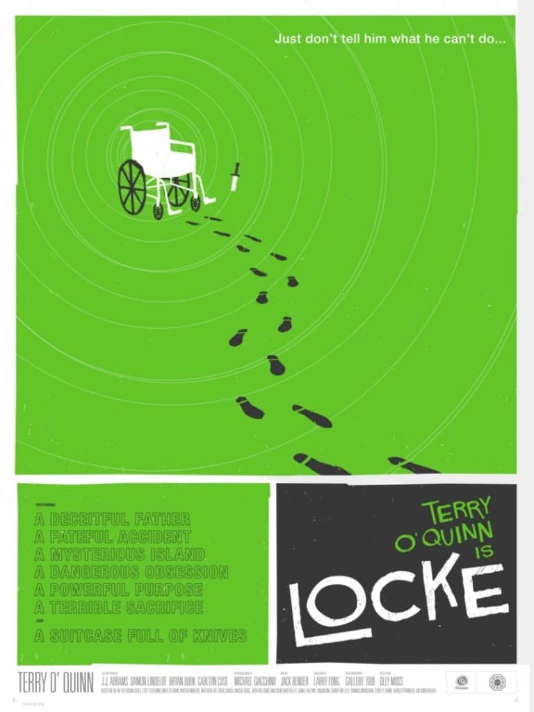
‘Lost’ poster by Olly Moss
Mitch Putnam, co-founder and creative director for the Austin, TX-based gallery and poster company Mondo, was responsible for bringing Moss deeper into the poster fold. “I had seen Olly’s work around the internet for a year or two before contacting him,” Putnam says. “He had made a couple of viral design projects that showed up seemingly everywhere. He was basically the godfather of modern minimal movie poster design. I didn’t really think about Mondo posters until after his entry in the Lost poster series. His piece was definitely the shining success of the series, so the desire to work with him was pretty natural.”
The first job Moss did with Mondo was a poster for the Sam Raimi horror classic The Evil Dead. The film’s original 1981 poster is striking—a hand reaches from the earth, gripping the throat of a young woman. Moss kept a similar composition, explaining, “It’s almost disrespectful when you’re working on a project to just wipe clean the slate if what’s already been done is so good.”

‘The Evil Dead’ poster by Olly Moss for Mondo
With only two licensed posters under his belt, Moss was again approached by Putnam with another film poster gig—Star Wars. Mondo had recently acquired the license from LucasFilm and wanted to create a series of posters for the original trilogy. Moss looked to his previously successful The Evil Dead design and followed suit. The hand in silhouette, its interior filled with elements of the film, begat C-3PO, Boba Fett and Darth Vader in the role of the silhouetted framework.
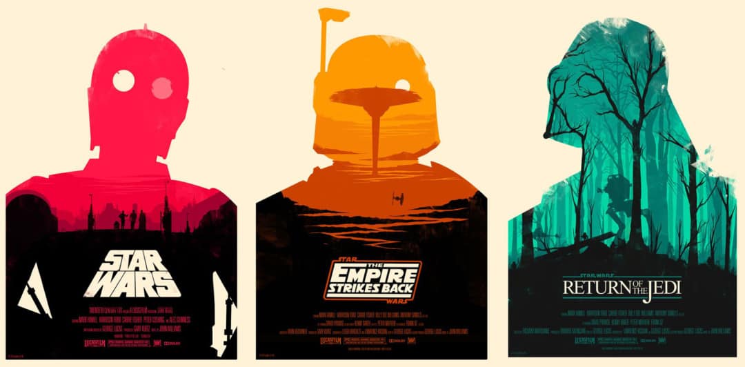
‘Star Wars Trilogy’ set of posters by Olly Moss for Mondo
Working directly with Mondo, Moss’s initial sketches were approved immediately. The design process on the series was smooth and unremarkable, with Putnam noting that “Nobody could’ve predicted the unbelievable response that those Star Wars posters were met with. They remain some of [Mondo’s] most popular products of all time.”
When Gallery 1988 later offered him a chance at his first solo exhibition, Moss shunned the expected showing of film-inspired screenprints full of visual stunts and instead filled the gallery with 300 silhouettes of modern faces from popular culture cut from black construction paper.
Still, Moss remained cognizant of his audience’s expectations that each of his works would contain a higher concept or double entendre. “Sometimes I want to do something that doesn’t have a stupid visual trick, but then I’ll get messages going, ‘Hey, I’m just not seeing it. Where is the thing?’ … You have to always be aware of the context in which people view your work. That’s a blessing and a curse. It allows you to subvert expectations in really interesting ways, but also those expectations can be a little bit of a ball and chain sometimes.”
With the solo exhibition, Moss moved further away from the expected, but with the same end goal in mind. “Olly and I admire the same qualities in good design,” says designer Jay Shaw, a frequent collaborator with Moss. “It’s all about the message. The imagery is important, but it’s always at the service of the concept. It’s interesting collaborating with another artist rather than an art director or a filmmaker. Artists will take what you’ve done and start drawing right on top of it. You then get to take the new image and add your own bits and pieces until you’ve got something you’re both happy with.”
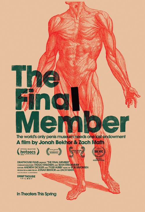
‘The Final Member’ film poster by Olly Moss and Jay Shaw

A cover image for the third issue of the anthology comic ‘Batman Black and White’ by Olly Moss
Moss’s collaborative efforts led to his first writing credit with illustrator Becky Cloonan handling the art for “Bruce,” a story featured in Batman Black and White #6. Cloonan explains, “We were at San Diego Comic-Con having a few drinks when he first told me about the idea. I loved it, and immediately thought out loud, ‘I have to draw this.’ It was such a simple story, but had so much depth and weight and humanity.”
Cloonan introduced Moss to DC Comics editor Mark Chiarello and mentioned Moss had a story to pitch for Batman. Months later, Chiarello asked to hear it. It was an immediate yes. Moss shared the script with friend and Batman artist Jock, who notes, “It just read great. It was an interesting, unique point of view on a character we all know. But that’s Olly. He seems able to just turn his hand to things and get an interesting take on them.”

Illustration for the game ‘Firewatch’ by Olly Moss
Despite being an avid gamer, Moss hadn’t worked on the design side of that industry until Sean Vanaman and Jake Rodkin approached him about art directing the first game to be released by their development company Campo Santo, launched in 2013.
The game, “Firewatch,” initially released in early 2016, follows Henry, a fire lookout in the Shoshone National Forest in 1989, and his only companion, Delilah, available through a walkie-talkie. The plot unfolds as a mystery, with Henry sent to investigate small fires and various strange occurrences.
Moss was hired as a concept artist, but his role blossomed over the two-and-a-half years to include art direction, logo design, posters, in-game textures, lighting, and story. “I came to it with no video game experience. It was very frustrating to our lead 3D artist, Jane [Ng], who very much came from a place where you’d have a bunch of concept artists and there’d be a drawing of a rock from four different angles and it’s like, ‘OK, I’ll just make this then.’ And everything had an insane level of guidance behind it when you were sending it out to the world. I didn’t really do that on the game. The way it would usually work out is at the start of the project, I would draw a detailed and nice painting and by the end of the project where everything was spiraling out of control and there was so much to do, a very rough sketch of what an environment should look like, and then Jane would go and do a rough 3D blocking of that, and we’d consider the ways that a player might approach that environment.

Official ’85 Years of Oscars’ poster for the 85th Academy Awards by Olly Moss for The Academy and Gallery 1988
His poster for the 85th Academy Awards might sum up his approach to visual problem solving as best as any piece of design can. “If I had to point at a piece of work in my portfolio and say, ‘What’s the most Olly thing you’ve done?’ I’d be like, ‘Oh, it’s probably this.’ I set up the rules very early in that piece … it’s every Oscar. And there are some that are harder than others. You have to figure out some that are obvious, and some that are deeper cuts, and it’s fun and hard and weird to do.”
There is distance between Moss’s current work and the work that brought him to the attention of collectors, art directors, film companies and game developers. Those poster days are in the past, for now. “It doesn’t feel like fertile ground for interesting new stuff right now. People can make a pretty good living and make really good work, but it’s just not super exciting to me.”
Once Firewatch was released, Moss moved on to a new project that won’t be seen for another few years—a personal project he won’t discuss for the moment. It will be released with no fanfare. Boom. Then it will exist. This is how Moss works.
As he puts it, “I think every interest I have has a shelf life of about three or four years and then I just want to move immediately on to the next thing.”
In the interim, he’s been teaching himself coding and 3D tools like ZBrush. “It feels like being back to the start, the struggle days—being really bad at them and not having the pressure to be good at anything. Just to toil away on something you don’t really know how to do on your own time without the pressure is really great.”
Following the back-to-back jobs on Harry Potter and Firewatch, Moss now finds some relief and stability. “I could quite happily not work for like two years, which is great. That’s the position I want to be in because it allows me to be a little pickier about the jobs that I take on and work on stuff there’s no financial reward for, but I’m keen to do.” To keep his audience alert, Moss is always looking for new ways to achieve that desired effect: the double-take.
Article originally published in HOW Magazine’s Summer 2017 Issue
