This article was first published on HOWDESIGN.COM in 2016
For two weeks each spring Austin, Texas is taken over by South by Southwest (SXSW), a unique festival experience set on exposing new creative content to a global audience where filmmakers, app developers, bands, and those in the periphery bring their specific craft to the sprawl of Austin. Added to the festivities is Flatstock, a poster event held by the American Poster Institute where the Austin Convention Center fills with booths of gig posters and the artists who make them. Since 2010 one of those booths has belonged to illustrator Eric Nyffeler, but not for long.
Nyffeler has been creating vibrant and joy-filled gig posters since 2009 under the moniker ‘Doe Eyed,’ a pseudonym he has recently retired and with it his role as gig poster mainstay. Nyffeler’s career is mid-shift from gig poster artist to full dedication to the field of editorial illustration where his list of clients include Facebook, The Washington Post, Whole Foods Market, and Airbnb. This is a calculated refocusing from an illustrator whose creative depth can bring the raw blues of The Black Keys to a gig poster as easily as illustrating the culture of the tech industry for Fast Company.
Nyffeler’s designs have a workmanlike feel which is no mistake — each shape and texture is manmade, torn and cut by hand and reassembled digitally. No matter the client or the name he’s working under, Nyffeler keeps one constant — the true grit of handmade design.


Gotye tour poster by Eric Nyffeler
Your illustrations are incredibly crisp and tight, but there’s a very handmade quality to them as well. Your Gotye poster for the 2012 Webster Hall show has those perfect lines, yet there’s this warmth to the textures that feel organic. Did that start of as all hand-drawn elements and then digitally finished? Do you keep a stock of handmade textures, or are you creating those as job-specific elements?
Almost all of my work starts off as super-fast, crude pencil sketches. Simply an attempt to get the idea and composition out of my head. Following that, I redraw the entire piece in Illustrator, which allows me build and stylize everything with perfect geometry and alignments and size relationships. This allows me to find a happy medium between a dynamic compositions and strong geometric construction.
Following the completion of the clean, “perfect” vector version, I then print off every single element as solid black and white shapes. These elements are then run through a variety of shitty old toner-based photocopiers or distorted with a handful of chemical processes, all specifically chosen for the job at hand. All of these trashy, textured bits are scanned back into the computer and reassembled into the original Illustrator file.
I then complete the small textural details with elements from my personal texture library — background grit from copper etchings, watercolor brush marks, found half-tones from hundred-year-old books, or other random printed ephemera. I’ve found that the combinations of these processes afford me the best of both worlds of vector art and hand-drawn/painted illustration.
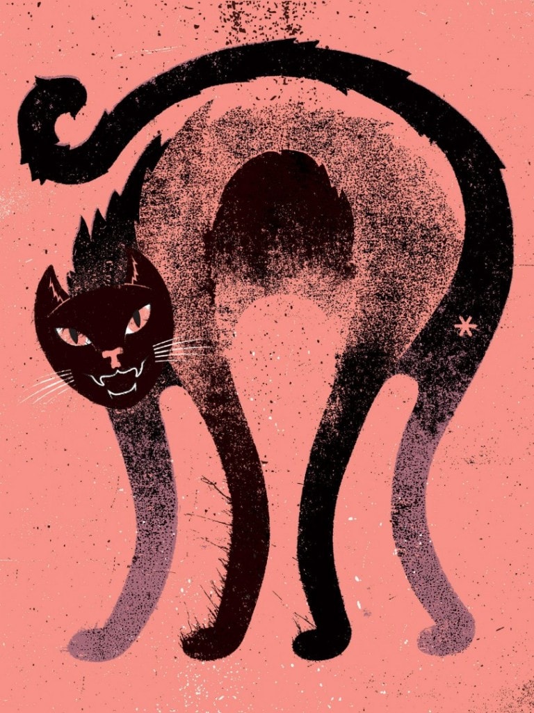
‘Bad Cat’ by Eric Nyffeler
So you make something “technically perfect,” take it apart and mess it up, and then put it back together? That’s an interesting approach when you could probably do the entire thing in the world of pixels — does the tangibility of holding pieces of your design in your hands change the design at all?
Yes, you are completely right, I do make something “technically perfect” and then break it apart. It’s kind of a pain in the ass, but the tangibility is that important to me. I want the textures and distress and grit to be real. I want to be surprised by what the textures and distress reveal to me. I need that for it to feel “real.”
I know that a lot of people do similar work with brush packs and texture packs and whatever other digital whatnot, but I think you can still feel the difference between textures made in the real world and textures made with digital means.

‘Grand Teton National Park’ by Eric Nyffeler

Eric Nyffeler’s unprocessed/untreated tree elements for the ‘Grand Teton National Park’ poster
So for something like the Grand Teton National Park print, you had each element as a slip of paper? How many pieces are you usually working with? Are the trees in that print each worked on separately?
I gang up several elements on 8.5″ x 11″ sheets. I think that the Grand Teton piece had 12-14 pages of different elements, with seven pages just for trees.
For being such a tactile builder, are you ever doing your own screen printing?
I used to do a ton of my own printing. I studied design and printmaking in school. When I first started doing a lot of posters, my buddy and I did all the printing for all our stuff. (laughs) It was a fucking headache and I hated it. Try as I might, nothing ever worked right and there was a different problem every time we printed.
I worship the aesthetic but I constantly felt like I was fighting with the medium. Back in 2012, I had the two-fold happenstance of breaking my wrist in a bicycle accident and getting a commission from Gotye for 1,200 four-color posters, so I hooked up printing with The Half & Half and haven’t looked back once. In fact, I hadn’t even held a squeegee until last summer when I was part of the University of North Dakota’s amazing Notstock event and had to run a print demonstration.
I wish so much that I was better at printing. I find myself so jealous of artists who are as good of printers as they are illustrators, like Dan Black from Landland or Justin Santora, but it clearly reached an impasse where I had to decide if I wanted to become a better printer or a better illustrator. I chose the later.
Yeah, those two are special cases. Not everyone can do both.

Gotye tour posters by Eric Nyffeler
I know one poster doesn’t make a career, but it sounds like that Gotye poster had a sizable impact. Were you doing runs of 1,200 on your own prior to that print? Does not doing your own printing relieve any of the stress? Can you see the difference in one printer from another?
Oh no, my friend and I had never attempted anything near that large. I think the closest we ever got was doing 300 three-color prints. At first, the idea of working with another printer was a bit worrisome, but they quickly proved their worth. Once I realized that I trusted them more than myself, it was a huge weight off my mind.

Puscifer gig poster Eric Nyffeler
There’s an overall sense of optimism to your work, even for something somewhat dark like the band Puscifer. Is that your natural personality coming out, or is that lightness a quality you are trying to achieve?
Oh my no no no no, there is most certainly no naturally sunny disposition shining through my work. I definitely skew more towards the sarcastic / pessimistic / misanthropic / cranky-old-man-in-the-black-metal-band-tee-shirt side of the spectrum.
To be honest, I’m not even really sure where the whimsical pastel world of my work comes from. Perhaps the humor and lightness in my work is just an inherent, inescapable part of the mid-century illustration that I am inspired by? Or maybe it’s just harder to capture ennui and darkness when you are building your world with little other than triangles, circles, and squares? Or maybe I’m actually a deeply repressed sweetheart and my work is an expression of my true hidden self? God, I hope it’s not the last one.
You consider yourself a total bummer?
A fun bummer? A fummer?

Eric Nyffeler’s illustration for Snacks Quarterly

EL VY gig poster Eric Nyffeler
The cast of characters you use in your illustrations are all wonderfully loose and non-specific, but for the EL VY gig poster, I think is the only time you’ve gone for likenesses. Was that a decision on your part or a request of the band?
With the EL VY poster, the more representational style was my decision on how to best serve the concept. I pitched them a handful of ideas, some stuff being slightly more in line with my geometric, stylized work, in addition to the riff on the classical Greek busts.
The band really loved that idea, and I decided that stylized, whimsical portraits would undermine the overall concept of rockstar vanity / celebrity worship that the bust concept represents. I still managed to work sneak some of my usual textures and grit into the portraits while still capturing a more realistic style. It was a fun change of pace.

‘Grand Teton National Park’ (detail) by Eric Nyffeler
Your poster for Grand Teton National Park is a total beauty – for me it’s all mood and feeling. It looks like how I want to feel when I visit the park. You want to walk in those trees, see those mountains and that wolf. It’s also one of your dynamic illustrations. How did you end up working with the folks at Fifty-Nine Parks? Did you get to choose the park?
The Fifty-Nine Parks Print Series is curated by JP Boneyard, from the fantastic National Poster Retrospecticus, who is a good friend and collaborator as well as the hardest hustler I’ve ever met. I’ve worked with the NPR for a few years now, creating poster designs for them as well as helping set up a show once or twice.
When he first told me his idea for an updated, contemporary take on the famous WPA posters, you can better believe I jumped at the chance! Once it came time to pick out the park for my poster, John and I had a quick back and forth about which parks I’ve been to and which would be a popular park to launch the series with.
Between your paying gigs, how important is it you to you find time for art prints or more personal projects?
I’ve been fortunate enough to curate my business and clients so that I almost never have to do any work just for a “payday.” Almost all of my paying gigs excite and inspire me as much as my personal stuff. I do have a few dumb side-project-business things that seem to be in perpetual limbo, but I can’t complain too much seeing how rad all my current clients are.
That being said, the real struggle is to find time to write and record and perform as much music as I’d like to. That is the true battle.

Mural at the new Whole Foods Market in Lincoln, Nebraska designed & painted by Eric Nyffeler

Mural (detail) at the new Whole Foods Market in Lincoln, Nebraska designed & painted by Eric Nyffeler

Mural (detail) at the new Whole Foods Market in Lincoln, Nebraska designed & painted by Eric Nyffeler
How did you cultivate a roster of clients that you’re excited about? Is it all from connections made in the music world?
Mostly, I just say no to work I don’t like. I only want to make something if I can actually be proud of the end result, and if that means making less money and saying no to big, well-paying projects that don’t interest me, so be it. If I wanted to make work that didn’t personally interest me just to pay the bills, I could go work in an ad agency somewhere and make a hell of a lot more cash than I make now.
But yeah, I find that surrounding myself with outrageously talented creators of any type, be it musicians, illustrators, gallery owners, etc, is a great way to keep myself immersed in the kind of work that I find existing and rewarding.

‘The Revolving Door of Tech’ illustration for Fast Company by Eric Nyffeler

‘The Revolving Door of Tech’ illustration for Fast Company by Eric Nyffeler
Did you ever consider going the agency route? Was being self-employed always the path you wanted to be on?
I briefly worked at an agency while in college, and then worked at an in-house design team for a large corporation immediately out of school. Both of those experiences were extremely important for completely contrasting reasons; while they both gave me an incredible amount of real-world experience you don’t get in school, they also showed me that I just don’t personally fit in well in the agency/advertising world. This sounds cheesy as hell, but design is my “art.” I found that I didn’t work well in an industry where design is just a job.

Eric Nyffeler Design & Illustration logo
What prompted the change to working under your own name?
There is no one big reason why I decided to put the name Doe Eyed to rest in favor of my own name. For the last year or two, I slowly started to feel the itch that I was growing out of the moniker, which has to be a feeling that Billy Corgan feels every single day (Smashing Pumpkins is just a flat out bad band name for a fifty-year-old man). It felt like time for a change and a chance to wipe the slate clean. I guess that changing my business name is about as close as a self-employed person can get to starting a new job.
Will there be any change to your direction, career-wise?
Putting Doe Eyed to rest in favor of my own name and with that an increased focus on pure illustration work. I’m especially excited about moving further into the editorial illustration world! Posters will definitely be much further and far between and back to only being for bands that actually interest me on a musical and emotional level, rather than whoever has a budget and will sell some prints.
I’ve always kind of been a “do whatever the fuck I want” kind of person, and that will still be my main operating tenet, but just with a slightly changed aim of work, if that makes sense.

Eric Nyffeler’s Doe Eyed poster booth at SXSW 2016 | Flatstock
You’re still doing poster events under ‘Doe Eyed.’ Once your poster inventory is gone, does that mean you’ll stop doing SXSW and other Flatstock events? No more poster making at all?
I’m not specifically trying to sell out of my stock of posters and prints, but it’s just the way it’s playing out. The last two years or so have definitely seen me selling more stuff at shows than producing new prints. Realistically, at some point soon I won’t have enough posters left to make Flatstocks worthwhile.
While I never want to entirely stop producing gig posters and prints, it doesn’t really make much sense to travel a thousand miles to hang up the three or four posters I designed that year. It’s the unfortunate trade-off of ramping up this editorial illustration game.
What came first, editorial work or gig posters? Do you see one as ‘your thing’?
Gig posters were definitely the catalyst for everything I do now and are entirely responsible for my love of design and illustration and typography and printmaking. I started making posters as an offshoot of my love of music and to promote my own bands, but I quickly surprised to find that I liked the design and illustration even more than the music.
At this point, I don’t really see either posters or illustration as “my thing.” I guess I hope I don’t have a “thing.” I just like making and building things, regardless of the size or shape or final use.
