When baseball was young, sportswriter and statistician Henry Chadwick created the form and written code of the game. “K” for a strikeout. “1B” for the first baseman. From this, he developed the earned run average the batting average. All of this summarized on a grid, the box score. The birth of the baseball scorecard.
The timeline of the birth of baseball to the creation of the scorecard is a major step in the development of visualized data. The viewer can read a scorecard from a game they did not witness, and see how that specific outing played out. Action displayed in the form of simplified code. When designer Bethany Heck created The Eephus League of Baseball Minutiae as a senior project during her time at Auburn University, she combined her passion for baseball and design into a brand and web experience that immediately gained the attention of venues like ESPN, Wired, The New Yorker, and Gizmodo.
In Heck’s work, her intense focus is the hallmark. She keeps a tight grip on the goal of each project and no matter the depth of material created and the vast amount of designed copy, the point is always clear to the viewer.

Eephus League posters designed by Bethany Heck


Eephus League scorebook, created and designed by Bethany Heck
CJ: Eephus League takes a unique approach to baseball—the products focus on the audience’s perspective. There are no bats, balls, or gloves in your shop but items useful to the game going fan—scorecards. Scorekeeping is such a pure and genuine way to enjoy the game. The task of handwritten data-keeping. This element, data keeping, is at the core of your work on Microsoft Power BI. What did the creators of the early baseball scorecards get right, design-wise?
BH: I think they got the small form factor right. Early scorekeeping methods were very truncated and the books could easily fit into a jacket pocket and it was set up to provide quick, simple references to the action as opposed to the giant spiral-bound books we see today. The grids were simple back then and the most common designs were either blank grids or a grid with cells split into 4 sub-sections with a diamond in the middle. They were simple and casual, and they weren’t prescriptive in terms of how you could annotate the cards.
Different people have different methods of taking the basic rules of scorekeeping and translating it to what works for them. It’s as unique as handwriting, and it’s similar in that if you know the fundamentals you can decipher anyone’s card, even if they wouldn’t mark it the same way you would.

Eephus League scorebook, created and designed by Bethany Heck

A display of Eephus League merchandise.
Your work through Eephus League is highly connected to you, your personal appreciation and love of the sport of baseball. The products and site experience through that project are geared towards like-minded folks. For your larger projects, the products are meant to appeal to a wider audience. Are you putting your own tastes and desires aside for the benefit of the greater audience? For a large project, is clarity king?
I always try to follow the aesthetic I think serves the project best. I don’t necessarily want someone to be able to look at my work and know who made it. Graphic design is a service; it’s applied art, so I try to use my skills, techniques, and style to support the goals of the project. I actually prefer working that way, because I’ve so rarely been given the freedom to do what a truly want to do for outside projects.
If I limit my pure personal expression to self-driven projects, I get that creative outlet and I’m less tempted to cram myself too much into a project for a client. Design work isn’t some excuse for you to make personal art. You have to take the job seriously and figure out what you’re communicating and to whom.

Microsoft Power BI (branding, product design, and web by Bethany Heck and the design team)
Hive Works Branding, a personal project designed by Bethany Heck
With Eephus and the Microsoft Power BI, the design is used to visualize data—to make the user interaction with data enjoyable and, perhaps, even personal. Coming from the world of fine art and illustration myself it makes me wonder, in the world of design, does ornamentation for the sake of beauty have a place in the world?
I think ornamentation can help create the voice of a brand. Every element of a design system is an opportunity to connect with someone, both on a personal and an information-based level. I think people appreciate things that communicate ideas to them, whether complicated or straightforward and that if those things also have a beauty they can appreciate that builds a connection to the brand. People want to feel empowered and special and design can go a long way to creating those feelings in people.
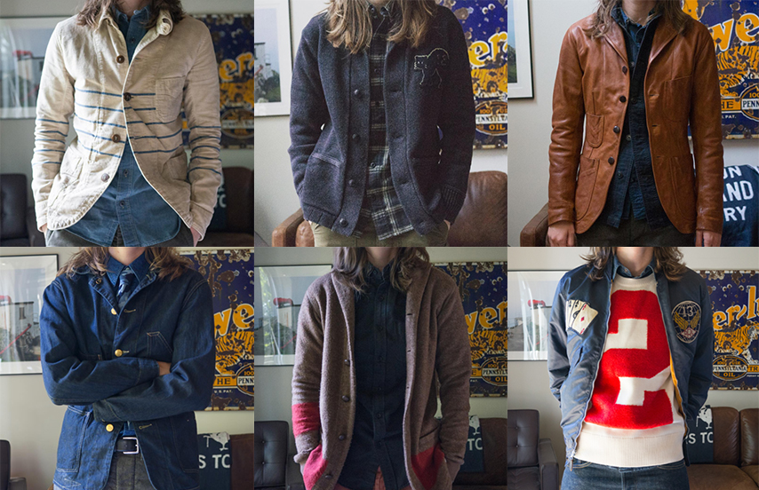
From Bethany Heck’s Instagram, the design of the everyday wardrobe.
On your Instagram, you often display your wardrobe for the day. Each post displays the concept of fashion as what it truly is—the everyday decision of everyday people. The clothing choices you highlight are insightful for how straightforward they are—simple things you enjoy for the fabric, the color. The cut. You are as knowledgeable on the brands and clothes you wear as much as you are the fonts and tools you use. Is design an inherent part of life?
I think so. Any time there are choices made by a person with the intention of servicing another person, that’s design. I enjoy the clothing I collect in large part because so much of it is historically inspired, and I can point to the exact reasons why this fabric was used, why it has this type of pocket in this location. The original design was crafted to serve a particular person in a particular industry—none of it was arbitrary.
Other people find design in other parts of their life, but even when we aren’t aware of it, it’s still there. I’m reminded of the monologue in The Devil Wears Prada where Meryl Streep’s character lectures Anne Hathaway about the lineage of the shade of blue in her sweater. While she thinks it’s just a sweater in her closet, it was actually chosen for her by leaders in fashion and the inspirations they had and the trends they set. The same goes for countless details in anything we use in our daily lives: the depth and height of the steps we climb, the level of salt in the snacks we eat, and the exact distance from the pitcher’s rubber to home plate on a baseball field. All of us are ignorant to hundreds of moments of design every single day.

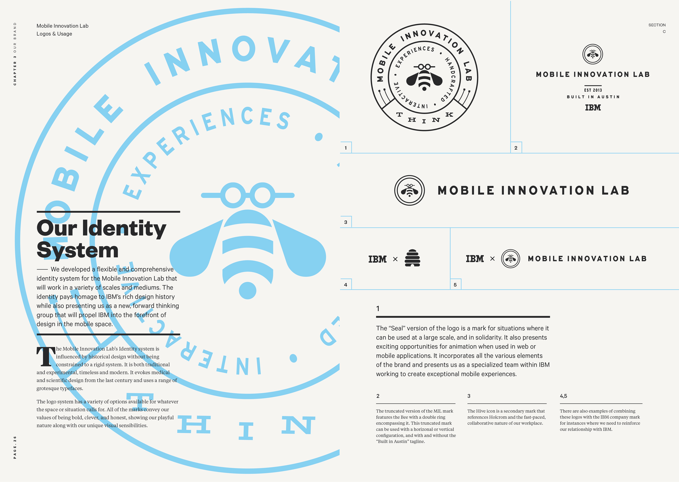
IBM Mobile Innovation Lab designed by Bethany Heck
IBM Mobile Innovation Lab designed by Bethany Heck
With logo and type design—you are creating the minutiae and overall expanse of a business. An identity is a major thing. When working with building an identity for someone’s business, is it possible to get as deep into their work as you are able to with your own on something like Eephus? Where do you start when trying to visualize something that, up unto that point, might not have much visually to start with?
Branding projects are usually something I avoid. A brand is a personal expression for the people attached and you’ll never get more subjective feedback on anything you make as a designer than you will a logo for someone else. I’d wager millions of great logos die on the cutting table every year because clients can’t get past personal hang-ups to see the objective value in the work.
I’ve never been skilled at visualizing work before I start and my best work comes when I have language to play with. This means I am not well suited for image-driven work like logo design. I’ve lucked into a few decent marks in my career but I consider it just that: luck. It takes a special type of foresight to be able to synthesize the taste of your client, have an understanding of the market they work within and be able to create a symbol that works on its own, and also anchors all the supporting material you create.
What makes a branding project a success is the application of that logo and how you control its appearance, support it with messaging, and craft the experience when someone encounters it. Brands like Nike, Apple and the like are successful because they find the right balance of driving trends while understanding their audience and adapting as they grow. You could look at 50 Nike pieces and they might all use different typefaces, colors, and imagery but you’ll know it’s Nike because of the tone of the messaging and because of the swoosh. Very few brands have done that successfully.
You mention you don’t necessarily want your design work to be recognized as yours—I keep looking through your work to act as Devil’s advocate, a way to say your work plays into your particular aesthetic, but really it all stems from the same conceit—do what is best for the project. It’s an oddly baffling idea, since the fine art / illustration world I tend to exist in it almost fights against it.
The idea that a designer shouldn’t make too much of an imprint on the content is definitely a controversial one, and I imagine it’s even more so in illustration work, where you almost need a distinct “style” to get hired, so the client knows what they are getting. The same sentiment happens in design as well and I certainly think I get fewer opportunities because I don’t have an obvious “selling point” on my work. I try to be more of a translator than a filter, I suppose? I’m not sure if that’s the right metaphor. Either way, this approach means I probably miss out on getting put in Rolodex’s because there’s no instantly identifiable trend in the work. Designers like Jon Contino or Jessica Hische can be instantly recognized by the aesthetic they’ve established, and that’s really valuable.
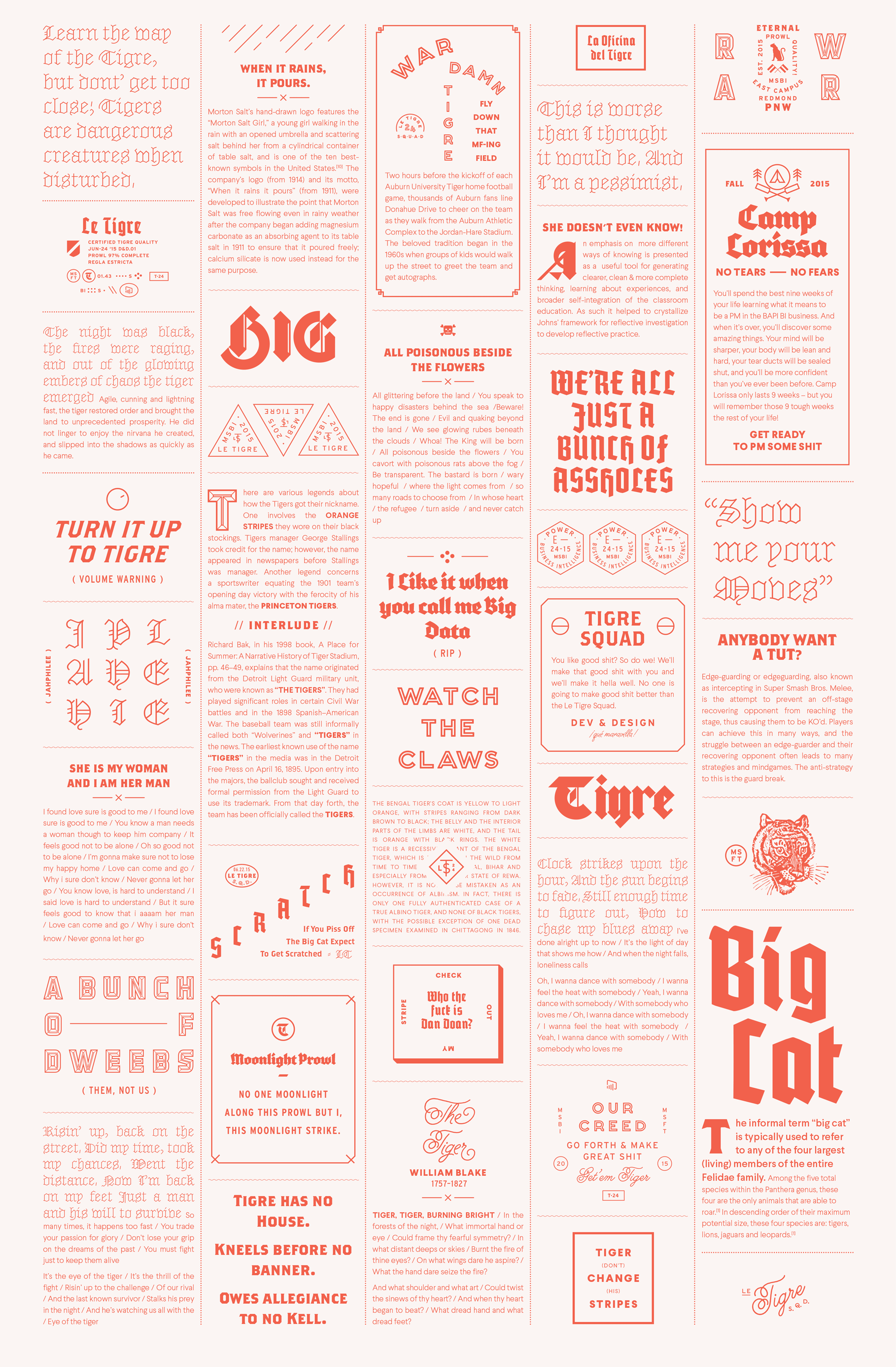
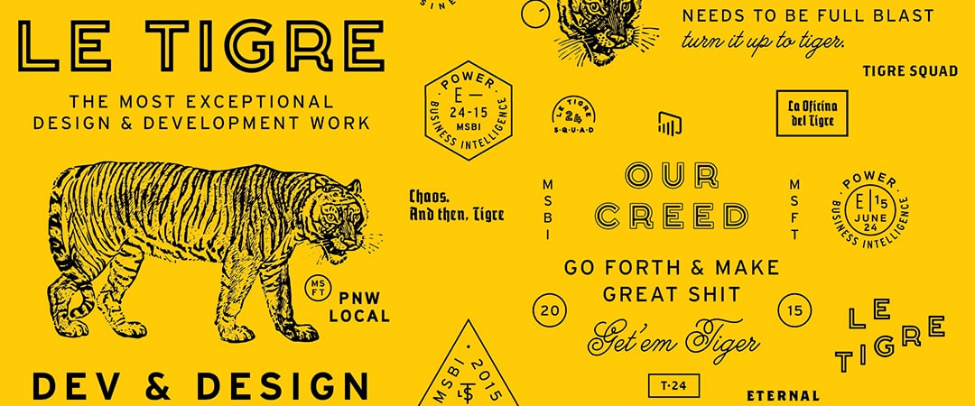
Design for the Microsoft Power BI design team Le Tigre
Your line, “Don’t design for other designers, design for your audience from your essay “The Value of Multi-Typeface Design reminds me of the feeling you get when you see illustration and design that grabs the eye because of the apparent level of difficulty and use of abundant elements or, in illustration, the photo-real quality of a drawing. Certain visuals get immediate attention, whether they are connected to the idea they represent or not. When the cover of a comic book is far better than the content inside, it doesn’t really do the book any favors. It’s not inline with the intent of the author. I recently met with some folks (an opera company) about the path their designs should take. Abstract visuals might be “cool” and can tell a story, but they don’t convey to the potential audience what the experience of being in a theater for a live performance feels like. Using photos from the performance is less attractive to some because it seems easy, not flashy at all, but it also gives the feeling of what will be seen if you attend a performance. Like promoting baseball with actual images from a game versus abstractions of bats and balls.
When you talk about covers that don’t match the art of the interior or an opera poster that uses abstract visuals, it reminds me of the “crystal goblet” concept many designers learn in type classes: the type should not be noticed, only the message. Good design should “get out of the way.”
I think there are different ways of interpreting this, and maybe sometimes an abstraction really is the best way to simplify and distill the message or experience the audience is about to consume. The great thing about design is there’s never one right way, and everything is a shade of gray.

Font Review Journal, the latest project from Bethany Heck
I was looking at your images on Dribble of your upcoming project, Font Review Journal, which feels in line with your writing on Medium and speaking engagements. There’s an almost tangible enthusiasm to your love of design and desire to engage with it and as many of the other fans and practitioners as you can. When you take on projects like the Font Review Journal, a speaking opportunity, an essay, or an interview, is it from a learning standpoint or professorial? Meaning, are you taking them on in hopes of learning as you go, or is the thrill in teaching others? Both?
Regarding your question about when I take on an outside project like writing an essay, giving a talk, etc. I think I learn from it as I also hope to help other designers grow in their careers, along the lines of the adage that “the best way to learn something is to teach someone else”. Talking in front of groups or even interacting one-on-one with individuals is not natural for me. I have an anxiety disorder and it’s really hard for me to even be in a crowd of people. Taking on these engagements helps me try to manage that aspect of myself without forcing me to ignore that it exists. I reject the idea that you have to be a Type-A, go-getting, non-stop-personal-promoter to have a great design career.
For several generations, I think designers have utterly failed in properly mentoring the next generation of designers, particularly when it comes to typography. I love speaking about type because I hope the way I’m talking about it is tangible to people no matter what their current comfort level in setting type is. I try to make clear illustrations of the points I am making, focus on both macro and micro aspects of setting type, and try my best to avoid wishy-washy terms like “horsey” which is difficult to define. There’s a strata of typographers that I think actually get off on the idea that good typography is exclusive, but I don’t fall into that camp. There’s too much stone-throwing and negativity around typography and not enough people going out and trying to help people in more useful ways than giving them useless lists of type combos that are completely divorced from any practical design use case. There’s needs to be more of a bridge between type design and the designers who use type, and while I’m certainly not a type designer, I’m trying to help in that area which is why I’m starting the Font Review Journal. I hope I can celebrate and analyze typefaces in a way that helps designers understand more about type history and why typefaces and designs they love are successful.
But as much as I hope to help other people improve their work, these things help me tremendously as well. I’ve reviewed 12 typefaces so far for the FRJ and I’ve learned so much about all of them. Whether it’s from digging into the origins of a typeface or studying the trends in how designers use them, I feel so much more connected to everything I’ve written about. I’ve had many moments of pure bliss where I stumble across something like an old license plate and think “WOW! This had to have been an inspiration for this font!” It’s been an incredible experience and I wish it’s what I could spend all day of every day doing.
![]()
