The work of Canadian illustrator Ghoulish Gary Pullin runs the gamut of what is possible within the world of illustration. He can do text-heavy layouts, crisp digital line work, or expressive hand-drawn pieces. If the job calls for various characters and chunks of text with a diverse selection of fonts, he can bring it all together without losing the overall point of the design. If the job can be achieved in one bold wordless image, he will deliver a singular illustration that will stand out and tell the story immediately. Pullin honed his craft as art director of horror magazine Rue Morgue, a perfect fit for a career-minded and monster-loving creative. Since leaving Rue Morgue in 2012, Pullin’s portfolio has ballooned with package design, apparel, logos, vinyl records, and collectible posters within the horror market.
There is no denying that Pullin is a horror illustrator but he is also a dedicated fan, understanding the nuances and wants of the audience. There is nostalgia to the world of horror collectibles, each piece connects the personal history to the characters and films fans adore, giving them something tangible to hold. Waxwork Records co-creator Kevin Bergeron explains Pullin’s place in the Waxwork catalog, “Waxwork specializes in horror, and because the owners of Waxwork grew up in the ’80s and early ’90s, we are obvious fans of the movies being released around that time. ’80s horror is just so rich with insane characters, blood, colors, and campiness. Just off the wall, out-there stuff that really made that it a special time of discovery. Gary’s art translates that vibe. He’s an expert when it comes to that era, and his art reflects the look and feel of retro horror we’ve all grown up with.”
There is reason to view Pullin as more than a niche artist, as Mondo art director Rob Jones mentions, “(Mondo) took a bit of left turn when assigning him Vertigo to see what would happen, the result was we couldn’t pick one poster of his amazing roughs and wound up producing two designs. Since the success of that assignment, we’ve been careful not pigeonhole him and offer properties to keep him interested but have a tangential relationship with his established interests.” Pullin’s recent book, Ghoulish: The Art of Gary Pullin (now in its 2nd edition) plays out his career from his childhood drawings to some of his most recent work. Pullin’s heart will always belong to the monsters, but his skill looks beyond the graveyard.


CJ: Reading through your book Ghoulish: The Art of Gary Pullin, it’s interesting to see that you started out doing traditional design work – layout and package design. Those elements are still very much a part of what you do, especially when it comes to the design of soundtrack packaging. For Rue Morgue you definitely had a lot of information to include on each cover outside of also creating the illustration. For a soundtrack like C.H.U.D. the art carries more weight than the fine print of credits, etc. Do you have any rules you follow when working with text that is vital to the reader?
GP: I do have a basic set of unconscious rules for how I use typography. Most of the time I don’t even realize I am doing them but when I am working I am constantly thinking of these things. First, does the type evoke the era I want to capture? The font size, placement, kerning, colour treatment, relative size to other design elements all have to be considered. Sometimes I create my own type if I can’t find something that works, but the end result is worth it. Be conscious of where the text falls, it should complement the cover not overwhelm it. If it is a magazine, consider how the page will bend and create shadows. Once you have your title, consider the size, colours, and placement of the other text elements in relation to the design. Your text should create a visual hierarchy of content on the page, which is something you see in old classified ads in comic books or monster magazines.
My Monster Squad vinyl record is an homage to those advertisements. I love creating artwork that is heavy on typography with a few illustrations. It means you have to do a lot of research to create fun little facts about the film, but it is a lot of fun learning those facts and incorporating easter eggs into the packaging. For some designs such as C.H.U.D., the artwork is obviously the focus. You could remove the typography and fans will still know the movie. If a client wants something like that, then the typography is typically muted and compliments the main illustration with the title being the exception. Either types of designs can work, but it really comes down to a client preference for what direction they want to take for the title.
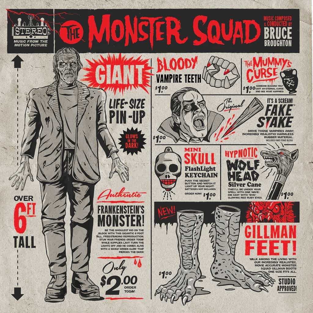
‘Monster Squad’ Vinyl Soundtrack illustration by Gary Pullin
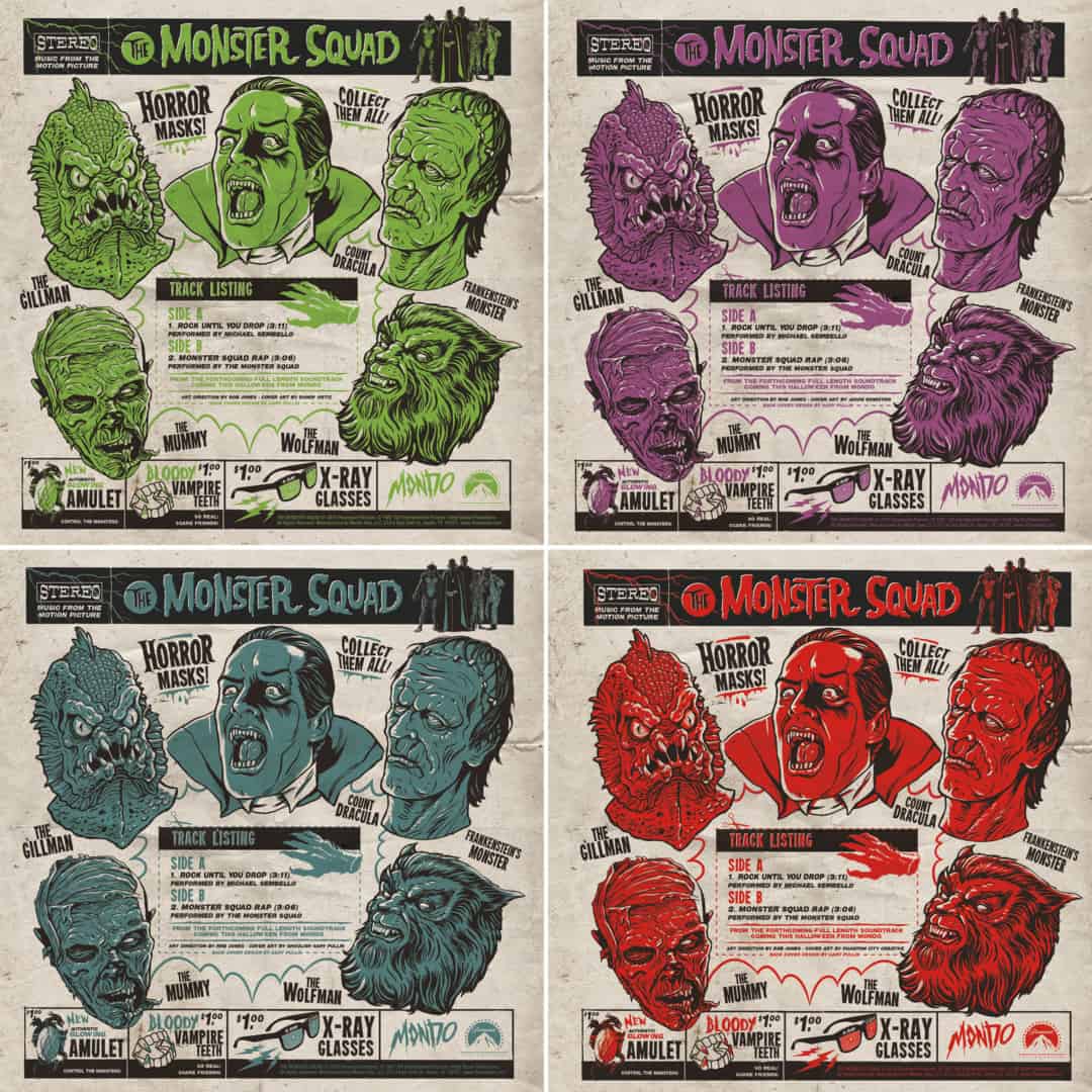
‘Monster Squad’ 7″ Vinyl illustrations by Gary Pullin
In your book, you briefly discuss client involvement on projects. Does it make a job easier if the client is involved, or is being left alone your preference?
I find working with the client makes things easier, especially when they have a vision of what they’re looking to achieve. In general, I love working with passionate people who have fresh ideas. Sometimes a client will need certain elements to be incorporated into the design, I’ll take those notes, combine them with my ideas and see where that takes us. Once we land on a sketch and a direction, I like going off to work on making it a reality. I’ll show some process screenshots, gather feedback and then do another round or two until it’s finished.
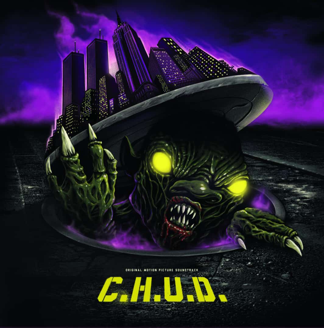
‘C.H.U.D.’ illustration for Waxwork Records by Gary Pullin
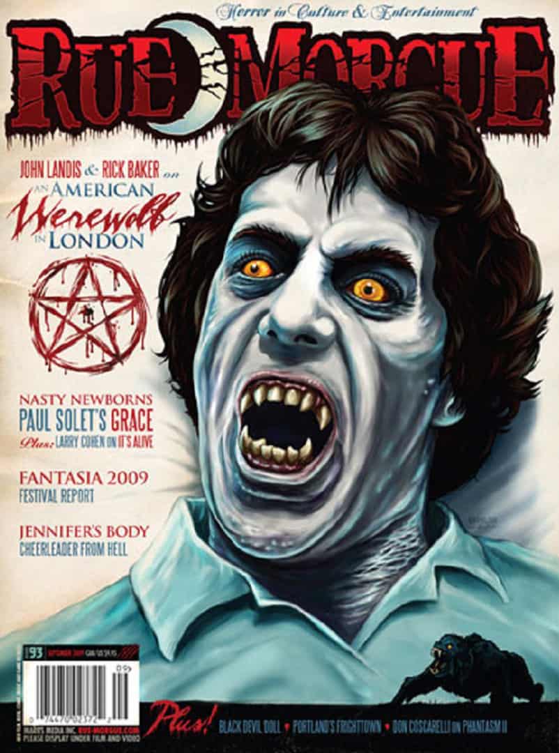
Rue Morgue #93 cover by Gary Pullin featuring the Ghoulish font in the title
‘Ghoulish,’ the font you created has found a life outside of your own work. Was this font born from your time at Rue Morgue? Is creating fonts something that you have on your ‘to-do’ list, or was it a one-time thing?
The font Ghoulish was borne from some title treatments I created when I was at Rue Morgue. An artist and friend of mine, Chad Savage at www.sinisterfonts.com designed some of his own fonts and offered to make my text treatments a working font. It was always meant to be a free font and it’s really fun to see it take on a life of its own out in the wild. Rob Zombie used it on his pinball machine, I’ve seen it on Kid Robot’s packaging and in the background on an episode Brooklyn 99. The latest spotting was in Hotel Transylvania 3 when Dracula takes a swig of Ghoul Cola and there it was on the can!

‘A Nightmare on Elm Street’ pencil sketch by Gary Pullin

‘Scream’ by Gary Pullin
I love seeing the early sketches for your work. In the book, you have an unused concept for A Nightmare on Elm Street focused on the heroine, Nancy Thompson. Even in sketch form it was a beautiful piece, but also didn’t highlight Freddy as the final did. Is that a concept you’d revisit? Do monsters/villains always trump the hero/heroine in horror?
That sketch of Nancy is a personal favourite as well, but since we were not permitted to use Heather Langenkamp’s likeness it probably won’t be revisited. However, that is not to say that the hero or heroine can’t trump the monsters when it comes to movie images. For example, the many posters that feature Ripley in Alien, Ash from the Evil Dead or even my SCREAM with Drew Barrymore. In some cases, you do not need to have the villain at all. For example, Laurent Durieux’s Jaws poster which is a peaceful scene with the small fin, it’s subtle but deadly. Although I really do love drawing a good villain.
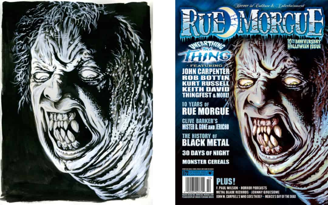
‘The Thing’ sketch (L) and final (R) for Rue Morgue #72 by Gary Pullin
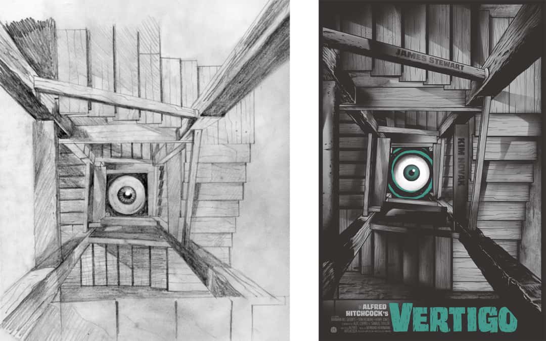
‘Vertigo’ sketch (L) and final (R) for Mondo by Gary Pullin
Some of your sketches are pencil and others look to be digital, and others look like a combination of both. Your final illustration can go the same way, like your Rue Morgue The Thing cover for the 2007 issue #72. Do you change your materials based on how much time you have?
While time may have a factor in the materials I choose, the subject matter and style will often dictate how much time I spend in the pencil/sketch phase. While I typically finish all my art on a Cintiq tablet, I often start many of my pieces as pencil sketches, completing multiple thumbnails as I am watching a film or listening to a soundtrack. Those are refined and sent to the client for direction. Sometimes if I really like the way a sketch is evolving, I will tighten it up and ink them, like I did for The Thing. In the end they are scanned and then finished on the computer. I do my own colour separations, so I keep the production end of things in mind when creating artwork. I find it’s easier to make corrections or alterations when working digitally. Sometimes I’ll do the occasional original drawing for an art show or to sell at conventions. It’s good to feel the paper on the pen and it keeps my muscle memory strong.
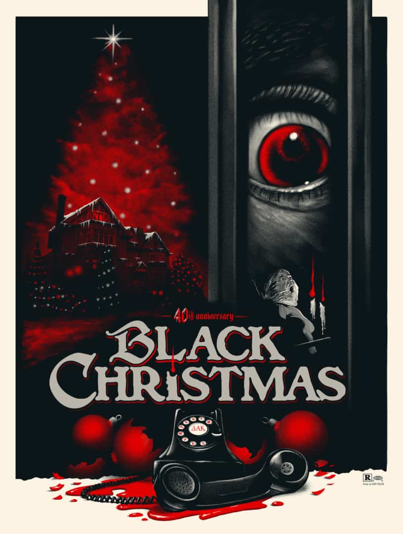
‘Black Christmas’ by Gary Pullin
Your digital work has a very soft quality to it like it was shaded with pencil. In your Black Christmas illustration, the eye in the door looks almost drawn in charcoal. You have an extensive history with practical tools, are you mimicking pencil/paint in Photoshop or scanning in hand drawings to color?
I’m happy to hear that you think it looks traditional because I go to great lengths to make it look that way. It takes a while to find the right custom brush set in Photoshop that works for your style, but I recommend Kyle’s Brushes for Photoshop. l don’t use filters or too many digital tricks as I want it to look as organic as possible. I toggle between a few favourite brushes that have a pencil, ink or painterly quality to them.
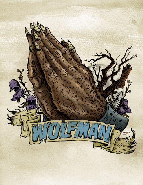
‘Pray For The Wolfman’ by Gary Pullin for his solo exhibit ‘I Remember Halloween’
How did your 2008 show I Remember Halloween come about? It’s credited to Rue Morgue. Did they approach you about doing a solo show? Was this your first time showing your work in a gallery setting?
I Remember Halloween, named as an homage to The Misfits, was my first art show and it was a great experience. The art show was my idea but was co-sponsored by Rue Morgue. At the time I was producing a lot of new work that I wanted to exhibit outside of my role as Art Director. The underlying theme of the show was that Monsters are my religion, so I used a lot of Christian iconography but with my own Halloween spin. This resulted in my Monster Praying Hands series that is still popular to this day. I have been knocking around some ideas for a new art show so hopefully, I’ll get the opportunity to do something like that again.
‘Creature from the Black Lagoon’ by Gary Pullin
Your first cover for Rue Morgue features The Creature from the Black Lagoon, in a style-wise nod to the great Basil Gogos. In 2018 you did a Mondo poster for The Creature from the Black Lagoon that is vastly different than your Rue Morgue cover. 17 years separate the two illustrations and it’s incredible to look at them both and see two entirely different takes on the same character by the same artist, and both are successful. There’s the element of time that separates them as well as the nature of a magazine cover versus a collectible poster. With a career over a decade long, are you looking at your older work to see what you’ve done right, what could have been better?
That is a tough question since I tend to not go back and judge work that old against my current standard. The Creature Rue Morgue cover is great for what it was at that point in my career and skill set. I will look back at my work and think about what I would do differently, not necessarily better, and I think most artists will assess their work. The Mondo poster was a way for me to capture the spirit of the film, something that I love just as much now as I did then, but to do so in a way that highlights my current style and skill level. I feel very lucky to have had the opportunity to revisit it, my love for the movie hasn’t wavered.
Where was your head at for the Rue Morgue cover versus where it was at for the Mondo release?
When I created the Rue Morgue cover, I was heavily influenced by the graphic gig poster art from the ’90s and a lot of what I did reflected that style. I was thrilled to revisit The Creature for Mondo and create an official poster. The poster started off as a pencil illustration in 2013 that I created for their Universal Monsters art show that they loved and asked if I could make it into a movie poster. I have to say I was quite happy with the end result. Frank Darabont bought my original Creature piece at the Mondo Gallery.
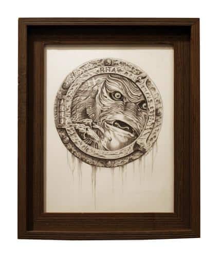
‘Creature from the Black Lagoon’ drawing from Mondo’s Universal Monsters show by Gary Pullin
Your Creature poster for Mondo has so much going on and hits all the right points — it feels like the film and gives off the sense of great sci-fi/horror fun that the film has. From my perspective, it’s the perfect Creature poster. Have you ever completed a job and quit, thinking that you hadn’t nailed it?
No, I’ll have my concept down before I move into onto final art but occasionally it happens where I’ll have an idea that sounded great in my head but on paper, it didn’t quite work out. I’ll just move onto the next idea or keep thinking until something exciting comes along. I’ve got a few sketches for films lying around that I feel I haven’t gotten the right concept for yet.
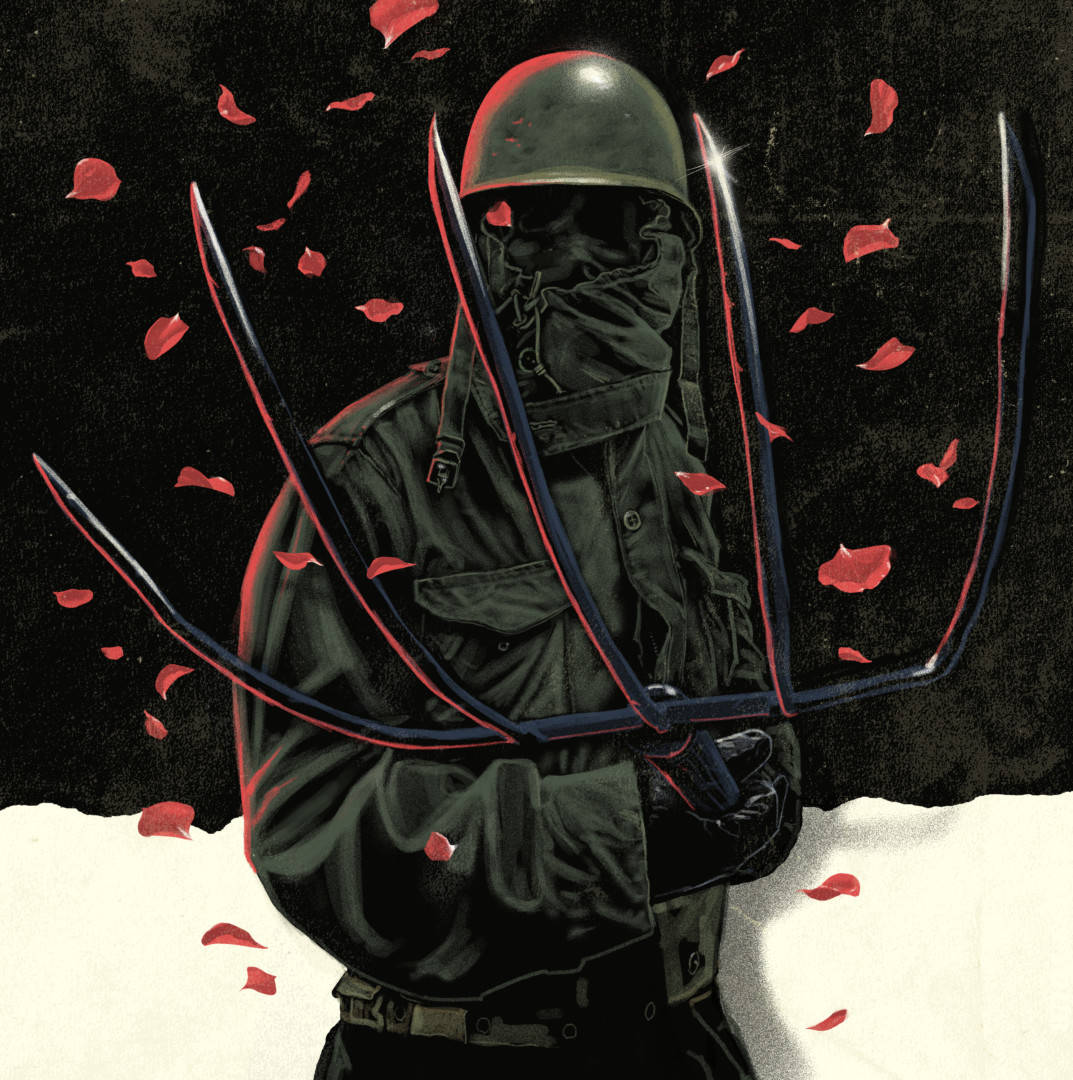
‘The Prowler’ by Gary Pullin
Before you accept a job on a poster are you taking into account your own emotional response to the property? Is it mostly based on your availability?
When it comes to older movie titles, I typically need a “punch in the gut” feeling of excitement for me to spend the kind of time and effort I’ll be putting into a project. If that excitement is there, I’ll do my best to make it happen. I’ve turned down certain titles because I may not feel I can bring something new to the table or it may be a film that hasn’t quite resonated with me. For newer titles, I am a bit more open and will work those in based on my availability.
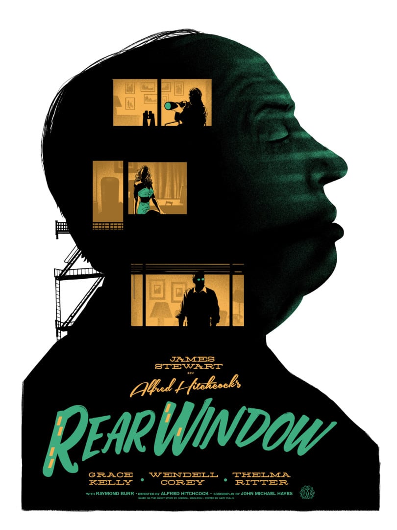
‘Rear Window’ by Gary Pullin
(Mondo art director) Rob Jones mentioned that one of your strengths is the ability to apply his notes and those of the client with accuracy to deliver a better product. What is your process for applying client notes to your next draft?
On your end, how vital is an astute creative director to you?
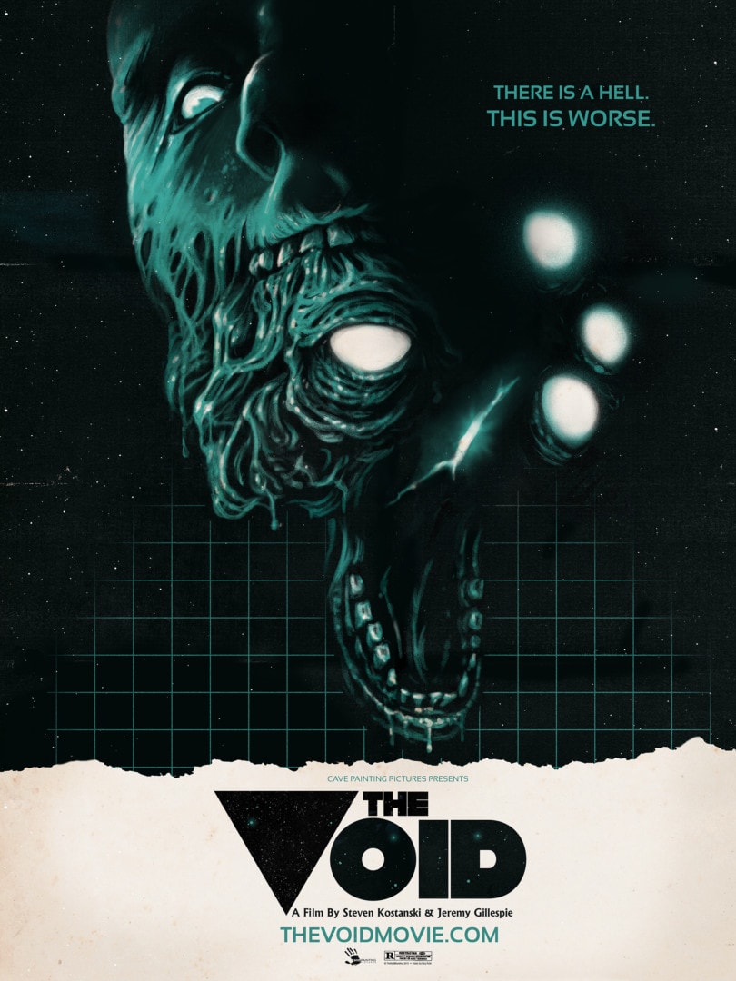
‘The Void’ by Gary Pullin
You created the poster for the horror film The Void while it was still in production. In a scenario like that, is the client showing you production stills or set designs?
We don’t often get to see the film and sometimes we don’t even get to see stills or set designs. When The Void became official, Steven Kostanski and the producers asked me, Justin Erickson and Graham Humphreys to each create a special poster for their Kickstarter campaign. There wasn’t any film yet, so they sent us exclusive photos of their creatures and I had the opportunity to visit their FX shop and see the monsters up close. The amount of work on a creature for what appears for only seconds on-screen is impressive. The filmmakers wanted me to do something you would see on a 1980s horror sci-fi cover, so I went from there.
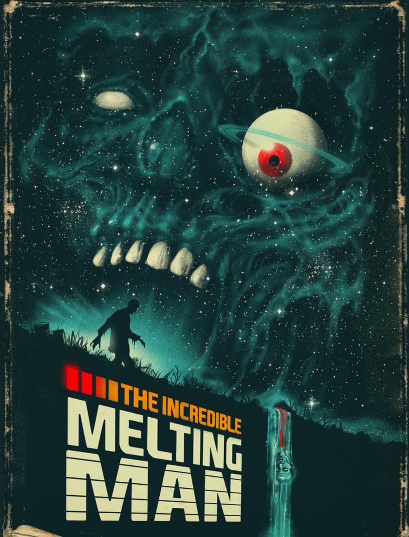
‘The Incredible Melting Man’ by Gary Pullin
Your illustration for The Incredible Melting Man is a gorgeous piece of work. I love the rough paper border you used. Subtle, yet visible. You give certain films a vintage ‘80s VHS box art vibe – The Editor, The Void, and Contamination come to mind. I haven’t seen those films to know if they are visually linked to the ‘80s style of horror film, but nostalgia does play a major role in horror and also to poster collectors. Using the classic VHS box art style is a smart way to bridge a new film to the past, a way of saying “if you like ‘80s horror, you will like this too.” How do you mentally balance the fanbase’s desire for nostalgia with doing something new?
When I’m creating artwork for something with a strong fan base, I try and focus on an element or two that may hit home to fans of these films. If I get excited about a design, then hopefully there are others that feel the same way. It all stems from growing up in that golden era of horror on home video, horror magazines, and metal music.
I still feel like I am doing something new even if the style I choose is something that has an 80s nostalgia to it. I like to create artwork that jumps off the shelf and grabs your attention during that time when going to rent a movie was a mini-event. The artwork on the covers were completely mesmerizing with their colourful illustrations. When I had the opportunity to create the cover for Issue #4 of MAD Magazine I was hyper-aware of trying to balance the nostalgia factor with Alfred E. Neuman and giving him my own twist. I try to get in the mindset of what would a die-hard fan want to see that maybe hasn’t been done before or to try to create an image with one foot in nostalgia and one foot in a new direction. It is the best compliment when die-hard fans of any film say the artwork made them want to watch the film again.
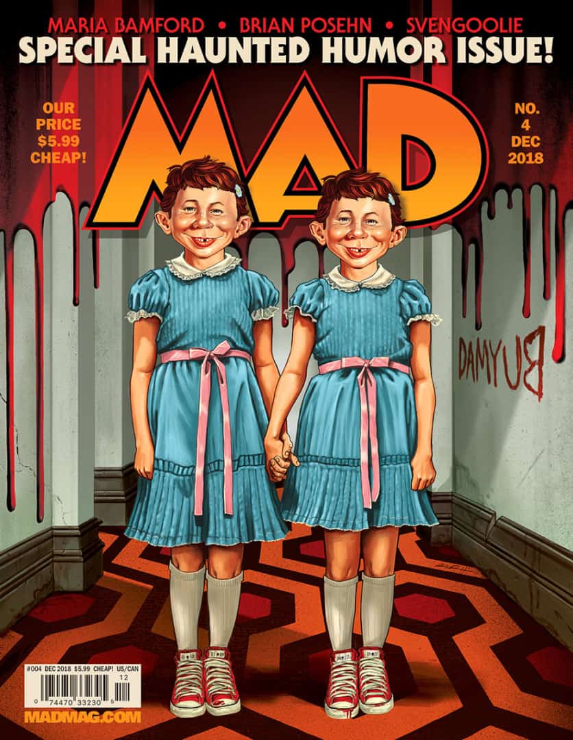
Mad Magazine Issue #4 cover by Gary Pullin
‘The Thing’ by Gary Pullin
I love your poster for ‘The Thing.’ It totally shows it for the weird alien science-fiction film it is at the start. Like ‘Halloween’ and ‘Friday the 13th,’ there are plenty of posters for ‘The Thing,’ yet you found a new way of exploring John Carpenter’s classic film. With no actual monster shown, was this a tough sell to the client?
Arrow Films actually loved the concept early on so it was not a hard sell. I’m a big John Carpenter fan so this title was near and dear to me. I didn’t feel the need to show Kurt Russell or any of the creatures, l wanted to really focus on atmosphere and play up that it’s a terrifying science fiction film.
How much thought do you give to making your illustrations a “Gary Pullin” illustration? I know you as a humble man, but curious to know if you want the art you put out into the world to carry your mark somehow?
That’s a tough question. I’m a product of films and rock music from the 1970s and 1980s, so there’s a natural lean towards the visual language and tropes from those particular decades. I think every artist wants to leave their mark somehow. Ultimately, I’m just trying to conceptualize films or music with original ideas that I hope resonates with clients and fans. I love finding the atmosphere and suspense in films and music. I like telling my own stories within a film’s narrative and figuring out how can I boil that down into a compelling image that will resonate with the audience or make them see the film in a different way.
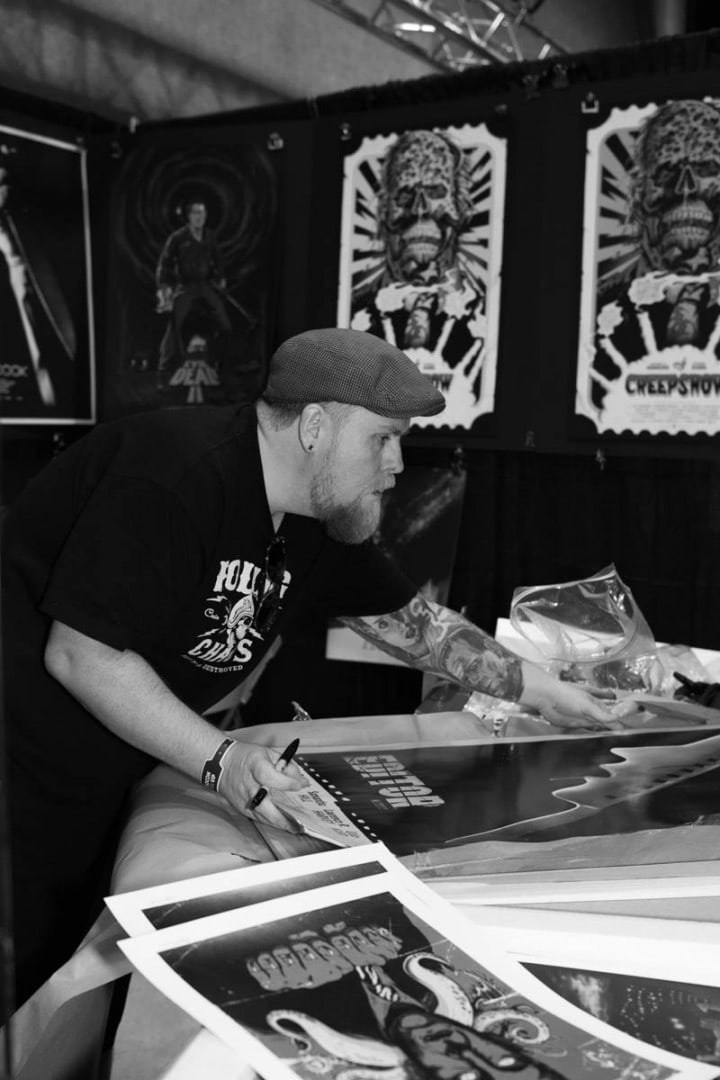
Gary Pullin setting up his booth at the MondoCon 2015 | photo by Holly Burnham
The world of horror fandom is quite tight. For someone not in that world, it can be an almost invisible subculture. You’ve had booths at horror conventions for some years now – are you seeing a lot of the same fans and artists? How vital is it to be visible to collectors, clients, and also new work opportunities? Are you on the lookout for new properties to work with?
The horror community might be small compared to other fandoms, but it has not stopped growing. I have seen some of the same fans, now friends, at conventions for over a decade and now their children, who grew up loving horror, are bringing their friends.
Conventions are certainly an important aspect of my business because it is vital to be exhibiting and like you said, visible as much as possible. I find more and more people are being introduced to and enjoying horror. With movies like Get Out, and A Quiet Place, it is no longer the red-headed stepchild of cinema. Also, conventions are a lot of fun to attend. It’s my job to get my artwork in front of as many film fans as possible and to be on the lookout for new opportunities. Conventions are a great place to do that and meet like-minded folks.
This article was originally published by HOW Design
