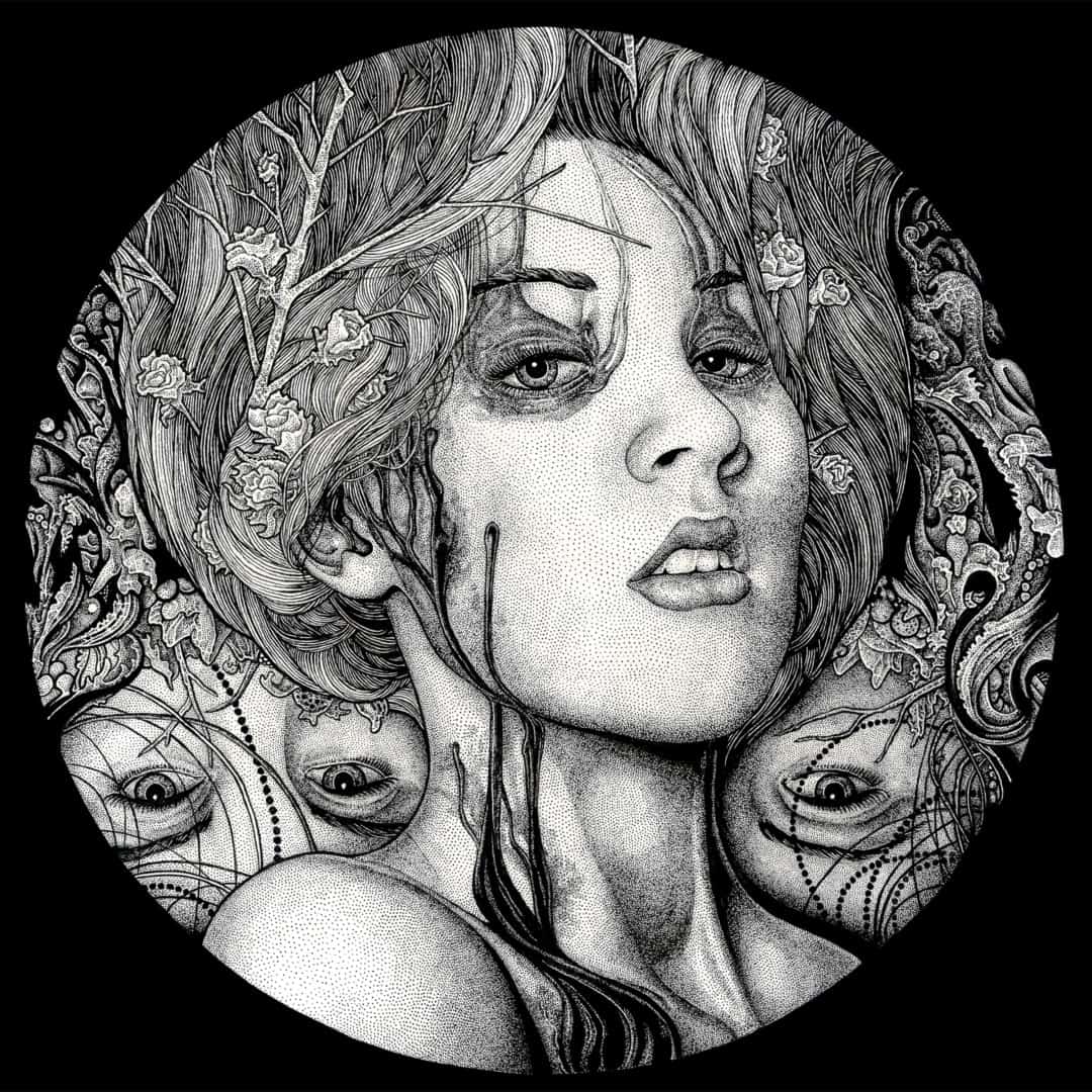
The shades of gray in Neal Russler‘s drawings trick the eye — those washes are minuscule dots. That smattering of blood and mucus on the woman’s face is simply a collection of pen marks compressed, a constellation in miniature. The paper bright and infinite with his precise penwork making each face a galaxy of the beautiful and the grotesque. Calling his skill a ‘trick’ betrays the depth of Russler’s penchant for exactness and level of patience. With his art being something he does outside of his regular job, it is incredible any of it exists at all.
There’s a gentleness to each drawing. Whether drafting the hardened shell of a crab or the bulked muscle of a shark, there’s a tactile sense that each of these surfaces has their natural give. A finger could find the dampness. The scaled outer flesh of a dinosaur. It’s this that makes his beasts frightening and his women gorgeous. His pen work renders the life exact, placing the living thing on a piece of paper.


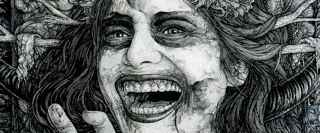
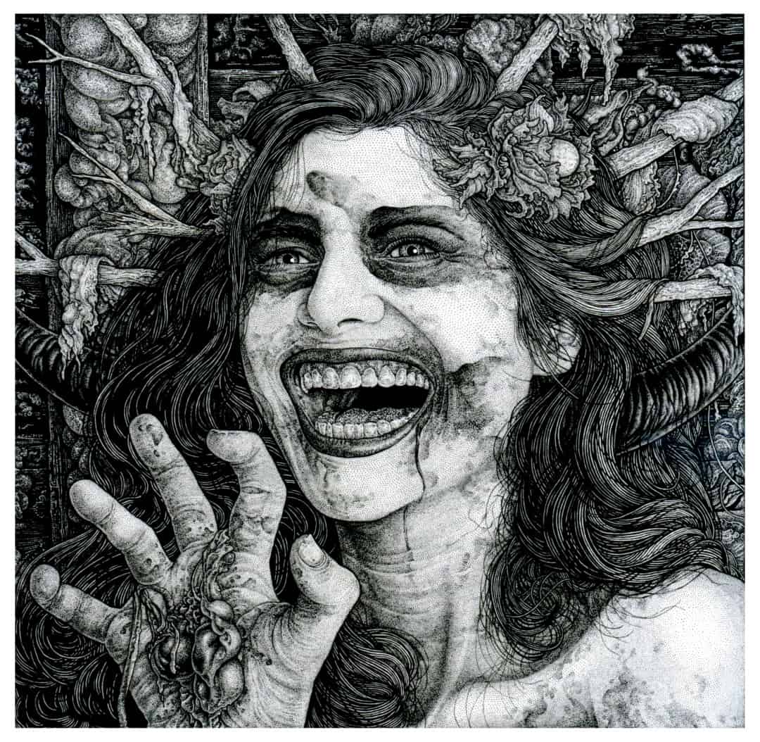
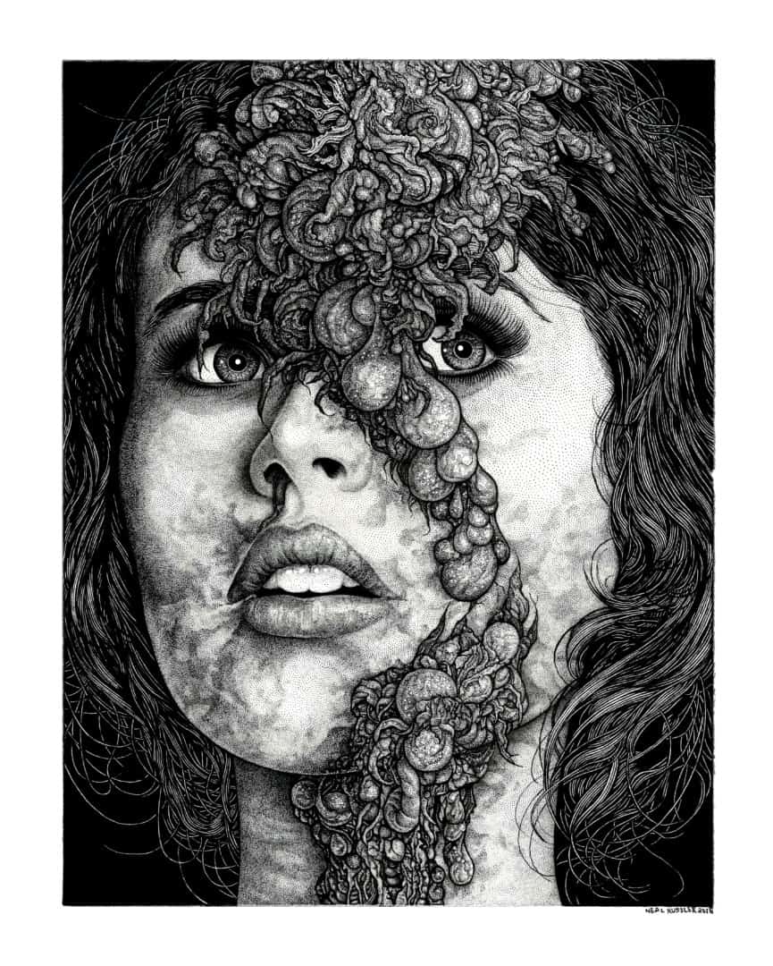
‘Let The Devil In’ by Neal Russler
CJ: What’s your day job? Is it related to your art in any way?
NR: My full-time day job is managing a coffee roastery (Frothy Monkey Roasting Co.) in Nashville, TN. I have to dedicate most of my time during the week to pay the bills by roasting and distributing coffee, so I can usually only find time for my art on the weekends. But, the trade-off is that I’m usually pretty caffeinated. It’s not directly related to my art, but I’ve been able to illustrate a few coffee bag labels, and that’s been fun.
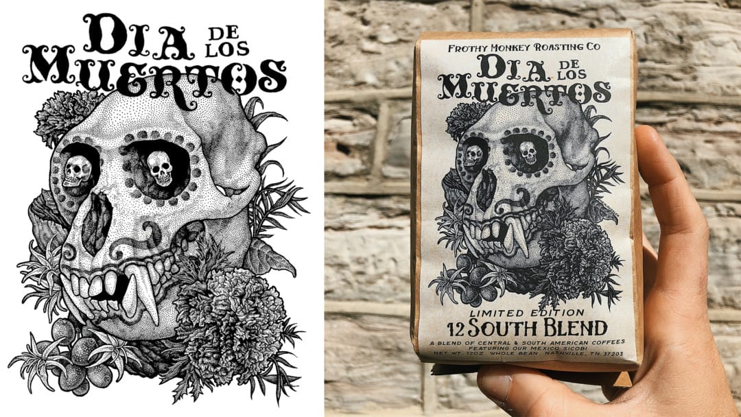
Packaging artwork for the Dia Los Muertos blend by Neal Russler for Frothy Monkey Roasting Co.
Do you have to fight to be able to do that, or are they asking you to help with the labels?
They definitely want me to do it as much as I can, and I get paid just like a normal commission. Problem is just carving out the time to draw them. I wish I could do more of them! That ‘Dia de los Muertos’ one turned out pretty nicely, I think.
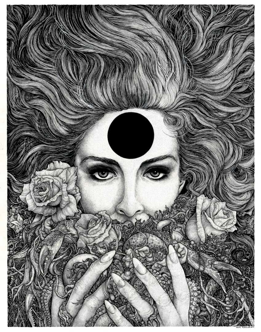
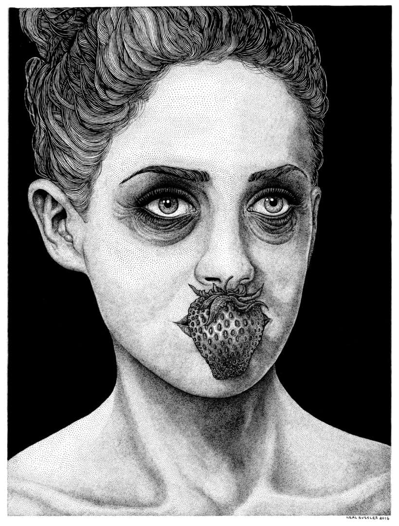
‘Feast’ by Neal Russler
It’s a bit difficult to find much information on you as an artist. Your blog Russler Art Works stopped being updated in 2013, with all signs pointing to the Sea Hag Press site as the new home of your art, but that site disappeared shortly after. There’s no real place to find your art outside of your personal Instagram.
Yeah, there are really two reasons I’ve stayed somewhat ‘reclusive.’ I guess you could say: the first is, for the most part, all of my art from 10 years ago is pretty amateurish and ungainly. I’m not overly proud of my early illustrations, so I guess I just abandoned them to the void of the internet and stopped updating those old sites of mine. So, I certainly thought that I should forget and ignore those early drawings. And, secondly, I’m a profound procrastinator. I’ve been meaning to create a new website for myself for years, but instead, I just post to Instagram and update my Big Cartel when I have new prints to sell.
Where does your art sit within your mind – is it something you do on the side, to forget and ignore?
My art certainly is something that I ‘do on the side’ right now, but only because I haven’t figured out how to draw fast enough to make art that can support me financially. I guess I need to quit procrastinating so damned much.
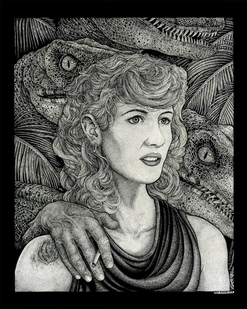
‘Woman Inherits the Earth’ by Neal Russler from Mondo’s Jurassic Park exhibit ‘When Dinosaurs Ruled the Earth’
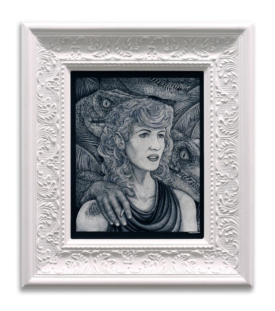
‘Woman Inherits the Earth’ by Neal Russler from Mondo’s Jurassic Park exhibit ‘When Dinosaurs Ruled the Earth’
Having seen only a few of your pieces in person there is something to them that cannot be reproduced properly, by scan or print. Whether it’s from the compact nature of your line work or the brightness of the paper, your work has a glow to it. Do you have a preference for how your work is seen – original, giclee, screenprint? Does the end product change how you work?
For sure, the end product changes how I work. If I know I’m working on a project that will eventually become a screenprint, I’ll need to spare some of the minuscule details in my ink work because I know that even a high-res scan isn’t going to recreate that level of detail.
I can still get pretty damned good scans and reproductions, both screenprint and giclee, but I think I’d always prefer someone to see my original pieces, which is easier said than done. I don’t really have a huge volume of work out there or anything.
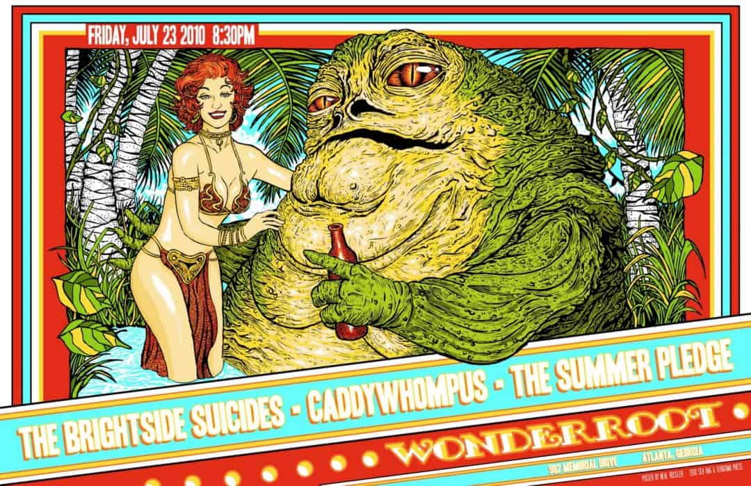
Gig poster (2010) by Neal Russler
Your Russler Art Works site has drawings going back to 2009 and beyond, where a totally different style is evident. You worked in simple line work and digital color. Is the stippling a new avenue, relatively speaking, for your art?
Ah man, no, I’ve been doing the stippling thing since high school. I think that, 10 years ago, I wanted to be like Tyler Stout and make movie posters that looked like his, and I went down a weird alley of changing up my style to emulate guys that were doing that early Mondo stuff.
Somewhere along the way, I realized that that wasn’t working for me, and I fell back into my love of pen and ink. Fell hard, too. I got way more meticulous and myopic about it.
Did you pick up any tricks during your stint trying to be like Tyler Stout? Was it a valuable experiment?
It was for sure valuable. I learned how to digitally manipulate my inks and how to make finished print-ready poster files. It also helped me realize that, no matter how much I adore someone else’s style and work, it’s not great to try and imitate them. I needed to find my own voice, as dumb as that is to say. Tyler’s one of my favorite artists, but man, I just had to go my own way.
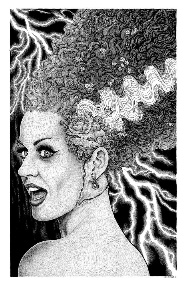
‘The Bride’ by Neal Russler
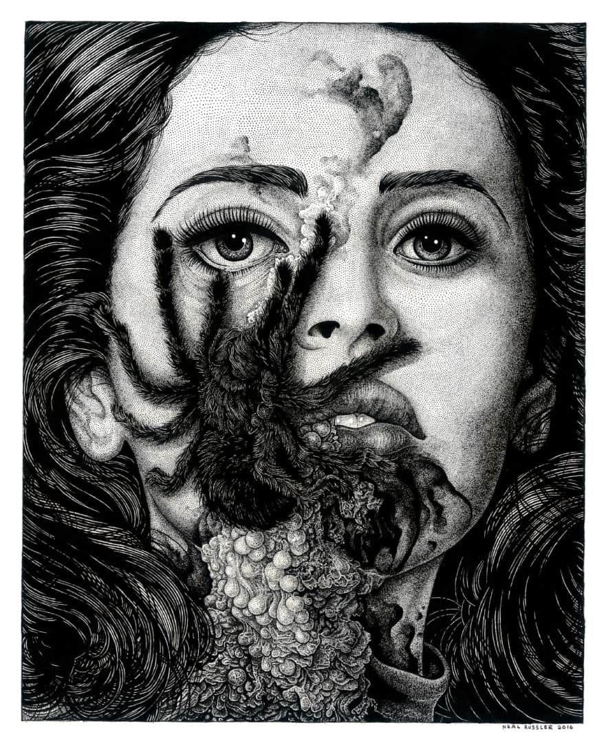
‘Our Lady’ by Neal Russler
Your piece ‘Our Lady’ is wonderfully grotesque – beyond the organs and blood, there are the blotches on her skin that are just phenomenal. Your work is so perfect, each dot in line with the next, seeing these physical distortions feel even more real. Are those discolorations finger smudges? Are you open to using methods outside of straightforward pen and ink?
No, that’s all individual pen points, crammed together to create different tones and get that ‘filth smeared on skin’ look. I never want to smudge the ink on the paper; I guess I feel like that’s cheating in some way.
I think I’m a traditionalist when it comes to inking that way; I doubt you’ll ever see me do an ink wash or use gouache, partly because I’m an idiot and don’t know how to use those or any other methods, and partly because I’m cripplingly loyal to the pen. I only ever want to use line and dot techniques. I’m self-taught and have never been formally educated about any of this. I’m learning as I go, so I’m taking a lot of cues from folks I adore like Virgil Finlay and Richey Beckett.
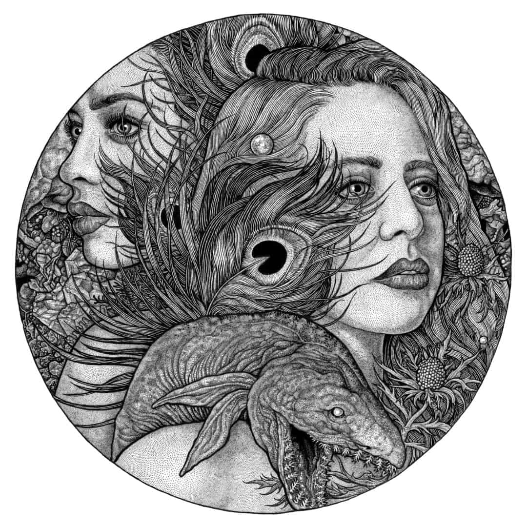
‘Women With Weird Fish’ by Neal Russler
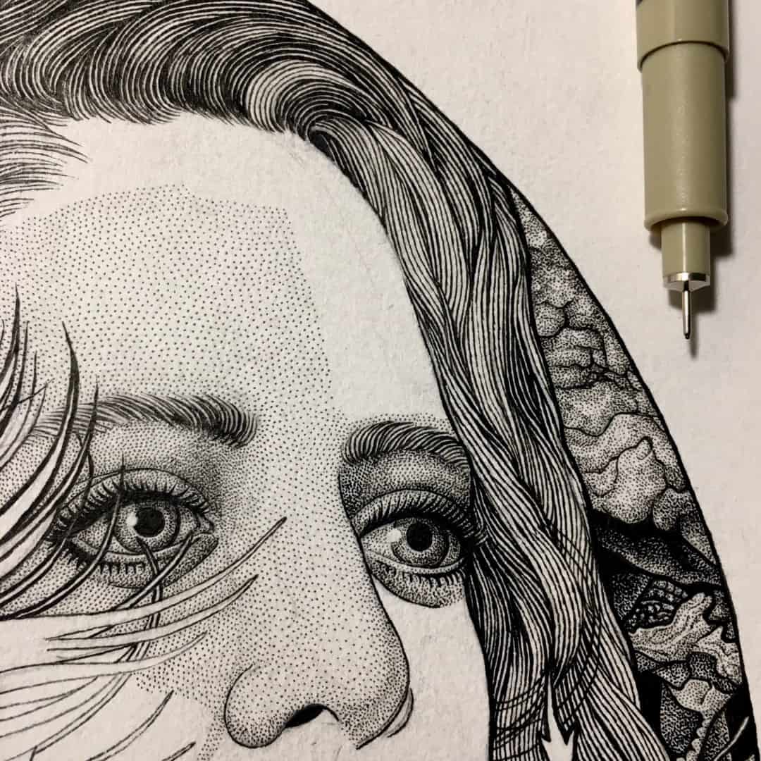
Process detail of ‘Women With Weird Fish’ by Neal Russler
So each mark a series of dots? Are you using a spontaneous method of applying the ink or is each mark deliberate?
It’s all deliberate. I won’t say that I have every section of a piece completely mapped out when I begin, because I do like to have a drawing evolve over the long course of time when I’m inking it, but when it comes to determining how much light and shadow I want to produce by placing dots or lines closer together or further apart, it’s completely calculated, almost painstakingly so.
Do you have every section of a drawing planned out before starting?
I always sketch out the majority of a piece (I’d say 80% of it) in pencil, based on various reference material, and then I start inking directly on top of my pencils, using Microns, mostly. I mainly use 100 lb. mixed media paper, because I find it more forgiving than Bristol.
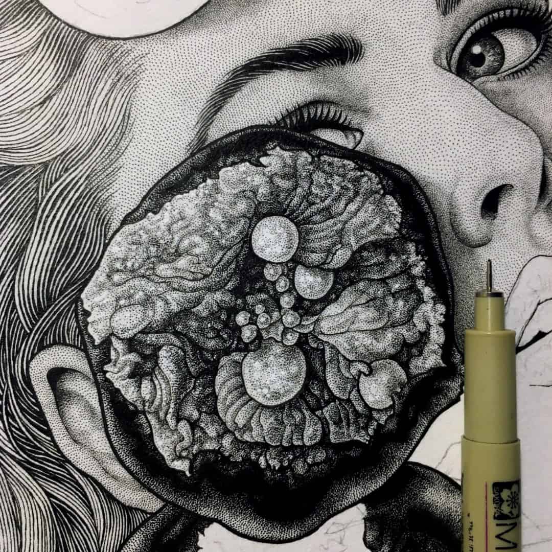
Process detail by Neal Russler
‘Baby Don’t Look Down 2’ by Neal Russler
‘Consumption’ by Neal Russler
From following you and your work, it’s pretty clear you are a huge fan of horror and you interact with it in a fun and playful way. There is nothing serious about horror through the focused lens of what you share online, personal or art wise. You combine the terrifying with the hilarious with care – like a Doré mixed with Robert Crumb. Even the women you draw, no matter how beautiful, are marked in horrific ways. What attracts you to the horror genre?
Man, I’ve just always been really into horror, since I was a kid. My folks never really put any restrictions on what I wanted to watch (like ‘The Shining’ when I was nine), and I think I learned to separate ‘horror movies’ and ‘real horror’ at a very early age. There was a clear disconnect for me between the two, and I was able to not take all those gory, schlocky movies too seriously, whilst still respecting the very real horrors of the actual world.
It just always made sense that scary shit would play a part in my art and expression; I like being shocked and excited and repulsed, and I want people who look at my work to feel the same way. It’s hugely gratifying for me to spend months drawing a woman’s face perfectly and then throwing a bunch of feces and spiders on it.
‘Storm’ by Neal Russler
You’ve done one poster for Mondo, ‘Storm,’ plus a handful of originals for their themed shows. You also did an incredible poster for the ‘The Fog’ that was commissioned by a group of collectors. Are pop culture posters something you’re looking to do more of?
That’s the dream, right there. If I had the time, freedom and resources to draw movie posters full-time, I’d be the happiest boy in America. I really just need to get faster in my process.
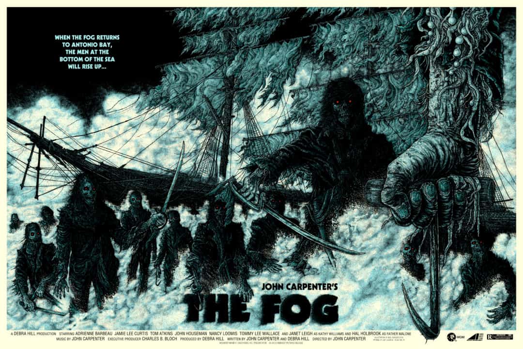
‘The Fog’ by Neal Russler
‘The Fog’ is the largest piece you’ve done. I’m guessing you didn’t draw it 36” x 24”? Did you have a good idea of how it would look that size?
That was the largest piece I’d done up to that point, and still probably the biggest to this day. No, I didn’t draw it quite at 36” x 24.” The original inks for ‘The Fog‘ were somewhere around 20” x 16”, I think. I knew I’d want to draw it pretty big, since those details were going to need to be crisp on the enlargement.

‘See How Mine Float’ by Neal Russler
‘King Boglin’ by Neal Russler
The dudes at Sanctum (Tattoos and Comics) in Birmingham, AL are rad as hell, and I jumped at the chance to do a stint at their wonderful shop when they reached out to me. They’ve had some absolutely incredible shows each month in 2018, and I’m so pumped about what they’re doing. Birmingham’s art scene is badass. All that to say, I’m bad about seeking out galleries to showcase my art, because I’m bashful as well as a procrastinator, but I’m always game for showing my work in public.
‘This Would’ve Happened To You No Matter What’ by Neal Russler
‘Astride The Gnashing Maw’ by Neal Russler
With a day job, how are you organizing your time to work on new pieces? Are you working towards a transition to be a working illustrator, or are you more focused on your current job?
I’m drawing at night and on the weekends, but I could always use more time to draw. I just got engaged last weekend, and they say planning a wedding is pretty expensive, so I don’t need to quit my day job just yet. Ultimately, I’d love to transition to a full-time illustrator. I love my job in specialty coffee, and it certainly pays my bills more than my art career, but being a professional artist is always my dream. I guess the first step is getting a new website, huh?
