The work of JJ Harrison exists in the pages of a comic book — an illustrated children’s paperback. Harrison is at play in the universe of characters that roam through your television via Cartoon Network, drawing the worlds of Clarence, Adventure Time, Regular Show amongst others. Harrison’s role requires him to understand the intent of characters created by other artists and render them accurately, true to the creator and also to his own style. In Harrison’s hands, Finn and Jake of Adventure Time gain a warm painterly touch. The chaotic youth of Clarence retain their bubblegum and grease, that blur of chaos captured perfectly into panels of a comic.
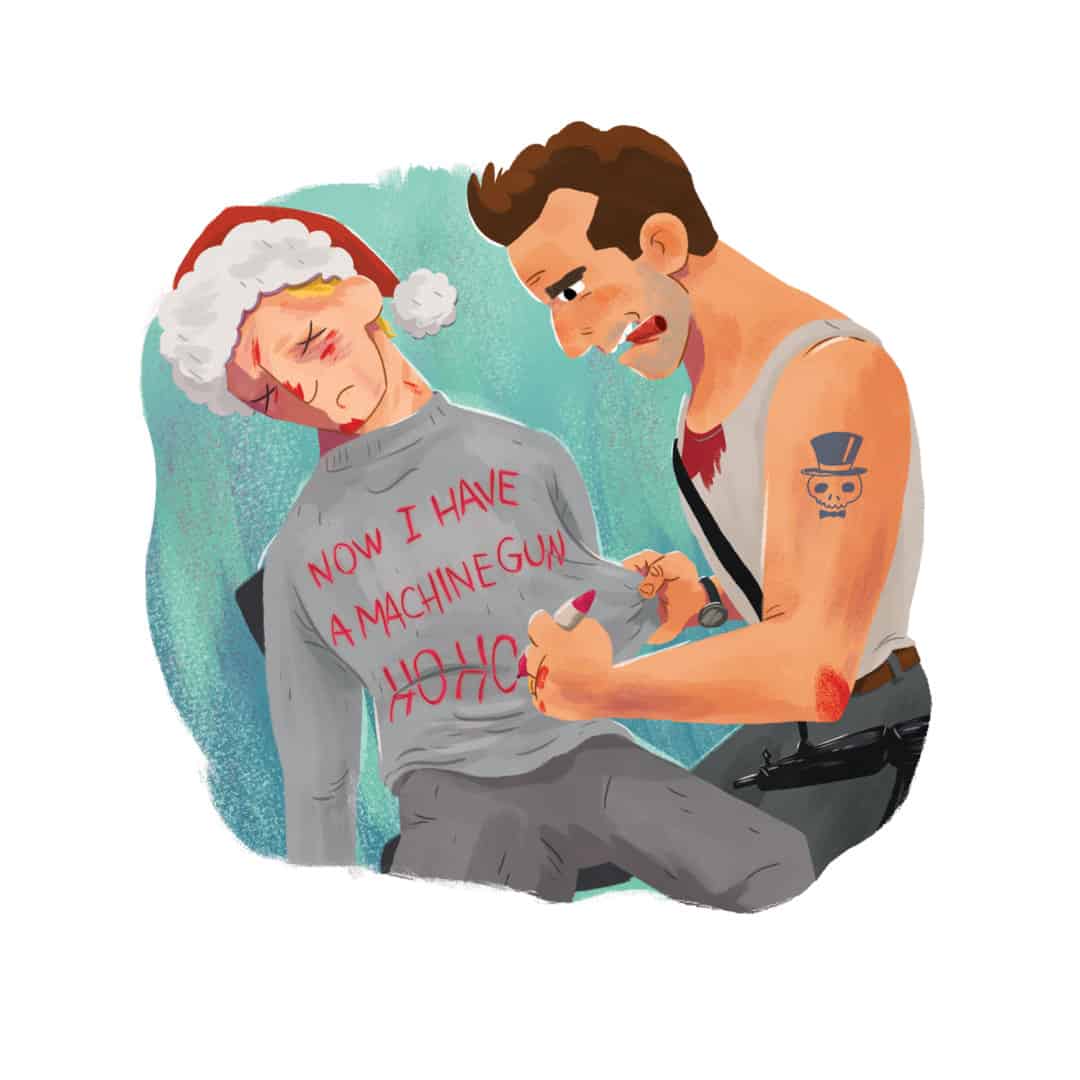
Harrison is an illustrator that highlights the enthusiasm and humor of his subjects — these feats of joy come with ease, playful and light even when tackling the ’80s action classic Die Hard as he did for ‘A Die Hard Christmas,’ sending John McClane on a fun-filled Christmas adventure through Nakatomi Plaza. The violence and adult themes of the film are given a makeover, softened with a whimsical glow. This is one of Harrison’s greatest skills — his perspective is wide-eyed and full smile with an inherent kindness in his art that comes through each page.


‘Clarence: Chicken Phantom’ cover by JJ Harrison
CJ: Working with titles likes Clarence, Regular Show, and Adventure Time, you are working within the framework of existing properties. It’s a rare skill to be able to stay on model and be consistent within the world of the show across comics and other merchandise. How much freedom are you given to give it your own style, or is that not a concern for you when it comes to that type of work?
JH: Freedom of style varies from job to job depending on how the art is going to be used. Say, the project involves art for marketing materials, you usually have to stay closer to model and the style guide. With Cartoon Network properties in publishing, we’re generally given more freedom to play with style. I’ve learned that if you’re drawing in your own style, your own style had better be far enough from being ‘house style’ that it’s clear that you’re intending to draw the characters differently.
In the early days of Adventure Time, I would draw Jake a little more squat than he appears in the show. I got away with that for a while, but I got nailed pretty hard for it one time. I drew an entire comic story with Jake kinda chubby and my pencil drawings were all approved by the editor and by the licensing team, so I took it to final inks and color. Nothing changed with Jake proportionally, but his squat bod must have been more glaring in color and I was asked by Cartoon Network to redraw Jake throughout the entire story on the night before it was supposed to go to press. In general, I think I’m able to draw most cartoons in a style that feels natural to me and still compliments the brand style. I reckon that’s how I’ve been lucky enough to keep getting hired at least!

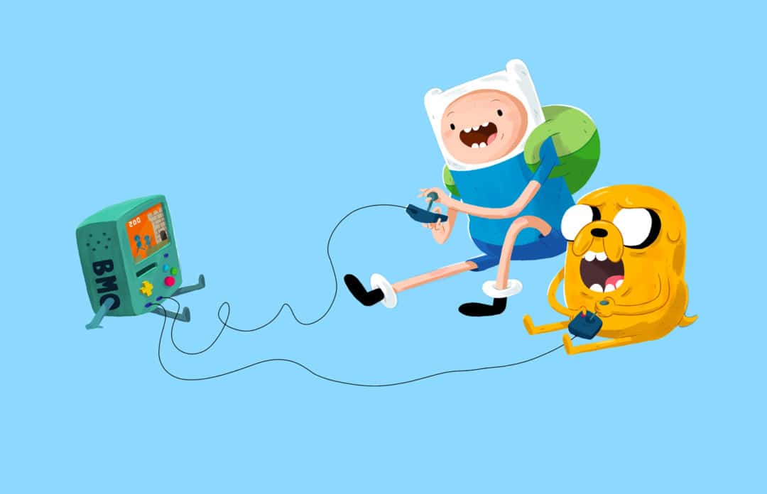
page from the ‘Adventure Time’ comic by JJ Harrison
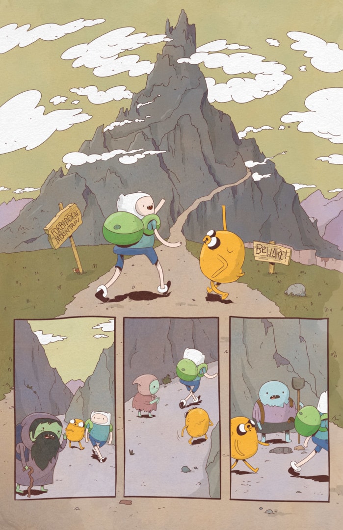
page from the ‘Adventure Time’ comic by JJ Harrison
For your comic book work – is matching the pace and elasticity of the characters in the cartoon a priority? Comics can do things cartoons can’t and vice versa – is it more important to take advantage of the comic book format rather than try and replicate the cartoon exactly?
Some comics publishers make these ‘toon books’ that are really just screen caps of cartoons with comic bubbles slapped on them. I’m sure you’ve seen them. I’d bet that they’re only popular among very young readers. I understand the business decision to make books like that, but they are not very interesting to me. They’re not taking advantage of all that the comics medium has to offer.
The basic approach to one vs the other is very different. In animation, a script is handed off to a team of artists comprised of character designers, prop designers, background artists, color stylists, and storyboard artists to name a few. With the comics I work on, most of these duties fall on a single comic artist. When I get a new script, I try to see how much I can play with varying camera angles and illustrating the characters to create an intersecting line of action. I also design my panel layouts and colors used within each panel with the whole page in mind. I try to take advantage of all of these elements to make for the most interesting looking pages as a whole.
It’s important for me for stories to flow so the reader doesn’t get stuck on something unless the writer wants them stuck there. While watching animation, you can pause a frame and the character might be contorted in such a way or making such an expression that they’re almost not recognizable. It’s part of a sequence that makes sense when played. In licensed comics, however, it’s more difficult to get away with drawing something like that. You can exaggerate, but you still have to stay on model. On the flip side of that, you can draw a character in an action sequence where they’re flailing their arms and as a cartoonist, you end up drawing several ghosted arms and a bunch of motion lines, yet you get away with it. The reader’s mind creates the motion without stopping to think, ‘WHY DOES THIS TALKING DOG HAVE NINE ARMS?‘
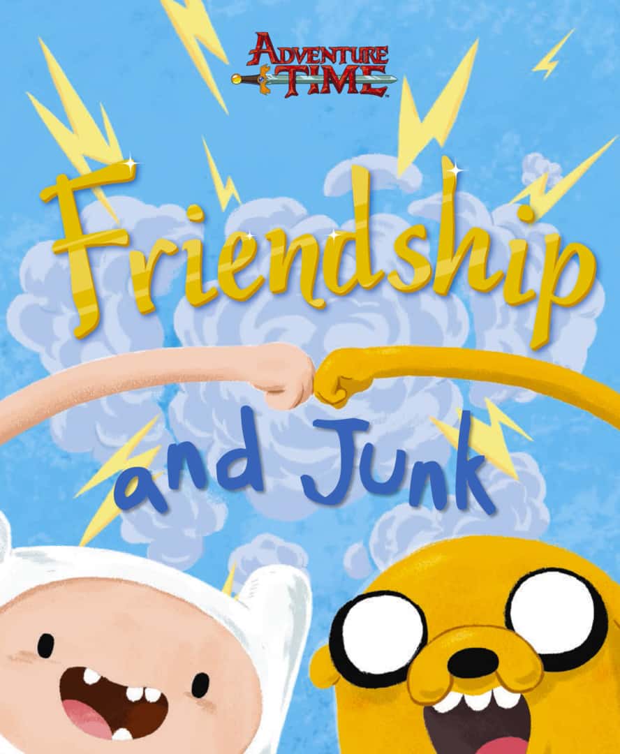
‘Adventure Time: Friendship And Junk’ by JJ Harrison
In your Adventure Time book ‘Friendship and Junk’ there’s no credited author – was a Finn and Jake book about friendship your concept, or did Cartoon Network pitch you the idea?
I wish I could say that was my concept, but no, they came to me with the idea. The studio had written a simple narrative about what it means to be best friends. I was really impressed with the simplicity of the manuscript. It has so few words, but they have a lot of weight to them.
‘Adventure Time: Friendship And Junk’ by JJ Harrison
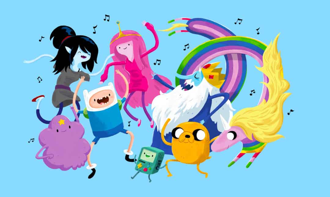
‘Adventure Time: Friendship And Junk’ by JJ Harrison
‘Friendship and Junk’ has a very loose story, so much so that you could have much anything from the Adventure Time universe and made it work. Watching you work, I’ve seen you come up with ideas / vignettes quickly. Did you have requested images from the publisher? Was it similar to doing the comic book?
The script had very basic art notes, so there was a lot of freedom. There were some images that were specifically asked for — like the bro hug. Others were very short like, ‘characters playing music.’ I got to play a lot. The publisher did ask that I keep the backgrounds sparse, which was a great decision in keeping with the minimal script. The approval process was similar to comics work in that I had to turn in pencil sketches before getting approval to move to finals. My art process after that was was very different from comics since I got to pour more into each rendering and give it a very painterly look.
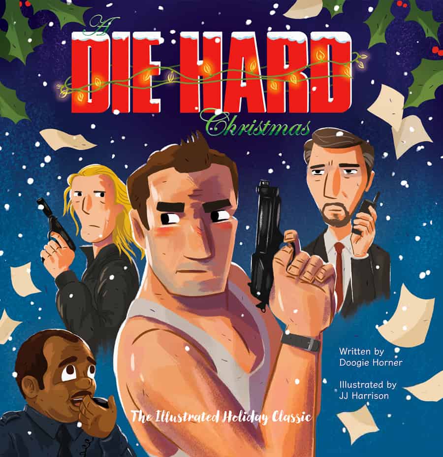
‘A Die Hard Christmas’ by JJ Harrison
Both ‘A Die Hard Christmas’ and ‘Friendship and Junk’ have a painterly style. Do you work digitally, or did these projects start in gouache or watercolor?
Both of these projects had fairly tight timelines, so they were 100% digital. I pencil everything out on an iPad Pro in Procreate with the Apple Pencil then I finish the colors on a Mac with Photoshop and a tablet. In the early years of my career I spent as much time drawing as I did adapting my traditional art techniques to the digital space. I would paint black gouache, charcoal, and crayon across white illustration board and sample those in Photoshop to make my own dynamic brushes. I was only interested in making digital art that didn’t bare the artifacts of most art that looks obviously digital. I spent a long time making this process seamless and not require extra filters and such. Of course, Kyle Webster came along and offered much broader brush libraries for Photoshop that made things even easier for all digital artists. Today, I use a mix of my own and Kyle’s brushes.
‘A Die Hard Christmas’ does something quite astonishing – it’s a funny concept, clever even, yet it goes beyond being a simple ‘joke’ and is an interesting take on the film. The prose is incredibly smart and your illustrations feel like the movie but also an entirely new beast. When Insight Editions contacted you for the book, did they have a style in mind?
This was my first project with Insight. I was approached about doing the project as a children’s book for grownups. I have always enjoyed drawing in the vein of classic Little Golden Books and Mary Blair. After having done other picture books in this style it was easy for me to see how I’d render the book. The real challenge was in designing the characters in a cartoon style close enough to be recognizable but not close enough that we’d be in trouble for likeness rights. The only actor we had likeness rights for was the saintly Reginald VelJohnson.
I think most of our back-and-forth about my drawings was over how to depict the eyes of each character. My initial versions of all of the characters gave them each little black bead eyes like Charlie Brown. I drew some samples with more expressive animation style eyes and at some point deep into painting pages I was asked to change all of the eyes to the more expressive style. An artifact remains of my original version in the published book. The back cover mistakenly features my earlier illustration of John in the vent with beady eyes. The publisher forgot to swap it out. I kind of like when stuff like that happens.
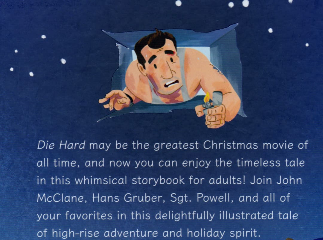
Back cover of ‘A Die Hard Christmas’ by JJ Harrison

‘A Die Hard Christmas’ by JJ Harrison
‘A Die Hard Christmas’ by JJ Harrison

‘A Die Hard Christmas’ by JJ Harrison
The violence in the film is toned down quite a bit in the book, Was violence in the film tempered in the script, or did you have to change your approach to tone down the blood?
Actually, my first pass wasn’t violent enough! I do so much art for all-ages readers that it was easy to keep things kind of cute. The first manuscript I had to draw from was very early and didn’t even have any swears, so I wasn’t sure how adult to go with the art. Somewhere in the middle of production I asked about gore and was given the push from editorial to amp it up, which was cool.
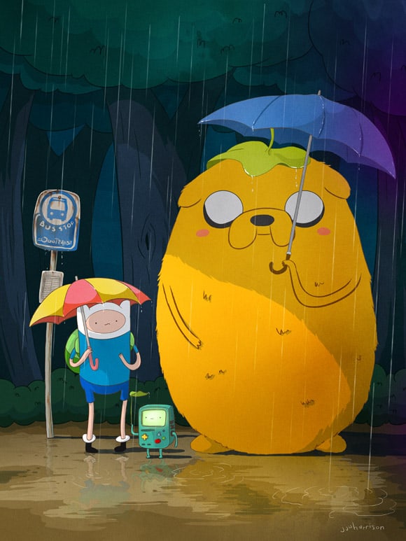
‘My Neighbor Jake’ by JJ Harrison
I found your work via Mondo, who do an incredible job of bringing in artists who have never done poster work into the fold. Was the ‘Adventure Time’ and ‘Regular Show’ your first time working with them? Is the world of posters and collectibles different than your usual work in comics and books?
My first time working with Mondo was for their first Adventure Time gallery show in 2012 and it was a total accident. About a week before that show, I had completed this painting for my kids called ‘My Neighbor Jake.’ It was a mash-up of Finn and Jake with the famous bus stop scene from My Neighbor Totoro. I showed it to some friends and they encouraged me to do a print run.
A couple years prior, I self-produced a run of posters for the finale of LOST that mashed up LOST with Star Wars. Those did well and even got me invited to a couple parties where I was hobnobbing with the cast and crew. So I had a little confidence I could do okay putting out ‘My Neighbor Jake’ as a print myself, but by no means did I expect lightning to strike twice. I got all set up to release the print on my own site and worked up the nerve to send an email to my favorite poster blog, OMG Posters, asking if they might share the sale info if they thought it was good enough. Mitch, who runs OMG, responded right away with very, very kind things to say about the poster. I was a huge fan of Mondo and bought their posters regularly, but I had no idea Mitch, who writes for OMG, is also Mitch from Mondo. I also had no idea that Mitch was curating the very first Adventure Time art show at Mondo Gallery. He clued me in and asked if I’d be willing to forego releasing the print myself and instead overnight my print run to the gallery since the show was opening in three days(!!!). I could have died. In an instant, my career was changed. That year, I ended up doing three or four Adventure Time prints with Mondo and had the time of my life doing them.
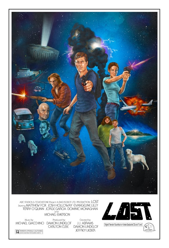
‘Lost In Star Wars’ by JJ Harrison
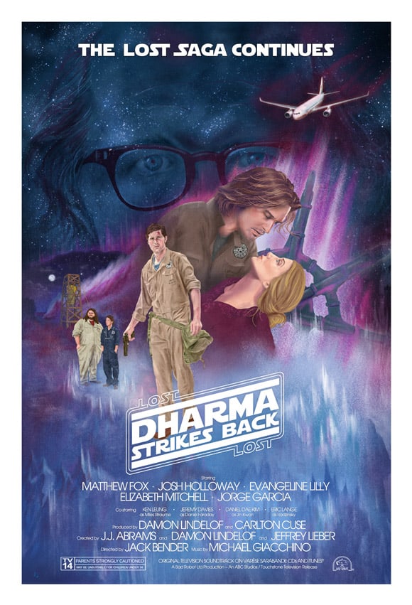
‘Dharma Strikes Back’ (Hurley Edition) by JJ Harrison
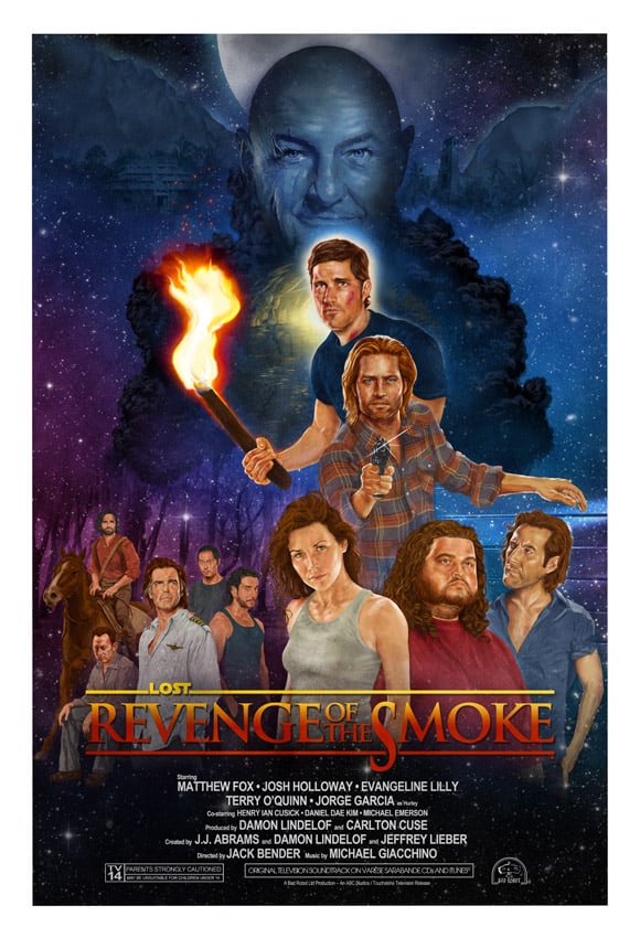
‘Revenge Of The Smoke’ by JJ Harrison
Working in posters can be very different from my other work in publishing, especially with Mondo. The gang at Mondo specialize in art directing and curating singular images that gain the attention of everyone from hardcore pop art collectors to Hollywood elite. Mondo’s art directors are very aware of this and they take great care in ensuring everything they release is true to the Mondo brand. Not only that, but they have collected a stable of artists that many would describe as some of the greatest designers and illustrators working today.
Realizing this can add so much pressure to the job. When you get that midnight call from Grammy award-winning artist Rob Jones, it’s no joke. I’m very comfortable churning out comics and picture books, which are comprised of multiple images, but a lot more thought and creative energy goes into designing a single poster for collectors. For me personally, I try to improve or learn something new with each subsequent poster I get to create.
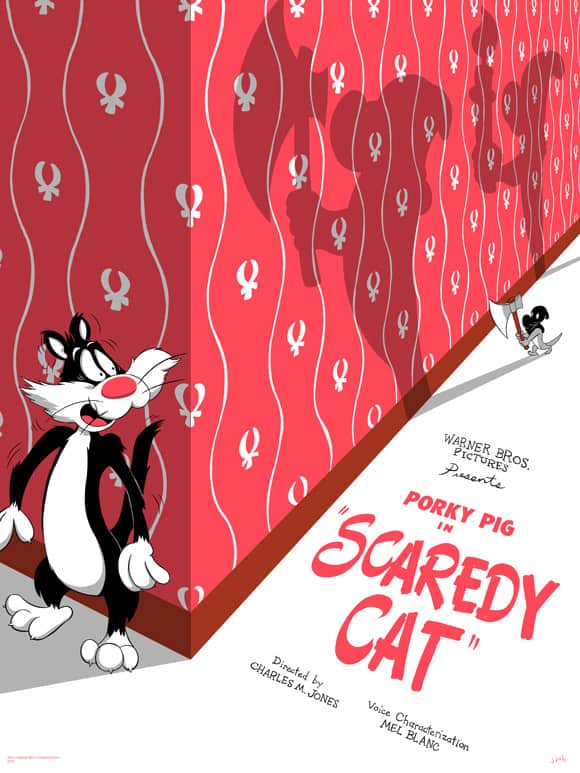
‘Scaredy Cat’ by JJ Harrison for Mondo
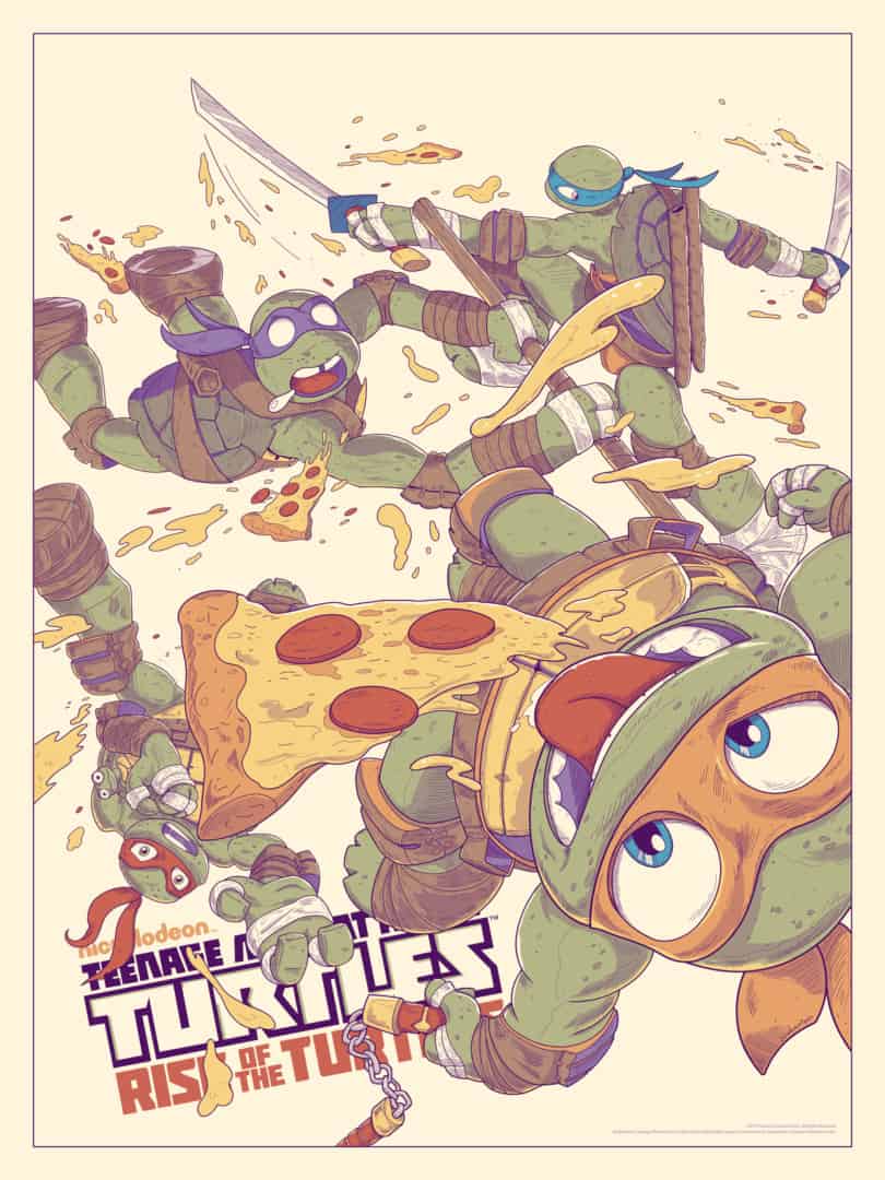
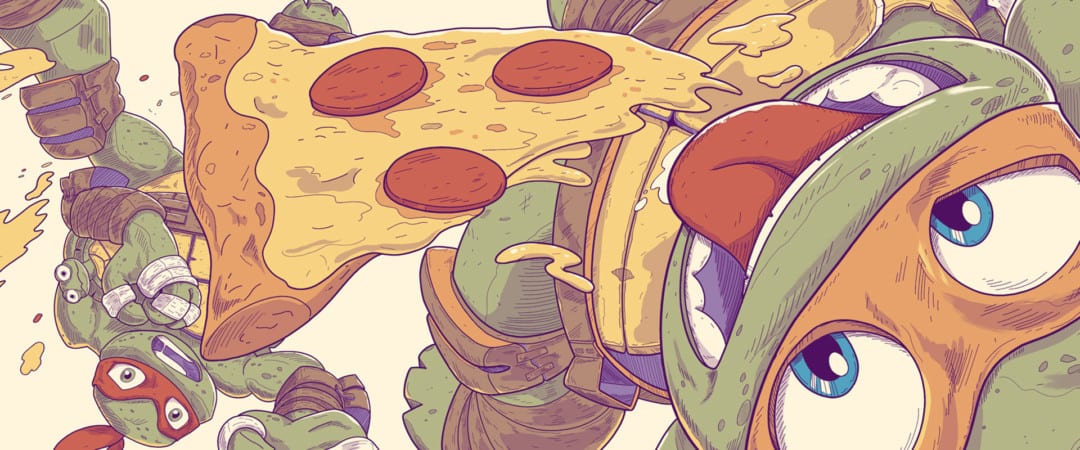
‘Teenage Mutant Ninja Turtles: Rise of the Turtles’ by JJ Harrison for Mondo
‘I Hurt Myself Today’ original inks by JJ Harrison
‘I Hurt Myself Today’ (Print Version) by JJ Harrison
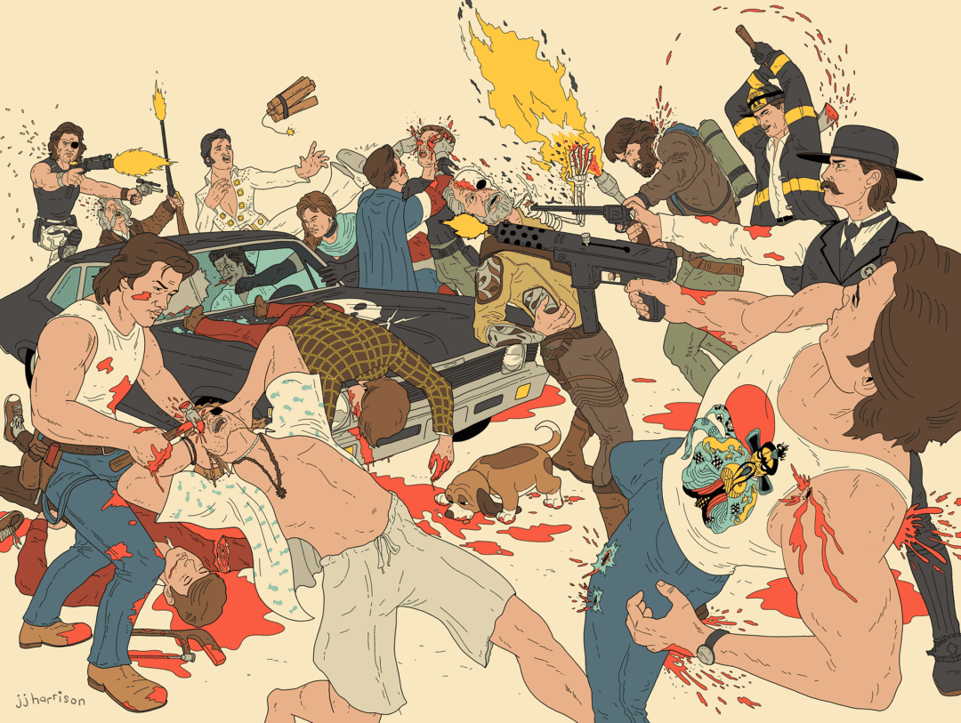
‘Russellmania’ by JJ Harrison
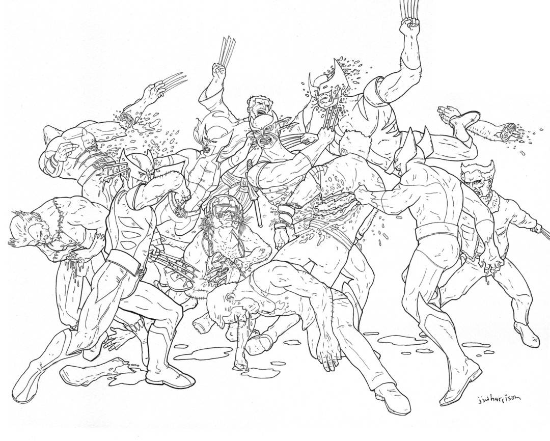
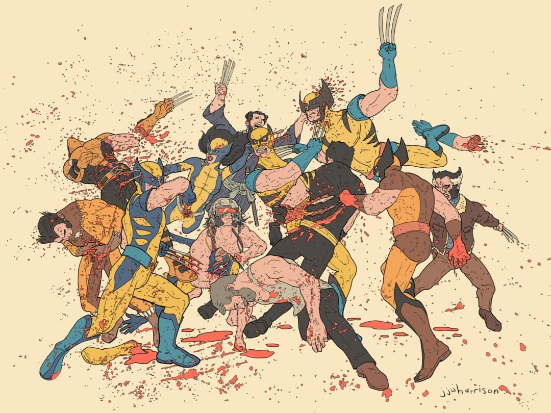
For the Mondo ‘House Party II’ show, you did a drawing of all the iterations of Wolverine fighting themselves, a concept that you followed up with ‘RussellMania,’ a poster of all the characters of Kurt Russell fighting. It’s such a smart yet incredibly silly idea – which is a commonality amongst the properties you work with. Is that humor something you strive to keep in your work?
Humor is a big part of everything I do. I think my main goal with my work is to at least bring a smile to whoever sees it and ‘gets’ it. I learned from a very young age, like 3 or 4, that I could make people happy by giving them funny art. That just kinda stuck. And as a fan, I appreciate things that play to the fanbase, even if it’s just a wink.
Interestingly, with those ‘self-destruction’ pieces you mentioned, they came from very cathartic origins. During the time that I drew the Wolverines, I was working on two simultaneous picture book projects and pulling a lot of all-nighters. Work had become somewhat mechanical in an effort to hit deadlines. I had just seen the movie Logan and it was beautiful. I kept thinking how they really broke down that character and made him more human than ever. I decided to do something on the topic. I just started drawing him destroying himself. It was violent and very therapeutic. When I finished and saw all the blood on the page, I laughed. I felt recharged and was able to get back into the other projects with new energy.
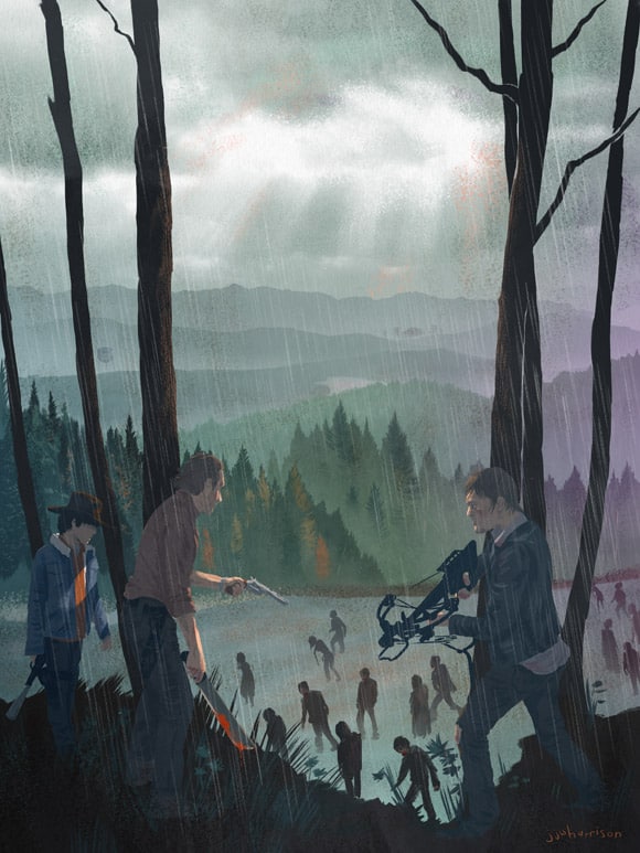
‘The Long Way Home’ by JJ Harrison
Speaking of humor, you did ‘The Long Way Home’ for a The Walking Dead themed gallery event, and it may be your only ‘dark’ illustration. It’s a beautiful illustration – haunting and sophisticated. Your minimalist handling of the faces and figures is subtle, just enough to recognize the characters. You let the light through the trees do all the work in shaping them. Is work like this something you’d like to do more of?
Absolutely, I’d love to explore more horror and serious content. Sometimes all it takes is an invitation. I’m a huge fan of The Walking Dead comics and the show. My approach to art, and especially that piece, is that when I can’t find a way to be light or fun with a piece, then I better try to make it beautiful and evoke some other feelings. I think art works best when it makes its audience feel something.
‘I Hurt Myself Today’ Original Inks by JJ Harrison
The original Wolverine piece sold and then prints were made, and the ‘RussellMania’ poster followed and both quickly sold out. Doing prints like that isn’t something I’ve seen you normally do. What prompted you to continue beyond the one drawing for the Mondo show?
After the first one, I thought it would be great to do a series of these. Other fellas like Mike Mitchell have done well with thematic series art. I just didn’t have an avenue to produce prints beyond getting them printed and fulfilling them on my own. Nowadays, it’s difficult for me to find time for personal projects like that. Luckily, a private collector came along and asked about commissioning that first piece as a short run screen print.
Personal projects are one thing, but when there’s a paying client with a deadline, well, that makes it a lot easier to schedule in. It was actually the fine gentleman who purchased the original art at the Mondo Gallery show! He and I quickly became friends and we came up with some ideas for future prints together. We basically started a private commission club dedicated to the series. These are so much fun and as I said, very therapeutic, so I look forward to each new one we do. I believe we already have the next couple sold out in advance and people haven’t even seen art! The community is really wonderful. Their excitement drives me to make these extra special for them.
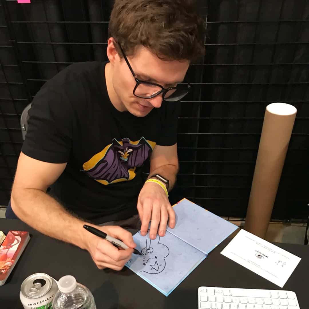
JJ Harrison at MondoCon 2017
You’ve attended comic conventions quite a bit. You’ve traveled with fellow comic artist Bill Galvan and you’ve also brought your kids to conventions. Are these events vital for a comic artist? For such a solitary trade, is the social aspect of it the point?
Going to conventions and interacting with other artists and connecting directly with fans of the work is very important, to me anyway. I am fairly introverted by nature, so I have to push myself to do it. Having such supportive friends and family like the Mondo gang and my pal Bill make it a lot easier. I enjoy learning from other artists. We share everything from war stories to techniques and even our insecurities. It’s very bonding. And placing art directly in the hands of somebody who genuinely loves it is so much different from just rolling it up in a tube and mailing it off. These are the things I look forward to most about conventions. The sales and exposure are just by-products really.
I know I’ve gotten more publishing work from going, but that’s not something I would ever expect. A lot of aspiring artists go to these things hoping to get discovered, but I would advise them to go to learn first. Chat with artists and ask them questions. I’ve never known an artist to be secretive about how they got into the biz or what inspires them.
