In the theater, you are a witness to a narrative happening in real time. The performers are there, alive, heaving under costume and sweating under stage lignts. Each moment unravels, untethered to the rewind of digital ephemera. You, the audience are involved as well. The darkened crowd. You watch as the stage changes — a chateau on the French Riviera, a vast kingdom, the confines a prison. You share the same air as the actors. This is the work of set designer Steven C. Kemp, craftsman and artisan, whose key skill is making fictional environments an immediate reality.
Kemp’s work takes him to opera houses, theaters, and cruise ships around the world. If there is a need to recreate an environment, Kemp is there. As an audience member, I watch the changes, the movements of actor and stage, and the hope is for constant surprise. As a set designer, Kemp understands these expectations as well as the limitations of the stage, its physical space locked and immovable. He is a draftsman, an aid to the director and the story.
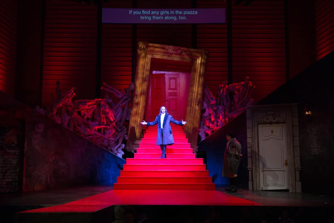
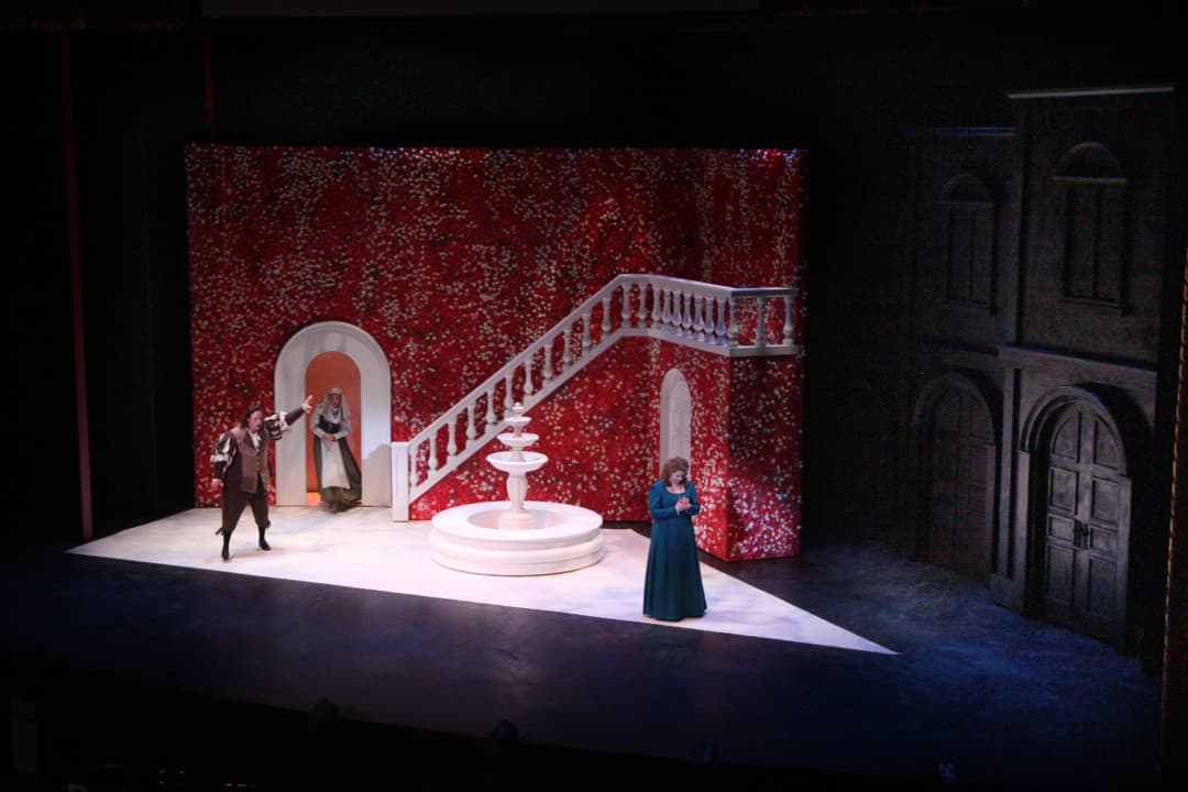
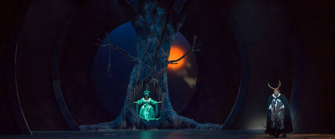
‘Don Giovanni’ by San Francisco Conservatory of Music | set design: Steven C. Kemp
CJ: Before any sets are built, you create 3D videos to show to the client. How close to the approved 3D designs are the final stagings? Does quite a bit change from computer to the physical environment?
SCK: The beauty of working in 3D space is that it inherently accurately depicts the scale and you can really work out the details and spacing and see how everything is going to work together. I strive for very realistic renderings to really communicate to the creative team and then to the shop for construction how the designs are to look onstage. I frequently get comments of how uncanny the final set onstage resembles the renderings.
When you’re hired I’d assume you are given the dimensions of the stage. Do you approach the stage designs first as a 2D image, like a painting, then evolve from that or do you go straight into 3D work?
After studying the material and beginning to research, I simultaneously work up a 3D model of the venue drafting and render it out in black and white and then begin to do rough 2D sketches on top to start to explore initial ideas.
Frequently these are just for me and are never shown to the director or to the team—it is just an outlet to test ideas quickly. Depending on the design and the conversations with the director I will either develop a more refined series of these 2D sketches or I will jump right into to a massing model in 3D and either draw on top of that further or render out more of a rough 3D white model. I then progress to more detailed renderings as I refine the details of the elements that feed both into the drafting for construction and the renderings for illustration.
Have you been on the building side of things?
I worked for the Alley Theatre straight out of college as a carpenter and had been on the construction side for years. I ended up getting to draft construction drawings for them and my exposure to famed designers there further cemented my desire to pursue my design career. It led me to grad school at UC San Diego that is partnered with La Jolla Playhouse, a similar scale regional theatre as the Alley.
Is opera your home? Is it where you got your start?
I got my start in theatre and musicals and continue to balance those projects with the exciting amount of opera I have been able to do over the years. I love opera for the epic scale, history and expressively deep, powerful connection with the music and performers which makes it an experience unparalleled in live performance.
You’ve worked with Opera San José quite a bit in your career. I would guess you’re aware of the theater size and what the company is going for. For something like Opera San José’s recent performances of Cosi fan tutte, are you spending time with general director Larry Hancock and director Brad Dalton about the story and the planned movements? How involved are they in the design?
Absolutely, the best cohesive designs come from an inspired collaboration with the director and integrating the company’s ideology into the production. Frequently the General Director or Artistic Director of a company will mention specific interests with the material that guide the initial responses of a piece between the director and I.
For Cosi, did Larry and Brad have specific wants and needs from you? What were they looking for at the beginning stages?
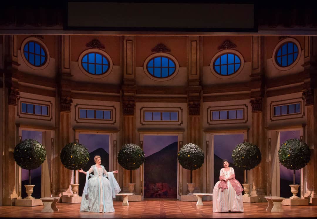
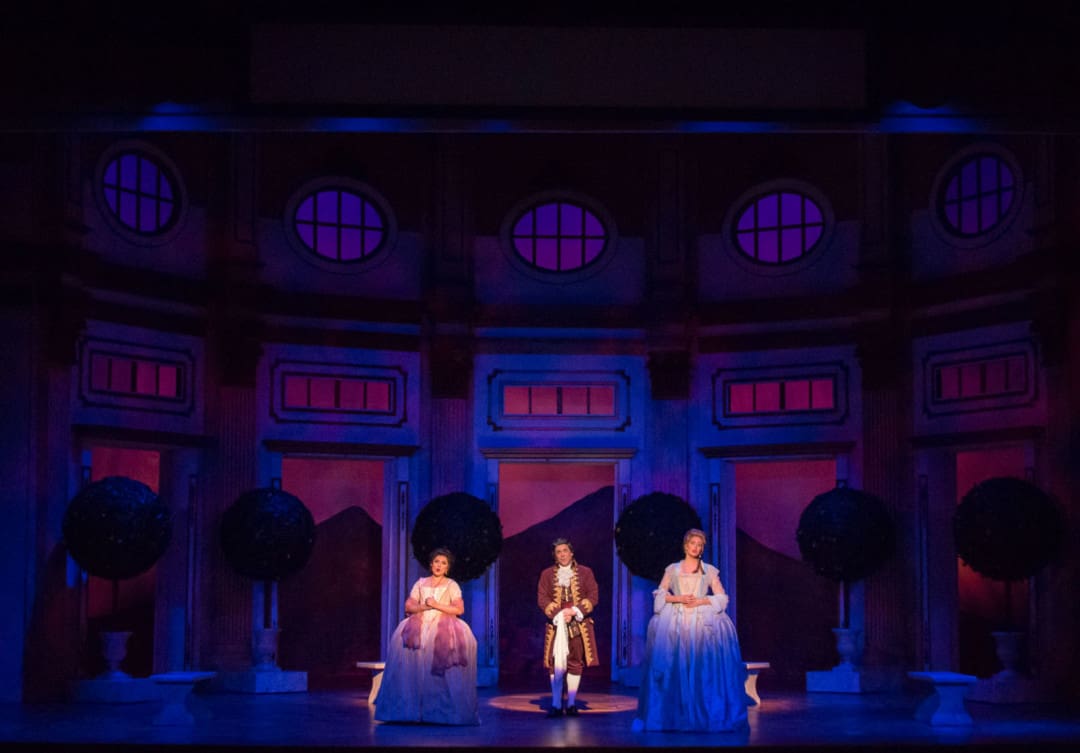
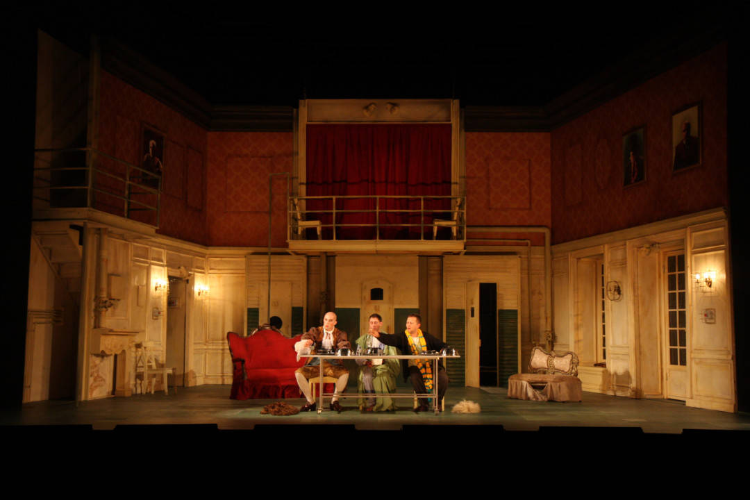
Cosi was a unique project in the sense that it was an existing set from the previous production that was going to be remounted, but they wanted to take the opportunity to update and embellish the design. I brought in a significant amount of Baroque architectural detail to add to the specificity and luxury of the environment and I got to design all the furniture and prop elements such as the garden trees from scratch to form a full cohesive whole.
The other major element desired was an update to the view seen through the lower windows. When I first reviewed the plans of Cosi I wondered if I could employ the semi-circular truss rigging from our production of Idomeneo and the curve ended up working perfectly to hang a full surround cyclorama instead of layering flat drops outside the windows. I then created the sweeping, seamless view of Mt. Vesuvius and opened up the additional upper windows in the walls to further dramatically reveal the sensual view out to the mountains and sea.
One incredible thing I love about theater is how the audience itself remains still, and the stage itself transforms in amazing ways to transport the actors and audience to where the narrative leads. In Cosi, the stage doesn’t have many moving parts, and even Da Ponte’s libretto only requires two different locations, so what remains is the clever movement of other elements and of course, the lighting. Are your lighting designs more of suggestions or are you closely working with the lighting directors of these performances?
When creating the renderings to illustrate my designs I do get to roughly model the space with light and I attempt to use the angles and positions of where the actual stage lights will be to approximate effects as a shorthand to start a dialogue with the lighting designer. They then fold in their ideas and the final lighting onstage is always 10 times more effective as they really bring their expertise to evocatively bring it all to life.
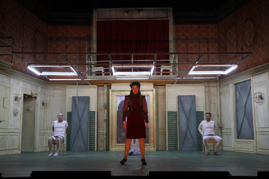
The stage design for ‘The Physicists’ is incredible. At first, it appears rather bare, but once the show begins it gains depth and evolves in wonderful ways. Like Cosi, you built off of that one main set and used lighting to change the mood and environment. When working on a show that takes place in multiple locations, how do you determine what the main set should be?
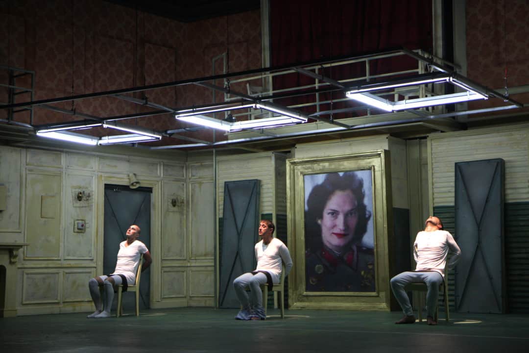
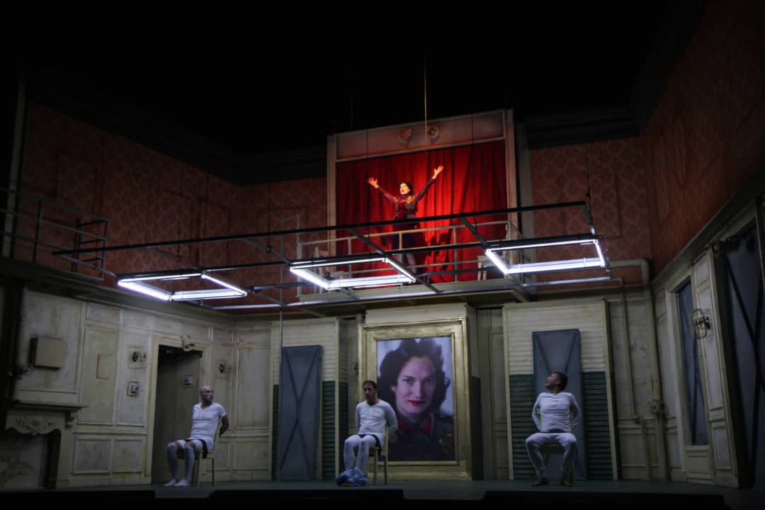
For ‘The Physicists,’ the design for the environment of the play was actually created with a realistic sense of space and unity of time. It is set in an old German villa that has been re-purposed as an insane asylum that eventually is revealed to be a prison/bunker for a maniacal psychologist turned world dictator.
We wanted to create a level of reality that the audience gets to share the shock and surprise of these transformations along with the characters as they realize that they are truly trapped in this space and are fully helpless to her controls and plans for world domination.
For Cosi fan tutte, the location is more abstract and malleable and with minimal suggestions of garden trees, for example, we transition from inside to outside locations to heighten the energy and pacing of the piece. In designs such as these, it is about finding a container for the space that can work for all locations thematically either on its own or with the addition of simple elements throughout to easily change the environment. This plays into the audience’s suspension of disbelief and allowing their minds to actively fill in the blanks of the abstraction in exciting ways.
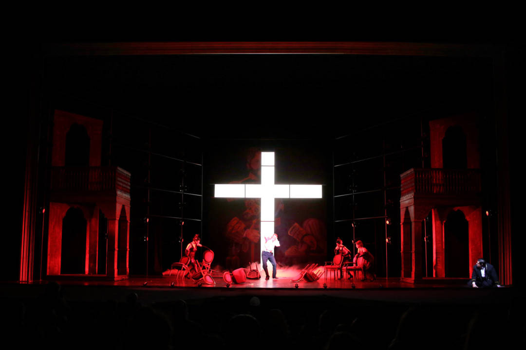
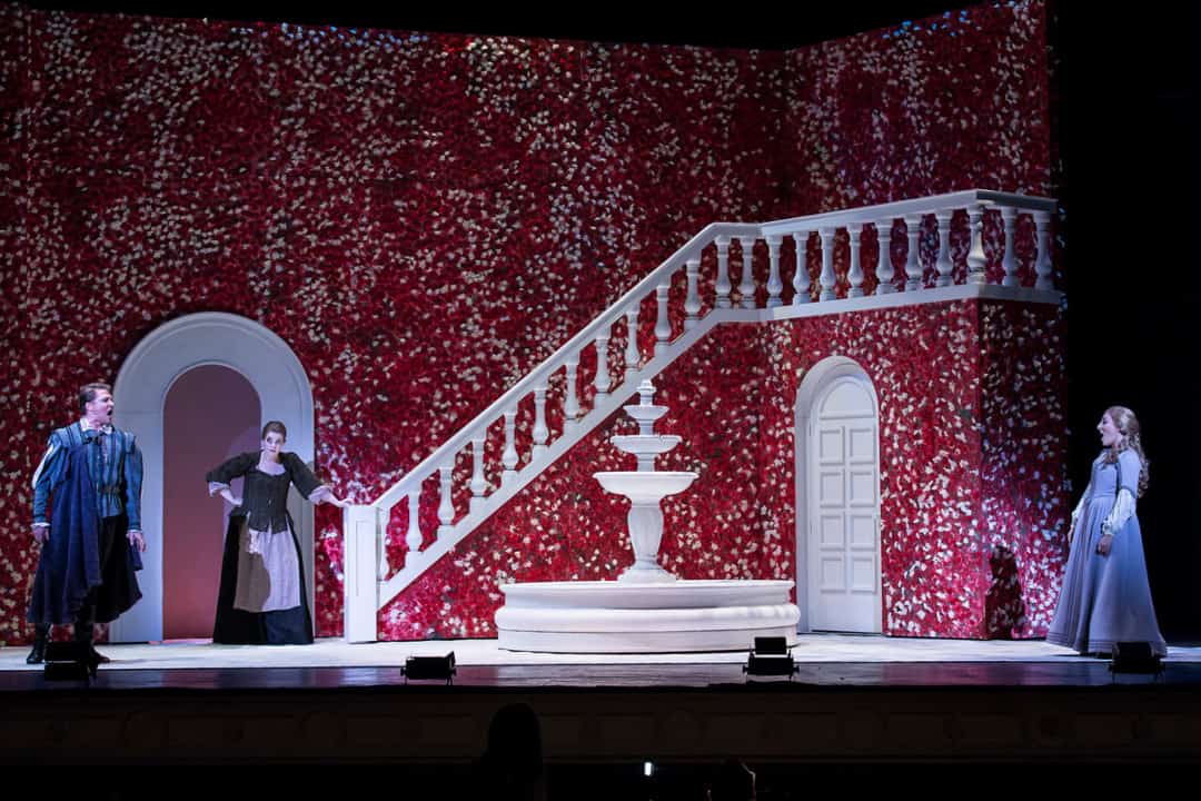
‘Don Giovanni’ by New Orleans Opera | set design: Steven C. Kemp
There are shows you have done that are classics, plus new works that may not have been performed as much. Are you ever tempted, or expected, to repeat what previous companies have done for a show? Is there room to pay respects to an opera’s history while also doing something new? Where was your head at on a production like the New Orleans Opera production of Don Giovanni?
Don Giovanni at New Orleans Opera was an incredibly fun and unique project that season because I had just designed an entirely different production with a different director earlier in the year. I think it is a great example of a piece that no two artists approach in the exact same way.
At no point did I feel tempted to pull from design solutions from my previous production because we were setting it entirely differently, but I did get to pull from my intimate knowledge of studying the material in such detail. In New Orleans, they had an existing production’s set that they were interested in seeing if we could utilize components of and so we were able to integrate some of the pieces as Don Giovanni’s palace interior, creating an homage to that production but then simultaneously framing the entire world in a sleek much more abstract environment where the judgment and memory of the Commendatore was ever-present, looming over the action in a giant fragmented portrait inserted into a presentational system of exposed lights creating extreme tension and energy throughout the entire night.

‘Don Giovanni’ by New Orleans Opera | set design: Steven C. Kemp
Theater exists in the same realm as other creative endeavors like illustration and graphic design. There are always going to be time restraints and budgetary limitations. Are there any ideas you’ve had that haven’t been brought to life because of budgetary issues? Do you keep a list of staging elements you’d love to see on stage, and you’re waiting for the right show to pitch them?
I pride myself in working economically and with the company’s budget in mind, so it is generally rare when an idea is so far off from the reality of the project that it cannot be realized to some degree. I subconsciously certainly have a database of effects and machinery, but I attempt to actively block out tricks when responding to a piece and conceptualizing a design to keep the staging concepts as a true reaction to the material at hand.
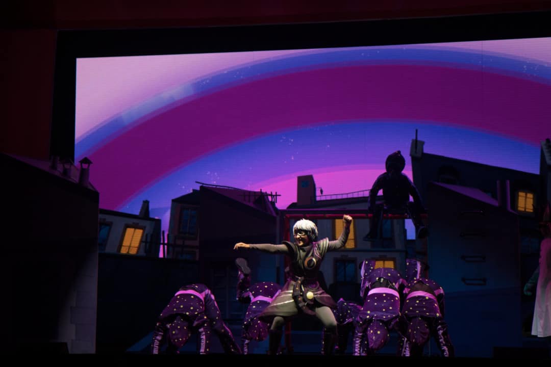
You’ve done stage design for Disney Junior’s ‘PJ Masks’ stage show, which is a bit different from your usual work. How did they find you? Does your process change for a kid’s show?
It is a business all about connections and that one came from the director who I have collaborated with many times before. We had actually worked together on kid’s shows years ago, as well when I was an associate designer, which has lead to our more recent collaborations like this project and Le Cirque Bijou for Norwegian Cruise Line.
I really love stretching my imagination and exploring the material at hand and working within and testing the boundaries of the parameters that a piece provides. The process is always similar in starting with the material but the style might certainly change to capture the spirit of the project.


