The photograph is titled ‘Good Luck‘ — a taxidermied horseshoe crab rests atop a beaten table. It is a creature of alien contours. A living fossil, the crab is both common yet unseen by most and in the hands of photographer Ben LaFond, it is stark and grotesque. A skilled screen printer with a day job at Minneapolis-based design and print house Burlesque of North America, LaFond turned the photograph into a limited edition two-color screenprint. From real to photograph to screenprint, the aquatic arachnid is leveled into a rust of shifting gray.
LaFond is both documentarian and real world fantasist. His images, each one — is a pause. There is loneliness in the photographs — he captures moments of quiet memory, those fractions of time that we forget ever existed. If we were even there. LaFond does not quickly focus and move on but deeply observes until a thing, a moment, dissolves into its separate elements. As a screen printer LaFond builds up minor color and shape until a major composition is revealed, but as a photographer he reverse engineers the image, removing layer (time) after layer (persona) until what is left are the skeletal remains of what once was.
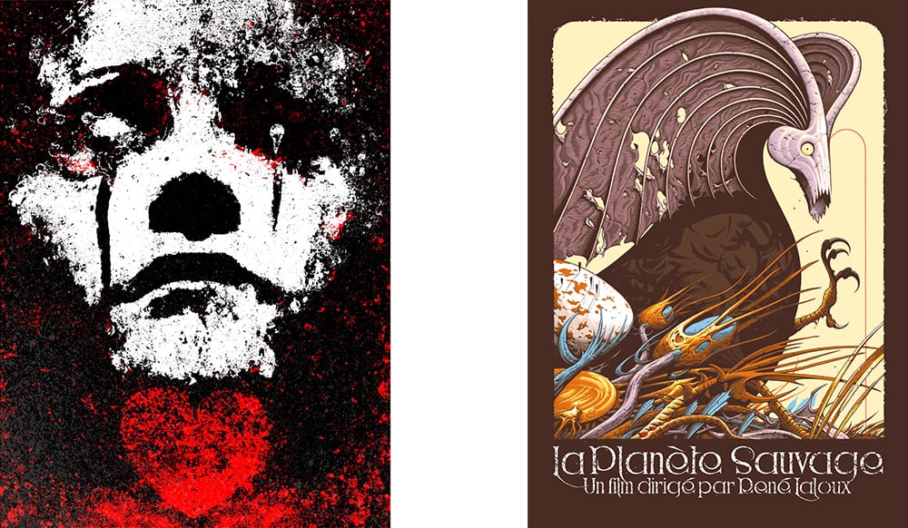
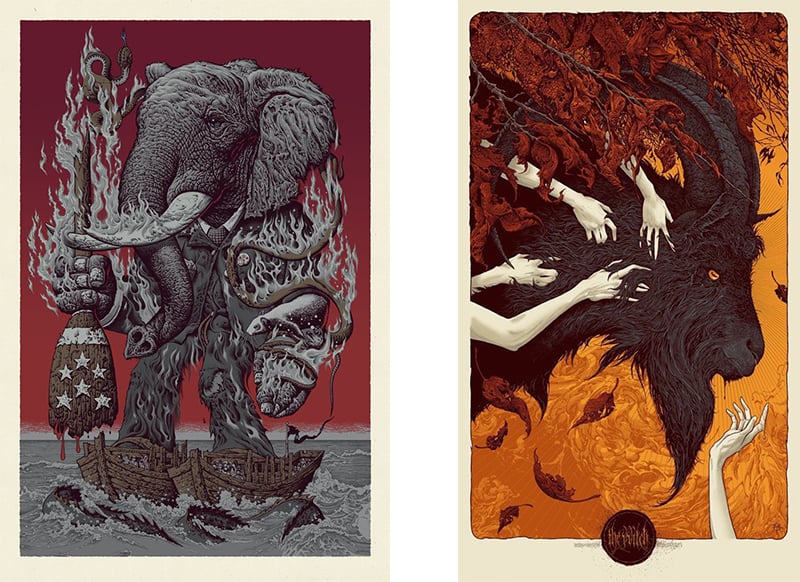
‘Winterhearts’ by Jacob Bannon (L) and ‘La Planete Sauvage’ by Aaron Horkey (R) | both printed by Ben LaFond at Burlesque of North America
CJ: As a screen printer you work closely with a variety of artists working in a variety of styles, from Jacob Bannon’s abstract figure paintings to Aaron Horkey’s dense line work. Your job is both physical and technical. Are you figuring out ink, mesh count, exposure time, emulsion, paper, etc. at the start of each project, or is it pretty much the same process for each print?
BL: It all depends on the job. We stick to using the same screen mesh and emulsion and have got the exposure times down solid at this point so that part a print run of usually pretty straight forward. As far as inks it’s definitely a case by case thing. Artists are either calling Pantone numbers for us to match or giving us the go-ahead to match the inks to the working computer file. Every ink color is mixed by hand / eye. When we get into the painting reproductions that we do for John Baizley, Jake Bannon, Thomas Hooper, etc. it gets a little more tricky.
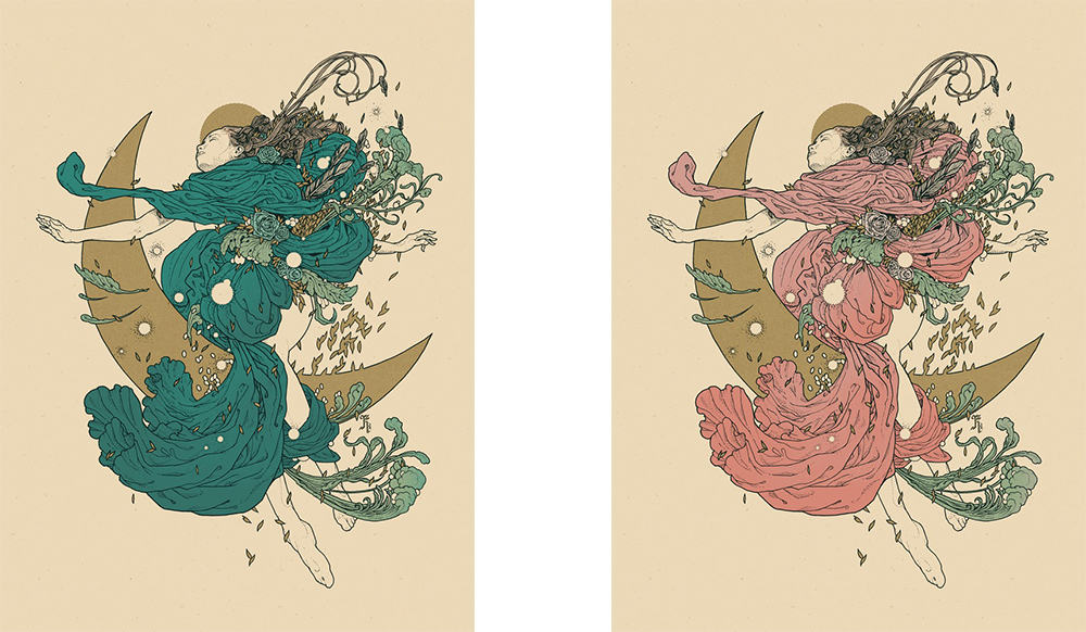
‘Celestial’ Regular Edition (L) and ‘Celestial’ Variant Edition (R) by Richey Beckett | printed by Ben LaFond at Burlesque of North America
You take on the bulk of print jobs for illustrator Richey Beckett, whose output has seemed to triple in the last year or so. He’s an artist who can take over a month for one drawing. When it comes to printing his work can take on a new life. One image will be printed across a variety of paper stocks with changing color palettes, something that puts on display both how strong his compositions are and also the impact elements like paper can have. Are you bringing these ideas to artists like Richey? Do you see your role as collaborator or purely technical?
It’s a little of both for sure. Working with Richey has been awesome and it’s been fun to watch his work progress over the last few years. He does work very meticulously on his illustrations and has the end print result in his mind as the “finished piece”. So in that sense, we are collaborating on the final product with him (and all the artists we print for.) They are trusting us to have the technical skills to pull off what they’re hoping the print will look like. When we first started printing for Richey, the color palette he was working with was typically very muted earth tones, usually on a darker dull colored paper.
I think it was actually the ‘Celestial‘ print we did for your show (2015’s ‘In Reference‘) with Hattie Watson that was his brightest print up to that point. I ended up throwing in a few sheets of brighter color paper with the print run and also included some crazy test prints. I think those things maybe allowed him to see his work in a different light that maybe he hadn’t thought of before. We also have an occasional deal with Richey where we get to come up with our own color version to publish via BRLSQ (‘Fenrir,’ ‘Aestrea,’ ‘Aurora,’ etc.) This is always fun to have free reign on pushing ideas even further. My favorite so far being the mostly metallic edition of his ‘Fenrir’ print.
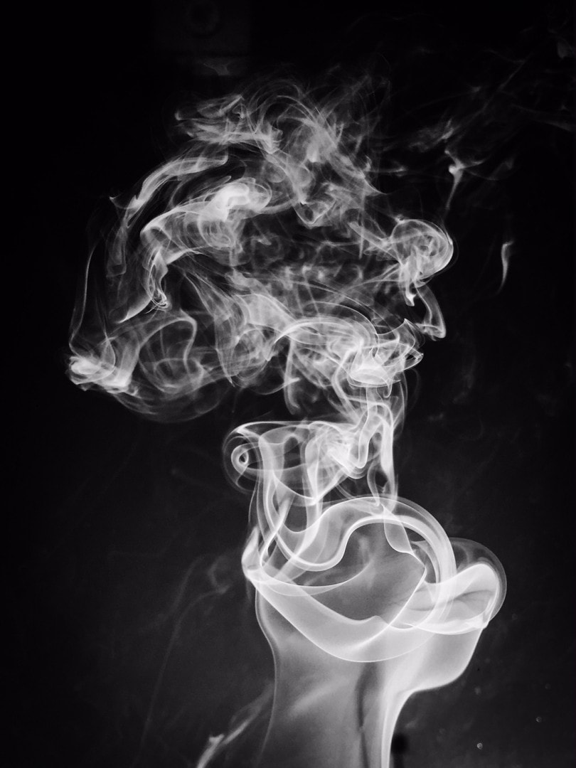
photo by Ben LaFond
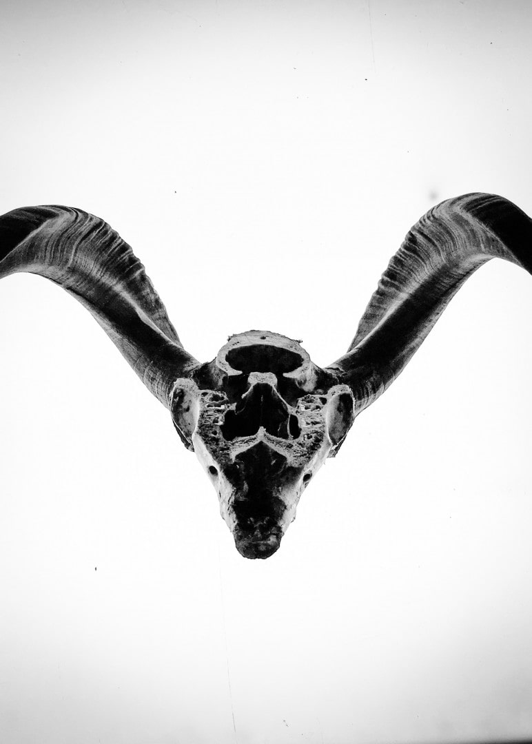
photo by Ben LaFond
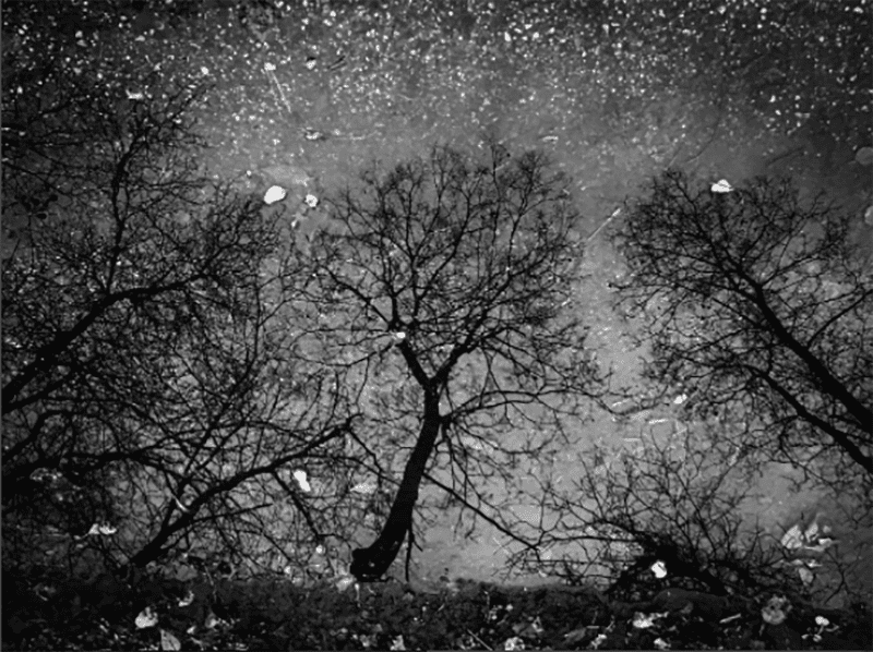
photo by Ben LaFond
‘Peace Island’ by Ben LaFond
It’s interesting that your own art is photography, rather than something like painting or illustrative work, but looking at your photos the connection is there – behind the camera you focus on capturing the reality of contrast and texture. Your subjects are the every day – dry bones in a field, rocks, wood. Smoke. Isolated these items become strange, both beautiful and alien. Is your photography a reaction to the art you’re immersed in every day? Instead of paint and ink you look to the opposite?
I’ve been shooting photos on and off since my early teen years. For my last two years of high school I attended the Perpich Center for Arts Education, a state-funded arts-based school open to juniors and seniors. It’s open to students from all over Minnesota and the kids have to go through an application / interview process to be accepted and somehow I hacked my way into the media arts program ( photo / film / video). I definitely struggled to find any sort of direction with what I was doing with photography but took advantage of the free film and darkroom use best I could.
(Side note: Aaron was a senior when I was a junior at the arts high school. 1996. Dude was already insanely talented then. It’s kind of crazy to think that I’ve been able to not only watch his art evolve over the last twenty years, but to also now have a small part in the creation of a lot of the things he puts out into the world. Many years later I would come to find out that Brandon Holt and Jessica Seamans also attended the arts high school a few years after Aaron and I did. Crazy talent in every arts discipline has come out of that school.)
Once I graduated, I quickly realized how expensive of a hobby photography could be and pretty much stopped shooting from 1998 – 2009. I’ve done a decent amount of concert photography since then but currently (last 5-6 years) seem to be exploring more personal work with macro worlds out in nature as well as in the print shop, memento mori type subjects, rural Minnesota and Wisconsin, etc. If something has good light on it, I’ll probably take a photo of it just to see what it looks like with editing and whatnot.
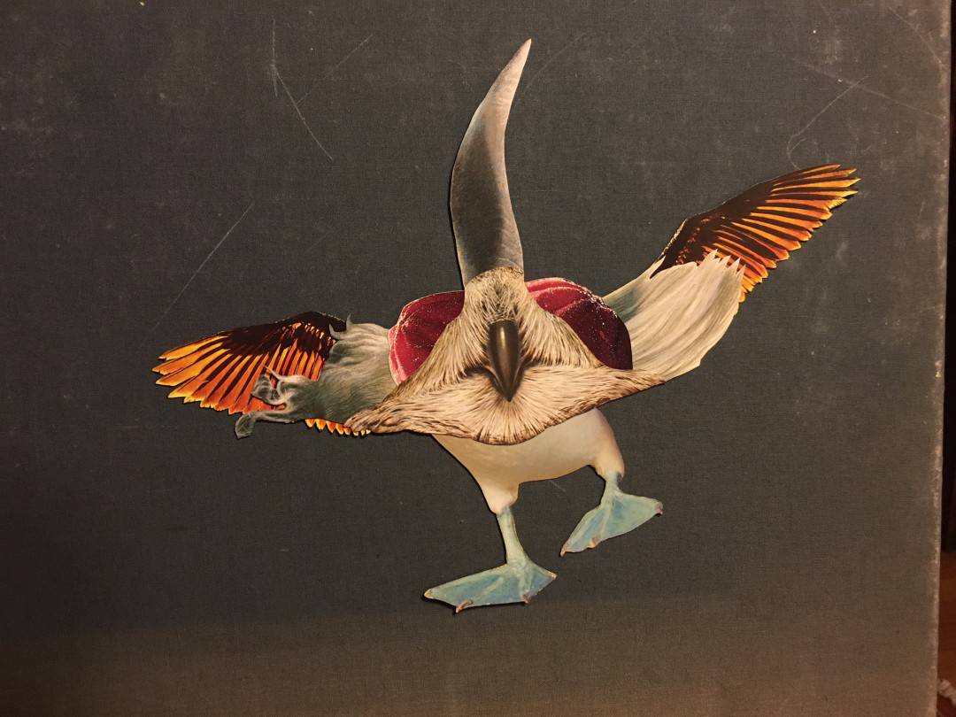
I do also dabble a little bit in illustration and painting but haven’t found the time to dedicate the practice to those techniques. For the last couple years, I’ve slowly been working on a series of surreal animal collages and I’m pretty stoked with the direction those are taking. I think I have about 20 of them now and am slowly piecing together a back story of their origins in the universe.
What are these collages? Are they from photos?
Yeah, they are chopped from animal encyclopedias, nature books, anything that has bright colors and good shapes. The creation of animals kind of happened by accident. I was attempting to come up with a cool way to present a gift to a friend of mine and I just started cutting shit out of books and was trying to create a couple different little vignettes to put on the box and I just kept cutting and cutting and cutting and one night, a couple pieces (fish lips and some weird eyes from a huge extinct bird) serendipitously ended up landing on top of each other and that was my “AHA!” moment. That one came together pretty quickly and became the “North American Side-Horned Bearded Gooberfish.”
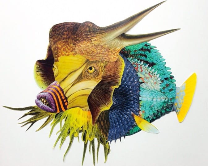
‘North American Side-Horned Bearded Gooberfish’ by Ben LaFond
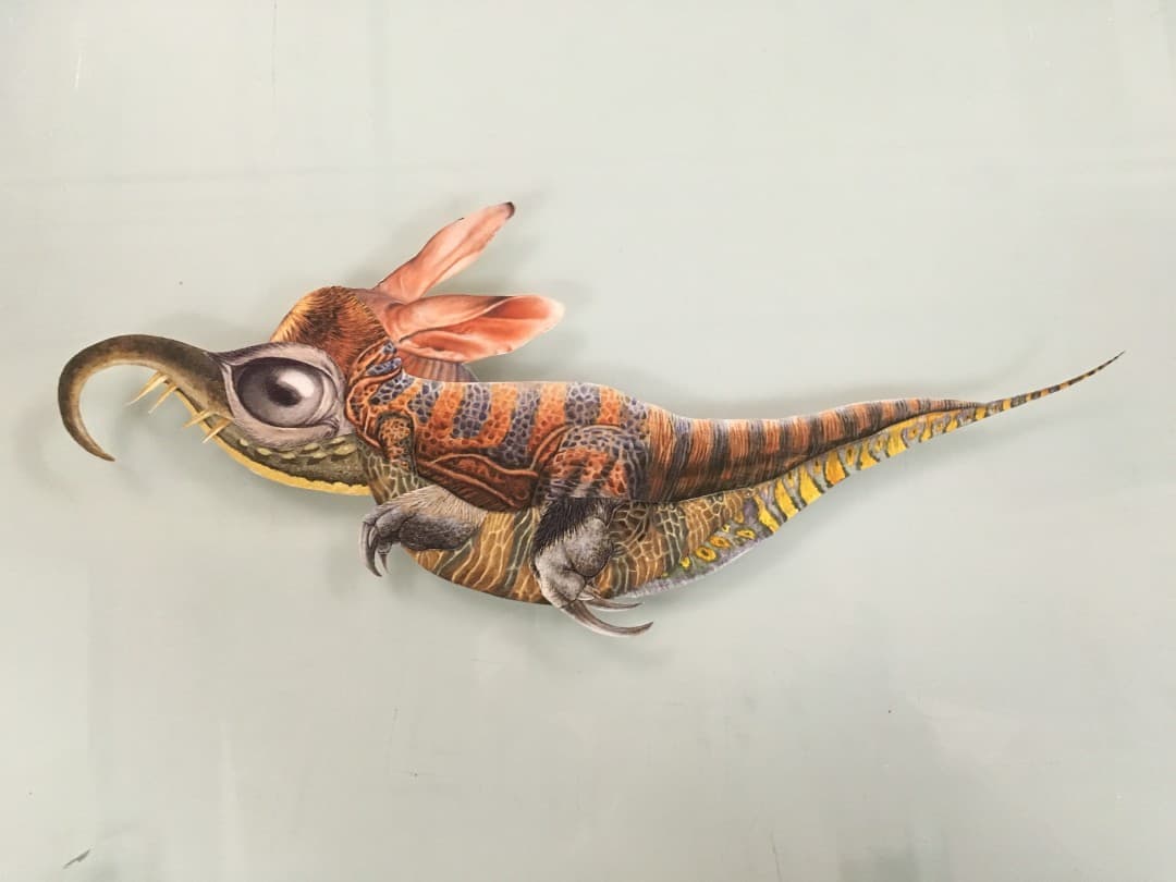
Animal Collage by Ben LaFond
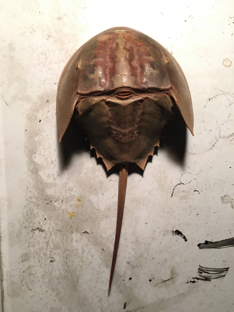
‘Good Luck’ photograph by Ben LaFond
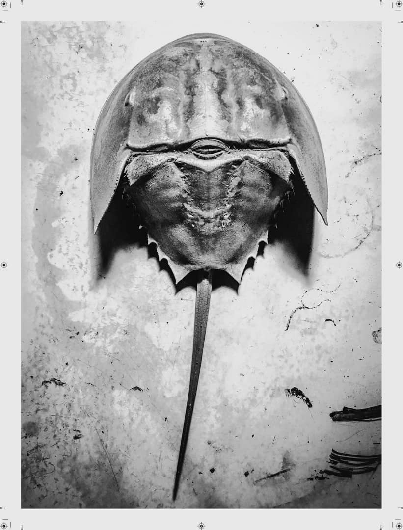
‘Good Luck’ screenprint by Ben LaFond
Through Burlesque you’ve released two sets of digital prints of your photographs and at MondoCon 2016 you debuted ‘Good Luck,’ a two color screen print of one of your photos. What decides the printing process for your photos?
No real major deciding factor I suppose. I’ve done several full-color CMYK print editions of my photos since about 2011. The ‘Good Luck‘ print is the first monochromatic screen print I’ve released and I’m very happy with the results. I’ve done a couple experiments with printing black and white photos as simple one color efforts but felt they have always fell a little short tonally, so I’ve scraped the projects.
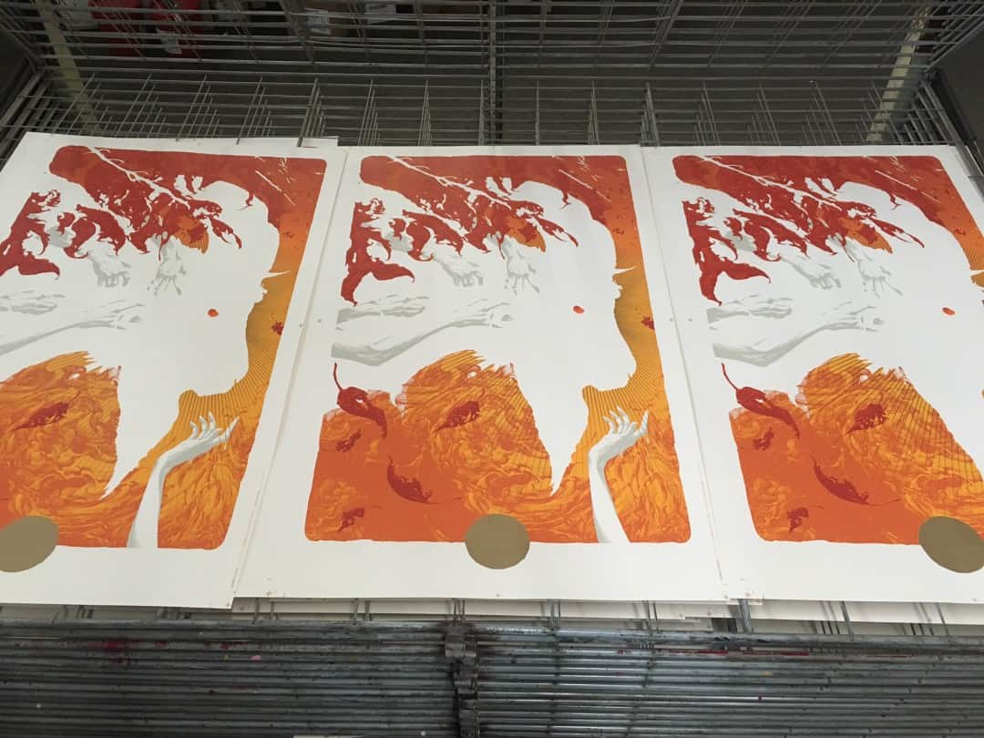
The VVitch’ by Aaron Horkey printing in process by Ben LaFond
I somehow fought through a mountain of fatigue the weekend before MondoCon and found time to separate and print the horseshoe crab image. This was in the midst of a five-day battle march printing the two versions of Aaron Horkey‘s ‘The VVitch‘ and Mike Sutfin‘s ‘Aftermath‘ MondoCon edition. Each beastly in their own right. But I couldn’t make all this sweet shit for other people and not have something new of my own to show off. It was a quick experiment in Photoshop to see if I could pick apart the image and get the tones I wanted. There seemed to be a pretty good response so I’m excited to try some new images soon.
‘Aftermath’ by Mike Sutfin (L) and ‘The VVitch’ by Aaron Horkey | both printed by Ben LaFond at Burlesque of North America
‘Good Luck’ takes the everyday shape of a horseshoe crab and delivers it with a Darwin-like austerity – it becomes foreign. The textures have the quality of a deteriorating dry plate print. The image feels ancient, lost for centuries. It also differs from your other photographs as it seems to be a studio setting, it doesn’t have the ‘found’ quality of ‘Peace Island’ or your ‘Photo Prints’ series. Did ‘Good Luck’ follow a different route than your previous work?
This photo was literally just me sitting at my art table at like 3:30AM, bored, and wanted to Instagram something before I went to bed. I have an ever growing collection of weird shit and I grabbed this taxidermy horseshoe crab I bought from the local cursed monkey paw store and tried to get some decent looking lighting out of my old floor lamp.
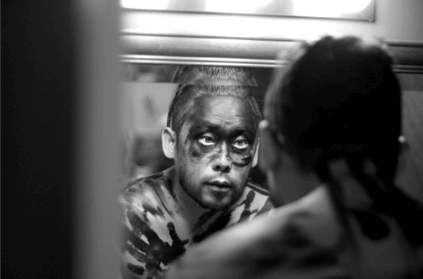
David Choe / Mangchi Hammer | photo by Ben LaFond
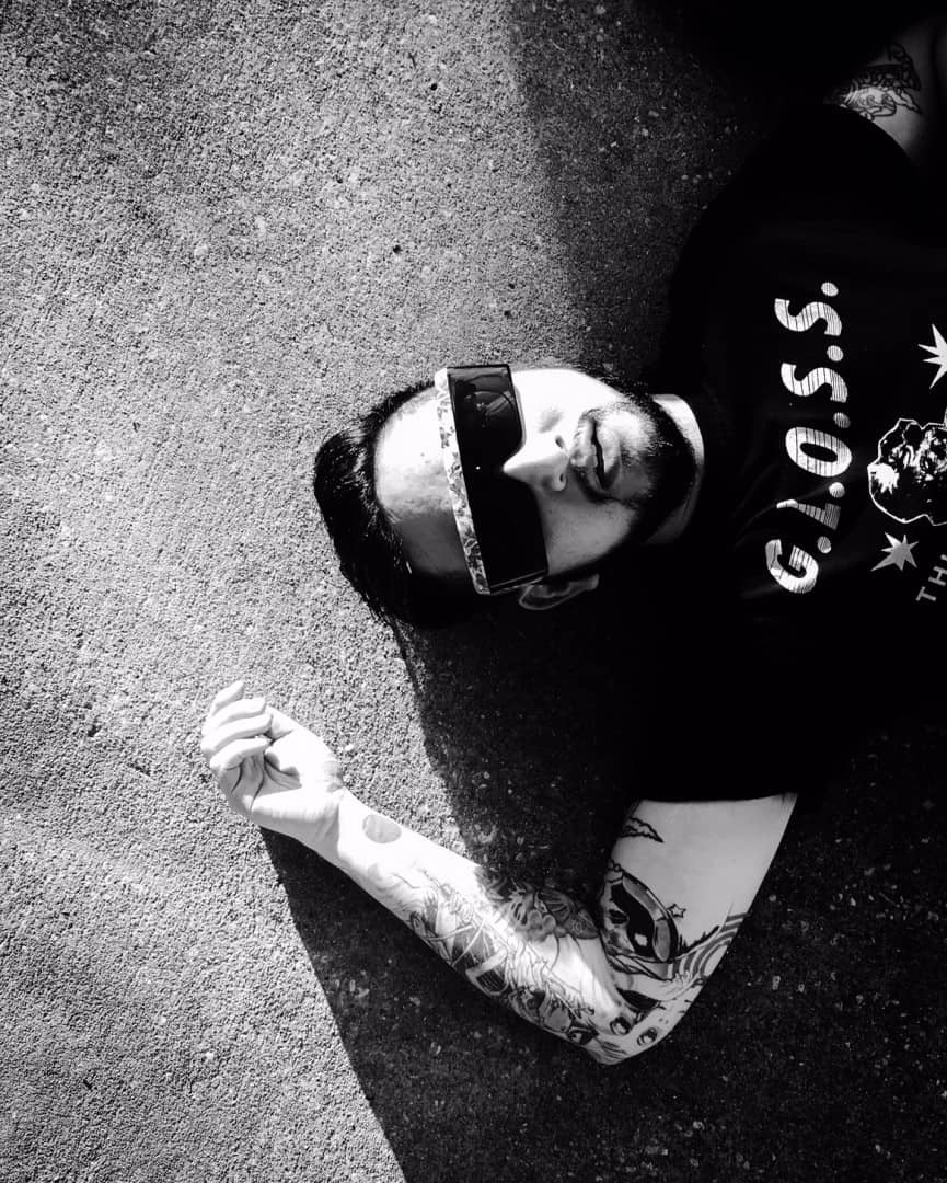
Artist Randy Ortiz at MondoCon 2016 | photo by Ben LaFond
Your work rarely features people – in only a handful of photographs do we see a fragment of a figure, but at the same time, your portrait of artist Randy Ortiz from MondoCon is an incredible image. It captures Randy’s joie de vivre and also the level of exhaustion artists reach during a long convention weekend. The photo keeps that austere simplicity of your other work but aims it at a personality rather than an object. Is the exclusion of people in your work a conscious decision?
I think my inclusion of straight-forward / obvious shots of people has always sort of ebbed and flowed. I struggle with some social anxiety / awkwardness and a lot of times I find myself really wanting to approach people for portraits but shy away and regret it later. I really want to make more effort to shoot portraits in a more controlled way though.
But I do love shooting from the hip and catching good candid stuff of people when their guards are down. With the photo of Randy, the BRLSQ crew was walking out of the convention at the end of the day and I spotted him laying on the curb with the afternoon sun throwing some good shadows, snuck up, snapped the flick quick with my phone and walked away.
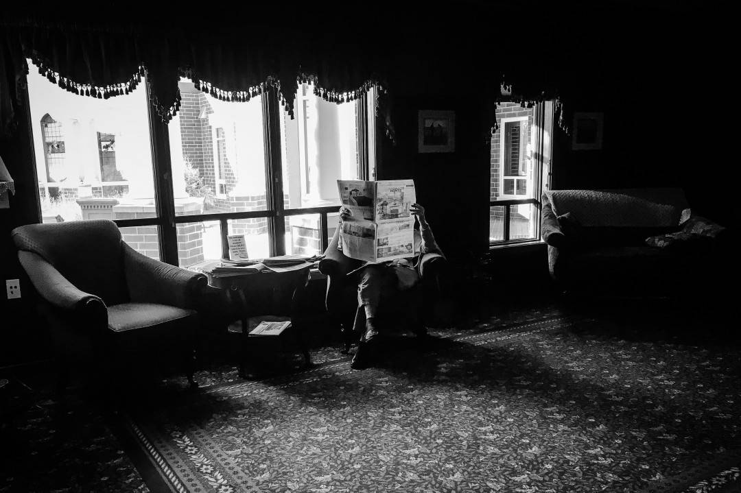
photo by Ben LaFond
Do you tend to go out and shoot by yourself? Is it a matter of shooting what’s around you?
I do go out shooting by myself quite a bit. Either on hikes down by the Mississippi or quite often I will hop in my car and take a series of random roads deep into the rural areas and see what I find. Yeah. I spend a significant amount of time alone.
What other conventions does Burlesque do? Is the convention world an important part of the ‘business,’ or is it more a fun a thing to engage in?
Yeah, we have been doing Flatstocks for a very long time. SXSW, Pitchfork, and Bumbershoot. And we’ve been very happy that MondoCon is a thing now. All of these conventions are great for catching up with friends in the industry that we only see at these sort of events, but we also love talking to customers about the process of screen printing and artists that we work with. And on top of that, it’s a great opportunity for us to showcase our print and design work to potential new clients and artists.
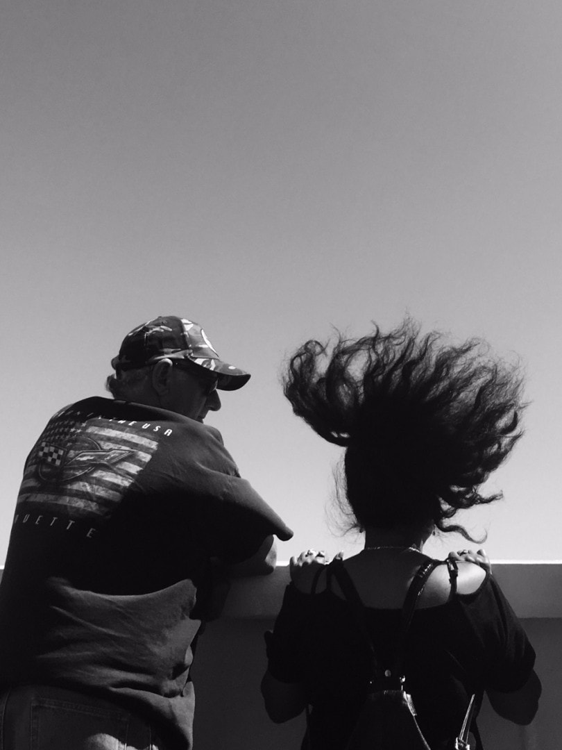
Photo by Ben LaFond
You have very little of your work online – there is no digital portfolio and your Flickr hasn’t been updated in years, in fact, outside of your Instagram and a few prints on the Burlesque site, you don’t share your art, at least in a professional manner. There’s not an online life that can build upon your Instagram feed, which is how I realized that outside of being a fantastic screen printer you are also a fantastic photographer. Is this from a lack of time, or interest, on your part?
I’m working on the digital portfolio thing slowly. I’m also slowly trying to compile images for a book, but am struggling with what content to focus on and how to present it. That is a goal for 2017. Book and maybe hang some photos on a wall somewhere, potentially inviting the general public. I also plan on trying to finish my collage animal series and present them and their story to the world somehow.
Animal Collage by Ben LaFond
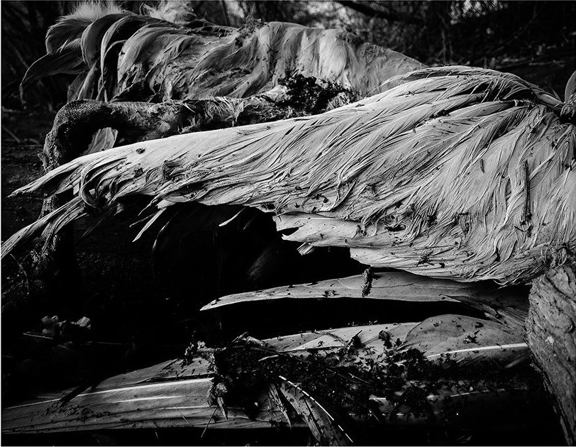
photo by Ben LaFond
