There is precision to the work of London based illustrator Thomas Danthony. If Illustration is about communication, Danthony speaks a perfect language. His work alludes to the private goings on of his characters, their private mystery. Once removed from the world of editorial illustration, minus text and copy, Danthony’s paintings hang as fine art — minimalist compositions of deft complexity.
In September 2015 French gallery Sergeant Paper hosted Danthony’s solo exhibition VOYAGE, a body of work that highlighted the core of the artist’s talents — storytelling, exotic and sophisticated. A color palette so rewarding its texture and placement grounds the show. In those focused paintings Danthony uses the empty space to speak for the events happening outside of his canvas. His craft is in depicting a minor detail with such truth that the entire world reveals itself.

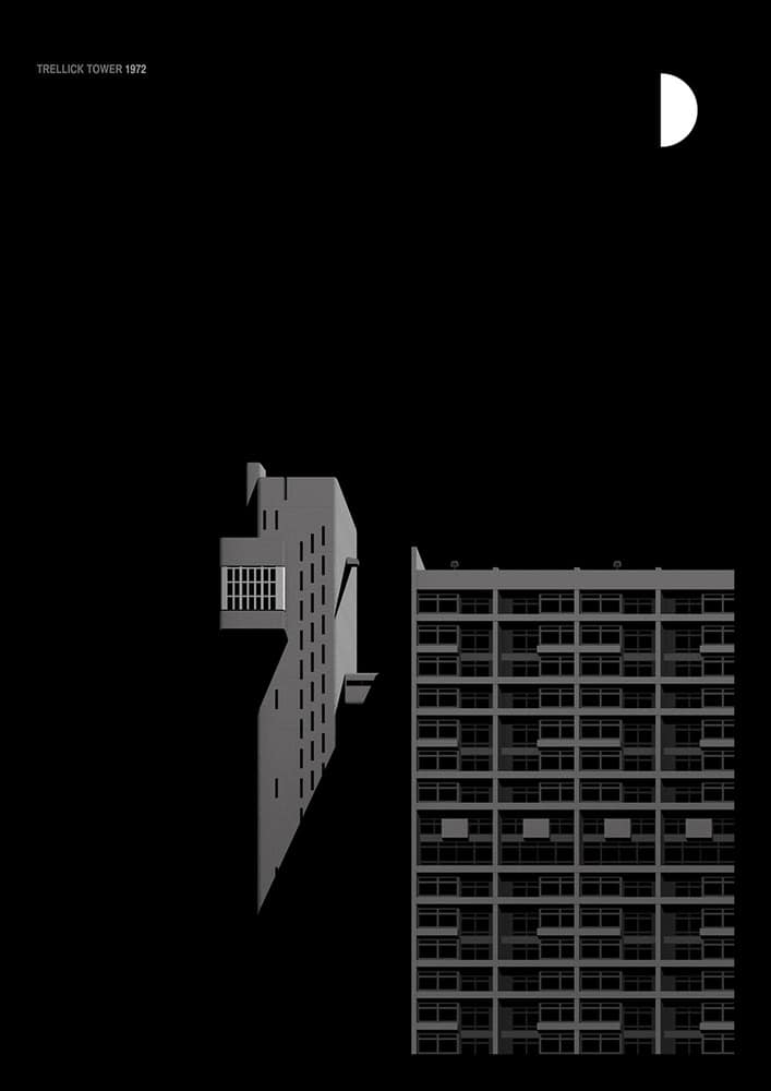
‘Trellick Tower’ by Thomas Danthony for Black Dragon Press
Cj: Your print series for Black Dragon Press showcases famous buildings around London such as Trellick Tower, which was designed in the Brutalist style by Ernö Goldfinger. For a building with a dubious reputation, you achieved something quite unique – you made it sexy. Not something that comes easy to architecture, especially ones that proudly display so much concrete.
Very little of the buildings are shown, but you know they’re there – you feel them in the shadows. They’re simply illuminated by moonlight or streetlights, and it’s quite beautiful. When approaching the series, how did you decide which angles to choose as your point of view? Were they always going to be black and white?
TD: When I started the series I did a lot of research and realized that the massive amounts of concrete were giving them that B&W feeling even in the daylight. So it was making sense to start from there.
I love those buildings and I wanted to depict them as I see them with poesy and a hint of narration with the moon cycle as lighting to tie the series together. Also, I wanted to show the actual proportion of the buildings so I decided to go for a front view and to only give volume with the light and shadow game.
Were you able to visit the buildings in person? Were you working from reference photos?
I live in London so when I started working on the project, James from BDP allowed me to choose the buildings, so I picked the ones I like the most or that had a meaning for me. I then worked from pictures and from my observations/souvenirs.
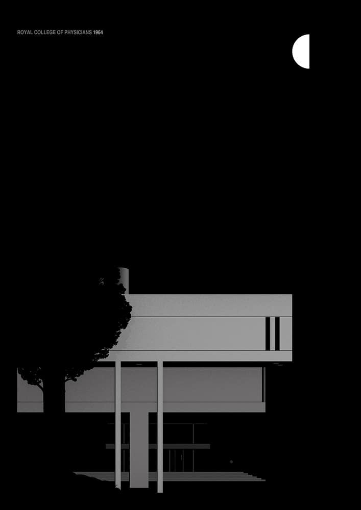
‘Royal College of Physicians’ by Thomas Danthony for Black Dragon Press
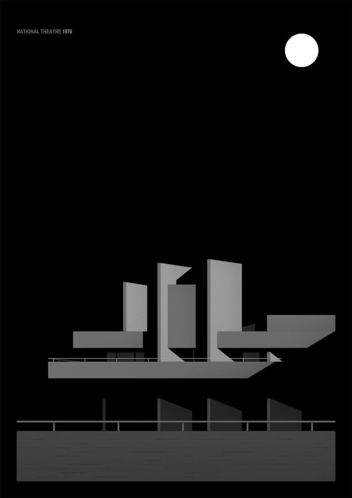
‘National Theatre’ by Thomas Danthony for Black Dragon Press
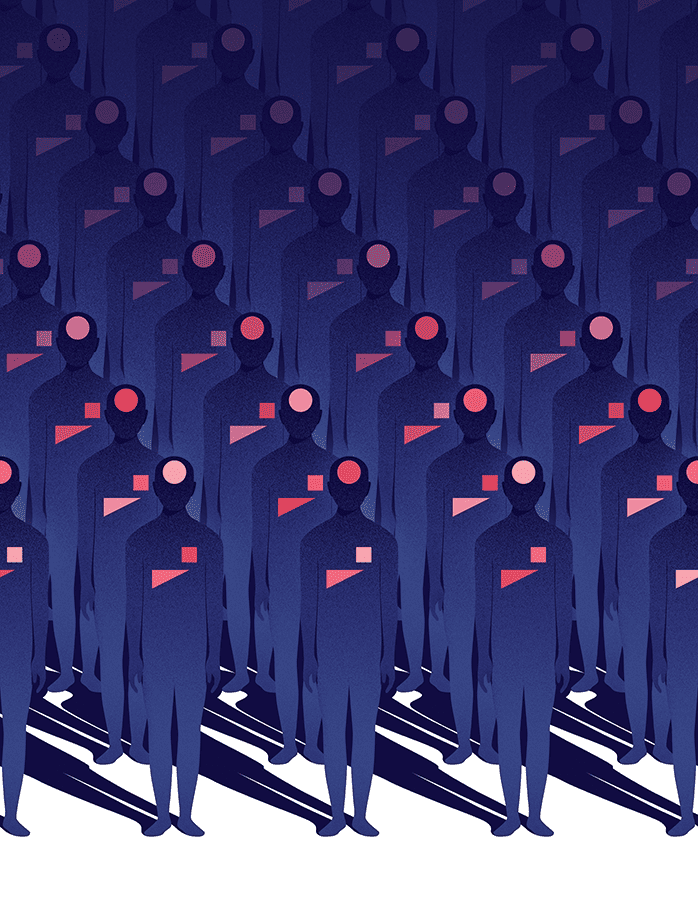
Cover for Science Magazine by Thomas Danthony
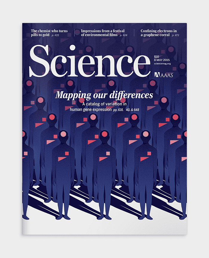
Cover for Science Magazine by Thomas Danthony
Your work exists as both fine art and illustration – an interesting position for commercial work. Your commercial portfolio is quite extensive but so is your work that has appeared in galleries and as art prints. Are these two separate worlds for you? Do you operate differently, or does your process change, when approaching commercial work versus a piece for a gallery?
For me, it’s the same. When I create an image it’s to express something or give my view on something — but depending on the project, and especially with commercial work I have to do concessions. Sometimes commercial projects push me somewhere I might not have gone by myself. So I would say it’s complimentary.
Are you able to pick and choose commercial projects that offer those types of challenges you’re looking for?
Not really, because at the time you take a project you don’t really know yet if it will be challenging or not. Sometimes the most straightforward projects end up being very challenging or the other way around.
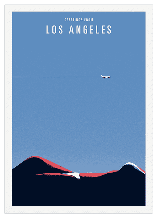
‘Los Angeles’ by Thomas Danthony
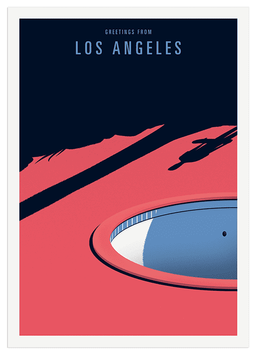
‘Los Angeles’ by Thomas Danthony
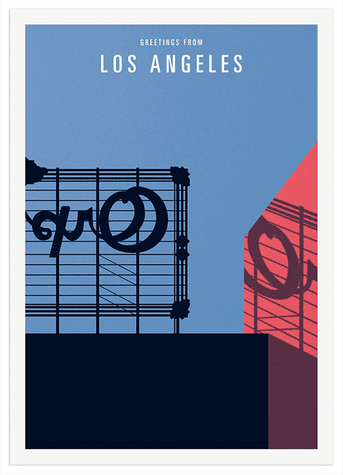
‘Los Angeles’ by Thomas Danthony
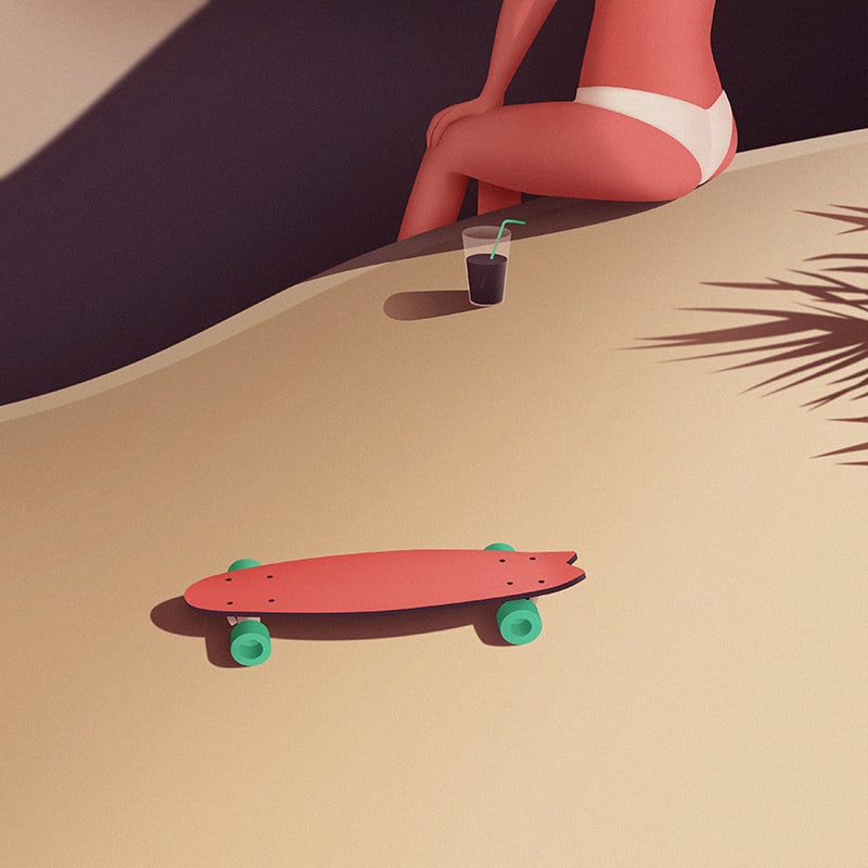
‘Harder Than You Think’ by Thomas Danthony
The version of Los Angeles you created for your series of postcards is quite romantic. A touch of classic Hollywood. There’s a film noir aspect to all of your work – that sense of mystery, and like the ‘Brutalist’ prints, they’re also sexy. Even something like ‘Harder Than You Think’ with its cheerful color palette has a noir vibe to it. Are you thinking in terms of style or mood when you start a piece? What leads the process?
I think the mood comes by itself from my personality. I sketch in colors though. Even if the palette is evolving during the sketch phase it helps me to build something balanced. I try to stay open and pick colors depending on the subject. But it’s also a trap sometimes, even if I don’t save my colors, I often end up with similar tones.
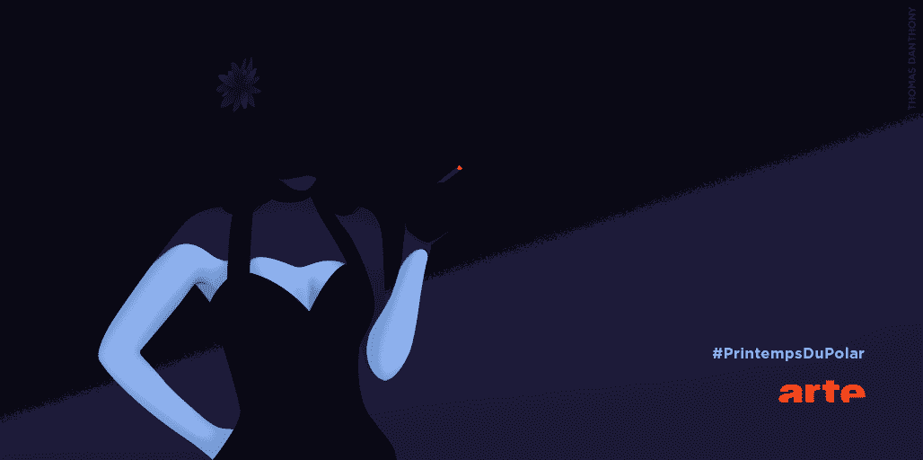
‘The Black Dahlia’ by Thomas Danthony
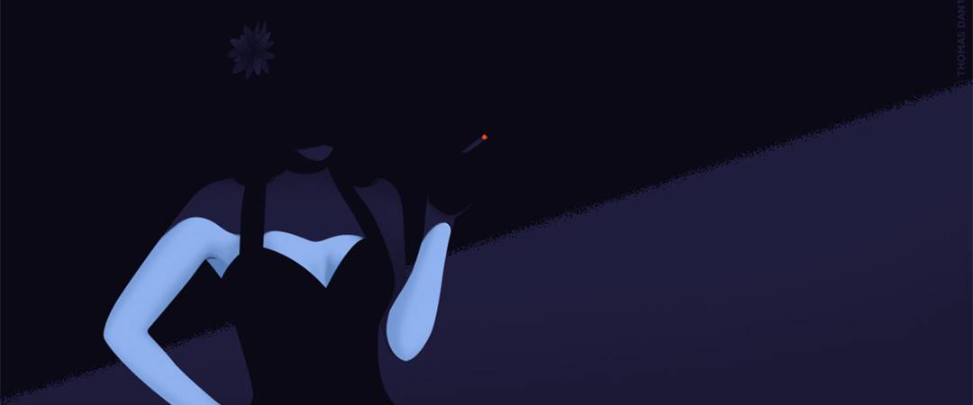
For your series of noir illustrations for ‘Le Printemps du Polar,’ your keen use of contrast turns each minor detail into a major part of the piece. The woman’s burning cigarette ash makes that design work – it fills the area with just a spark. So much is going on with so little on the page. You are able keep that perfect balance. How do you know when an illustration needs ‘more’ or has too much going on?
This project is very specific for two reasons — the turnover was very, very short, and I had total freedom. Since I was doing the AD myself I was directly sending the final to the client on the deadline. I tried to stick to film noir where the light plays the big role and I wanted to keep the mystery feeling, so the focus would have to be in the details. I think the more simple it looks, the harder it is to design and sometimes choices are really hard to make.
Sometimes from the very first sketch I am happy with the composition, and sometimes I spend hours looking at it not knowing what to change to make it work. I usually stay at the sketch phase tweaking endlessly until I am confident it works. Then I draw it.
Is the sketch phase in pencil or pen, or is your entire process digital from start to finish?
Mostly digital even for the sketch. I don’t really sketch on real paper anymore even though I still enjoy it. It’s also probably why I enjoyed so much the process of going back to painting with gouache.
‘Sentinels’ (work in progress for VOYAGE) by Thomas Danthony
Work in progress for VOYAGE by Thomas Danthony
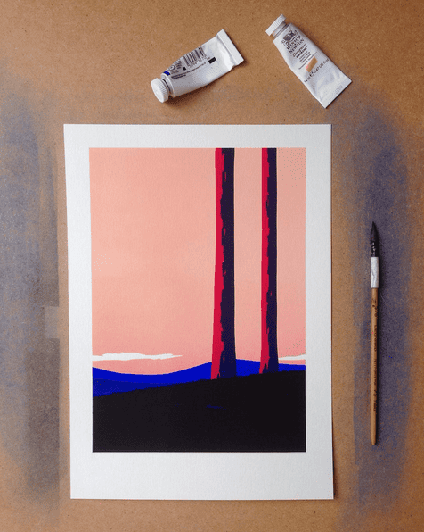
For your solo show VOYAGE you switched mediums from digital to gouache. Did you find that there are there things you can achieve better with analog tools that you can’t with a computer?
The starting point was the need to go back to something manual and go away from the computer. The technique I developed with gouache is an adaptation from the 19th century stencil technique used to reproduce art. It’s half way between screenprint, woodblock, and painting. I was feeling limited with screenprint (even if I love it) and that new medium definitely allowed me to go very close to what I wanted to do. I also love the process. I used to do a lot of stencil during my design studies, so for me it’s like going back to my first tool but with a new approach.
I also like the very time consuming process behind it. It puts limits, and involved solving technical problems along the way. I am still improving, and I am looking forward to taking it further! I am already thinking about my next show and can’t wait to start planning it.
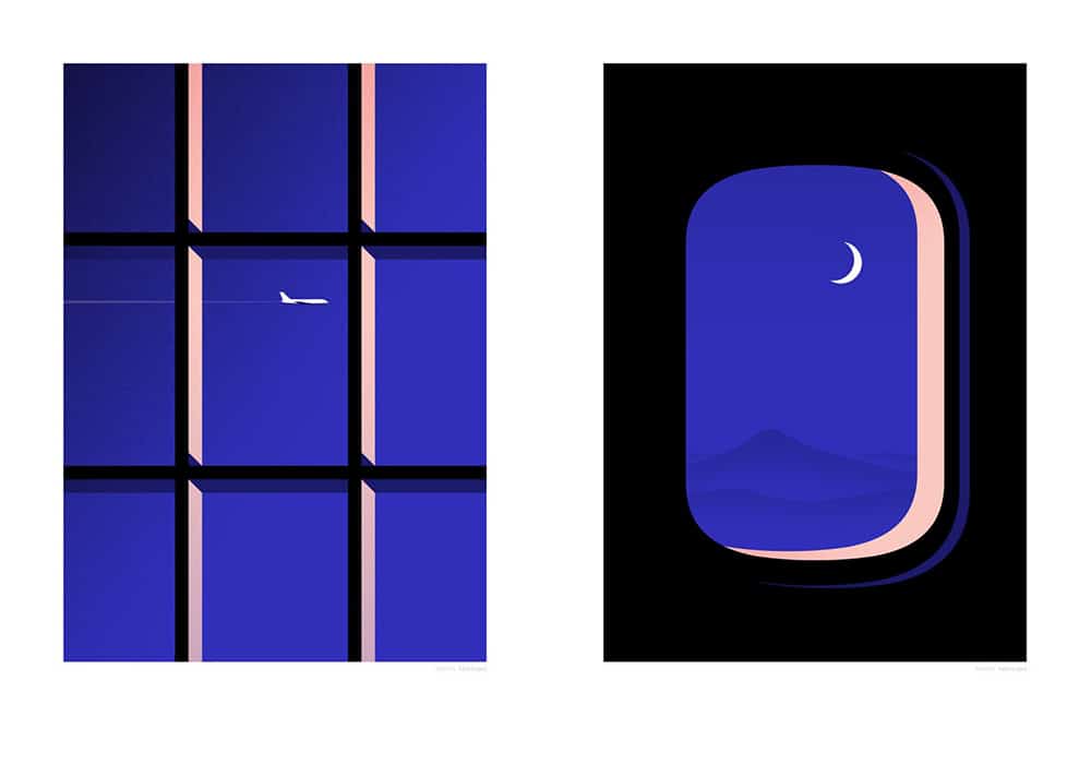
‘Window’ & ‘21,000 Feet’ by Thomas Danthony for his solo show VOYAGE
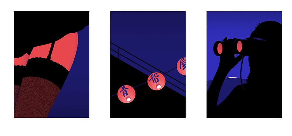
‘Cabaret’ & ‘Green Gang’ & ‘Observer’ by Thomas Danthony for his solo show VOYAGE
The paintings that make up VOYAGE flow like a wordless narrative. Did you imagine them to be seen in a specific order, or for specific prints to be hung as a diptych?
Yes, there is a story. It’s very loose, so people can use their own imagination too.
I proposed a specific order for the paintings in the gallery and in the catalogue. Since the digital prints were also on display during the show, we decided to show them in a different order, by diptych and triptych using idea association, for example ‘Jungle‘ and ‘Snake,’ ‘Window‘ and ‘21,000 ft,’ and ‘Cabaret‘ – ‘Green Gang‘ – ‘Observer.’
How involved was Sergeant Paper in the development of VOYAGE? Did you need to get their approval on your overall concept for the show?
I showed them WINDOW which was the first piece and the starting point for me. Then they trusted me and gave me total freedom, they discovered the final set of pictures at the end. The last painting was only finished 2 days before the show!
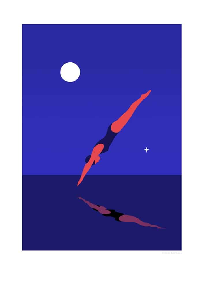
‘Midnight Bath’ by Thomas Danthony for his solo show VOYAGE
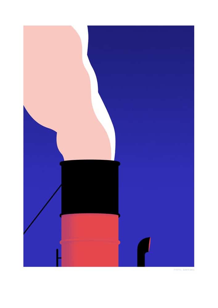
‘Smoke’ by Thomas Danthony for his solo show VOYAGE
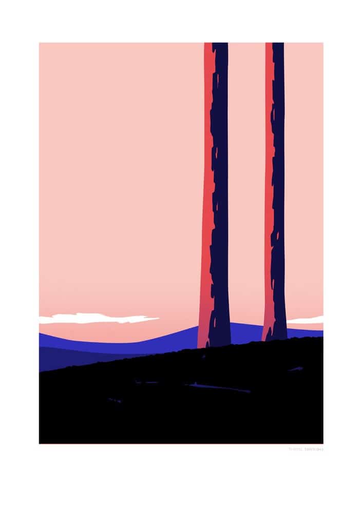
‘Sentinels’ by Thomas Danthony for his solo show VOYAGE
There’s magic in that shade of blue that grounds each painting in VOYAGE — it conjures up a specific time of evening, that fleeting hour where every moment feels special. Color plays a huge role in your work but that blue is especially significant. It aids in the narrative. Was that one of the first elements you landed on for the show? Was your color palette integral in the creation of the show?
Yes, Actually I picked that blue very early. It looks so intense on the painting, the kind of colors you can achieve only with gouache. I decided on the color palette very early and it was very important in my process.
Work in progress | Thomas Danthony
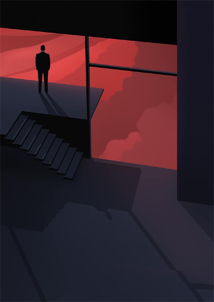
‘Handsome Future’ by Thomas Danthony
Your work is a lot about what is not shown. In ‘After Wall Street’ the shadow tells us the story. For ‘Handsome Future’ there’s a sense of waiting. Again, the shadow tells us the story. We know the time of day and we imagine this man’s entire life from this static image. Is narrative work something you would be interested in doing? Something like a graphic novel?
The mystery is one of the things I love the most in illustration. Since most of the time you have to tell a story with one single image, it gives space to play with the viewer’s mind, what happened before, after? Who knows, everybody can make up his own story and that’s what is so fun about it.
I don’t think I would be able to do comics for example, I like to spend too much time perfecting a few pictures than drawing hundreds of them to tell a story. I have been a huge fan of Belgian / French comics since I was a kid, so there is probably an influence there though. I worked on a graphic novel project last year but I am not sure it will ever see the light of the day!
Is that a project you’re doing by yourself or with a writer? Will it not see the light of day because you’ll abandon it, never finishing?
Let’s say it’s on hold for now. It was a personal project half way between poetry and comics. It’s not lost because it helped me in the process of creating VOYAGE. I consider it that way now, I might decide to finish a couple of pages from it though. I am thinking about starting a new book project. Will see what next year brings!
Your body of work goes from editorial to limited edition posters. Is there an attempt to balance the client work with your personal work?
Definitively, I think the balance between client and personal work is the key for a happy illustrator. Personal work allows me to keep experimenting and to express myself. It often leads to new commissions and that way I avoid to be stuck always being ask to draw the same kind of stuff.

L’Or Espresso illustration by Thomas Danthony
L’Or Espresso illustration by Thomas Danthony
L’Or Espresso illustration by Thomas Danthony

![]()