In the work of UK based illustrator Marc Aspinall you find the return of a classic era of modern illustration. His paintings bring back those decades-long passed where bookshops and grocery store shelves were dominated with magazines full of articles written by intelligent and witty authors, their words illustrated by innovative artists who used those outlets to create miniature masterpieces in the margins.
Aspinall’s digital paintings combine the tactile freedom and efficiency of those illustrators from the ’50s and ’60s who colored the pages of publications such as The New Yorker, Playboy, and Reader’s Digest with his own distinct visual ideals and values. There’s a clarity to Aspinall’s craft — he does what the job ‘illustrator‘ requires and illustrates, perfectly, the mood and story of the words his art accompanies.
Aspinall’s work appeals to the sophisticate, the gentleman in us all. His art lets us feel far more intelligent than we may actually be.
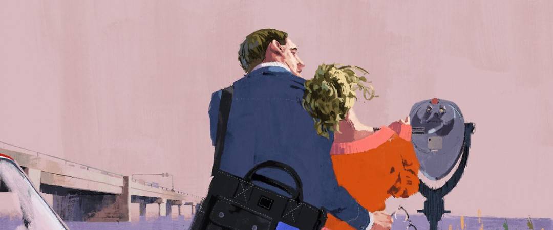
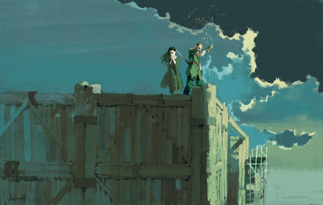
Marc Aspinall’s illustration for the BBC crime drama ‘Happy Valley’ for The New Yorker
ETDC: Your work is decidedly a throwback to illustration of the 50s – wonderfully sophisticated and intelligent. Added to this, your work regularly appears in The New Yorker, a publication known for its incredible editorial illustrations. Your career is very focused. Was editorial work always your main goal?
MA: I’m happy you identified my work with that of the ’50s, I’d like to throw in the more energetic work of the ’60s as a major influence too.
It wasn’t too long ago that I discovered this era; I think mid 2012, it was a fantastic picture by Brian Sanders; depicting a train station, fantastically expressive and colourful composition capturing a moment in time. The bubble and streak and pencil hatching really took me, ever since then I wanted to be apart of that, even if I’m five decades or so late!
Editorial was definitely a main goal in the short term; it felt tangible as a budding illustrator and my viewpoint was that there’s a high turnover of magazines, even in the somewhat dwindling market (although positively I did read that there is apparently a slight resurgence in print lately, albeit predominantly in the DIY/independent realms).
I saw that there were so many magazines, on such a variety of topics, that there must be one or two that would take me on to answer their briefs. The fact that they are churned out monthly or sometimes weekly felt like a positive to me; if I don’t make it in this months issue, maybe I might be asked for next months, and hopefully, in the meantime, I’m working on something for a different magazine altogether.
The real ‘main goal’ for me, and still is; to work on book covers. It’s almost like editorial, but a little more permanent; a little more prestigious maybe. I used to be one hundred percent graphic design-focused, before getting back into drawing and becoming an illustrator. But even then my goal was very much the same. I received Chip Kidd’s Book One as a gift and loved how he could combine such strong, nicely designed book jackets with more illustrative titles and comics. I’d love to grace a book jacket with a suitably strong graphic solution. Potentially timeless.
The work for The New Yorker doesn’t feel too much like an editorial in the traditional sense; the pieces aren’t contriving towards an abstract subject or trying to be too clever. I imagine myself creating snippets from a storyboard, or maybe a panel from a comic book, rather than a straight-up editorial. Directing my own interpretation of the subject at hand. I’d say stylistically I’m suited to that approach; I believe abstract concepts lend themselves better to abstract, more graphic visual interpretations. I’d say this was the main reason for self-proclaiming to be a ‘lifestyle illustrator,’ a little more specific than just ‘illustrator.’
Marc Aspinall’s promotional illustration for Industry Portage
Dunhill Menswear Spring / Summer Suit Collection illustration by Marc Aspinall
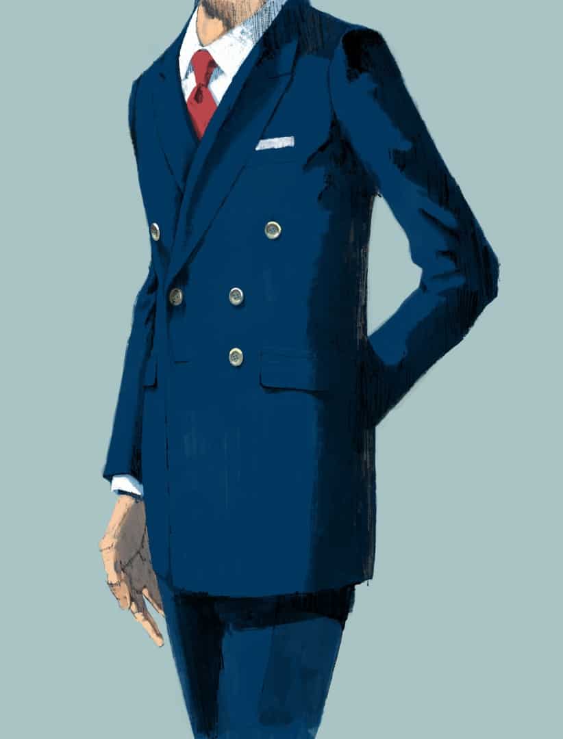
Dunhill Menswear Spring / Summer Suit Collection illustration by Marc Aspinall
Dunhill Menswear Spring / Summer Suit Collection illustration by Marc Aspinall
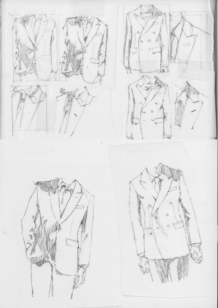
Your series of illustrations for Dunhill Menswear’s Spring Summer Suit Collection does exactly what I’d assume was the goal – it makes me want to have those suits. I want to be that sophisticated and dashing. When working with fashion, does the client provide photos or a live model for you to work from? What’s the approval process like, in terms of getting the garments accurate?
This was a first for me, but definitely something I wanted in my portfolio. Appreciating the old fashion print ads for Puritan or Pendleton of the ’50s and ’60s; I really wanted my own slice of that, and gladly took on the role when Dunhill approached me. The brand is very classic, and yes wanted a very sophisticated look, but with that slightly rugged edge that my work offers.
Elaborating further on that ability to put yourself in the model’s shoes; I think the brand decided on cropping at the neck so we the viewer could easier place ourselves in those suits – that’s my theory anyway. I’d have loved to place one of the figures in a more personal setting, maybe something social; maybe a beautiful girl and a cocktail in hand; maybe a cigar slowly burning away too!
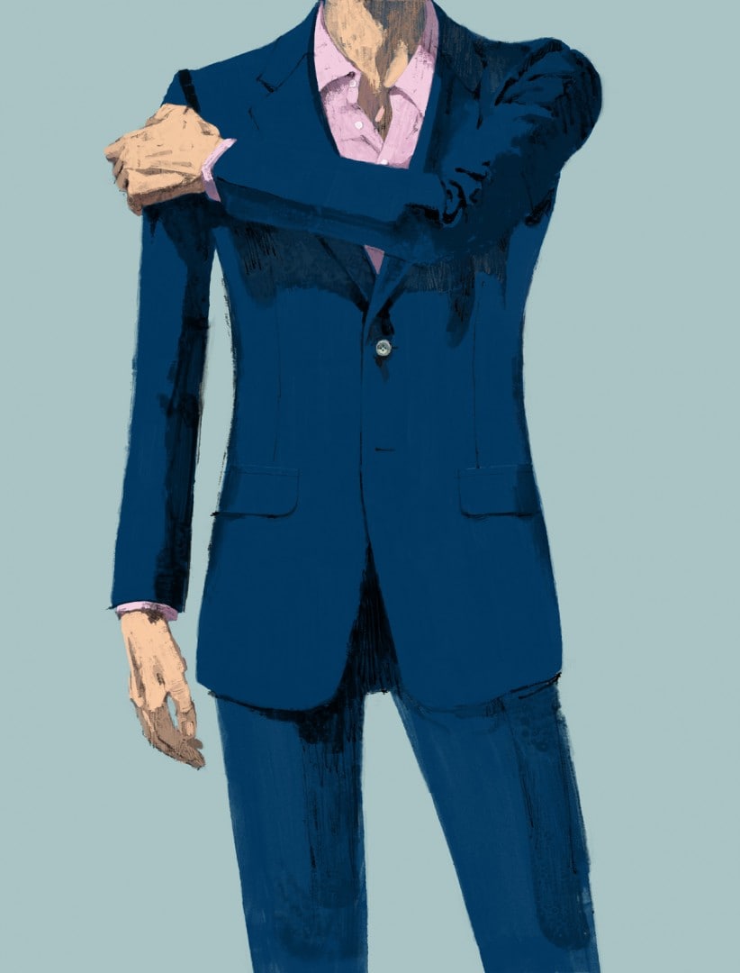
Dunhill Menswear sketches by Marc Aspinall
For the project I was provided photos of the smaller details, so the melton lining on the collar, the trouser fastenings and then I was given flat line drawings of the different cuts; Belgravia, Hacking, St James, and both notch and custom lapel. There was no model to work from, and most if not all of it was drawn from my imagination. Looking back I’m not entirely sure why I didn’t shoot my own reference for the drawings. When I look at a few of them, I can see mistakes; and I could have maybe understood and conveyed a better sense of light and more accurate patterns in the fabric creases. And saved a lot of time too!
The approval process wasn’t too painful. I ensured the majority was done at the pencil stage. So sketches are approved to nail down the various poses for which jacket, and then the final is drawn up on the computer, ready for colour. If I can get all of my amends down in this stage; relating to pose, and fashion then I’m happy at the end. There was initially an issue with the legs being too thin, waist too thick, pockets too high. Small changes, that are easy to solve at the line art stage – thankfully!
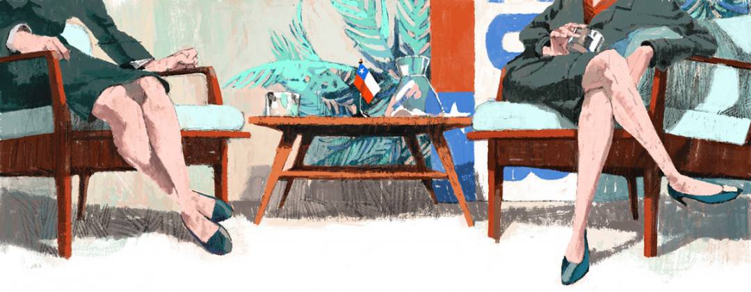
Marc Aspinall’s illustration for the politic piece ‘Old Enemies, New Battles’ about Chile’s presidential campaign for Monocle
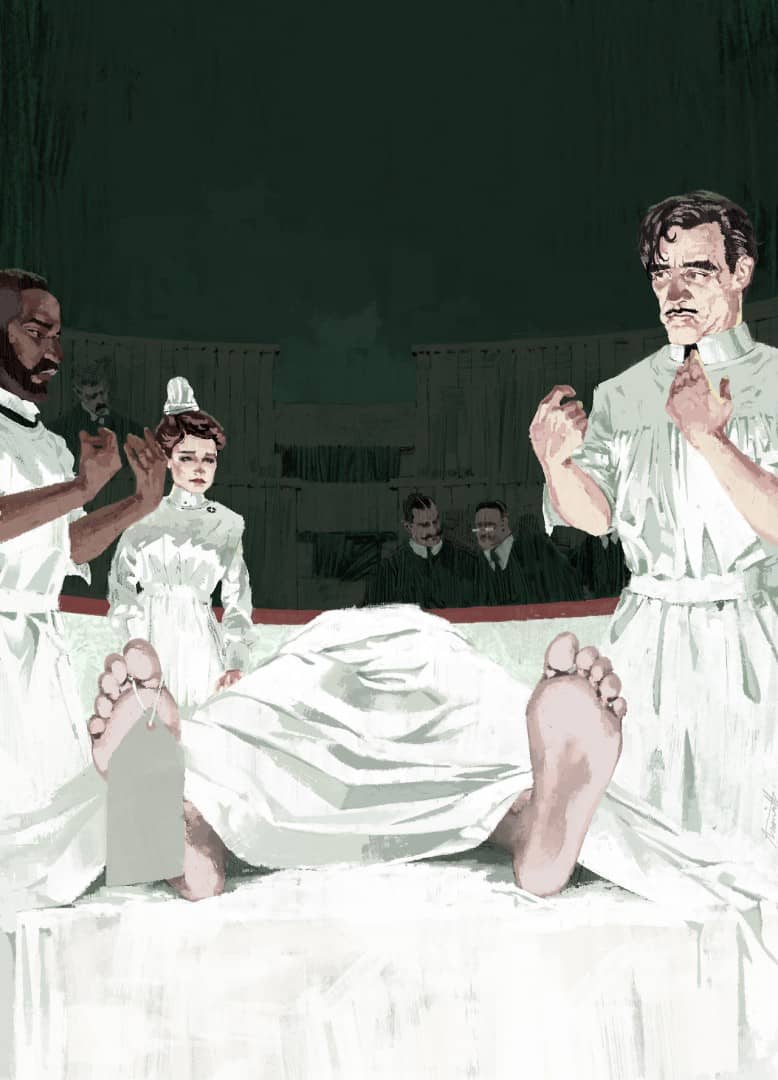
Marc Apinall’s illustration for Showtime’s ‘Masters of Sex’ for The New Yorker
With editorial work, the client can easily use a photograph – have you had to sell clients on going the traditional illustration route?
This is never something I’ve dealt with. I suppose if a client is asking me; they’ve already had that discussion in-house. A photograph can sometimes be quicker to acquire, especially if it’s stock photography, but I do feel illustration can offer something different. And of course, adds variety to the printed page. Monocle, a fantastic magazine showcase the two mediums incredibly well, it almost feels like part of their visual branding; The New Yorker equally shows great scope in that regard, too.
With my work I try to present a snapshot, or movie still; but one that has been composed, and directed; for example, the Llewyn Davis piece is devised from elements from the era and where the film predominantly takes place. Using reference photos of the Cafe Figaro to get it close to authentic, then the traffic signs and cars I have the ability to arrange them however I like to benefit the composition, so while it could potentially look like a still from the film, it’s entirely fabricated to relay the message.
Although I have not had to fight my corner; I have had work bumped for photographs a few times. It’s a disappointing feeling; sometimes you follow the wrong solution, maybe the art director and I are seeing a certain vision, but the editor might have a change of heart and a photograph is used instead, editorial seem to always get final say. Can really knock my confidence and I find I’m doubting myself and my abilities, and a strong sense of having failed the client. I’m a problem solver, and sadly the problem wasn’t solved.
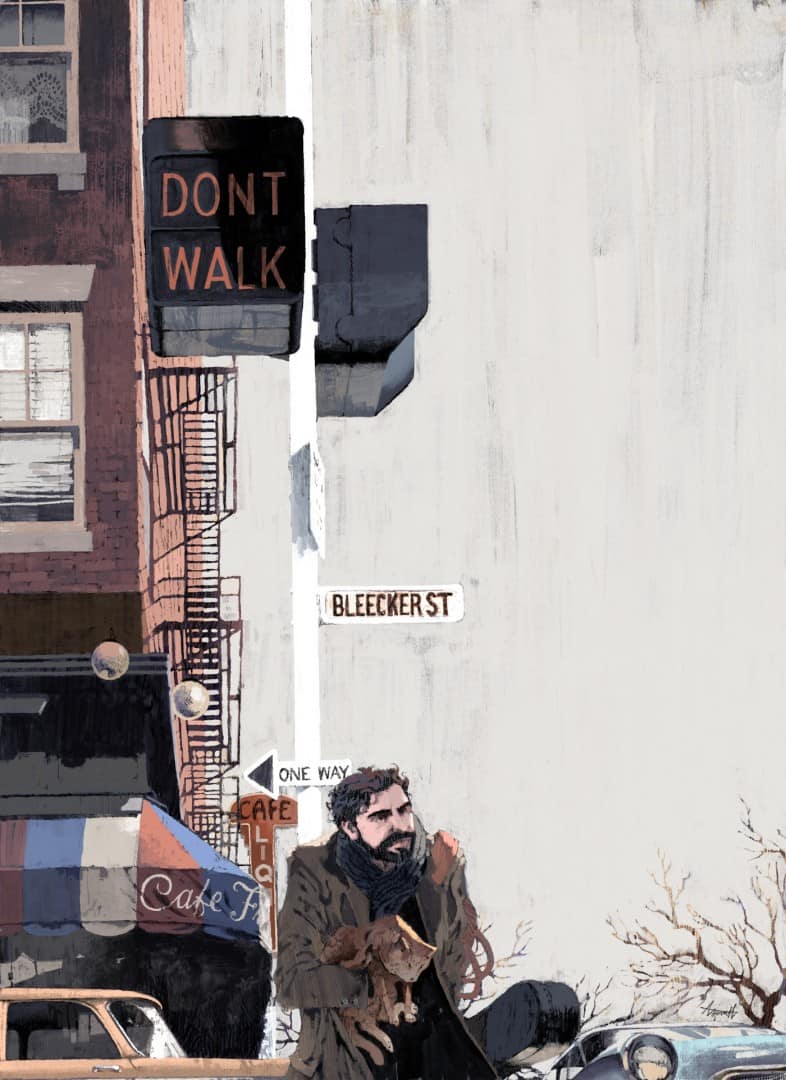
Marc Aspinall’s illustration for The New Yorker’s review of the Coen Brothers’ film ‘Inside Llewyn Davis’
Your Inside Llewyn Davis piece for The New Yorker is incredibly subtle – the cold winter bearing down on Llewyn, a man lost in the city. Like a lot of your work, it doesn’t look like a digital painting at all. The white brush strokes are so wonderfully textured. Did you always work digitally, or did you start with traditional methods?
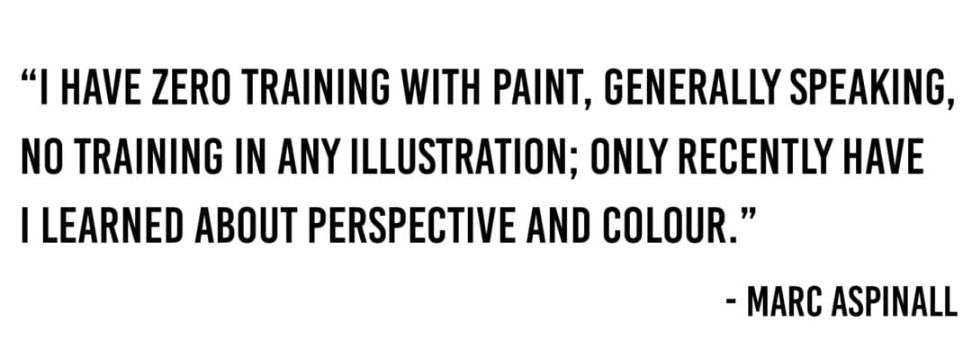
I have zero training with paint, generally speaking, no training in any illustration; only recently have I learned about perspective and colour.
My colouring method is a bit of a cheat, and a bit convoluted at the same time – if that were possible. I cheat in the fact that my aim is for a traditional painted look but with the safety net of digital. I find that Photoshop can do so much in pretending to look traditional; but creating washes, and dry brush can all feel a little false.
You don’t get that wonderful bleed from wet on wet; dry brush can feel too orderly and pattern like. So I meet in the middle and hand paint separate layers; a wash layer, dry brush layer, bubble and streak layer. If there’s a large area of pencil marks or maybe crayon, I’ll do that too, but I do have some good digital pencils made up that I’ll use more often than not.
The piece I did for The Knick has a large portion of the background scribbled in; that was all done with a chunky crayon. This is all scanned in, and utilised with the magic wand tool as I go along; usually I’ll drop in the base washes for the background, then a darker underpainting for the figures and object then work up with my chosen colours, finally arriving at the final picture; which usually ends up being on one or two layers total. Like I say, a bit convoluted, but it seems to be doing the trick on the whole.
‘The Knick’ illustration for The New Yorker by Marc Aspinall
This method was a gradual thing; in that, I was 100% digital with a flatter, more graphic approach to my work. But as I discovered the works of the golden era and their wildly experimental and tactile approach, I too wanted to express an appreciation for what they were doing.
I wear my influences on my sleeve, for sure. Guys like Bernie Fuchs, Brian Sanders, Robert Heindel, Robert McGinnis; I loved how they seemed to be throwing all sorts of ingredients into the pot and creating exciting and arresting pictures. I often feel like the digital aspect of my work hinders any real spontaneity, but there are instances where I’ve managed to do something a bit different to last time or aligns closer to what my mind’s eye is showing me. One day soon it might be nice to be entirely analogue, and know how to mix paint, and produce a picture from start to finish on a surface you can hold.
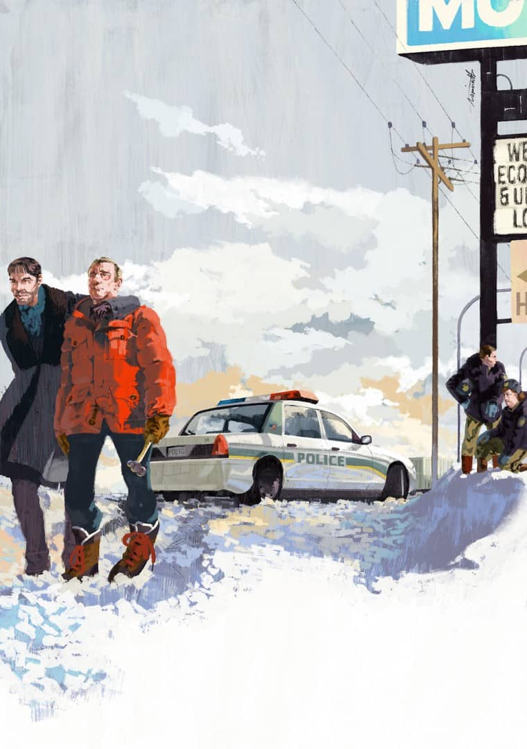
Marc Aspinall’s illustration for the TV version of Fargo for The New Yorker
Marc Aspinall’s illustration for The New Yorker’s review of Park Chan -Wook’s film Stoker
Your illustrations feel very well balanced – such strong and simple design. Are you doing rough sketches before you start the final piece? For something like your ‘Stoker’ piece for The New Yorker, does the client get any sketches beforehand? Are they telling you what exactly they want?
The balance and design I think come from having studied graphic design rather than illustration. My tutor at the time taught us about balance, visual hierarchy and to love white space. So I suppose this over time informed how I think compositionally, I literally knew nothing before those two years of study. I’ll arrange things and objects with consideration to where the eyes might go, and try and direct them accordingly. Thinking about the edge of the picture, how to bring the eyes back into the picture.
Sketches are always provided. Usually no bigger than an inch or so. They’ll be super rough, tweaked, re-drawn, again roughly; maybe I need to try that car at a different angle. Then once I’ve got an idea I’m happy with I’ll trace it up a little tidier ready for the client’s feedback. Sometimes I might suggest a lighting scheme too; especially if the image is particularly moody thematically. It’s rare that the client will have a vision of what they want; I sometimes ask, but not for anything too specific; it might just be more of a need to know who and what might need to show up in the image. Compositionally and conceptually it’s up to me.
It’s actually not too great if a client has a strong vision of their own. As a problem solver, I like to conceive and design the idea to my understanding and interpretation of the brief. If it didn’t come from me organically, from my own design process it can be creatively frustrating. I think you end up resenting whatever work your doing.
‘Sanctions on Iran’ for Ethisphere Magazine by Marc Aspinall
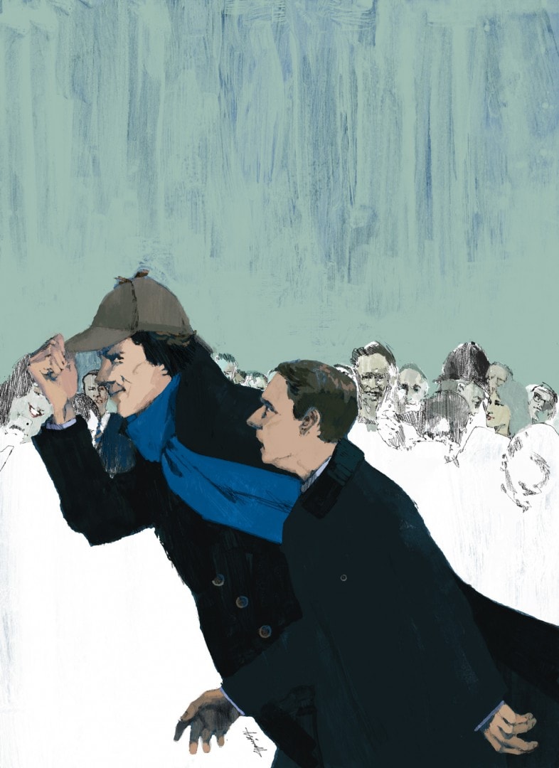
Marc Aspinall’s illustration of the PBS Masterpiece show Sherlock for The New Yorker
The dimensions you’re working with for a magazine are incredibly small. You don’t get much space to get your point across. Is that limitation a hindrance?
Dimensions vary a lot. The New Yorker full pages are nice, plenty of space and a chance to go to town on some of the rendering and mark making. I do however like the smaller pieces too. There’s the challenge of how to utilise the space, thinking about how far away we are, the visual depth of the picture too.
A small picture with key elements set to the back might miss the mark completely; it’s also harder to aim for a likeness of someone famous with a smaller image. Larger pieces pose challenges of how to keep the eye moving along the right path, the eyes can get lost in such a large space. Also how to deal with larger areas, shapes, and details that don’t need much attention but are key to the composition – how do you strike a balance between rendering, do you keep the edges clean? Roughen up the edges, maybe? And how much detail should I include or exclude.
For a recent commission, I was painting large areas of snow. I knew I couldn’t just have the paper white show, even if it might save a good deal of time. Instead, I had a blue underpainting with white washes on top. Increase the density of the white wash where I want the eye to focus, and let more blue show as the wash thins; creates a considered vignette and also interesting surface texture for the piece overall.
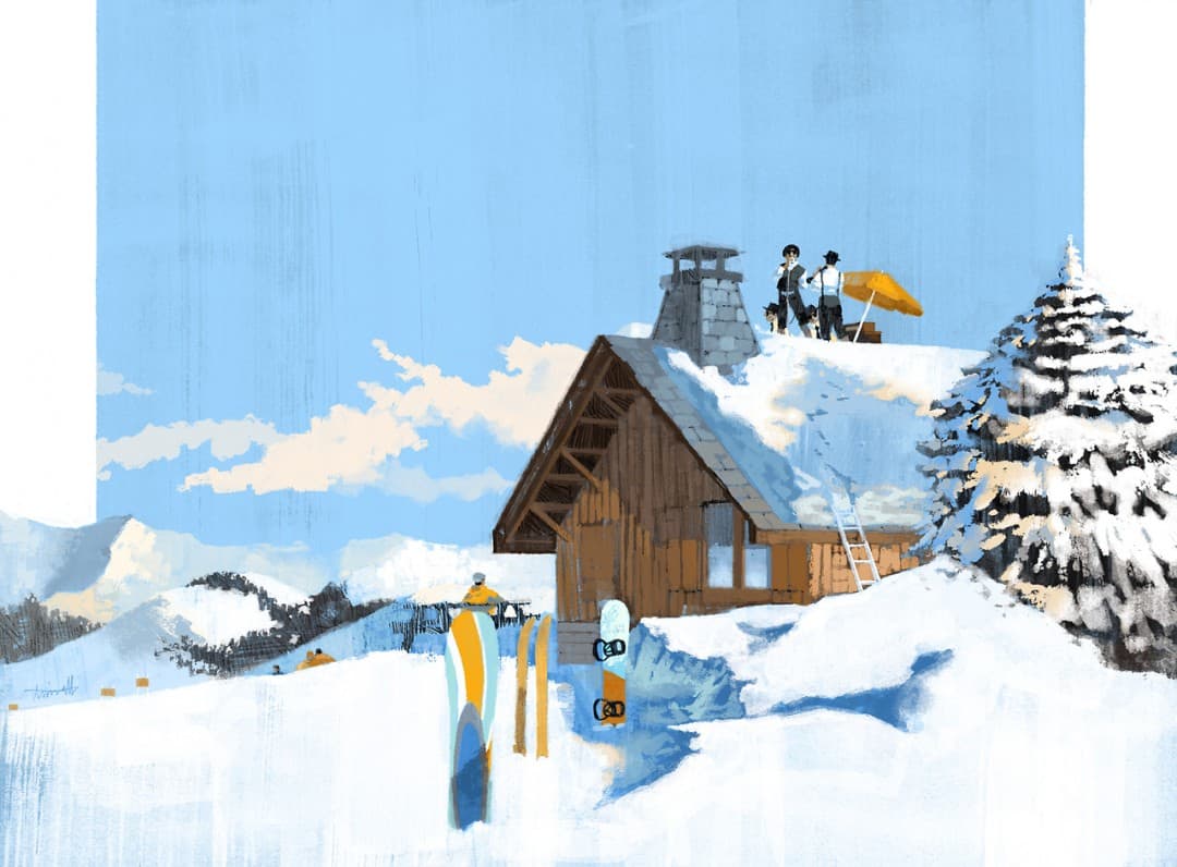
Marc Aspinall’s illustration for German WIngs in-flight magazine about the Morzine ski resort.
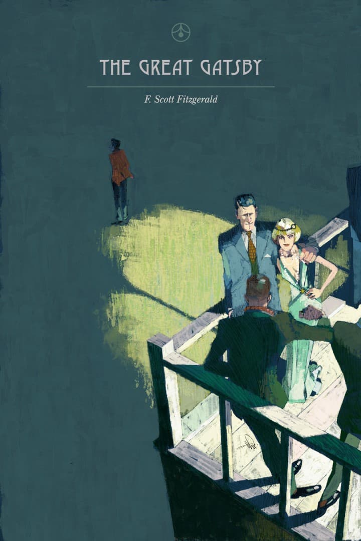
‘The Great Gatsby’ book cover by Marc Aspinall
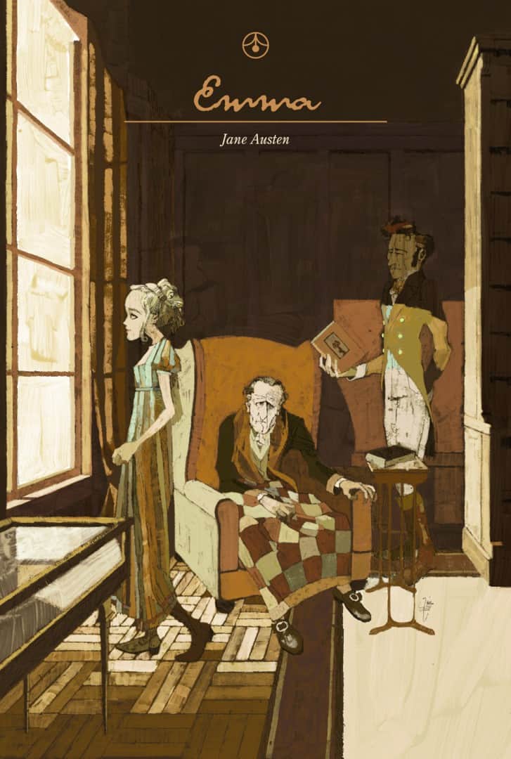
‘Emma’ book cover by Marc Aspinall
One of your personal projects is a series of book covers, going through classics like ‘Wuthering Heights’ and Emma. Your cover for The Great Gatsby, like Inside Llewyn Davis, really captures the isolation of the character. When working with an existing property like a book, film, how much awareness of it do you need to have? Is it difficult to create a painting for a film or TV you don’t love, or even like?
For the book covers, I’d read these and devised my own visual solution whilst reading. I think most people as they read, they might have a picture running through their mind, so yeah I think it definitely helps in that instance to know the source material, allow it to inform me. It’s my interpretation, a summarisation of what I saw whilst reading the book.
It’s not integral, however, to have read/seen the existing work. I hadn’t seen Llewyn Davis before creating the picture, nor had I seen Stoker, Masters Of Sex, Fargo, etc. It was a case of watching the trailer a few times; not too many as I’m likely to want to watch this stuff myself, and from there I could get a feel.
With Llewyn Davis, the Coen’s conveyed quite plainly the mood and temperament of the character and setting. The colours, the season, Oscar Isaac’s body language all clearly communicated in their short trailer. So even if I didn’t know the ins and outs of the story you can generalise a bit and still create the right depiction.
More often than not, the brief I’m given is of a new production, therefore, it’s pretty rare that I’ve seen anything about it. It can be exciting to discover something that looks fantastic, that I knew nothing of, now earmarked in my mind by my very own illustration. I get excited by the props, the faces, and differing genres. I could have no appetite for a particular film or show but I can get very excited at the prospect of composing a picture.
While enjoying Aronofsky’s past films, I wasn’t at all eager for his telling of Noah, especially once the trailer arrived. That fact definitely didn’t put me off working up some exciting ideas for the editorial, even if the weaker idea was eventually picked. You get involved visually, and I think forget about your own preconceptions.
That’s an interesting point — as a viewer, I might have no interest in a book or film, but seeing the accompanying artwork can get me excited about something I might not actually enjoy.
Noah illustration for The New Yorker by Marc Aspinall
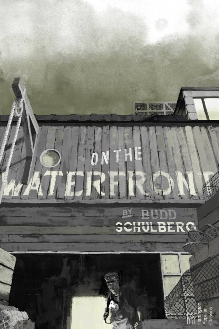
On the Waterfront book cover by Marc Aspinall
Are the book covers a hint at things to come? Are you using them to potentially get yourself into the world of book illustration?
Yes and no. They are a hint at more to come. As I read more I want to create more. But I can’t say there are any actual commissions in the pipeline. They are however a means for practicing my storytelling and hopefully pique the interest of the right people and hopefully land myself a commission.
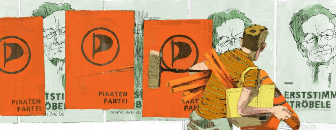
Marc Aspinall’s illustration for the Monocle article about Germany’s presidential campaign and the rise of smaller political parties
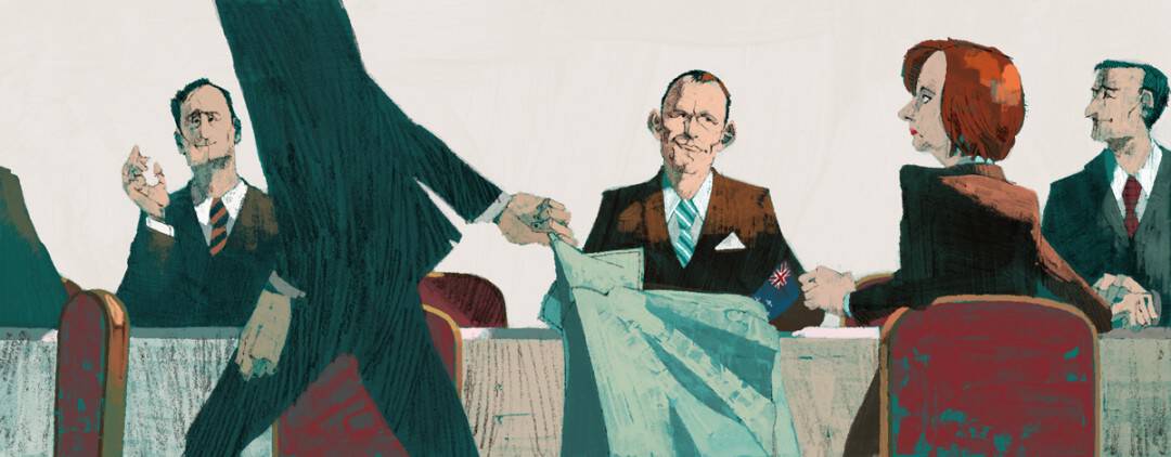
Marc Aspinall’s illustration for the Monocle article about the tension in the Australian Parliament
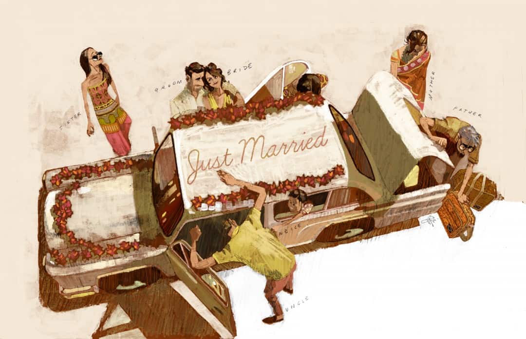
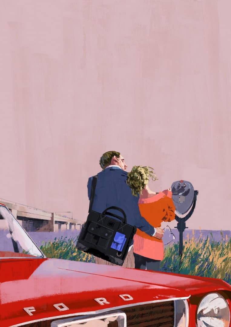
Marc Aspinall’s illustration for the Conde Nast Traveller India article on ‘familymooning’
From the piece in Monocle Magazine about the tensions in the Australian parliament to the Conde Nast Traveller India ‘Family Mooning’ article, you’ve illustrated a huge variety of places and topics. It’s impressive how many different areas you’ve covered – is the topic of international politics something you’re attracted to working with? Did you do it once and all of a sudden became the ‘go-to guy’ for business and political illustration?
The way I see it is; the more subject matter you’ve tackled and become familiar with, the more rounded you become as an image-maker. If you haven’t got any examples of animals in your portfolio for example, then you are likely to not land yourself a commission drawing animals. If you’ve tackled the subject once then you’ve got a good idea how you might tackle it again, or even what might need tweaking next time.
Sometimes I could have some downtime and look for gaps in my folio and try to fill the gap. Other times its part of the commission and maybe the client is simply assuming I know what I’m doing, ha ha. I think because my work is heavy on people, they form the core of the picture, where everything else is there to communicate the concept. I think the client might enjoy my approach to how the figures are done, then maybe the style and that forms their decision to hire me.
The politics angle I do enjoy. There is a real challenge in it; I find that I’m learning a lot from the copy so that in itself is a challenge and then knowing how to convey that as a picture can be particularly hard, a little more challenging than my other lifestyle stuff. Especially if the piece is more technical rather than, shall we say scandal.
I’m not a metaphorical image maker, not in the very abstract sense. So showing, for example, Gillian Gillard’s troubles in parliament can be tough, especially when grounded in a real-world setting, and how do I make this visually appealing and not feel like a recycled idea from another political piece; there’s potential for mundane. So I think if I exaggerate the setting somewhat, maybe make it quite literal and have clear body language to drive the message I have an OK time solving the brief.
I’d definitely love to take on more like this, saying that, I definitely wouldn’t consider myself as the go-to-guy for this kind of work, depends if someone wants the brief to be answered through the lens of a 60’s espionage flick; which is often how these articles play out in my mind!
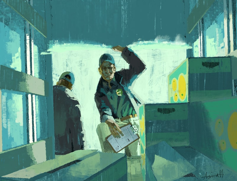
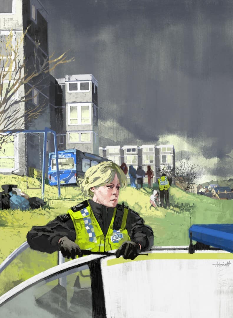
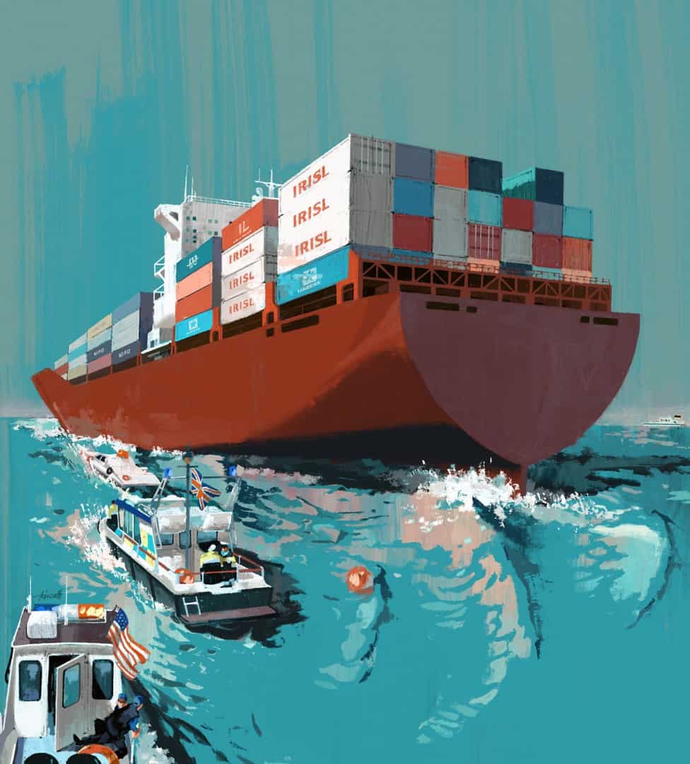
Marc Aspinall’s illustration for Security Management Magazine’s article ‘Protecting Food Imports’

A pleasure to see Mark’s work going from strength to strength from the time that I first became aware of it, in my terms a relatively short time ago, until today. Super!