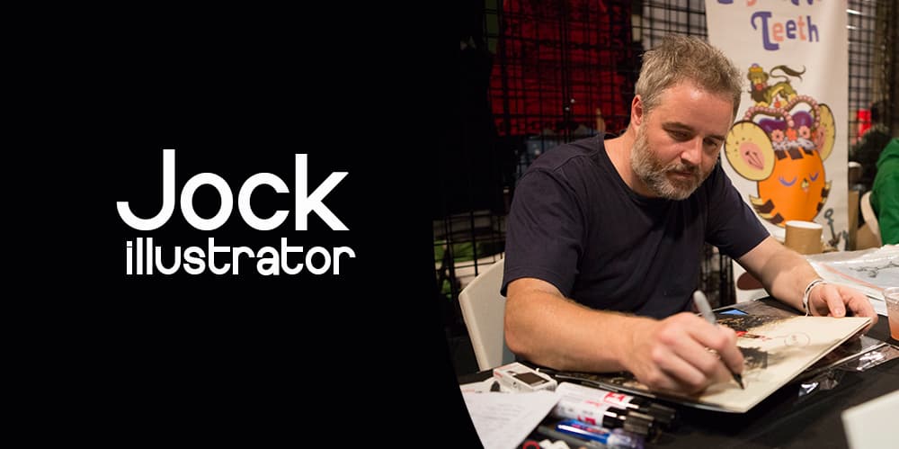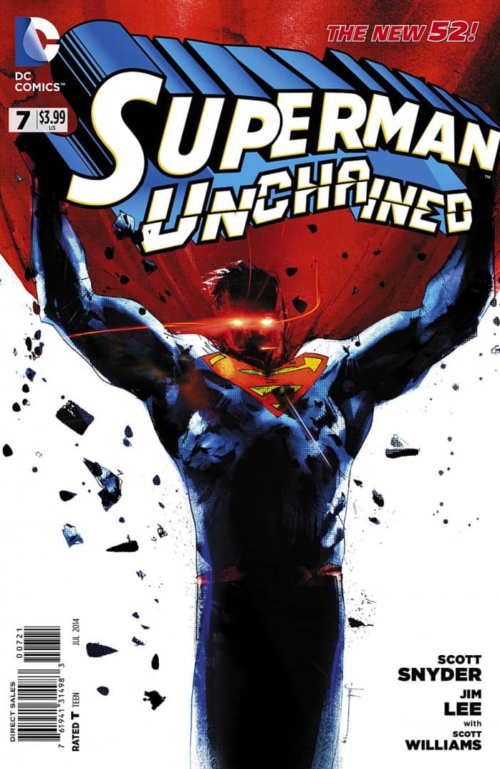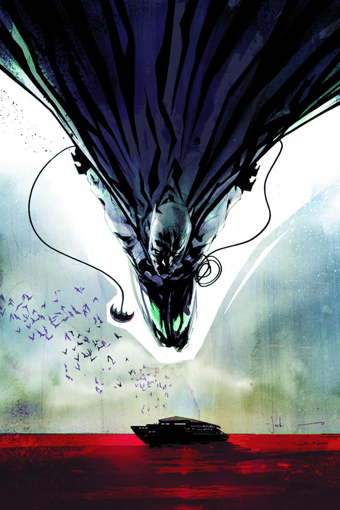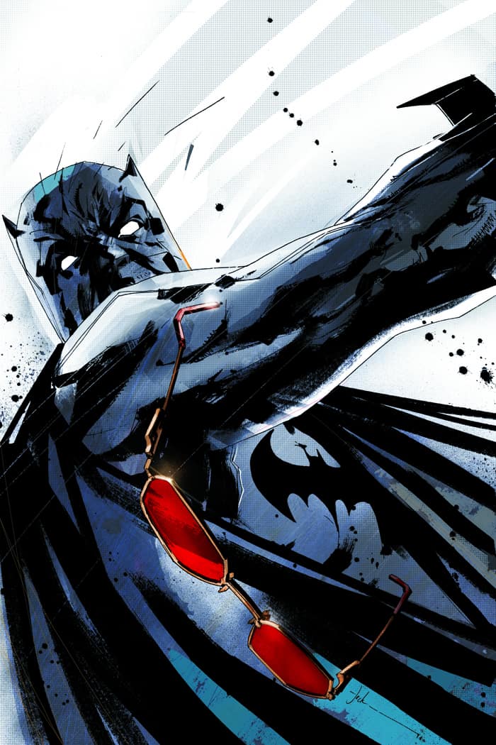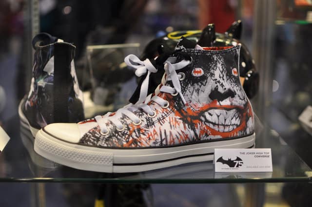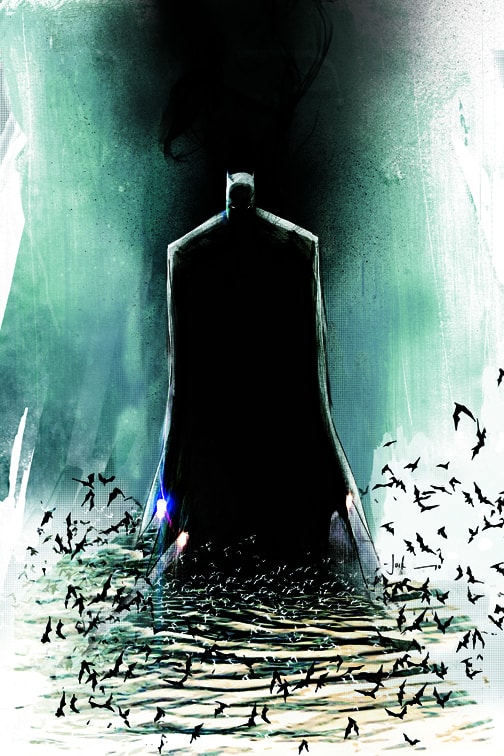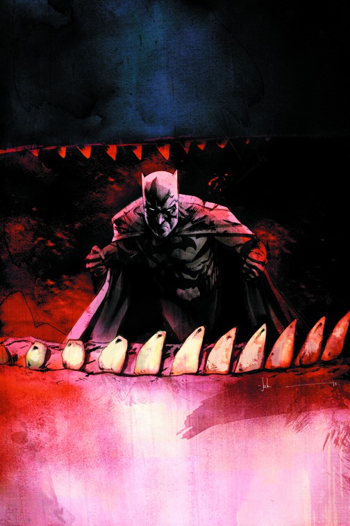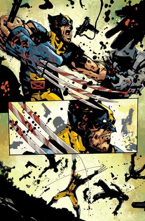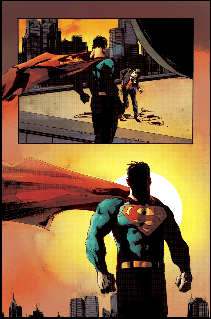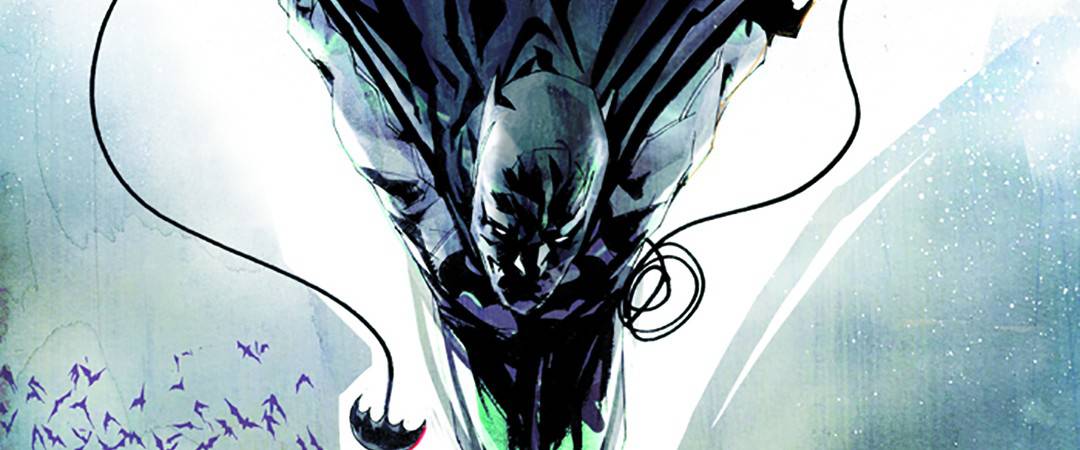
The artist is known simply as Jock. Whether you know it or not, you’ve seen his work. Maybe his image of The Joker is on your shoes or your backpack. Maybe some of his designs are in your favorite films of the last decade. Maybe on your bookshelf sits a copy of the New York Times bestseller ‘Batman: The Black Mirror.’
Right there on the cover. Jock.
A comic artist by trade, Jock has expanded his creative influence to include film design with all that entails — posters, character and wardrobe, vehicle and landscape. Tone and setting. Designs fit for the expanding universe of Hollywood cinema. Jock’s work starts with loose ink, impassioned linework that builds into a frenzied storybook of sharp narrative, character, and mood. His drawings have urgency — they scream and claw. Organisms unto themselves. A storyteller of grit and menace, he’s entered the world of contemporary heroes such as Batman, Superman, and Judge Dredd both on screen and in print.
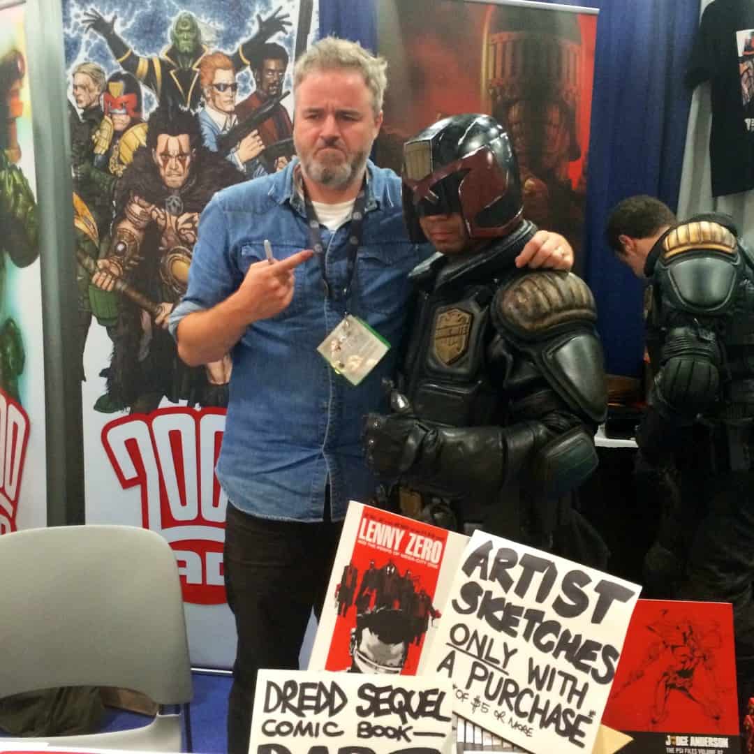
The following interview was conducted in San Diego during one of Jock’s few breaks at Comic-Con 2014.
“My goal is always to be a clear storyteller when I’m drawing comics. Then, when you apply that to a comic cover, which is when you go to the next thing, then you’re trying to tell a story in one image, but also, a comic cover is this big, and then when I start working on posters, I’m still kind of the mindset of this comic cover size, even though I knew it was going to be 24 inches by 36 inches.”
– Jock
ETDC: Coming out for events like Comic Con, are you treated like a celebrity?
Jock: Not really.
No?
No, don’t get me wrong. Everything’s paid for, I get free meals, free drinks. It’s pretty cool, but it’s funny. I used to be excited because I got to go to some of the huge parties. ‘I’m going to this movie party or this movie party,’ but you just go to these things, and it’s dreadful. Now, I just make sure I have a good little crowd around me and we just do whatever.
As a fan, you always hear about the parties, but you’re never invited. They’re not for us.
That’s the thing, and when you start coming and you’re a professional, you start getting invited to a few ones and you’re like, ‘Oh. Thank you.’ It’s exciting, but actually, they’re normally terrible.
Are you here specifically for 2000 AD?
Yeah, they flew me out.
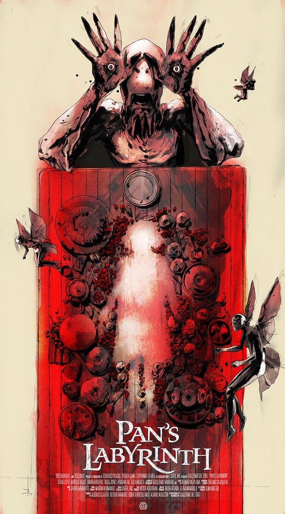
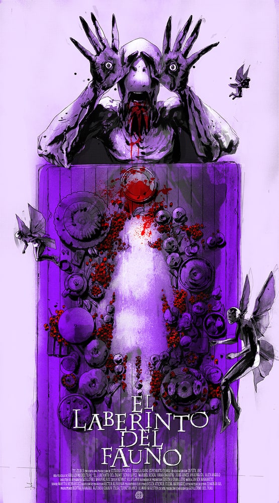
So release of the ‘Pan’s Labyrinth’ poster with Mondo was just a coincidence, or was that planned out far in advance?
We talked about ‘Pan’s Labyrinth’ about a month or six weeks before Comic-Con, whenever it was. I was just talking to Justin (Ishmael) from Mondo, and we were talking about coming out here and that we’d both be here, and what we could get up to and stuff. There were a couple of other things in the pipeline that stalled for a bit, and then we were talking about coming out here, and I said, ‘It’s a shame I’m not doing something for you for the show,’ and he was like, ‘Yeah, maybe while you’re out here we should get something going. Is there anything that you’ve got to do?’
It had to be a super quick turnaround, like one week from conception. This was actually a Thursday, and he said ‘Can you do it by Monday?’ I was away that weekend, and I was like, ‘No, I can’t do it by Monday, maybe like mid-week.’ He said, ‘Is there anything you would like to do, anything straightforward that wouldn’t need too much approval?’ I said, ‘Actually, hang on, how about Pan’s Labyrinth? That’s my favorite of Guillermo’s films.’ He knows Guillermo (Del Toro), and he said, ‘I can just email him directly and just say, let Jock do a poster.’ We did that, and just like five minutes later, he just said, ‘Oh, yeah, Guillermo’s well up for it. Get going.’ Then Guillermo asked to do the signing with me for the release as well, so he came around Thursday morning. I said to Justin about a week ago, ‘Can I tell people about this?’ He goes, ‘No, we’re just going to release a photo when you both turn up, and we’ll just put up a photo of you both at the table, and that’s it.’
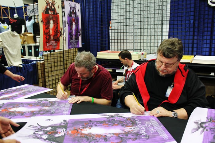
Jock (L) and Guillermo Del Toro (R) signing Jock’s poster for Del Toro’s film ‘Pan’s Labyrinth’ at the Mondo booth at San Diego Comic Con 2014
Yeah, I didn’t know you two were signing at the Mondo booth until after the fact.
Really?
I missed the signing but was able to get the poster. Guillermo is known for being super supportive of the artists doing posters for his films. Had he seen your art beforehand, or did he just tell you to go for it?
Pretty much. I met him a couple years ago when he was signing for ‘Mimic.’ It was a couple years ago. I went over to the booth by chance, I was like, ‘Oh.’ Justin goes, ‘Have you met him?’ I was like, ‘No, I never have.’ He tapped Guillermo on the shoulder, and Guillermo just sort of went, ‘I’m a huge fan.’ I was like, ‘Oh shit.’ I wasn’t expecting him to even know who I was, let alone be into it. So when this year came around, it was kind of a lock from Guillermo, and I was super happy. It’s so nice to meet someone that is at that level and deals with millions and millions of dollars, big studios, but he hasn’t been ground down by it all and he’s still a really open, lovely guy, everyone knows his stuff.
Did you choose the size for ‘Pan’s’? To go with 20” by 36” rather than the usual 24” by 36”?
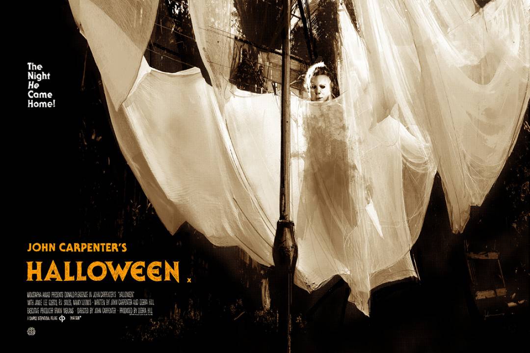
Totally, yeah. My ‘Halloween’ print was that size as well. I know it means custom framing, but I just really like tall and thin designs.
It fit with the design.
Yeah. Basically, I will always go for what’s best for the art, I try and be aware that it’s not ideal if the guy’s actually got custom frames, but I can’t worry about that. I did try this design wider, and it is kind of a tall sort of design, and so that’s set up like that.
You’ve drawn for Batman, you’ve drawn for Superman. You’ve done these properties that have been around for a long time, established icons, and then you come along to work on them. Do you care about the fan expectations? A million artists have done Batman. Are you trying to do your own thing or stay true to the history of it? That has to be a complicated thing.
Yeah, it is, and it can be, but I just try and ignore it and just do my own thing, because if you start thinking about how something should be done rather than just getting on and doing it, then that tends to halt things. If you’re working on something, you kind of want it to be like an open faucet. You want to just be flowing and just keep everything moving.
That’s a good question because that’s the kind of thing that if you start thinking about it …I mean, of course, I’m aware of it because Batman is one of the most famous characters in the world, and of course, I’m aware of him and what’s gone before but only in the way that, hopefully, informs the way I’m going to handle him. The way I draw isn’t really a chosen style. I just draw that way. Over the years as I’ve gone on, it’s natural, that’s just how I draw.
Luckily, I do have the ability not to worry about that stuff, so I just do my own thing, and that seems to be what people respond to anyway. That’s probably what all those guys that we might hold up on a pedestal were doing, just doing was their own thing. Jack Kirby, Neil Adams, they were just bringing their own thing to it.
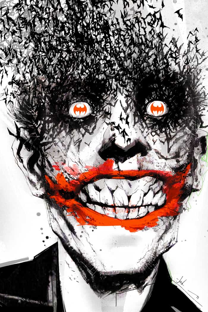
The Joker piece you did for the cover of Detective Comics issue #880, I feel like this image is going to last for a long time.
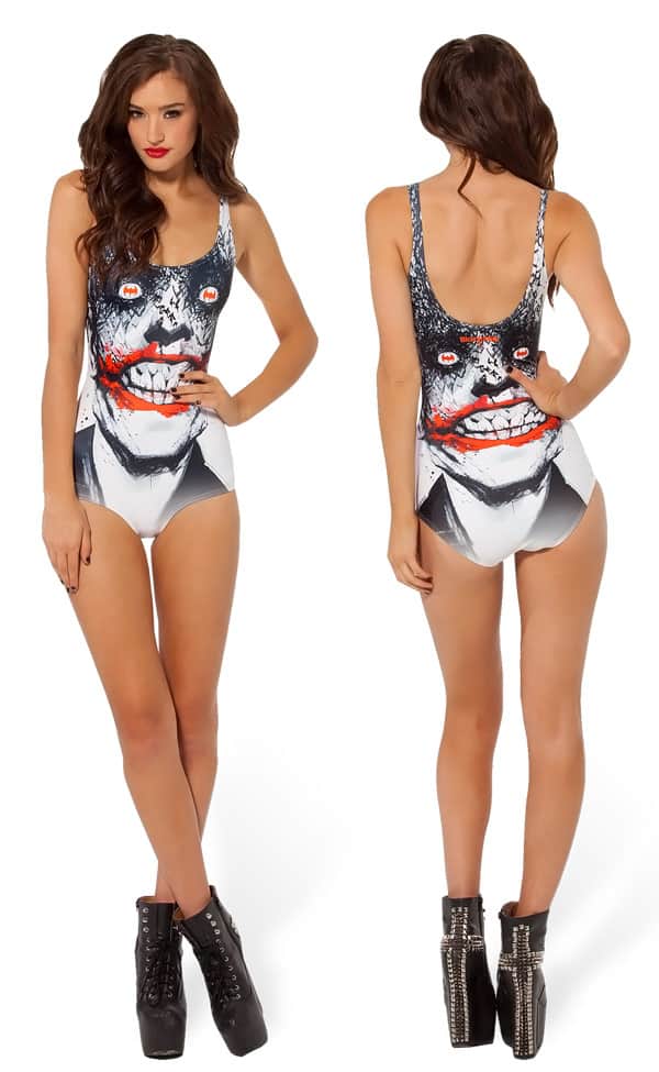
Yeah, now that a few years have passed, and now I’ve seen it on shoes, t-shirts, towels, mugs, swimming costumes, posters, books, foreign books. It’s like, oh, okay. There’s some Converse that you can buy with that on the side. It’s funny, that poster sells in Target, but they’ve removed my signature.
Really?
Yeah, which I sort of understand, because as a sort of corporate identity, if you have this kind of weird drawing and it had the word Jock on it, to a mainstream person they’re thinking, ‘Well, what’s that, what does that mean?’ and not realizing that it’s an artist’s signature.
I haven’t bitched about it at all because I get it, but at the same time, if that image starts going more, my name’s just been backed off.
Did you know that that image was going to be a hit?
No. I thought it was okay, but I didn’t really think much of it, and I sent it to a friend and I was, ‘I’ve got this, but I don’t know…’
I was thinking it’s a bit dull, it’s just his head, and, ‘Should I crop it like half and half and just his head off and something?’ He was like, ‘No, no, no, no, no. Honestly, trust me, it’s great. Keep it as is.’ I went, ‘Oh, okay.’ Then I sent it to my editor, Mike Marts at DC. I said, ‘Oh, here’s some progress on the cover. How’s it looking?’ He replied straightaway, ‘The best cover I’ve ever seen.’
Oh, maybe it’s okay. It was in between issues so I didn’t have to wait for DC to put it online, and I just put the cover up on my Twitter. This was three years ago or something and Twitter wasn’t quite what it is today. I didn’t have anywhere near the followers I’ve got now, and it wasn’t really the kind of same sharing culture that Twitter now has.
I put it up on line, and I had ‘at’ replies for three days, just solidly about this cover. The first 10 – 15 minutes after I posted it, I mean, for one I’ve never had anything like it, and just all the replies from people that I hugely admire in the industry as well, just all going, ‘Whoa, fucking hell, man, that’s amazing.’ Just everyone.
For ten minutes, I was at my computer, just watching all these people, and it was like, ‘Oh my God.’
I remember distinctly thinking at the time this might never happen again. It’s not like it was viral literally, but for the comics industry, it was a bit viral. Then it was, ‘this is unbelievable.’ So no, that was a long-winded way of saying that no, I didn’t think at the time that it was any better than any of the other covers.
Since it’s such a hugely popular image, it’d be interesting to know if that introduced any kids into reading ‘Detective Comics,’ or comics in general.
I don’t know. It’s a pretty freaky image as well. I’ve seen so many tattoos of it. Some of them could be ugly, because it’s quite an ugly image. For me, it works great as a comic book cover. It’s great in context as a comic cover. I start seeing it in other places it doesn’t even go well, that’s quite freaky. There’s a massive beach towel you can get.
Yeah?
I’m like, do we really want a beach towel with that bat on it? It’s funny. You can’t control that stuff.
It’s awesome when something like that gets a life of its own. Hopefully, you get a few new fans from all of that exposure, with your name attached or not.
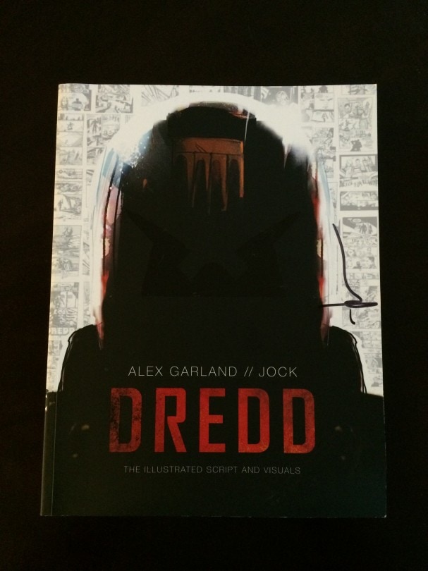
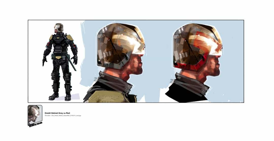
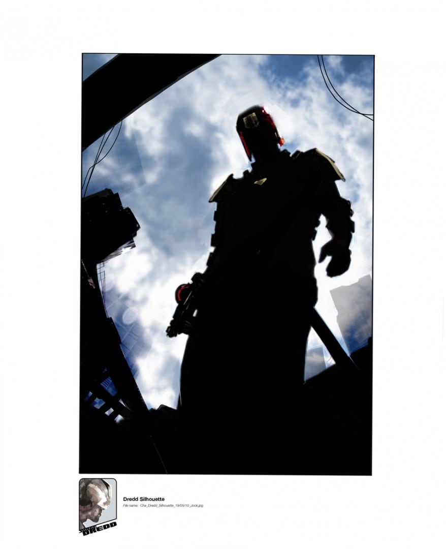
‘Dredd: The Illustrated Script and Visuals’ by writer Alex Garland and artist Jock released by 2000AD
For the work you did on the ‘Dredd’ film that’s in the illustrated script book, was that done before filming started?
Oh, yeah. I was the fourth person on the film. There were two producers and the writer, and then they brought me on board. They wanted a comic of the script, and they said, ‘Oh, can you do it in eight weeks?’ I was like, ‘No, we can’t do a 100 page comic in eight weeks, but I could maybe do a layout that would get the information across.’ That’s what this is.
It’s quite loose and simple in some places, and then I started painting stuff up, so it’s like it’s, like I want it to represent the environment better.

Jock’s concept art utilizing location photos — ‘Mega City 1: Johannesburg Test’ for the DNA / Lionsgate film ‘Dredd.’
I read they sent you possible location photos to work from?
Yeah, they went to South Africa, and they’d send me location shots, which I’d then never heard of that kind of thing, and I’d paint over that. It was quite good fun doing it. I like this because my job is to make it believable, and it’s quite an interesting challenge to do that.
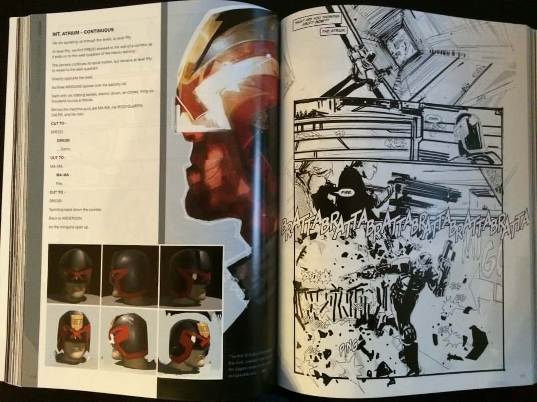
‘Dredd: The Illustrated Script and Visuals’ by writer Alex Garland and artist Jock released by 2000AD
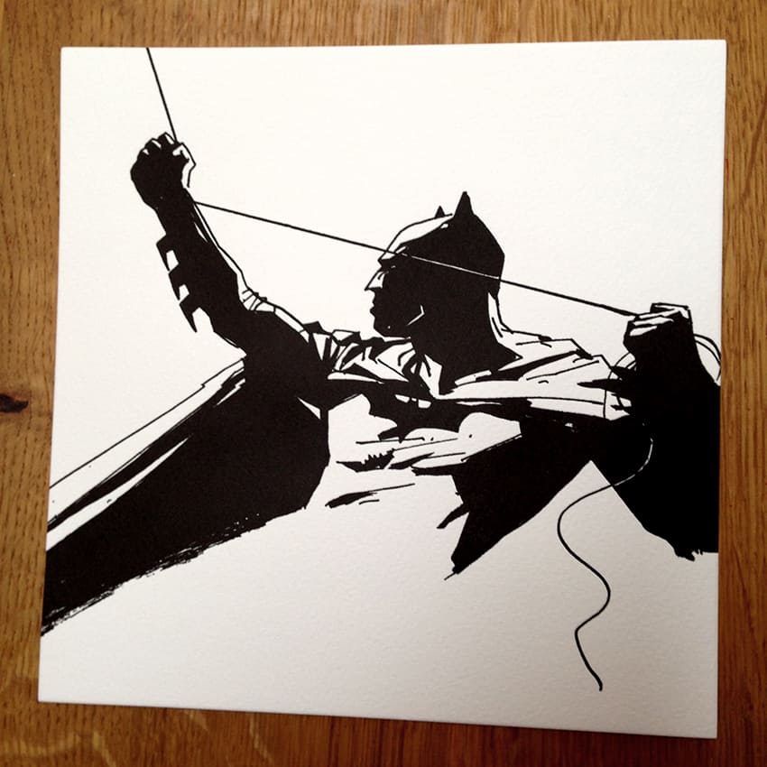
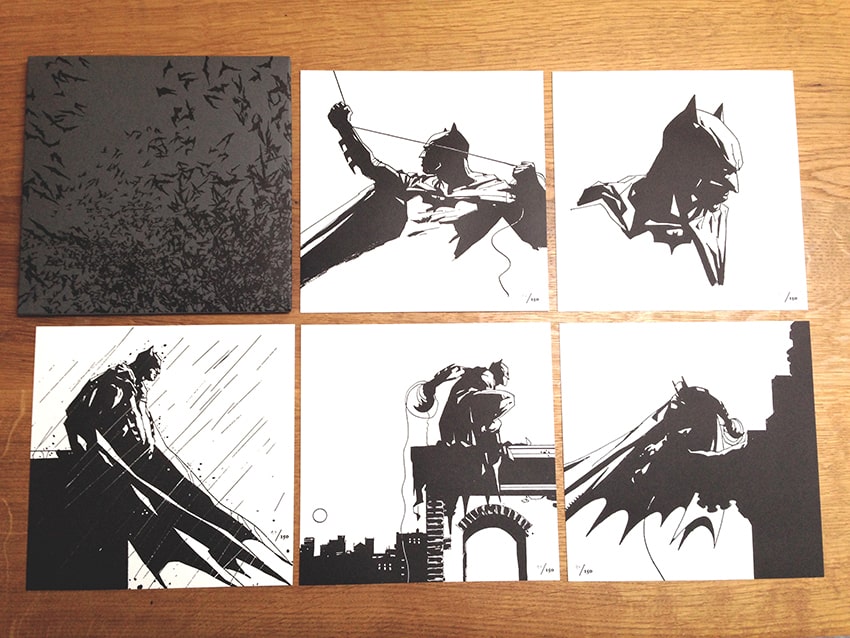
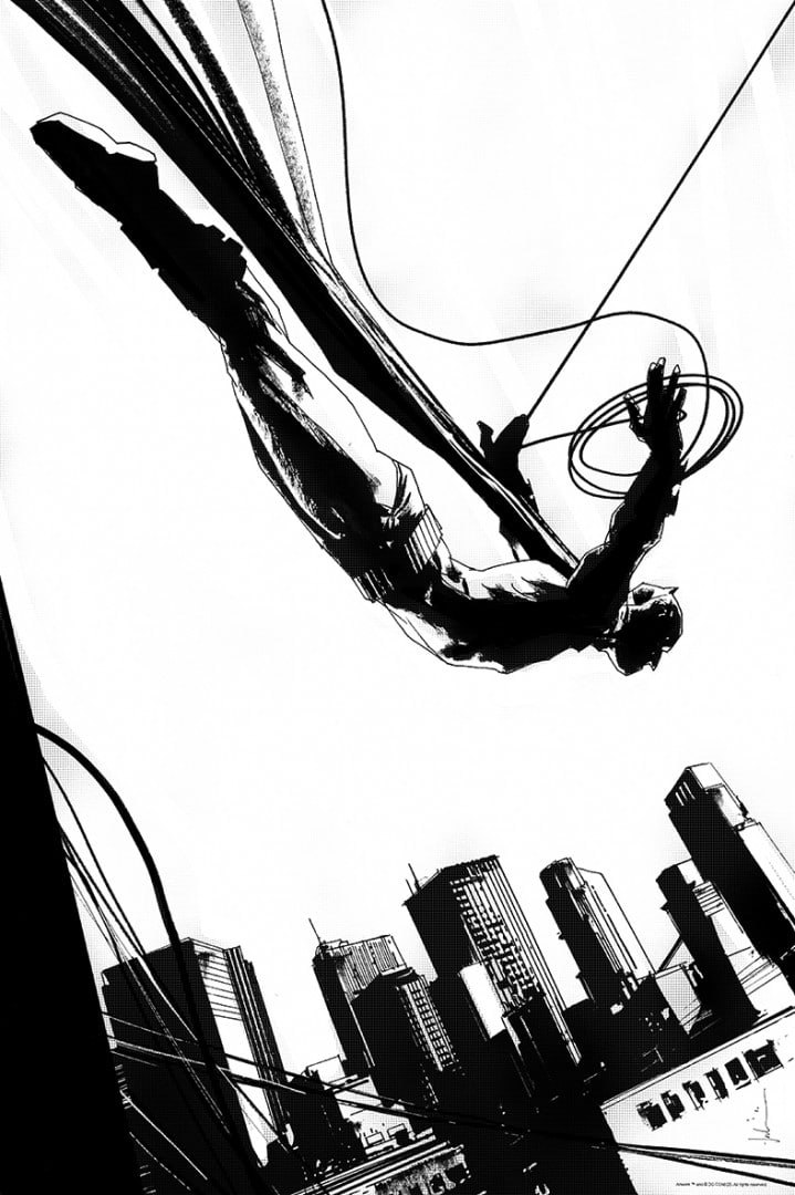
With your work, it’s always believable. I was struck by the Batman Letterpress prints that you did. You can feel the tension in his hands, with the rope strung up high. For being a simple black and white image, there’s this tangible thing. You’re able to get a good sense of the weight of what’s going on.
That’s really important to me. The way that he’s holding the line, when you’re drawing the line, and for some reason, I drew it going in from the bottom of his hand and then coming out on top. Just little things like that make it immediately look more realistic. It’s little tricks to try and sell it as believable.
Another is the way his cape’s draped over the roof. Just that little extra element of thought, going into something that will hopefully help sell it a little better.
Doing that Batman series as letterpress prints adds a level of elegance to it. What made you choose letterpress rather than screenprinting?
It was actually Olly Moss who turned me onto it, to be honest. He had done a few, given me a few runs, but they were always really nice prints, and he just said, ‘Oh, you should do some Batman letterpress.’ I thought, ‘Huh.’ So I just grabbed a couple of my images and put them into a square. ‘Yeah, this could work.’
The printer was amazing, and we designed the envelope that it would come in. I was really proud of it because I put quite a lot of work into it, trying to make it a really nice item.
Was it a project you took on to satisfy your own artistic self? Obviously it was going to sell out because it’s you and it’s Batman, but is that something you just did for yourself?
It just has to be about the quality of the work, at the end of the day. The work has to dictate what you do with it. I don’t want to sound arrogant. It’s just like that for me because that’s what it has to be.
Have you been to Austin (home of Mondo)?
No, I’m going for MondoCon.
Oh, are you going to have a booth there?
Yeah.
Is your family coming out to that one?
No, it’s just me.
Do you have any kids?
Yeah, two kids.
How old are they?
A boy who’s 16, and a little girl who’s two. We left a 14-year age gap, but it’s actually great because he can babysit. That’s a bonus.
Are they aware of what you do?
Yeah.
I guess if he’s 16, he knows what dad does.
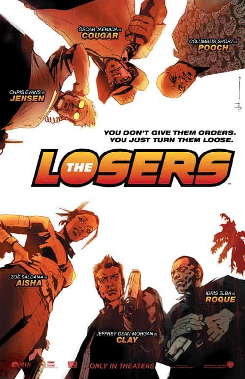
Yeah. He was never very interested, but I think when we were sitting in the cinema and watching ‘The Losers’ and my name came up at the end…
‘Oh, okay, my dad’s not lying.’
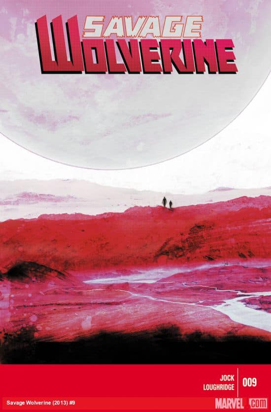
Yeah, he’s never shown an interest really in comics or drawing, but he’s really into filming and editing and effects. Last year, he did a little animated trailer for my Wolverine (Savage Wolverine #9) story.
You should check it out because it’s fucking great, and he’s my son, and I don’t want to be biased. Check it out.
That’s legit.
That’s not bad, is it?
If you didn’t tell me your son made it, I’d just guess it was an actual promo from Marvel.
Like I say, he’s not into comics, but he can do that.
How much of your own artwork is hanging up in your house?
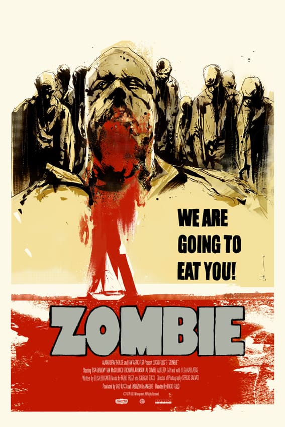
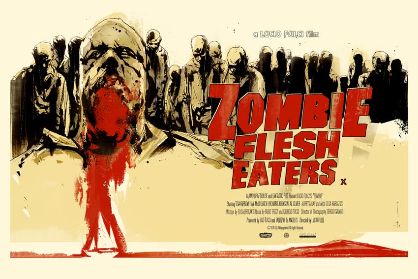
I’ve got ‘Zombie Flesh Eaters,’ my first Mondo poster, in our front room.
That’s it?
I don’t like having my own stuff up around actually anymore. There was a time when I took pride in that sort of thing, but I prefer other things.
My wife, she’s not into comics or anything like that, and she luckily really likes ‘Zombie Flesh Eaters.’ She just likes the colors and things, so I’m always trying to say, ‘So, can we have this in the house?,’ like original art I got and, ‘Can this be in the house?’ ‘No, no, it can’t be in the house.’
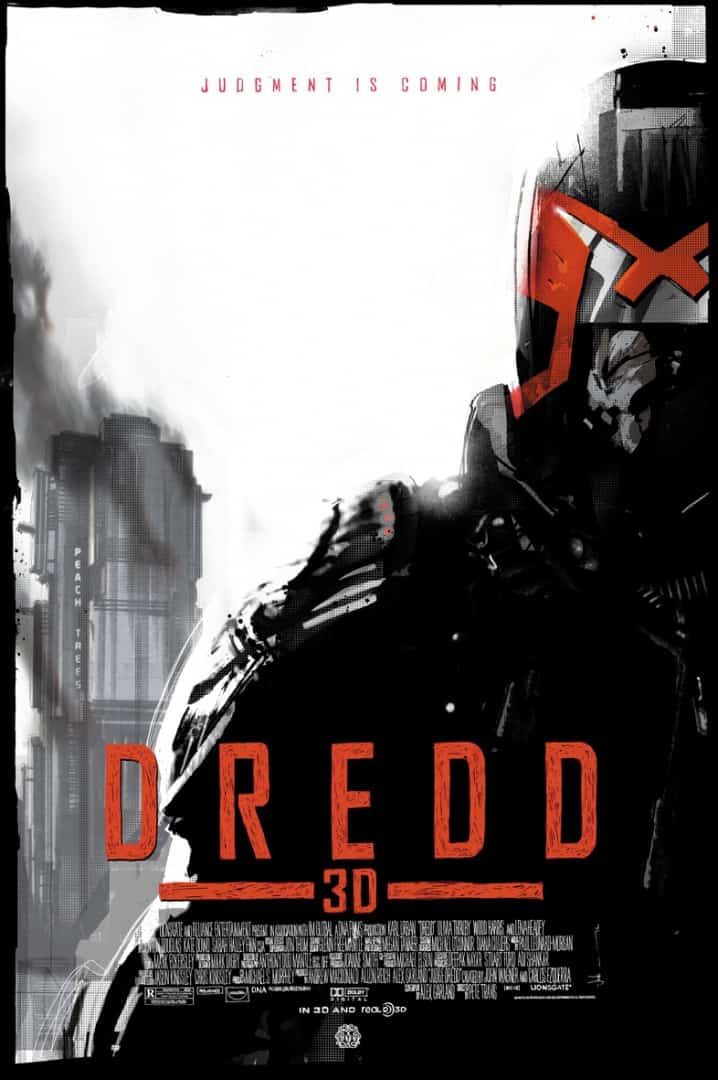
In the studio I put my ‘Dredd’ Mondo poster up as well, but that’s because it was signed by Karl Urban and Olivia Thirlby in the film. They signed it to me. I’ve got a wall of Dredd stuff and some old 2000 AD artwork that I’ve gotten from over the years.
I’ve got a little Dredd shrine, and the movie poster’s there. I’m really proud to have worked on that film.
It was a pretty incredible piece of cinema. Totally matched the grit and reality of your work on the comic.
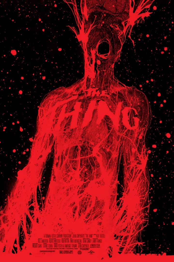
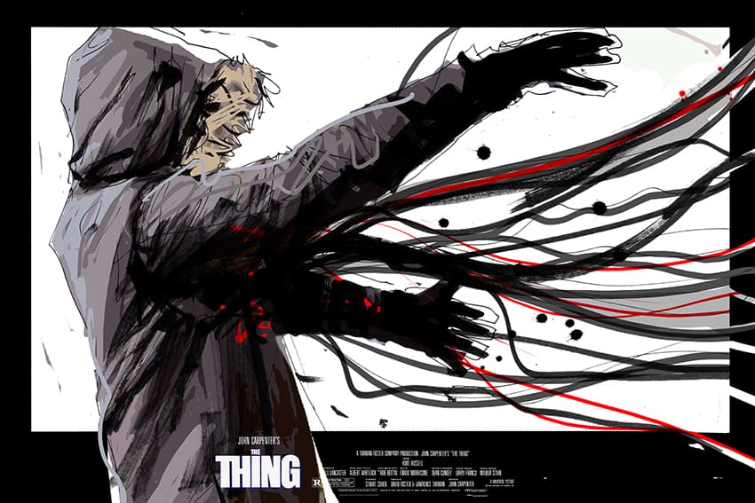
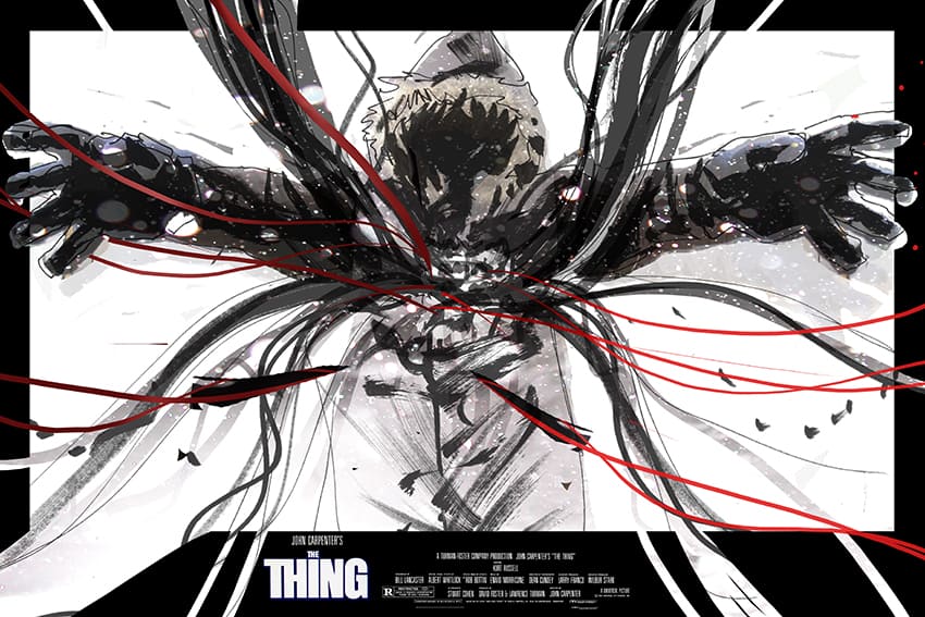
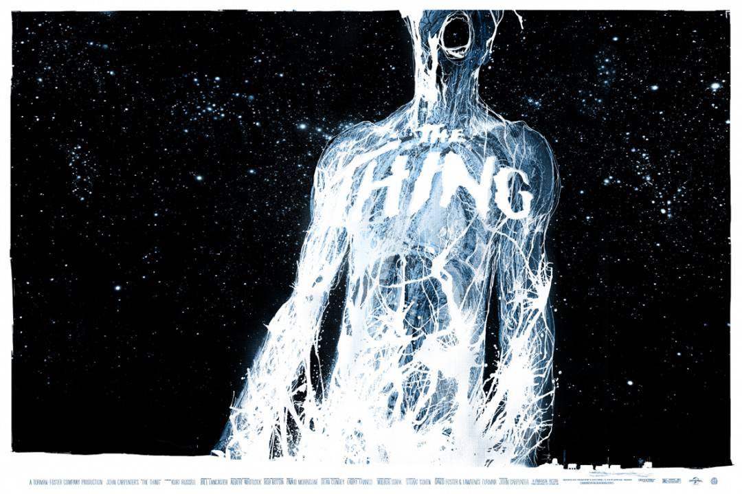
You’re Mondo poster for ‘The Thing’ is one of the most visceral and beautiful things I’ve ever seen. When it comes to ‘The Thing’ you always think about Drew Struzan’s poster. You’ve kind of captured that same moment, that weird changing that goes on in the characters. Struzan’s is very iconic, but I feel like yours captures that same moment in a more realistic manner.
I had some early sketches that I did. They’re on my website, actually, if you want a look, there was one of them I quite liked, but Rob (Jones of Mondo) just said, ‘Yeah, these are pretty good, and you’re obviously riffing at the same idea as the Drew Struzan poster.’ I was like, ‘Oh, am I?’ I didn’t have a light. I had a guy in the parka and I had all the kind of tendrils coming out. I looked at it and said, ‘Oh shit, that is exactly the same as Drew’s really in subject matter, even though it’s handled differently.’
I was like, ‘Oh, okay, maybe I need to rethink this.’ I was ready to go. I thought, ‘That’s a winner.’ There’s one where the angle’s a bit Dutch, and there’s one where it’s kind of turned towards us, and you know, I think that’s pretty good.
Another thing about ‘The Thing’ is apart from the posters we already know, if you type ‘The Thing poster‘ online, there’s a billion fan posters. There’s always that thing of if I do one of these, even though it’s for Mondo, how’s it going to stand apart? Can I do something interesting?
After Rob said that, I just went completely back to the drawing board with a tiny little two by three sketch about this big, just thinking of that circuitry and the whole thing was drawn as an ink drawing. The world around us, it has rules. Flowers grow in a certain way. Buildings and rocks form in certain ways and some of them, we might call it math or we might call it nature, whatever it is — you start being aware of those things, and you start drawing things in your imagination and have things actually behave in quite a coherent way, like if you draw a pot of rocks. There’s rules going on there. It’s not random. You’ve got a hunk here, and you’ve got little bits here, and they support each other. Or the way a flower grows, or the way a city grows. That’s an interesting thing that applies to the way things get built. They have to obey laws. I think about that a lot. There’s a way you can make it believable.
Anyway, so I started thinking like that, and then blowing ink through a straw, it meant that the ink would behave in an organic way because the way that the ink would have to push away is the same way a plant would grow or it’s the same way as water would come down a thing. So the point is, is that doing it that way was a way to ensure the drawing looked completely organic because there was no way that I could’ve drawn by hand to have the same energy. There’s kind of a vibrancy, maybe, that I was going for. I was literally drawing it like a seven-year-old, but there was a method to my madness. I know that you’d just get little spurts and surprises and little bits, and also that would represent all the circuitry and the tendrils in the body. That was kind of my approach.
I think it came out awesome. Having it be printed on red paper was such a great choice. I don’t know if that was your idea?
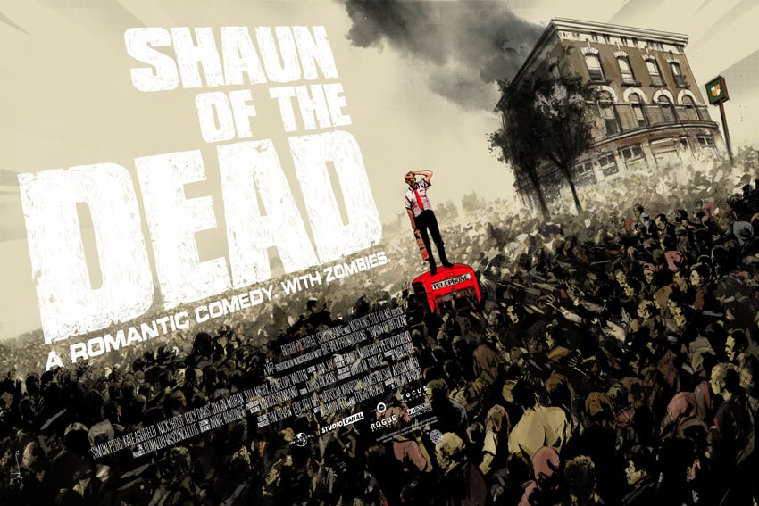
Yeah, I love trying to use the color of paper to be an element in the poster. It’s a make a really more interesting print basically. ‘Zombie Flesh Eaters’ is on like a cream background. That was the paper. ‘Shaun of the Dead’ has a cream background. I’ve done plenty on white as well. There’s something different and tactile when part of the image is the paper stock.
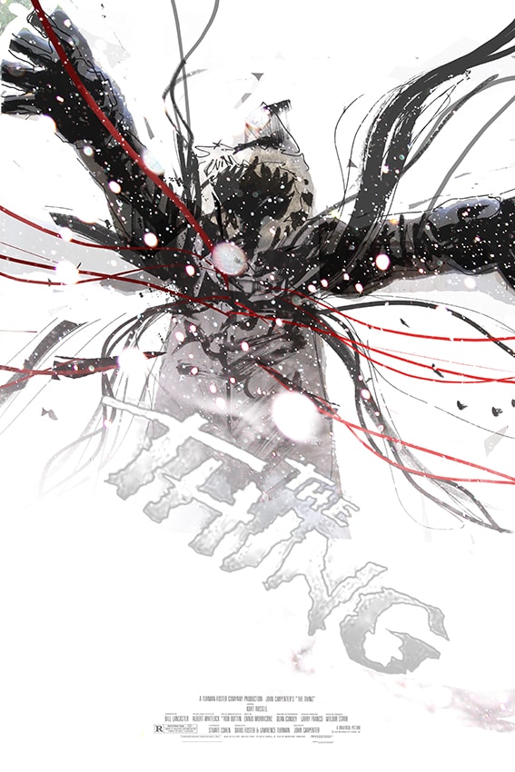
‘The Thing’ has a variant on white paper that’s pretty damn gorgeous. It looks like it’s glowing. Is getting feedback on your work an important part of your process?
There’s so many times having my editor Will at DC has made my covers better, or a suggestion that Rob (Jones at Mondo) makes.
From doing a poster to doing a comic book, does your design process change at all Do you approach it differently?
Yeah, for sure. Three things. There’s comic covers, there’s comics, and then there’s posters. The reason I say that is because you’ll have a cover. If you’re drawing comic pages, you have to service the script. You’re not drawing pretty pictures. You’re telling a story with images.
That’s a really fundamental thing that if you do your job right, people won’t think of that sort of thing, but that’s actually the skill of drawing comics is good storytelling, and the style, and how well things are drawn, and all that kind of stuff comes out of that. If you don’t have that, things like style and content and overcompensating for bad storytelling, actually when you read it, it sucks. There’s something a bit off about it. You don’t particularly enjoy the story. My goal is always to be a clear storyteller when I’m drawing comics. Then, when you apply that to a comic cover, which is when you go to the next thing, then you’re trying to tell a story in one image, but also, a comic cover is this big, and then when I start working on posters, I’m still kind of the mindset of this comic cover size, even though I knew it was going to be 24″ by 36.”
I’d never seen a Mondo poster in my life until I’d done two of them. With ‘Zombie Flesh Eaters,’ which I still really love that one, actually, and that one, with the blood smears on the left, which isn’t the greatest poster by any means, I was thinking of it in like almost comic cover size.
Then, Mitch (Putnam from Mondo) finally sent me some comps and I’ll never forget it. I took them out of the tube, unrolled them and I was like, ‘Oh, okay. This is a completely different.’
This is a whole different theory. This is an artifact. This isn’t just a print or comic cover, which has to look cool. This is an artifact. This is a thing. This is a tactile, beautiful, vibrant item.
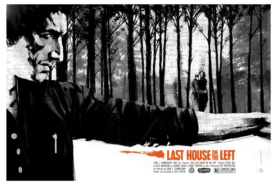
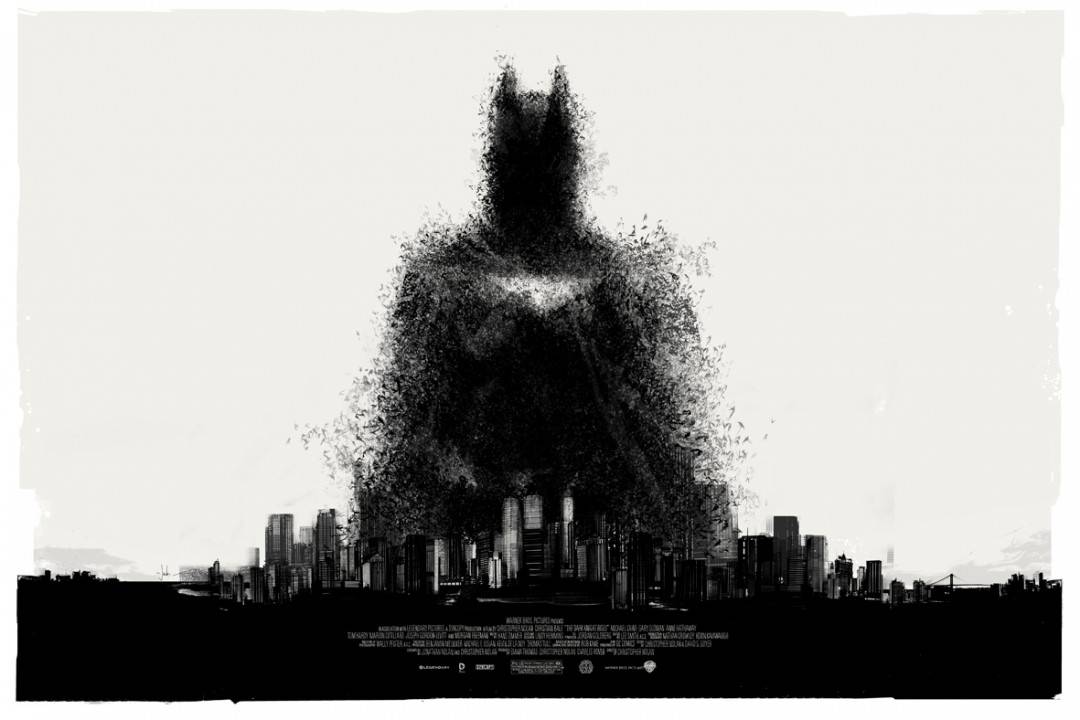
The next one after that was ‘Last House on the Left,’ and if you look at the scale of ‘Zombie Flesh Eaters’ and ‘Last House on the Left,’ and then you look at ‘Dark Knight Rises,’ there’s about 1,000 times more depth in it. You’re suddenly aware that when you’re working at 24″ by 36″, there’s a lot in there. You can make the viewer see a lot of things in there.
From then on, my approach completely changed to posters. I wanted to make them worthwhile. If you’re going to have something that big and they’re going to be beautifully printed, they’ve got to be worthwhile.
I’m not super proud of all of my posters by any means. There’s a couple that I’m not very keen on, and then I always feel like I sort of let everyone down somehow because of the item, they’re such beautiful things. When I do one I’m not so proud of, it doesn’t feel very good.
That just makes me work harder to try to make the next one good. Sometimes the one I spend the longest one is my least favorite poster, and then like ‘Halloween,’ for example, I did it so quickly –
Really?
I think that one works pretty well.
It looks well thought out, time well spent on that one. Talking about poster design, the last Batman one you did where he’s jumping from the rooftop. In terms of some of the other stuff you’ve done it’s incredibly simple, but going back to the letterpress series, it has so much weight to it. It works awesome as a 24” by 36” poster.
A lot of people said, ‘You sure you want to do 24″ by 36″?’ and it put me off a little bit.
Do you listen to comments like that?
There were a few guys that were going, ‘Don’t do it that big,’ and all this kind of stuff. The guy that was handling my shipping is a little bit hooked up in EB, and sometimes in forums small things get blown out of proportion a little bit, and they emailed me during the sale saying, ‘Oh, you shouldn’t have done it 24” by 36”.’ I was like, ‘What, everyone’s saying it should be smaller?’ I checked the thread, and there’s like four guys.
The art, it’s for a comic. I ended up printing out and sticking six pages of A3 together, and I did an 18” by 24” version, I did a 24” by 36,” and laid them out on my floor, and looked at them both, and considered them both, and I said, ‘No, it’s got to be big so the design can breathe.’ That’s why I did it that large.
I love that size. Personally, that’s my favorite. Are you signing on Sunday as well?
Yep everyday.
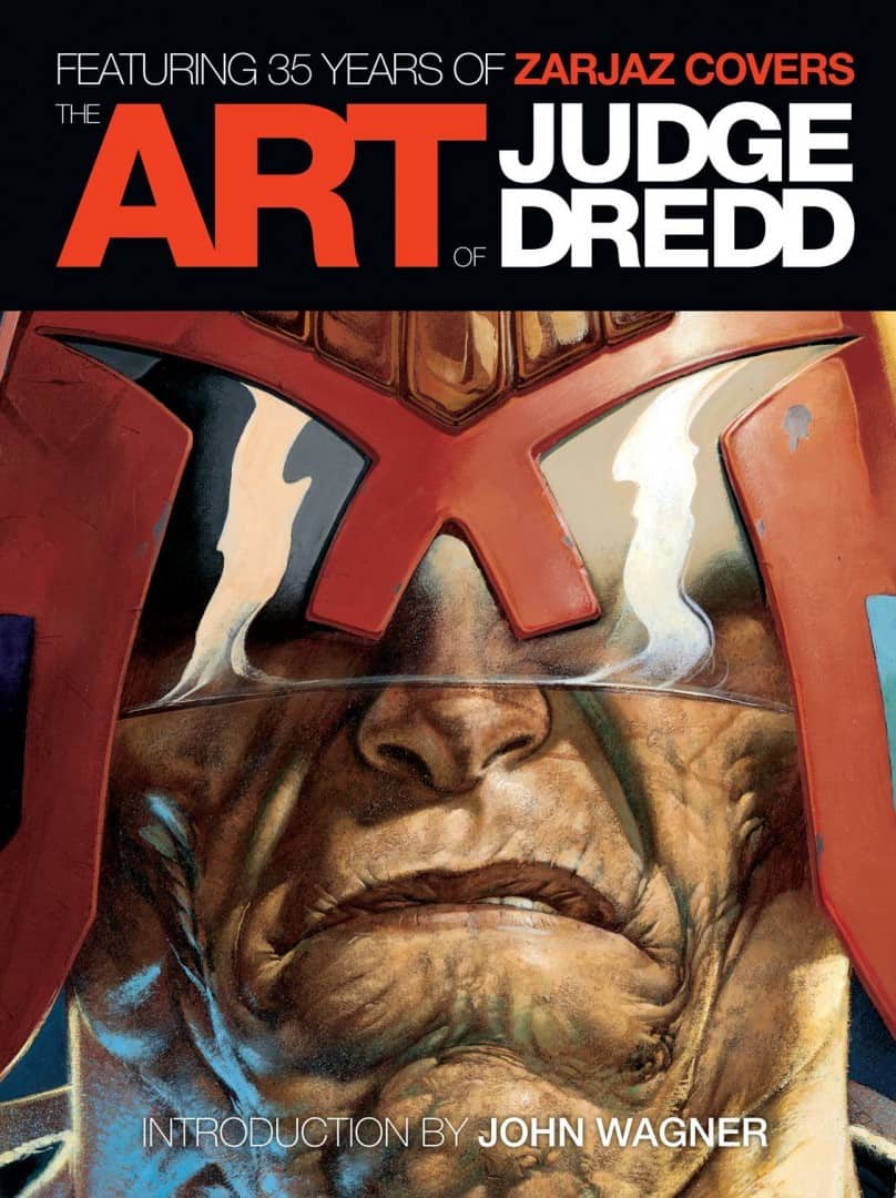
I picked up the ‘Art of Dredd’ book. I probably got into the comic only a few years ago. It’s cool to see stuff from 1977.
Yeah. It was a different world back then. I’m in that book doing some annotations. They sent around an email saying, ‘go through the covers and have any notes on them.’ I quite enjoy doing that. Not many, but just a few peppered in.
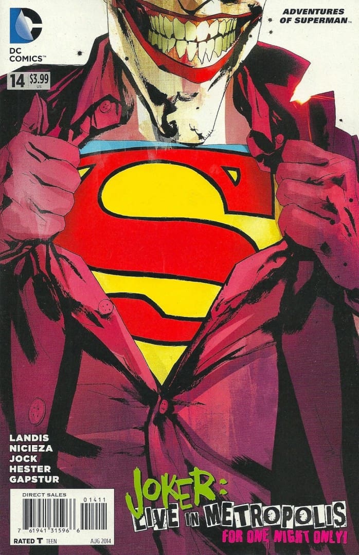
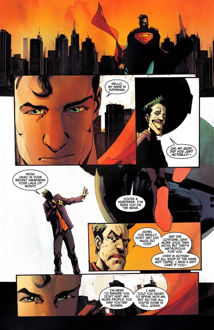
I’ve been re-reading the Superman comic you did with Max Landis, it’s an interesting comic. Coming from a writing background I’m looking at it thinking, ‘Wow, there’s not much action in these.’ At all. Was the script just straight conversation? How much of the visuals were in the script from Max?
He worked it like a comic script. He suggested second tier cut, diagonal this…and I totally get that, but I knew that coming on board I’d have to sort of decipher it a little better and make sure it read well as a story, kind of thing.
But DC didn’t want to do it originally because one of the reasons, there was no action in it. The editor said to me early on, ‘can you try to get Max to put a little bit more action in Part I or something?’, and I sort of said, ‘yeah sure,’ but I didn’t want to do that because what’s good about it is it’s just two guys talking to each other, that’s all it is.
I think Max’s dialogue really crackles. There’s a lot going on. It wasn’t everyone’s cup of tea. Some people didn’t like that about it. They thought that it was indulgent, but for me I like stories that just try to do something a little different.
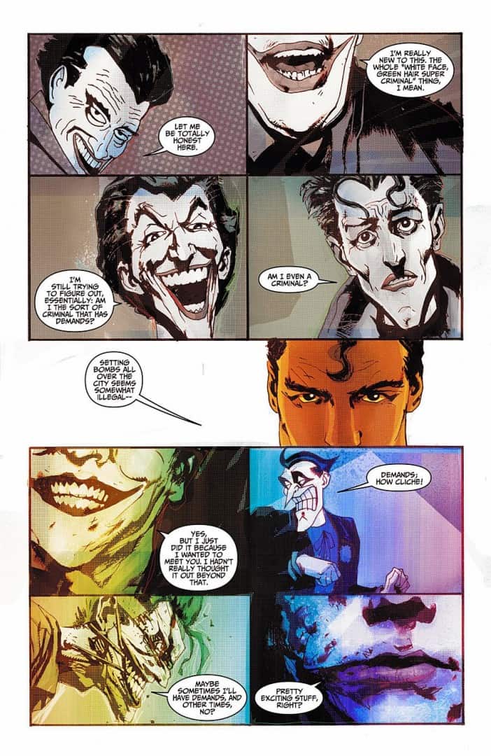
That’s what I liked about it, we got to see a straight up chat between the Joker and Superman. In Part I there’s a series of panels with the Joker, each one is a different version of the character. Was that in the script?
Yeah, yeah. That was Max’s idea. I quite enjoyed doing that page. I try and keep a page from each project and those who were asking me to buy that one, I’m like, ‘no, I’m keeping that one.’
Are posters your side project? Are comics always going to be your main thing?
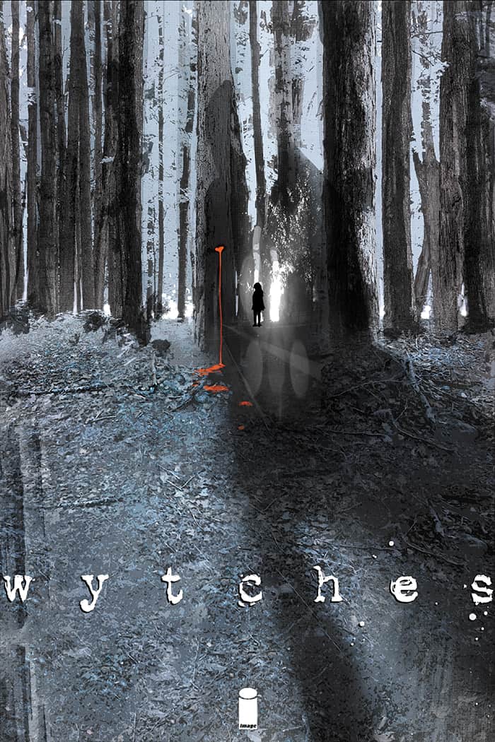
No. Just comics are my main thing right now. I’m just getting into (the Image Comics release) Wytches but I’m trying to do less and less comics, really.
That’s surprising.
Yeah. because it’s such hard work.
Are you looking to do more concept art like you did for ‘Batman Begins’ and ‘Dredd’?
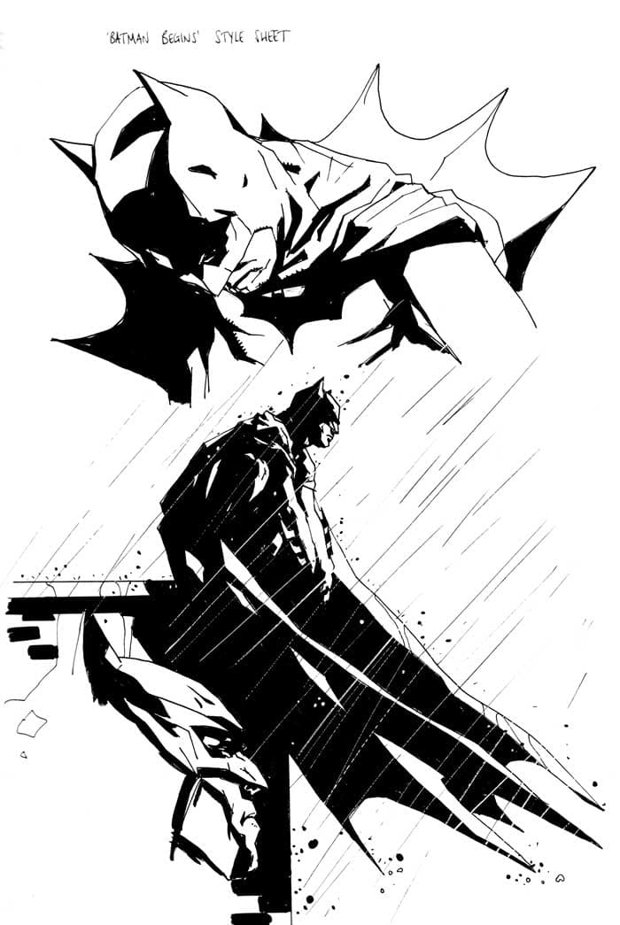
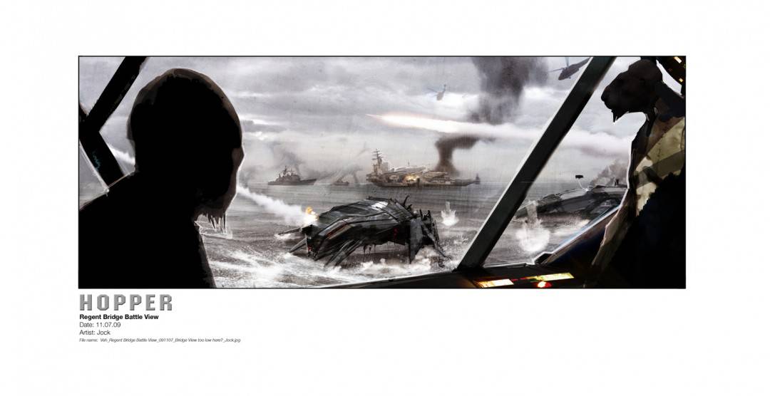
‘Batman Begins’ wasn’t really concept art. Christopher Nolan asked artists at Comic-Con to show what we thought what a real Batman should look like. But I’ve done concept art on a few other movies since. Some smaller stuff like Alex Garland’s new film ‘Ex Machina,’ but then big budget movies, like ‘Battleship.’ I did 6 months on ‘Battleship,’ working every day.
Now I going to have to watch it.
It’s a funny film, but that was a brilliant experience. I was thrown in to working on a $250 Million movie, and it was me, 10 other guys starting it, people from WETA and ILM for example. Top of the range guys. And in the end it was just me and Carlos Huante from ILM, because Pete, the director, really liked what I was doing. It was an awesome experience. Total freedom. It was amazing.
That was Peter Berg right?
Peter Berg, yeah.
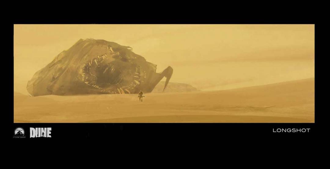
Who was going to do ‘Dune’?
He was going to. I met Pete because he was going to be writing and directing ‘The Losers’ to begin with and we stayed in touch. He got me to do the ‘Dune’ stuff, and then ‘Dune’ fell through and then he was starting on ‘Battleship,’ so he got me on board for ‘Battleship.’
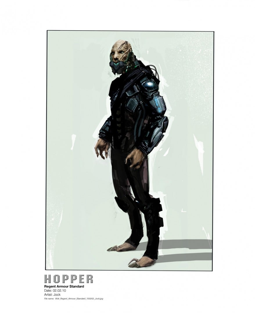
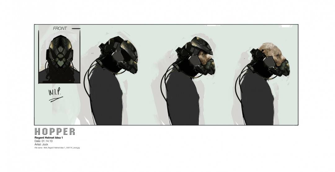
Yeah so there was that, some costume design on ‘X-Men Days of Future Past,’ some costume design on ‘G.I. Joe.’ Yeah, little bits and pieces. I love movies just as much as comics, in fact I watch more movies now than I read comics.
When you do movies, when you do that kind of work it’s awesome being involved with somebody that you are only ever like a cog in a machine, with comics or posters or whatever it’s your art that everyone sees, and all together I don’t really want to leave that behind.
It’s tempting because the movies pay really well. It’s a really relaxed pace, like I got paid a weekly rate. I worked quick enough that I was easily getting more than enough on it. I would spend two or three hours in the morning doing some ‘Battleship’ stuff and doing some comic book stuff in the afternoon. I try to be really much more selective with comics, because it’s really hard work, it’s so hard work man, it’s crazy.
The comic ‘Wytches’ reunites you with writer Scott Snyder. When you’re approached with a script for a comic, what does it need to have to make you want to be on board?
Honestly, it’s normally the person that I’m working with.
It’s that simple?
Yeah. Like when I met Max in Dubai. He’s quite a character, but he’s telling me his story and I just really liked it. He goes, ‘I’ve got a ten page story,’ and I just go, ‘I’ll do it.’ ‘You will?’ I was like, ‘Yeah I’ll draw it.’ And he phoned DC and said, ‘Jock will draw it,’ and then they immediately green lit it which was amazing. They were unsure about it. When I said ‘yes’ it just kind of went through. I had no idea I could do that.
So it’s always the people. And I always become friends with people that I work with, that’s just how I like to operate. So Scott said, ‘do you want to do this new series?’ He did tell me the pitch but I was just like, ‘I’ll do it.’
Has more been released than just the cover art?
There’s a six page story online which is not even from issue one, it’s just a little stand alone thing. So that’s been released. I’m replacing the cover one with a new image. I’ve done issue two’s cover, which hasn’t come out.
If you showed issue number two’s cover to me and didn’t say you had done it, I wouldn’t immediately think it was you.
I’m more excited about this. I love doing this stuff.
How’d you choose to go with a painting? Did you get more time on that cover?
No, just the subject matter. If I got a tight deadline I’ve got to be aware of it, and again, I never try and let outward things dictate how I should handle something. I just try and handle something the way I think it should be handled. Scott had the idea actually for the neck, and I just felt it like if I’m just showing a neck and an ear, it’s got to be a pretty tasty looking ear. So I thought I would paint it.
You’re not painting often anymore? Was that done in oils?
No that’s digital. My concept stuff is digitally painted.
That’s interesting that you paint digitally, but your drawings are done by hand with ink.
Yeah, always. I like ink too much. I like having it all over my hands, I like making marks, and it surprises me. A lot of people are going to go over to inking digitally, but I don’t think I could do it. Ink surprises you, and it does things you don’t expect. And that could happen in Photoshop as well.
The design for the ‘Battleship’ helmets came by accident. I had half of this shape with one white thing and I duplicated the layer, and flipped it 180 degrees to do something else with it, or paint on it or something and then suddenly there was this face that was looking at me; I was like, ‘that’s the helmet.’ I kept that and painted over it a little bit, and that’s the helmet that ended up in the film.
Are you finishing your drawings in Photoshop? Is that were the grid texture comes in?
Yeah, letratone, I don’t know why I do, I just do. I just like it. So letratone, you use to be able to get it as a physical sheet with a sticky back. You’d cut it out and put it on these drawings and it would look great, like a tone. I’ve just do my own one in Photoshop.
I always put it on everything I do. I have layers of letratone. It’s slightly graphic, but because my stuff’s quite textured, and I like having that little graphic element to it as well. For the prints, I think it works well because of the way that the sort screen is done, the way they’re handled. It’s got a graphic quality that I like.
It shows up in weird spots. I notice in Batman’s cape on the cover of issue #871. All over really.
I put a dot there, and I invert it and have a light there so I can highlight with it and shade with it basically.
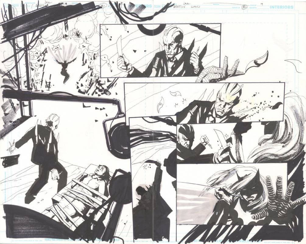
Original drawing of Detective Comics Issue #861 pages 8 and 9 by Jock available at Splash Page Art Dot Com
Do you keep most of your original drawings, or do they all go to the folks at Splash Page to sell?
Yeah, I’ve got loads at home as well. I try not to give them everything, just send them pages kind of thing.
That’s one thing I’m trying to get more. Collecting posters is fun, and comic books, it’s fun and it’s relatively easy, because at 60 bucks, 80 bucks a pop, yeah, you can do that easy. When it comes to something original like drawings, like how much are yours, a couple hundred bucks?
Yeah some are a hundred, some are a thousand, kind of thing.
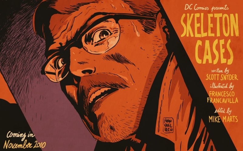
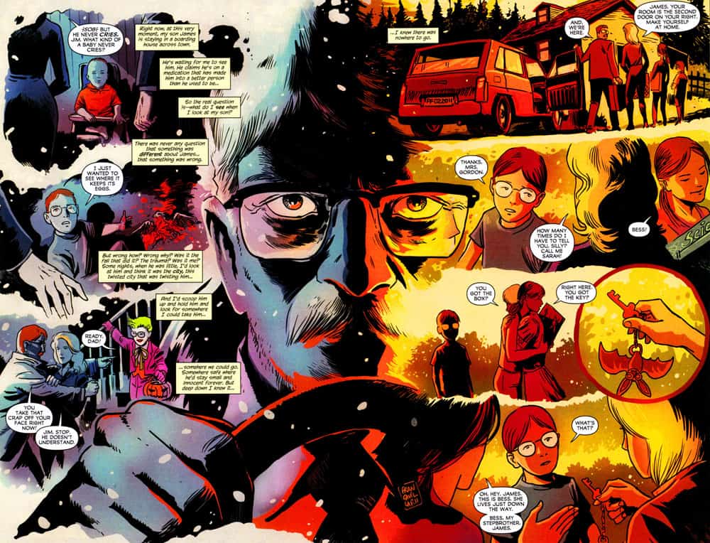
For Batman ‘The Black Mirror,’ art duties were split between you and Francesco Francavilla. Were you in contact with Francesco about it at all?
Yeah totally. 100%.
It shows. Your styles are very different, but taken as a whole, the book is incredibly consistent in tone.
It was pretty unique. That project was super good like that. That book has been a blessing really. Because at the time it was a random little story, but I just had a really good feeling about Scott, and sure enough, he’s made quite a name for himself.
Was that your first time working with Scott?
Yeah.
Had you known Francesco before?
No.
So you had not been involved with these people at all?
Yeah, Francesco was someone that Scott found and wanted to work on it. Like I said, he has a very different style. I thought Scott was so smart, I don’t know if you’d read the book, but it starts with separate stories and they gradually kind of combine to one story. It was just really enjoyable to be a part of. People seemed to have loved it.
Are you working with Max again anytime soon?
We’re talking about doing more with DC. I like working with him. That’s the thing, to answer your question. It’s always, for me, it’s about the people that I work with, if I just enjoy the work they do.
Hopefully it’s because you like their work as well.
Yeah, yeah. There’s a sort of synergy that starts happening as well, once you get to know someone better, and I think that’s got to help.
With someone like Max or Scott, are you able to help discuss the story and help guide it or give feedback? If they gave you a script, are you’re like, ‘Oh, what about this?’
Yeah, yeah, Scott is always asking for ideas and feedback. He doesn’t need it from me. I’ve just been really lucky that I’ve worked with brilliant writers. You find people who are very good and who can be very open as well, so they’re always happy to get feedback or thoughts, but again, nine times out of ten, it doesn’t need feedback.
At the same time, the writer’s trying to tell a story, and you’re trying to tell that story visually. At some point I would assume you’d be like, ‘Oh, I can condense these two pages into one scene.’
Sure. That’s my job anyway. Once I get the script, if I want to have an extra panel or lose a panel, then that’s totally cool. Again, good writers, they trust you. They want you to do whatever you need to do to make it work.
Is your book, ‘The Art Of Jock,’ is that coming out?
It is. It’s not going to be called that. I hate that title.
Will the book be any sort of statement? Like, ‘here’s what I’ve done in the past.’ I always feel like once you do a retrospective, it kind of signals something. An end. A beginning. What’s the basic idea behind the book?
It will have a section for comics, a section for my Mondo stuff, posters, and probably a movie section as well, with some concept work, so it is going to be an overview of everything I’ve done, basically.
Does that mean you’re going to start taking on new things, or expanding? The ‘Art of Jock Part Two’ will be much different than the first one? ‘Volume Two’ will be much different than ‘Volume One’?
I should just call it like, “Jock: So far…”
Jock, almost there. Not quite. Almost.
