Canadian-based illustrator Randy Ortiz is extremely prolific, constantly creating — drawing, studying. There’s a depth to his work that can only be achieved by an active mind, a steady flow of exploration.
Ortiz’s body of work splinters into fragments — he’s an illustrator, a fine artist, a purveyor of soft charcoals as well as the dense movement of pixels. His prints and drawings vary from incredibly muted tones of shifting grays to the vibrant pulse of digital neon.
In his charcoal work, Ortiz shows patience and calm, a visual prayer. This monastic approach to creating is there in his commercial work as well, bringing thoughtful designs to films like ‘Evil Dead II,’ ‘Alien,’ and ‘Only God Forgives.’
Ortiz is able to find the weight of his subject, giving each piece a subtle yet effective heightened sense of importance.

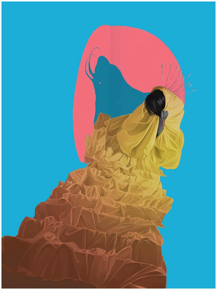
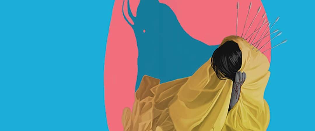
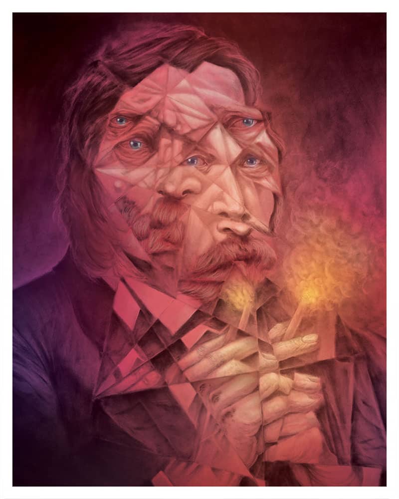
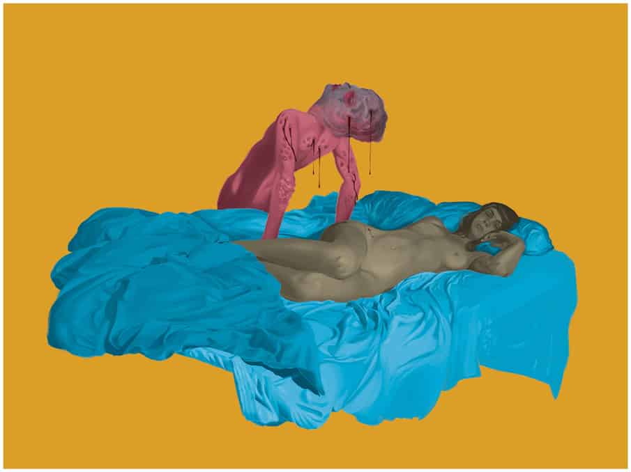
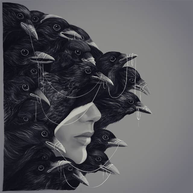
‘The Painful Sound of Talking Down’ by Randy Ortiz
CJ: Your piece ‘The Painful Sound of Talking Down’ is what first got my attention, but then seeing the rest of your work I realized I was already well aware of your art.
There seems to a direct split stylistically between your personal work like the polyopic series and something like ‘Groot’ for Mondo. The separation runs along the fine art versus illustration line. Do you approach illustration work differently than a personal piece?
RO: There’s definitely a difference, my personal work is strictly for selfish and exploratory reasons. It’s my chance to do whatever I want, with no inhibitions or restrictions, and no direction from anyone other than myself. Sometimes this even means changing up my usual style completely, just to see how far I can push myself and in which directions.
When approaching commission work, it’s a different story. While I try as much as I can to put my own style and ideas into a piece, I have to be conscious of the fact that I’m working within a certain box and that I’m not just creating work for myself, but for others as well.
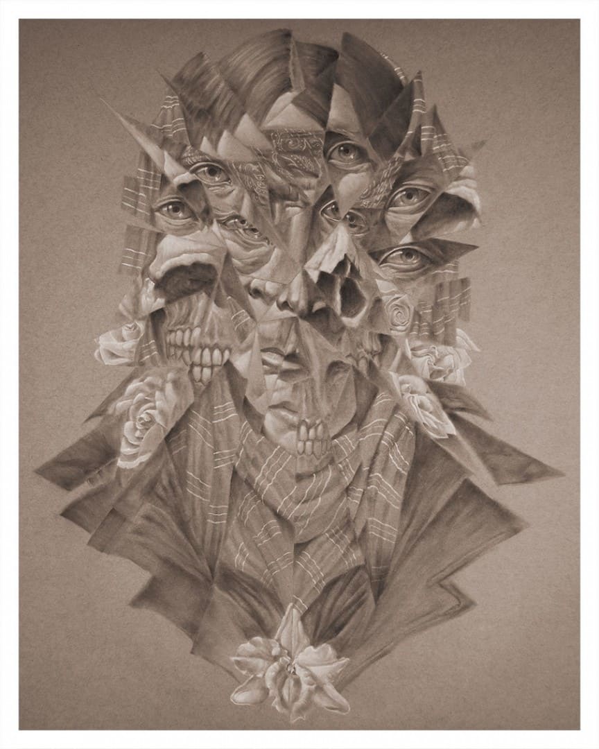
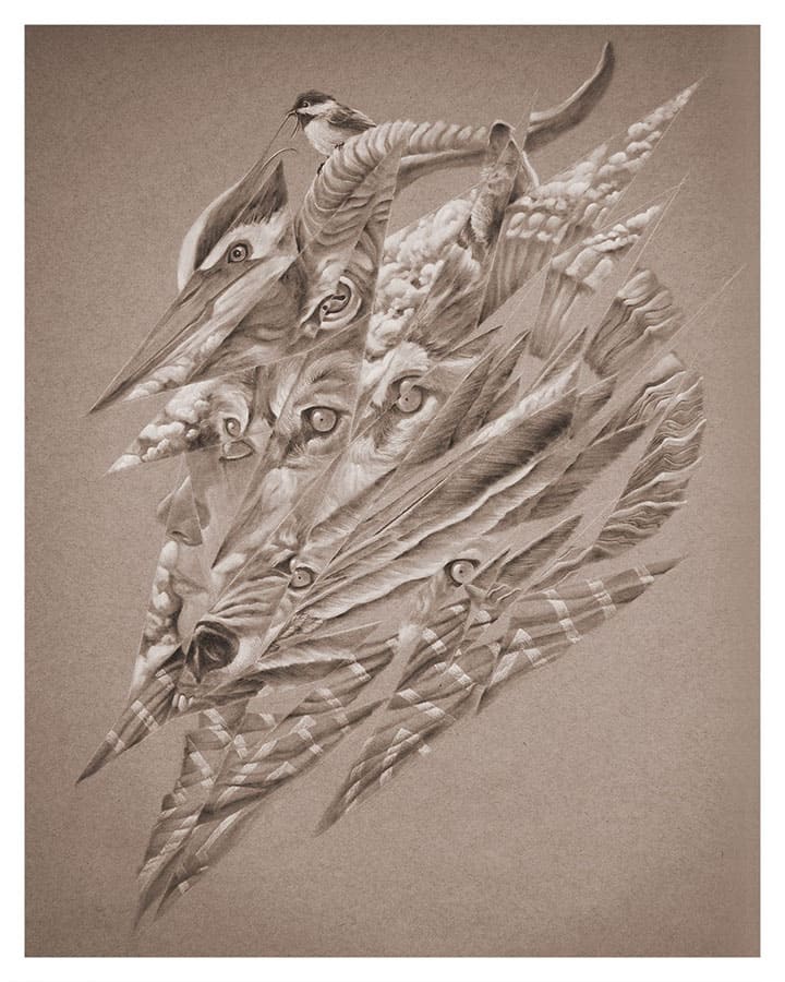
‘Polyopic Fragments: For He Is the Man of Sin, the Son of Perdition’ original charcoal drawing by Randy Ortiz
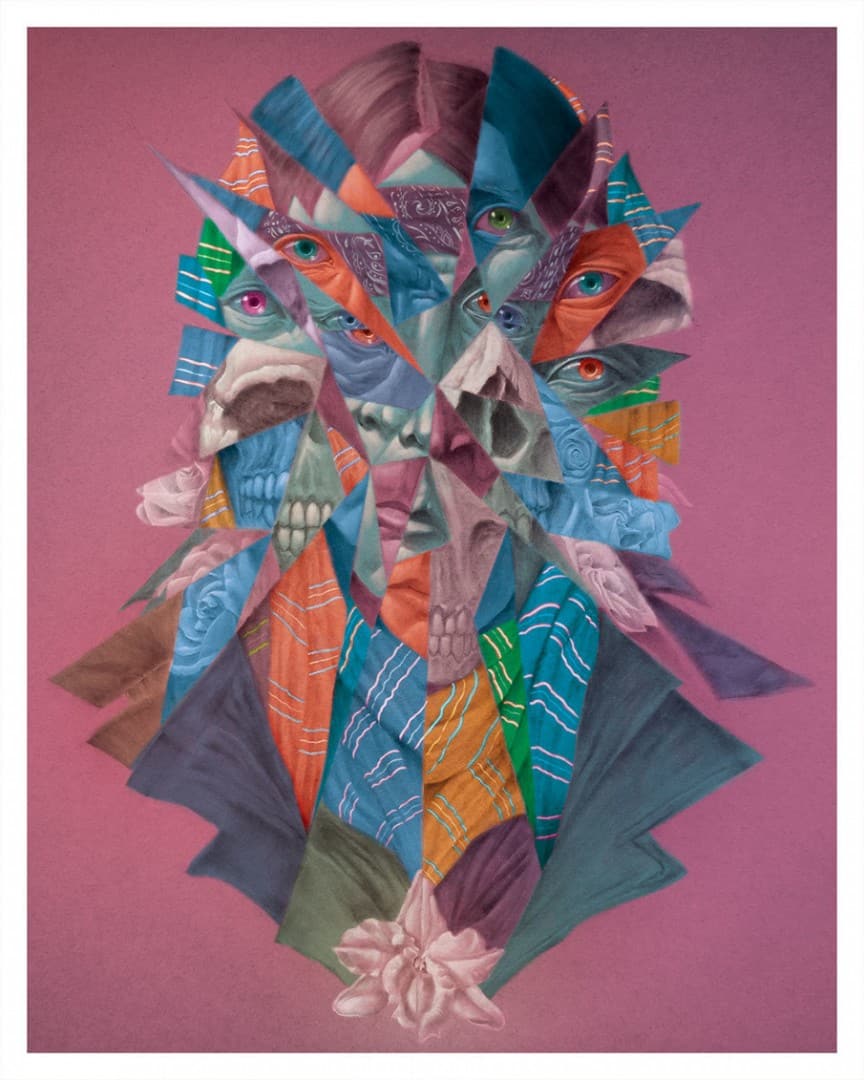
‘Polyopic Fragments: For He Is the Man of Sin, the Son of Perdition’ digitally colored version by Randy Ortiz
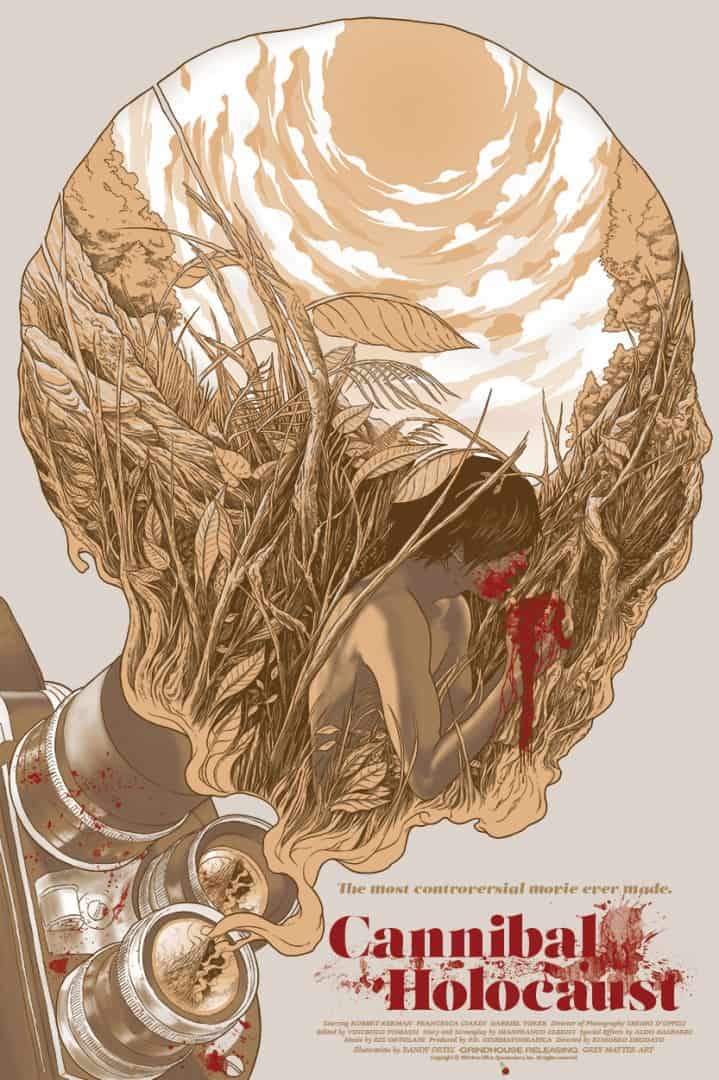
‘Cannibal Holocaust’ by Randy Ortiz for Grey Matter Art
There is a definite stylistic distinction between some of your pieces – there’s the digital painting of ‘Cannibal Holocaust’ next to the soft charcoal work of ‘Her Visage Sullied with Iniquity.’ Both are simply incredible but totally different.
Do clients approach you with projects where your hand-drawn charcoal work would work best? Is a digital workflow better for illustration work for a faster turnaround?
I have yet to be approached to use my charcoal technique on a commissioned project. I think my reputation as a Mondo artist precedes my fine art illustrations, and so people sort of expect that digital style from me.
99% of projects that I’m offered request I draw in that style, mostly due to the fact that screen printing is involved. It’s much more simple to draw everything digital in that case; charcoal drawings aren’t very screen print-friendly.
‘Polyopic Fragments II: Her Visage Sullied with Iniquity’ original charcoal drawing by Randy Ortiz
‘Polyopic Fragments II: Her Visage Sullied with Iniquity’ digitally colored version by Randy Ortiz
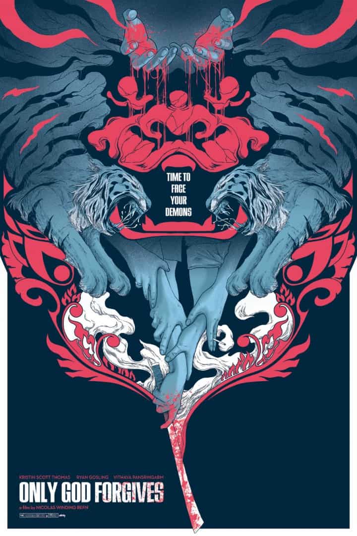
‘Only God Forgives’ by Randy Ortiz
Your design for ‘Only God Forgives’ is brilliant. There’s a wonderful flow to it and also a sense of discovery. The tiger’s stripes emerge, then the hands. Blood. For being a complex design you keep it incredibly tight.
Each of your film posters has a different approach – for ‘Guardians of the Galaxy,’ ‘Gremlins,’ and Marvel’s Venom we get a portrait. ‘The Thing’ is a bit of a portrait as well. With being capable of such a variety of styles, where do you start with a film design? Was a Ryan Gosling portrait ever in play for the ‘Only God Forgives’ print?
‘The Only God Forgives’ poster was a really fun process. If you haven’t seen the film, it’s full of symbolism and that’s what the art director wanted me to convey in the poster.
I originally had Gosling’s face on it but scrapped it as it kinda took away from the flow of the piece. He’s just so damn good-looking, it became a distraction, haha.
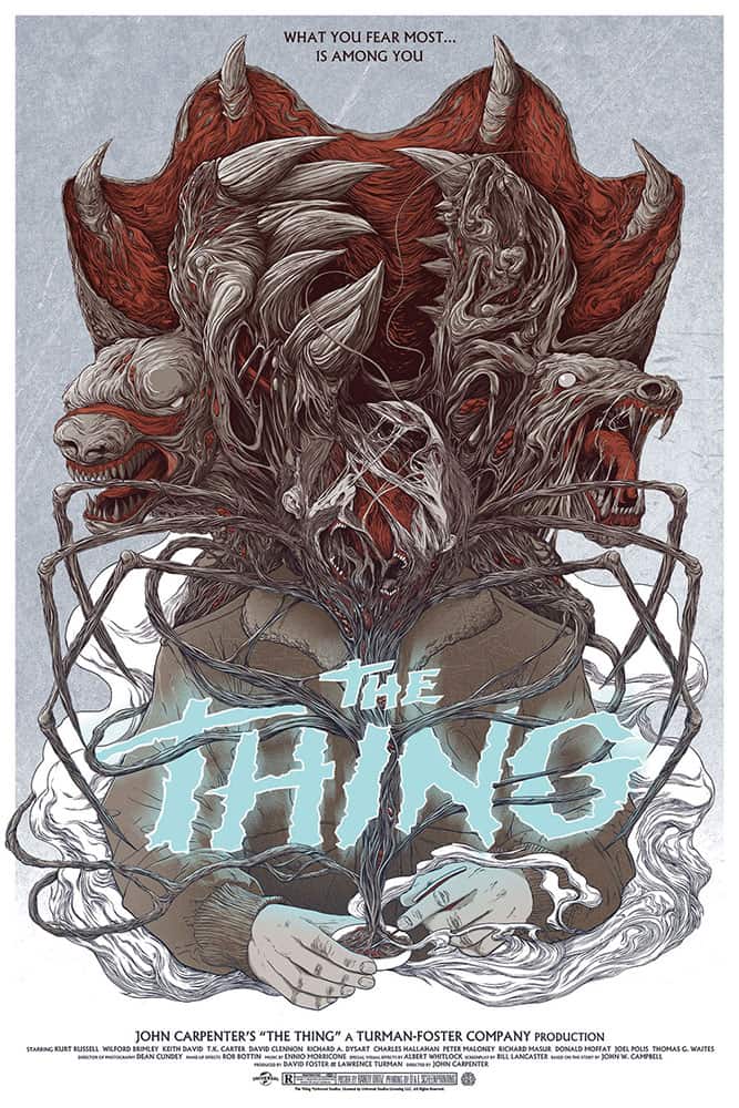
‘The Thing’ by Randy Ortiz for Mondo
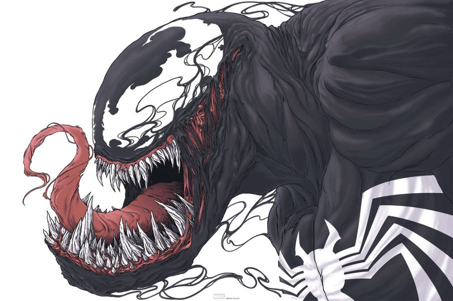
‘Venom’ by Randy Ortiz for Mondo
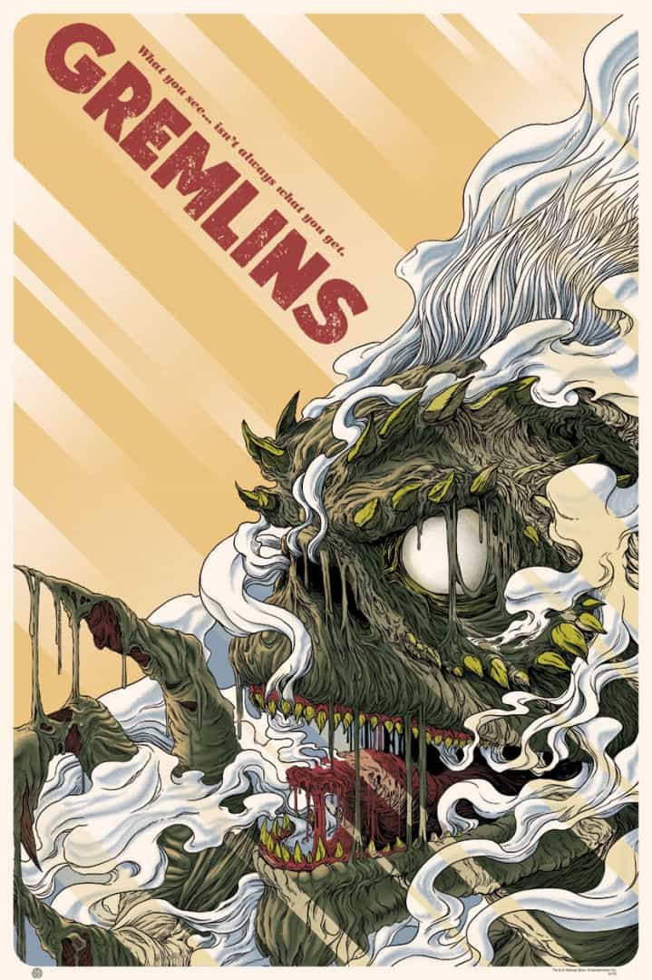
‘Gremlins’ by Randy Ortiz for Mondo
For ‘Alien’ and ‘Guardians of the Galaxy’ you did an amazing job of summing up these big stories into these intimate and human designs. Even with the gore of ‘Cannibal Holocaust,’ you treated the property with respect rather than camp or irony. You didn’t even choose the goriest moment of the film. Is there much discussion with Mondo or Grey Matter about your approach?
Rob Jones at Mondo usually just lets me go crazy with my ideas at first and he’ll come in and tell me what works and what doesn’t and possible ways to improve on the illustration. As for Grey Matter Art, they are relatively new to the movie poster scene, but Mike was sort of the same way.
Luckily, my idea for ‘Cannibal Holocaust’ was in my head for many years, kinda festering in my head waiting for its opportunity to be drawn one day. The idea was so easy for me to do a convincing enough rough draft that GMA immediately agreed to it.
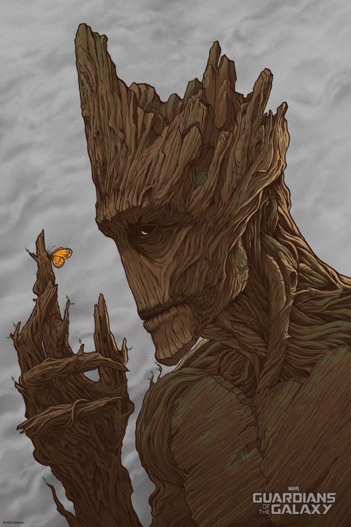
‘Guardians of the Galaxy – Groot’ by Randy Ortiz for Mondo
How aware of the property do you need to be to take a gig? Was ‘Cannibal Holocaust’ a film you had a connection to? Did you have a working knowledge of ‘Guardians of the Galaxy’ comics before you took on Groot?
I grew up on gore and pseudo-snuff films so ‘Cannibal Holocaust’ definitely had its place in my heart, haha. As far as ‘Guardians’ goes, I never read the comics ever until I was given the assignment.
I was aware of who Groot was but still needed to do my research on him first and quickly discovered that I can make an interesting piece with him. That poster ended up being the quickest piece I’ve done for Mondo I think.
‘Sub Tuum Praesidium’ by Randy Ortiz
You have a remarkable output. Each new drawing or print always brings something new and interesting to your portfolio. When your work ‘Sub Tuum Praesidium’ was finished, you immediately put it up for sale. Do you sale all of your originals? Is there anything that you keep for yourself?
Anything and everything I do is for sale. I dunno, once I finish a piece I feel I no longer really need it, honestly. The journey of figuring out a piece and trying to create it is what excites me.
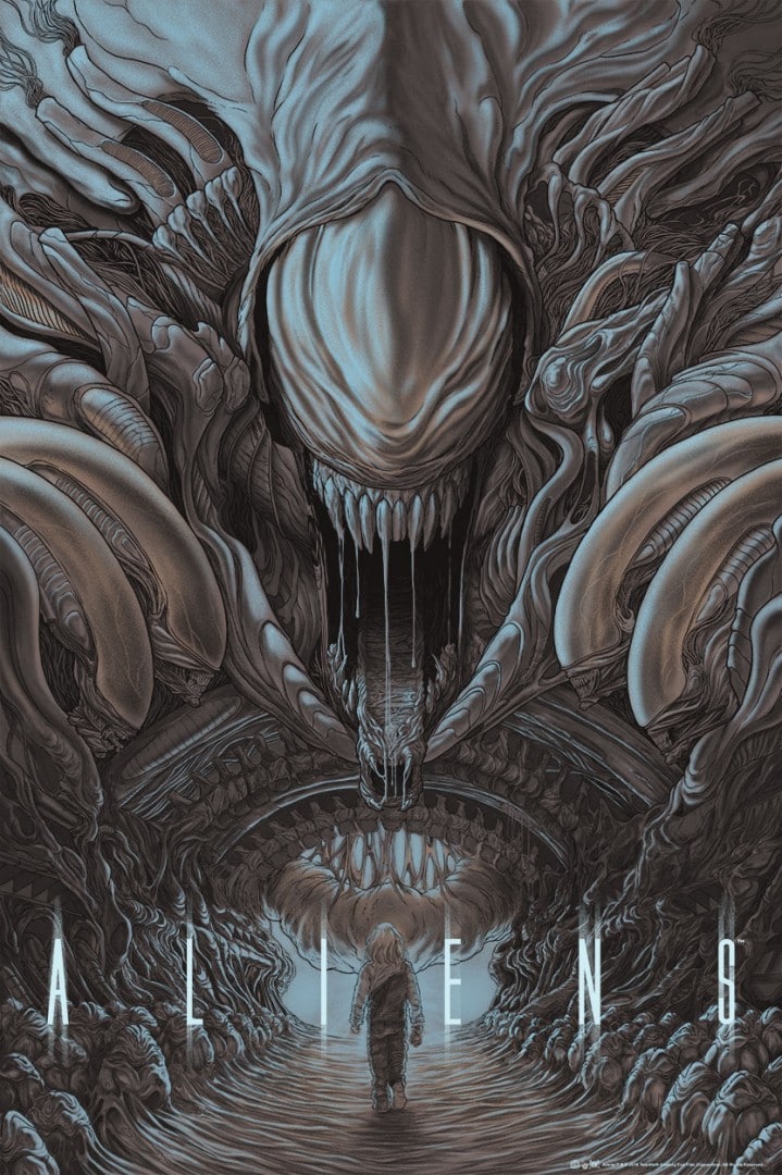
‘Aliens’ by Randy Ortiz for Mondo
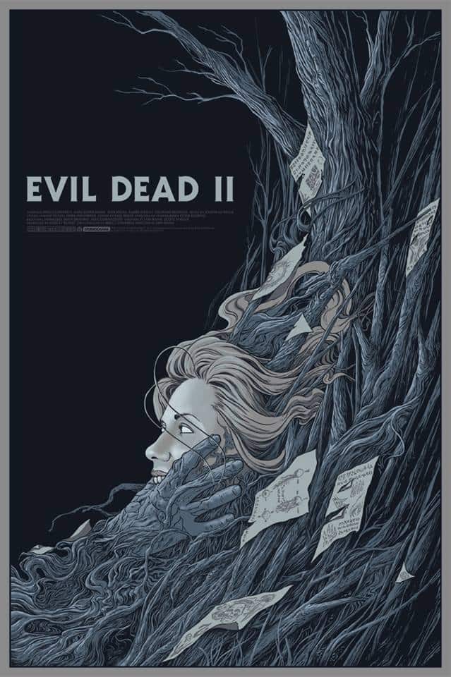
‘Evil Dead II’ by Randy Ortiz for Mondo
For your film posters, there’s a relatively steady color palette of grays and earth tones. ‘Gremlins’ has some green in there, but it’s of muted variations. Even your charcoal drawings stay in that tonal range – you rarely use deep blacks, but go for a softer range of grays.
Not sure if this is an idiotic thing to notice, but with your work seeming so deliberate I was curious if that’s just pure coincidence or decision made at the start of drawing?
I just naturally gravitate to that palette. Bright, saturated colours scare me, haha. However, I did purposefully tackle that issue with pieces like ‘The Painful Sound of Talking Down’ and that whole series.
The colours are very difficult to work with I find, but when done right it can look amazing. I should definitely try it again.

‘Never Quite There When I Need You the Most’ by Randy Ortiz
‘Unihalvaus’ by Randy Ortiz
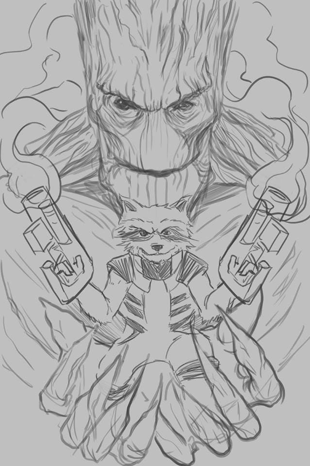
‘Groot’ sketch by Randy Ortiz
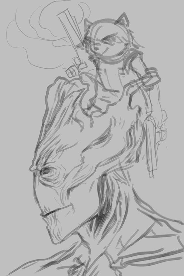
‘Groot’ sketch by Randy Ortiz
For your ‘Groot’ print, you posted your rough pencil sketches – it was interesting to see the variety of choices you came up for a portrait. Do you always start with a round of pencil sketches before you start? When do you know you’ve landed on the right one?
I usually like to come up with at least two quick rough ideas. The number of roughs is ultimately dictated by Rob Jones and how many he rejects as I send them in, haha.
Luckily, I never had to make more than three or four roughs sketches before getting it right.
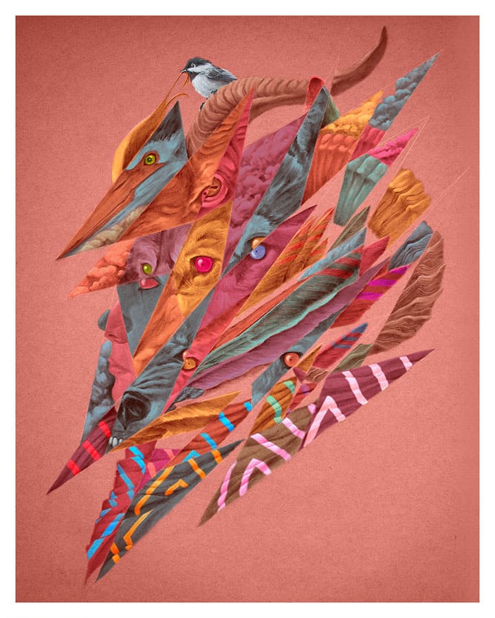
‘Polyopic Fragments III: Steadfast In the Midst of Change’ digitally colored version by Randy Ortiz
‘Polyopic Fragments III: Steadfast In the Midst of Change’ original charcoal drawing by Randy Ortiz
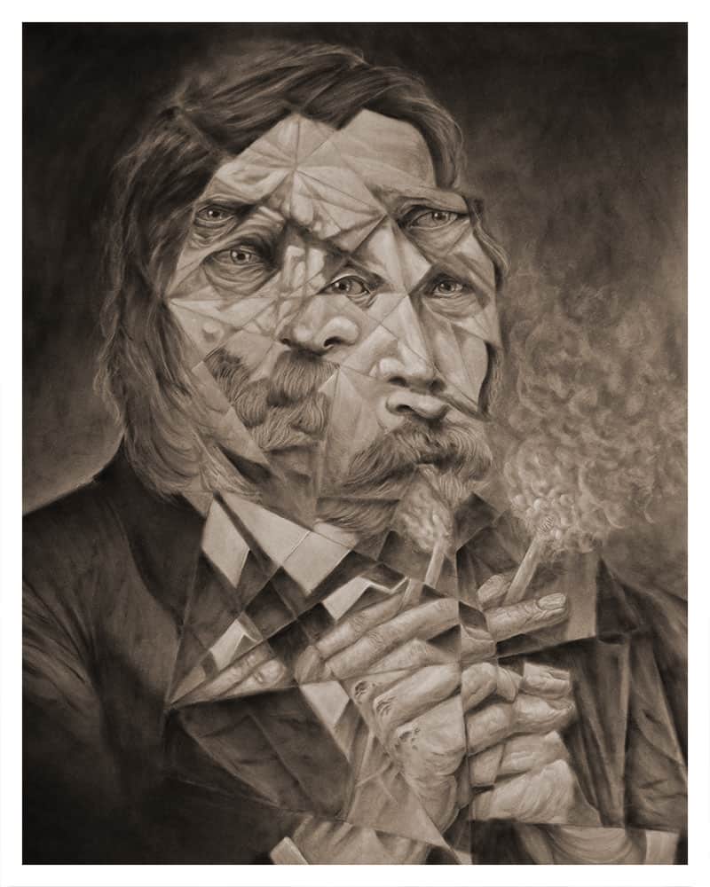
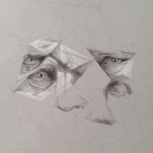
The polyopic series is simply staggering – ‘Steadfast in the Midst of Change’ is so dang gorgeous. You get lost looking at all of the fragments before you piece them together, and the face emerges. Are you drawing the image un-shattered as it were, and then using that as reference, or are the charcoal drawings your first attempt?
That was a fun exercise in beginning with a disjointed idea and slowly piecing the parts together as I went on. I literally start with just a randomized ‘grid’ of white lines and fill in the gaps as I go along.
It’s a strange way of going about things as it’s pretty disruptive to working with a flow, but it was still fun to create. A challenge that I thoroughly enjoyed and will have to visit again someday.
‘Polyopic Fragments: For He Is the Man of Sin, the Son of Perdition’ work in progress by Randy Ortiz
‘Polyopic Fragments: For He Is the Man of Sin, the Son of Perdition’ work in progress by Randy Ortiz
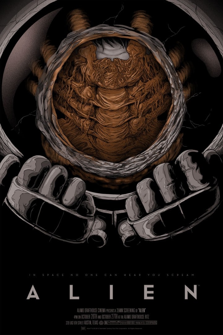
‘Alien’ by Randy Ortiz for Mondo
Original work by Randy Ortiz
With illustrating a film or a band’s gig poster, there’s a direct thing the design is speaking for – ‘this film is about this,’ which is something you have a knack for. For me, your ‘Alien’ print is pretty perfect. When it comes to your personal work is there anything you start with that isn’t visual? Meaning, do you need to have a thing you’re trying to say?
My personal work is simply that, personal. A lot of it reflects what is happening in my life at that moment. As you might guess from what I produce, sometimes my situations can get a little dark.
But illustration is my way of purging the negative things that happen in my life. It’s my way of taking the darkness, rolling it up into a ball of charcoal and graphite and smearing it onto some toned paper. The weight instantly gets lifted off my shoulders and I end up feeling great again.
Original work by Randy Ortiz
Having never met you in person but following you online I feel that I get a sense of who you are, or at least of your online persona as an intelligent and very funny man. Your illustrations on the other hand are highly intelligent but also dark — they don’t have the humor that you show online.
You mentioned that your work is a way of purging the negativity in your life — something I absolutely understand. Does humor not have a place in your work? Are you surprised at the heaviness in your own work?
I think for the most part I’m a positive dude but like most people, I do have some issues in life that can make my day suck.
While I wouldn’t bother anyone, especially strangers, with said issues in a self-pitying status update, I do find solace in the therapeutic nature of creating art. It just so happens that I have an audience for it unfortunately, haha. I guess I could try one day to make ‘happy’ art, but that doesn’t really seem all that fun to me.
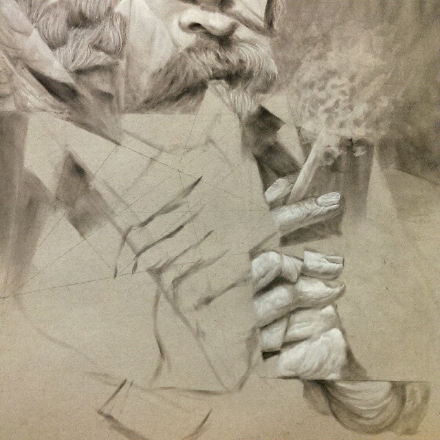
‘Mr. Boots’ work in progress by Randy Ortiz

‘Mr. Boots’ work in progress by Randy Ortiz
‘Mr. Boots’ by Randy Ortiz
