Illustrator Rich Kelly takes on his work with the ease of a fine artist — pushing and pulling lines, mucking it all up in the hopes of creating something new. Something different.
His clients include bands like The Black Keys, Phish, and Mike Gordon — film poster work for Mondo, titles like ‘Django Unchained‘ and ‘Beasts of the Southern Wild.’ His work is out there in the world, and Kelly always makes sure it’s interesting. The majority of his work leans towards the serious — the dramatic. His last few jobs are different — the first for Disney, ‘The Sword in the Stone‘, an underrated animated classic of the Arthurian legend followed by a poster for ‘Captain America: Winter Soldier.’
I won’t say these two films are out of Kelly’s league, just both are inspired choices for his work. When I heard Rich Kelly had done a poster for ‘The Sword in the Stone‘ my mind went wild with what he could have possibly done. When his next gig was for the release of ‘Captain America: Winter Soldier,’ I had to see it. Kelly is an illustrator who takes risks, finds an angle and distorts it until he finds the beautiful truth inside. Both of the posters mentioned are quality pieces, dense with immeasurable skill and inspired moments of loose gesture.
For ‘Captain America’, a Hollywood tent pole blockbuster if there ever was one, Kelly was required to take a more realistic approach to the characters, in direct opposition of his natural skill at a skewed and twisted caricature. Ever the professional, he did it and he nailed it.
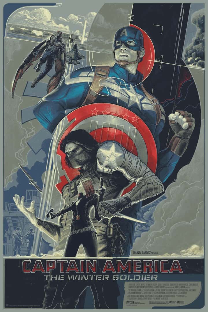
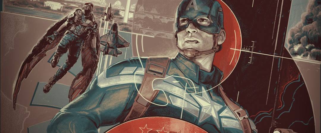
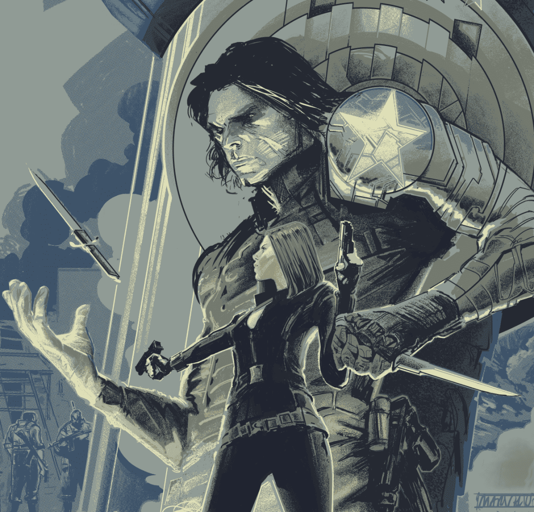
‘Captain America: Winter Soldier’ by Rich Kelly
I was happy to see that Mondo got you for the ‘Captain America: Winter Soldier’ print – you brought your unique touch to the Marvel universe, and as a fan of your work it felt really great to read ‘Captain America by Rich Kelly.’
It feels like a different type of film for you to take on, most of your posters are for heavy dramas or at least more serious films. Did you approach this big Hollywood tent pole film any differently than you did for more serious films like ‘Hard Eight’ or ‘The Place Beyond the Pines?’
I actually typically approach all of these film poster projects from the same angle, trying to establish a visual concept from which to base the initial image and then build on that. In this case, I started with the double use of the star for Captain America’s shield as well as on the Winter Soldier’s arm.
As I build the image around that central hook, I search for compositional elements that might carry some significance to the film. For example, the bullseye is a nod to the old 70’s political thrillers that the Russo brothers cited as an influence. Merging that into the S.H.I.E.L.D. logo leads the eye through the piece.
Sketch for ‘Captain America: Winter Soldier’ by Rich Kelly
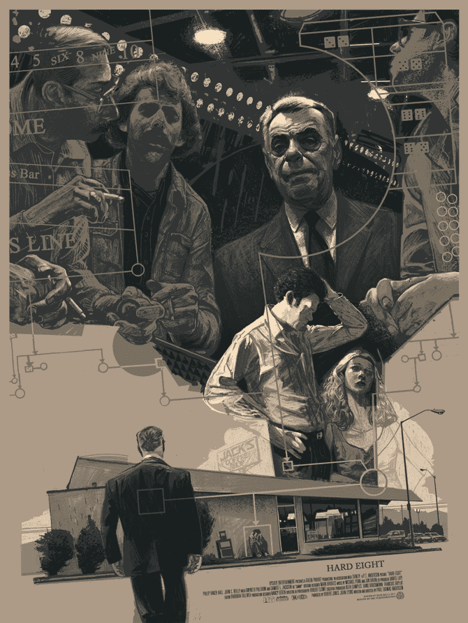
‘Hard Eight’ by Rich Kelly
One of the many things I love about your work is your ability to skew a figure in strange caricature. Looking at your ‘Hard Eight’ print next to ‘Winter Soldier’ there’s a similarity in design, but your approach to the figures are much different. For ‘Winter Soldier’ you treated Captain America with a classic attractiveness, capturing the actor Chris Evans’ likeness to a tee rather the loose portraiture you did for ‘Hard Eight.’
In both posters the characters are immediately recognizable, but ‘Winter Soldier’ has a more heroic rigidness in Captain America’s features. Was that dictated by the client or was that a choice you made?
Before I even started I knew that when working with a large Hollywood production like this I would need to keep the likenesses fairly tight. And in the end, I did have to go through a couple of revisions of Chris Evans’ likeness to get it to where it ended up.
However, the client did embrace some of the liberties that I did take, skewing the Winter Soldier figure and exaggerating the proportions of Captain America. I would have loved to really abandon any demand to keep it fairly realistic, but then they probably would have went with someone else.
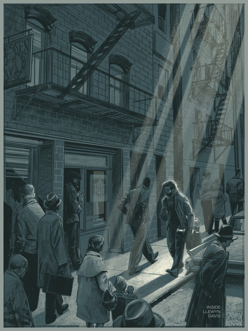
‘Inside Llewyn Davis’ by Rich Kelly
Your print for the Coen Brothers film ‘Inside Llewyn Lewis’ is one of your more straightforward in terms of composition. It reads like a snapshot – each element giving a dose of insight into the character and the film. There’s also a touch of classic folk album artwork to it as well, like an early Dylan vinyl cover. There’s a meditative quality to it.
When looking at your gig posters it’s obvious you are capable of extreme flights of zany imagination — do you find yourself holding that instinct back for a realistic scene like the one in ‘Inside Llewyn Lewis’ or is it a chance to explore something new?
I try to carefully pair the mood of each piece to the property it will represent. ‘Inside Llewyn Davis’ was really challenging for me because it was such a simple, short tale. While masterfully told, I struggled to find a grand idea to represent it. (That’s more a reflection on my inability to be a visual storyteller than it is on the film.)
I was really happy with the final image, but I’m sure there would have been a better way to make a poster for it. This illustrator named Marc Aspinall made an editorial illustration for the New Yorker that is so smart in its simplicity that after I saw it, I knew I wouldn’t be able to come up with anything better.
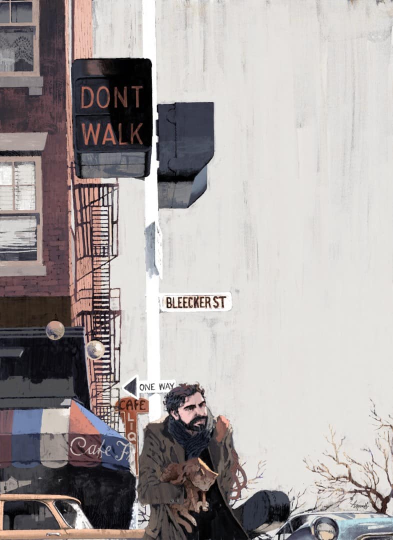
‘Inside Llewyn Davis’ For The New Yorker by Marc Aspinall
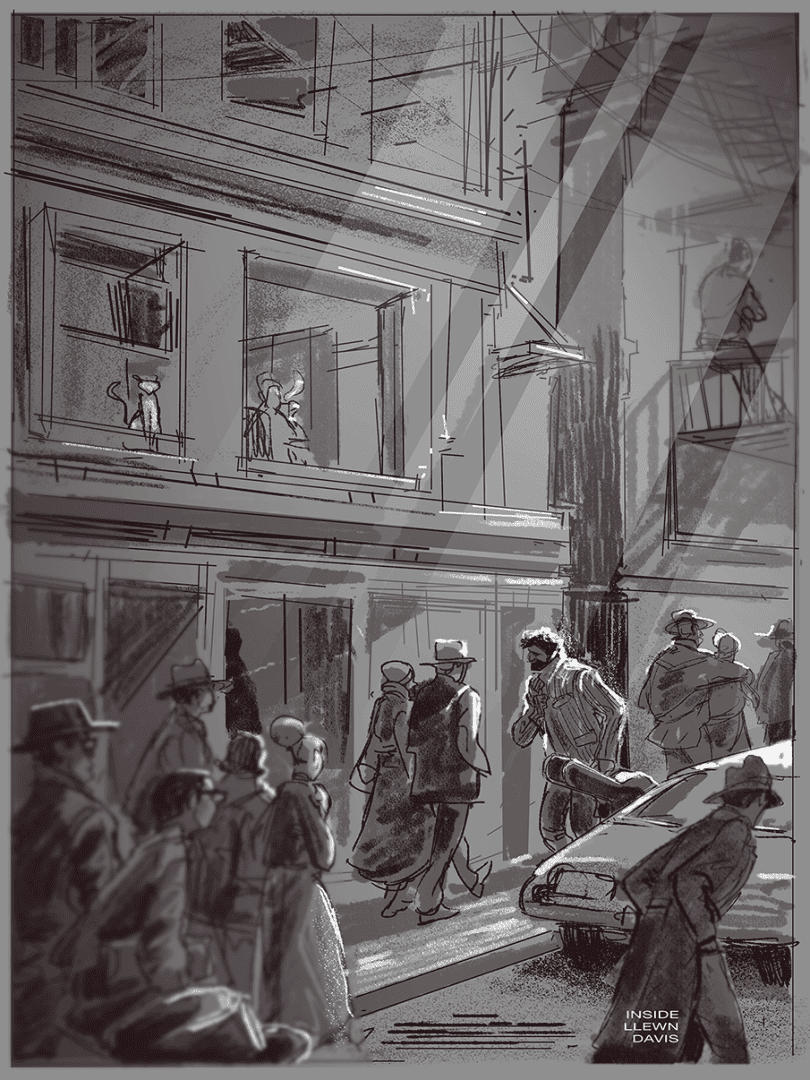
Sketch for ‘Inside Llewyn Davis’ by Rich Kelly
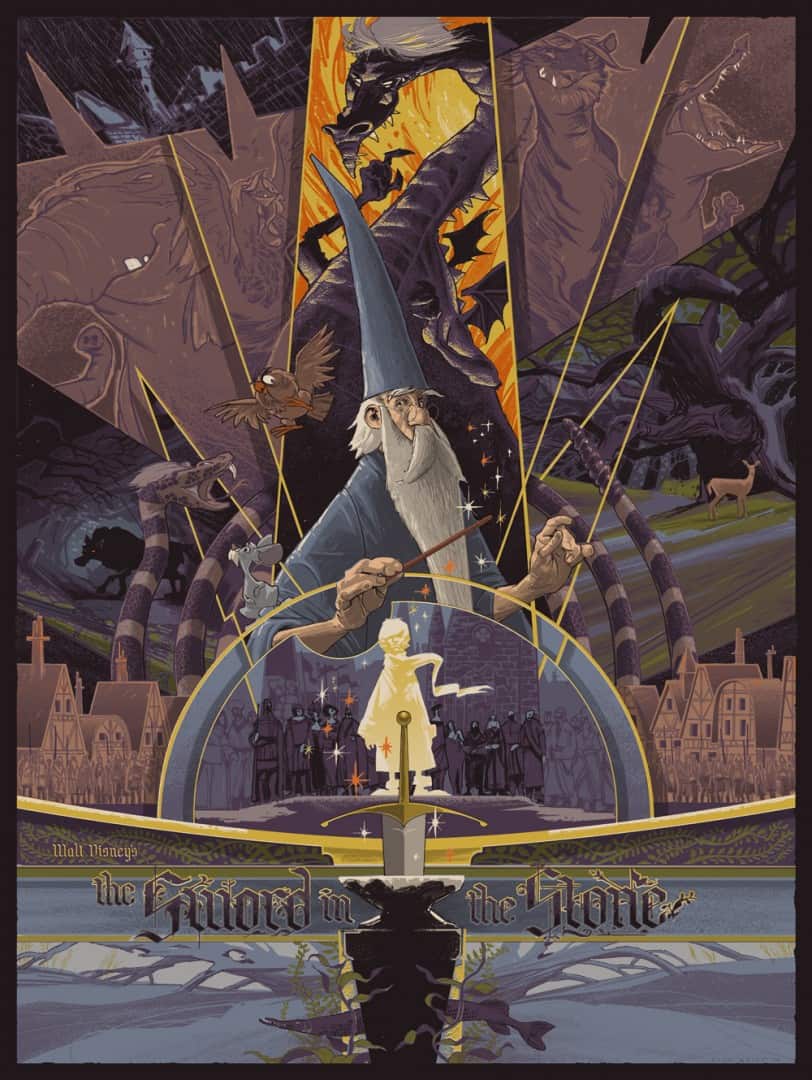
‘The Sword in the Stone’ by Rich Kelly
The ‘Sword in the Stone’ print you did for the Mondo / Oh My Disney show ‘Nothing’s Impossible’ is all types of perfect. For fans of that film, you showed everything that we love about it – one of them being the fight with Madam Mim. You were able to get so much detail from the film into the poster while keeping Arthur front and center. It shows a real love and understanding of the film.
I was lucky enough to be able to pick up the print from the show and beyond the design what struck me is how well it captures the tone of the film. It’s a dark poster printed on dark paper, matching the visual style and look of Disney’s animated films of the 1960s, where the colors get a bit muddy and the drawing style loosens up compared to earlier films like ‘Cinderella’ and Snow White.’
How many rounds of drafts did that poster go through until you landed on something that both you and the Mondo / Disney camps were ready to move forward with?
Surprisingly that project moved along pretty smoothly. They quickly approved my initial sketch as well as some studies that I made trying to figure out how to render the characters in my style.
I initially intended to portray the animal versions of Madam Mim fairly close to the way they were presented in the movie but when I put my twist on them I was surprised and thrilled that Disney was cool with it. In the end, I wish I would have went with a larger size as it is a fairly busy piece but again, I was really happy with how it turned out.

Sketch of Merlin for ‘The Sword in the Stone’ by Rich Kelly
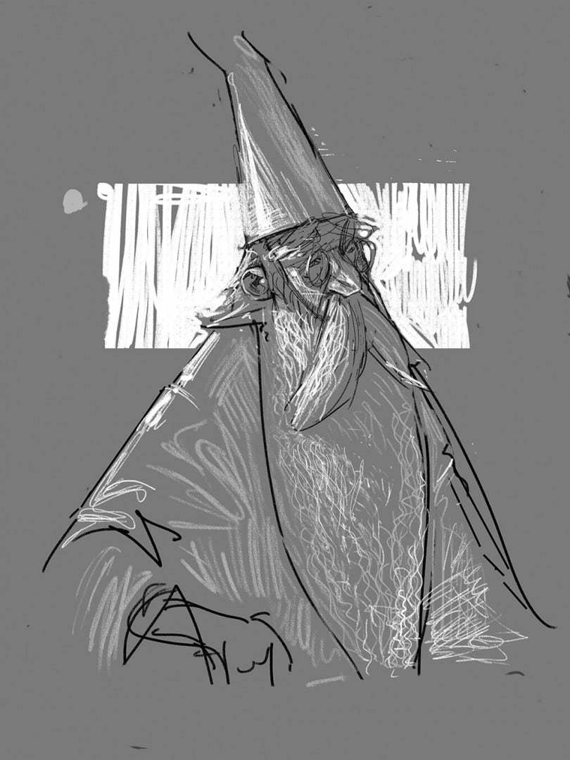
Sketch of Merlin for ‘The Sword in the Stone’ by Rich Kelly
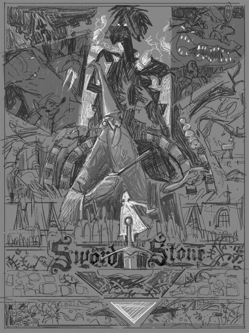
Sketch for ‘The Sword in the Stone’ by Rich Kelly
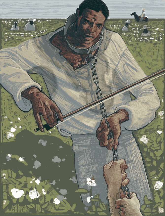
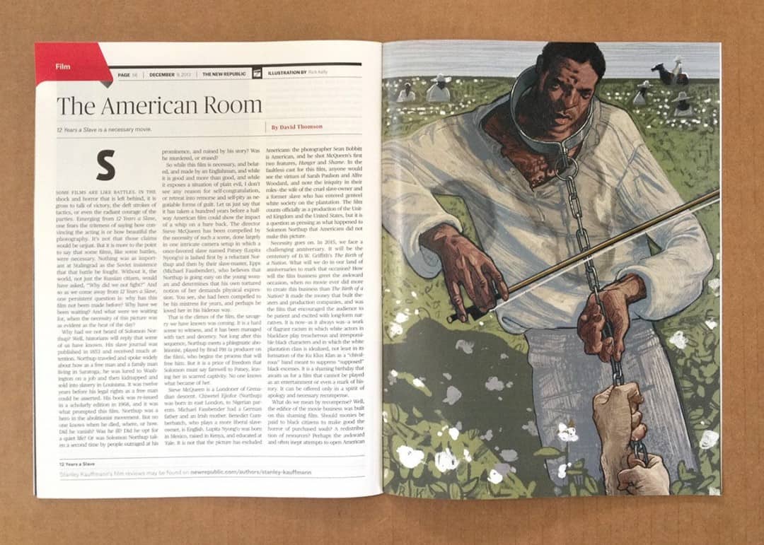
’12 Years A Slave’ for New Republic Magazine by Rich Kelly
You did an illustration for The New Republic magazine, an outlet that has really stepped it up in terms of getting quality illustrators such as yourself and Richey Beckett. Most of your work is done for gig posters or film posters, either 18″ x 24″ or 24″ by 36.”
When working on a piece like ’12 Years a Slave’, an illustration that accompanied an article, do you have to change your design process for the smaller output? Was this your first job for a magazine?
Before getting into doing all of this poster work I had planned on pursuing editorial illustration as my main focus. So actually my approach to music and movie posters is an adaptation of what I was doing when I was trying to chase editorial work, a focus on a strong visual concept in order to create a narrative.
The design process is streamlined, as the real estate occupied by the illustration is much smaller, but the method for coming up with ideas is the same.
I take on magazine jobs here and there when they come my way, the turnarounds are always pretty quick and it’s a chance for me to get better at this whole picture-making thing.
’12 Years A Slave’ for New Republic Magazine by Rich Kelly
