
Los Angeles based illustrator Kevin Tong has a reputation as a perfectionist. This reputation is of my own internal response — what I see when set in front of his work. Each time I find myself guessing the intentions and the starting point for a poster I’m usually wrong. His thought process is clear, clearer than mine, with an Occam’s Razor-like through-line.
Tong leaves out all unnecessary elements and steps, taking a direct route to the final design. The outcome of that process is beautifully bone dry composition. Tong recently visited Texas for his show with fellow illustrator Martin Ansin at Austin’s Mondo Gallery. The show was one of the many events going on for SXSW. While Austin trembled with bands, music fans, and free beer I was able to catch up with Kevin to discuss his latest show.
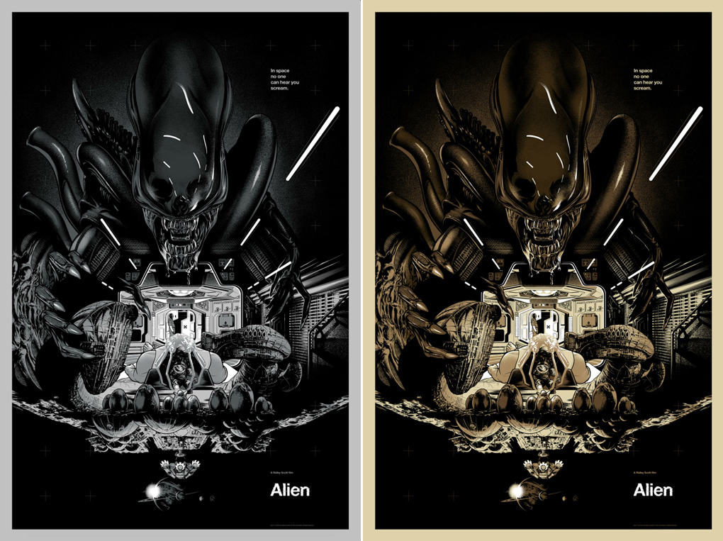
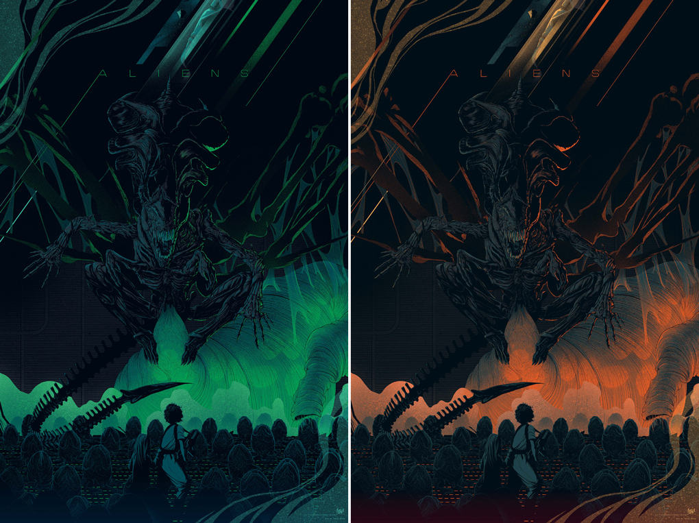
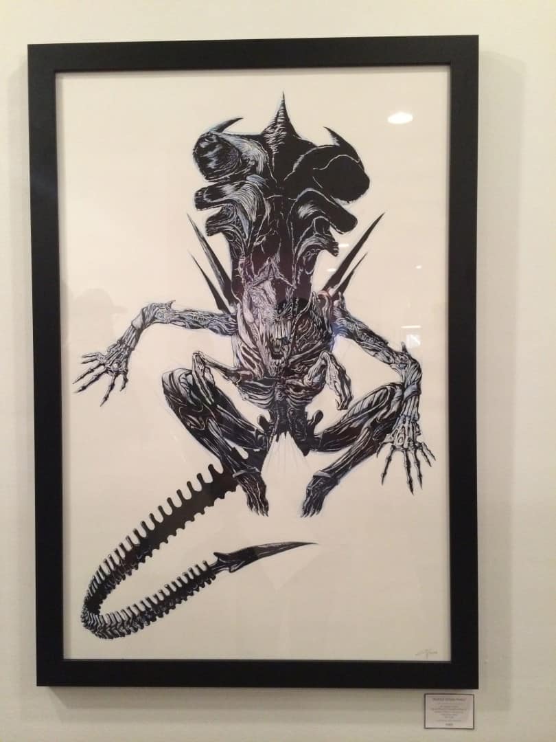
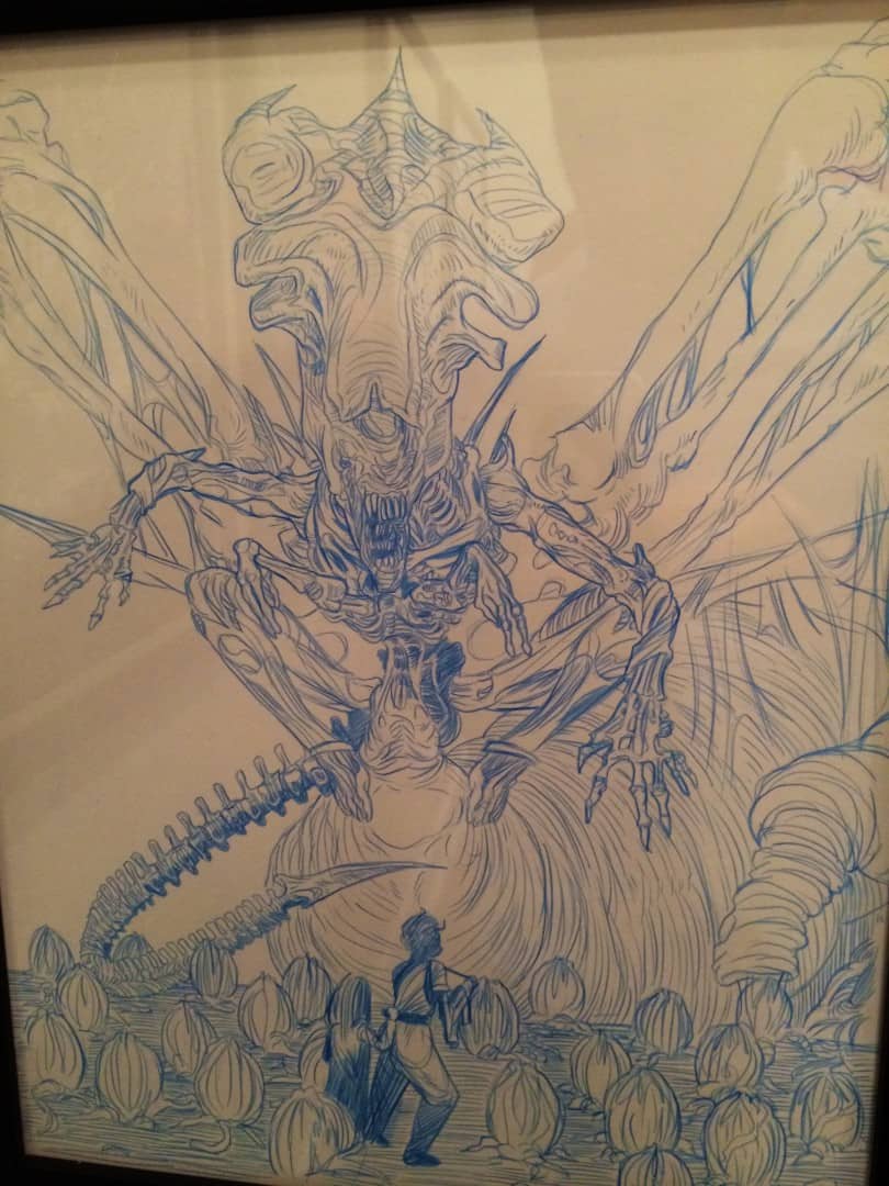
CJ: There was a strong showing of science fiction in your show with Martin Ansin, with a core set of prints in the ‘Alien’ franchise done by you both. Did you have any communication with Martin and Mondo about a theme or direction for the show?
KT: I didn’t have any prior communication with Martin before the show. In fact, I made it a point not to see anything he did until I walked into the show and saw them in person. Mondo suggested some titles, but ultimately it was my choice what films I did work for. I suspect from previous chats with Martin that we’re both heavily into science fiction so it makes sense there would be lots of sci-fi work in the show.
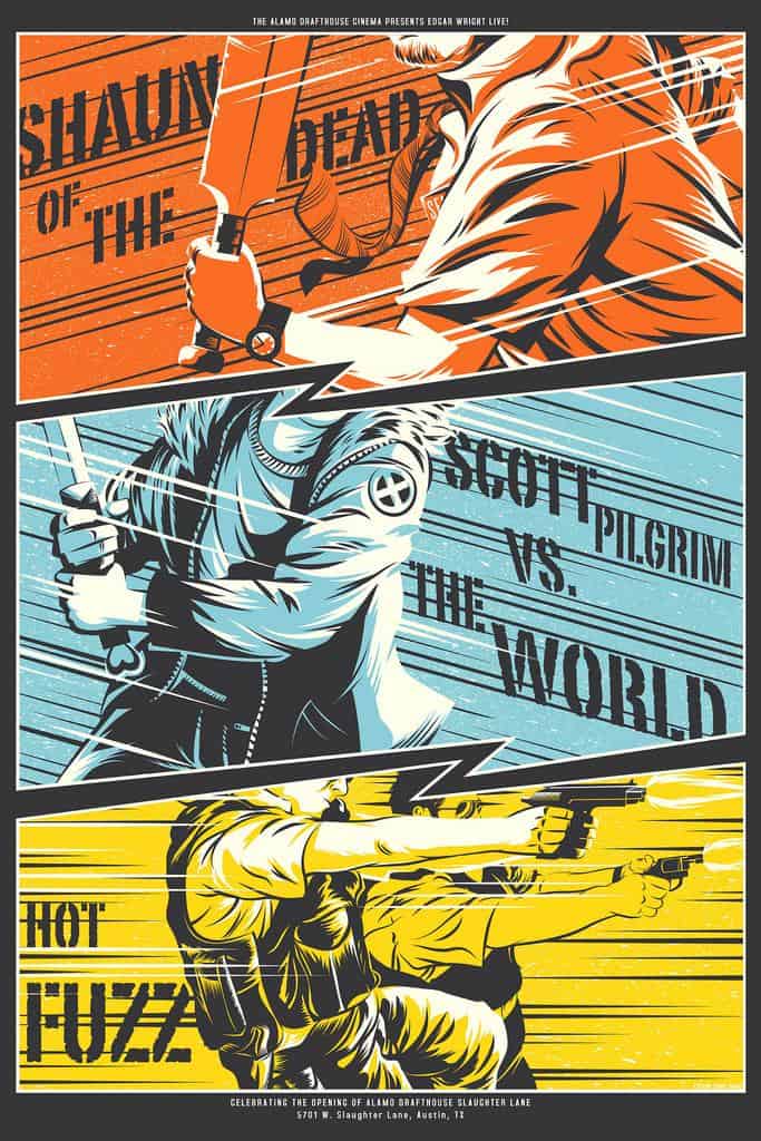
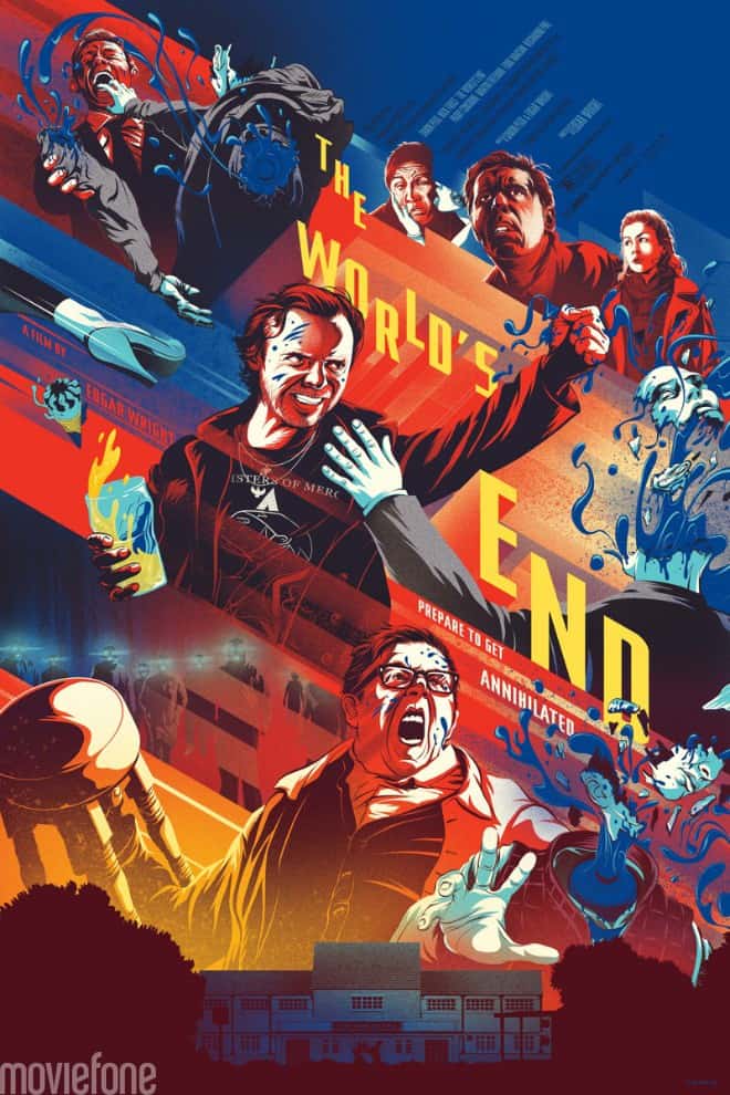
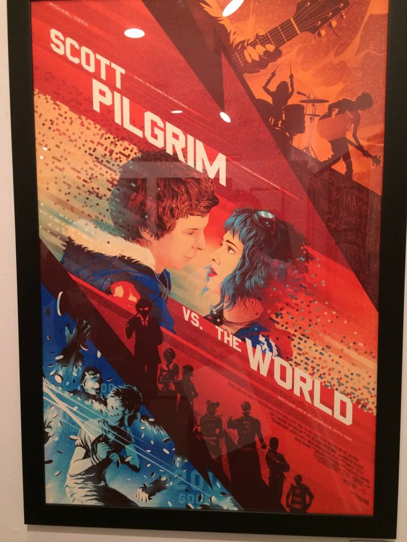
You had the opportunity to work with ‘Scott Pilgrim Vs. The World’ for your ‘Edgar Wright Triple Feature’ poster awhile back. It was only a third of the print, and for this show you took the film on again. This new poster fits alongside your other Wright poster, ‘The World’s End.’ From what I’ve heard Edgar Wright had requested you do a poster for ‘The World’s End,’ was ‘Scott Pilgrim’ the same? Are there plans for you to do prints for any other of Wright’s films, or (hopefully!) a ‘Spaced’ print?
Edgar Wright is very supportive of what both me and Mondo do. I did the Scott Pilgrim poster for the show because I’d had that idea in my brain for a while and the show seemed like a good time to make it happen. Currently, there are no plans to do any more of Wright’s films, but I would like to in the future if I get ideas. It’s better to spread those out anyway.
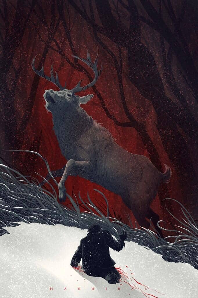
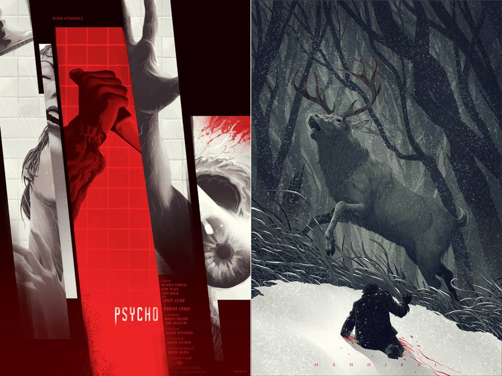
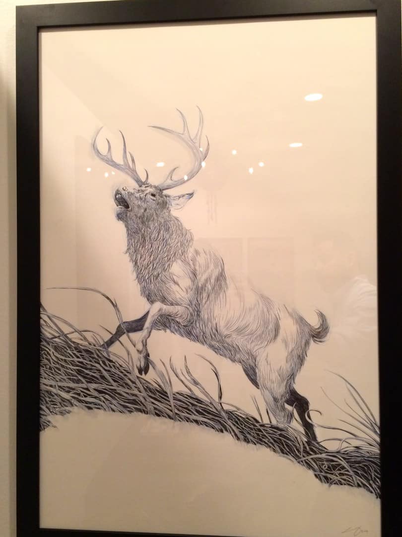
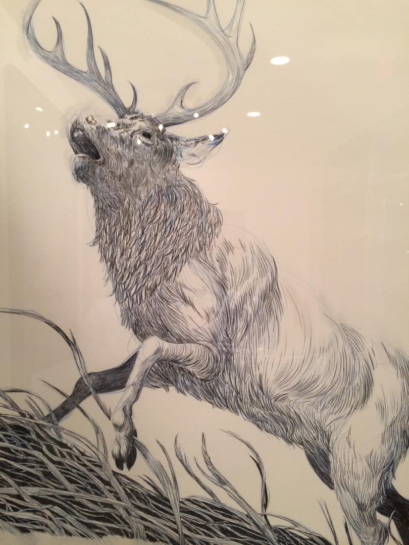
Your ‘Hannibal’ poster is one of your most beautifully subtle pieces – the regular version of the print came out in February of this year and it was awesome to see the variant get a chance in the spotlight in the show. How did it end up being a part of the exhibit?
It was always intended to be part of my show and when I finished it, the ‘Hannibal’ team loved it so much, they wanted to use it to promote the Season 2 premiere, so the regular and variant were spread out over two releases. Their support blows me away.
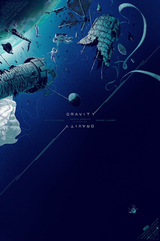
‘Gravity’ by Kevin Tong
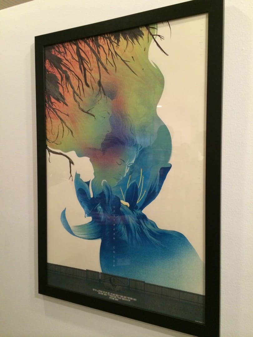
I’ve never seen the film ‘Upstream Color,’ but your poster made it go to the top of my movies to watch list. In some ways that’s what a film poster should do – inspire an audience to enter the unknown world a film offers. Your poster for ‘Gravity’ came out around the same time as the film, joining the social landscape as part of the film’s media push before they knew what the film was.
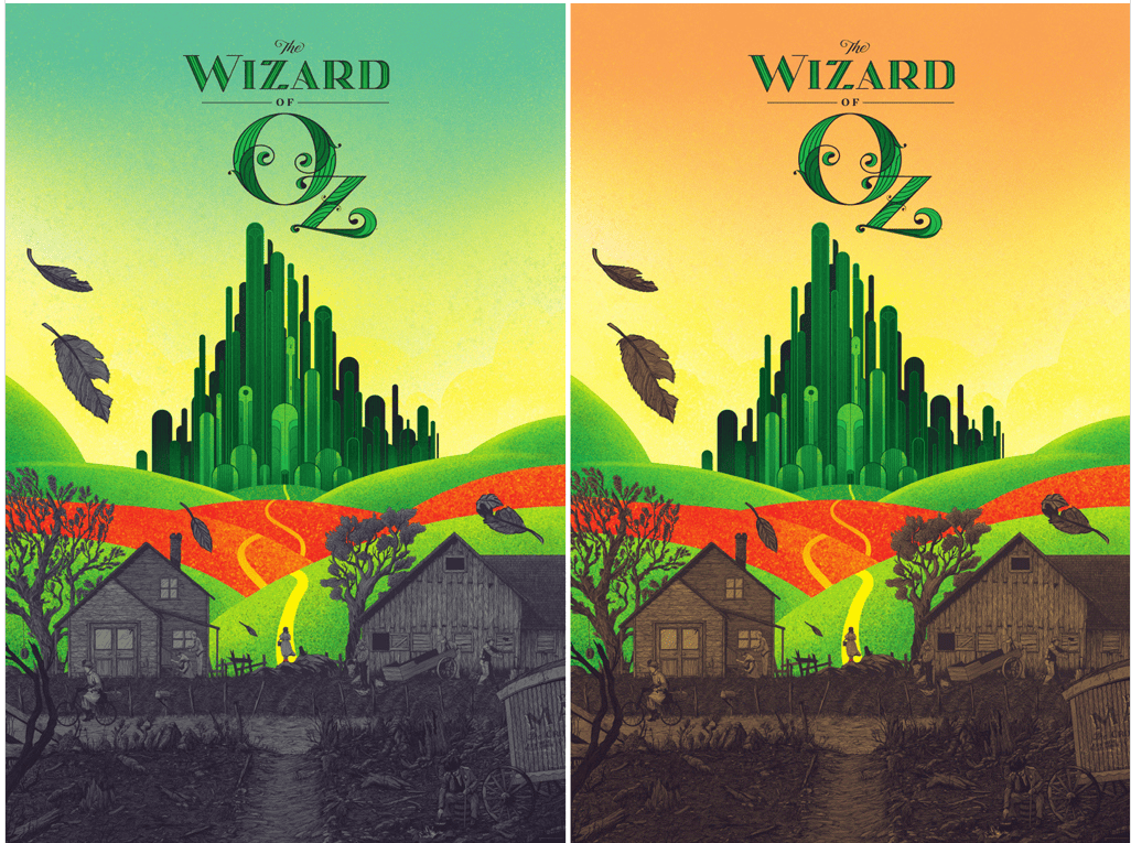
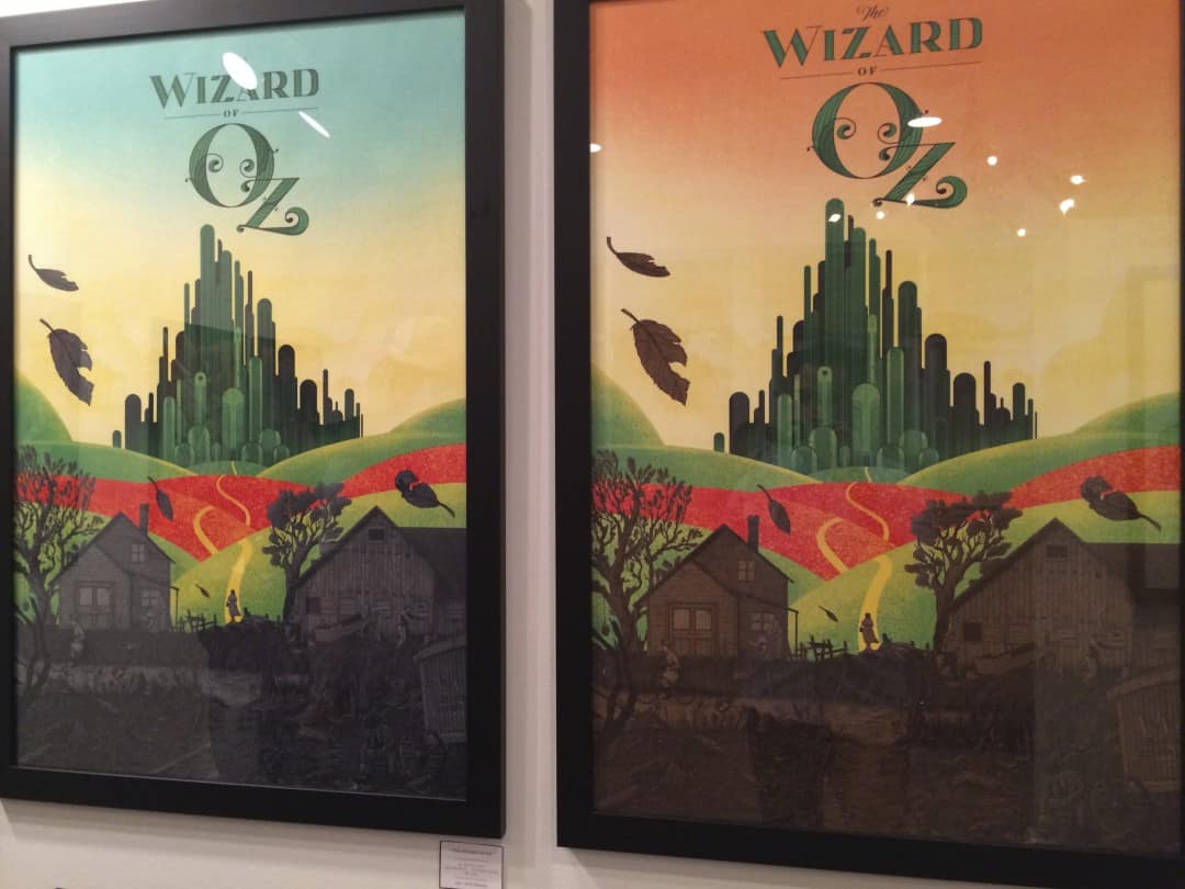
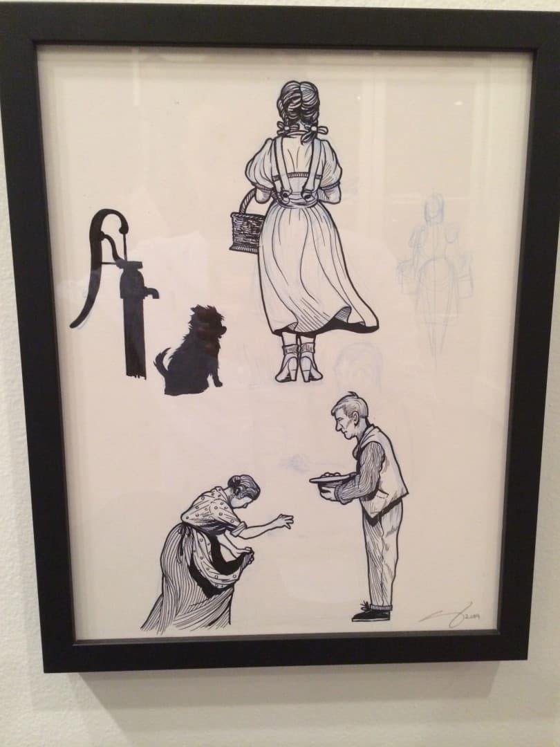
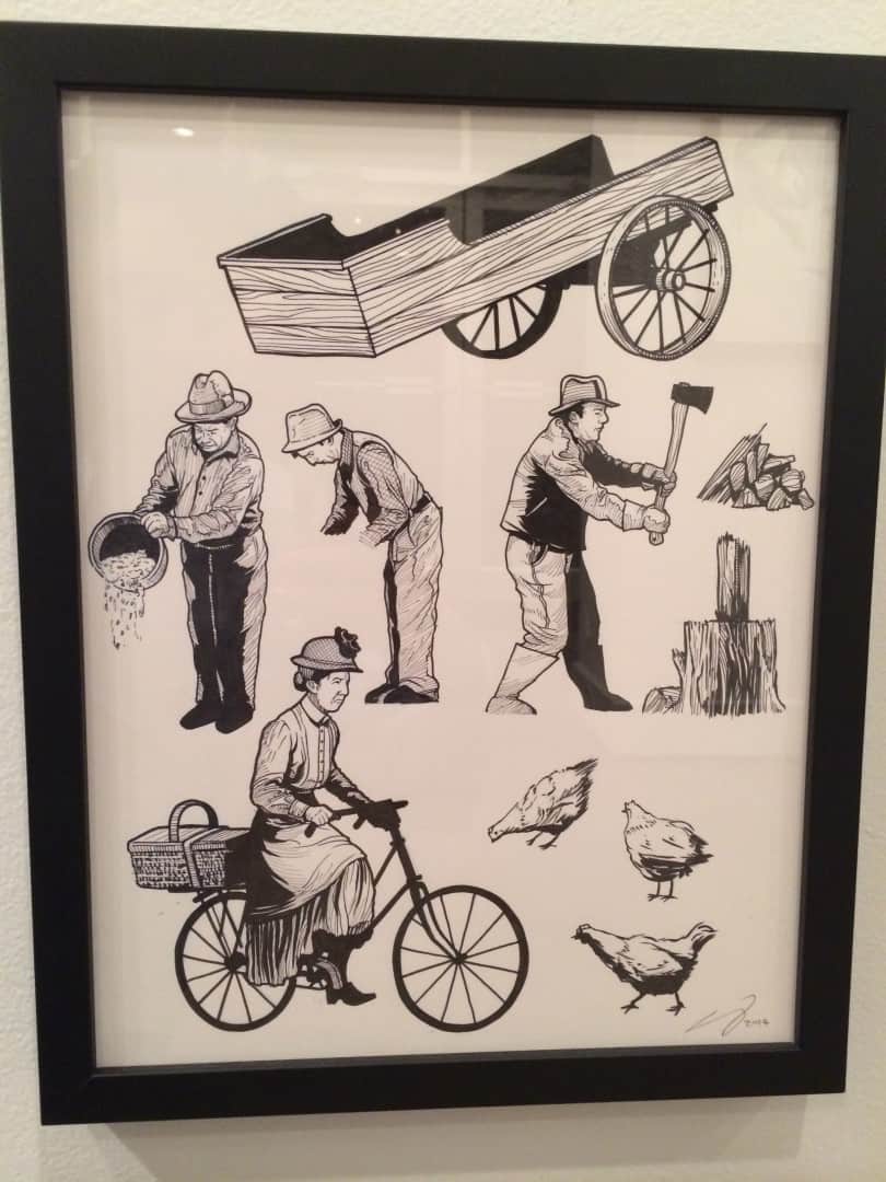
The opposite end is something like ‘The Wizard of Oz’ or ‘The Bride of Frankenstein,’ films that we as a culture already have an affinity and nostalgia for. Do you prefer taking on films that the audience might not be aware of? Is there more pressure in the design of ‘Upstream Color’ over ‘The Wizard of Oz’?
It’s always tough to do a poster for a film that is less popular because it takes as much (sometimes more work) and you never know how many people are familiar with it. When artists do posters for smaller films, it’s usually because there’s a personal connection to the film.
Even if the poster doesn’t sell or goes unnoticed, the artist is just happy to have done something for it. More established posters come with a different pressure in that more people will be scrutinizing it and there will be other previously done posters that will no doubt draw comparisons.
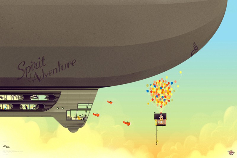
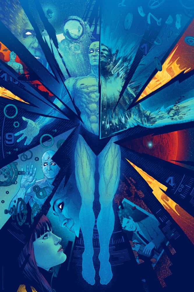
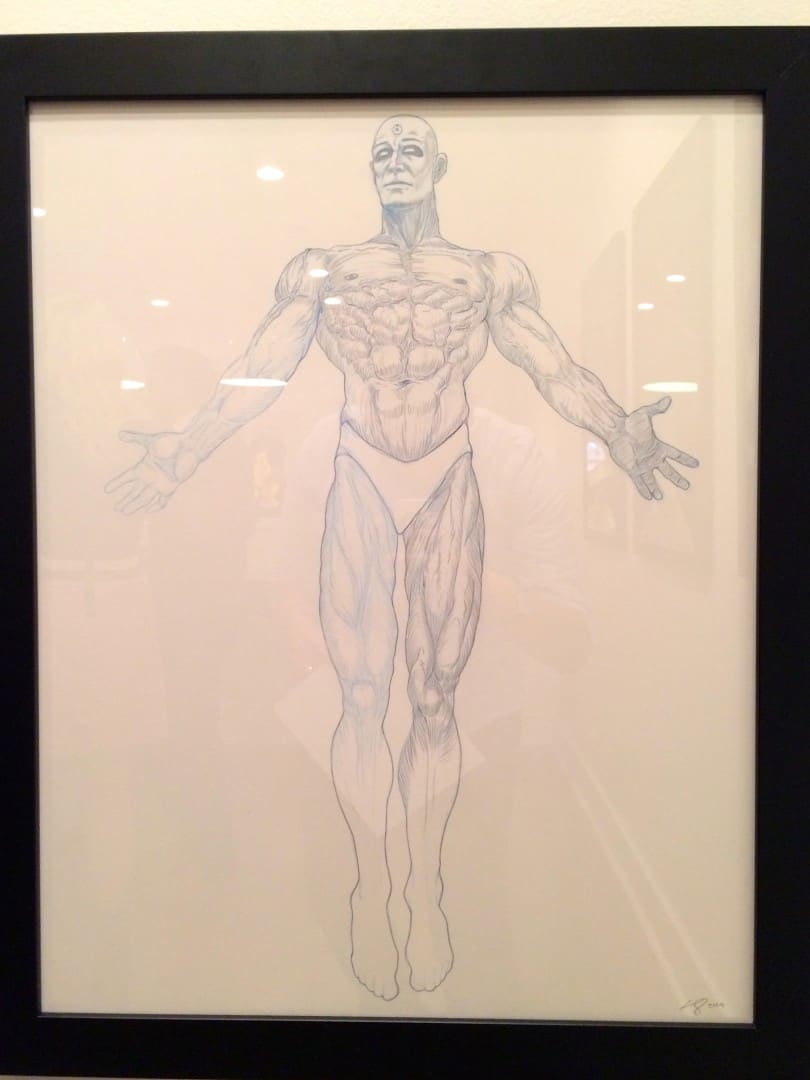
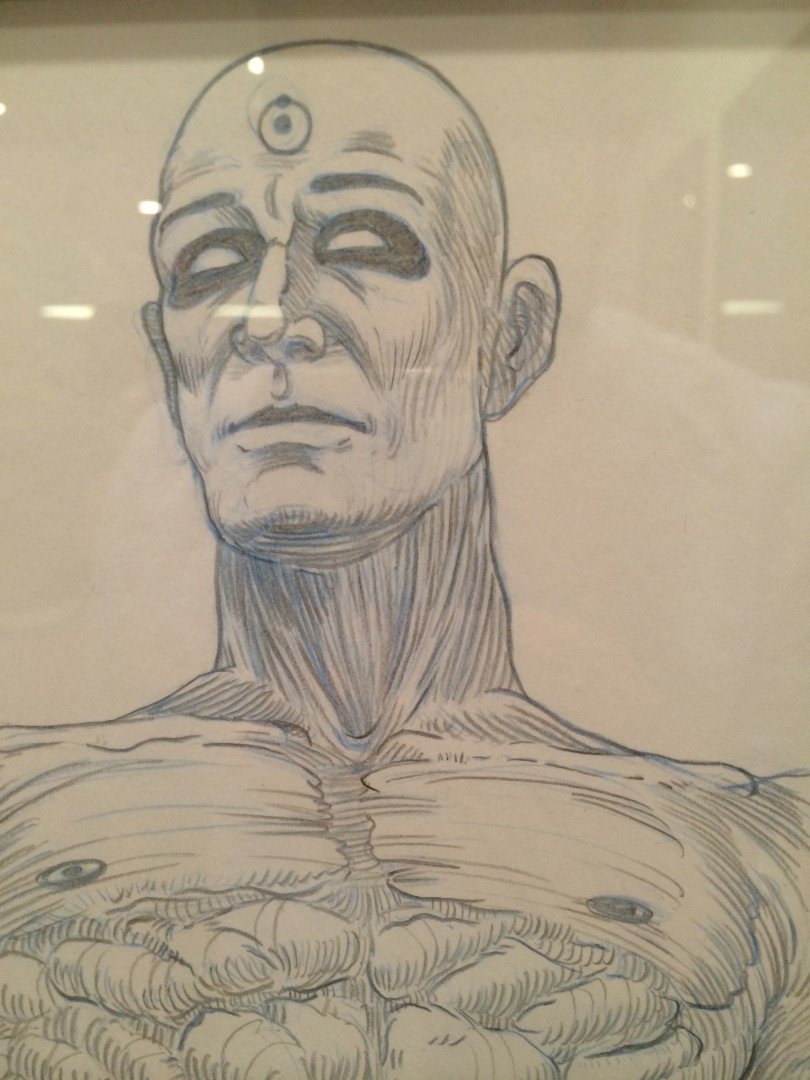
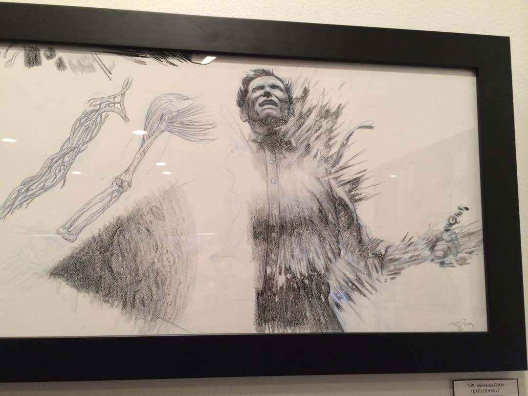
Your show with Martin was Mondo’s second for SXSW, the first was their collaboration with Oh My Disney which you did two prints for – one for ‘Wall-E’ and one for ‘Up.’ Both had an incredibly vast canvas with a distant, almost God-like perspective. You’ve distanced the audience and loosened up the camera to show us the true weight of the moment. Both ‘Up’ and ‘Wall-E’ are almost direct opposites of your most recent detail drenched posters like ‘Pacific Rim’, ‘Metropolis,’ ‘Dr. Manhattan,’ and ‘The World’s End.’ Are these Disney compositions a reaction to, or a moving away from what you’ve done in the past? How involved was Disney in your design process?
For years I have bounced around doing different styles. It’s just whatever suits the idea best. Other posters in which I have used a simpler style are ‘Breaking Bad,’ ‘Jurassic Park,’ and the Unfamiliar Objects series. My work for the Disney show went through with very little revisions thankfully.






One thought on “Interview: Illustrator Kevin Tong at Mondo SXSW”