The work of illustration and design duo Dan Black and Jes Seamans, better known as Landland, pulls images from the hopes and dreams of the open land — a restaurant on the side of a highway, an amusement park lost between cornfields and rural small town USA. A circus of dust.
Dan and Jes have an uncanny ability to breath life, warmth, and tenderness, into their scenes of everyday living. A mass of dilapidated storefronts and billboards is filled with the charm of those citizens who believed it would all work out for the best. Their figures and interiors have been lived in. The Landland version of antiqued plains is lined with rusted billboards that remind you, ‘something real happened here, once.’
When Landland paints a local landmark they come at it from a point of reverence, of knowledge. they know what it means to people because it means something to them as well. Their work translates because their work is alive. It’s human.

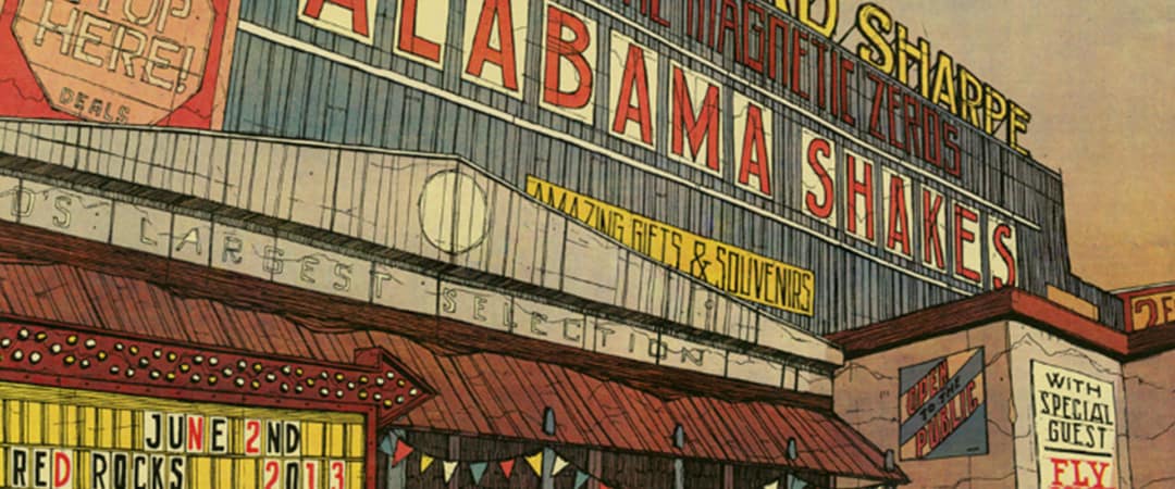
Edward Sharpe & Alabama Shakes gig poster by Landland
CJ: Your work exists in perfect balance between fine art and gig poster. One of my favorites is your Alabama Shakes & Edward Sharpe poster. If you didn’t know those two were bands, you’d just think it was the name of the store.
It’s a smart way of solving the issue of incorporating the practical elements within the piece, rather than having the text be simply stamped over the image. This seems to be an idea that you constantly explore – new ways to combine the necessary text and the ‘art.’
Your poster for the Eric Church date in Minneapolis, MN shows something like the back of a sign, where from your other work would make you expect the artist’s name to be – but no, it’s below hidden in the trees. It’s like you created a template, then challenged yourselves to not do it again. It seems like a lot of thought goes into incorporating these two elements. When you’re commissioned for a gig poster what do you approach first – the text or the visual? Is there a repeated process for dealing with that?
(Dan) I WISH we had a repeated process for this stuff, it seems like that would fix a lot of our problems right there. We definitely have a handful of tactics that we’re attracted to and that we trust will work for us, but overall it always feels like a brand new problem to solve every time, which can be good and bad, obviously.
I mean, Jes and I both work really differently when it comes to this stuff, so I’m not going to speak for her, but for me, whenever I’m asked to work on something, I start with thinking about really basic composition questions and—in really the absolute broadest sense—what I want the thing to look like. I’m thinking a bit about the band and what we can do to serve their needs and represent what they’re doing, while also working within the vocabulary of what we like doing (and why they hired us in the first place).
We generally ask bands if there’s anything they don’t want to see us do, every band has a list of things they’re sick of or steer clear of, and that gives us a pretty good idea of where we can / should go with it.
From there, I guess there are a few different paths to take (and at this point some of them probably have deeper tracks than others), but I’d say I generally fuss around with the visual element first while loosely keeping the text in mind knowing that that part will get long nights of its own soon enough.
Sometimes the text is more interesting when you’ve built the whole image and really have to find a way to pack it in somewhere…not necessarily treating it like an afterthought or just slapping it on there at the end after everything else is done (because that can really kill a poster), but allowing the existing composition to dictate how you treat the information.
With the Alabama Shakes & Edward Sharpe poster, it made sense to pack all of the information into the structure; that was the plan from the beginning. I’d actually wanted all of the necessary band names & show details just completely BURIED within a whole mess of inessential signage and sales sloganeering that would be tied into the idea of this building existing as something like a roadside fireworks store, those nasty tin warehouses on the sides of highways that just scream a bunch of threats at you if you pass by without checking out their cheapest prices on whatever they’ve got going on. Just COVERED in billboards about what a mistake you’re about to make not taking that exit.
As you can probably guess though, my crusade to pack in a bunch of totally irrelevant copy and bury the important messaging usually gets killed pretty quickly. That poster in particular always feels half-done to me without margin-to-margin signage all over every surface of it, but that could also be because I totally ran out of time and had to cut myself off.
We ended up actually driving them out to Colorado because there wasn’t even enough time to overnight them. I finished signing, numbering, and packing them up something like 15 hours before the show started and it was a 14-hour drive.
Parts of that were my fault, a big part of it wasn’t. Turns out I don’t need much of an excuse to take an impromptu drive out to the mountains.

Eric Church in Minneapolis gig poster by Landland
In that Eric Church poster, part of the design brief from the band mentioned including local landmarks…sort of like the poster equivalent of the band coming on stage being all ‘Hellooo Minneaaaaaaapoliiiiiis!!!’
Living there, it’s just a fact that that Grain Belt sign has been done completely to death…there are printmakers out there who have essentially built their careers on just redrawing that thing over and over again.
There is no shortage of Grain Belt sign prints and photos littering the apartment walls of the Twin Cities, but in a weird way (and this isn’t meant to sound like as much of a cop-out as it probably does) it kinda made sense to do something like that, because the rest of the brief (in our minds) called for these really tired and worn-out (tried and true?) themes—things like motorcycles and skulls and beer and fire, which are fine (why not?), but nobody’s acting like any of that is really innovative at this point—so I guess if we were obligated as Minneapolis printmakers to eventually make a print of The Famous Grain Belt Sign, this was probably our best chance.
Looking at it in that context, I guess the fact that we used the backside of it could unintentionally read like a middle finger to its local celebrity at worst (I hope not though), or at best, a glimpse into our weird hesitation to take the easy road but really, when it comes down to it, seeing that sign and all its complicated guts from the parking lot behind it beats the view from the river any day, and that’s an easy thing to forget.
With the text, it didn’t really make sense to pull any tricks burying it into the construction of the sign with this one. Had it been the facing side, sure, but I don’t think we could have pulled that off very well with this particular sign without it looking like the same kind of logo manipulation you’d see on like, a 90s pop-punk t-shirt.
It felt like a reverent thing to do, to leave the text separate. We even edited out some lazy graffiti that was scrawled all over that weird secondary sign hanging off the back. Cleaned the thing up a little bit for our out-of-town guests.

Calexico gig poster by Landland

Dave Matthews Band gig poster by Landland
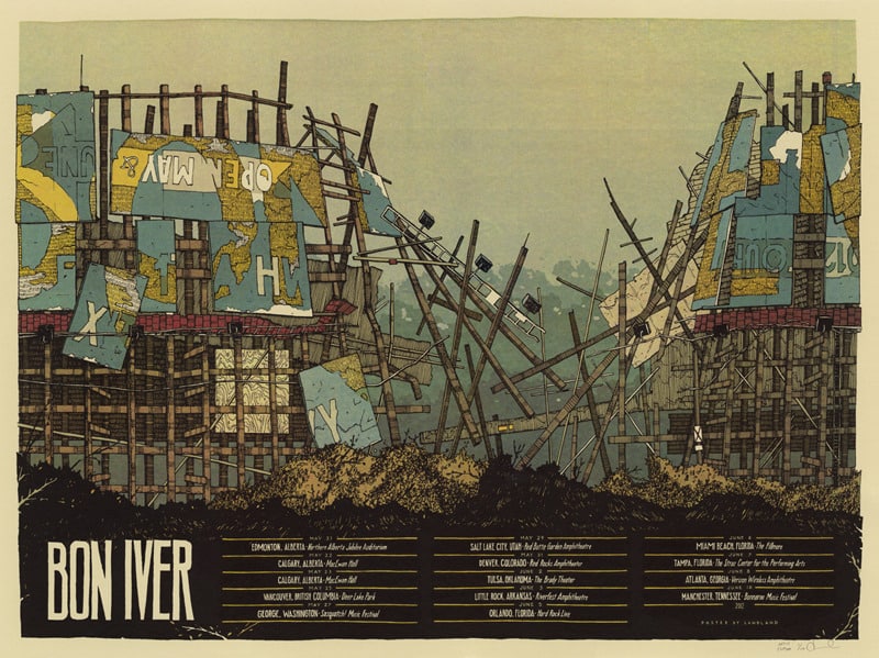
Bon Iver Summer Tour poster by Landland
There’s a strong sense of ‘place’ in your work. There’s a focus on architecture, weathered and abandoned. Your Calexico 2013 tour poster shows a rundown and empty fairgrounds. Dave Matthews Band in Mansfield gets an empty water park.
There’s no sadness in these images, they’re almost nostalgic. Loving. Longing. Even the Bon Iver Summer 2012 poster, with its crumbling structure, has a warmth to it. There aren’t a lot of figures in your work. Is there a conscious effort to focus on place?
(Dan) This is probably the easiest way to tell where Jes and I branch off, thematically. Most of her work is covered in figures and they’re all doing things, and I love it.
My work, on the other hand, I’m pretty sure I’ve really only ever used figures in the past to illustrate the scale of something, like in that very-old Mount Eerie poster.

Mount Eerie gig poster by Landland
I have a ton of reasons (excuses?) why I leave that stuff out. The main thing though, is that I’m not really concerned with people being in these spaces anymore. The idea is that they’re gone. They all took off and just left this ice cream shack or gas station or whatever to sit here and fall apart.
Honestly, I don’t even like being in these places when I’m out taking photos and sneaking through fences and digging around for the perfect vantage points.
I move through them as passively as I can—recording and not interacting, or keeping interaction to a severe minimum—to the point where it’s actually pretty easy to lose track of the fact that there’s anyone there at all.
I mean, don’t get me wrong; I’ll stop the car a hundred times on a road trip, and I plan my routes off the interstates any chance I get, but I don’t really feel all that comfortable rooting around through that stuff.
All it takes is a good, hard look at a waterlogged cardboard box full of rotten, unopened envelopes and piles of magazines scattered all over what’s left of some mattress, the whole mess torn up by animals (they’ve all left too), and the whole thing’s covered in smashed up floor tile, and you know you’re not supposed to be there. Nobody left that stuff for you, they just left it.

Chippewa Lake Park by Landland
And yeah, I don’t mean that in a sad way at all. I’m not actively focusing on whatever personal narratives I can dream up about what happened or any of that; these places are obviously rife with failure or tragedy or some sort of resignation on some level, otherwise, they’d be flourishing, right? I’d be inside, looking at fishing lures or buying Skittles instead of trying to see whether or not I can push these beams out of the way to get up on the roof.
There are definitely stories in there, but I’m not interested in guessing at or inventing some sort of dark angle or loneliness to any of it. if other people pass by and end up reading that into these things, that’s obviously really romantic and they’re not wrong to do that, but I’m looking at it more like a shell of whatever past it had.
The place itself is definitely more important to me; the weird structures stripped of intended contexts, gradually converted from whatever (probably) exciting thing it was to whatever it is now, and how it’s holding up (or not holding up) now that its utility is totally used up and it’s just a part of the landscape.
On the other hand though (I go back and forth about this a lot), you’re also left to decode some pretty weird / amazing decisions sometimes, and without anybody around anymore to answer for it.
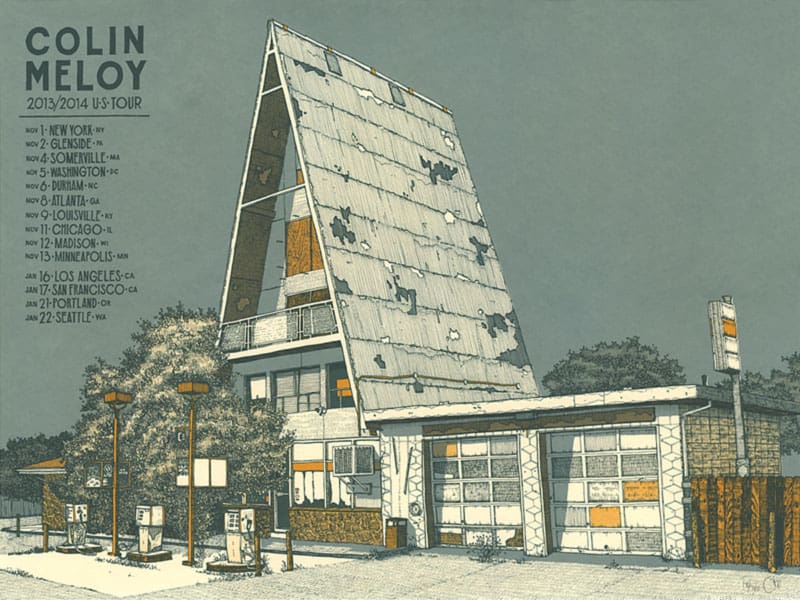
Colin Meloy gig poster by Landland
Storefront windows completely barricaded with chopped up construction signs, a pile of dismantled & faded barber poles blocking the also-barricaded entrance. These things are way more interesting to me than trying to shoehorn in some people doing things or having figures in there to give the viewer a relatable entry point into the scene.
I don’t want to worry (or make someone else worry) about who that person is or why they’re there, what they’re supposed to be doing and how they should be dressed.
At best, the people are sort of implied; I guess there’s a good chance that I’m building the people and the narrative in there and then taking them back out in a split second just by selecting these particular spots—obviously there’s some level of humanity to all of it. If forced, I could concede and give someone that to work with—but more likely, they’re just gone.

A test print from LandLand | photo by Jared S. Kelly
At your booth at the San Francisco Renegade Craft Fair you had a small stack of test prints – posters where you’d first print the screens to make sure they were correct. Some turned out looking incredibly interesting; overlapping textures and hidden images.
With the screenprinting process being so deliberate, do you leave room for spontaneity or happy accidents?
(Dan) I’m always really envious of friends of ours who are able to really rework things on the fly and print a bunch of layers of something and still go in and add things here and there, that feels really exciting and experimental to me (by definition, I guess that’s what they’re doing, really).

Dave Matthews Band gig poster by Landland
We’re almost never really working like that unless we really fuck something up or something we planned to do didn’t do what we wanted. It always feels like fixing or hiding something when it’s happening, and I know that’s not where these other people are coming from with it AT ALL.
With the CMYK stuff that we do, Jes’ watercolors, and everything that looks full-color, there’s really NO room at all for messing around or playing with it…the screens have to expose fairly perfectly and work tightly with each other, registration needs to be close to perfect, and the inks need to be balanced with each other, or the whole thing falls apart in a really unsalvageable way.
Our other work, there’s probably room for it, and I bet we’d probably benefit a lot from allowing ourselves more flexibility/spontaneity, but we’re usually up against such tight deadlines that we can’t really seek out those rabbit holes.
We’re working on approaching our workflow a little differently now that we’ve moved out to Chicago, always building on what we already know and hoping to be able to allow ourselves more time to really explore and push things, so we’ll see if that changes but at the moment, we’re usually just trying to nail the thing as we’ve planned it.
In regards to our test prints, we’re like a lot of printmakers in that we study those things and really try to soak up the accidental composition treasures that happen there, and the way things layer and obscure or reveal details we’d either meant to emphasize or bury.
We look at that stuff a lot, but it’s always in regards to future applications, not something as we’re working on it at the time. And even then, I don’t know if it’s ever totally apparent in our work at the end of the day.
The test prints feel really authorless to me—seeing drawings we’ve made as they’re smashed into other ones and working in these improvised ways is usually pretty refreshing—and they’re always way crazier and feel a lot riskier than anything we end up planning out, though I guess a lot of that could be that we never really afford ourselves the luxury of making a 20-color screenprint.
Some of what makes those test prints great can be the over-the-top density and then how the next layer can just cancel most of it out and open up weird passages where the eye gets a chance to rest.

‘Jungle Book’ by Landland
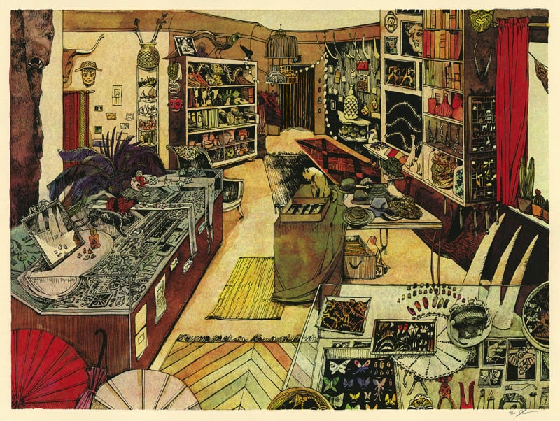
‘All Sorts’ by Landland
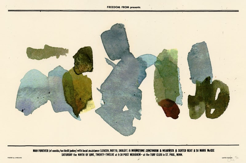
‘Man Forever’ by Landland
Your posters are wonderfully textured and full of depth. The ‘Jungle Book’ poster reads like a puzzle, and in the art print ‘All Sorts’ you can feel the years and history in that room. It’s interesting to see those next to poster for the Man Forever show, where the design is decidedly minimal. How do you decide the direction a piece is going to go?
(Dan) It depends on all sorts of things, and Jes can probably answer specifically about those two prints better than I could, but in general, the first fork in the road that we have to address is obviously which one of us is going to work on something. Or maybe it’s both of us working together; the fork has three tines.
Sometimes that comes from a specific direction from the client, whether they’re asking directly for one of us, or maybe they’ve just pointed to a bunch of Jes’ stuff on our website or something like that. That right there will usually determine a lot of what the direction is going to be.
Regarding execution, sometimes it just comes down to “How much time can we invest in this, either reasonably or physically?” With the Man Forever poster, I had zero budget (hooray!) and no time at all to put it together (even more hooray!)
It was really the kind of thing I would’ve turned down if it was just some dude coming up asking for it, but the guy putting the show on is a buddy and he was in the midst of relaunching his weirdo noise label and this show was kind of part of that, which I was totally in support of. So I did the best I could with what I had.
It ended up being a quick poster design in between other (paying) projects, and in the name of maximum efficiency, I committed to using only existing materials that I already had around and forced myself to not draw any of the text (not that Letraset is really any less laborious sometimes), and whatever I could get done in an evening was what the poster would be.
It also made sense in making a Man Forever poster to set up some rules to work within, while at the same time giving up a bit of control in exchange for an element of chance and the limitations of my immediate resources. A big part of their touring live show relied on teaming up with local musicians and having them work within defined parameters for how to carry out the compositions.
It was rigid and orchestrated, but loaded with variables and weird risk. The poster ended up being really overlooked amongst everything else we were working on at the time, and it probably seems like a strange blip next to some of the more illustration-heavy work, but I’m really proud of that thing. It simultaneously feels both more formal and way looser than anything I’d ever make if given time to fret about it and sink a million hours into drawing.
It’s nice to work with such tight deadlines sometimes, in that you really have to put yourself to work figuring out how to solve the problem in the short amount of time you’ve got without sacrificing or phoning it in.
The flipside of that, of course, is a situation where we’re working on a poster where everything lines up perfectly —
A) the edition size is huge (which usually takes care of the budget, and that’s usually the case for tour posters, which are used over the course of a bunch of dates instead of just one night.
B) the band has a “built-in” poster fanbase so we’re not nervous about sitting on a stack of these things after the band sells their copies (which can otherwise be a crapshoot even if the illustration/design is solid)
C) the deadline is far enough out (because the band or their management were pro enough to get their ducks in a row ahead of time).
When all of that happens—or when a couple of those things happen—we can just sink tons of time into pushing the illustration & design as hard as we can, knowing that we’re (probably) not working for minimum wage or killing ourselves for nothing. We usually work on everything we have as much as we can…the trick is figuring out what we can rationally manage.
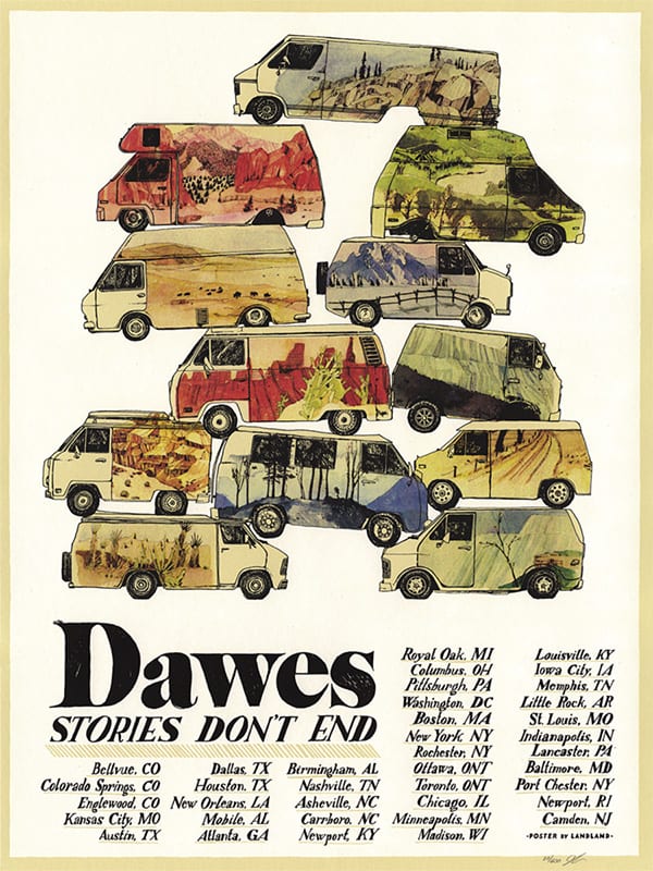
Dawes tour poster by Landland
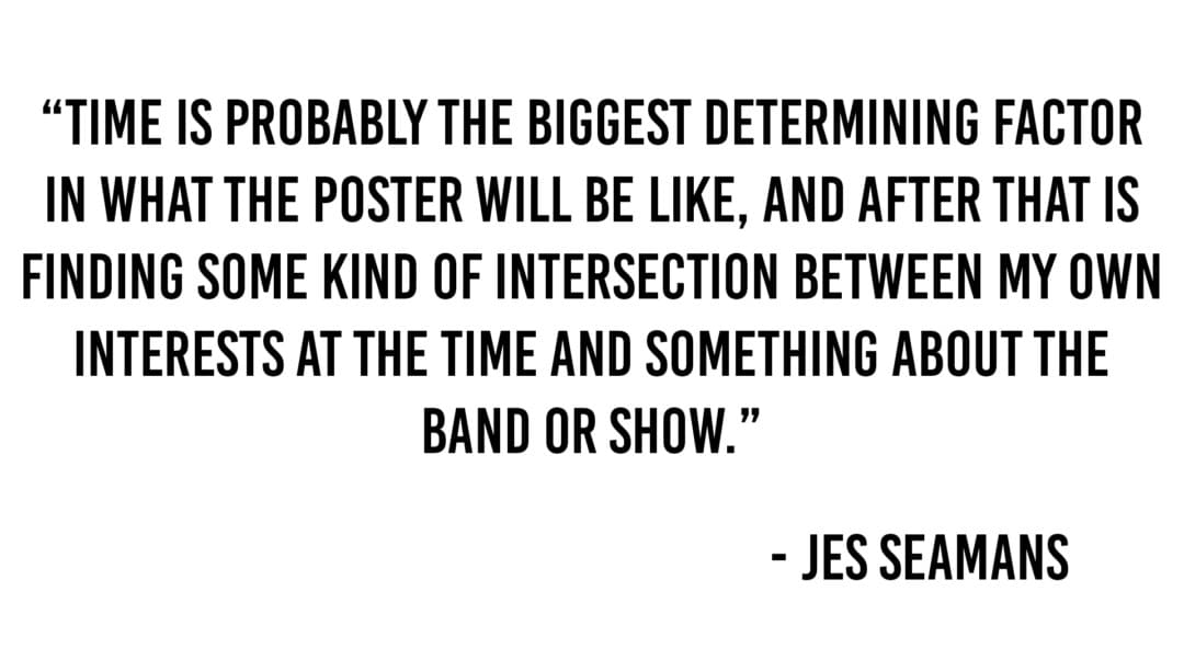
(Jes) In the end, I’m always prouder of the minimal posters. I’m sure part of that is some kind of inverse correlation between hours spent working on the thing and how much I can enjoy and appreciate the final image, but I also think that it feels like more of an accomplishment for myself to really pull off something that doesn’t rely on painstaking detail for visual intrigue.
That said, I do really enjoy drawing and if I have the time I’m going to use it, usually plus a day or two. But yeah, the short answer is that TIME is probably the biggest determining factor in what the poster will be like, and after that is finding some kind of intersection between my own interests at the time and something about the band or show.
Jes & Dan in action.
Taking Landland on the road.
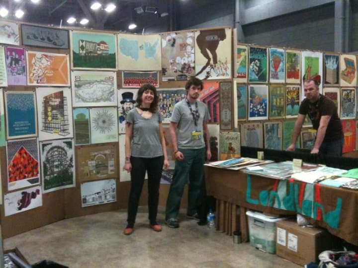
What part do events like the Renegade Craft Fair play in the work-life of Landland? I had seen a few of your posters online before, so as a fan it was awesome to see them in person and actually chat with you guys.
For me, seeing your work and the art of others is totally inspiring. Exciting. You guys had to travel a long distance to show your work there, so your perspective is totally different than mine. Do events like this act as inspiration to you? Is it mostly a financial decision?
(Dan) We’re still figuring out where things like Renegade fit into our Landland life. I go back and forth about whether or not posters make sense there.
We spend a LOT of time explaining ourselves and our work and our relationships to the bands (one common question so far has been “Aren’t you worried that the bands will find out about this and sue you?” which is always followed by a “No, we’re not worried about that.” All of the posters we make are officially commissioned by the bands or their management. We couldn’t sleep at night otherwise), or apologizing that there are band names on so much of it.
I guess that means we should be making more art prints (self-initiated prints without affiliation to bands or any of that), but there are really only so many hours in a day. I know, because I’m awake for most of them.
In 2013, I made a mission to get to as many of the Renegade Craft Fairs as I could, just to have an idea of which ones we make sense at, and which ones drove us out with torches and pitchforks.
We did six of them, in Chicago, Austin (twice), Los Angeles, and San Francisco (twice), and overall, it was really great. It’s a lot of fun getting to do things like that.
Believe it or not, driving out to Texas or California or wherever to do that stuff is as close to a major vacation as I’ve really had in a few years. A lot of times, we’ll actually try to build some amount of leisure time into it, whether that’s an extended leg of the trip in cities we’ve got friends in, or just a longer route back to check out weird places and dodge our emails for a little longer.
It’s still a lot of work, but I think the chance to get out and actually represent everything we’ve been working on in our studio (in relative seclusion) is really refreshing and inspiring in a lot of ways. It’s nice to have a situation where we can have a ton of really direct feedback, whether that’s people actually telling us what they like or don’t like, or just seeing what people pick up and how they move through everything we have hanging up.
90% of our time is spent in a bit of a vacuum as far as that’s concerned, partially by design, but also just because we spend so much time working on whatever’s in front of us that it’s tough to step back and weigh the whole thing as a body of work.

Prohibition Repeal Day poster by Landland
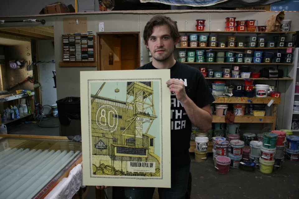
Dan Black with the Landland Prohibition Repeal Day poster.
There’s another circuit of these things called Flatstocks which are a lot more poster-centric and attached to larger music festivals (like SXSW in Austin), and those are always more lucrative for us than the Renegades have been—I feel that it’s because the people coming through know what they’re looking at and are (usually) already immersed in this tiny niche thing to some degree—but that’s not to say that we don’t do pretty well at the craft fairs too.
We’ve always done well enough that they’re worth taking the time out to get ready for and travel to and everything. Also, at this point, we’re meeting a ton of people out there, but now that we’ve been back to a few of these places a couple of times, there are people coming up to us who are already initiated to what we’re doing, and searching around or asking for new stuff.
I’m really bad at ever knowing whether or not anyone’s actually keeping track of us, but at those things, it seems like there are at least a few people who are, which feels pretty good.

Baroness Summer 2013 Tour poster by Landland

Detail of Baroness Summer 2013 Tour poster by Landland
(Jes) This can be a really lonely and isolating and insecure-feeling job at times, and it’s really wonderful and somewhat rare for us to get to interact with people as part of work.
It’s really encouraging to get not just good feedback, but to know that anyone even cares or is curious or interested enough to ask questions and engage. It’s flattering, and flattery is important when your whole job hinges on whether or not people like looking at the things you make.
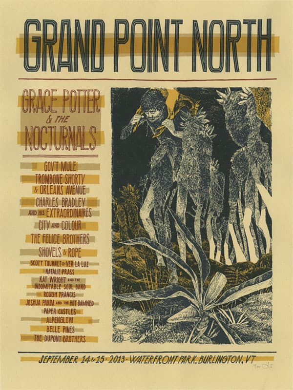
Grand Point North and Grace Potter & The Nocturnals poster by Landland
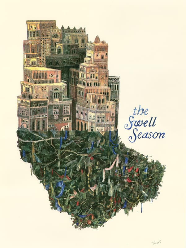
The Swell Season poster by Landland
Landland does both design and printing, which isn’t exactly an anomaly but still rare for those in the poster world. Do you do printing jobs for work that you didn’t design? Have you designed for projects that you weren’t going to be printing?
(Dan) The short answer to the first question is “no.”The slightly longer answer, is that we have a shortlist of friends who we’ll always help out when they need it, and beyond that, if things are slow for us (which isn’t often) and we can get something turned around for somebody without it stressing us out too much, we’re always happy to make that happen and I feel like we’re pretty good at that.
But having a print shop, for us, has always had more to do with allowing us to control the production of things we’re designing, and pushing our illustration & design situation further.
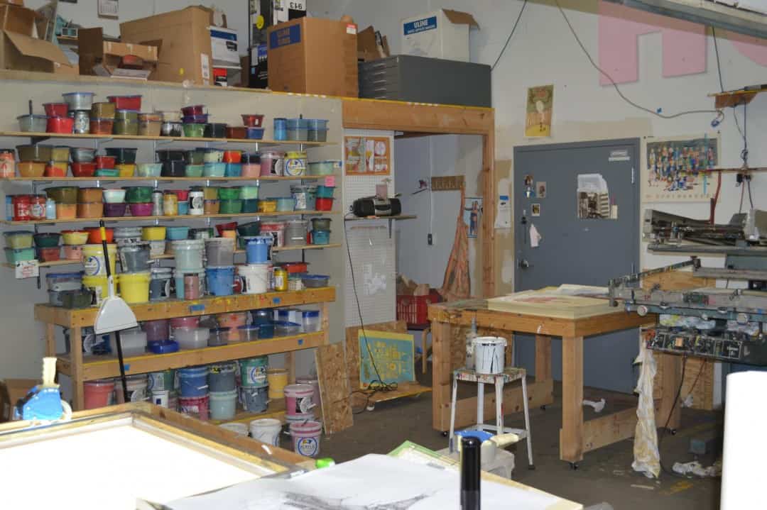
A Landland workspace.
There’s really incredible and addicting liberty in just being able to make something without having to bother anybody else about it. That probably sounds really selfish; I don’t mean it like that. It’s just that being a full-service print shop for other people hasn’t ever really been something we’re interested in. When people ask us about it, I always have a list of great printers that we can refer them to and do what I can to make sure they’re not left out in the cold.
As far as designing for projects that we’re not printing, it depends. If it’s something that will ultimately end up screenprinted, we’ll ALWAYS prefer to handle that part ourselves for all sorts of reasons. I can’t imagine a situation where we wouldn’t be adamant about that, unless it was something that we just weren’t capable of doing, like 24″x36″ prints or something like that.
Any large-run album packaging or offset printing, letterpress, or t-shirts, anything like that, all of that is sent out and we eventually just get a box of them in the mail sometime later, which is really exciting and a bit disorienting when you’re used to handling everything yourself from start to finish.
I love it when it works out, but there’s always a little bit of anxiety between sending the files off to the printer and getting your samples back, especially because the proofing process for those kinds of projects is oftentimes really casual and not terribly telling of what’s actually going on over there.

Process of the STNNNG Benefit For A Totaled Van gig poster
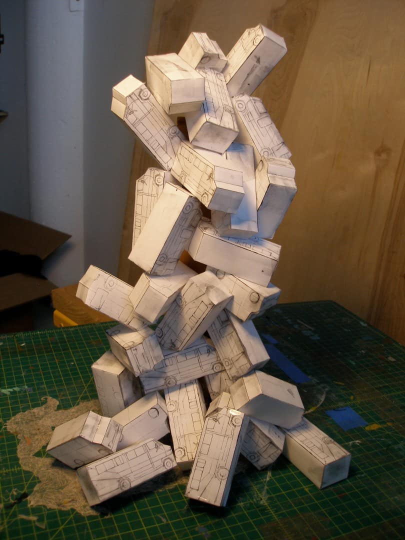
Process of the STNNNG Benefit For A Totaled Van gig poster
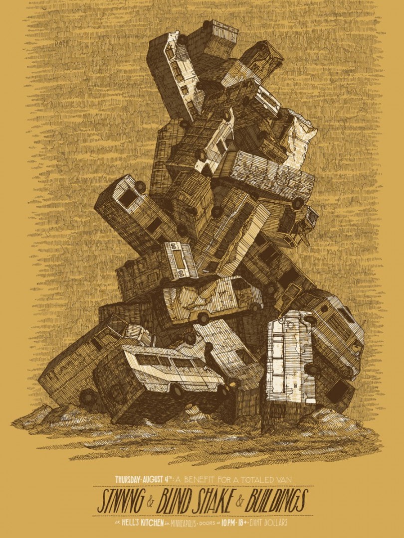
STNNNG Benefit For A Totaled Van gig poster by Landland
When did you realize you could make your creative hobby a career? Was it a slow process?
(Dan) I’m still never totally sure I can. I love being able to do this stuff 100% of the time and feel constantly grateful that anyone’s interested in it at all, but a big part of me feels like signing on to this sort of lifestyle comes with an admission price of living with a bit of uncertainty.
It’s like I traded everything I hated about having a miserable and unfulfilling day job for everything I hate about not having a steady paycheck, though that’s a trade-off I’ll take any day.
I’d rather worry about something ridiculous like money than whether or not I’m wasting my ever-dwindling youth or if I’m going to regret years of my life sometime down the road. It’s been working out really well for Jes and I for the last couple of years, but of course, there’s always concerns about the longevity of various factors, whether it’s external (“How long will people keep hiring us or buying things we make? How dependent are we on that?” “Eventually there will be no more wall space on Earth for another poster.” et cetera) or internal (“How long can I maintain working 12–15 hour days?” “What if I have to do something else at some point and have only this very specific skill set?” “Is my body falling apart any faster than it normally should?”).
Jes and I always joke about our backup plans; years of printing everything by hand leads to really strong fingers and hand muscles, so I bet we’d be GREAT deep-tissue massage therapists. We could even keep the name since it’s so weird and nebulous anyway. Actually, I’d probably just end up in a cave somewhere, naked and surrounded by the bones of stolen livestock.
That doesn’t really answer anything for you, I guess.
This whole thing has been really gradual for us, and we’re totally into that. I couldn’t even tell you the exact moment we actually started making a living solely from Landland income. We’re both really cautious people, and wary of diving into anything we can’t handle, so this has been a progression of tiny baby steps.
When we started really taking this seriously, I was working as a freelance designer for a really great advertising agency in Minneapolis while trying to work on Landland projects on the side, and eventually, the balance shifted and lopsided to the point where I was doing more and more Landland stuff and hardly ever at the agency. Once I was doing Landland work full-time, it was a lot easier to take on more work, and at some point down the line, Jes was able to quit her other job as well and launch into just doing this.
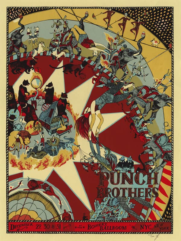
Punch Brothers gig poster by Landland
Our set-up at first was REALLY modest and cramped (though insanely glamorous compared to our years of pre-Landland apartment/basement printing situations) and our overhead was next to nothing; we spent the first couple years printing by hand in a really small warehouse space and just buying our supplies project-to-project by taking 50% deposits upfront from clients when we were hired for something.
A few years in, we bought a really cheap Cameo semi-automatic press and paid for it with the first job we printed on it. From there, we were WAY more confident about printing larger runs without destroying our bodies and taking forever to finish an edition, and our output kinda blew up in a really huge way.
We’ve managed to pay for any upgrades to our studio as we need them, piece-by-piece with income from larger projects as they come in, which is really important to us—we’ve never relied on loans or credit cards or any of that, which feels really good even if that means we have to run a pretty lean ship from time to time.
At this point, we both live relatively comfortably and for every worry that we ever have about money, there’s usually an equal-sized or larger satisfaction that we’re lucky enough to be making this completely made-up thing work relatively well (for now).
(Jes) Dan gets all the credit; he took the big first steps and the big leaps of faith. I’m just along for the ride. I’m just a workhorse!
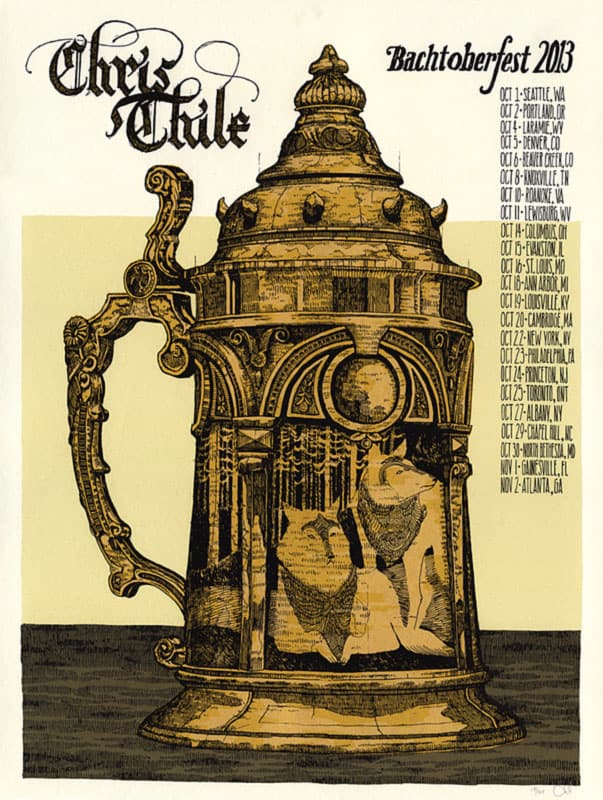
Chris Thile – Bachtoberfest gig poster by Landland
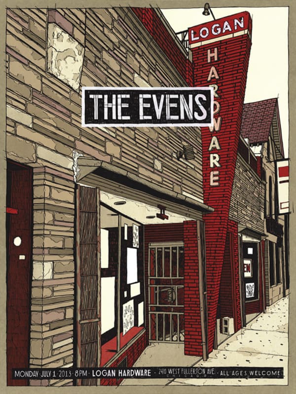
The Evens gig poster by Landland
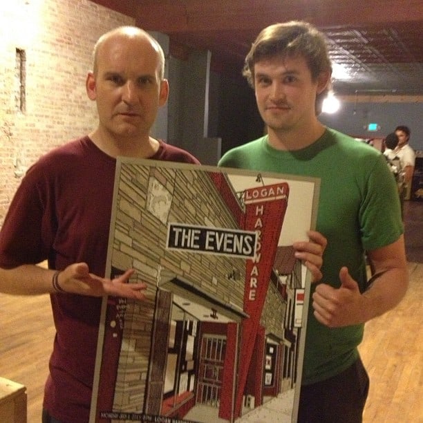
Ian MacKaye with Dan Black and The Evens gig poster by Landland
There’s a familial feeling to the work of Landland. The work itself is full of warmth and coziness — something to slip into and feel at home, but also the culture that surrounds the art has a family tone to it.
You work with a lot of the same bands and artists. There’s a team quality to it all that’s so great. With such a closeness and intertwining of hands and ideas at work, are there discussions of what Landland is and what it is isn’t? How do the two of you stay on the same page about the focus of the Landland brand?
(Dan) We don’t really worry about “brand management” a whole lot. It might be more of an issue if we had other people signing on to handle the art part of things, but with it just being the two of us—and with us being as close as we are—there’s a lot of trust that we’re steering the ship together in a way that makes sense for us.
We want it to change and evolve as our interests and skills change, and we’re constantly re-evaluating what we’re comfortable with, and what we want out of this. For as much work as we each put into this thing, we’re both pretty invested in making sure that it’s EXACTLY what we want to be doing, and that we’re not making bad decisions about where things are going with it.
(Jes) A huge reason this thing can even exist is because Dan and I are so close and have known each other for so long. We met when I was 18 and just out of high school, and he’s been one of my very best friends ever since, and I’m sure a huge part of my personality and sense of humor and aesthetic preferences have been shaped by or alongside his own.
We have a lot of unison brain or whatever you want to call it — a lot of times we know exactly what the other is thinking or where they’re coming from without having to speak it. We’ve also gotten pretty great at communicating with each other verbally (I have to say: we’ve fucking earned it) so that really helps with everything.
(Plus, I’m Taurus with a Sagittarius moon while he’s Sag with a Taurus moon, so we’ve both got a good balance of pragmatism and idealism, industry and enthusiasm, which pretty much explains the Landland work ethic and approach. Ha!)
Landland at work.
I think that in a lot of ways, whatever warmth or personality or accessibility showing up in our work and brand is a direct projection of our collective and respective personality/ies, and because we’re always checking in with ourselves and each other, consciously and not, to make sure we’re being “true” to ourselves, Landland kind of naturally winds up with a consistent feel.
For better or worse, we’re pretty reluctant to do anything that doesn’t feel in some way representative of our own psyches, and, for me, representing the band is often secondary.
If I don’t feel invested in the image, I’m bored and miserable making it, and it usually winds up pretty sub-par. Dan says you can always tell when I wasn’t into a poster, although, again, that may be him just knowing me super well.
Another good thing about knowing each other so well is that it keeps us honest; if one day Dan started drawing sexy ladies on bikes with boobs falling all over the place, or whatever, he knows damn well I’d call his ass out.
(Dan) As far as working with bands and these management teams, we really value those relationships, and it’s great to hear back from people we respect and have great experiences working with. We don’t worry a whole lot about bands pushing us into territory that doesn’t “feel like Landland” to us or anything like that.
We’re pretty in touch with our comfort levels with this sort of thing, and we’re not really afraid to tell a band or anyone when we feel like they might’ve hired the wrong kind of people for what they want to do.
For the most part, I believe that the bands we’re working with are hiring us because of what we’re already doing, more than any interest in trying to siphon something non-Landlandish out of us. At this point, our website is covered in examples of the kinds of projects we prefer working on, and there’s hopefully a lot of trust that’s established there as far as what we’re capable of.
I could be wrong about that, but it seems like the bands that want a whole other aesthetic are obviously hiring other people to make that stuff for them. And that’s cool too.
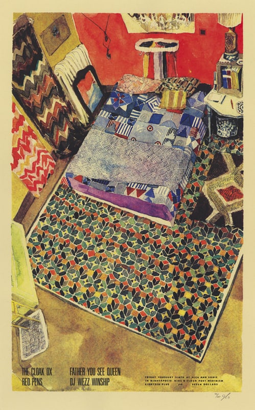
The Cloak Ox gig poster by Landland
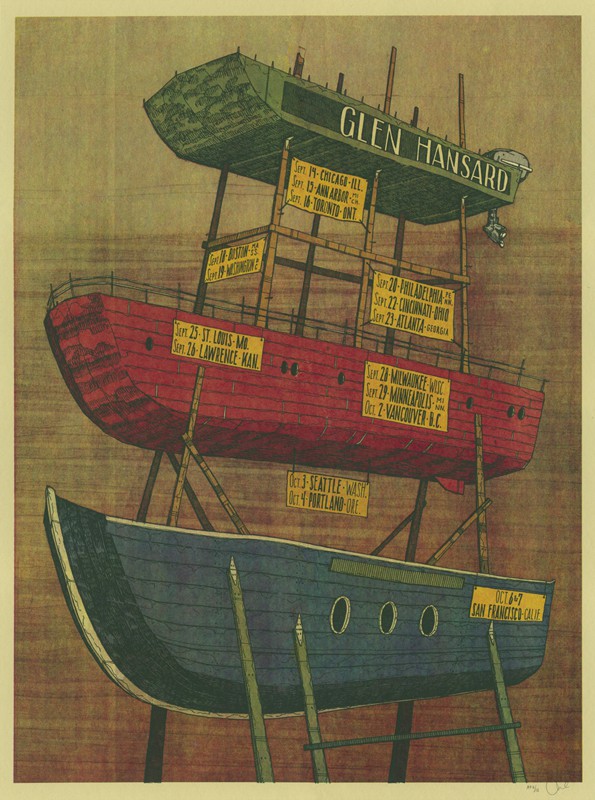
Glen Hansard gig poster by Landland
With you both being based in the Midwest, Chicago and Milwaukee, is it difficult staying busy with work? This might show how much of a bonehead I am, but has their been discussions of relocating to someplace like Los Angeles or New York? Does physical location even matter these days when it comes to running a design and printing business?
(Dan) That’s not a problem we’ve really had so far. I think that the internet and the ease with which people can see what we’re up to and reach out to us has really leveled the geographic advantages to living in those major cities. At this point, I think we’re shipping enough of our posters to bands all over the place that our location doesn’t really seem to be a huge factor.
Of course, I don’t want to sound naïve either, and I guess I can’t say for sure what opportunities we’re missing out on by not being out there, but going back to our slow-growing process thing, I hear “relocating to Los Angeles or New York,” and just think of an unnecessary jump in overhead. Minneapolis was an incredible place to start out because it’s really easy to live there (no winter talk) and everything there is really affordable.
It’s really an amazing place to live, and whenever I’d make weird plans to move from there (up until I actually did) I’d always run into these walls in other cities, whether it was cost-prohibitive, or just that we’d never be able to find a studio or supplies.
We actually did relocate our studio from Minneapolis to Chicago recently, so we did sorta put ourselves into a major city in a way, but that had more to do with getting me and Jes a little closer to each other (and saving her from 14 hours of driving every few weeks) than seizing any opportunities from being based in a larger city.
If that happens as a result of coming out here, that’s great and we’ll obviously welcome it with open arms, but it wasn’t really a consideration when we decided to move.
If anything, we were nervous about encroaching on an already crowded poster scene here and pissing off our friends, but that hasn’t seemed to be the case at all.
‘Melusine’ by Landland
‘For Erik (Tertris)’ by Landland
Having two distinct visual voices involved, you both blend so well together. The work attributed to solely Jessica, like ‘Melusine’, sits well against ‘For Erik (Tetris)’, a piece attributed Dan. It’s a beautiful thing, really. To see two artists working together to create a body of work that’s so human and unique that it feels crafted from a single vision. Were your two styles set before you got together to work, or did you adapt to each other?
(Dan) I always like hearing that our work fits well together. Sometimes I agree with that, and sometimes I feel like it’s so clearly coming from different places that it sounds like a joke.
People tend to guess at who made which prints, and I’m always surprised when they get it wrong. I think we’re both attracted to a lot of similar things, pattern and composition and color, and whether or not it comes across directly in our subject matter or linework or any of that, we spend a LOT of time in communication with each other and showing each other things we’re finding.
Jes’ work really reflects our shared humor a lot better than mine ever does, or certain aspects of her personality that I appreciate a lot and probably subconsciously emulate in weird ways. I think we probably borrow techniques and mark-making tricks from each other fairly often.
We’re just surrounded by each others’ work so much that it’d be tough to keep from subtly blending aspects of it here and there. It hasn’t happened lately, but I’ve been really into the prints where Jes and I both team up and work on the keyplate drawings, and we’re essentially just passing our drawings back and forth and finishing them for each other.
It’s been a really surreal feeling to start something, go to sleep for a while, and come back to see this thing that feels intimate and familiar, but is totally foreign and built up by someone else. The Phish Alpine Valley poster was one of those, and the one we did for The Black Keys in Winnepeg.
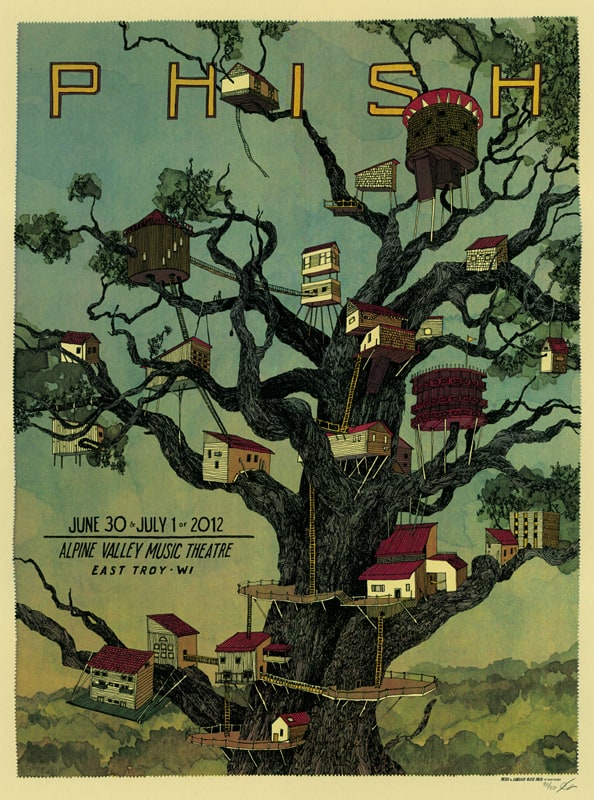
Phish gig poster by Landland
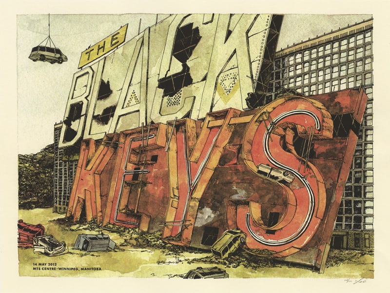
The Black Keys gig poster by Landland
(Jes) We definitely both brought different things to the table right from the start, but I do see them as complementary. You can look at the stuff Dan was interested in drawing way back when he was 2 years old and it’s more or less the same things he likes to draw now. It’s pretty freaking adorable. He used to make his parents stop the car so he could pose for photos next to road signs.
And I’ve always been more interested in movement and organic things, animals and humans and plants, and narrative and trajectory.
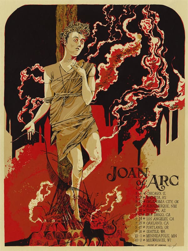
Joan Of Arc gig poster by Landland
You’ve worked closely with both Tim and Nate Kinsella on a few projects. I’m a fan of Joan of Arc and Capn’ Jazz (just the family of Jade Tree bands really), how did you hook up with them?
(Dan) I met Nate right around the time I started college in 1997, while he was still in high school. He and Jes both went to this arts high school right outside of the city and had a million friends in common, though I don’t think they were there at the same time.
He was in a band called Escher with a friend of mine from Mankato (my hometown) and later on he played drums in another band that ended up playing a lot around town (decembers architects, which was all lowercase because of the 90s and emo), so I just knew him as this SUPER NICE math-rock kid up until he moved into a house with a cousin of mine and we actually started hanging out.
Years after decembers architects broke up, I ended up releasing their “lost” full-length album on a record label thing I started as part of a college project. I still think it’s the most amazing thing nobody’s ever heard. While I was still in college, Nate and I (along with the cousin I just mentioned and over time, almost everybody from decembers architects) were in that Everybell band together right up until he moved to Chicago to be in Joan of Arc & Make Believe with Tim (Jes actually replaced him as our bass player for a minute after he moved, which is partially how she and I met).
At some point, we ended up locking it in that Nate and his bands would stay at my house whenever they came through Minneapolis, which is how I met Tim and a bunch of those guys.
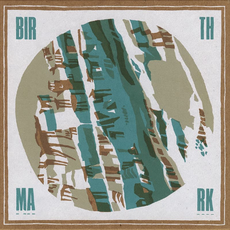
Birthmark record cover by Landland
The side project of ‘Landland Is Not a Record Label,’ which is kind of a record label, has put out quite a number of limited-edition releases like Nate Kinsella’s project Birthmark and Dan’s own band Everybell & Whistle. As side projects go, releasing records is a pretty big deal – time consuming and expensive. It’s an awesome and admirable venture, but also a gutsy move. What prompted Landland the design and printmaking group to start putting out records?
(Dan) Our record label is a mostly a weird passion project. We’re really interested in making records that feel special & well-considered and that probably wouldn’t exist otherwise, and luckily for us, some really great people have gotten into it with us and trusted us with some pretty amazing recordings.
The packaging is generally fairly laborious and hand-built, usually screenprinted and assembled by hand in numbered limited editions. It’s a ton of work for very little return, but the objects that we’re producing look and feel really special and I’m constantly excited about it.
It seems like not too many people really know about it (our marketing department is terrible!), which is mostly my fault, even though all of the records we’ve put out so far are really incredible, from a music standpoint as well as being really nice physical things to hold and handle and unpack and forget about on a shelf.
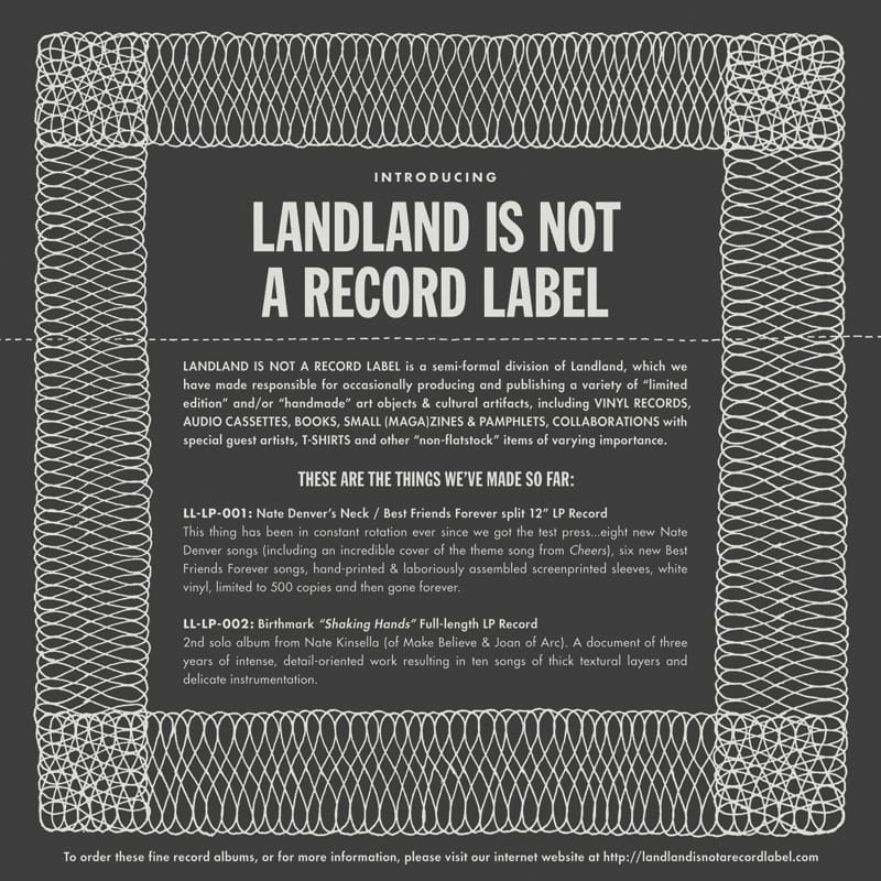
We called it “Landland Is Not a Record Label” as a way of acknowledging that we can’t get in too deep with this. there’s a TON of aspects of running a record label that I don’t want anything to do with. Tons of really boring and horrible work (especially at this point in time) that I’m not built for and just don’t have time to deal with, work that I’d feel ashamed to not be doing if I were really seriously throwing my hat in that ring.
Also, we didn’t want anyone to think that they should send us demos. We still don’t. This isn’t that type of thing. It exists beside our regular Landland stuff as something fun that we can do when we can afford to, and it doesn’t really pay for itself yet, so we can’t really afford to do it often, but I LOVE dealing with all of the parts of manufacturing records and sourcing vendors for that stuff, and getting test pressings in the mail, dreaming up weird packaging solutions (and horribly improbable ways of putting it all together), and working with some of my favorite people and having this weird hand in making things happen.
If all of our plans for releases this year come together, I am going to be totally giddy. I’ll just be an absolute idiot clapping and grinning atop boxes and boxes of 12″ records.
We just bought a tabletop paper-scoring thing for helping out with making our folds awesome, which has been long overdue for us. We’re also working on trying to get a better distribution plan together, and a situation where the income from it is a little less risky, but for an odd side-project, it’s working out well and a ton of fun.
We keep talking about getting things to a point where we can also start putting out limited-run books of our work and things from some of our friends somewhere down the line. We’d really be excited about that and it’s a major goal of ours.
There’s a lot to all of that that we don’t understand the logistics of, but I think being able to have those books and things like that existing in the world is good motivation to figure it out.
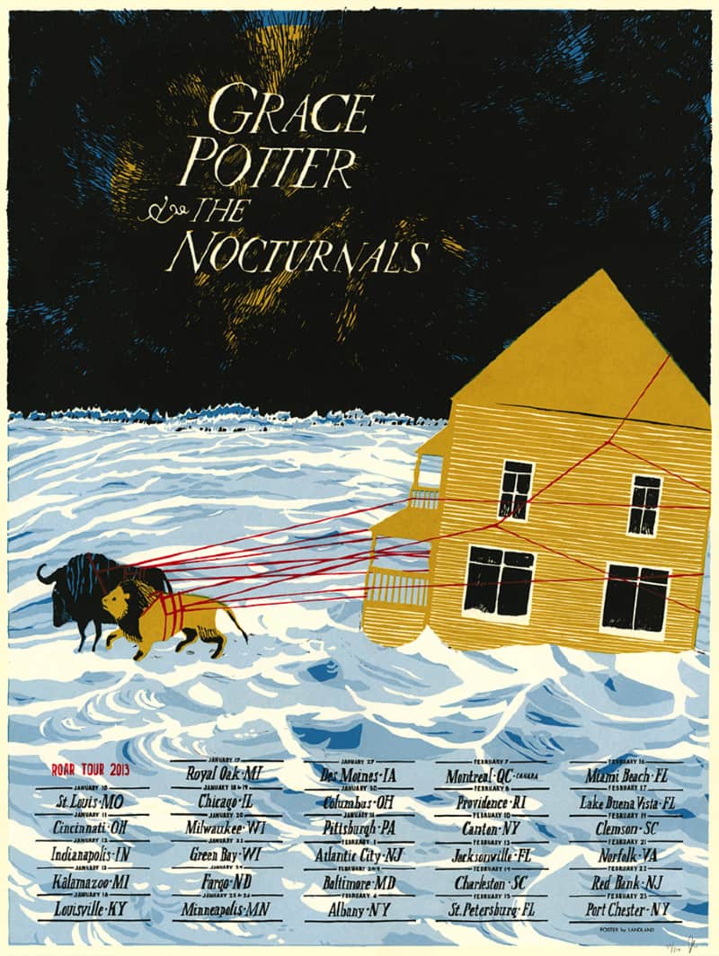
Grace Potter & The Nocturnals gig poster by Landland
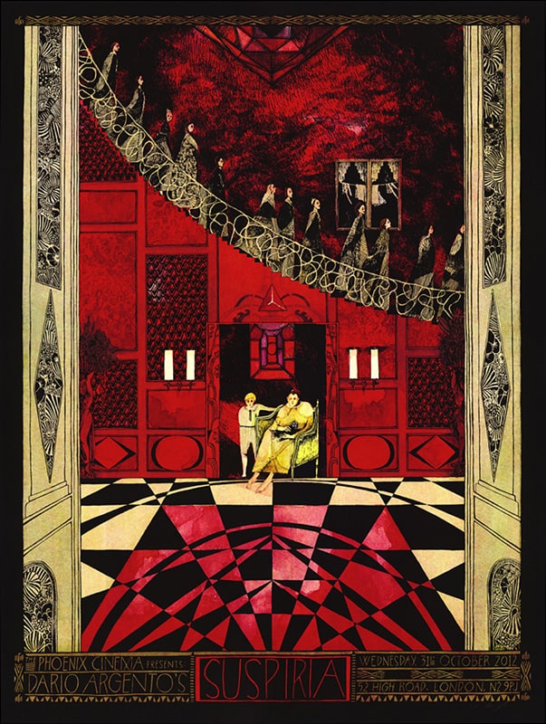
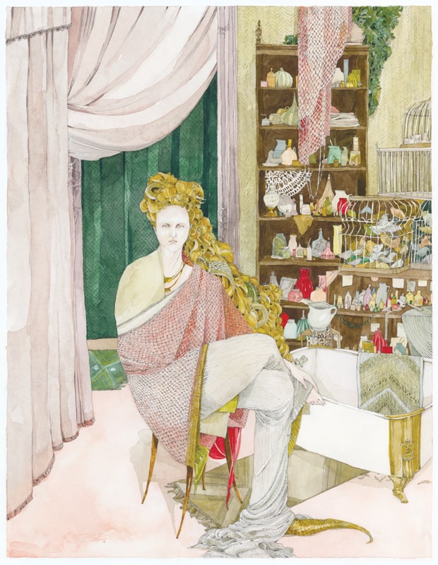
Suspiria by Landland
Do you keep regular business hours? Is there an attempt to separate work life and personal life? Can that even happen when you work closely with friends?
(Dan) I don’t keep regular business hours at all. Not even a little bit. I don’t see how I could…I usually divide my day up between working on projects, working on Landland administrative/business stuff, and whatever’s left ends up being hangout time or relaxing or sometimes watching a movie or getting dinner.
Sleep happens somewhere in there as well, but as much as I’ve tried to fight it, I’m really productive late at night and into the early morning.
I tried really hard for a while to keep a 9-to-5ish schedule, and it just wasn’t enough time to get anything done or really focus. That’s not to say that I don’t have huge breaks where I’m not really working on anything…it doesn’t happen often, but for example, winters are always really weird because bands aren’t really touring as much, so there’s not as much work coming in.
We get to decide if we want to keep ourselves busy working on all of the backlogged self-initiated stuff or general Landland upkeep projects, or hibernate a little bit to catch up on actually being a human being.
There’s not a whole lot of division between my work life and my personal life, I haven’t quite gotten that figured out yet, which I’m sure is pretty annoying to people around me.
I haven’t had a chance to drive off any of my friends out here in Chicago yet—probably because most of them do the same kind of poster/design/illustration/printmaking work we do, and some of them even work in the same space now—but I know that back in Minneapolis, if I’d cancel plans to hang out more than three times because of working late nights, I ran a huge risk of falling out of friend-rotation with whoever was asking (which makes sense, of course…canceling on people is a crappy thing to do, especially regularly).
And then, it was kinda just assumed that I was always working all the time, so I’d miss out on invitations or finding out about anything, which led to me just ending up working more often, etc…until I really didn’t get out much at all. I bet I have friends there who don’t even know I’ve moved.
When Jes and I are working closely together, like when we’re in the same room and everything, things usually feel really buddy-buddy and social, and we try to take good breaks to walk around and get dinner out in the world and just catch up on our regular life stuff if we haven’t seen each other in a little while. We try to not have all of our conversations be all about Landland stuff.
It’s tough when there’s always so much planning and consultation that needs to happen, but it always feels really good to be reminded that we’re really great friends outside of this work stuff too.
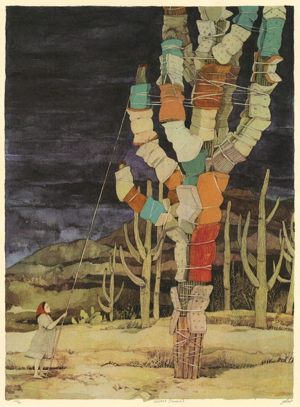
Untitled Souvenir by Landland
Gig Posters Vol. 2 “Pre-Order Incentive” mini-prints

I’m from liverpool, UK and have bought posters from landland. They are beautiful works of art. Love their style and ethos.