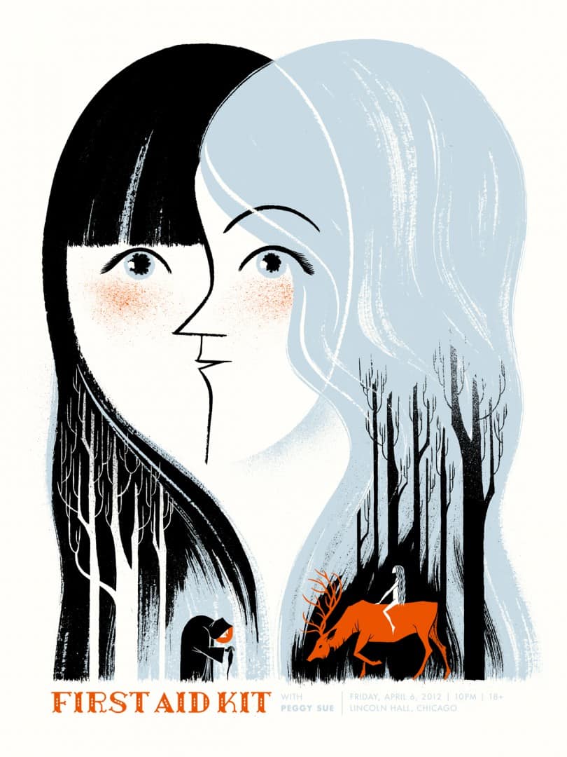
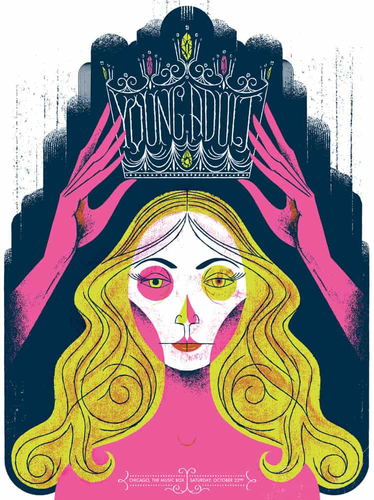
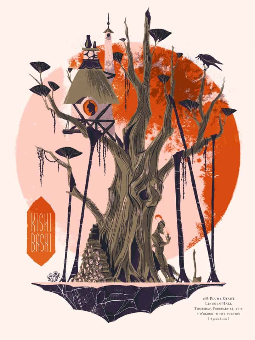
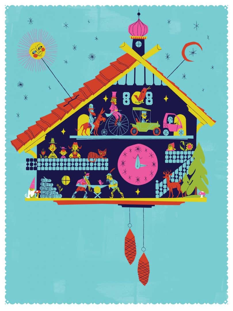
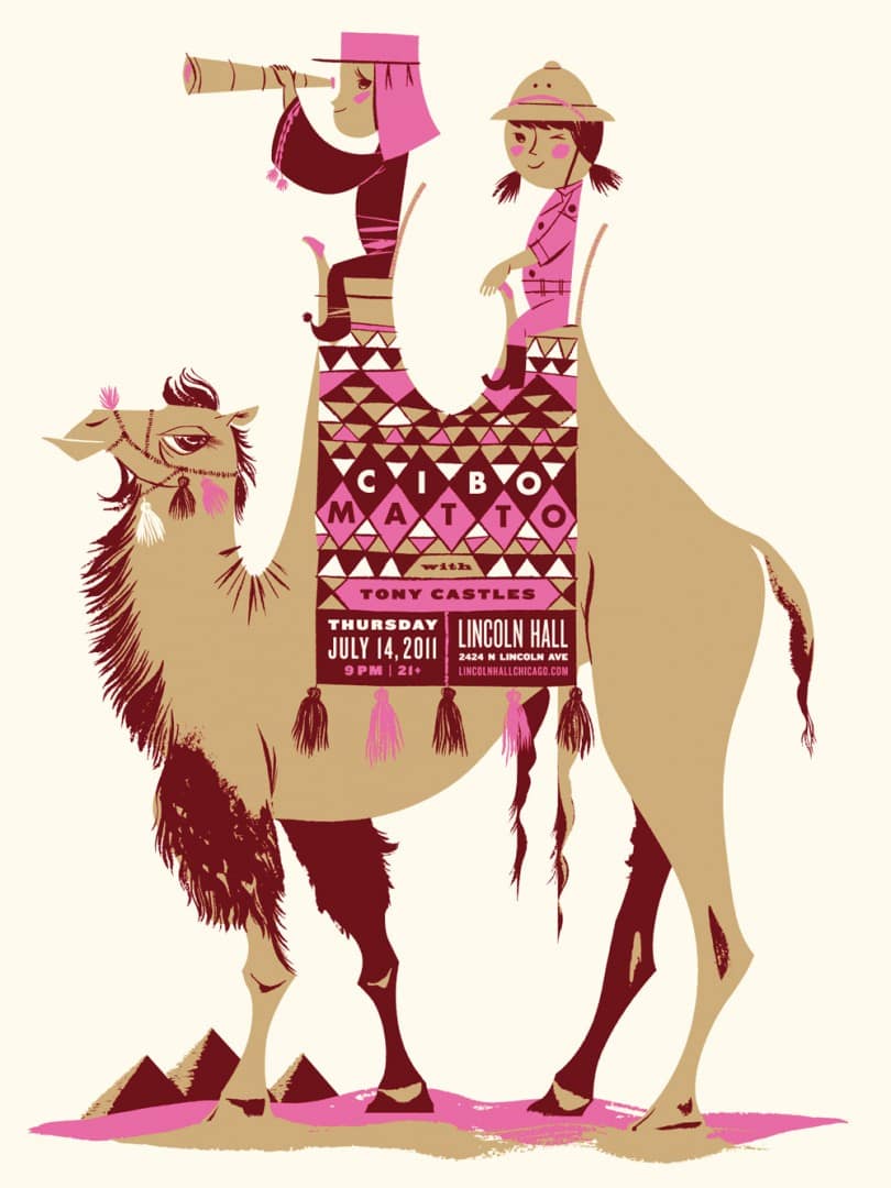
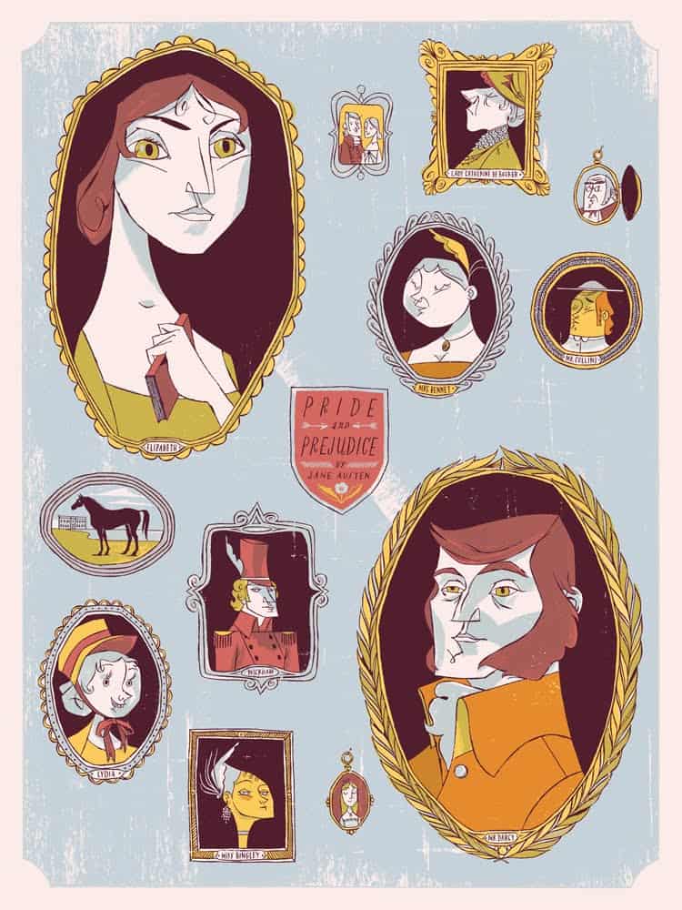
Chicago based illustrator and printmaker Anne Benjamin creates designs that have the fantastical feel of a Disneyland ride poster. She shows us adventures. A promise of fun and excitement. Her work balances the child-like and the high-minded, like a children’s book created for mannered readers. Refined. Sophisticated.
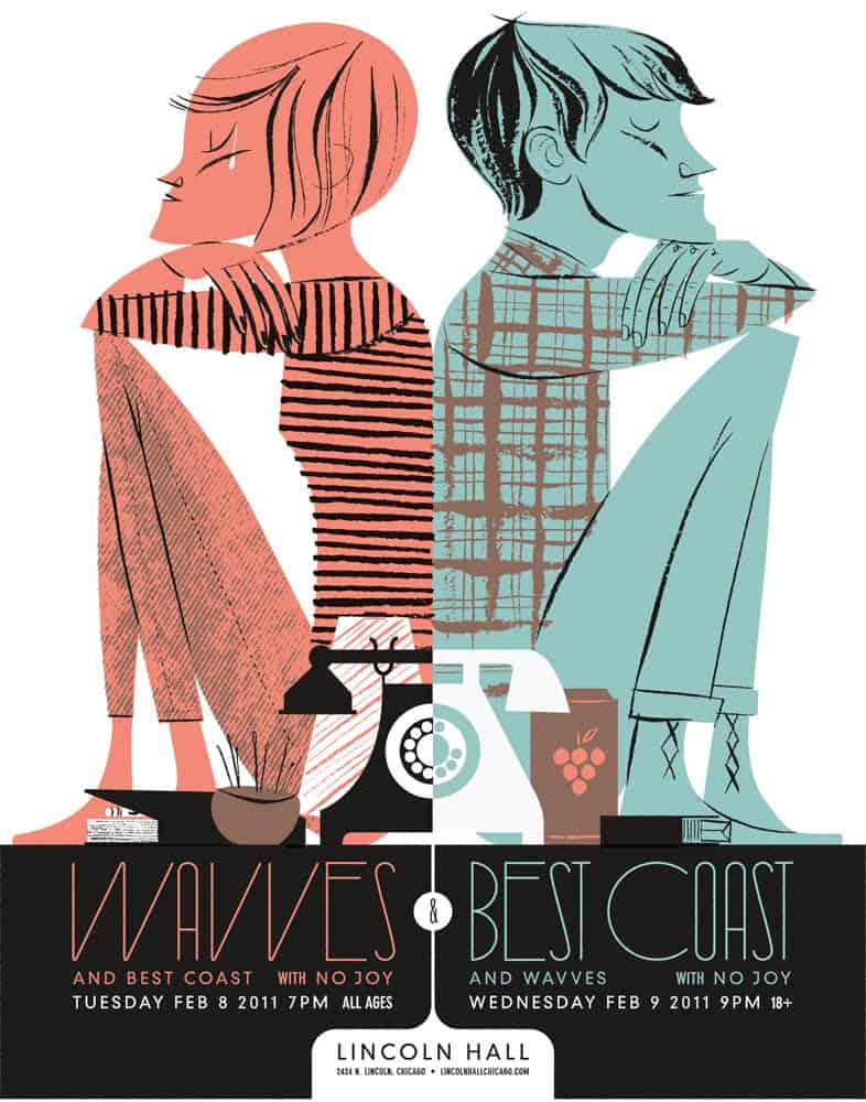
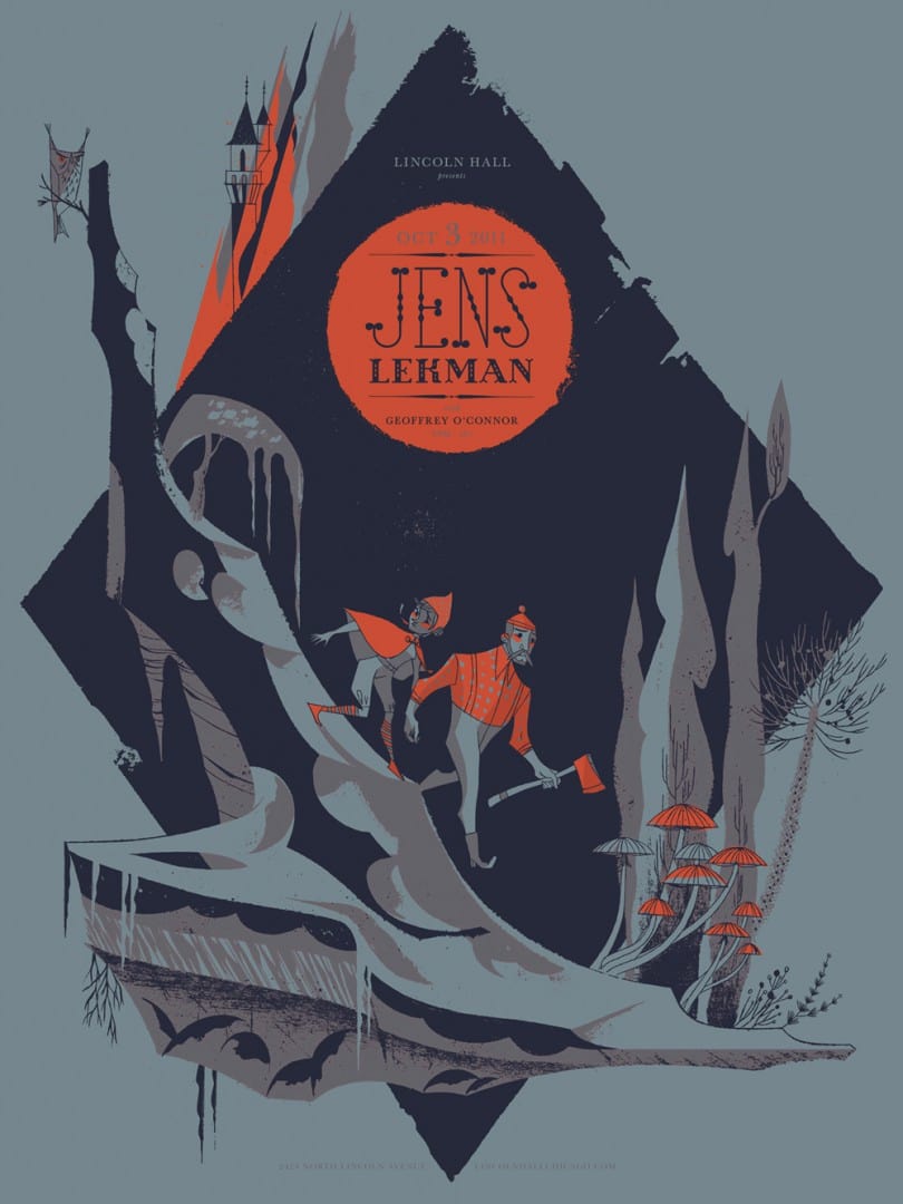
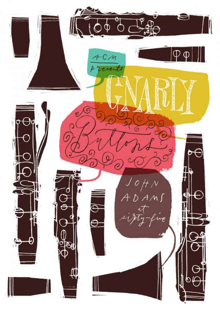
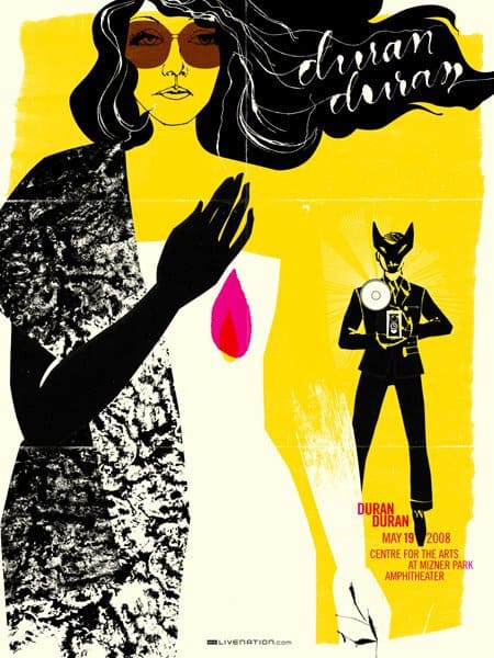
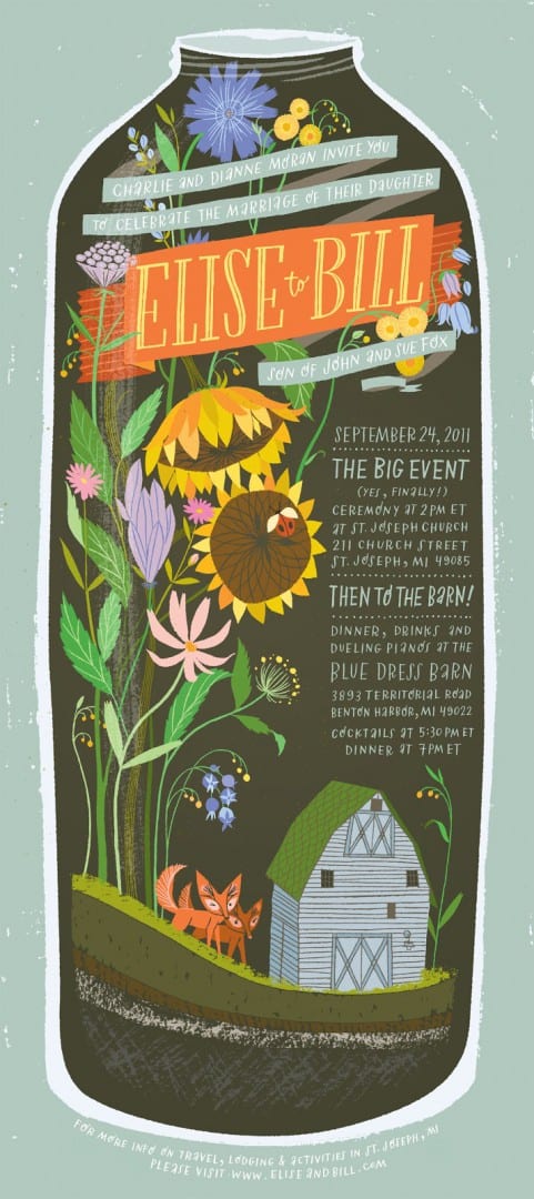
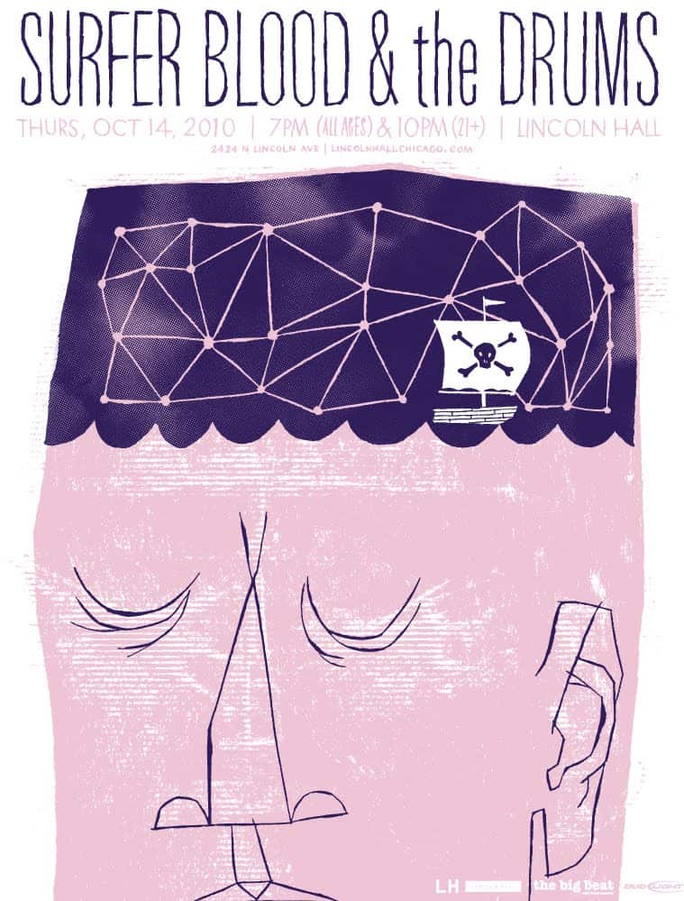
Benjamin’s compositions are built of simple shapes — all are important. A perfect balancing of line and color. With her custom invitation work, she shows an amazing sense of composition and skill. Benjamin is able to load a slip of paper with the important dates and names needed in a unique and personal way. Her gig posters and art prints show Benjamin’s deft imagination and ability to create a sharp moment — Sad. Fun. Endearing. Loving. Singular events, each rich with life.
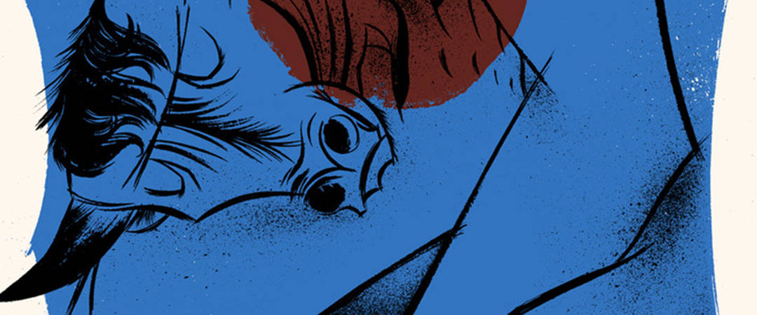
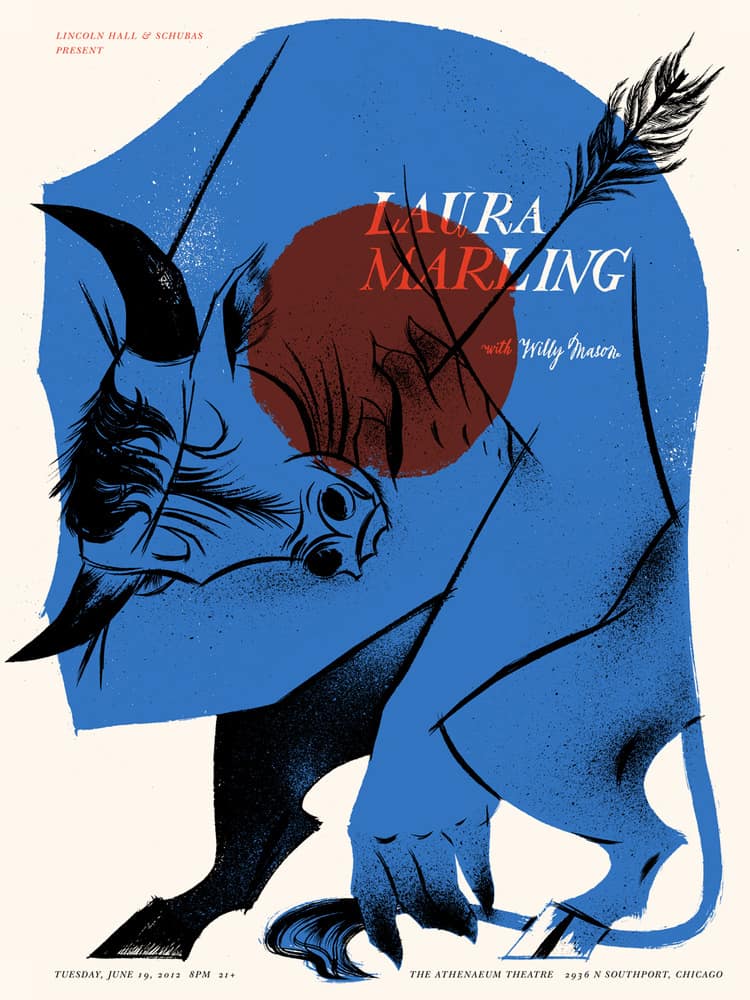
CJ: Your poster for the Laura Marling show in Chicago is incredible. It captures so much so beautifully. The bull itself has a Looney Tunes feel to it, but the overall story this one image is telling is so eloquently sad. It shows death and heroism in a child-like and mature way.
It’s interesting to see how you use a children’s book style of illustration for gig posters and newspaper illustrations. How do you approach the balance of your whimsical and playful style with serious, or at least mature, subject matter?
AB: Well, part of my playful style comes out of my limitations as an illustrator. I can’t draw photo-realistically nor do I have a desire to and that forces me to simplify and stylize forms. So my approach to illustrating a dying beast is relatively the same to illustrating a cute squirrel. The difference comes more in the posturing and tone of the subject.
That’s a pretty awesome way of explaining it. A lot of aspiring illustrators, or creatives in general, struggle to work towards some ideal way or style rather than focusing on what they can do. I know I have.
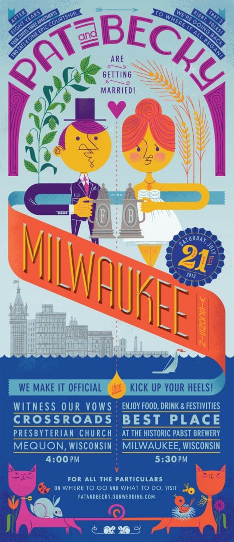
With your custom print company Mok Duk you do a lot of wedding invitations and other custom work. What’s your process for trying to turn a couple’s personalities into a design? How closely do you work with the couples? Do you approach the job the same way you would a gig poster for a band?
For the most part, I work directly with couples. I give them a questionnaire to fill out to help me learn more about their tastes, interests, history, etc. There’s a lot more restraint working on wedding invitations than gig posters. I usually submit three concept sketches and have several rounds of proofs with revisions before reaching the final design, whereas with gig posters, I can typically do whatever I want with one final approval from the band/venue.
I love the fact that you stick with the traditional methods of printmaking. Silkscreen, letterpress, and engraving. Those hands on methods are a skill and craft all their own.
Knowing how each process works, does the final printing process affect how you develop a design? When creating a piece that someone else will print, do you approach that differently than if you were to do the printing yourself?
Yes, each process has it’s own set of limitations and that affects how I build the design. If I’m printing the piece there’s an additional set of specific limitations based on my own rickety old printing press and what I can pull off successfully.
Sometimes I’m smarter, but most times I design something then have to work backwards trying to make it printable. That’s when I end up spending a full day on color separations.
It’s nice when someone else is printing my work especially when it’s full-color offset, then I can be a little more carefree when designing.
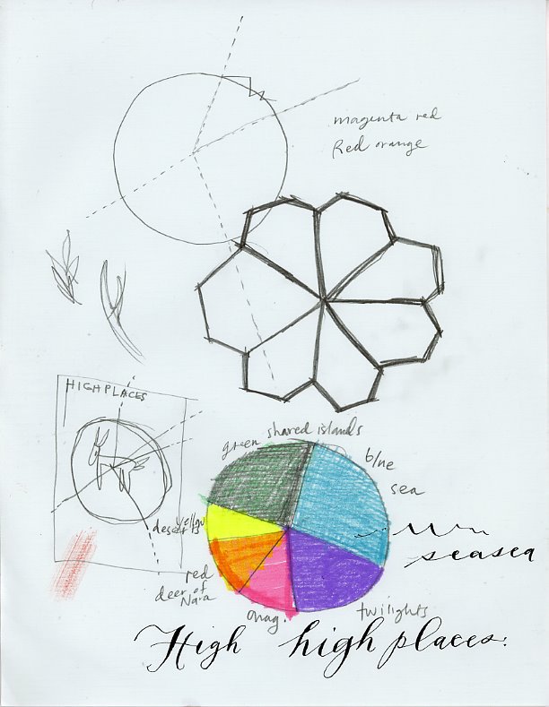
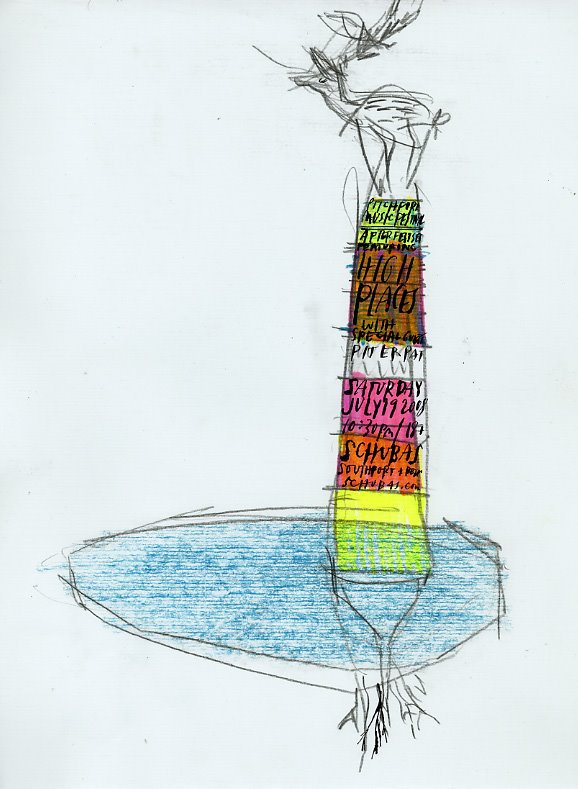
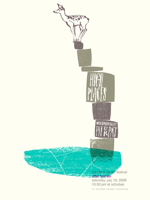
You posted process shots of your High Places poster from back in 2008 – it looks like you had a clear idea of what the composition would be from the beginning. Do you normally have an idea of what you’re going to do before you start sketching?
It depends but usually I go through a bunch of thumbnail sketches before I nail down my composition. This initial process tends to make the work stronger than if I settle for the first sketch I come up with. But sometimes I’m lazy or pressed for time and go with that first sketch and spend a ton of time shining that turd before flushing it.
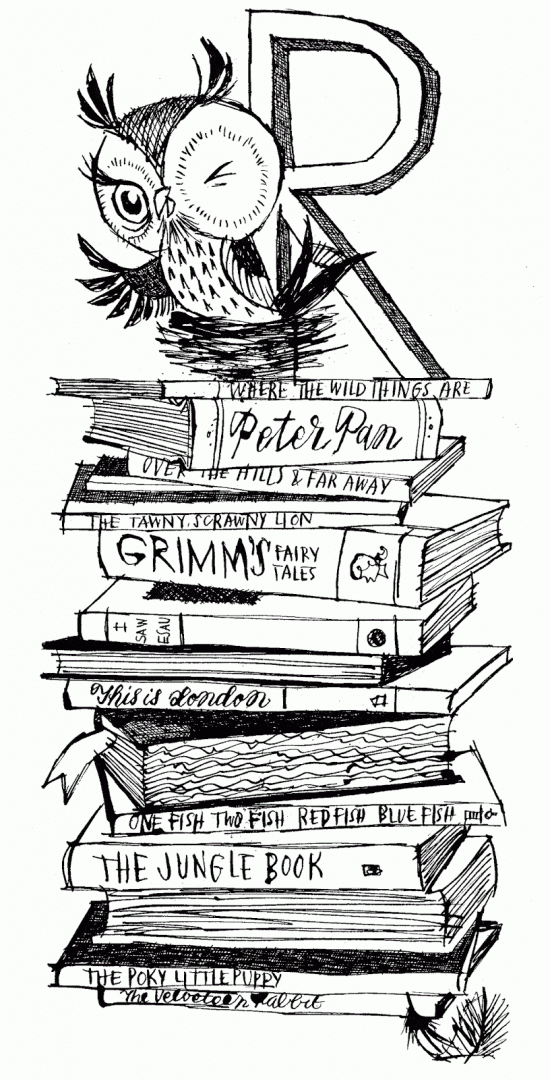
I love your hand drawn text. It’s so natural and organic. Decorative. There’s a baby shower invite you did with a stack of children’s books, an owl sits on top. It’s such a wonderfully loose and playful drawing with different type styles for each book title. With your work with custom invitations and gig posters, type is incredibly important. How much work goes into the type creation for a print? Is the text portion of a design first or last in the process?
I’ll include the type in my initial rough composition sketches, if nothing else to figure out where it will live. Then I’ll typically leave the type until the end when I’m finalizing the artwork. I try to customize at least the headline and sometimes the type itself will take 1 to 2 full days.
With the hand-crafted quality of your work, is there a digital element to your work flow? Are you using Photoshop or Illustrator to edit or compile your compositions? Do you turn your hand drawn type into fonts for Photoshop or Illustrator?
Yes, I use Photoshop and Illustrator to put together the hand-drawn and vector elements. I haven’t designed a proper functioning typeface, but I’ve created a few (mostly) full alphabets for some projects like my own wedding invitations.
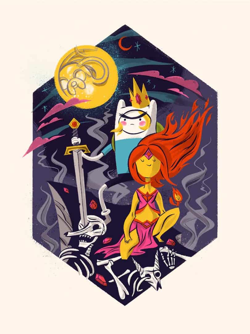
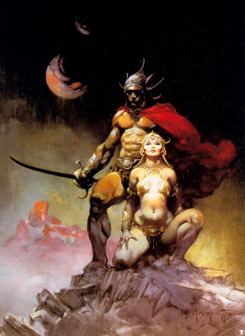
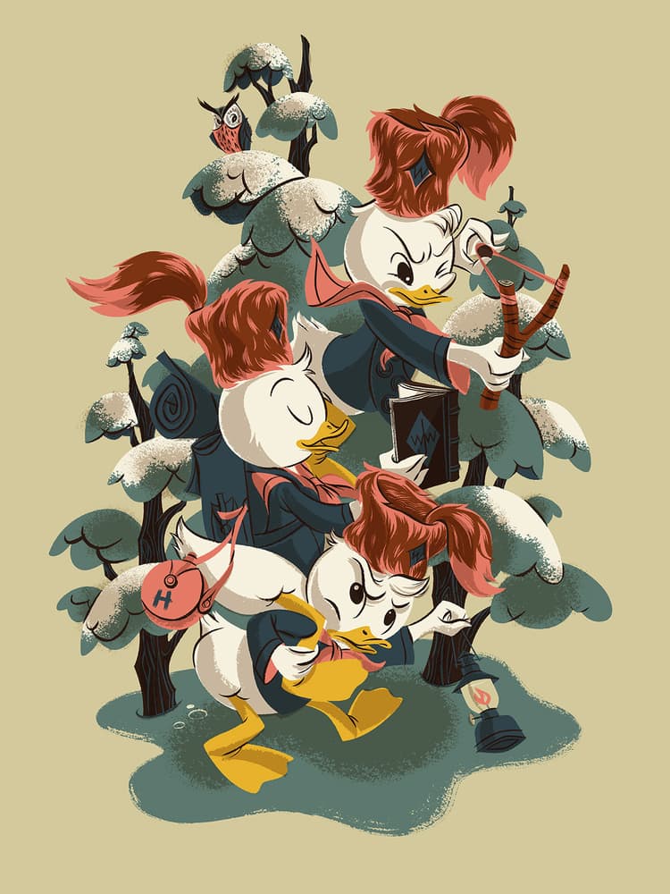
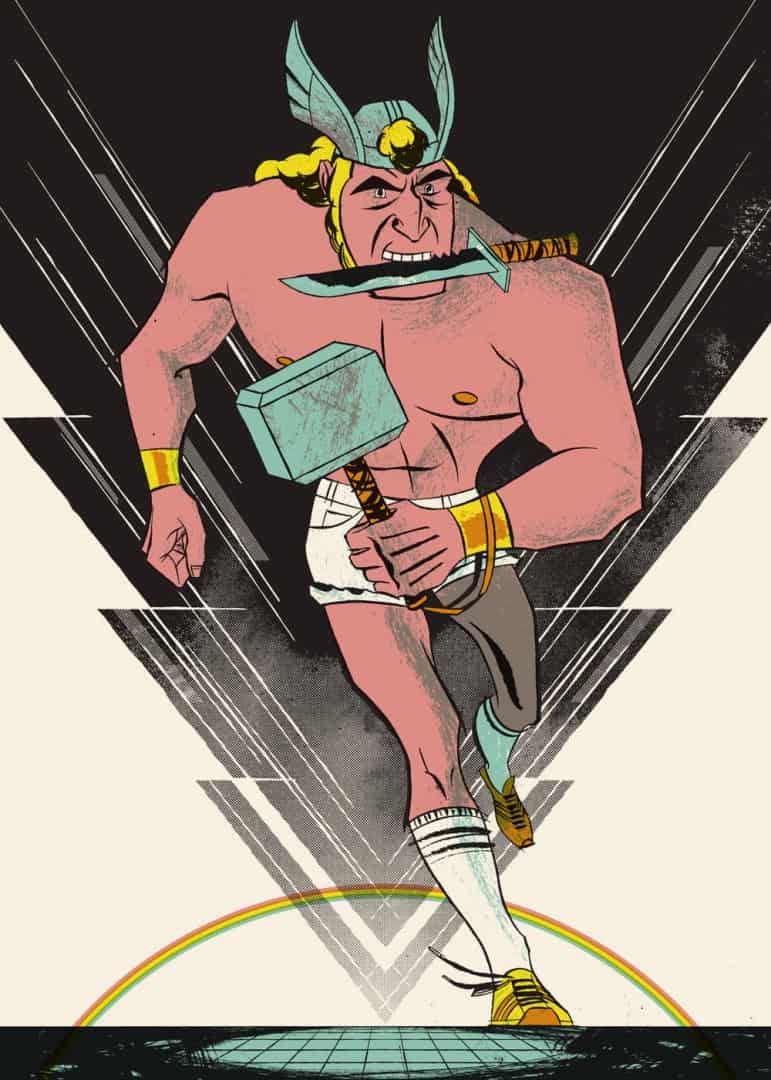
Your Adventure Time print ‘A Fighting Man of Ooo’ is awesome. I love the nod to Frank Frazetta’s ‘A Fighting Man of Mars’ painting. You’ve done a few posters for Mondo now but the majority of your work is with your original ideas – does working with existing properties like Duck Tales or Adventure Time change your design approach at all?
I find it challenging to work with properties especially ones that are cartoons because the illustrated style is already established. In some cases, the character design and style are so good that I feel like, ‘What more can I bring to it?’ In both the Duck Tales and Adventure Time poster I tried to infuse my own thematic spin on each show, without straying too far from the character model sheets.
You’ve had a booth at the Chicago Renegade Craft Fair before. What role do events like this play in your career? Are they more for fun or are they just good for business?
Most of my income comes from commissioned work, so these shows tend to be more for fun. I’ve made a few contacts from shows in the past, some of which pan out into projects. I’m leaning away from doing Renegade in the future because it’s a big investment in participation fees and time and unless you’re really dedicated to making and selling products, it’s hard to turn a profit.
I wondered about that. I’ve heard the same thing about Comic-Con and other conventions. Still, it has to be fun to be involved on that side of it.
I’d imagine trying to keep a steady Monday through Friday work life can be difficult when you work for yourself. Still, do you try and work a regular 9AM – 5PM work day, or just whenever inspiration hits?
I don’t have a strict workday and since I work from home it can be a bit of a free for all. It depends on my workload, but usually, I work between 10am and 7pm.
Is there a priority between your work with Mok Duk and your freelance illustration? Is there room, or time, for you to branch out and try new things, work wise? Will we be seeing a hand-crafted book or other projects from you soon?
I’ve been moving away from the wedding invitations work in the past couple years and doing more freelance illustration work. I only did three invitation projects this year and it’s a nice change just because those projects can be so involved and drawn out. I’d like to get into children’s book illustration but that’s a whole other ball of wax.
Between your custom work through Mok Duk and freelance illustration jobs, do you have time to create just for you? How do you balance work life with a personal life?
In most of my design projects for other people, I have enough autonomy where I feel like I’m creating for myself. That’s certainly the case with gig posters and art prints. I enjoy doing embroidery, ceramics and other crafts when I can because they are creative activities but completely different mediums than my design work.
I guess I don’t give much thought to work/play balance. I’m married without children, so at this point I don’t have much else to do but work and putter around the house. My husband is a designer as well, so our work is important common interest in our relationship. We iChat each other screenshots of work progress throughout the day for feedback. This is helpful to me especially since I work alone at home.
Wow, like the innocent feel and how clear-cut the shapes are.