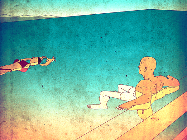
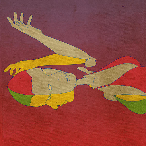
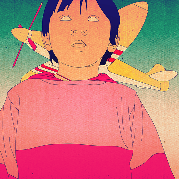
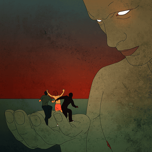
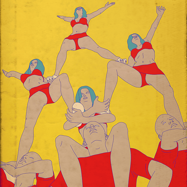
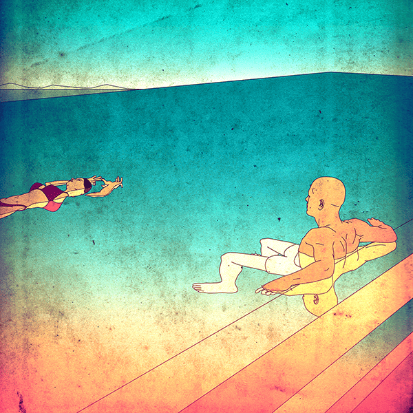
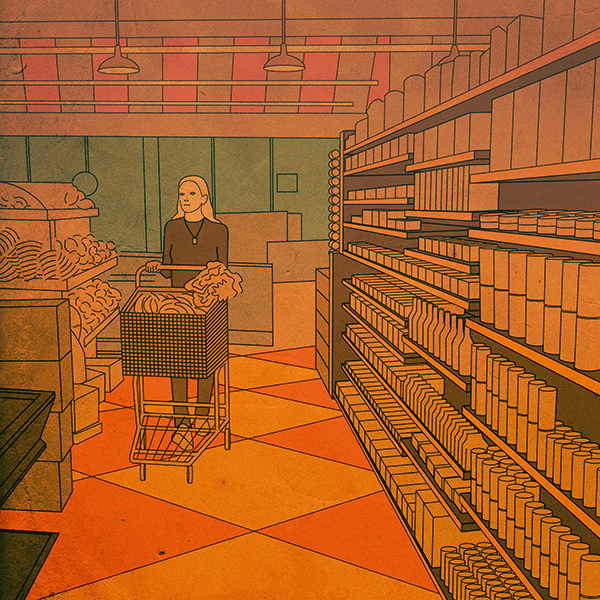
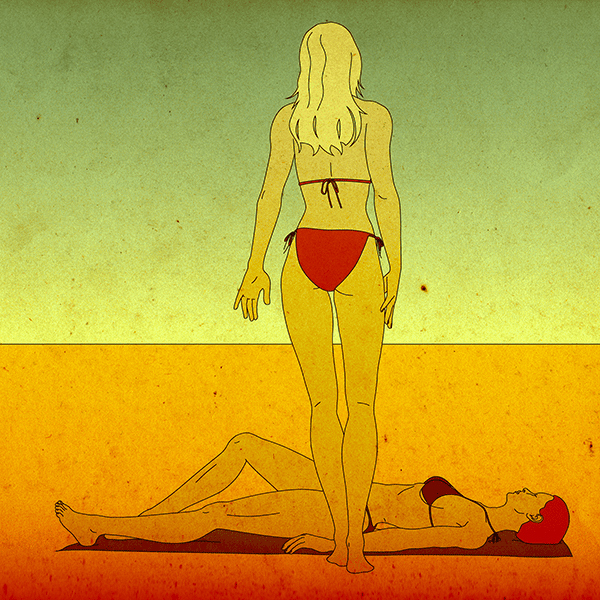
The characters in the work of illustrator Eric Petersen inhabit an alien landscape of strange routine. These players, empty-eyed and remote, move through Petersen’s incredibly tight and eerie compositions in simple interactions — on the subway. Swimming. At a desk.
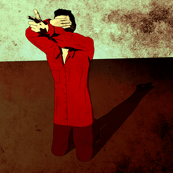
His work is deliberate in perspective and its total lack of detail. He allows the viewer to write their own stories, to place themselves into his world. Petersen shows his inspired touch and unique vision in each drawing. When I see his pieces I’m immediately drawn in. I go back to them. I think about them. Wonder. There is beauty in the cold stillness of his characters — they’re not quite human, yet feel totally human and a bit alien.
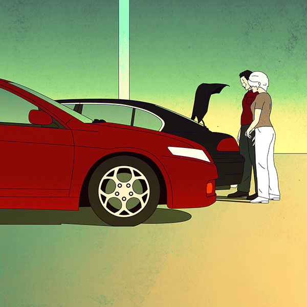
The placid tone of Petersen’s work is incredibly calming, yet he can turn the simple scene of two people loading the trunk of a sedan into a moment full of anxiety, wonder, and an unnameable creepiness.
CJ: One of my favorite pieces of yours is ‘Three O’Clock.’ It takes the event of two people in a parking lot, which is almost a non-event, and creates mystery – anxiety. It’s a wonderful example of what can be extracted emotionally and mentally from a common occurrence when seen through a new lens.
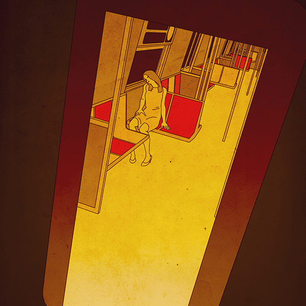
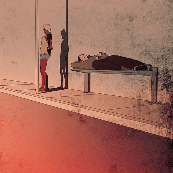
How do you choose moments like it to illustrate? What attracts you to moments like two people in a parking lot, or something like ‘Tomorrow’s Sun’ where a woman sleeps on an empty bus?
EP: My ideas come to me randomly. They are never complete ideas and are usually visuals of ordinary situations, but can change during the process. I am attracted to ideas that can produce a strong visual graphic along with an ambiguous story. ‘Three o’Clock’ is one of the rare ones I actually witnessed. There was something strange about the encounter of the two people in the parking lot. They looked like mother and son, but did not act like it – a bit cold and professional. I’ll leave it to the viewers to imagine what was really happening.
‘Tomorrow’s Sun’ was from my imagination, although I did live in NYC for a number of years and would ride the N train frequently. This was not an uncommon sight.
Are you from NYC? What made you leave New York for Olympia? It would seem that NYC is more conducive to a creative career.
I lived in NYC and the greater NYC area for most of my adult life. The cost of living was too high and I also decided to quit my coding career. It would seem that NYC is more conducive to a creative career, but for me, I need a less stressful day-to-day existence.
Being in Olympia puts me in the proper mental state to do my work. I appreciate its laidback attitude and independent spirit. There is a pioneering feel here. I also appreciate the wide-open space which is apparent in my work with its vast empty landscapes.
I get that. I had to move out of San Francisco for the same reason. It’s awesome that you’re able to know what works for you.
Your work is able to build so much from so little. Each composition seems to be saying something, and I’m sure they each speak differently to each viewer. For me, they feel like vignettes of science fiction. Do you have your own stories behind the images? Do you know what’s in the trunk?
I always start with a visual thought. The story comes later and usually can be read many different ways. I often go back and forth about which story I want to see when viewing it. For ‘Three O’Clock’ I have my suspicions of what was really in the trunk, but cannot be sure.
Are you working from photo references? What’s your process like? Is there a lot of sketching or prep work before each piece?
I work from 3D reference. I build my thoughts in a 3D program and draw in Adobe Illustrator from the render. If there is perspective for buildings and such involved, I will create vanishing points in Illustrator to create a more accurate result (tracing alone would not create correct perspective).
My goal is to remove the human touch from it. On rare occasions, I work from a hybrid of 3D and photo reference as in ‘Adora.’
Your work feels proudly digital. Or, really, ‘classic’ digital like the early images created from computers for video games or films like ‘Tron’ that pushed the uses of whatever graphics were possible at the time. Computer-generated work has been said to feel static – emotionless.
You take those qualities of digital work and use them as a tool to create tension and emotion, which is an incredible feat. What attracts you to the digital medium?
I grew up with classic video games and have always been attracted to the digital medium. For a time, I coded interactive websites for large corporations. I’ve always been around computers and feel much more comfortable and work much faster with them although I do have training in traditional art techniques.
I can capture smooth lines on a computer using Bézier curves that do not have the imperfections that would occur if done by hand. This allows for the emotionless, inhuman quality I am looking for.
It’s interesting that you strive for emotionless and inhuman settings in your work. The crazy part is that it seems the more you seek it out, the more alive the characters and environments become. What attracts you to that coldness? What inspires you to remove humanity in these moments?
I have always had a minimalist design sense and like to get to the core of the matter. When I attempt to remove emotion and humanity from my scene, it is to create a space where the viewer is injecting their own feelings into the piece. I think this is why it seems alive.
My goal is to make people think. I feel the coldness and lack of humanity helps remove the distraction and allows people to focus on the scene and imagine.
I love to hear that you used to do coding. That’s such an interesting place to come from as an artist. It doesn’t sound like traditional paints and other mediums interest you much. Is there any software or other tools you’re looking to explore? Have you attempted any type of printing methods like screenprinting or etching?
Currently, I am not looking for any new software, but am open to it if it enhances what I am able to produce. The end result is the most important thing to me and I like to take advantage of anything that will help me get there. Screen printing is something I am interested in, but have not tried.
With your compositions being so open, with so much space and clarity — it lets the textures you use play a larger part. It’s as if you created these static and clinical moments then added these very earthly and organic elements like dirt and grime.
It sounds like you’re able to manipulate your composition at the 3D stage and be as deliberate as you want. How do the textures come in? Are they spontaneous or do you somehow plan it out in the early stages?
I believe the textures add just the right amount of detail to let the mind wander a bit as if it were a photograph. Without the texture, I think it is a bit too sanitary. The textures are spontaneous. When they are more visible, I try to use them to aid in the lighting of the scene (dark areas are positioned where it should be dark).
Your coloring has a wonderful eeriness to it – you create these incredibly simple and realistic moments, then color them with unnatural and alien light. How do you decide on the color palette of a piece? What motives your color choices?
My color is all about play and exploration. I never know what I will end up with. I start with a color palette that is pleasing to me but is never the end result. I consider the initial colors I choose to be my base. Then I tweak it in Photoshop until it feels right. I try to use colors that are uncommon in everyday life. I believe color greatly enhances the mood in my work.
Your style has the clinical quality of instruction manuals, but when that’s used in a surreal world such as yours, the atmosphere and moodiness make these blank-eyed characters come to life in a strange way.
How did your style evolve? Did you work in traditional illustration mediums like paints and inks or did your work always happen in the computer?
I have always appreciated the clean look of instruction manuals. The fact that they lack detail allows the viewer to put themselves in the situation. My intention in using blank eyes is to allow the viewer to connect with the scene instead of concentrating on the character’s face.
My background has also influenced my style. I went to school for art, graphic design, and photography. Graphic design and photography especially influence my composition. I picked up 3D in my work experience. I’ve never considered paint because I can’t stand the mess.
What sort of illustration jobs are you working on? Are you freelance or do you work for a design firm?
Currently, I am working on an album cover. I only work freelance and am just getting started. Most of my time is spent on promotion and creating new work.
What’s been the nature of the freelance illustration work that you’ve done? Does it align with your clean and clinical style? Manuals and things like that?
My freelance work has been in the same style. That is something that is very important to me. I will turn down a client that requests me to change my style for them (such as adding irises and pupils or giving them facial expressions). I do not work on actual manuals. I don’t think my manuals would help anyone build or use anything.
I’d love to see what an actual manual created by you would look like. It would make assembling a dresser or something a lot more interesting.
I’ve seen your work a lot around the internet, and you’re posting new work on your Society6 store pretty regularly. What’s your next goal for your art? Any projects coming up?
My goal is to keep making art! I can’t anticipate what is in store for me but am always pleasantly surprised.

these are incredible, thanks for posting 🙂
Thanks for checking it out! Eric has a ton of great stuff on his site as well. Dude is good!