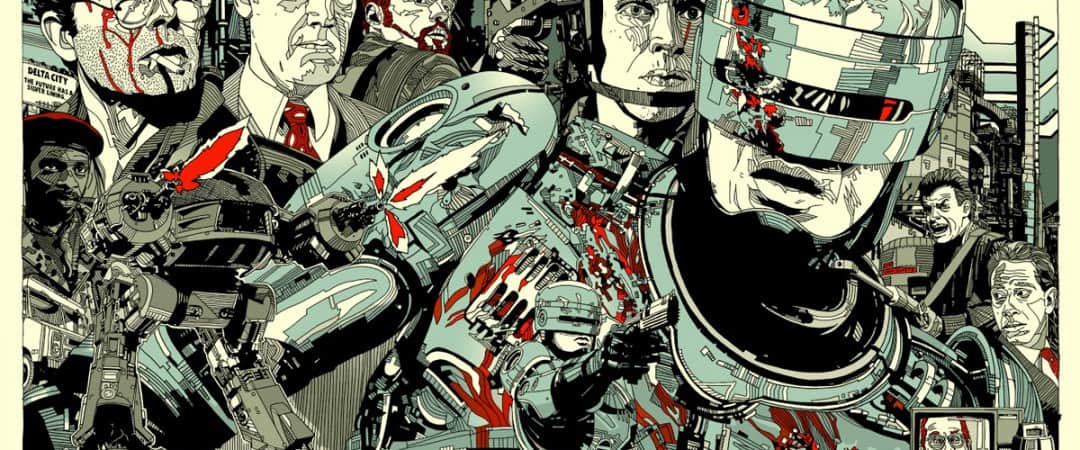
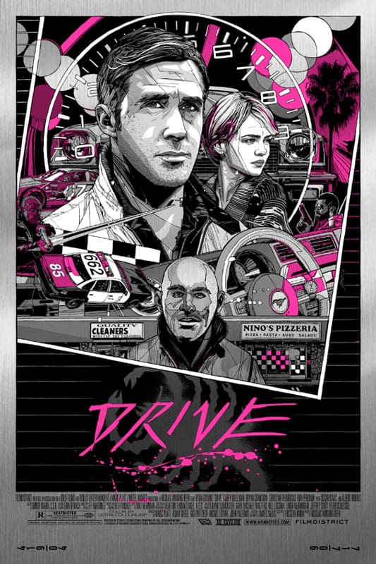
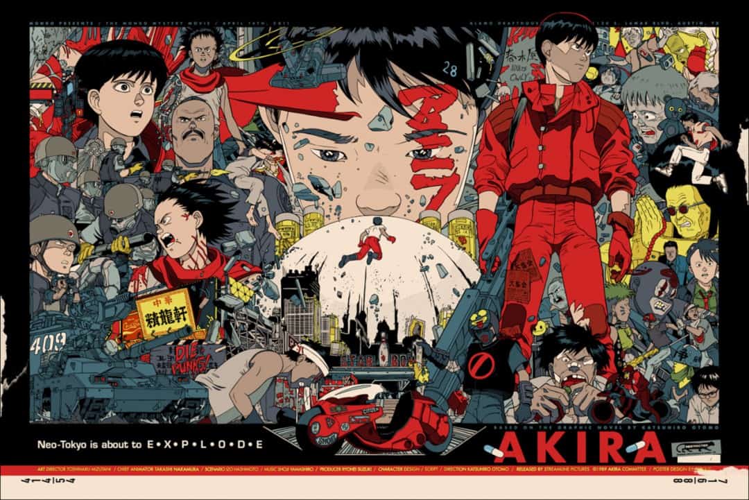
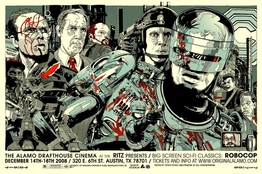
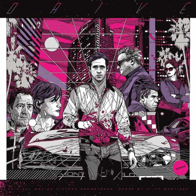
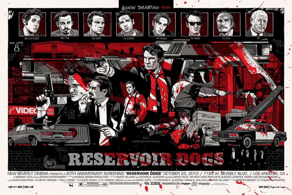
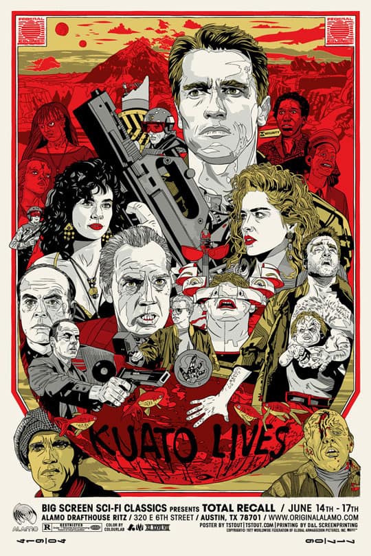
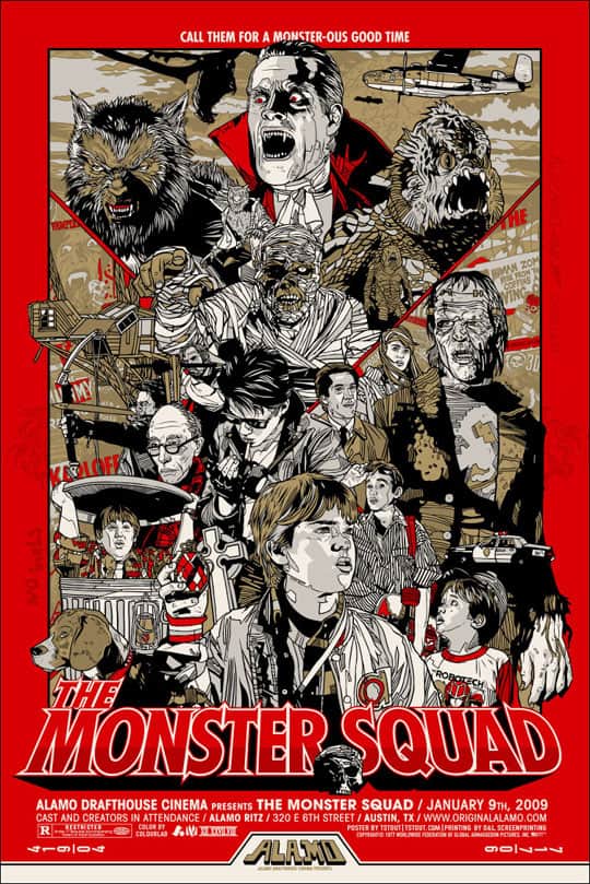
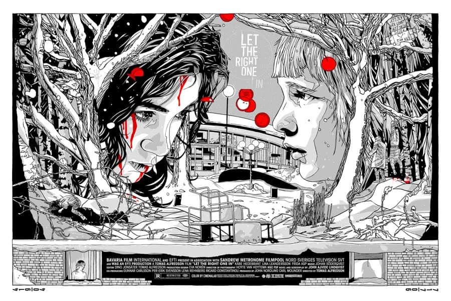
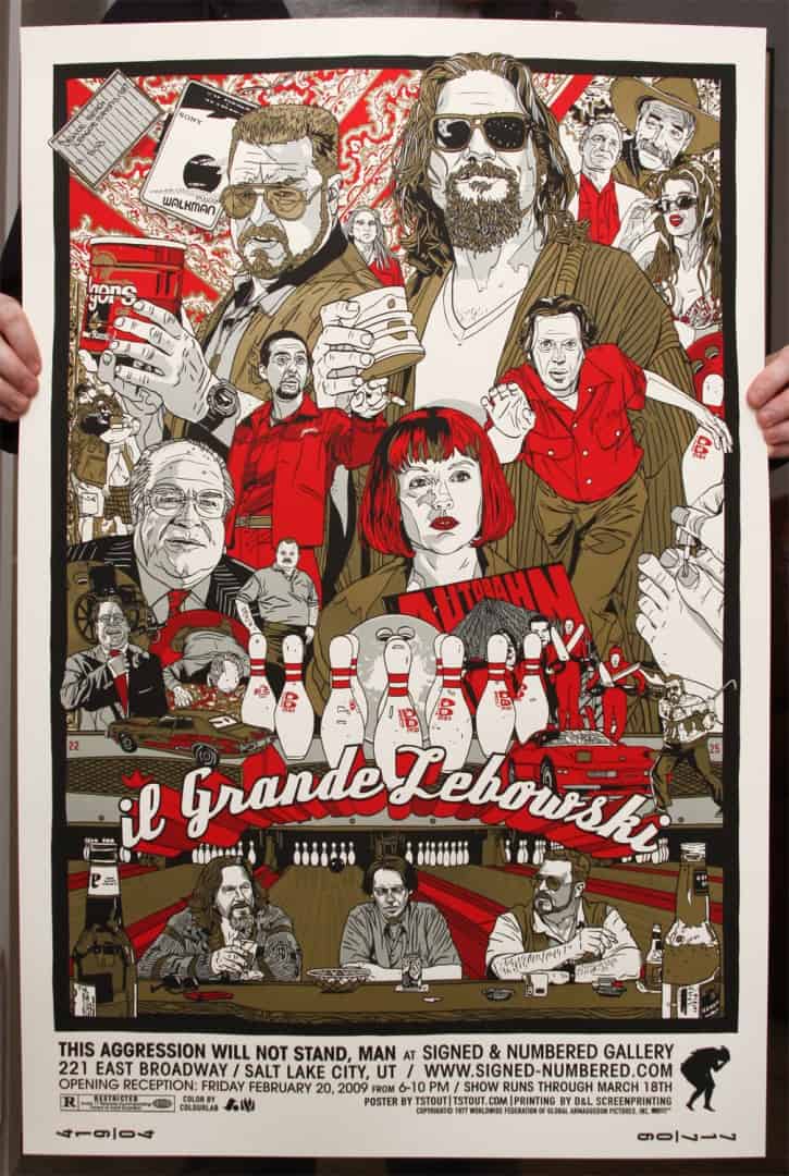
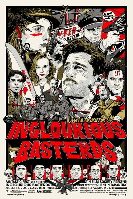
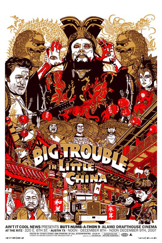
There’s a thrill that hits when I see the work of illustrator Tyler Stout. He’s able to tap into that thing that pushes me back into child-like excitement. A wade through his work reminds the viewer of the love that exists for films like The Thing and RoboCop — not because he reminds you that those movies exist, but because he created a poster that reminds us of how we feel about those movies.
There’s a controlled looseness to his art — energy contained. Stout draws to the edge of the canvas, filling the space with characters, ideas — the full narrative of the film he’s depicting. I’m a fan of Tyler Stout. This is true. I’m a fan of Tyler Stout like the Vatican is a fan of Michelangelo. This is truer.
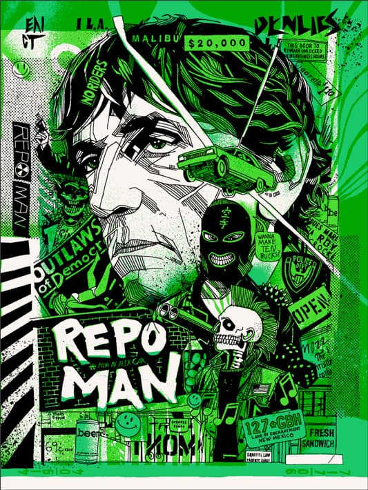
‘Repo Man’ by Tyler Stout for the Criterion Collection
CJ: One of the first things that I responded to in your work is the playful danger of it. There’s an underlying punk rock attitude to the loose, yet expertly applied line work. Especially your recent ‘Repo Man’ design, but that attitude also fits the film. Well, that’s just my take on it. How did you develop your style? Did you go through any artistic transitions before saying, ‘Alright? This is what I do?’
TS: It’s kinda a mix between what I think looks cool and what gets a positive response. Since I came up in the commercial illustrator world, with a client art directing projects, it’s hard for me to not care about what people think of my stuff. I can’t just say ‘I’ll do whatever I want,’ I want to be liked. But over time it’s developed into something I guess you could say is my style or at least the style I work in. Now the hard part is making sure I like what I am working on, since that’s kinda been my internal compass up to this point, and right now it’s pushing me to be better than I really am, so I keep starting over on things. But that’s life, that’s how we grow.
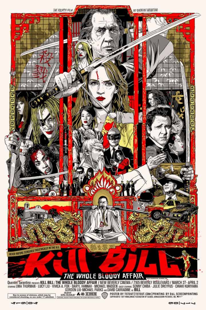
Even with how loose your line work can be your overall designs feel incredibly tight. Your ‘Kill Bill’ design is so dense with detail, yet divided with the placement of the swords and the red bars that it doesn’t feel cramped. How much prep work do you do before you begin a poster? Do you leave yourself room to get spontaneous or is it pretty rigid work?
It’s pretty spontaneous at first, during the idea phase, the sky’s the limit. Then as work progresses it gets narrowed down and narrowed down, until the focus is pretty specific – trying to match up what I’m envisioning to what is actually happening on paper.
Prep work varies from project to project, I try to keep it to a week, otherwise, I’ll just think about something forever and never start it. Or things can stretch on forever. The best jobs are the ones with deadlines coming up quickly, where you know they’ll be happy with whatever you do, so you don’t worry about things getting approved or not. My way or the highway.
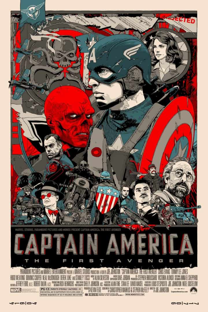
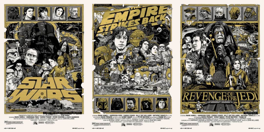
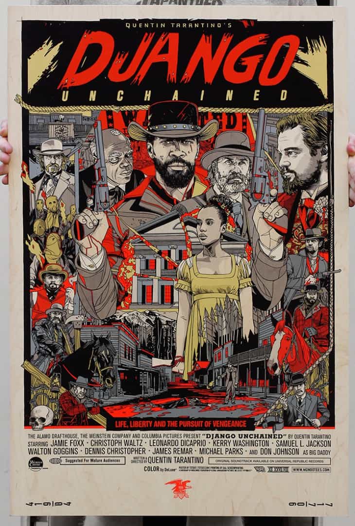
There’s an art gallery in my area that has one of your ‘Captain America’ prints going for a bit over $600. On eBay, your ‘Star Wars’ posters are going for over $2,000 for the set. Not to mention the quick sell-outs of your posters from Mondo. I was unlucky on Oscar night in my attempt at snagging one of your ‘Django Unchained’ posters. It’s an awesome position for you to be in, but what type of pressure does that put on you? How do you start a new project knowing that it will sell out in minutes?
I try not to dwell too much on money thoughts, I was kinda raised in a family that didn’t put as much value on money, my parents and grandparents were always very giving to other people, never holding onto money. My satisfaction comes from completing jobs, money is nice to pay the bills, but don’t think it brings long-lasting satisfaction.
I’d like to think that once I stop finding the work satisfying, creatively and mentally, that’d I’ll switch to something that was, whether that’s teaching or working at a sign shop or something like that. My main pressure now is the pressure to take the piece as far as I can, and not turn in work that feels rushed or subpar. It might not be great to others, but if I consistently was putting out work that I personally felt was mediocre, that would be unbearable.
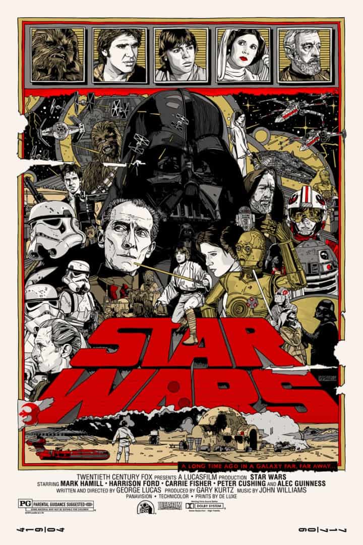
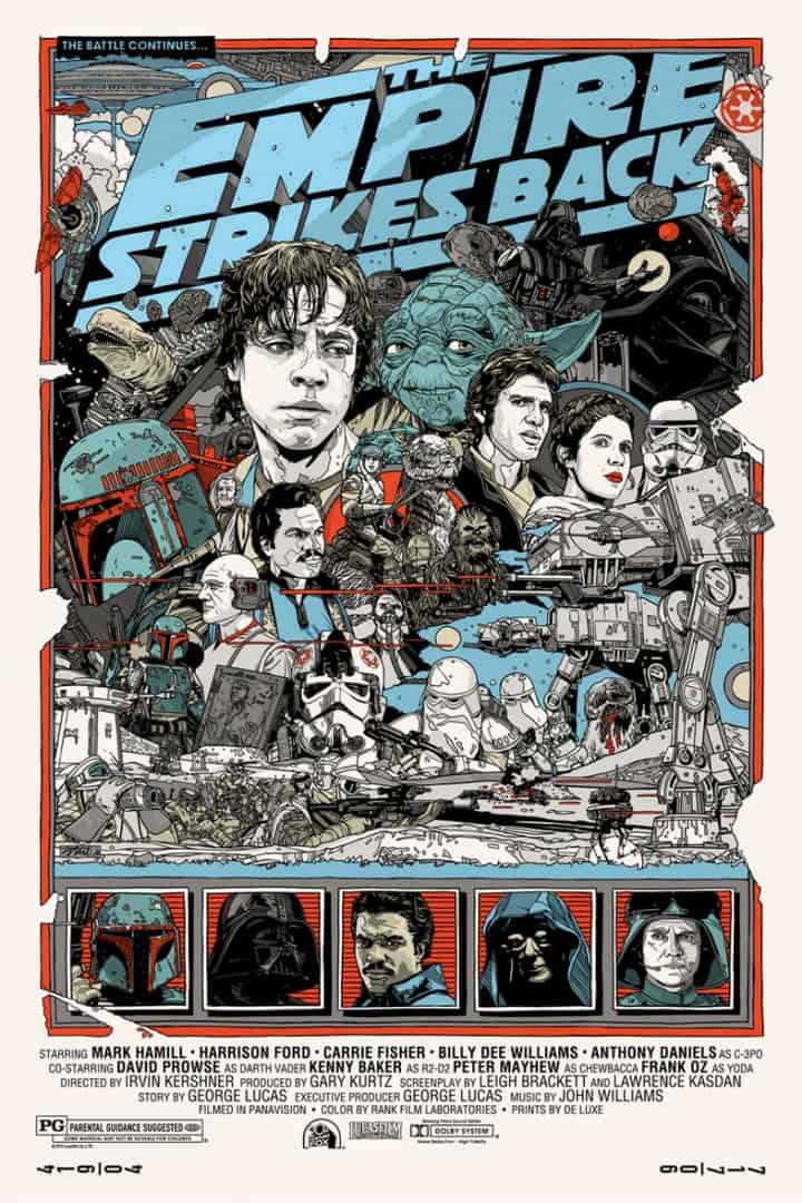
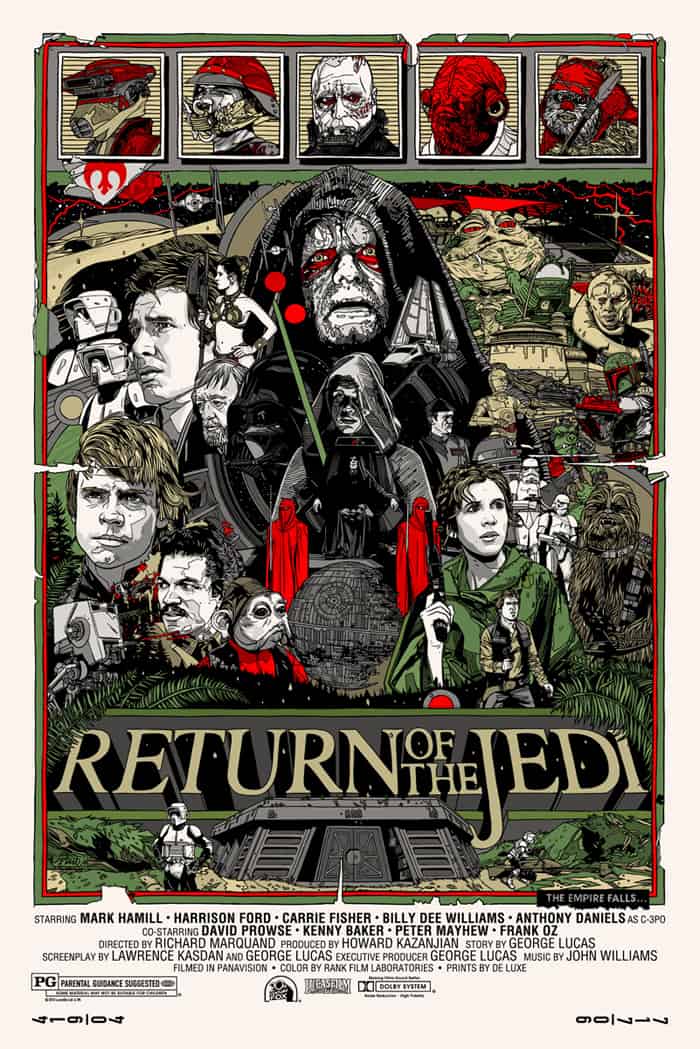
Your work has kinetic energy to it – an excitement captured. Looking at the ‘Star Wars’ set, they have a thrill to them, like you were eager to get in everything that you love about the films in one page. The same can be said for all of your posters.
When working on a poster for a film, how do you decide what to leave in and what to leave out? Any characters that you just couldn’t fit into a design?
It’s kinda just one foot in front of the other, just keep walking the path on a project, and at the end you turn around and think, ‘man, maybe I put too much into that one.’ I don’t have a final vision when I start, I’m always surprised to see what the final piece ends up like. When you’re working with an iconic movie though, there’s certain things that come to mind, and it just comes down to me thinking ‘Would I want to see that on the poster?’
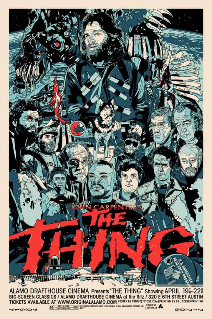
One of my absolute favorite posters is your ‘The Thing’ print. You totally captured the story of the film. The creature itself is placed in the background, sneaking beyond the characters it will eventually kill. Drew Struzan’s original ‘The Thing’ poster is iconic. How much was the original poster in your mind when you were working on your version?
Do you feel the need to compete with the originals when it comes to ‘The Thing’ or the ‘Star Wars’ trilogy?
I really try to not focus on the previous posters, since at the end of the day they all blow my posters out of the water. I can’t compete with Struzan or the Hildebrandt brothers, I can only watch the movie and do something that I feel represents it. Not to say I don’t find the previous posters awesome and inspiring, of course, I do. But also super intimidating.
You’re incredibly level-headed when it comes to some things that would totally stress me out — like doing ‘The Thing’ or ‘Star Wars.’ I’d be too focused on comparing myself to those and totally give up and shut down.
Ha, yeah, it’s easy to stress things too much, I just have to kinda start small, build on that.
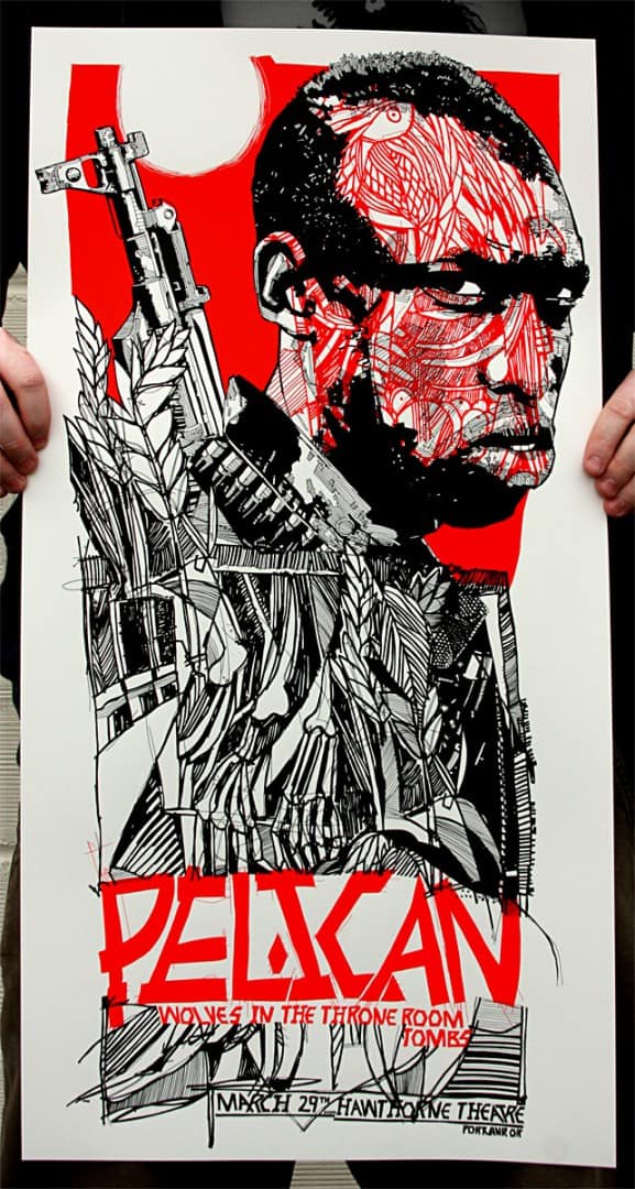
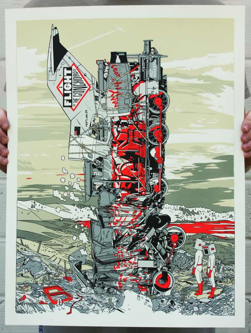
The folks that have only seen your Mondo posters are missing out on your band and concert posters. Those show off a wide range of styles, that don’t necessarily make it into your movie work. Do you approach a poster for a film differently than you do for a band? Does one offer more freedom for you?
I think I have a bit more freedom on a music print. It’s more open, in terms of interpretation, subject matter, etc.
Do you enjoy the printmaking process? Are you a fan of doing your own screenprinting? Have you tried your hand at any other printing techniques – like etching or lithography?
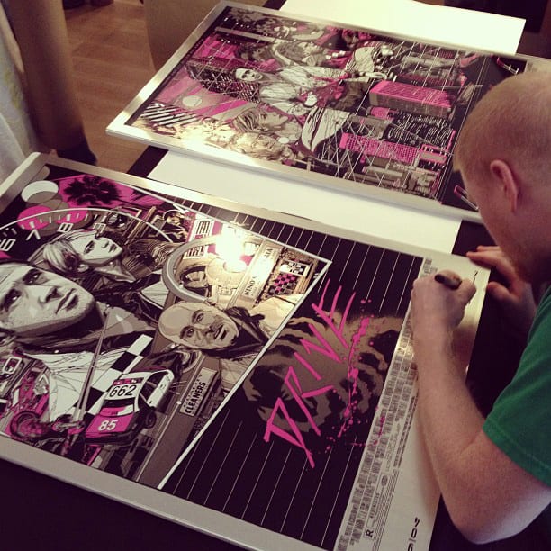
I do enjoy printmaking and screenprinting in particular, I started in college, printing my own stuff. Nowadays I don’t do as much, it’s been awhile since the clients I use all outsource to other printers, but I would like to get back into it, putting out some smaller stuff that I print myself. I haven’t done much etching though, mostly screenprinting, some letterpress.
You seem to be always working on something. If it’s not a poster then it’s a t-shirt, sticker, or some other type of work. Do you ever take the time, or even have the time, to sit down and work on something that doesn’t have a client attached to it?
I need to do that more. I try to sketch every night, watching TV, or just relaxing. But most of that is personal stuff, nothing work-related. And nothing good as far as that goes, but fun for me.
Have you always worked freelance? Have you ever done in-house design work?
I have indeed, I was a designer at a company called Jager Di Paola Kemp Design (jdk.com) for 3 years, out in Vermont. A fun place to work. Plus I worked for my brother in law at a place called Copious Creative (which is Latin for ‘Very Creative’), I worked there for 2 or 3 years. It’s nice working with other people, going out to lunch, shooting the breeze. But my current life is all about working alone. In the dark.
You recently did a show at the Mondo Gallery in Austin with Ken Taylor. How did that come about?
Mondo asked and I said ok.
For some reason, I had some fancy ideas about how your show with Ken Taylor came about. Like, you two had been working on the idea for years and it finally came together. But it makes more sense that Mondo would just if you were up for it.
Nothing too fancy about that show, they just asked me and Ken and it worked out. He is a great guy though, for sure.
You’ve done gallery work, advertising, film, and music – where do you want to see your work go next?
I have no idea, knowing that would mean I have some sort of vision, some sort of long-term plan. I do not. I’ve pretty much fallen into this current life I live, and I could easily fall out of it as well. Hopefully not literally, while climbing or something. But it’s been fun so far, my life is very full and I am very blessed. I could lose some weight though. Who couldn’t? This sedentary lifestyle, man. The silent killer.

5 thoughts on “Energy Contained: An Interview with Illustrator Tyler Stout”