My life exists primarily on the computer. Communication happens on a series of digital screens. Entertainment. Information. There are still books and magazines, of course. Beyond the words on the page, there is craft to the layout of letters. There is art to how the reader relates to, and interacts with what they are reading.
I prefer small paperbacks that fit in my back pocket. White pages with enough clean space to keep my eyes strong and loose in my skull. On the illuminated screen of my laptop, eyes grow tired from the constant and steady pulse of light. Tablets lack the tactile flesh of rolled magazine. The scent of paper. The ability to toss around a book, worry free. Online there are endless scrolls. Links. Ads. Pop ups. ‘Click for More.’ Desktop to laptop to mobile, design shifts. You fight to read.
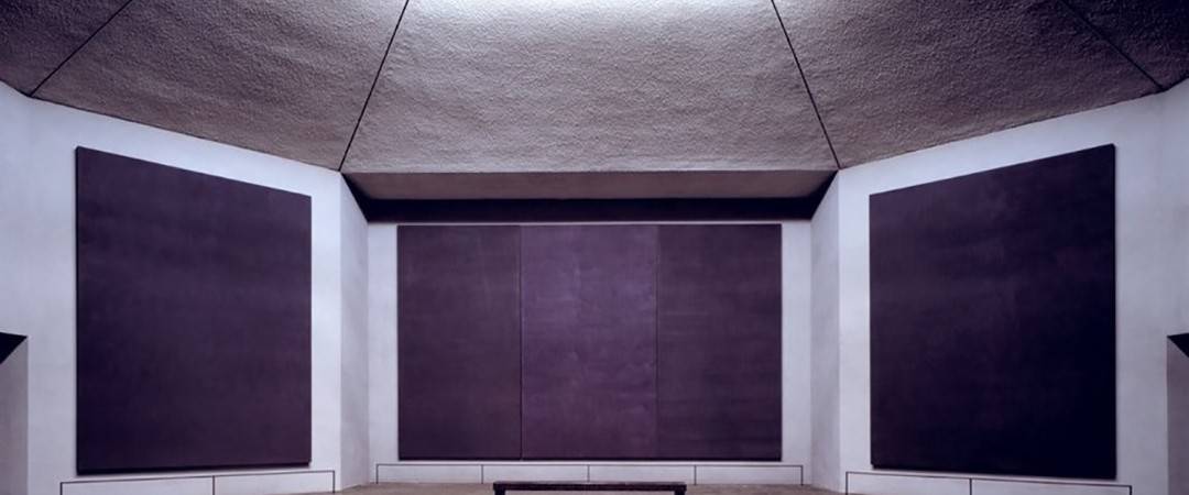
A printed page can work the words to ease the stress of the reader’s eye and a page in a book can also be visually appealing even beyond the words and their meaning. A Rothko-esque canvas of paragraphed space.
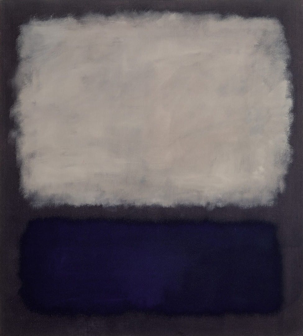
‘Blue And Gray’ by Mark Rothko

Page 5 of Francoise Sagan’s novel ‘ Bonjour Tristesse’
This page is from Francoise Sagan‘s 1954 novel ‘Bonjour Tristesse‘, a HarperCollins book designed by Cassandra J. Pappas. This is page one of a one hundred and thirty-page novel, a book roughly five inches by seven inches. The font is a dark steel blue on matte white page. The amount of white space that heads the page pushes the reader’s eyes down through the white to the title ‘ONE‘ that is printed in the center of the page to balance the eyes before they hit the first paragraph.
The viewer has a lot of clean negative space to draw the focus easily into the first paragraph. The letters are loose with a lull of white between each word. One critique of this page is that the empty space between the paragraphs is too large. The time it takes the viewer to get from the last word of the first paragraph to the first word of the second paragraph, it appears that these paragraphs are two separate thoughts and not a continuation of a thought. It could be argued that this brief pause is necessary, it gives the reader a breath before the eye hits, ‘That summer…’ It’s only an aesthetic issue I take with it, not one of content.
To steal an example from a far more insightful man, I turn to animator John K‘s love of ‘Yogi Bear.’
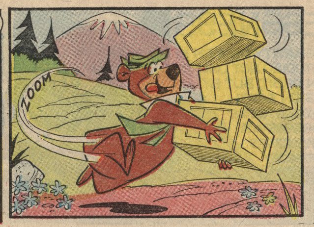
Hanna Barbera’s ‘Yogi Bear’
In the above panel from a ‘Yogi Bear‘ comic we can immediately discern that Yogi Bear is where the artist wants our eyes drawn. He is at the center of the page and the white motion lines connect him from the background to the foreground. His brown coat pops against the pale green of the grass floor. The yellow crates in his arms push down on him, tipping from the right of the page and the top. It’s a simple drawing, an obvious set up, but one that can also be applied to the written page.
Opposite of the clean space of Sagan and Yogi Bear is this page from Ayn Rand‘s novel ‘Atlas Shrugged.’

Page 672 of Ayn Rand’s ‘Atlas Shrugged’
This paperback edition of ‘Atlas Shrugged‘ is full of densely packed type. As soon as the book is turned to this page, the eye is drawn to where you find the only clean break in the page where it reads, ‘I swear by my life…and my love of it…that I will never live for the sake of another man…nor ask another man…to live…for mine.’
Beyond being a stilted and melodramatic moment of monologue, it acts as a spatial release from the solid masses of type above and below it. It gives the eye something to look forward to and if the writer hasn’t done their job of crafting interesting writing, it gives the viewer something to jump to, skipping the prose that came before it.
As readers, our attention is always compromised. Life happens around the book, the one constant. As writers Sagan and Rand are on the opposite ends of the spectrum, the end product of both authors are of equal merit. Their intent lead the way for their style, the narratives that were being told grew the flow of words. Neither is right or wrong in the layout of text, it’s about the final result — a strong visual experience for the audience while they’re absorbing information. Success lays within each reader.
![]()
Was surfing around some writing blogs and found yours…nice post! I think we are still in the infancy of making things easy to read electronically. I think any computer monitor is good for one page and that’s about it. And I also get the “interrogation feeling” of staring into a bright light on any device.
Also will check out John K’s blog, miss him from the Ren and Stimpy days of yore!
I agree, it is still in it’s infancy. I know technology will change (enhance or defile?) the way we ingest content, for me I haven’t found a happy place with it. Marvel Comics has an interesting approach of bringing their digital comics to life but even that, I still want the feel of paper in my hands.
John K is totally brilliant – check out is site! He also has a blog dedicated to his thoughts/drawings from his Hanna-Barbera days – http://funkyhb.blogspot.com/