The gig posters of Texas-based illustrator Todd Slater go beyond simple advertisements for a night of rock and roll. The band’s name is there. The date and location. The facts that make up the event, but Slater bypasses the ordinary and creates an artifact that shines brighter than the memory of guitar and song.
Slater’s dedication to his role as illustrator is devout. This is his craft, his trade — and his commitment and focus are monk-like. Each concert is a chance to link the band and its music to the specific plot of Earth where they are performing. His gig posters are totemic in nature — visualizing the spirit-beast of each band, each club, and location. His posters mark the kinship between music, place, and audience.
His understanding of the printmaking process and the lineage of poster artists that came before him light the path, but Slater’s work is full cascade, barrelling through common thought of what a gig poster is and should be.

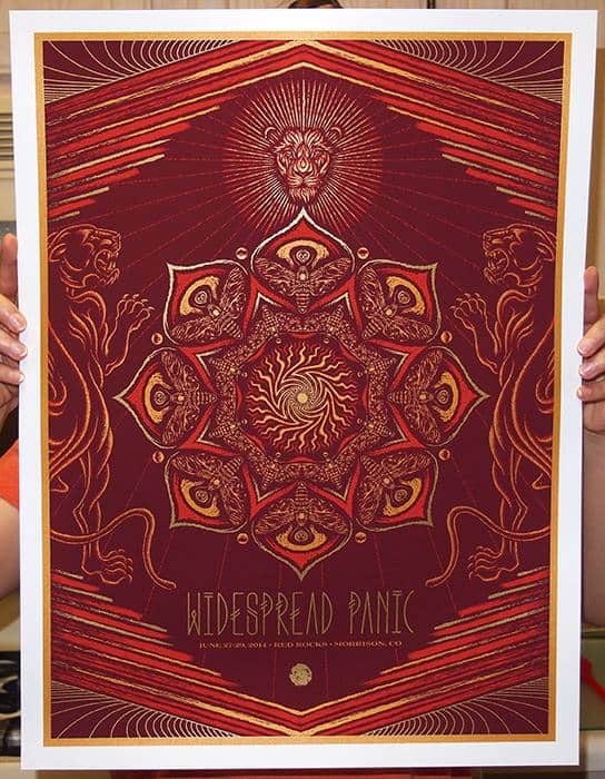
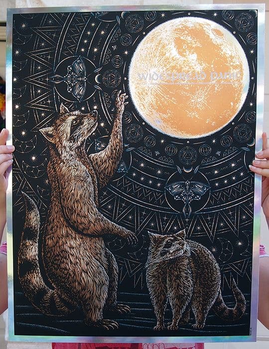
Widespread Panic gig poster for their Red Rocks performance by Todd Slater
Your posters are simply incredible. Each one goes above and beyond what a gig poster needs to be – which can be boiled down to creating an interesting image and the details of the ‘who, when, and where’ of the show. Something like your Widespread Panic at Red Rocks print is a fine art used as a gig poster.
Looking at your early work like the Death Cab For Cutie (Ghosts) gig poster from 2005, there’s a very ‘gig poster’ style to it. You’ve been at this for so long, can you pinpoint a moment of transition? Growth? I guess the real question is, when you sit down to work a poster – what is your main goal?
I think the moment of transition corresponded with the rise of Mondo. The screen-printed world I existed in went from 3 – 4 color 18″ x 24″ prints to seeing 10 – 12 color 24″ x 36″ prints that were densely illustrated. The work they put out was a game-changer for us all and ended up altering the expectations of a gig poster.
I know very little about baseball but a good way to explain this change might be to look at Mark McGwire and Jose Canseco in the ‘80s versus the ‘90s steroid era. The prints in our scene all went from being pretty modest in colors and size to suddenly getting really BIG in every way.
My goal is really to make images that are both mysterious and compelling to look at. I’m interested in growing and improving my craft but also know that ideas are more interesting than execution. At the end of the day, I hope people will notice the thought involved in each image over anything else.
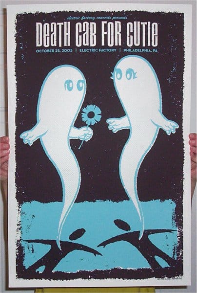
Death Cab For Cutie gig poster by Todd Slater
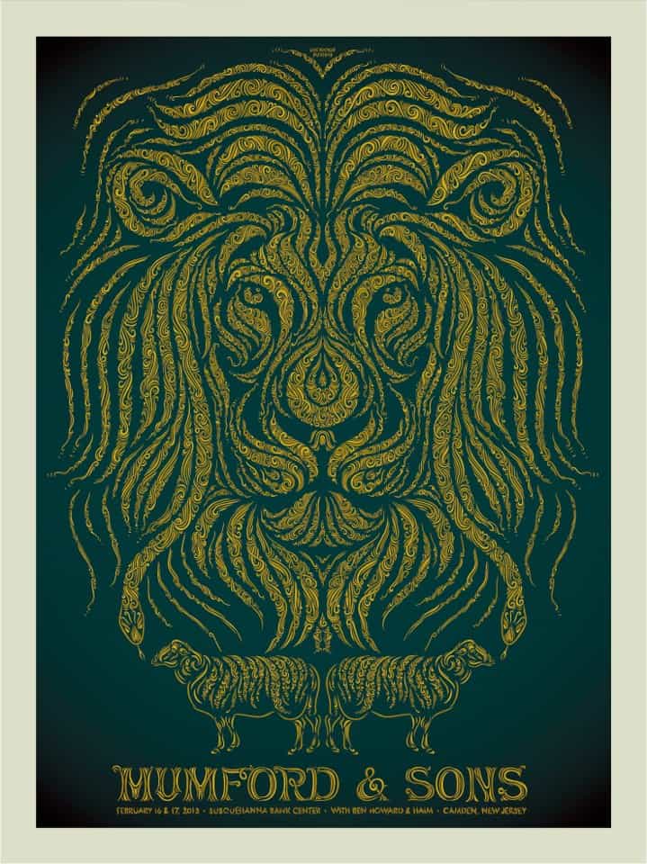
Mumford & Sons gig poster by Todd Slater
Your gig posters would be successful purely as art prints, but it doesn’t seem you’ve gone down that path much. What keeps you from doing art prints?
I think it’s a combination of a number of things. Deadlines keep me in check and I suspect I’d spend months on an art print. Gig posters connect to a wide variety of people. I’ve shipped a gig poster to virtually every spot on the globe over the last 10 years.
That being said, I’ve banked about a dozen ideas that are ready to go and are completely free of text. It’s just a matter of finding the time to execute them the way I want to.
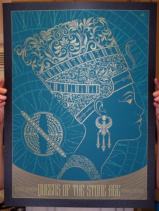
Queens of the Stone Age gig poster by Todd Slater
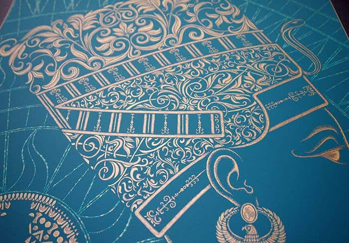
Queens of the Stone Age gig poster (detail) by Todd Slater
Your color palette and ink choices are brilliant. Something like your Queens of the Stone Age in New York print has metallic inks with an edition printed on black onyx paper and another on metallic copper stock. Getting to see it in person, that thing just shines.
These details seem like the decisions made by someone who understands the printmaking process and how to work the materials. Are you involved in the printing of your own posters? Was that ever a part of your role as designer?
I worked in a screen printing shop in east Texas (Tattoo Productions) when I graduated in ‘02 and that helped me understand the process of color separations, trapping, registration, and what would be doable for a screen print which is a limited medium in a lot of ways.
Despite coming from a remote area of the world I had a really excellent teacher for digital media while working in East Texas. I had a one on one internship with a guy named Dave Turton (The Graphic Library) who is the leader in creating stock illustrations for istockphoto.com amongst many other art ventures. He’s a rare talent and taught me a lot about the craftsmanship associated with art-making.
Strangely, this one screen printing shop in East Texas has had a long line of professional artists gracing its halls. Before myself and Dave worked there the art was done by Brady Smith who had produced a well known zine that circulated throughout east Texas chronicling his travels throughout the world. He exhibits his paintings worldwide and also acts. For reference, he’s the guy who says, ‘I’m like Magellan I’m so gellin‘ in the Dr. Scholls commercial. An additional footnote on Brady is that he married Tiffani Amber-Thiessen from Saved By the Bell (Kelly Kapowski!). Anyway, I spent countless hours combing through his old files at the shop, and seeing his singular style early on had an impact on me.
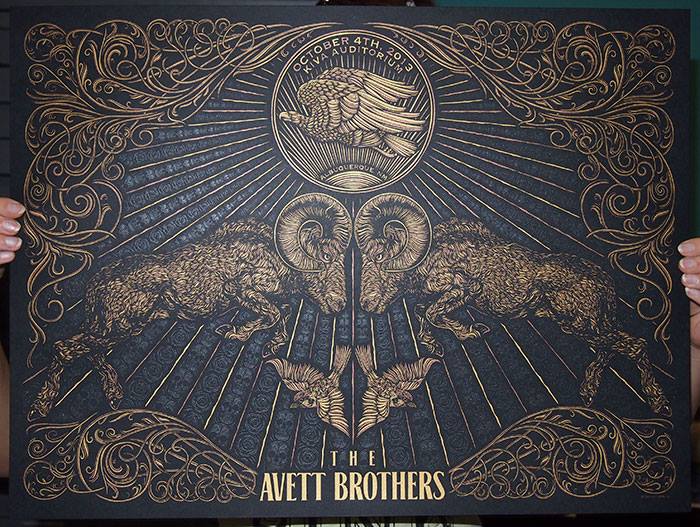
Avett Brothers gig poster by Todd Slater
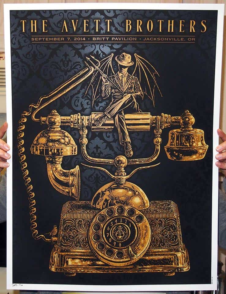
Avett Brothers gig poster by Todd Slater
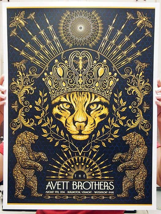
The Avett Brothers in Vermont gig poster by Todd Slater
Each one of your prints carries a story, an internal narrative that you’ve used to build the images from. For the Avett Brothers show in Vermont you used the theme of a queen bee as your starting point. The end result is a quiet epic – bees, honey, beers, royalty, and Vermont all coming to together in a satisfying way.
If anything is arbitrary, it’s the band itself — the Avett Brothers don’t have a role outside of playing in Vermont. For the Jack White show in St. Louis you did pull the concept from Jack’s performances. Is it important for you, or the band, that the imagery be a direct link the music of the band?
It is yes. However, I have learned that if the references to their music become too narrow or niche the image will fall flat to many buyers — I had to learn this one the hard way.
The Avett Brothers factor into the Vermont print more on a stylistic level. The illustration is both ornate and antique which I felt matched their feel. I also thought that because the band is made up of two brothers that I’d draw some parallels to the fighting that can occur over a woman with the two bears flanking the image left and right.
I also think about growing up and being surprised at what a band used for album art — most of the time the art for one album didn’t relate to the next one. To answer your question I don’t think the art has to be a direct link to the band, I just hope it feels right.
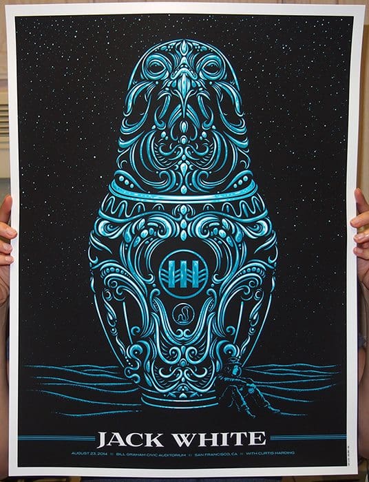
Jack White in San Francisco gig poster by Todd Slater
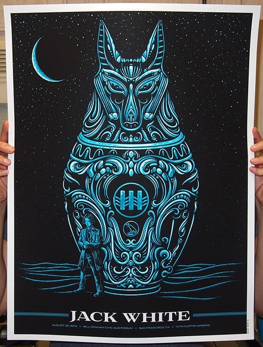
Jack White in San Francisco gig poster by Todd Slater
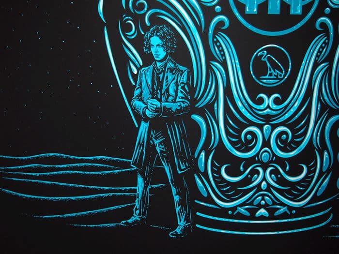
Jack White in San Francisco gig poster (detail) by Todd Slater
Your illustrations tend to stay away from any physical representation of the band, except for your two Jack White in San Francisco prints where you drew an exact likeness of Mr. White. Was this a decision based on your own internal plans? Are you averse to including images of the band, or really figures in general, in your posters?
I do make an exception for Jack, yes. His image transcends the music he makes. Some musicians are so singular in their vision that it can become difficult to separate the actual person from the music.
I feel this way about Morrissey and Elvis Costello as well. If I were to hang a print of any of those three in my home I would probably want some sort of portrayal of them in the print. I think that’s a good rule of thumb as an artist — to just do what you like and people will follow.
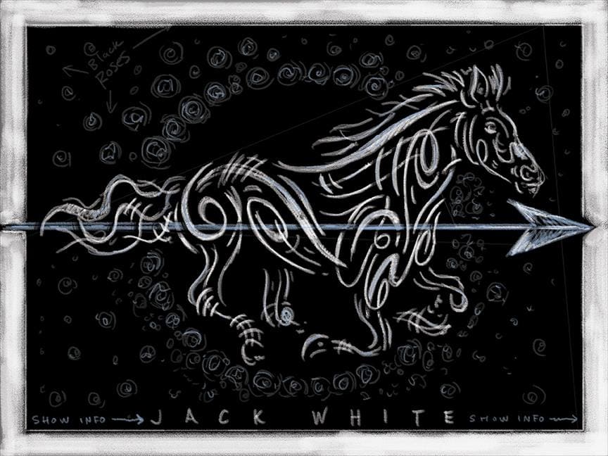
Sketch for Jack White gig poster by Todd Slater for Jack White & Rob Jones to review.
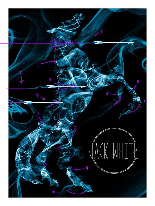
Todd Slater’s in progress Jack White gig poster with notes from Rob Jones
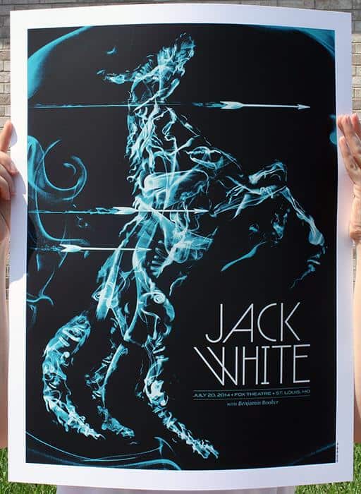
Jack White gig poster by Todd Slater
You’ve mentioned collaborating with Rob Jones on a few of your posters. For something like the Jack White posters for his San Francisco shows, is Rob acting as the creative director or are you going to him as a designer that knows the material really well?
It’s more of a free form conversation with a broad range of topics. I was struggling with some elements in the Dave Matthews print and he made some suggestions that were helpful so I decided to credit him on the print. For Jack stuff, Rob (Jones) is really hands-on. It helps that he’s an artist because he speaks our language and has an idea of how difficult a revision will be. If the revision is exceptionally taxing he can usually frame it up in a way that makes it seem feasible which is one of his gifts with regards to art direction.
He’s the art world’s bizarro version of Liberace I think. Or maybe the version of Mick Jagger he drew in his Electric Six print from a decade ago. If you’ve met him you know that’s him. Shirt off, well-coiffed hair, smoke in one hand, and massive electric eel cock in the other.
Yeah, that seems about right.
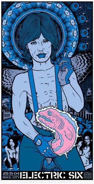
Rob Jones’ gig poster for The Electric Six
Certain bands have a reputation for having quality posters for their shows – Phish, Dave Matthews, and Widespread Panic come to mind – all bands you’ve worked with. Is there anything that makes a band more appropriate for your work?
I don’t think so no — those bands have just recognized what they stand to gain by selling a gig poster at every date. The bands that commission prints regularly are usually managed very well.
The ones you mentioned are well-oiled road machines who have it down to a science from multiple decades of experience. I’ve worked with a wide variety of bands in my 10+ year career and will try and make it work if a band comes to me.
Widespread Panic gig poser by Todd Slater
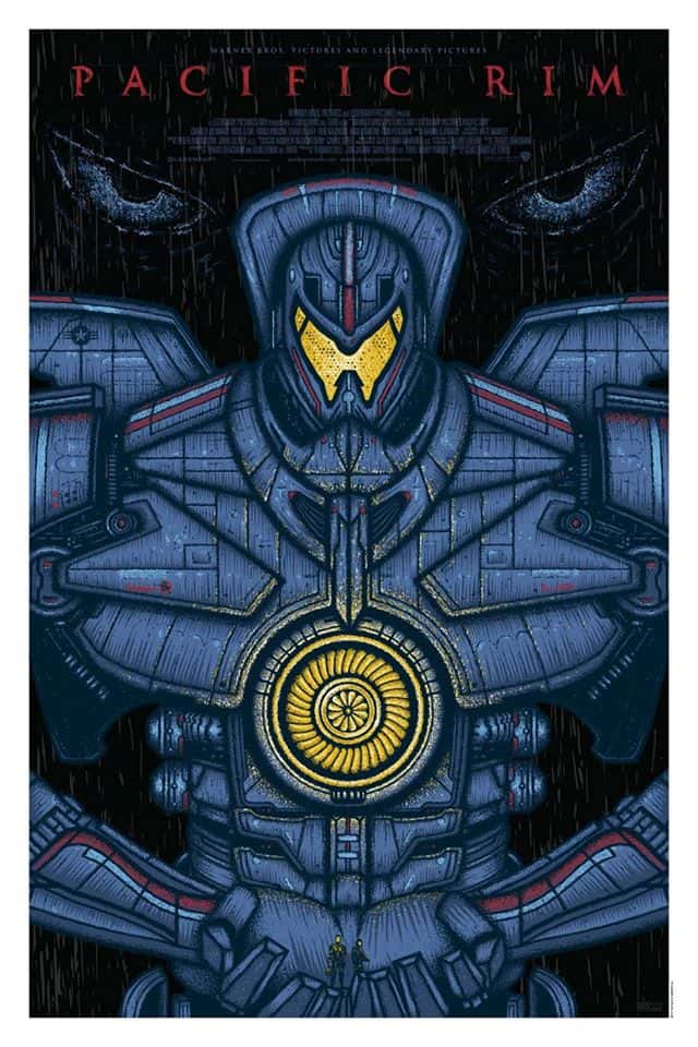
‘Pacific Rim’ by Slater
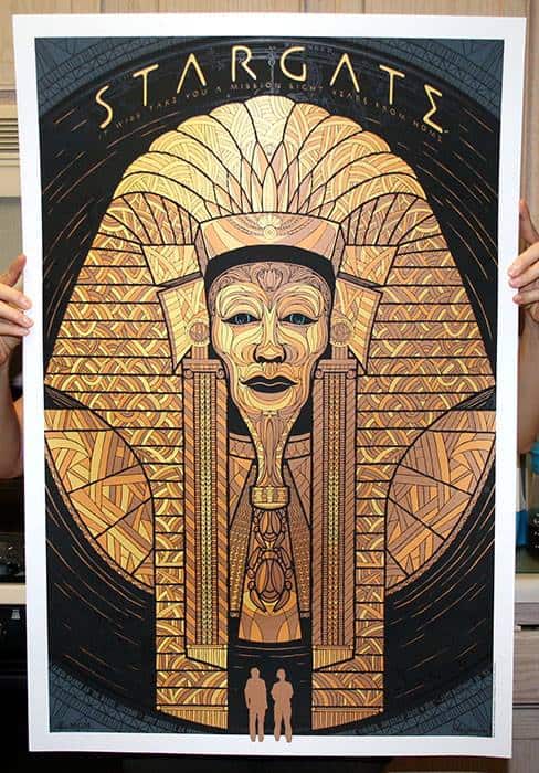
‘Stargate’ by Todd Slater
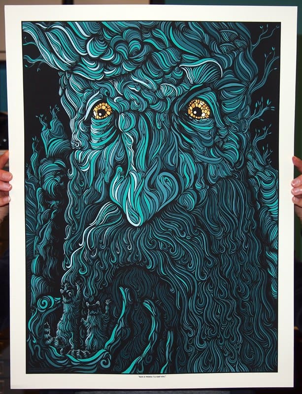
‘Treebeard’ by Todd Slater
The ‘Treebeard’ print you did for Mondo is one of the few film posters you’ve done. It’s a bit different than a gig poster since you are now illustrating an existing narrative with likenesses and visual style to reference, if not mimic. As much as it is evocative of the films, ‘Treebeard’ doesn’t feel 100% tied to Peter Jackson’s version. There’s a strong tone of Tolkien’s books in the design of it, but that could be my connection to the books over the films.
With ‘Treebeard,’ ‘Stargate,’ and ‘Pacific Rim’ you had a great run of film posters. Is that work you don’t particularly seek out as much as gig posters? Is it a different process?
The process for licensed work is much more restrictive. People are completely invested in the films and visuals that are already associated with them. My favorite film prints all radiate the essence of the film. I’m thinking about Ken Taylor‘s ‘Halloween,’ Martin Ansin‘s ‘Taxi Driver‘, and Laurent Durieux‘s ‘Jaws‘ as three personal favorites of mine.
I would say that I don’t seek out film work the way I do gig poster work because there’s only a handful of ways to reinterpret something that already has a set of visuals associated with it. There are hundreds of Jack White prints out there with a wide range of subject matter, but I don’t think I’d want to make another print for ‘Alien‘ or ‘The Thing.’ I LOVE both those films and the art around them excites me but I’m more likely to do one that hasn’t had multiple screenprints created for it already.
I’ve seen the private commission groups putting out some really interesting work and they’ve been able to dodge the pitfalls of licensing some. The Tomer Hanuka ‘The Shining‘ print is truly outstanding.
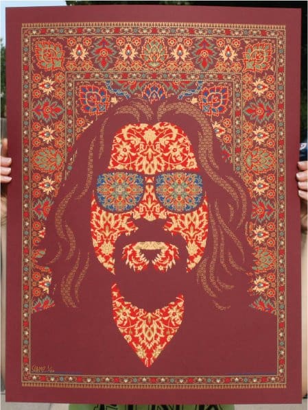
‘Big Lebowski’ by Todd Slater
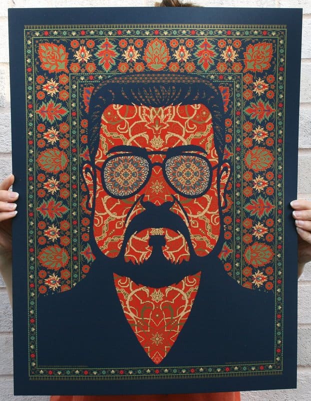
‘Big Lebowski’ by Todd Slater
When it comes to film posters, are you picky about what you take? Have you turned down opportunities?
I’ve turned down a number of licensed film properties this past year just because I felt the projects weren’t right for me. So yes, I am picky on what I take on for film gigs.
Newer films are particularly tricky because the response to them is so unpredictable. I also feel that for me personally I’m much more likely to hang a print of a film that’s been around for years versus a recent release. Something will come along that’s right for me. I’ll do another one soon.
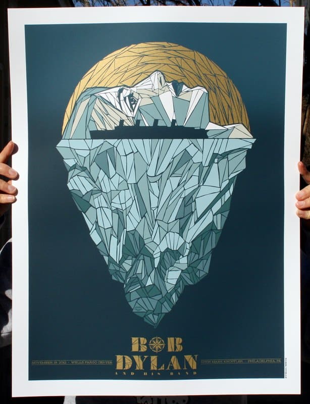
Bob Dylan gig poster during the tour for The Tempest by Todd Slater
Amongst your list of bands sits Bob Dylan, as close to an American legend as you can get. In your notes on that piece you mentioned staying close to his most recent album, ‘Tempest’ at that time, rather than trot out old Dylan visual cues. Do you run into pressure, internal or otherwise, when working with an artist of that stature?
It seems you had free reign to do what you wanted rather than abide by some Dylan rulebook, even referencing Jack White in the design. Did Dylan, or Jack for that matter, get the reference in the iceberg?
Several months after the show Jack emailed requesting a copy of the Dylan print along with a Hitchcock print I did for G1988, so it seems he approved on some level. I actually still had number 3 too which was nice to send him.
The brief for the Dylan job was wide open and I had just listened to the WTF podcast with Marc Maron where he described Tempest in depth and I suspect that informed my decision to focus on that album.
I’ve noticed that for many of us who make gig posters with regularity that the most common feedback we get is a one word email that says: ‘approved.’ Jack is one of the few artists I’ve worked with who directly approves every image with his name on it. Many times it’s a third party merch company or a road manager who gives the approvals.

Jack White gig poster by Todd Slater
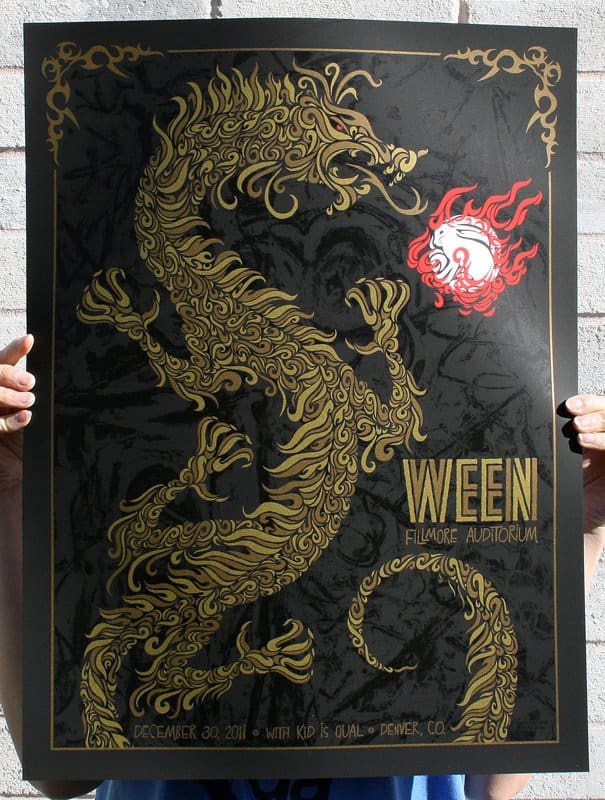
Ween gig poster by Todd Slater
Have you become used to the fact that a band or artist responds simply with an email saying ‘approved’ and a check in the mail? You have an incredibly high caliber of work — In terms of art as fun versus art as career, do you think you’ve found a comfortable spot where you can create what you want and make a living, without much compromise? Is there something out there that you’d love to try your hand at next?
I should clarify that some bands do really nice write-ups when I send the image in. Jack always lets us know when we’ve made something he likes. Ween’s management were really good at letting me know too. The Avett Brothers are really nice to say kind words as well.
I am lucky that there isn’t a lot of compromise in what I do. I do have revisions to make on various projects but it’s minimal. I am fortunate. What I really want to try is making art without text or written information on it with more regularity.
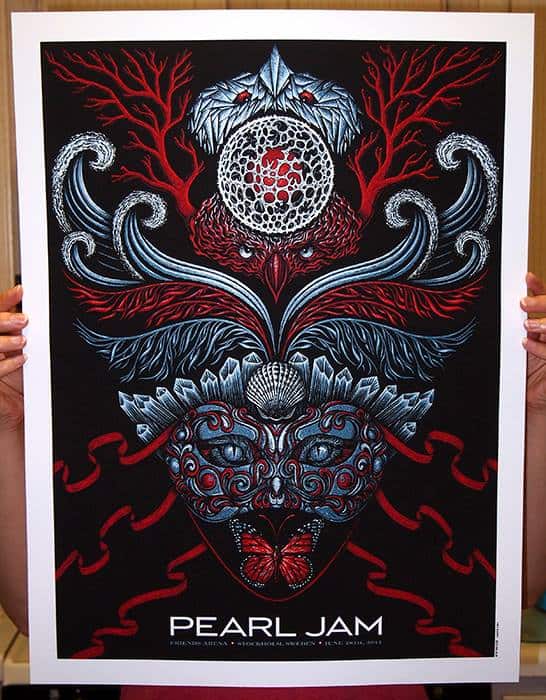
Pearl Jam gig poster by Todd Slater
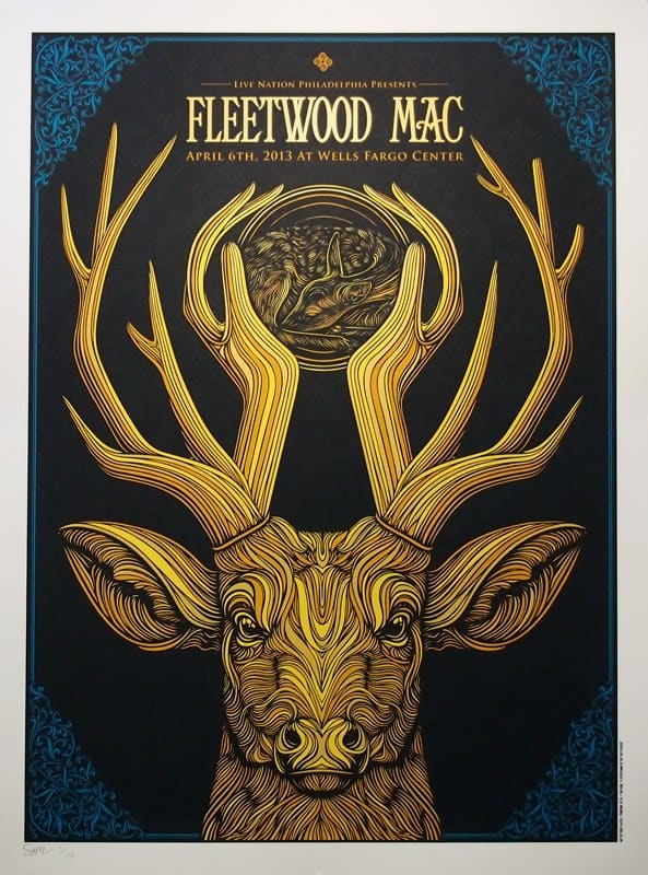
Fleetwood Mac gig poster by Todd Slater
Your text is already pretty light — in your Queens of the Stone Age in NY print the band’s name and show information is minimal, but still tied to the overall design. The clock face you included plays more into the band than the text. Would it be possible to make a gig poster minus all text? Just visual cues to the band and location?
Absolutely yes. I actually think we are heading closer and closer to this with every year. Once these stopped being used to actually advertise the show and sell tickets all bets were off.
I think the less these look like advertising the better. Rob and I talk about this a fair amount and you can see that he’s really embraced minimal text in his recent work as well. If I could communicate who the performer is and where the show is at without words that would be brilliant.
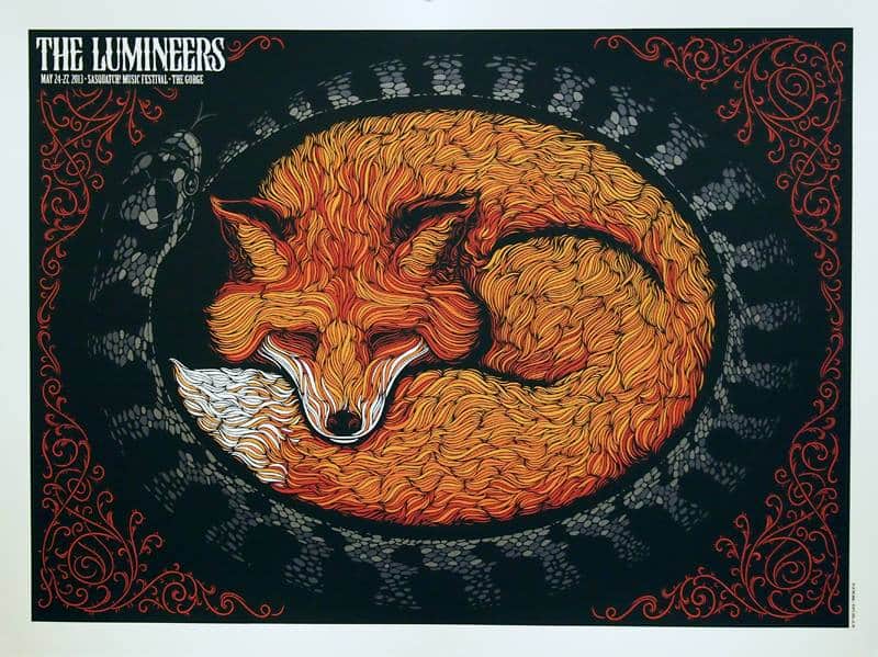
The Lumineers gig poster by Todd Slater
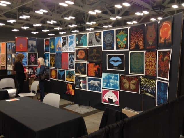
Todd Slater’s live event booth set up.
You regularly have booths at poster events like Flatstock, and you were the only gig poster artist in a sea of film posters at MondoCon, which seems like quite a feat.
As a fan getting to see your prints in person at Flatstock was a highlight, but for you what part do live events play? Are they an important part of the job or more trouble than they’re worth?
It’s really hard to say because I have no idea how many people discover me at these things. For me, the event was in Austin which made travel convenient so I did it. I would say that my time is best spent working on new art versus selling existing art.
That being said, getting out and seeing nice people who like what I do is inspiring. I always feel good after these things. They are overwhelming but seeing people respond to something I’ve made in person is always a thrill.
With tight deadlines and the nature of freelance work being that you can’t count on the next job, how do you manage to create amazing work consistently at the level you have while also being a husband and father? Do you and your wife keep any hard and fast rules on how your time is spent?
With three kids work sort of has to be first for me. I’m lucky to have a wife who understands and supports me and what I do. In a way I’m sort of grateful for the pressure of deadlines because it ensures that I’m being productive at all times. I also work from home so I’m always here but not always ‘present’ and in the moment, which is something I often struggle with.
I don’t have any set amount of time to spend on each project, I just work until it’s finished or until the printing deadline is upon me. I think every artist gets a sense when a project is in it’s completed state.
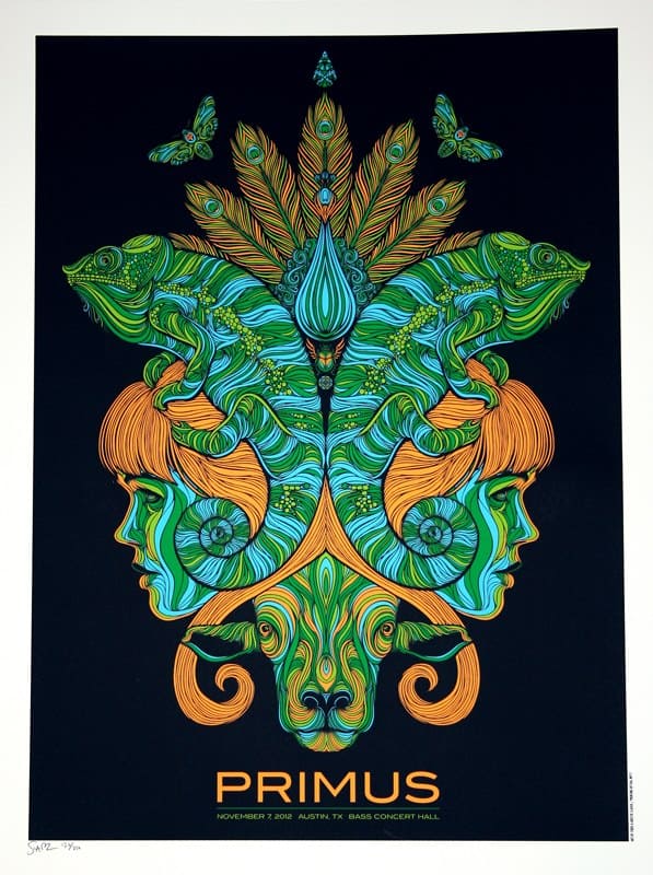
Primus gig poster by Todd Slater
