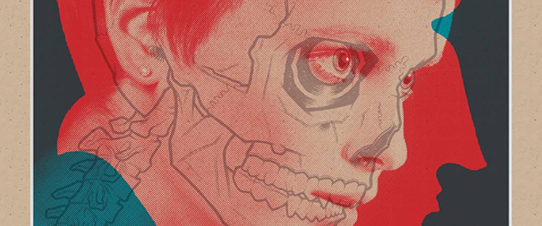
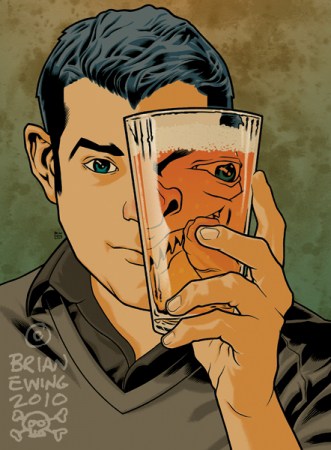
The work of a gig poster is to tell the potential audience the facts of the event. Bands involved, date, place, and time. If at all possible make it interesting. For illustrator Brian Ewing, the job of a gig poster is an opportunity to explore his visual loves of skulls, monsters, and girls.
Ewing’s world has the midnight glow of city clubs and damp alleyways where you can hear the chug of guitars from the neon-lit sidewalk. His work is evocative of a specific experience, an evening spent drunk and shouting along to the band killing on stage.
Ewing’s rock poster vocabulary is professor-like. An engaged fan and observer, Ewing is well versed in his artistic lineage and fills his work with droplets of history, noting gig poster artists like Coop and Frank Kozik. He keeps true to a workman’s ethic — anything to get the job done. This has turned out some incredible posters for the likes of Dropkick Murphys, Bouncing Souls, Faith No More, and Queens of The Stone Age. The list continues, an epic scroll of names. His catalog is an encyclopedia of modern rock and Ewing’s posters are ever-growing and evolving.

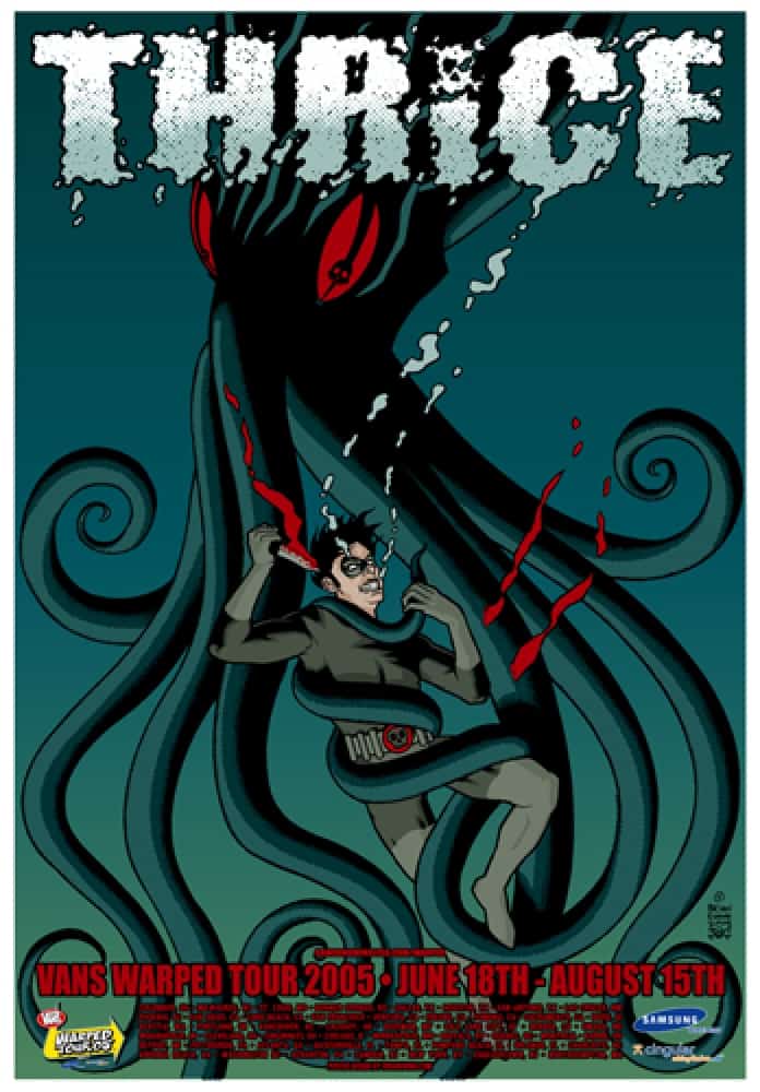
Brian Ewing’s gig poster for a Thrice performance during the Vans Warped Tour
ETDC: You created an incredible body of work with the folks of the Warped Tour over the course of six or so years. When working steady with the same client for so long did you have free reign to create what you wanted? How close did you work with them on something like the posters for Thrice or Less Than Jake? I’d imagine they had some say in the size and location of the corporate logos, but were they involved in any part of the design?
BE: Actually it was 8 tours total in the past 10 years. Holy crap! I actually had to look it all up. I had forgotten. Not trying to get too full of myself with the first question. (I was saving that for the third or fourth question when I start making shit up so my life sounds more interesting…)
Yeah, I usually have free reign to do whatever. I remember the first year they gave me a list of bands (some I was familiar and some I wasn’t) and I just took the approach I was already using by just trying to illustrate the band. They weren’t too heavy-handed with the art direction, maybe just when it came to the logos. For some reason it’s bad luck to outline a logo in red. Who knew.
And yeah at times they would ask for, ‘the logo to be BIGGER…,’ but for the most part they felt I was familiar with the audience they wanted to reach. I always dealt with an agency or directly with the people who ran the tour. They were paying me – the bands weren’t. And as far as logos go…it’s the logos that pay for the tour. They pay the bands, the crews and they pay me.
For Thrice and Less Than Jake I had to convey comic books (Thrice) and toys (Less Than Jake). I basically did what I felt would work for both bands. The only suggestion from Thrice was to dial down the skulls so I hid extra ones in the image. LTJ was a no-brainer because their drummer — Vinnie Fiorello, had a toy company called Monkey Vs. Robot. So yeah that’s what I drew. Everyone loves monkeys.
Every year there was a theme. One year it was comic books, another toys and another tattoos. Stuff I was very familiar with. After they gave me the theme and a list of the bands I would then just try to relate it all together. I was very fortunate that they trusted me enough to not over-art direct me. They would also ask me to consult and suggest ideas when appropriate.
I worked on this year’s Warped Tour art with photographer Lisa Johnson. They called me and asked if I was cool with collaborating with a photographer. I started laughing and asked if they had seen the stuff I was currently working on. The final piece ended up being used as the main art for the tour and as store displays in every mall in America.
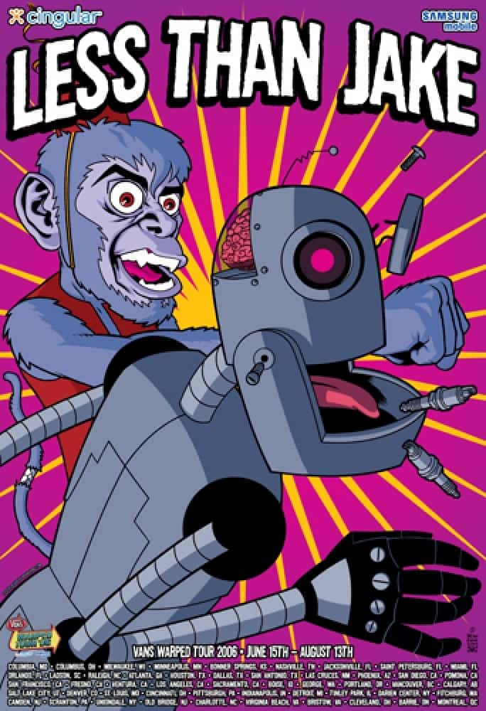
Brian Ewing’s gig poster for a Less Than Jake performance during the Vans Warped Tour
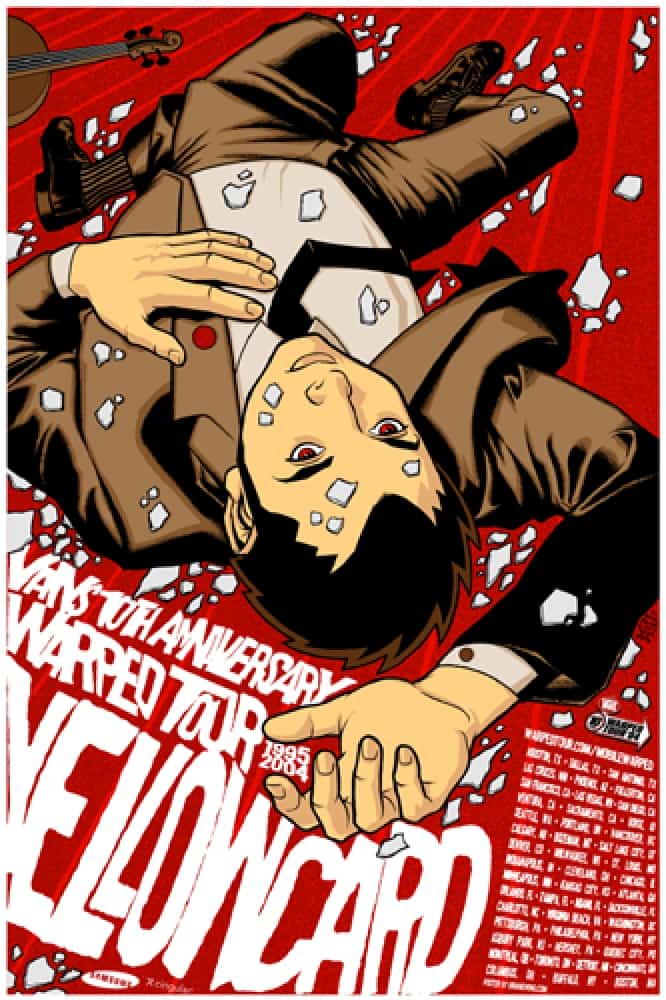
Brian Ewing’s gig poster for a Yellowcard performance during the Vans Warped Tour
You had a fifteen year-old boy’s dream job, as an employee of adult entertainment behemoth Hustler. From what I’ve heard it was a job you were happy to leave. Like any publication, Hustler has its own design style – font choice, layout, color palette, etc. Did working on the inside of that affect your own style? Is there Hustler art stank leftover in your early posters?
I guess I’d equate it to working at a donut shop. I love donuts! But if I were around them all day, five days a week they’d lose their appeal after a while. I applied half-heartedly thinking I’d never get hired. Actually I didn’t know it was for a porno mag. The employment ad just said ‘Adult Magazine’ I thought they meant GQ or Details. I sent them a sarcastic cover letter talking about how I had dropped out of art school and never had a drivers license or a college degree. Because of that they called me in for an interview. They felt that I was ‘Hustler material.’
I originally interviewed for an assistant art director job. I walked in with a manilla envelope full of folded xeroxes of my flyers and role-playing game illustrations. I had no idea what I was doing there. The lady I interviewed with, Sharon Ludtke, saw I had some promise and that I wasn’t freaking out with all the porn everywhere. We talked about the job for about twenty minutes then spent the rest of the time talking about music. She came up with all the bands in New York during the 70’s so she had some amazing stories. I owe her big time.
As soon as I got the job I lost it. They called me a few days after being hired to say that one of Larry Flynt’s family members needed a job so they gave him mine. Wompwomp. A few days later they hired me to work in production where I started laying out 1- 900 ads in the back of the magazines.
I left because it was creatively unsatisfying. I was hired to be groomed as an art director. But after six months there Sharon (the groomer) quit and that plan left with her. I was also freelancing for the magazines by doing illustrations for the regular and porno mags.
I thought I could still work my way towards being an art director especially since some of the assistant ADs didn’t know how to use Photoshop and would hire me to help out. After a few years I couldn’t advance so I split. I was never ashamed of the job. My name was in the masthead of every magazine. They asked if I wanted to use a pen name and I declined.
Actually some of the ‘Hustler style’ did have an effect on me. In a good way. I’d talk to all of the art directors whenever I had a chance and pick their brains about how they created ‘badges’ which were the titles for each photo spread. Or how they set up their files for the PMS spot color on the cover. Or why they never used illustrated covers.
I’d also have to handle artwork sent in for the magazines, people like Rockin’ Jelly Bean, The Pizz, Coop, Dan Clowes or S. Clay Wilson. So I got to ask the ADs about how they find artists and how they felt about the jobs turned in. I’d also show them the posters that I was working on at the time.
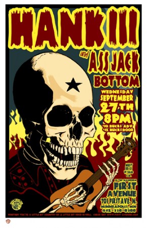
One of the ADs was Mackie Osborne and she worked on ‘Barely Legal.’ I had just finished a poster for Hank III and showed it to her. She hired me to do some spot illustrations for the magazine the next day. Which paid really well! When I quit she called me up and invited me out to Disneyland with her and her husband‘s band the Melvins. It was pretty rad!
I don’t think there’s a ‘stank’ leftover in my earlier work. I was still HEAVILY influenced by all the rock poster artists from the 90’s. Coop, Kozik, Pablo, Hess, etc. I really enjoyed their senses of humor and tried to inject that into my own work. Not sure how successful I was at it. The illustrations I did for the porn mags never really carried over into the poster work. Glad my mom never saw them…
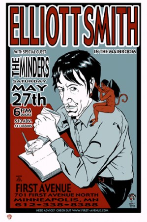
Brian Ewing’s gig poster for an Elliott Smith show
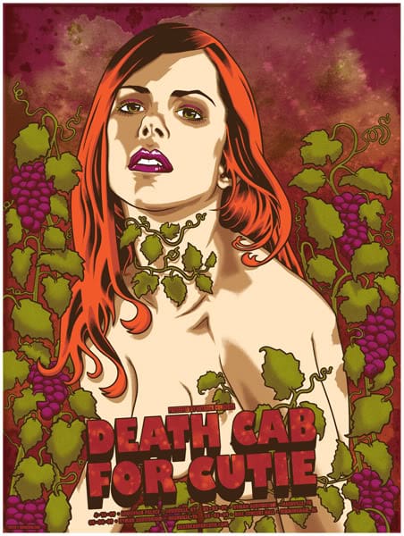
Brian Ewing’s gig poster for a Death Cab For Cutie show
It’s crazy to see the breadth of bands you’ve worked with – Cat Power, Elliott Smith, Death Cab for Cutie, and even the Black Eyed Peas make it into your catalog next to High on Fire and Queens of the Stone Age. Each has your touch, but there’s a variety from poster to poster. Do some bands lend themselves better to your style of work? If a band wanted you to create a gig poster for them but you didn’t find their music very inspiring, would you try to come up with something or just pass on the job?
Wow. Yeah, I forgot I worked with all of those bands. Fuck, I think I’m getting stupider…
I think some bands lend themselves to what I want to draw versus my drawing style. I dunno, I always tried to challenge myself. I had this idea of what kind of artist I wanted to be and what type of artists I wanted to draw like. I guess I still hold onto that. If the artists that influenced me can draw xyz subject really well then I want to get better at drawing that xyz subject too.
When I started working with the Warped Tour and all the emo bands were big I had no problem doing posters for them. They had budgets! Rock posters aren’t created to be fine art. I needs ta get paid. So if a band hits me up and actually has enough of a budget (to at least cover the printing) I will probably do it. As long as I think I can do a good job.
A friend once told me to make the job interesting even if it wasn’t and to inject my own interests into it whenever I could. So I would. I guess I don’t want to stay inside the rock poster bubble my whole career and never explore anything else I can do as an artist. That’s just lazy and self-sabotaging.
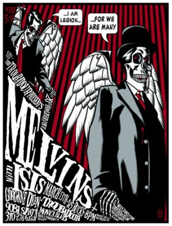
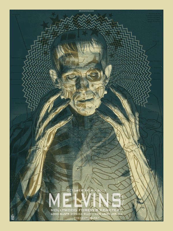
Brian Ewing’s gig poster for a Melvins and Isis show
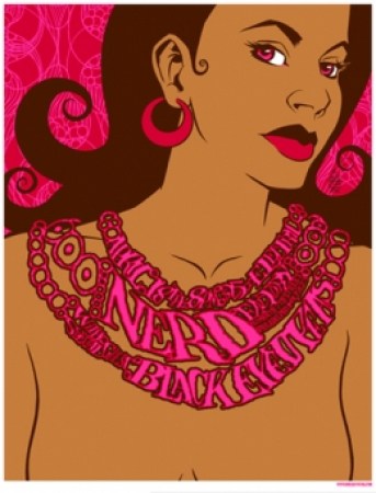
Brian Ewing’s gig poster for a N.E.R.D. and Black Eyed Peas show
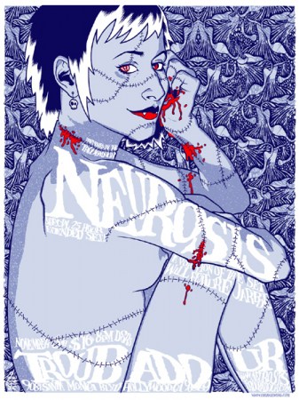
Brian Ewing’s gig poster for a Neurosis and Isis show
You’ve experimented with different text styles on your posters – there are some classic rock n’ roll fonts as well as some interesting offshoots of different styles. I’m thinking of the N.E.R.D. poster where the text is used to make up the necklace, or the Melvins / Isis poster from ’04. When it comes to gig posters you have the task of creating an awesome image but also have it be easily readable. Are you working text placement out at the sketch level? Deciding fonts and color?
In the beginning, I started out thinking about the text last. Ugh. I found that frustrating so now I start with a sketch and then tried to figure out how type would work with that. Color depends on how it will be printed. If I have a limited palette I’ll try to figure that out in the sketch phase too.
Rock posters were my art school. Still are. I was learning on the job and tried my best to improve (even if it was only 5%) with each poster. When I started I wasn’t very good at using type which was pretty obvious, but I learned from that.
I think I started trying out different ways to use text because I was also growing up on a steady diet of Gig Posters Dot Com. In the beginning, it was a young and creative place to be. It was a forum created by Clay Hayes as a way to catalog rock posters. Artists would hang out and show off their latest poster. It was a great environment because you could interact with veterans and learn a lot from a critique or a tutorial. I think we challenged each other through the work we were doing. I kept wanting to get better and to be open to try new design ideas. It was a very inspiring place at the time. That’s where Flatstock was born and what filled the pages of Paul Grushkin’s ‘The Art Of Modern Rock’ book.
Trying out new ways to use text was the result of being influenced by all the artists on GP. I felt like I needed to step my game up a LOT because there were all these other people creating great work. I was allowing myself to open up to more influences outside of comic books and rock posters from the ’90s.
Brian Ewing’s illustration for the Quay Brother’s film ‘The Piano Tuner Of Earthquakes’ for the New Yorker

Brian Ewing’s illustration for the Quay Brother’s film ‘The Piano Tuner Of Earthquakes’ for the New Yorker
Brian Ewing illustration for a Malcolm Gladwell article in The New Yorker
You’ve stepped away from the poster world a few times to do editorial work, mainly for The New Yorker, which I’d say is a pretty top of the magazine for illustrators. Was that work you sought after, or did it find you?
They found me through the rock posters. I never thought I’d be lucky enough to work with them or any of the other publishers that took a chance on me. Same thing with comic books. My first professional job in that area was doing the cover for Detective Comics #2323776. Then I did some ‘Nightwing‘ covers.
The New Yorker deadlines are brutal. Because it’s a weekly magazine they want jobs turned around in a weekend. But in the end it was always worth it because I got bigger jobs from people seeing that work.
I always wanted to be an illustrator. Nobody would hire me so I made up my own jobs by doing rock posters. I’m happy that the posters are now getting me regular illustration work.
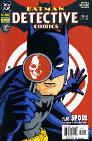
‘Detective Comics’ comic cover by Brian Ewing
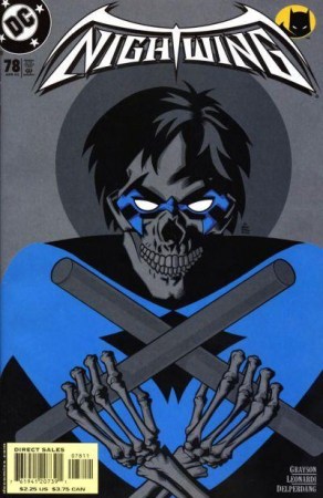
‘Nightwing’ comic cover by Brian Ewing
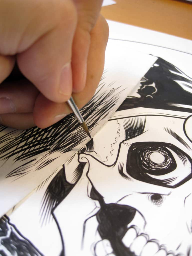
I’m a total sucker for process photos and videos and it’s interesting to see your work at the pencil and ink stage. You can totally see how there’s a special quality that you using analog tools gives your work. You could do the same thing with digital brushes in Photoshop, but it definitely makes the drawing come alive when your fingerprints are physically in the work. Have you been tempted to utilize digital tools more?
Dude, I wish I could go straight to digital but I’m not ready for it. All the drawing is done by hand. Then I do the type, layout, color, and pre-press on my computer. I have some inner conflict with going straight to digital. Some (not all) of the digital illustration out there is so lifeless or very badly done because the person is just tracing a photo in Photoshop.
When they hit a part of the photo that isn’t clear — you can tell because it’s no longer accurate. They could’ve at least photographed a friend in the same pose and filled in that gap, but they didn’t. I was at a friend’s place and they were showing me this new print they bought from one of the many 80’s movie-themed shows and I was amazed at how bad the ears were drawn. It dawned on me that the artist just traced the photo and couldn’t fill in the blanks from the picture. But hey that’s just me. They probably get more work than I do. My friend is pissed at me now because he sees all the mistakes I pointed out. I ruined that poster for him. I suck.
But then again artists like Brian Bolland have switched over to digital because his eyesight has gotten worse over the years. Which is common amongst illustrators. So for him to work digitally makes total sense. Or with Becky Cloonan. Her eyesight is fine (I think) but when we collaborated on a High On Fire poster she was in Ireland being awesome or something so she drew her art on a tablet and emailed it over. I couldn’t tell the difference from her hand-drawn work.
Sometimes people see my work printed and think it’s all digital. It’s funny to see or hear their reaction when I show them that I did it by hand and inked it with a brush. I post the process stuff so I have something to talk about on all my social media crap and also to answer some of the same process questions I get all the time. I wrote a tutorial so it would be easier to answer those questions.
I learned a lot about drawing by just observing so I really like seeing an artist’s process photos. I’m a huge dork. I also would geek out on artist interviews that talked about process. I feel like I have a few more good years left in my hands before I’m gonna switch. At least I hope so. I can’t afford a Cintiq right now. I wonder if I could ‘Kickstarter’ some hand insurance and get a tablet in the process?
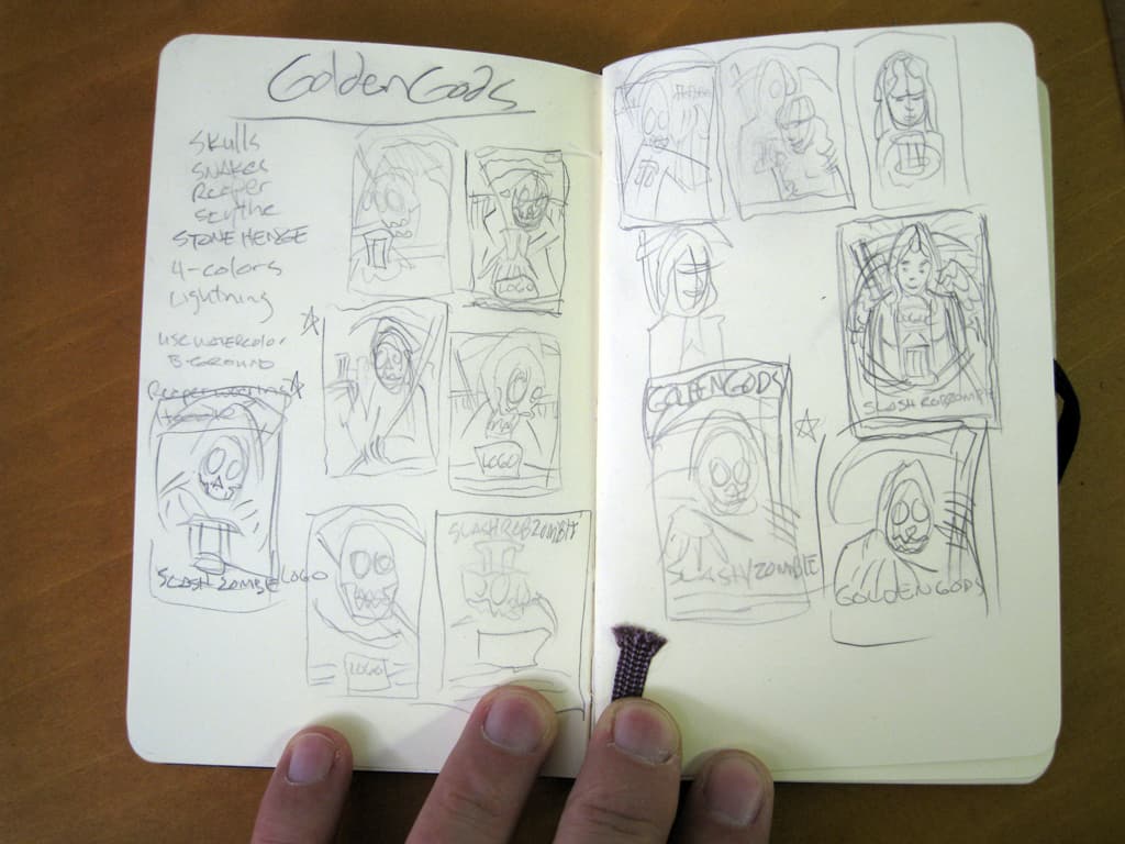
Process of Brian Ewing’s ‘Golden Gods’ poster
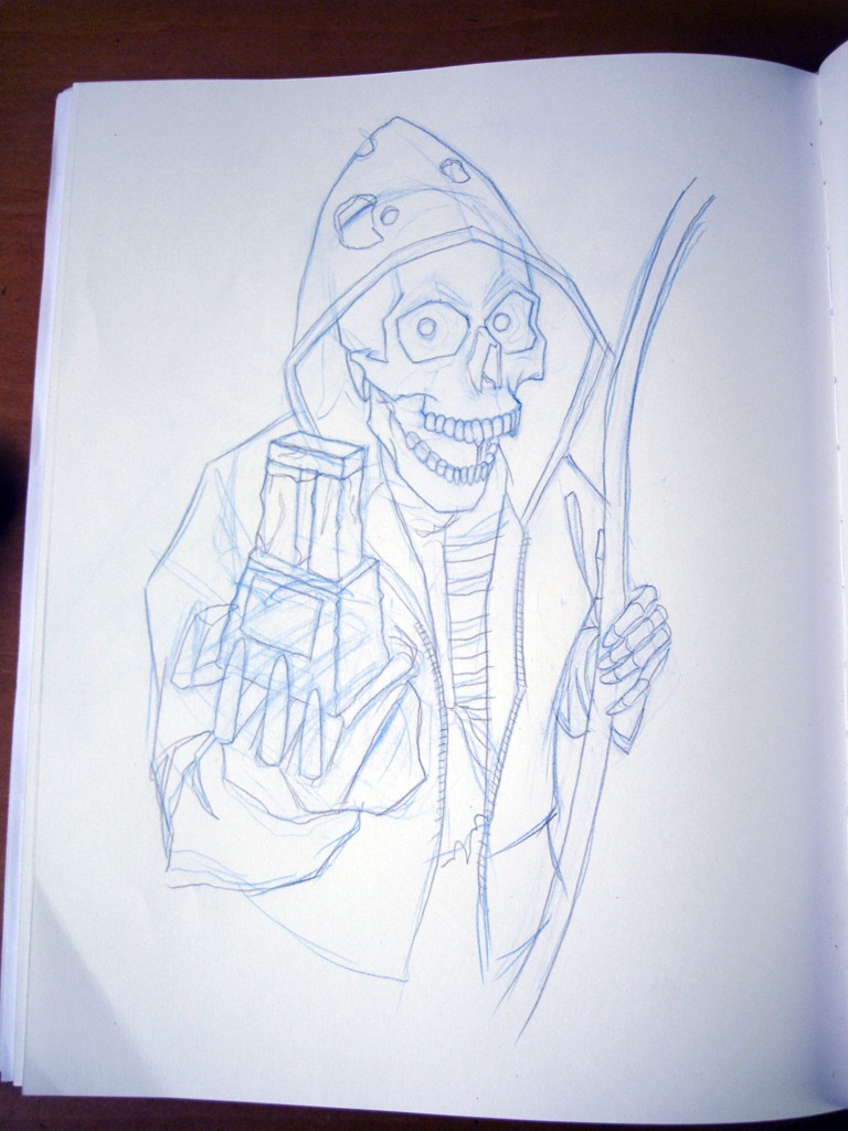
Process of Brian Ewing’s ‘Golden Gods’ poster
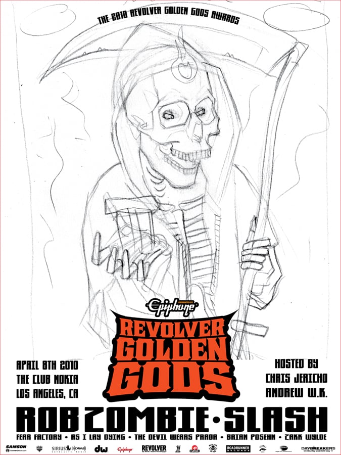
Process of Brian Ewing’s ‘Golden Gods’ poster
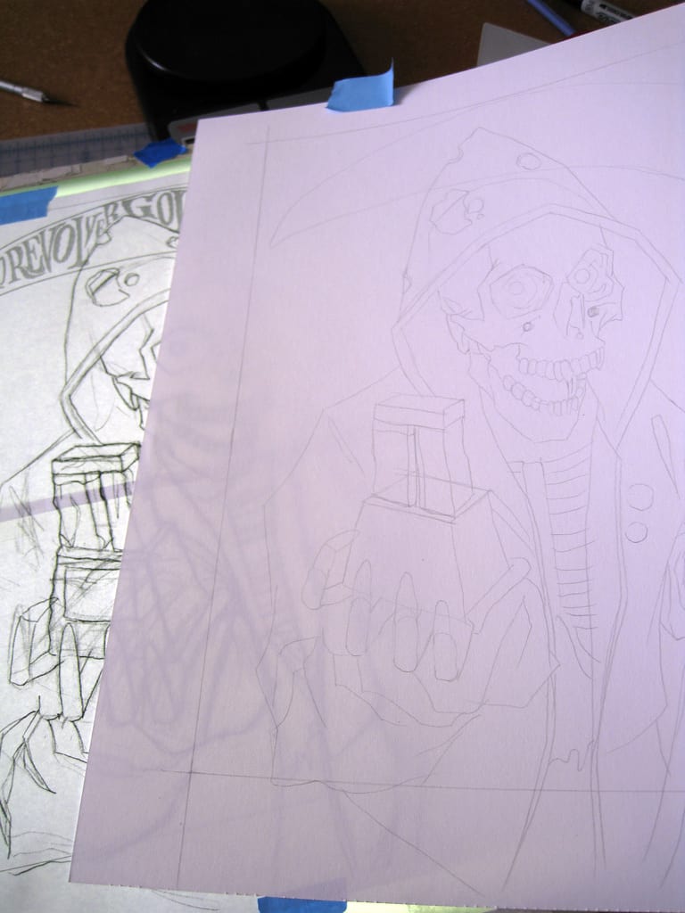
Process of Brian Ewing’s ‘Golden Gods’ poster
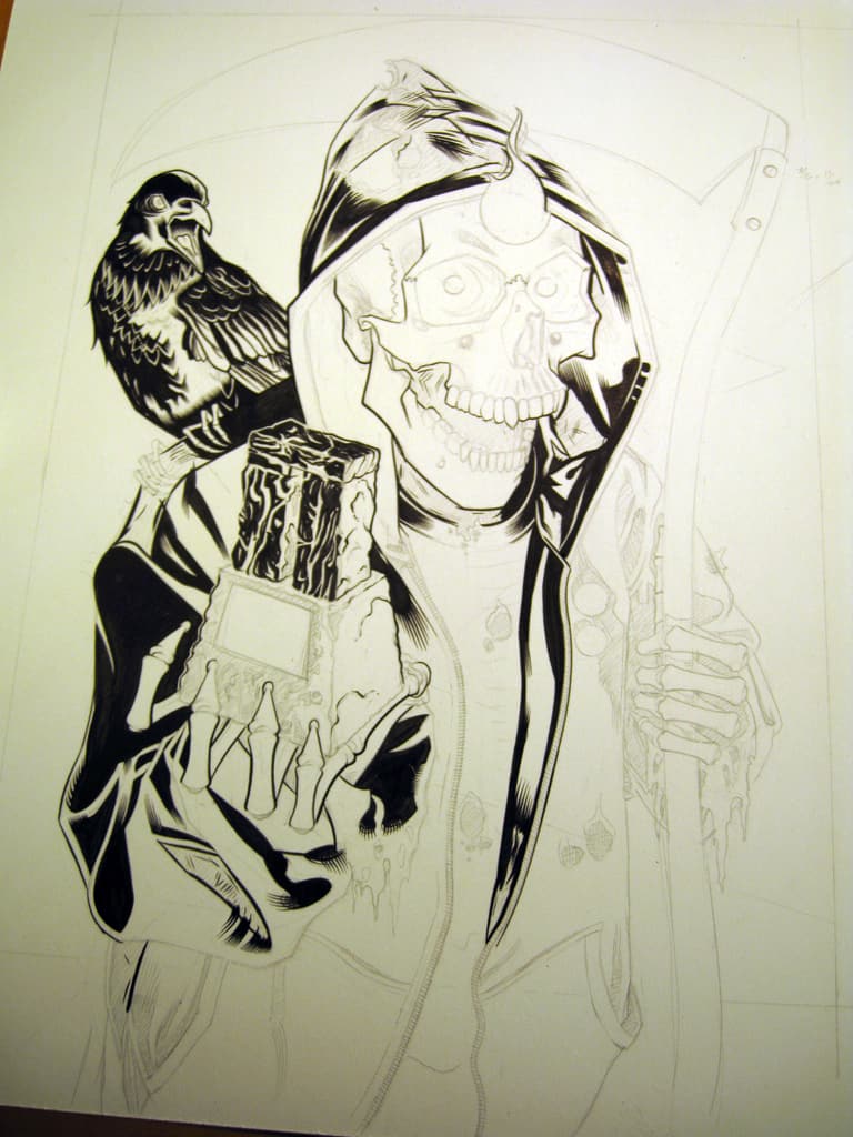
Process of Brian Ewing’s ‘Golden Gods’ poster
Process of Brian Ewing’s ‘Golden Gods’ poster
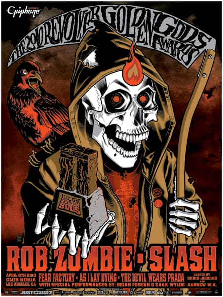
‘Golden Gods’ final poster by Brian Ewing
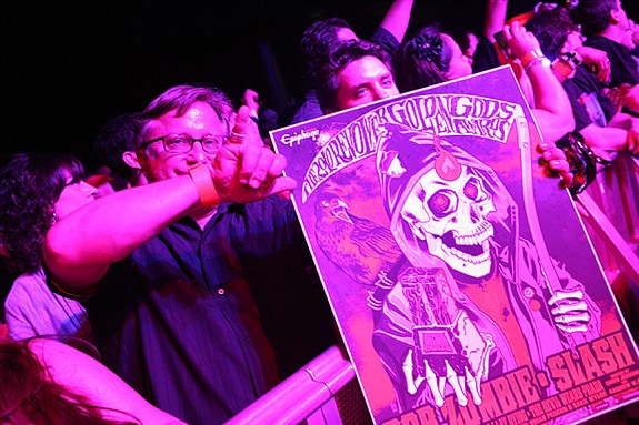
‘Golden Gods’ by Brian Ewing in action
With knowing so much about printmaking and being involved with it for so long, have you had any desire to print your own work?
I took a screen printing class taught by John Miner, in Pasadena, CA years ago. It was awesome but also not for me. I’d have to stand on a milk crate to pull the squeegee. We were using solvent-based inks and it got you pretty high. A few times I’d forget where I lived after class let out.
John had us cutting our seps with rubylith and there was no fancy printer to output your films. We had to use a photostat machine for that. I didn’t know it then but eventually, it occurred to me was that I took the class so I could talk to printers and waste less of their time if I didn’t turn in bad files or ask lots of stupid questions.
Also, it had a lot to do with space. I always lived in places where there’s never enough room to set up a print studio. Now it has to do with time. I’d be spending less time on the artwork and more time on the printing. Then…there’s the cost. If I go to a professional printer they already have all the equipment and inks. They have the nice FedEx discount and they have the employees to make sure everything runs nicely.
I think the best compliment I get from printers is that my seps are done well. I learned that the hard way. I was working with a printer in the beginning that would charge me to do the color seps but never actually do them. It was bullshit. So instead of letting that guy rip me off I started asking other artists how they did their color separations and by studying other people’s posters to see how colors overprinted and how clean their seps were.
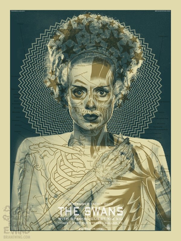
Brian Ewing’s gig poster for a Swans show
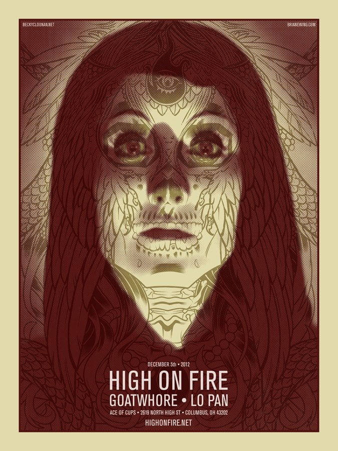
Brian Ewing’s gig poster for a High On Fire show
With your posters for Swans, High on Fire, and Motionless in White you introduced photo elements from classic horror films. Were these prints your first foray into using existing images? What inspired that leap into working photographs into your work?
Broke ass bands…hahaha. Seriously. Nobody wanted to pay for posters. Since everyone wants to do rock posters the budgets have dropped. Not every band is like that but some of them are. Queens of the Stone Age or Pearl Jam are awesome to work with because they find value in the posters and pay for printing and then some.
I got hit up to do The Swans and Melvins Lite posters and there was no money. Not even for printing. I LOOOOOVE the Melvins so I did it anyway.
So it started out of desperation and it turned into me figuring out where to go next as an artist. Necessity being the mother of invention and stuff…
I can definitely claim that Faile and Morning Breath had an influence on me. I’d see Faile’s work all over New York and thanks to Chris Parks (Palehorse Design) I got to go to the Morning Breath Studios in Dumbo and meet Jason Noto.
Both groups have had a serious and obvious impact on my approach to design. I’m just trying my best to not be too derivative of their styles. From there I went backward and looked at more of Warhol’s work and read up on him. None of that clicked until I moved from NYC to Columbus, OH.
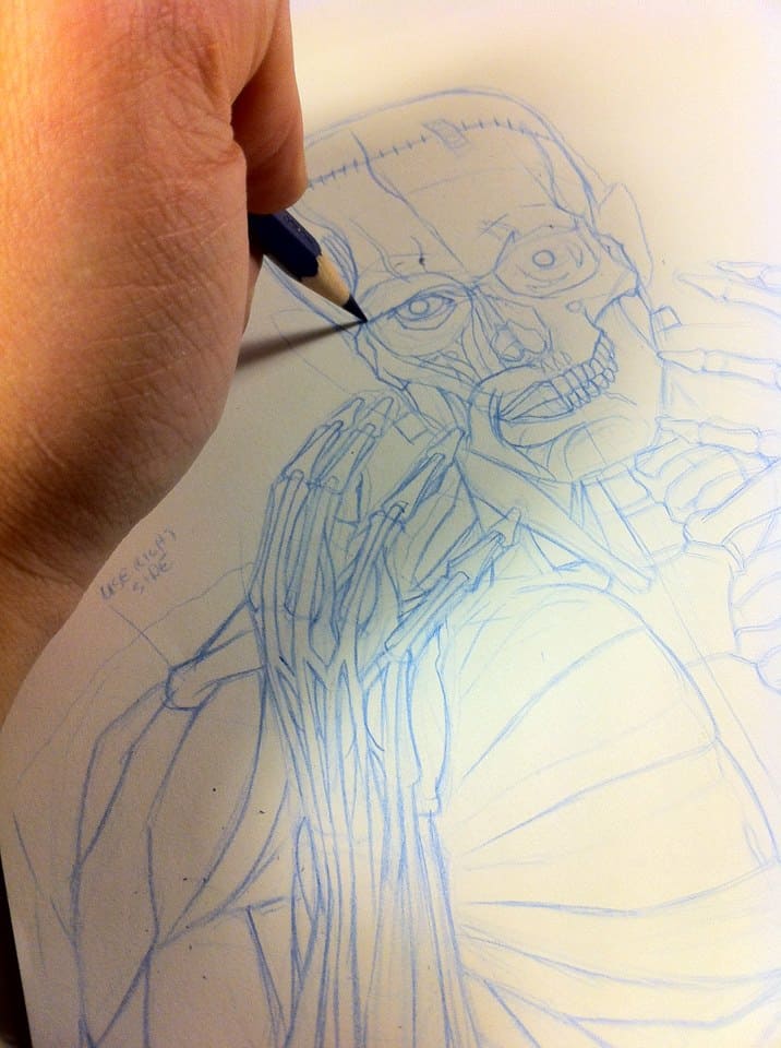
Brian Ewing doing the pencils for his Melvins gig poster.
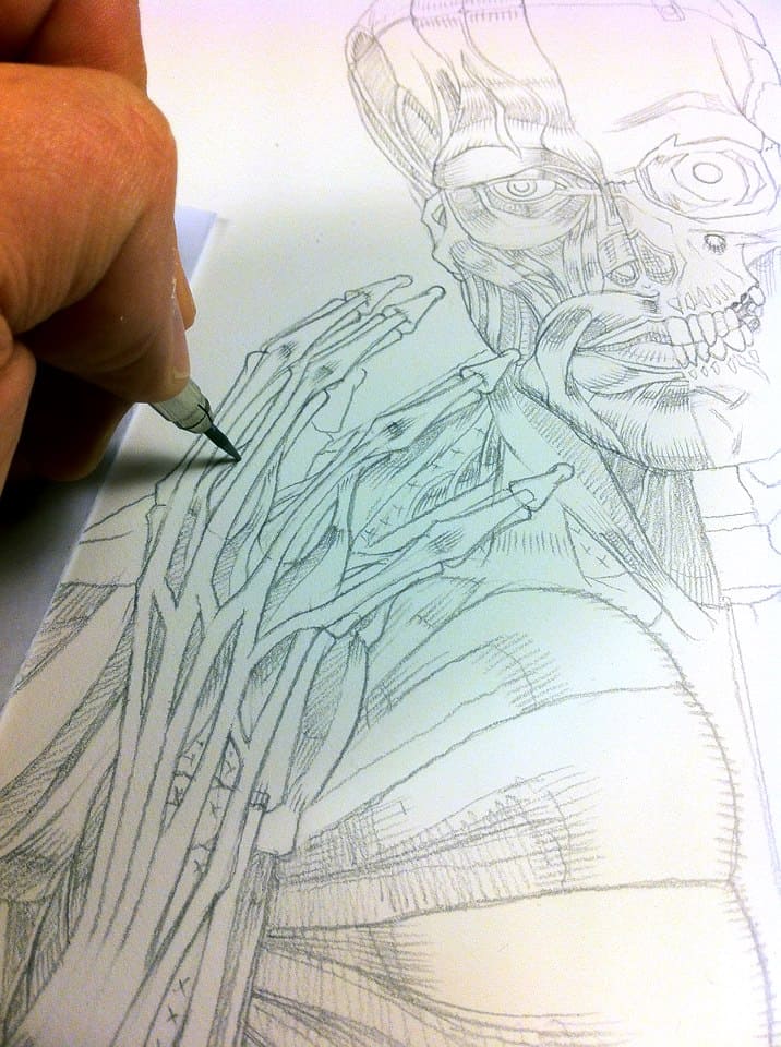
Brian Ewing doing the pencils for his Melvins gig poster.
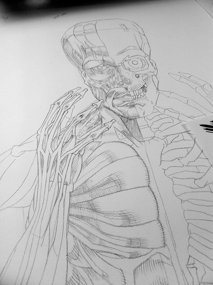
Brian Ewing doing the pencils for his Melvins gig poster.
Brian Ewing’s gig poster for a Melvins show
I totally fell in love with your two recent releases through Galerie F – ‘The Shining’ and ‘Psycho,’ they both hang like twisted versions of mug shots. The collage of newspaper clippings and notes that wallpaper the back are brilliant touches. The guilty and their and their sins.
Both are in your upcoming show ‘Scream With Me’ at Chicago’s Galerie F. Are you working with the folks at Galerie F you choose properties to work with? How involved are they in the show? How many pieces did you make specifically for the show?
Oh wow, thanks for noticing the collage in both pieces! I’ve been enjoying that part of the process the most. Having to do all the research and hunting for images from the movies or finding new meaning in found images has been a satisfying challenge. They’re like visual hashtags to me. I get to satisfy that part of my personality that wants to fill every space on the poster and I also get to engage the viewer for more than five seconds.
Prepping for the show has been a big undertaking for me. I had to figure out how to draw faster in less time without sacrificing the quality. Galerie F wanted mostly new pieces. They suggested I start with ‘Psycho’ and ‘The Shining.’ As a kid, I was so terrified by the edited-for-television version of ‘The Shining’ that I never saw the whole movie (Same goes for ‘The Exorcist’ and ‘The Wizard of Oz.’ I’m weird.) so I had to finally watch the movie thirty some odd years later. Fuck I’m a dork.
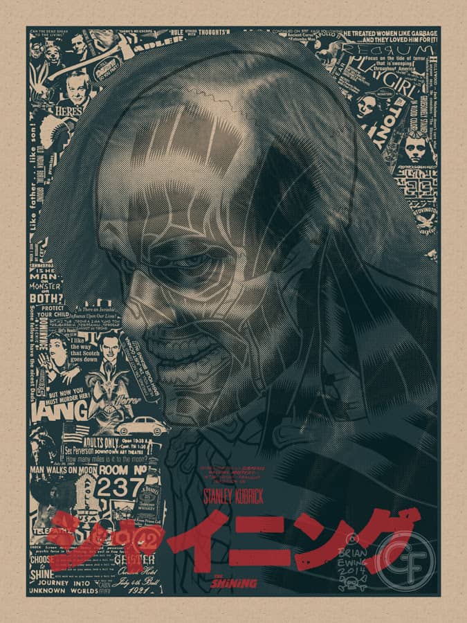
‘The Shining’ variant edition by Brian Ewing
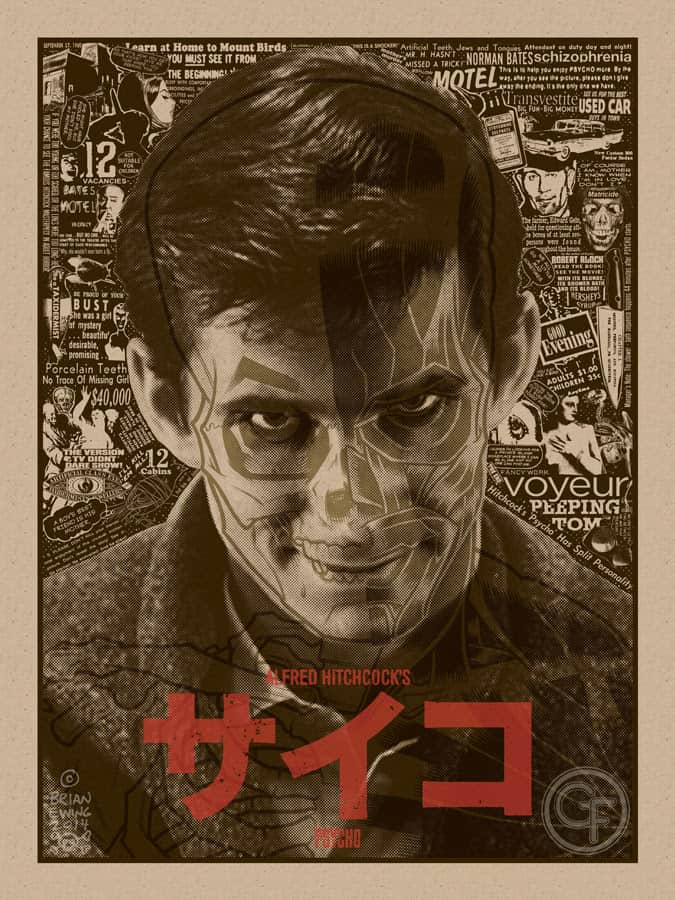
‘Psycho’ variant edition by Brian Ewing
Zissou and Allie have been pretty involved with the show. They sent me a list of movies they wanted to see me work on. I had my own list. So I took some from theirs and some from mine to make up the pieces for the show. Since Zissou also runs Fug Screen Printing we are able to try different techniques and explore colorways when possible. Fug is printing everything for the show. So Zissou has his hands full because we are doing variants for some of the prints and I changed the films around so the regular version and the variant won’t just be a change of color palette.
I made ten new prints for the show. I had a million ideas but not enough time or attention span to follow through on most of them. This will be one of the very few times I’m displaying the original art alongside the prints. Some of the ideas I had for the prints required that I do two drawings and not use mixed media. So a few posters were twice the work. But I wanted to expand on the anatomical style I had started a few years back. I was pretty lucky that Galerie F was down to let me do all of this.
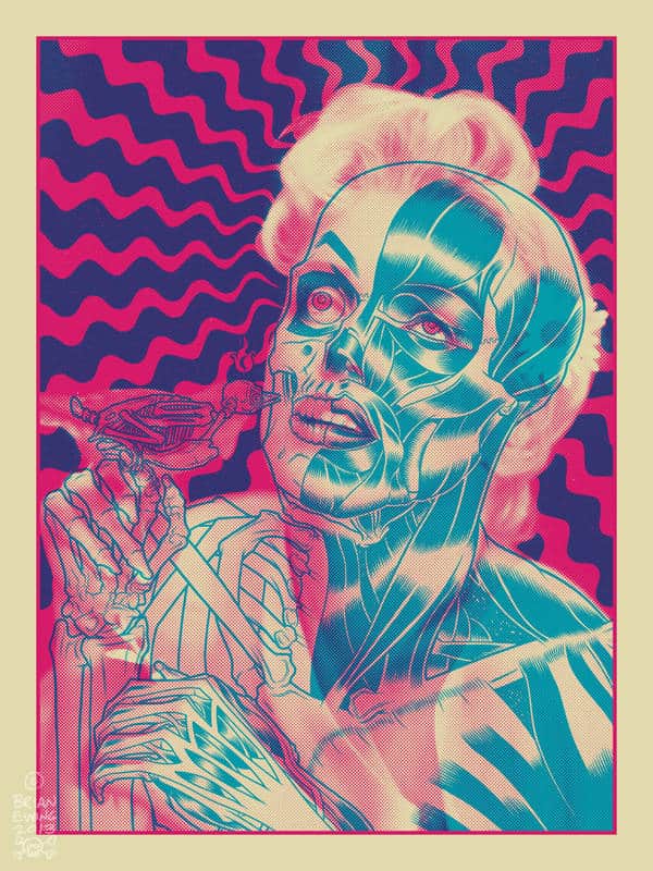
‘Marilyn’ by Brian Ewing for his solo show ‘Horror Business’
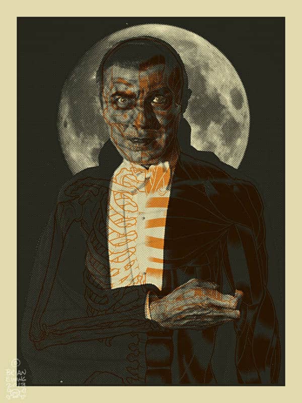
‘Dracula’ by Brian Ewing for his solo show ‘Horror Business’
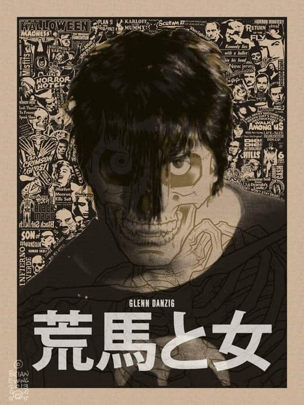
‘Danzig’ by Brian Ewing for his solo show ‘Horror Business’
Back in 2013 your solo show ‘Horror Business’ took over Rivet with some amazing prints focused around the classic monsters. With ‘Scream With Me’ it looks like you’ve focused on the horror or more modern monsters and maniacs. When you do a solo show, or are a part of group show, are the curators approaching you? Were you looking to do a show and asked Galerie F?
I wanted ‘Scream With Me‘ to be a sequel to ‘Horror Business‘ but also stand apart from it. Hence all the new work. I’m taking all that I leaned from the first show and throwing it into this one.
For the solo shows, I approach the galleries. For the group shows it’s through invitation or a referral from an artist friend in the show. I have a small group of art friends that refer each other for group shows when possible.
There’s a lot of group shows I can’t be a part of because I have to take time out of my work schedule. Or I think the theme is weak and played out. Phonebooth Gallery just hit me up for a group show next year that blew my mind.
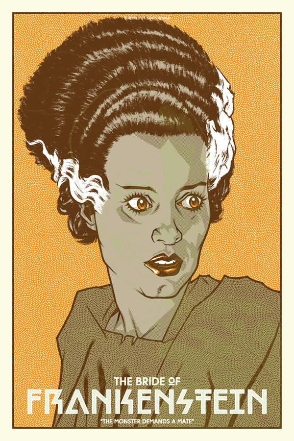
‘The Bride of Frankenstein’ by Brian Ewing for his solo show ‘Scream With Me’ at Galerie F
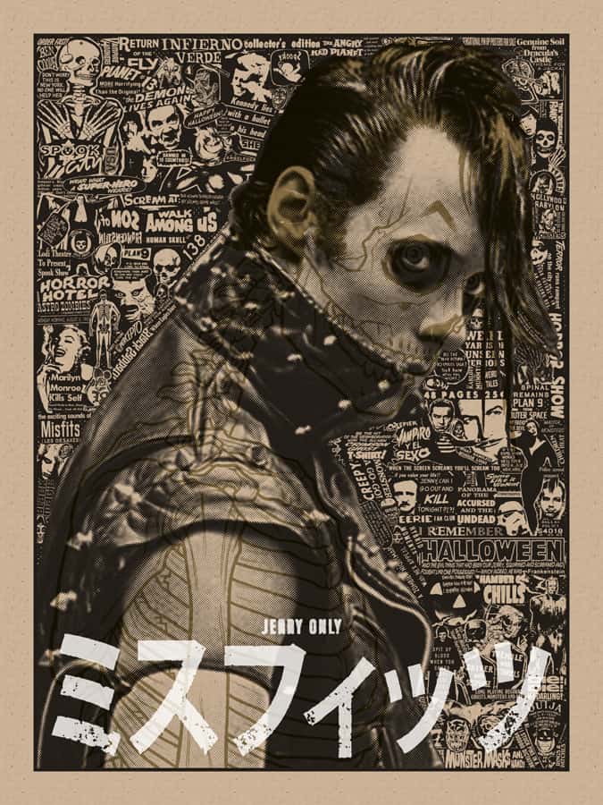
‘Jerry Only’ by Brian Ewing for his solo show ‘Scream With Me’ at Galerie F
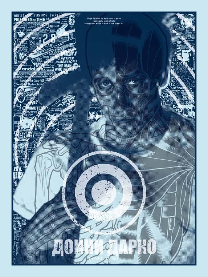
‘Donnie Darko’ by Brian Ewing for his solo show ‘Scream With Me’ at Galerie F
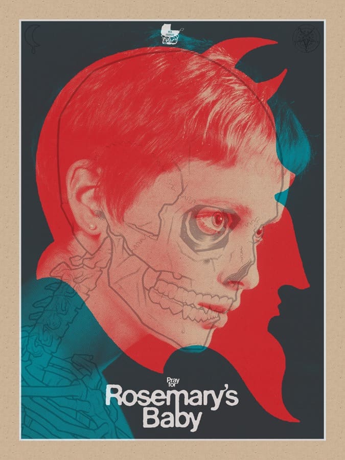
‘Rosemary’s Baby’ by Brian Ewing for his solo show ‘Scream With Me’ at Galerie F
1With Justin ‘Hateball’ Jewett you’ve released the toy Shub Zeroth plus others through your brand MetaCrypt. As poster artist it’s just you and the tools, but with a toy, there’s a lot more hands involved – more collaborators. Was that a hard transition to make? To let others be in control of something you created?
Yeah, it was a tough transition to go from posters to toy design. I had been approached in the past to design something or to take what I already designed and turn it into a toy but it never went anywhere. Justin had some credit with Luke Rook from Lulu Bell Toys to do something and brought me on board. MetaCrypt was born.
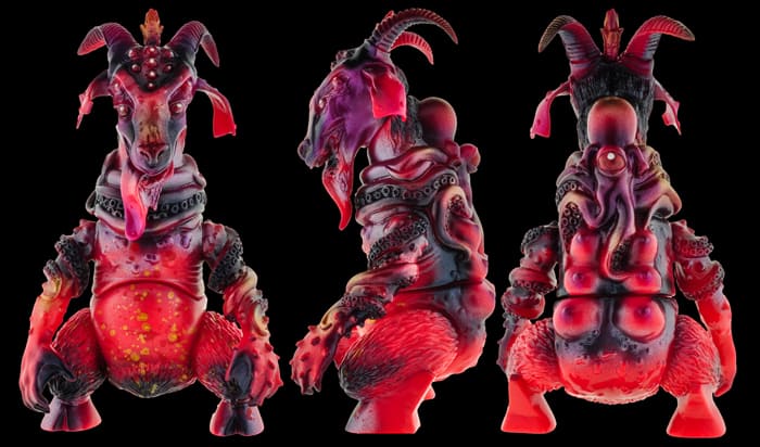
Shub Zeroth – Negocio De Horror edition toy from Meta Crypt from Brian Ewing’s ‘Horror Business’ show at Rivet
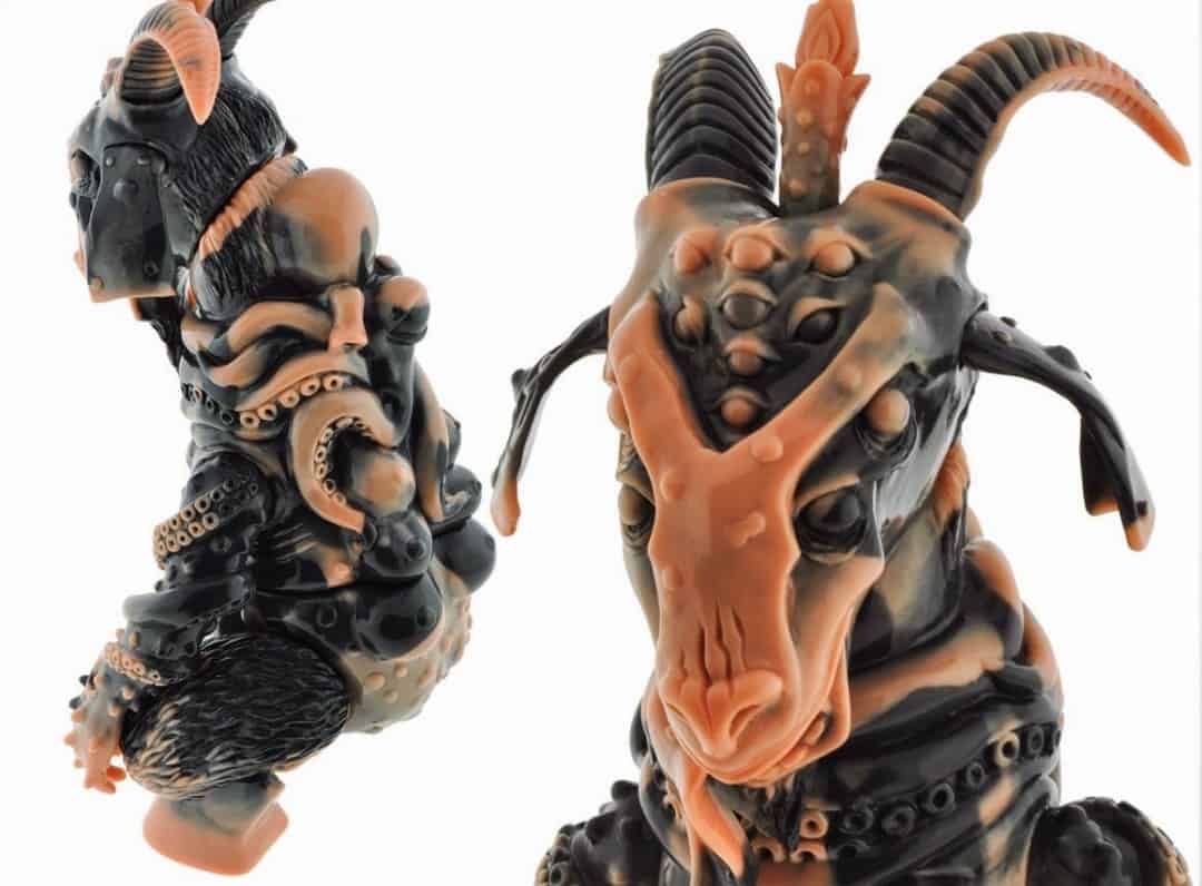
‘Scream With Me’ Edition Shub Zeroth Marbled Vinyl Figure
We had never collaborated before so we just started talking about what we liked. We were both passionate about H.P. Lovecraft and the types of imagery his writing has influenced. Justin is organized and has follow through so I knew we’d actually finish this. So we built it from there. I was fixated on drawing a goat head and showed that to Justin. From there we kinda knew what we wanted.
I’m very proud of it because nobody thinks I can design stuff like that and then I show them Shub or the new Drude I designed. We are building up a small universe at a comfortable pace.
Justin makes sure we are on schedule and deals with the factory in Japan. He also handles the website, vendors and promotion. He’s much better (and sometimes nicer) at all that than I am. He also photographs all the releases. I’ll do all the packaging and web graphics. Together we decide on colorways or which artists we hire to paint the release and do shirt designs for us.
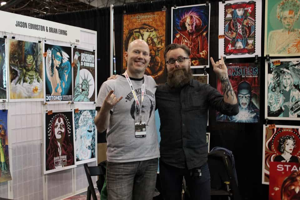
Jason Edmiston (L) with Brian Ewing (R) at the 2013 New York Comic Con
You were invited to show at Mondo’s first convention MondoCon and after than immediately went to New York for the New York Comic-Con. How many conventions do you try to do a year? Are live events like those and Flatstock an important of the job?
I usually try to do two conventions a year. San Diego Comic Con and New York Comic Con. I’ve done SDCC for twelve years and NYCC for four years now. This year I did…five. Ugh…
Conventions are extremely important. The business connections I make are mostly at these shows because I’m standing in a giant 10′ x 10′ booth that’s an advertisement of my work and people have a chance to talk to me. I think most of the jobs I get are after a client meets with me. Face time is important.
I have my own booth at SDCC and split a booth with Jason Edmiston at NYCC. It’s important to not go broke exhibiting at a convention. Jason and I work really well together at NYCC. If I meet a potential client that would also like Jason’s work I’ll make an introduction. Jason always does the same for me too.
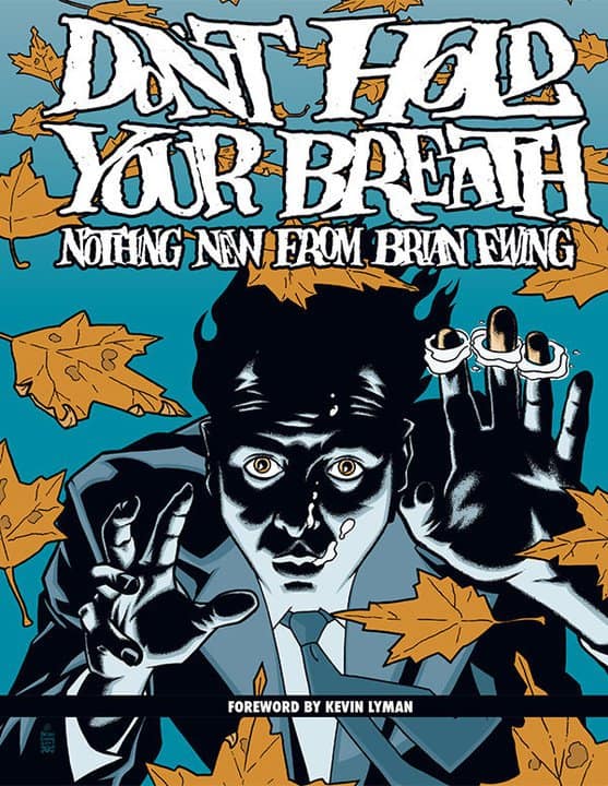
‘Don’t Hold Your Breath: Nothing New From Brian Ewing’ from Dark Horse Books
In 2010 your posters were collected into the book ‘Don’t Hold Your Breath: Nothing New from Brian Ewing’ that was released by Dark Horse. As an artist that has had his works collected, do you give any special meaning to this book? Curious to know if once that book came out, how you felt having it out there – like, now you’re free to move on from certain styles and grow or experiment? Do you see there’s a Brian Ewing before the book, and a different Brian Ewing after?
The book collected the first ten years of my poster work. Everything that I was going through in my personal life I could see in each poster in the book. I could look at each piece and tell you what I was going through at that time. What girl I was dating. Where I was living. What the band was like to deal with. Where I bought that album by that band and how years later I got to work with them. I saw it as a professional milestone or least pages full of mile markers.
The book was a lot of things to me personally. It was a selfish ‘FUCK YOU’ to people that never thought I’d make anything of myself as an artist. I also wanted to have something important to show my Mom before she passed away.
I talked the publisher into letting me design and write the whole book myself. So I taught myself inDesign and went to town. It was a fun experience. Sometimes I forget it’s out there to be honest. I’m always focused on my work at the moment and where my next job is coming from. The publisher really didn’t push the book so it sold on me constantly trying to promote it and word of mouth. It’s daunting.
Yeah, I guess there was a me then and a me now. I don’t think about it. I’m more interested in the me next month or me in five years.
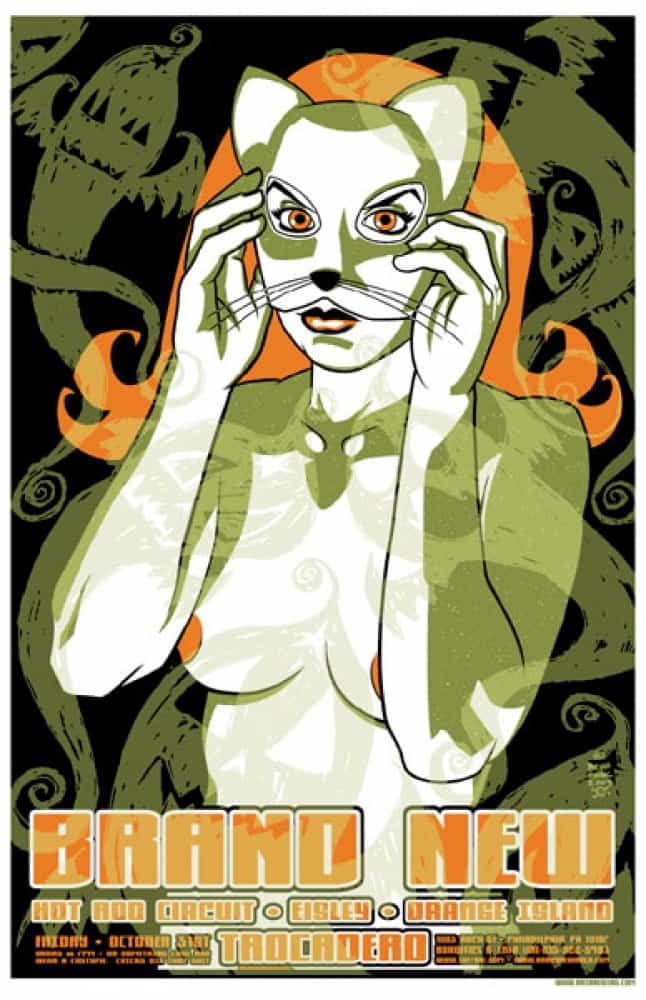
Brian Ewing’s gig poster for a Brand New performance
