Illustrator Oliver Barrett is from Cleveland, Ohio. A city I’ve never been to, but when discussing Barrett’s work it feels important to mention it all the same. He’s a creature of his environment, proud and questioning of the city and its citizens — a skilled observer and narrator of his hometown.
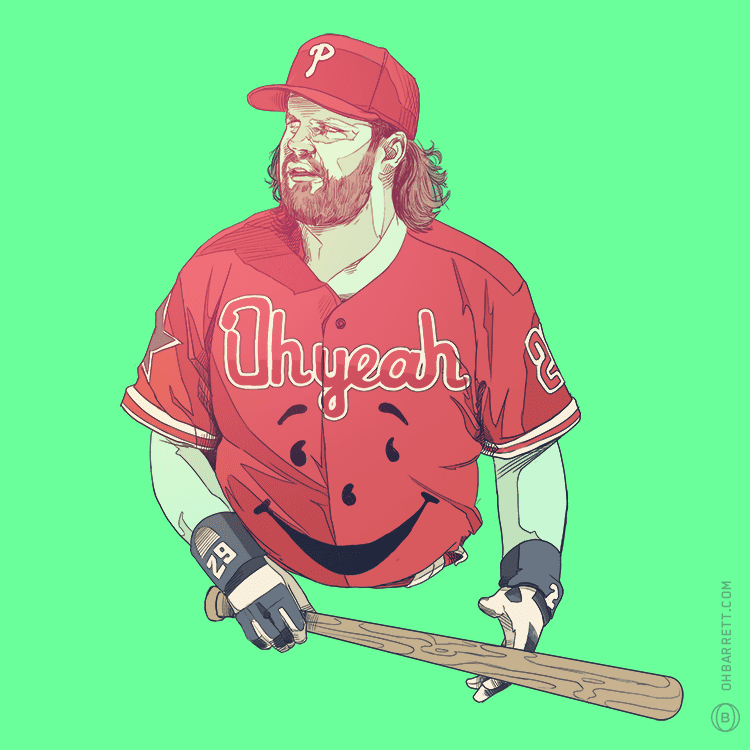
In Barrett’s work flows a stream of cynicism, a tightly wound and sophisticated brand of analysis. In his Baseball Jerks series Barrett aims that cynicism at some of the sport’s most skilled misfits. His take on former Oakland A’s giant Mark McGwire places the overt declaration of ‘Cheat’ across Big Mac’s jersey, with the twin cardinals defecating on that title. In this portrait is the distaste from the depths of fandom for Mark McGwire’s steroid use. That giant letdown from baseball hero to statistical footnote.
Barrett’s ‘Jerks’ illustrations are loose and to the point — each portrait the mugshot of a career.
Beyond his cynicism there is still that sophisticated touch, Barrett in affect searching for the weight in his subject that connects illustrator to canvas.
Barrett’s illustrations speak with his voice — each piece a personal commentary. There may be digital tools in Barrett’s hand, but he never lets that get in the way of keeping his work human.
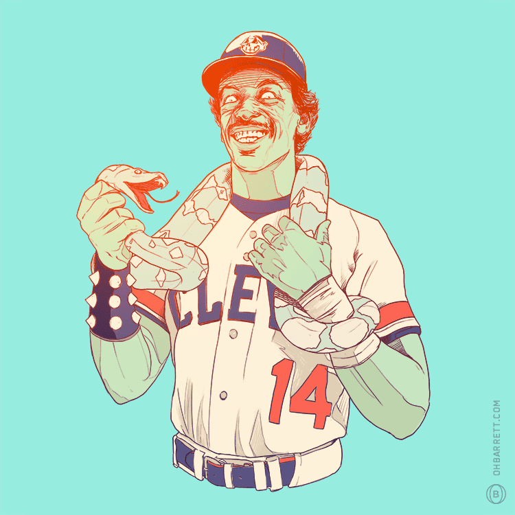
‘Julio Franco’ by Oliver Barrett
CJ: Movies, gig posters, and cult pop culture figures populate the poster world landscape. It’s awesome and it’s a given, but what I always hoped for were some quality sports posters. Sports fans get pretty much nothing in the way of great art, and that’s why your ‘Baseball Jerks’ series totally hit me hard. I love it. Such a brilliantly designed and executed idea.
OB: Thanks! As far as sports-related artwork goes, there’s not a ton out there outside of the cheese-ball stuff you see at the mall. Although there are some random cool pieces that pop up from time to time on Tumblr, but they’re usually more soccer and basketball related, probably because those sports have a bit more of a global appeal.
The ‘Baseball Jerks’ thing just came from being pumped up about the start of baseball season and doodling Julio Franco which was a lot of fun, I showed one of my friends and he said something along the lines of, ‘man, you should do this guy, and that guy.’
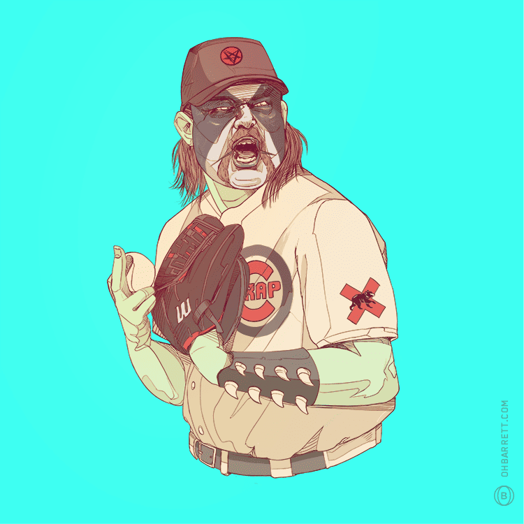
‘Rod Beck’ by Oliver Barrett
‘John Kruk’ by Oliver Barrett
There’s a cynicism that runs through us all and sports triggers that the hardest – a bunch of guys making tons of cash for playing a game is hard to care about. What’s interesting about your baseball series is that there’s a clear sense of fandom to your design choices and you come at it through a lens of high intelligence and cynicism.
You’re on track with the cynicism comment. A lot, if not all of my personal work, carries some level of cynicism. I’ve been trying to put my personality into my work a lot more often lately, and Baseball Jerks was a great opportunity for that. A lot of the players in the series were a part of my childhood on some level.
For example, I remember rabidly collecting baseball cards and getting furious after getting duplicate after duplicate of that fat slob, John Kruk. Or Randy Johnson murdering that pigeon with a fastball. I know he wasn’t on the Mariners when that happened, but I always associated him with Seattle because of the 1995 ALCS against the Indians, even though it was Joey Cora that blew it for the Mariners and not ol’ Randy.
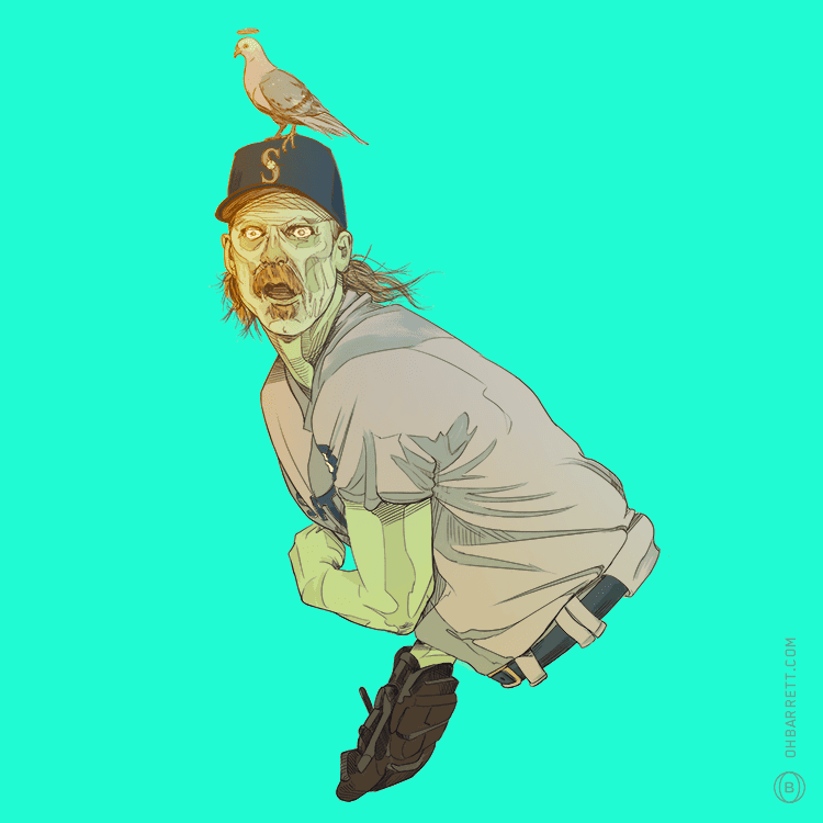
‘Randy Johnson’ by Oliver Barrett
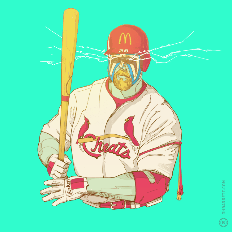
‘Mark McGwire’ by Oliver Barrett
The one that got me was the Mark McGwire design. Growing up in the East Bay of California during the Oakland A’s high point, Mark McGwire was a local hero. Your ‘Baseball Jerks’ portrait of him knocks him down in so many ways it reaches genius level jabs.
The Ultimate Warrior face paint and arm bands hits an exceptionally personal note – Mark McGwire was hitting his stride with the A’s as the Warrior was his in the WWF. As a kid I’d watch both ‘athletes’ do their job in the same weekend.
I actually was working on the McGwire piece when the Ultimate Warrior died. Total coincidence.
For a minute, I wasn’t sure if I was going to use the Warrior references in the drawing, but then I remembered that the Ultimate Warrior was actually a crazy homophobe and didn’t care anymore about potentially disrespecting him. It’s not like he’s going to rise out of the ground and gorilla press me, although it would be pretty cool if that happened.
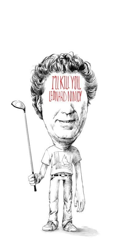
I think I might have some bizarre ‘kiss of death’ thing happening. I was drawing Harold Ramis for a warmup drawing for this Ghostbusters thing, and then the news broke that he had passed away the following morning. I thought about drawing Lebron right after that happened.

“Harold Ramis’ sketch by Oliver Barrett
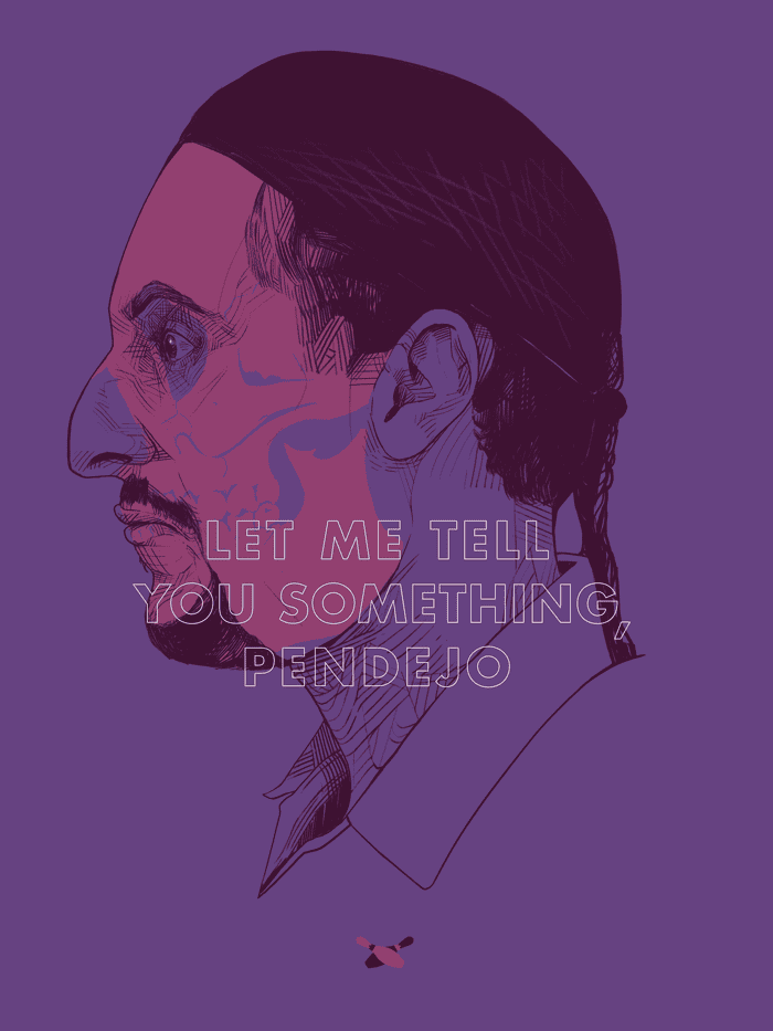
When you started the ‘Baseball Jerks’ series did you have any reservations that there wouldn’t be an audience for it or did you just go for it? Did you consider if people would get the references, like with Billy Ripken’s ‘Fuck Face’ baseball card?
I just went for it. I wasn’t too concerned about making sure that everyone would understand specific references immediately. I figured that as long as the image was interesting enough, people would figure it out on their own.
The Billy Ripken ‘Fuck Face’ thing could have worked on its own, but adding in the Joker facepaint and some of the other details brought that piece to a level beyond, ‘this is an image of that Billy Ripken card.’
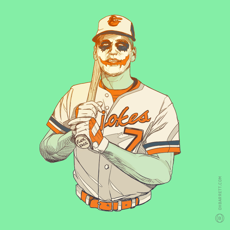
‘Billy Ripken’ by Oliver Barrett
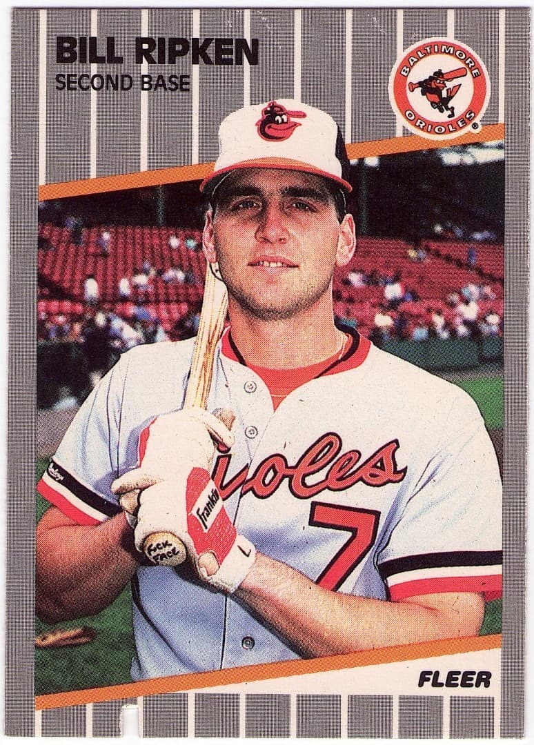
Bill Ripken’s 1989 Fleer Baseball Card
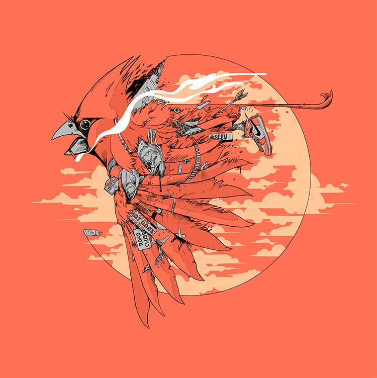
‘This Place is Still Gross’ by Oliver Barrett
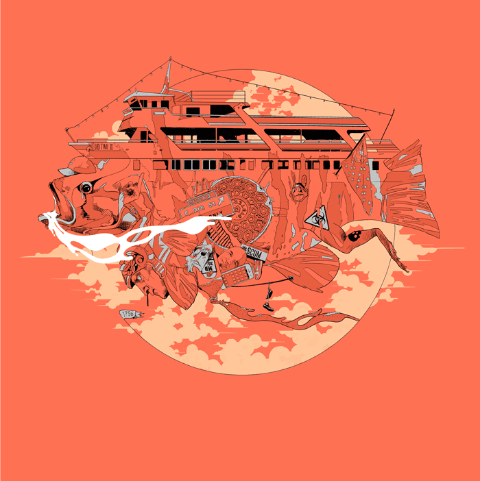
‘It’s Still A Mess’ by Oliver Barrett
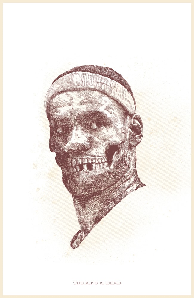
‘The King is Dead’ by Oliver Barrett
I love that you are able to incorporate so much of yourself in your work. There’s a definite opinion and point of view in prints like your ‘This Place Is Still Gross’ and ‘It’s Still a Mess’ and especially the Lebron James print ‘The King Is Dead.’
The ‘gross’ and ‘mess’ pieces are very personal. They’re based on my cynicism toward the rapid development and improvement in Cleveland.
Don’t get me wrong, it’s great that the city is rapidly improving and making great strides, but all of the recent civic pride, especially all of the tee shirts and stuff really just give me the douche chills.
The idea popped into my head when my girlfriend and I were taking our dogs to the beach but had to turn around after the sand was covered in dead fish and dead birds and then when I got back to the parking lot, there’s a group of meathead idiots wearing shirts emblazoned with cheeseball shit like, ‘Cleve-land that I Love.’
As far as Lebron goes, I’m pretty over it. He was a super big deal here and it was a fun time to watch basketball, but he made his choice. I was pissed and made a print about it. He won two championships. I think he got the better end of the deal.
However, it’s taken me so long to get to doing this interview that there’s a very real chance that he’s coming back to the Cavs. I might have to make some variants if that happens.
Yeah, better get on that. The King has returned to Cleveland. (note: you can read Lebron James’ essay on his return to Cleveland HERE.)
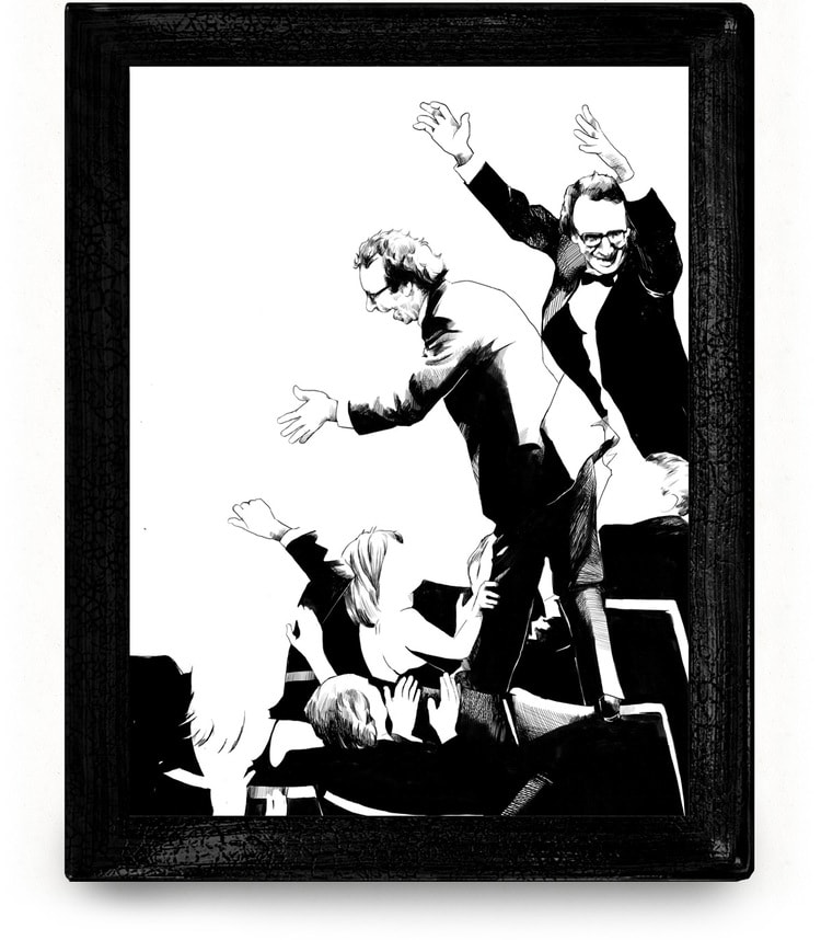
Oliver Barrett’s piece for ‘For Your Consideration: The Academy Awards’ for the Academy’s art exhibit at Gallery 1988
Oliver Barrett’s piece for ‘For Your Consideration: The Academy Awards’ for the Academy’s art exhibit at Gallery 1988
Oliver Barrett’s piece for ‘For Your Consideration: The Academy Awards’ for the Academy’s art exhibit at Gallery 1988
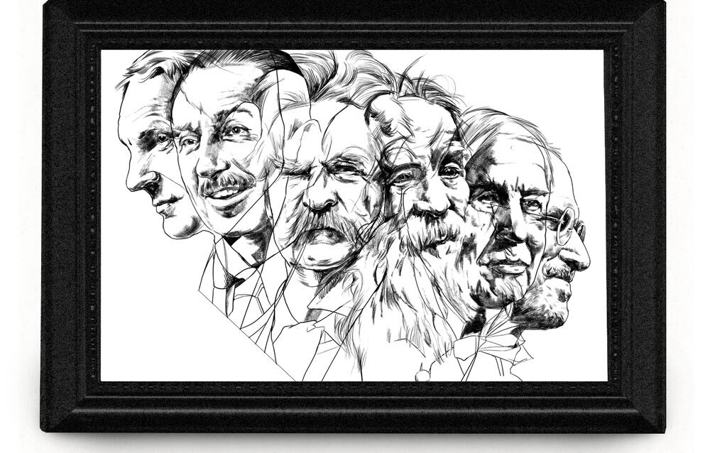
‘Innovators’ editorial illustration by Oliver Barrett
For your editorial work like the ‘Innovators’ piece for ‘And Culture,’ are you still able to get yourself across? Are the innovators shown like Walt Disney and Mark Twain your choice?
The question is, really, when working for a client, do you have to shut a part of yourself off to get the job done, or are you able to incorporate who you are, beyond the visuals, into the work? Does that even matter when you’re getting paid for it?
It depends on the project. It can be tough to put yourself into an editorial piece that has nothing to do with you personally.
When it comes to editorial stuff, I just try to make it look like something that I would have at least tried to do on my own. For example, with that ‘Innovators’ piece, I picked the historical figures and composed them with these weird overlaps that made sense with the rest of my work.
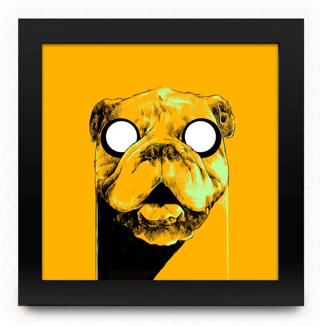
‘Jake’ by Oliver Barrett
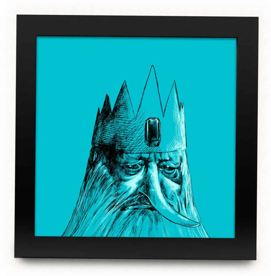
‘Ice King’ by Oliver Barrett
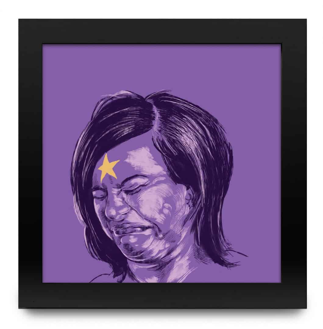
‘Lumpy Space Princess’ by Oliver Barrett
Your drawing style is incredibly realistic, to the point that when you drew the portraits of characters from the cartoon ‘Adventure Time’ they appeared alive and in the flesh. Are you working from any sort of reference photos? Have you used live models for any of your work?
I wish I had the studio space to use live models. I actually work as an art director at a design agency for a majority of the week and have design-related freelance projects in addition to the illustration and art stuff, so I’m working in all sorts of different places throughout the week, so there’s not really a time or place for a live model. I usually just cobble together reference from stock photo sites and Flickr.
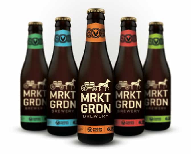
Oliver Barrett’s pitched design for Market Garden Brewery
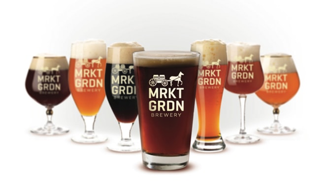
Oliver Barrett’s pitched design for Market Garden Brewery
What sort of client work are you dealing with at your art director job? Does the firm specialize in specific market?
Mobile development. It’s a completely different animal. It breaks up my work week pretty nicely though. Being able to jump from illustration to serious problem solving and user experience keeps me from getting too burnt out on one or the other.
I also take on a lot of projects as just a graphic designer. So I might have a week where I’ve got a print for a show, an illustration for Bandcamp, six screen renderings for an app, and then a hand-lettered logo + collateral materials to do.
On the flipside, I sometimes feel like doing all of these different things doesn’t allow me to really push one of them as far as it could possibly go. That’s probably just me poking holes in myself, but it happens.
I’ll work on an illustration and think, ‘Man, I could really do a whole bunch of cool stuff in a series like this if I didn’t have to spend time on this stupid fucking logo,’ or, ‘I could think of two or three better logo concepts if I didn’t have to fix the shitty lips I drew on that guy’s face.’
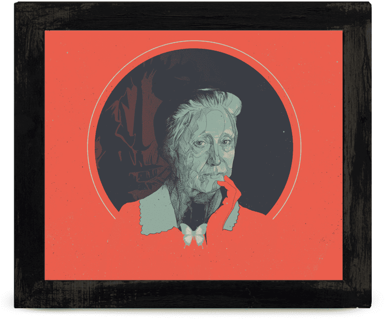
‘Marianne Moore’ for the Atlantic by Oliver Barrett
Being born and raised and now working in Cleveland, how much of your work comes from your hometown? Do you get most of your work locally or do you get jobs remotely?
Almost all of my work is done remotely. It’s actually been kind of an issue for me as I’ve lost local projects that I chased after because I don’t have much of a local presence due to focusing on the remote stuff. Building that up has become a goal for the rest of 2014.
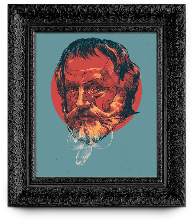
‘George Meredith’ for The New Republic by Oliver Barrett
Are you travelling to events for work? Do you take your prints to anything like Flatstock or any other convention?
I have gone to some of the group shows that I’ve been a part of, but it’s been about a year. I definitely wish I could do it more often, but there’s the excuse of being ‘too busy’ and ‘the airport sucks’ and all that.
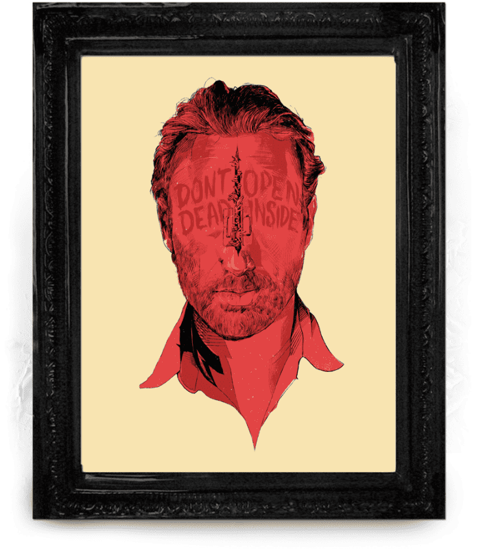
‘Walking Dead’ by Oliver Barrett
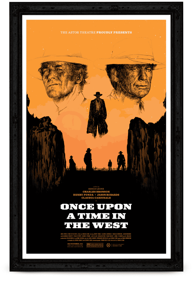
‘One Upon A Time In The West’ by Oliver Barrett
A lot of your prints tend to be on the smaller side. What draws you to selling prints that are 8” x 8” or 12” x 12”? Are you working at that size?
When it comes to shows and prints and all that I try to put myself in the shoes of the buyer. In our house, we’ve got a few walls that are filled up with smaller prints and it looks so much more fun than just a few big prints. It opens things up to treat a wall like a canvas that can be composed.
I’d rather mix up a bunch of smaller prints of various sizes and throw in a small mirror or antique on the wall than just hang 3 huge posters and call it a day. Plus, the whole pop-culture art scene has gotten so big with so many galleries and so many artists, that I think it’s really fucking obnoxious to print something at 24” x 36” and expect people to want to put that on their wall. So much of the stuff in the shows these days is just bullshit with no real concept. I dunno.
Maybe it sounds like I’m putting my own work down, but that’s not the case. A 24” x 36” of some wild Aaron Horkey linework and type makes sense, a 24” x 36” tablet tracing of ‘all of the characters in X or Y film’ by some random does not.
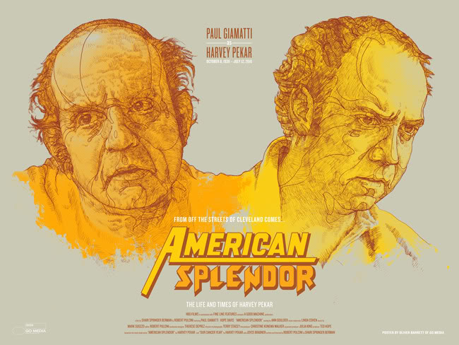
‘American Splendor’ by Oliver Barrett
You make a good point, a 24” x 36” print of a pop culture property isn’t always necessary – yet something like an original work from someone like Aaron Horkey of that size definitely would incredible. It comes down to concept, down to the design. I’m a fan of a large print, especially if it is an original concept.
I’m not even saying an original is something that merits that size. I’m just saying that if you’re gonna print something THAT big and mark your territory all over some collector’s wall, it had better be a really good piece of work.
You’re a strong illustrator with a definite concept of what it is you do, which at times can be combative – I think we pretty much covered the fact that ‘Baseball Jerks’ and ‘It’s Still a Mess’ came from a place of anger.
If the buyer burn out and pop culture flood wasn’t an issue, would the opportunity to do a 24” x 36” work be something you could see yourself doing? Or do you personally prefer working on a smaller canvas?
I wouldn’t say they come from a place of anger. It’s more like they’re snarky responses to subjects that I like. Sort of like having a nickname for your best friend that’s funny but annoys him a bit.
So no, I’m not against doing giant prints. To be honest, the small print thing really started from trying to get my work on more walls. The prices are a bit lower, and the smaller sizes stick out a bit in a sea of 18” x 24”s, which I think is a cool thing.
I’m not against doing anything big, like a 24” x 36”, I’ve done them in the past. It’s just if I DID do one, it would have to be something really awesome, and likely officially licensed if it’s going to be for a property.
One of my great friends, Aaron Sechrist, and myself are working on putting a show together here in Cleveland in the fall and I was considering doing some larger prints for that show, although it would be a completely new subject for me. Again, not really pop-culture related.
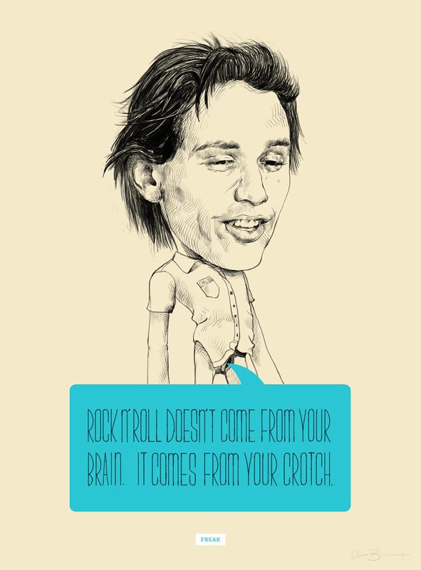
‘Freak’ for G1988’s Judd Apatow show by Oliver Barrett
In your store, some of your work is available as giclee prints and some as screenprints. Does the final product of your work matter to you? Does the printing method get decided by the client or you?
Yes, absolutely it does. I’m assuming this question is coming from the strange ‘giclee is not as valuable as screen printing’ stigma.
In my situation, it depends on if screen printing is feasible or not. Some of my line work has really tiny detail work that I’m afraid won’t show up through a screen mesh. Maybe I need a better printer. Some of my work also has weird blend modes and lighting effects that won’t translate all that well to being bitmapped or half toned for screen printing.
Giclee covers that gap up because it nails everything that’s in the image. Ideally, I’d want everything to be screen printed. Over the last year or so, I’ve been working harder to make that a reality.
To be honest, in some cases giclee is just faster. Admittedly, I’m a terrible color separator, and that might be part of the issue. I’ve also been burned a few times trying to screen print something that required an adept separator, so I sometimes hesitate on the printing medium.
It’s interesting that there is a, ‘giclee is not as valuable as screen printing’ stigma, but then again I’ve been accused of ‘fetishizing the printing method’ when I talk about screen printing, but I don’t see fetishes as bad things.
Maybe I’m wrong about that stigma thing, but I’ve just seen some silly debates condemning giclee printing over screen printing. I agree with you, fetishes aren’t necessarily bad things, but there are some sick fucks out there. What are we talking about again?
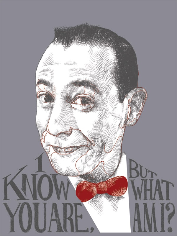
‘Pee Wee’ by Oliver Barrett
There’s a bit of conflict in you – you denounce the giclee vs screen print stigma, but then you admit to preferring screen printing. You’re an illustrator who’s been in pop culture shows, but doesn’t like pop culture shows. It’s very close to how fans react in the world of sports, where someone can be a die hard fan of their home team, but do nothing but bad mouth them out of love and frustration.
Whoa buddy, I never denounced either. I just prefer the tactile feel of a screen print, though like I mentioned earlier, screen printing is limited in terms of what you can do unless you’ve got a good separator. Maybe I’m wrong, but that’s just my experience.
I think the pop-culture thing just doesn’t grab me like it used to. When I first started doing them, I thought I was a part of this special opportunity, and in many cases it still is a special opportunity, but now it just feels like a call for entries for a gallery to do a little work and make a lot of money.
In 2009, it was OH SHIT, I’D LOVE TO DRAW PEE WEE FOR 15 HOURS and then pay for printing and shipping and then make 50% of what the gallery sells. In 2014 it’s NO, I DON’T WANT TO DRAW PEE WEE FOR 15 HOURS UNLESS YOU’RE GOING TO PAY FOR SOME OF THAT TIME, OR PAY FOR PART OF THE PRINTING.
Of course there are some situations where I know I can do well, so I throw my hat in the ring. For example, Spoke Art and I have always done pretty well together. Not all of the prints I did were home runs, but enough to where I have no problem with the terms. I’m not trying to bash any of the other galleries either; I just used the Pee Wee thing as an example.
Speaking of that Pee Wee thing, a quick lesson I learned the hard way when it comes to printing for these shows. I had sold out of a few print runs for my earlier pop-culture shows and got invited to submit stuff for G1988 and the first show they sent my way was this Pee Wee tribute. And my dumbass thought, ‘well, I’ve sold out of everything else so far, so I’m gonna print a fuck ton of these Pee Wee prints and laugh all the way to the bank.’
What happened was the artwork wasn’t as great as I thought it was and I sold like 15…OUT OF 250. It was a bummer, but I learned a lot from it. I still have some of those fucking prints in my basement. If anyone reading this bought one, don’t worry, you made me happy. They’re still great prints…
I don’t mean to sound like a big baby or anything, but these days it just seems like anyone can get into these shows. They’re not even really curated. For fuck’s sake, there was a Star Trek print in a show that said ‘TO BOLDY GO WHERE NO MAN HAS GONE BEFORE‘ in big type at the bottom of the piece
1. How do you send your own work to print with a typo like that?
2. How do you as a gallery owner, art fan/collector, business owner let that show up on your wall for other people to see?
Also part of the reason I come off as apprehensive toward the pop-culture show thing is also because I’ve completely bombed at some shows. I’m not afraid to admit it. The thing about these shows is that I put them off for paid projects and by the time I start working on some of them, I’ve waited to too long to get the really great concept and instead I’ve started on something that isn’t as great as I thought it was initially.
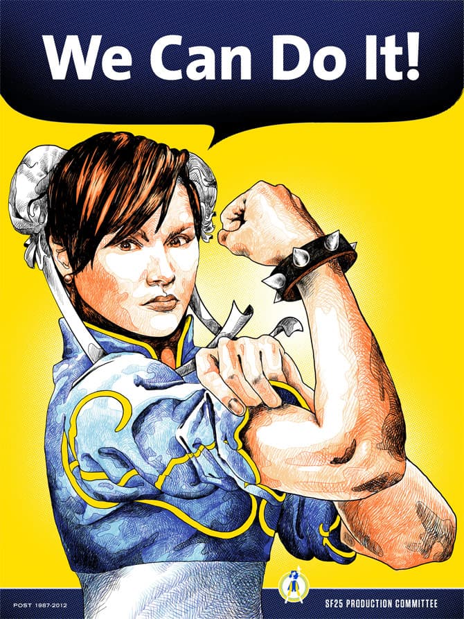
‘We Can Do It’ by Oliver Barrett for iam8bit’s Street Fighter 25th Anniversary show
I did this Street Fighter 25th Anniversary show for iAm8bit a few years ago and I’m a huge fighting game nerd. I had just started freelancing and was scared to death of making ends meet so I did a bunch of shirts for One Direction. Yeah, One Direction.
It was a good paying gig and the dude that ran the merch company is one of my favorite guys to work with. So anyway, I was doing these shirt designs on a deadline to pay the bills and the entire time, I’m thinking, ‘man, I can’t wait to start that Street Fighter thing.’ When I actually got started on the piece and got almost completed with it, I had come up with a much better concept, but not enough time to start over on it.
OR I bombed because I just straight up blew the drawing with tunnel vision and didn’t give myself enough time to really let the artwork sink in to polish it off. There’s one piece, I won’t mention which, that barely sold because the portrait is pretty much cross-eyed and I didn’t even notice until I got the prints back and it’s because I didn’t give myself time to catch some errant strokes in the eyeball. Ugh.
There’s nothing like opening a box of prints to see this derp-face staring back at you and knowing that it’s your own fault.
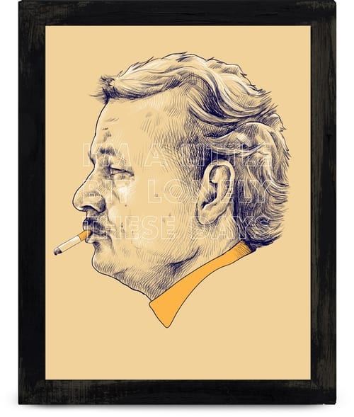
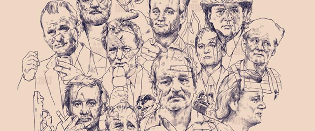
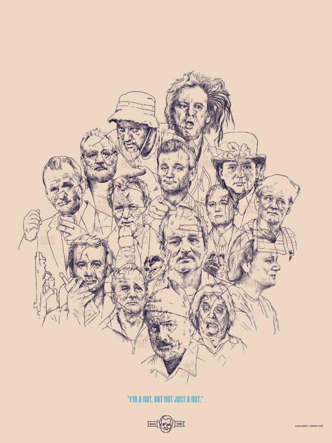
Oliver Barrett’s Bill Murray portrait for Spoke Art’s ‘Bad Dads’ show
Oliver Barrett’s Bill Murray portrait for Spoke Art’s ‘Bad Dads’ show
Oliver Barrett’s Bill Murray portrait for Spoke Art’s ‘Bad Dads’ show
’17 bills’ by Oliver Barrett
The line work and detail in work like ‘The King is Dead’ or ’17 Bills’ would look great as etchings, or even monotypes. There’s very tactile feel to your work, those pieces in particular. You can see the handiwork on the page
I feel like my linework has slowly simplified over the last couple of years. Not sure if that’s a good thing or bad thing, but I find myself trying to do more with less lately instead of trying to cram as many tiny lines as I can into an eyeball or gum line.
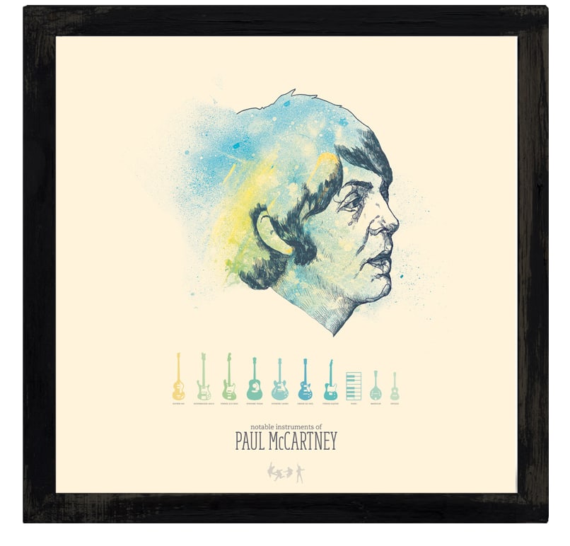
‘Charting the Beatles – Paul’ by Oliver Barrett
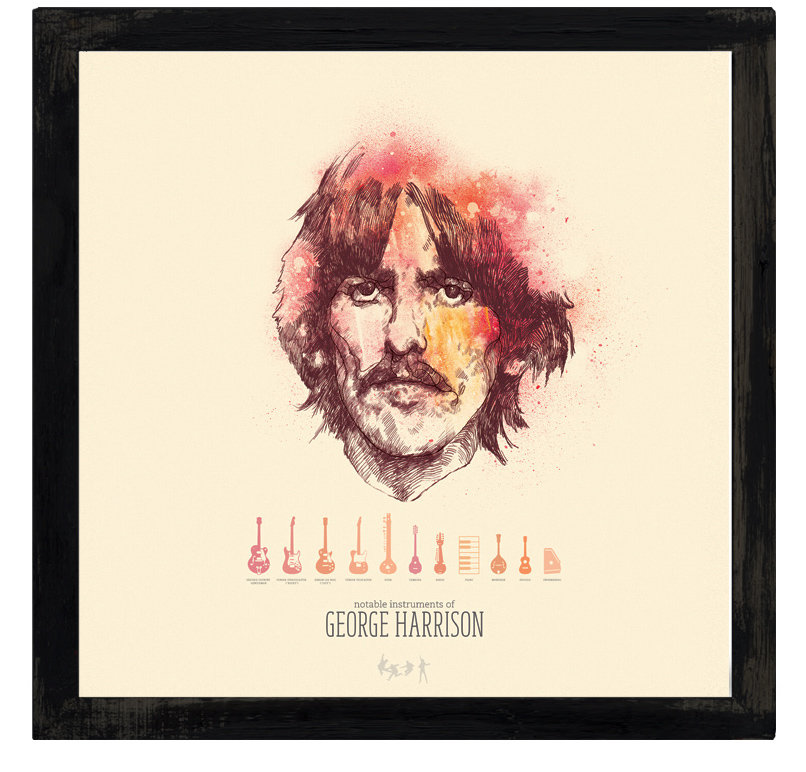
‘Charting the Beatles – George’ by Oliver Barrett
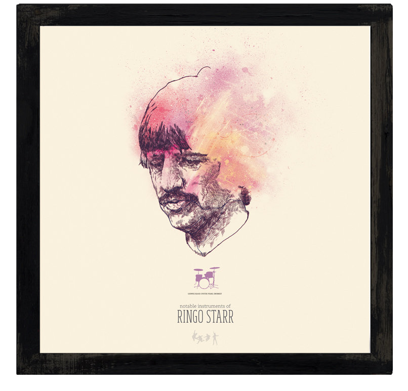
‘Charting the Beatles – Ringo’ by Oliver Barrett
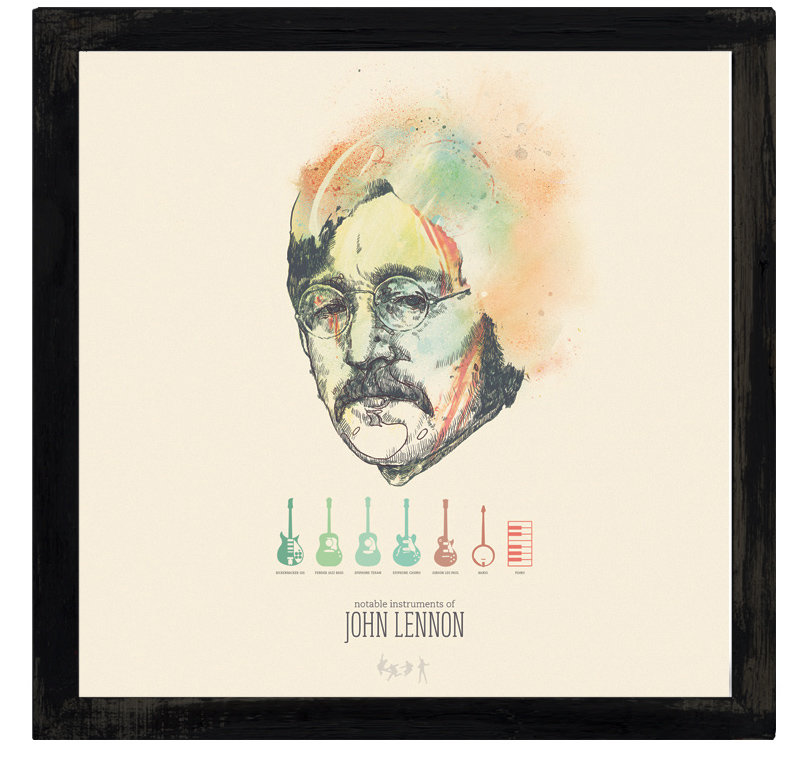
‘Charting the Beatles – John’ by Oliver Barrett
I know some illustrators eventually make the move into printmaking, where they print all of their own work, and some stay strictly illustrators, not dealing with the end product much at all. If given the choice, would you rather be able to do the file preparation for screen printing yourself or hand that job off to someone else who’s an expert at it?
I would want to be an expert at it eventually. If I had the space, I would be learning right now.
For big jobs, I’d still put it in the hands of an expert until I felt comfortable. If I had my own setup, I could see myself doing goofy small prints to hone my printing chops. I can’t really see myself getting that opportunity unless I got a group of artists together to get a space for it.
You show a strong connection to certain things in your life — your hometown, your local sports teams. Your art. There’s a real sense of humanity about how you discuss your work, no sugar coating the bad or shining of the good.
Thanks? I just try to be as straight-forward as I can. It’s landed me in hot water a few times. Even cost me a job once. Hopefully no one gets too upset at anything I’ve said.
If this were a video interview, I would have been smiling the entire time I was talking. None of this really comes from a malicious place.
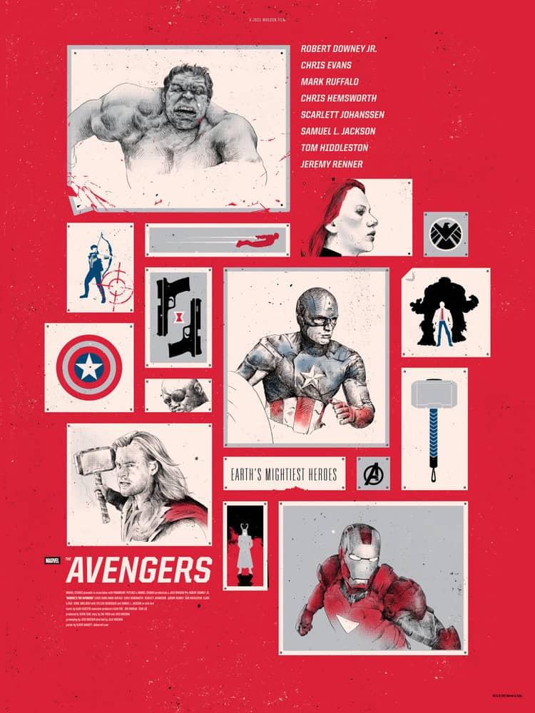
‘Avengers Assemble’ by Oliver Barrett
For all the things you can see wrong with you work, as the viewer, I don’t see it. Your design for the ‘Avengers Assemble’ poster is quite impressive. It takes your detailed sketch style and incorporates a bigger canvas, which you fill with small sketches of each character.
It’s a totally ingenious way to solve the problem of having so many characters on one sheet while staying true to your style. How many sketches and rough drafts did you have to go through until you finally found your composition? Did the gallery have any input or say into the final print?
That one was a little bit easier than it looked. I had done a similar composition for a small project a few months before that Avengers thing and it was scrapped. It made so much sense to try it out with the Avengers because of all of the different characters.
I really enjoyed that poster because it allowed me to do some vector work as well as the drawings by hand. Any opportunity I have to use more than one illustration style is something I prefer to jump on. I don’t get to do it enough.
‘Brennan’ by Oliver Barrett for Gallery 1988’s ‘Step Brothers’ show
‘Dale’ by Oliver Barrett for Gallery 1988’s ‘Step Brothers’ show
With attempting to incorporate as many different illustration methods as you can in one piece, does that make an Oliver Barrett original work non-existent?
Pretty much. I don’t think I’ve done a purely original, on paper piece since the Step Brothers pieces for G1988 and those were still scanned and then cleaned up and giclee’d. Is giclee a verb? No? It is now.
Sometimes I feel like a hack because there’s so much reliance on the tablet and Command+Z and the original hard copy doesn’t really stick around for me, but that’s the business. With the smaller illustrations that I do for my regular clients, the editorial pieces, and then the gallery shows + personal prints, it’s just insanely more efficient to work more on the computer.
Oliver Barrett’s piece for Spoke Art’s ‘Quentin vs Coen’ show
Oliver Barrett’s piece for Spoke Art’s ‘Quentin vs Coen’ show
Some folk see their life in segments – work, and then the rest of it. With so much of your time spent with your ‘work,’ is there any separation of the two? Or really, would you even want there to be a separation between career and family, friends, and free time?
Oh yeah, there’s a pretty big separation. My laptop isn’t always with me. My work is not my life.
I know most folks in the creative community always give this spiel about, ‘loving what they do’ and, ‘it never feels like work’ and, ‘I’m lucky to have this career where I draw’ and blah blah blah and it’s fucking bullshit. It IS work.
I am not lucky to have what I have. I worked my ass off for it. I’ve been drawing my entire life and I’ve never stopped trying to get better. Never stopped trying to think of better ideas. I have a big fat piece of shit student loan that hangs over my head. It’s not luck. It’s time and effort.
This is a job. If I get tired of working out the hair on a portrait, I don’t always get to stop and pick it up later. There are deadlines. You have to push through it. Is it a better job than picking up poop at the zoo or pushing shopping carts? Absolutely, and I don’t take that for granted, but it’s not this wild fun time that some people make it out to be. That being said, I break my work week up a lot with other stuff to keep myself from getting burnt out.
I work out twice a week, play softball on the weekend, occasionally bowl, swim, take my dogs on adventures, play in a band, and spend time with the people I care about. These things are constants and my work-time fits in everywhere around them. Sometimes that means I’m up ‘til 4AM, but it’s worth it if I spent the day doing something fun.
Oliver Barrett illustration for Bandcamp.com
