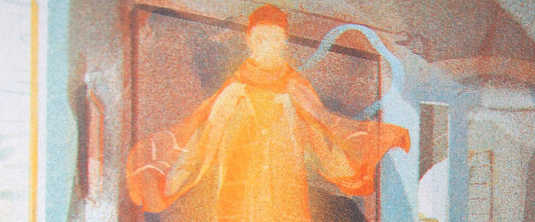
The work of printmaker Georgia Green is beautifully meditative—each print a natural exhale. In her piece Kettle’s Yard, we find a room with a figure afloat, inches above the hardwood floor. She paints the window light with mists of blues that swarm around the glowing figure like gentle ghosts.
A blown out daydream captured on paper.
There is a sense that each piece is a portrait of something, perhaps the daylight or an old house, or both—that moment when the trees sway away from the window and the sun has the moment and pours in. The interiors that she paints are inspired by the historic homes she visits on her travels, painting each with a sense of place and time. Green begin her prints as pastel sketches in a notebook, from there she recreates the art once more through a chimera of analog and digital methods. Eventually, it will be a screenprint or a risograph, or both.
The evolution of Green’s mark making from sketch to print is a living process, her fingerprints deep in each layer. There is a lived in quality to her art—as if she patiently held an archaic camera and observed her own idea over time. You can feel the life the idea has lived in order to land on the paper in its final form, simply brilliant art.


‘Kettle’s Yard’ by Georgia Green
CJ: Your prints are so lush, fuzzy and warm. I can’t really visualize your process. I know you begin with pastel sketches and move to digital, but your work is so painterly I don’t see any remnants of the digital process. I’m used to a screenprint consisting of line art and then a series of colored layers. Looking at your print Kettle’s Yard, there is so much overlap of color and shape and from that magic comes the iridescent figure. Are you painting 100% digitally? Do you paint directly onto the screen or transparency?
GG: All my prints start organically as chalk and pastel sketches. I have a scruffy A6 sketchbook I take with me everywhere filled with ideas. These little compositions are then worked up into larger designs digitally, allowing me add detail to each design as I prepare to translate them into much larger prints. Finalising each design digitally also makes it easy for me to separate the colour layers for my finished prints. I have an old iPad and Ppple pencil (purchased in 2019), which I use with the popular illustration app Procreate.
I studied painting as well as printmaking at university, so the way I draw is naturally very painterly. I use soft watercolour pencils and pastels, prioritising the colour and texture of my mark-making over details. As I work so small, the marks become a central part of the composition in each drawing. So, when I come to scaling up each design digitally there is already a strong foundation of texture to begin with.
Procreate allows you to make your own brushes, so I often photograph textures and turn them into new brushes. I have transformed everything from a pencil mark to woodgrain into a Procreate brush, it is incredibly fun! For example, in my latest risograph print A Visit to Emily’s I added a woodgrain brushstroke behind the chair. I love working these extra little experiments into my designs digitally, as it adds something to each drawing that I wouldn’t be able to make in the original.

‘Kettle’s Yard’ print and original sketch by Georgia Green
The design stage for each print is lengthy as it takes time to layer all the pencil, pastel and digital brushstrokes visible in the finished print. I always prioritise texture over detail, which is clear in a print like Kettle’s Yard. Once a design like Kettle’s Yard is finished I try to translate it as accurately as possible into silkscreen. I split the design into CMYK channels in Photoshop, creating four layers of colours for each print (Cyan, Magenta, Yellow and Key which is black). It’s a little technical, but for silkscreen I work with a very fine halftone in order to print the subtlety of depth necessary for the painterly quality of the designs to resonate. I use the finest silkscreen mesh possible (120T), which makes the halftone almost imperceptible.
I am fortunate to have access to excellent halftone software, and a transparency printer at my studio East London Printmakers. So, the quality of each print is really nice. Alignments is also key with my editions, as more than a millimetre of misalignment would affect the sharpness of the image.
However, as I am basically printing big rectangles of colour one on top of another I find this part quite simple. I never use crop marks, I just follow the edge of the previous layer. I use affordable Daler Rowney System 3 acrylic inks in their special ‘process’ colour range which is designed for CMYK printing. However, I customise each colour with warmer inks as I prefer a bolder, brighter palette.
I would say the most important tips I have for printing CMYK editions is to get really technical about it, as it can be very unforgiving. I weigh all my ink mixes using scales and make notes on quantities. I have my own 120T screens, my own squeegee and my own emulsion tray. So, I know that there is less room for error, and if something is going wrong, I can work out where the issue is and how to fix it. As a printmaker this is the part I love! As it is all about technique. I have yet to try painting directly onto a screen, although I have painted on top of transparencies in the past which is fun. There is so much you can do with printmaking, it is endlessly surprising.

‘Lead Me Nowhere’ by Georgia Green

‘Lead Me Nowhere’ sketch by Georgia Green
Do you think your work loses anything moving from a pastel piece into a print?
I studied BA Fine Art: Painting and Printmaking at university, so the two mediums have aways been intertwined in my mind. I stopped painting once I graduated as I no longer had access to a studio. I couldn’t afford to pay to use a communal print studio, and rent out a more private painting studio on the side. As a result I ended up prioritising my printmaking, which has been very fruitful. I have so much I still want to explore as a printmaker, and I feel the specialised nature of my practice has allowed me to become more skilled as an artist.
With the work I currently make, when I digitise my pastel drawings it feels like a natural progression. It is an opportunity to really study and refine each design before I print. Plus the print process itself can be really playful. I love the painterly, dreamy quality of translucent riso inks. Riso machines translate colour into a fine dither of dots, softening each layer with a grainy appeal. This grain reminds me of old film photography, which lends a nostalgic tint to each edition.
There is also a natural drift which occurs from layer to layer as part of the process, a classic element of the riso charm! I love that these capricious shifts and changes are entirely beyond my control, as though the machine is a collaborative partner adding its own personal touch to each print. In my mind every stage of the creative process from pastel to print is an opportunity for development, and the end results are usually far more enticing to me than the initial drawings.

‘A Visit To Emily’s’ by Georgia Green
Your first risograph print of 2025, A Vist to Emily’s, has the most beautiful rendering of a tiger. The tiger is peeking through the window, inquisitive and sincere. The tiger is a subject you’ve returned to quite often. Compared to past paintings, the tiger in this latest print plays a smaller role compared to the environment in the composition. You beautifully capture the relationship between space and figure and sunlight. How do you approach having a figure (human or animal) as a subject? How do you imagine the relationship between space and figure?
The spaces always come first! All of the interiors in my prints are inspired by real life places I have visited. I have a National Trust membership which allows me to visit lots of interesting houses conserved for the public to view here in the UK. The sweet spot is finding a beautiful interior framed with light. This means many of my editions feature rooms with windows or open doorways where light and shadow can shift and pool in interesting ways. Light has always fascinated artists, just think of chiaroscuro!
The interior in A Visit to Emily’s was designed in response to a beautiful house in Kentish Town (London) where I used to sublet a room. I knew the moment I walked into the hallway and saw their curving lamp that I was going to make at least one edition featuring it. The slightly surreal story threaded through each interior is influenced by a wide range of visual and written material, often including a solitary figure or animal as a narrative cue. I collect inspiration from children’s book illustrations, novels, poetry, frescoes, architecture and interior design.
Tigers often appear in my prints especially. They are a gentle keepsake lifted from a place of literary sanctuary I remember from childhood, Judith Kerr’s brilliant book The Tiger Who Came To Tea. I also watched a lot of Studio Ghibli as a kid, and I have always been drawn to the hidden symbolism or dualism found in the animals, dwellings and characters from these beautiful films. Nothing is quite as it seems in the vivid, nature-saturated scenes of Princess Mononoke, My Neighbour Totoro or Spirited Away. While my artistic style remains very different, I definitely feel the anthropomorphic animals sitting and sleeping in my designs relate in part to my love of these Studio Ghibli productions.

‘Dartmoor Tiger’ by Georgia Green
Are the homes you’re visiting historical homes?
Yes, they’re often historical houses. The National Trust buys up and protects large estates usually because they’re too expensive to maintain or inherit. But they also conserve interesting buildings from famous architects or designers which is more my cup of tea. For example, I have a few prints inspired by The Red House which was decorated and lived in by the famous textile artist William Morris in the 1860s. Kettle’s Yard is a cottage (lived in by famous curators from the 1950s – 1970s) in Cambridge (owned by the university but still free to access), which has been preserved as a wonderful little art gallery.
Neither house are grand estates or hugely old (by UK standards), but they’ve got beautiful interiors! We’ve got a lot of beautiful and/or old building here in the UK, even my local pub opened in 1712.

‘A Visit In Gold’ by Georgia Green
I’ve seen you mention having residencies, which I’m guessing is vital for a printmaker. How does the nature of printing—the need for presses, screens, lithography stones, chemicals, etc. play out in your creative output?
Printmaking is simultaneously wonderfully innovative and frustratingly inaccessible. This is largely due to the specialised facilities required to make both traditional and contemporary prints as you say. Print studios are fantastic resources for artists such as myself, and non-toxic print practices are becoming more commonplace. However, studio fees are often expensive, with limited space or long waiting lists for artists looking to become key-holder members with full access.
I often have to travel in order to access specialised printmaking facilities, which I am fortunate enough to be able to do. But for many artists and communities these barriers are massively prohibitive. As an artist I firmly believe art should be accessible for all, and I have made community engagement a big part of my printmaking practice. Since April 2022 I have been working as a risography printmaking technician and arts facilitator at The Art Station, a charity supporting creative outreach in rural East Anglia here in the UK. Risography is a mechanised form of stencil printing with a more climate conscious appeal than its traditional or digital counterparts. It is a perfect example of innovative, sustainable and affordable printmaking!
I am very fortunate to have access to this particular space in order to make my own work. I am also able to schedule when I choose to run classes depending on my own workload, which is fantastic. My other more permanent studio is East London Printmakers, where I print all of my silkscreen editions. At the moment I feel blessed to have access to both of these printmaking facilities on a regular basis.
I still travel abroad as an artist in residence in order to access more specialised studios such as Aga Lab, a non-toxic print studio in Amsterdam (Netherlands) were I practice stone lithography. Undertaking residences away from home for a month or so at a time enables me to truly prioritise my time as a practicing artist, and access the specialised facilities I need to develop a new body of work.

Ben Nevis by Georgia Green
Your Ben Nevis print is from a photograph you took. It is a wonderful print of a photograph evolving through the risograph process. What was the inspiration for working a photograph into a risograph? Did doing the work impact how you print your paintings?
I have only ever made two photographs into prints, both of which are mountains. I actually made them originally as a teaching aid for my risography classes at The Art Station. Many of my pupils choose to work with photography rather that fine art as a medium.
Whilst I do not naturally gravitate towards photography within my own practice, it is always refreshing to work outside of my comfort zone.

‘A Head Filled With Tigers’ by Georgia Green

‘The Other Side of Night’ by Georgia Green
You will often print the same painting as a risograph and as a screenprint. Are you looking for anything specific in these different editions? What sort of differences between the processes are you playing with?
Risography and silkscreen are very similar print processes as they are both forms of planographic printmaking. Risography (riso) is my favourite medium, as I adore the grainy quality of each print and the warm saturation of the inks. It is nearly impossible to replicate this effect with a screenprint, unless you have access to expensive diffusion dither software (which I do not).
However, riso machines are only able to print up to A3, and the machine I have access to at The Art Station prefers an even smaller scale. This is why many of my riso editions are only A5. Translating each riso design into a silkscreen allows me to scale up each print into A3 and A2 editions, giving them more impact. The colours in my silkscreen editions are always softer, lighter and more ethereal due to the quality of the halftone I work with.
For certain editions I prefer the silkscreen version, as with Kettle’s Yard. Although I usually start each design with risography in mind, and then translate them into silkscreen if I feel further exploration is needed. I find working across multiple printmaking mediums very rewarding, as it enables me to practice and explore every design to its full potential.

‘Tiger in the Bear Rainforest’ by Georgia Green

‘Warm in Blue’ by Georgia Green
You have an Etsy shop with amazing prints, and I was curious if you do craft and print fairs as well?
Yes, absolutely! In the months leading up to Christmas I sell my work at craft and print fairs almost every weekend. They are an excellent way to make money and to promote yourself as an artist. I also find it really encouraging to receive positive feedback from customers face-to-face, and talk about my practice in person.
I travel all over the UK for fairs, so it ends up being a great promotional opportunity. I think this sort of outreach also helps boost my online sales, as I have a surprising amount of returning customers. I also sell a lot of work through exhibitions and commercial galleries. Sadly, this feels more disconnected, as there is very little contact between an artist and the buyer when a sale is made through a gallery. I always relish the opportunity to meet and talk to my customers in-person at a print fair.

‘The Gloaming Wood’ by Georgia Green
What is your approach to social media? I know social media can give an artist a big audience, and that prospect alone can provide plenty of stress. At least that’s my experience. At the moment, I’m leaning towards deleting it all. Your work is deserving of every pair of eyeballs online. I guess what I’m trying to ask is, what do you do, mentally, with social media? Dismiss? Grudgingly play along? Joyfully participate?
This is a tricky question! I personally have been very fortunate with social media. I only use Instagram, and I have a very lazy ‘goal’ to post once a week. So I don’t spend that much time on social media. According to the screen-time monitor on my phone I have only been on Instagram for an average of 20 to 35 minutes a day this month, although who knows how accurate it is.
The majority of my 7k Instagram followers are fellow artists, who without fail are heartwarmingly supportive and generous people. I find the interactions I have online to be entirely positive as a result, which I realise is a rare gift! I keep my Instagram almost entirely professional – following artists, galleries and studios. I often spot open-calls this way, and find myself feeling really inspired by what I see from fellow creatives. The less formal, more casual nature of a platform like Instagram allows me to see the creative process of other artists in far more depth than a professional website or exhibition would provide.
Instagram has also directly boosted my income over the years by bringing new audiences to my work and providing its own free shopping platform which doesn’t (yet) take a cut unlike marketplaces such as Etsy. However, I am also under no illusion that Instagram can be an incredibly restrictive and toxic platform for creatives. I cannot begin to imagine how stressful it must be for the multitudes of talented, professional artists whose accounts are taken down by mediators. Often simply because they post sex-positive or LGBTQIA+ art which ends up being reported or flagged.
I think this is especially dangerous when (like me) artists are reliant on one particular platform for all their outreach. I would be devastated to lose the community I am part of on Instagram, not to mention the potential revenue loss I would experience as a result. To sum up! For me social media has been a blessing on an individual level. However, I reserve a deep distrust of the developers and moderators behind the Instagram app, and I think it is can be a very oppressive space for certain artists.
Although I don’t use any other social media apps, I am sure the same is true across all mainstream platforms. I completely understand why artists find alternative ways to build community, and I am a huge fan of mailing list newsletters personally. One of these days I aim to start one of my own, as I love receiving little email updates from other artists.
Agreed, I love an artist newsletter!

‘A Cat Named Juliet’ by Georgia Green
