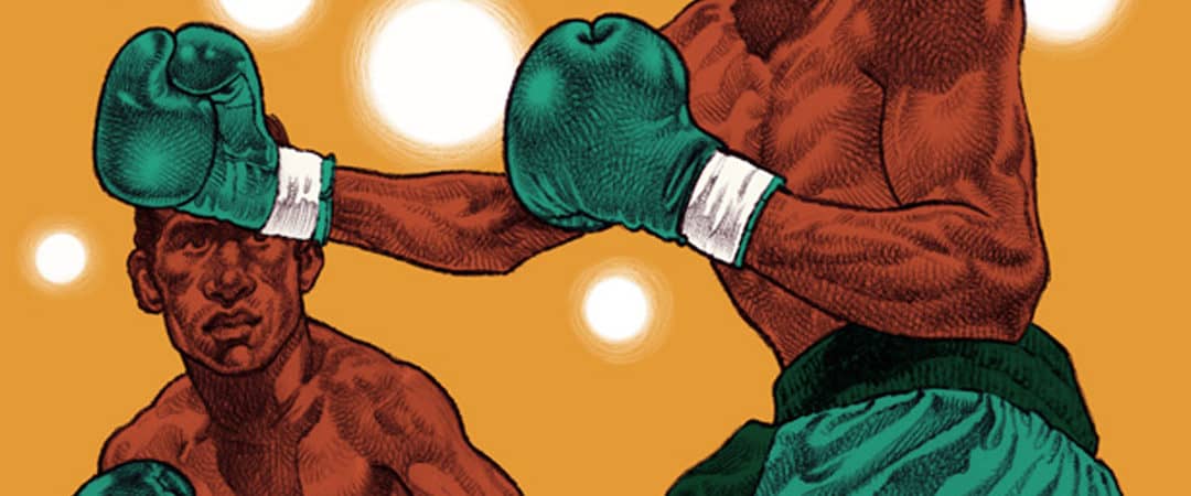
The posters of Swiss illustrator Michel Casarramona move between impressionistic caricature and deliberate realism. With each of his posters having a low color count, he finds visual depth with his organic and controlled pencil marks. Beneath his hand-drawn gradients exist a single plot of color, Each poster is in need of dense information on a single slab of paper, Cassaramona lays out his custom type while never losing sight of the core illustration. Each print is an exquisite lesson in the classic gig poster — no false move of type, figure, or color.
Cassaramona’s work speaks to the past, turning to the visual cues of the ’50s and ’50s advertising world. That was an era that focused on developing the tools of marketing that are still in use today — sell experience, sell an idea. Cassaramona understands his posters exist to promote a specific event, but he shows faith in his art to the story.
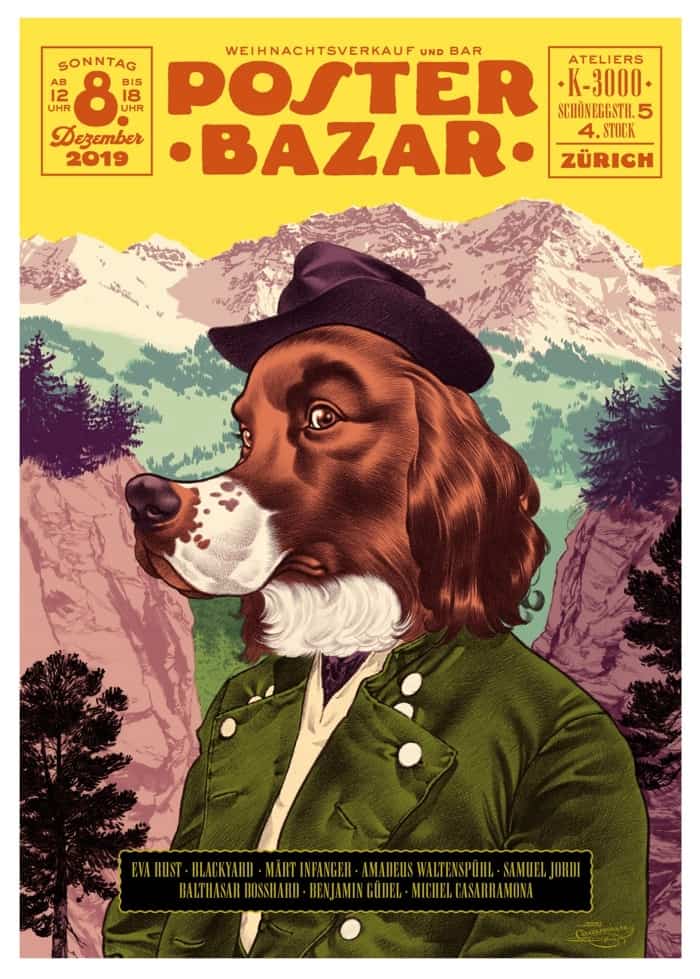
Poster Bazar December 2019 poster by Michel Casarramona
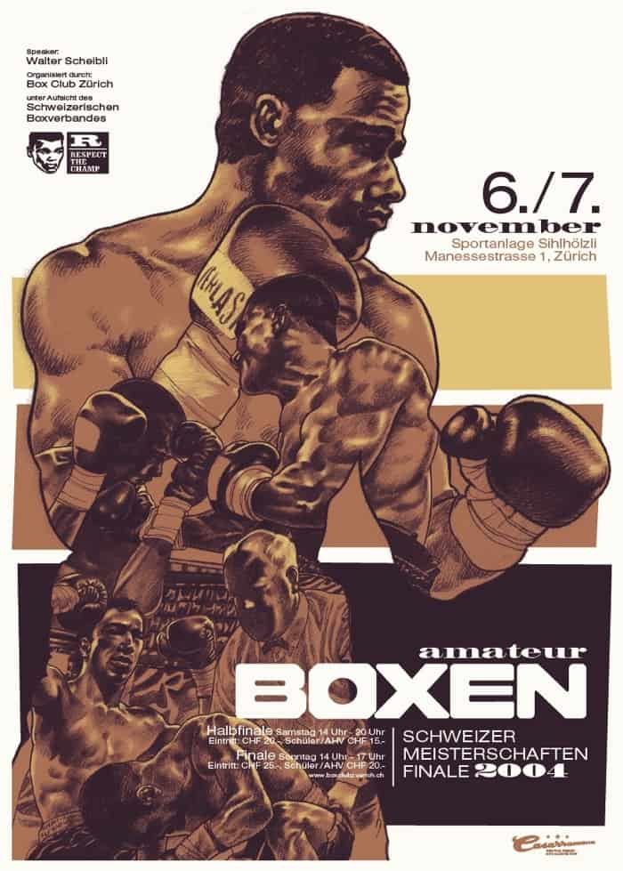
Boxen 2004 poster by Michel Casarramona
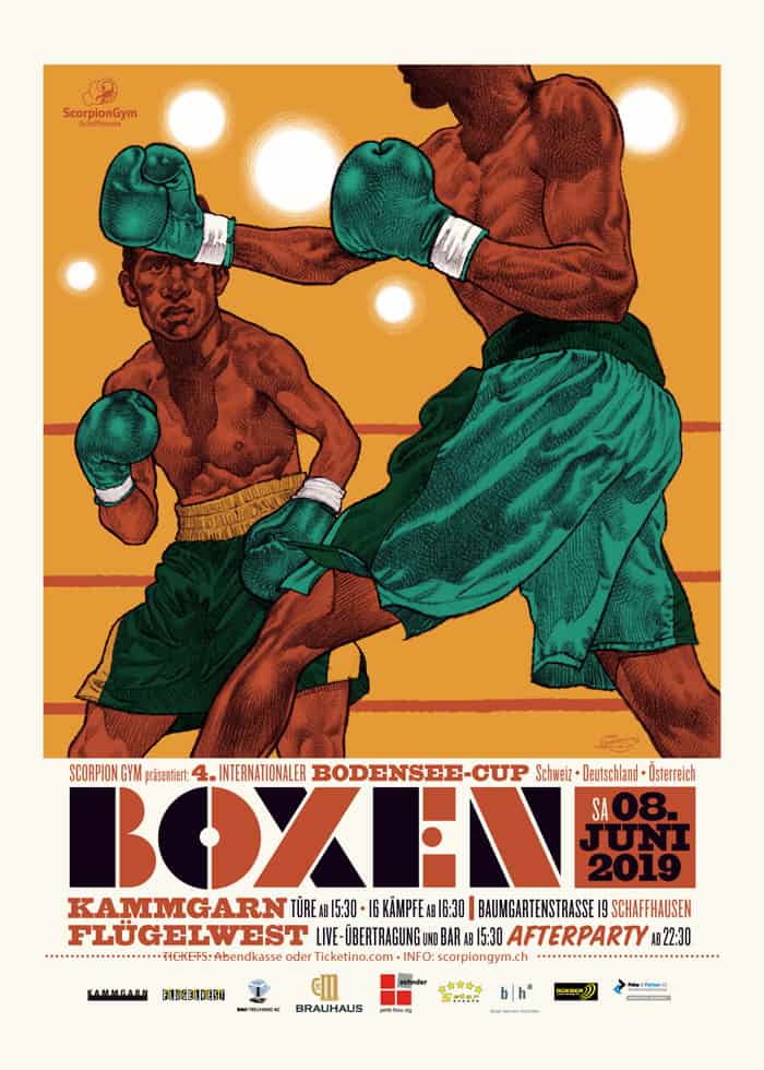
Boxen 2019 poster by Michel Casarramona
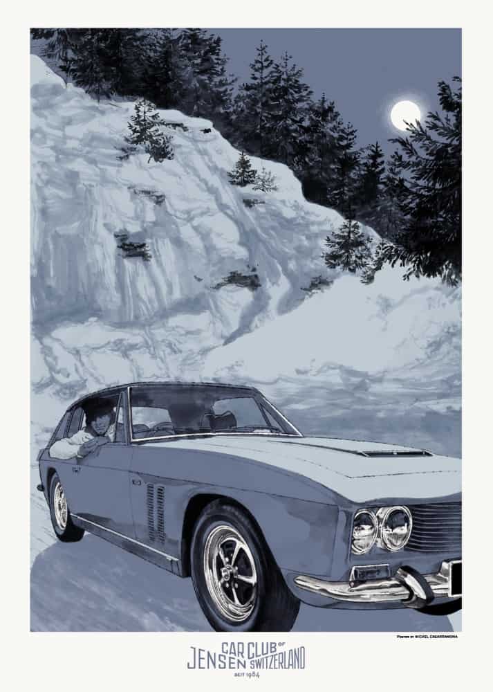
Jensen Car Club of Switzerland 2018 poster by Michel Casarramona
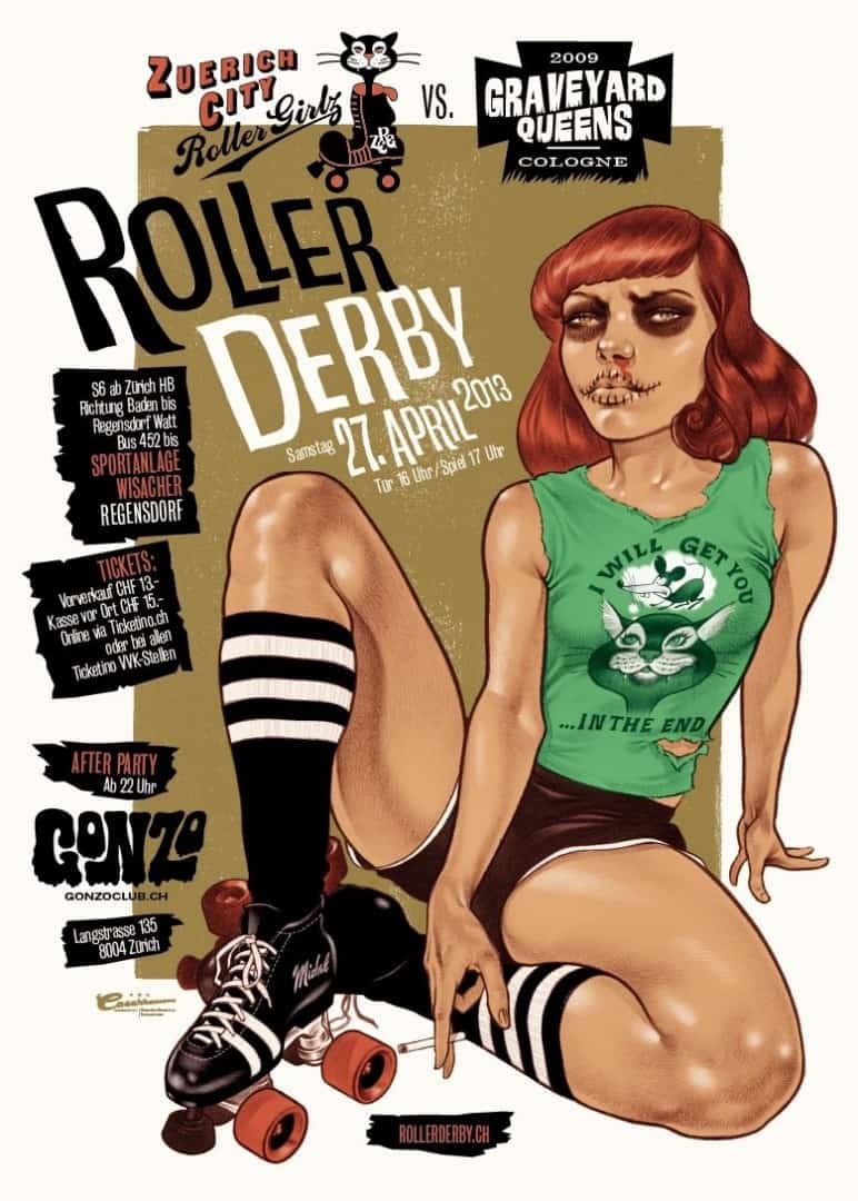
Roller Derby 2013 poster by Michel Casarramona
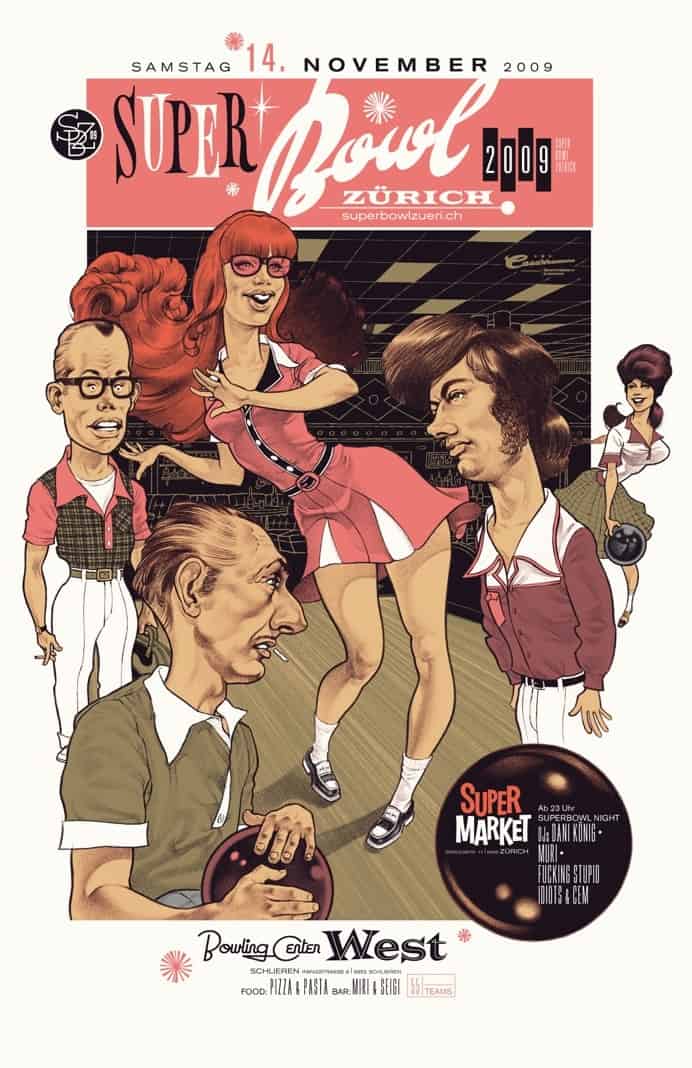
Super Bowl 2009 poster by Michel Casarramona
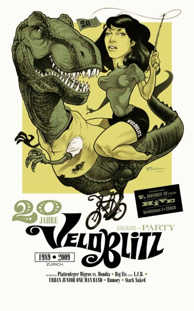
poster by Michel Casarramona
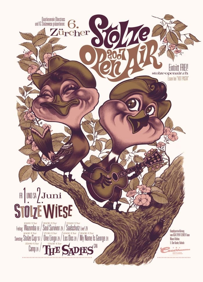
poster by Michel Casarramona
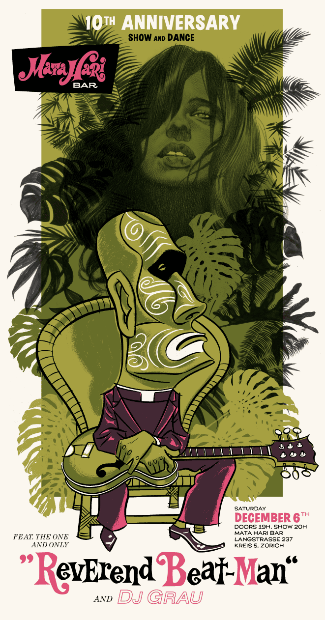
poster by Michel Casarramona
Hi
I have 3 posters by michel casarramona to sell
-brodbeck ‘s playground signé 40/100 new perfect
-the sadies 2007 band tour signé
-albin horror picture show 190/250 signé
would you be interested ?