London-based illustrator Jack Hughes has built a career in the world of fashion, crafting a portfolio filled with the beautiful and the chic. His illustrations capture the truth of the fabric and design while heightening the allure and magic aimed for by the fashion industry.
Hughes accomplishes a great deal with simple shapes—a bowed arm, the white dress, a flock of hair. Each a bare form of solid color. The elements spartan by design. There are a variety of experimentations in his portfolio, as the artist pushes the negative space and reduces the color palette to its most vital elements. In an industry where photography is the default tool for advertising, Hughes returns fashion to the splendor of J.C. Leyendecker and the elegant illustrations of the 1920s. I had the pleasure to connect with Hughes to learn more about his career, his take on illustration vs. photography, and the influences that London itself has on his work.
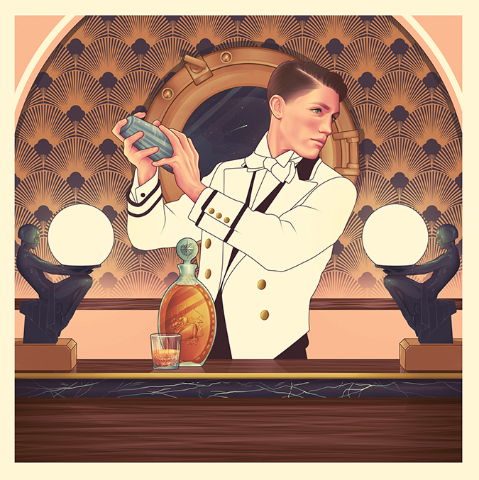
Illustration for Eckero Line by Jack Hughes
CJ: Your illustrations for Holland & Sherry’s fabrics depicts the collection with crisp detail–the quality of the clothing design is sharp and front and center, yet those illustrations still have your style to them. When taking on the task of illustrating something like fashion, how much freedom are you given to explore, visually, the product? The client chose you overusing photographs, so there is an investment and importance put upon your work.
JH: I don’t want to pooh-pooh the industry and I find it helpful to be as honest as possible. Holland & Sherry chose illustration over photography simply because it was the cheaper option and a more flexible option, too. To use photography for the lookbooks, they’d have to get the garments made and photographed on models—a long and expensive process. I’m actually surprised more fashion magazines haven’t employed a similar approach to their editorials—magazines don’t have the big budgets they once had and budget cuts are happening year on year. Illustration is a cheaper option to photography and can provide an interesting alternative to what’s already out there.
For Holland & Sherry, they were quite particular with the styling in each illustration. It took some real convincing to get them to push themselves beyond a three-piece suit for the men and a shift dress for the women. In the past, most clients will give you some creative freedom to interpret the clothes as you see fit. Keeping in mind that the brand is recognizable and the focal point of the illustration for Holland & Sherry, the clothes were the most important part as they had to come first with everything else following suit.
Illustration for Holland & Sherry by Jack Hughes
Experiment #2 (edited illustration for Holland & Sherry) by Jack Hughes
Experiment #8 (edited client work) by Jack Hughes
You spent a good part of your early career with Shortlist Media. When you left, did you have a plan? What prompted that change in career?
When I worked for ShortList Media, I was still freelancing and taking on other jobs. They were my main client for quite some time, however, as I had signed a contract with them. It made sense to work from their office a few days a week, both for the team I worked with on Mr Hyde [a daily men’s lifestyle email with 40K+ subscribers] as well as my own sanity at getting out of the house.
The consistent workload was great for someone who had not long left [at] university. What wasn’t so good was the restrictions they had put on me in the contract about who I could and couldn’t work for (mostly the latter). Leaving them and coming off the contract was so liberating [and] it didn’t take long for the clients who had been wanting to work with me for years to finally commission me. I’ve never looked back and I’ll probably never sign a contract like it ever again. I’m grateful to have experienced something so important and eye-opening so early on in my career. It taught me a lot about not just the industry, but about myself, too.
“Digital Selling” Illustration for WWD by Jack Hughes
After leaving Shortlist, you remained in the world of fashion. Was that a conscious choice? What is it about fashion that attracts you?
I suppose my work for Mr Hyde had become what I was best known for and clients wanted a piece of that. I enjoy the aesthetic of fashion and I still love how some brands continue to make it fresh and interesting (Gucci and Maison Margiela, for example) but I dislike the industry as a whole.
People are often too concerned with how successful their lives appear and become consumed with the glamour and privilege of the industry than actually concentrating on the art and the talent. The focus should be more on the highly creative and talented individuals running these large fashion houses full of other highly creative and talented individuals producing beautiful garments for the world to see.
Jack Hughes’ cover illustration for the ‘The Gentleman’s Handbook’
You’ve illustrated two books for Alfred Tong. How did your relationship come about? Did he pitch you the idea for the books?
It was actually the publishers who first approached me, Hardie Grant Books, after seeing an illustration I had done of Mad Men when I was in my third year at uni. The project didn’t start until a year later and it was the project that launched my career and my style. I learned so much about my working method and aesthetic during that time … I’m so grateful for it and it remains one of my fondest jobs.

Illustration of Frank Ocean by Jack Hughes for the Village Voice
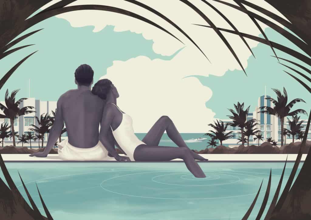
Illustration by Jack Hughes
Your illustrations for ‘The Gentleman’s Guide to Cocktails’ have a texture to them—an analog Polaroid scratch. Was that in response to the era the book was trying to evoke? It works quite well, especially how sparingly you used it. It feels organic yet total precise. Textures don’t show up in much of your work outside of that series. Was that a project-specific experiment?
I use to play around with textures and effects more when I was at uni, I found myself wanting to develop a healthy relationship between digital and analog processes during my three years there. My course tutors were very traditional in their methods and would praise us if we followed their lead. Don’t get me wrong, I think a foundation rooted in analog techniques is essential to grow as an illustrator. I simply wish my tutors had championed digital more, not as an alternative but as a companion to the traditional.
This fondness for textures remained as my work became wholly digital [and] it also worked for The Gentleman’s Guide to Cocktails, a book reminiscent of an era where illustration was at its peak. I wanted the style to reflect that—a homage but with a contemporary edge. Not many projects since then have offered me the same chance to play with textures in such a way, but I have been sneaking them back in over the last year. For me, they have to tie in with the job—I don’t want to sprinkle my illustrations with textures for the sake of it, to make them prettier—they have to have a purpose. I’m constantly trying to develop my style and everything comes full circle eventually.
QPS Brochure illustration by Jack Hughes
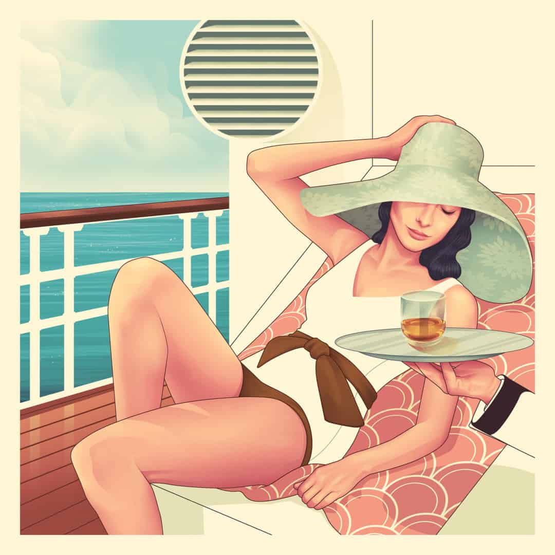
Illustration by Jack Hughes
As a bonehead American who has never even been to London, your work ‘feels’ like the imagined London in my head—urbane, sophisticated, and forward-thinking in lifestyle. Being born and raised in London and calling it your home, do you have a sense of its impact on you as an illustrator? If you were from another part of the world do you think your art would be the same?
London is so vast and sprawling as each neighbourhood is different from the next and each street displays a mixture of architectural styles from different eras. It’s a beautiful, hot mess and its people are just as colourful and varied and interesting, I cannot imagine myself living anywhere else. London has been the backdrop to my entire life, I can’t pinpoint any exact influences.
I feel what London has given me above anything else is room to breathe, explore, nurture my craft and provide a sense of constant inspiration. It has an overbearing presence, the reminder that you are somewhat insignificant—a tiny cog in an inconceivably vast network. That sounds gloomy, but I find it humbling—you’re not the centre of the universe, everyone you see or interact with has their own struggles, all 8.7 million of them. It’s reassuring knowing you’re not alone, giving you perspective to focus on yourself and not [on] what anyone else is achieving. I often wonder who I would be if I had been born in a different city or country. And I honestly don’t know.
Experiment #3 (edited client work) by Jack Hughes
Even though your illustrations are highly figurative, loose forms and shape play a major role in your work. Your series revisiting client work shows detailed faces and hands placed amongst a variety of patterns. It’s incredible how well they work—the figure feels grounded even without the detail of the full body. When approaching a project, like the Women’s Wear Daily ‘Digital Selling’ image, where details fall or are non-existent, does that come from the client, the content, or you? The Macallan ‘Golden Age of Travel’ series is highly detailed and remains your most ‘realist’ take. Both of these illustrations have your style but go in different directions. Are both comfortable?
I’d love to give a simple answer and say it’s simply down to time constraints, but The Macallan job is a prime example of a job I had very little time to complete but went overboard in terms of detail. It all depends on the job and the client, I think because my work is figurative and not too dissimilar from the realms of photography that clients have a solid idea of what they want me to produce and it becomes difficult to break that mold. Holland & Sherry was a prime example of a client with a very traditional means of imagining my work. They would think certain parts were unfinished or neglected when it was me simply trying to push them out of the stylistic rut they’d forced me into. Which is exactly why I went and reimagined older illustrations of theirs, transforming them into something a little more exciting and enjoyable for me. It’s definitely something I want to pursue in future projects, but it’ll be a slow process transforming how clients view my style and how they see it fitting within their own needs.
Illustration for The Macallan by Jack Hughes
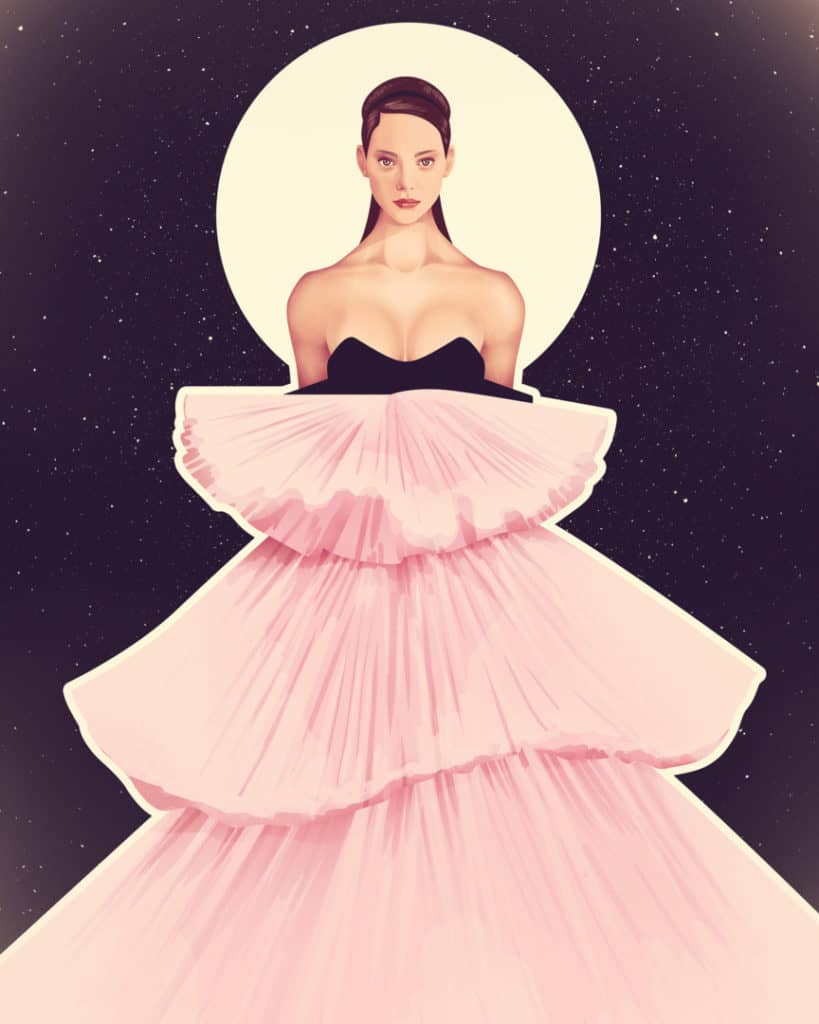
Giambattista Valli illustration by Jack Hughes
Illustration of Iggy Pop for The Village Voice by Jack Hughes
Your portraits for The Village Voice are beautiful—your take on Iggy Pop shows the man in a new and interesting way while staying true to who he is. The same can be said for Adele, John Mulaney, and Groucho Marx. Those illustrations have a loose and painterly approach. It’s an inspired direction to take for how they were used. Did the client ask for that? Was that your decision based on the brief?
The Village Voice is a brilliant client to work for and I’d implore anyone who gets the chance to work with them to jump at the opportunity. They have such open briefs and are generally very laid back in their approach to each commission. The stylistic approach to the series of portraits I did for them was something I had been wanting to try for a while and they were keen. Sadly, the details were lost as the quality of the paper it’s printed on isn’t great, but I had a great time working on them and again it’s something I’d like to develop in future projects.
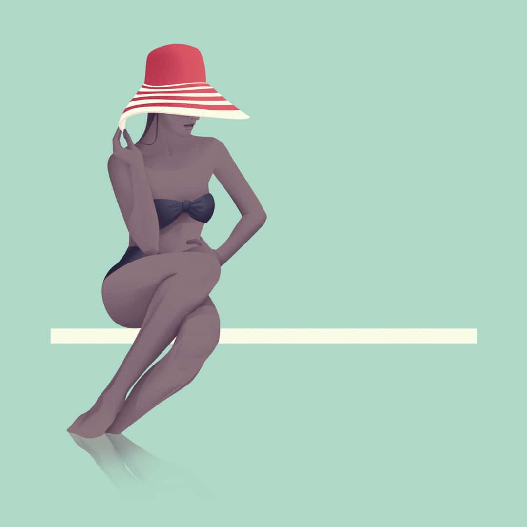
Illustration by Jack Hughes
Illustrations based on Gucci’s F/W16 Collection | personal illustrations by Jack Hughes
Illustrations based on Gucci’s F/W16 Collection | personal illustrations by Jack Hughes
The series of illustrations inspired by Gucci’s F/W16 line is incredible with those brilliant shapes, again. The young woman with short-cropped hair, blue V neck sweater, her head floats free of her body yet the viewer completes her neck. These are bold and really push fashion illustration into interesting places. Are you starting first with the clothes? Did you work from reference photos from the runway?
I’m in love with the work Gucci is putting out. This was the first collection of theirs that I truly admired and I responded by illustrating some of my favourite looks. I was again playing with the relationship between graphic shapes and details. It was great fun and something I wish clients would embrace more. I used references from the runway but tried to alter them so they were as symmetrical and graphic as possible. Usually starting with the head, the rest just falls into place—I had no real plan in how to develop this series, I kept going back over them and developing them as a collection until I realised I had to stop.
Jack Hughes photographed by Lee Faircloth
St. Vincent illustration for Guitar World by Jack Hughes

