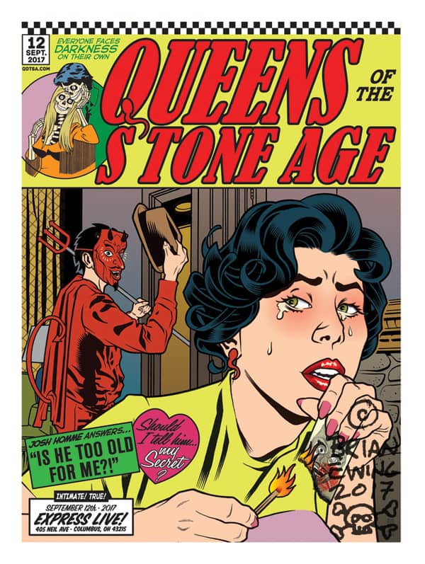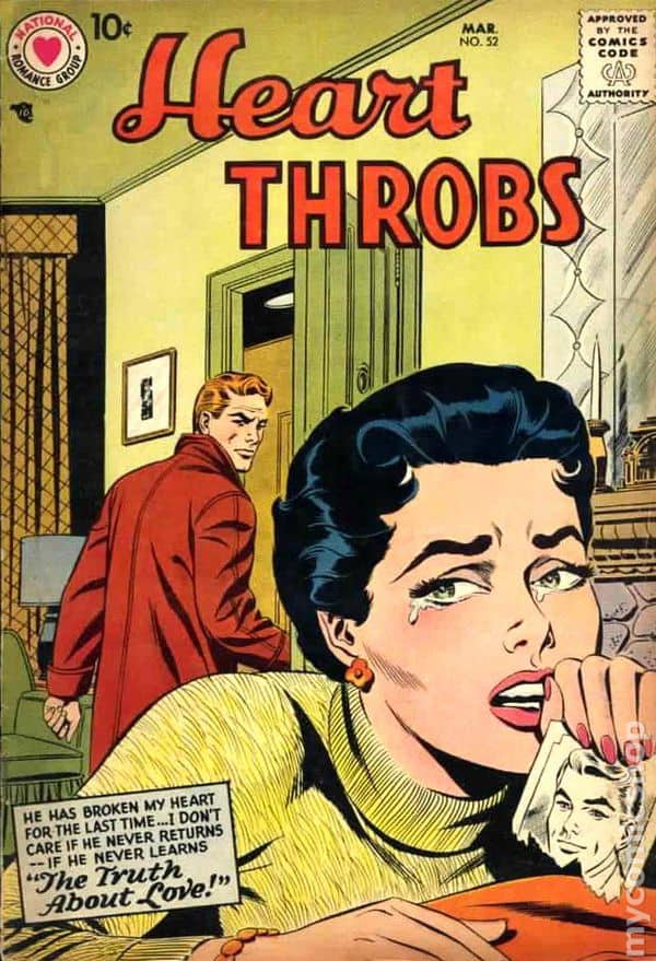
Illustrator Brian Ewing uses the history of design and illustration as a tool. He keeps an intelligent eye on his influences, exploring new ways of connecting his work into the storied lineage of the illustrated poster. Ewing’s 2017 poster for a Queens of the Stone Age performance in Ohio is a prime example of this, as he explains, “I am a HUGE fan of the old romance comics because of how awful and cliche they are. But they’re also a great source for design inspiration. On top of that, I love John Romita Sr.’s work. I’m not the first gig poster artist to find inspiration from old comic book covers either. Guys like Frank Kozik had already opened that door, in the late 90’s, for the rest of us to walk through.”
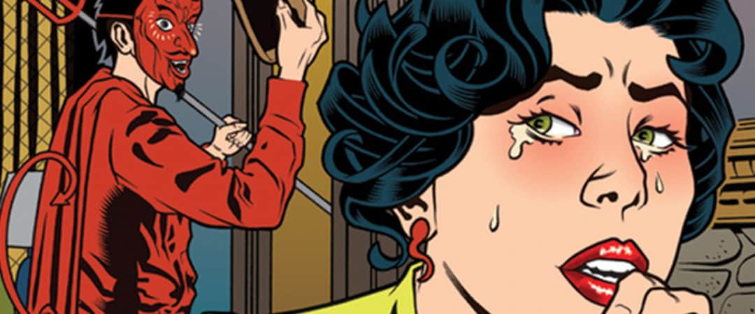
The poster not only plays on a template created by Romita, Sr. but also on the identity of the band itself and the imagery they had created for Villains, their current album at the time. “I was worried when I sent in the sketch to the band but they were happy with the direction I was taking. I felt that the vibe would fit QOTSA perfectly since they have a sense of humor about themselves. Villains had just come out as I was finishing the poster so I didn’t have time to read over the lyrics. I wanted to use the devil character, that was drawn by boneface, and reimagine him in my own style. I grabbed a lyric from ‘Fortress‘ off their new album and used it near the band’s name. When it came to print the poster I talked to the printer and asked how we could use 4 color process printing and make it look like an old comic book. Mis-registration and all. I’ve never tried that style of printing but am very happy with how it turned out.”

Gig poster for Queens of the Stone Age by Brian Ewing

Heart Throbs #52 cover by Sy Barry & Bernard Sachs
