For art to be timeless it first needs to exist and expand beyond the regular and everyday eyes of existing fans to reach the regular and everyday eyes of the world at large. A gig poster exists as a billboard in the life of the gig poster collector and a minor slice of ephemera for the casual fan of the band, but those regular and everyday eyes — supermarket eyes, are capable of appreciating and enjoying the art printed on the paper.
When it comes to creating a year-end list I think of those supermarket eyes — if given a short moment of their time, what do I think they should see? This list consists of art I found myself referring people to this year, posters I think go beyond the properties and bands they represent to be something special. Unique. Will they become timeless? Well, as the phrase implies, time will tell.
‘Swiss Army Man‘ by Oliver Barrett
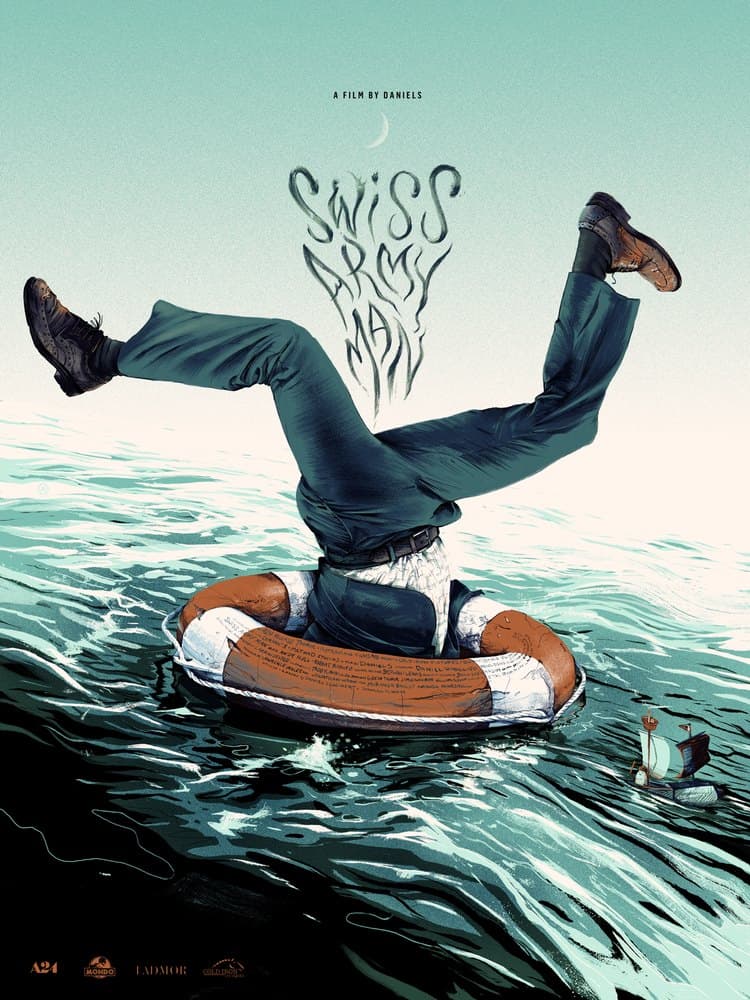
‘Swiss Army Man’ (Regular Edition) by Oliver Barrett
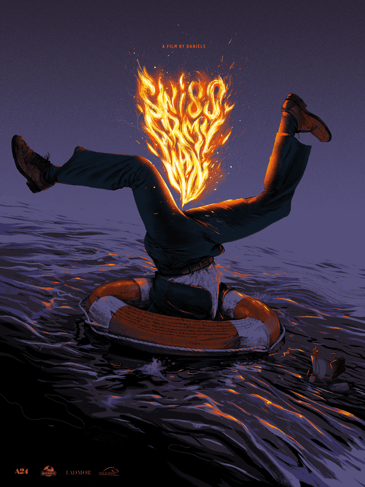
‘Swiss Army Man’ (Variant Edition) by Oliver Barrett
It is rare when a poster has a regular and a variant version that are both the same as well as two entirely different pieces of art, but Cleveland based illustrator Oliver Barrett did just that with his poster for ‘Swiss Army Man.’ Barrett is a skilled artist blessed with a sharp wit, empathy, and an incredible sense of composition and for ‘Swiss Army Man‘ he turned an elaborate fart joke into a brilliant slab of art.
PJ Harvey at the Greek Theatre, Los Angeles, CA by Ken Taylor
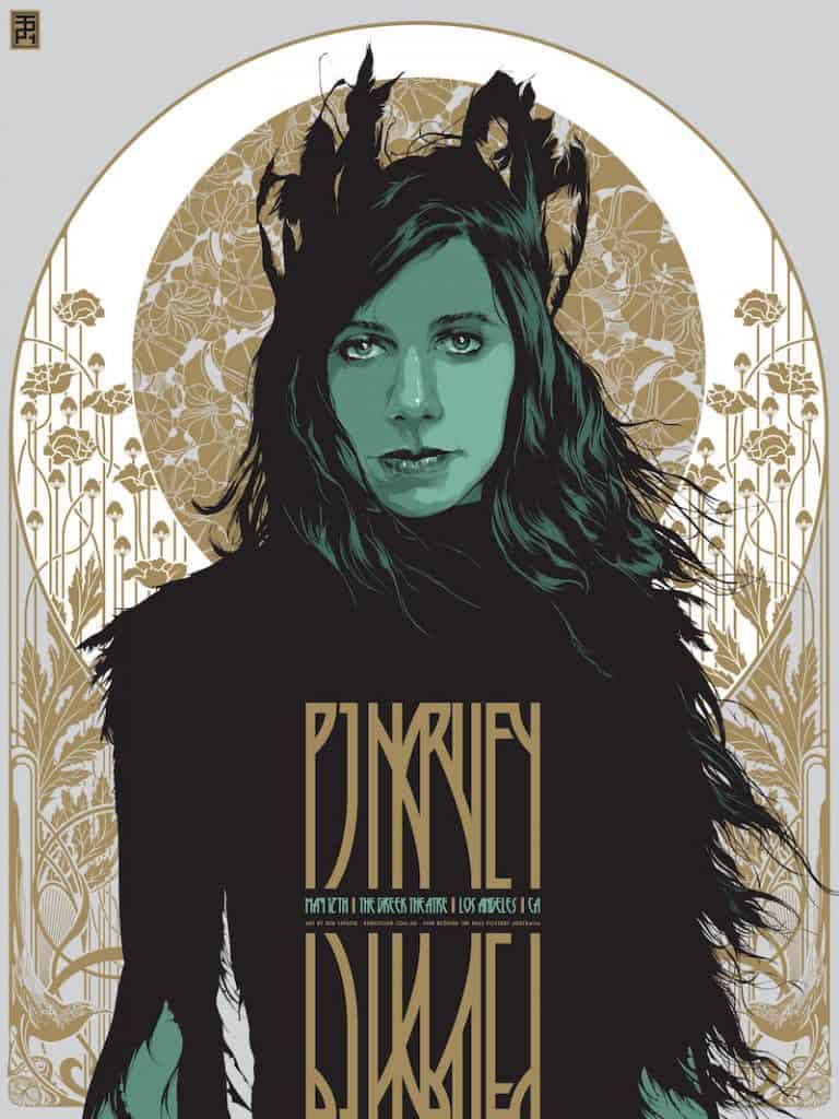
PJ Harvey at the Greek Theatre, Los Angeles, CA by Ken Taylor
In his gig poster for PJ Harvey’s LA performance, Australian illustrator Ken Taylor captured the austerity of Harvey’s music and persona — beautiful and raw, regal in presentation. Direct likenesses are difficult to make compelling beyond the fact that they look like who it is supposed to look like, but here Taylor nails the likeness but goes beyond that to visualize Harvey as a modern goddess, witch-like, bringing subtle and static gold decor to the lively beauty of Harvey.
‘Spacelord‘ by Rob Schwager
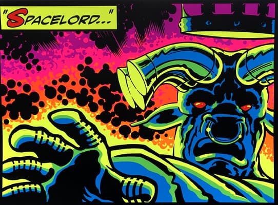
‘Spacelord’ by Rob Schwager
Illustrator and print-maker Rob Schwager keeps a workman-like schedule as a colorist and graphic designer, and still finds time for gig posters and his own art prints. With ‘Spacelord,‘ Schwager pays homage to the history of American comic books and especially comic great Jack Kirby. The poster is wild, vibrant, and incredibly fun. It immediately puts me back into my childhood and feeling that excitement of a reading comics. Over the top and bold. This is simply a wonderful piece of comic art.
‘Saburo‘ by Joáo Ruas
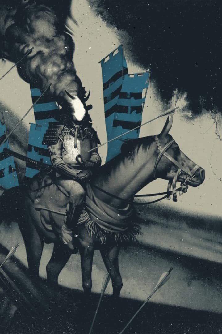
‘Saburo’ by Joáo Ruas for Black Dragon Press
Filmmaker Akira Kurosawa’s ‘RAN‘ is a narrative rich with history and myth, a lineage of ancient families, war, and the struggle for power in a forgotten era. In his fine art work, Brazilian artist Joáo Ruas creates his own strain of myth and history, embuing his artwork with a sense of antiquity. Here, Ruas sums the ancient fury of Kurosawa’s narrative into a single image that reaches the high expectations set by the film’s label of being called, and rightly so, a ‘masterpiece.’ Ruas’ entries into the world of screen prints have all been stellar, and ‘Saburo‘ is no exception.
‘The Observer‘ by Ash Thorp
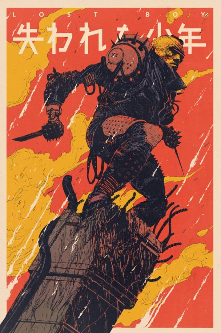
‘The Observer’ by Ash Thorp
Ash Thorp carries many titles — director, designer, animator, concept artist, digital artist. One he does not go too very often is that of illustrator and printmaker. ‘Lost Boy‘ was a concept Thorp had been working on for years, and 2017 saw the release of the short film as well as a few collectibles. For those that followed Thorp’s work, finally seeing a print from the concept was exciting unto itself. ‘The Observer‘ finds Lost Boy above the desolate cyber-punk world he exists in. Thorp’s film work is crisp and rendered with the utmost attention to believability, but for this poster he turned in a wild and loose drawing, alive with movement.
‘Labyrinth‘ by Richey Beckett
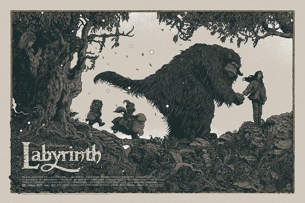
‘Labyrinth’ by Richey Beckett
Jim Henson’s ‘Labyrinth‘ is a perfect subject for UK based illustrator Richey Beckett. As Beckett’s career progresses, he has leaned into his penchant for illustrating the rugged flora of his native country. In Henson’s film, the world of Sarah, its heroine, come to life in strange and exciting ways — a task that Beckett was clearly up for. He recreates Henson’s world (by way of concept artist Brian Froud) while keeping his own style intact. This illustration shows the classic adventure spirit of the film, the fun of it all, as well as the charm and awkward adolescence of Sarah.
‘Mary Poppins‘ by Marc Aspinall

‘Mary Poppins’ by Marc Aspinall
‘Mary Poppins‘ never gets old. It is a film I constantly rewatch and enjoy — it is a happy place. Illustrator Marc Aspinall took on the property for this year’s Mondo x Cyclops Print Works Present NEVER GROW UP: A DISNEY ART SHOW and delivered an absolutely stunning take on the classic film. Aspinall brought the pure magic and wonder of the film to life and the way the text lays in the clouds, her name the sun lighting the sky, is beyond brilliant. I am in love with this illustration as I am the film and music. A true masterpiece.
‘TMNC-OOOA‘ by Matthew Woodson

‘TMNC-000A’ by Matthew Woodson
There’s a level of quiet and warmth in the art of Matthew Woodson. ‘TMNC-OOOA‘ is a collection of three art prints, strangers in each, lives caught in solitude. Woodson excels at this level of loneliness, the beauty of it — the benefit and necessity of living within yourself, even amongst others. He nails the rendering of the brick and rock and the slow phase of the moon between the illustrations, the poster’s internal clock, is wonderful.
‘Wonder Woman‘ by Tula Lotay
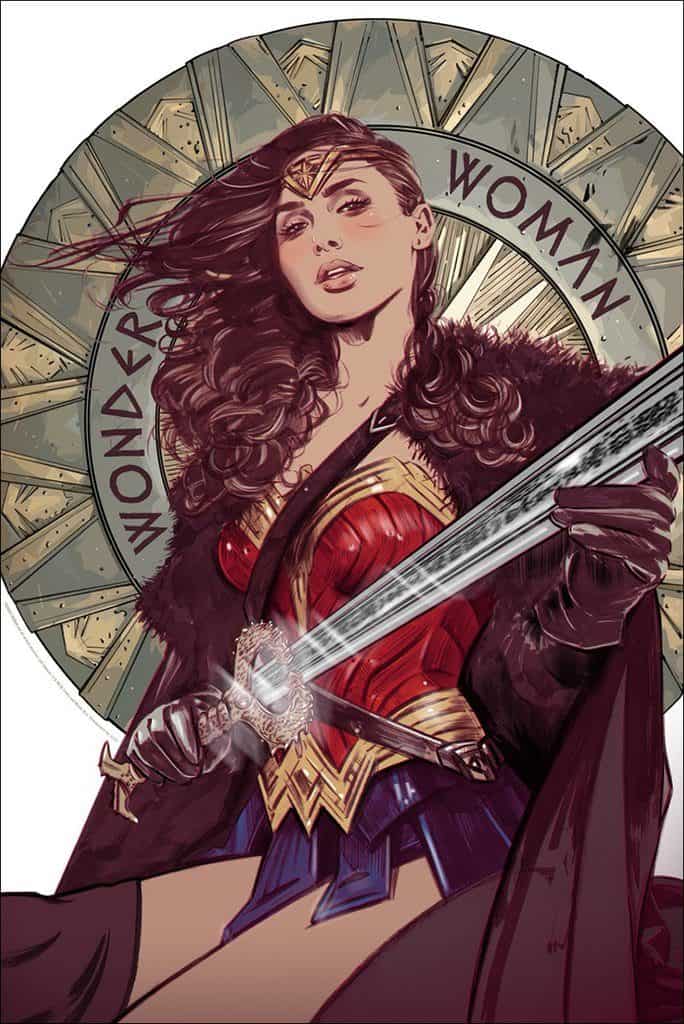
‘Wonder Woman’ by Tula Lotay
‘Wonder Woman‘ is a film that pushed beyond the Linda Carter era television show and the comics to bring Diana Prince into the modern world. Illustrator Tula Lotay‘s poster for the film captures all of that — the history, the modern update. Gal Godot’s performance made the film something special and here Lotay focuses solely on the figure of Diana — she’s intelligent and kind, strong and yes, there is the inherent sex appeal of a beautiful woman, which Lotay excels at illustrating, but the entire focus of the film and this illustration is that of the Amazonian princess, a warrior ready to defend those unable to defend themselves.
‘Collisions‘ by Kevin Tong
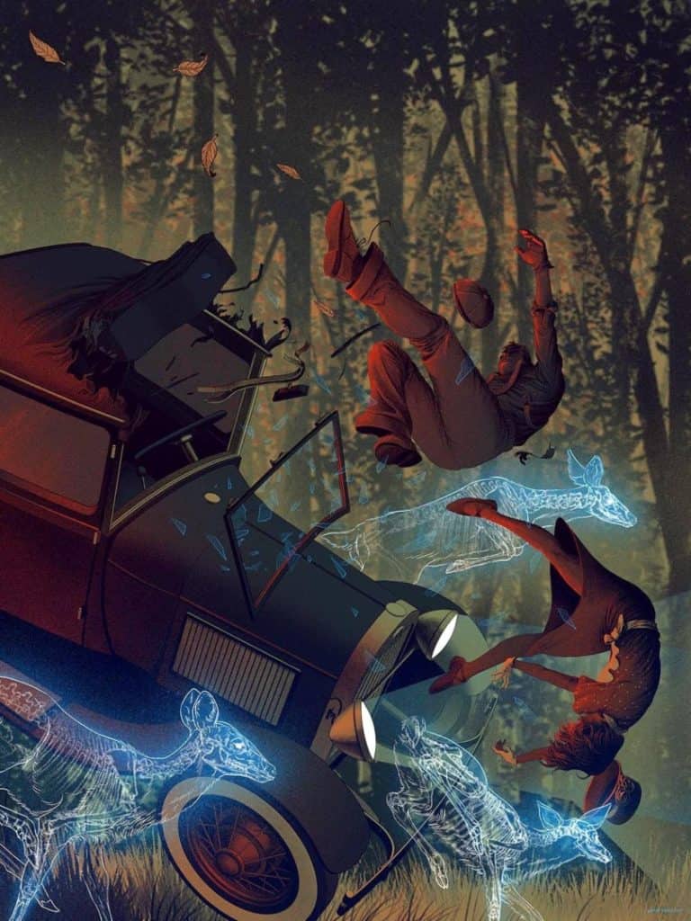
‘Collisions’ by Kevin Tong
Kevin Tong is constantly moving forward — his illustration, both in technique and execution is a forever evolving. His art print ‘Collisions‘ further pushes Tong’s expert level draftsmanship and focus of concept. ‘Collisions‘ is harrowing — are both man and woman already dead and the ghostly deer are the first glimpse of their step into the afterlife, or are they the cause of the accident? Either way, a beautifully haunting piece from Tong.
‘The Temple Falls‘ by JC Richard
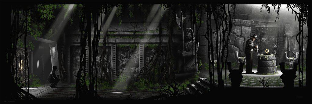
‘The Temple Falls’ by JC Richard
Steven Spielberg’s ’80s blockbuster ‘Indiana Jones and The Raiders of The Lost Ark‘ is a film of classic set pieces and iconic moments, and one that is frequently borrowed from and parodied is the opening sequence in the temple — the whip and hat action, the shooting darts from the walls, that boulder rolling overhead and of course, the switching of the idol for a bag of sand. It is a scene we watch play out in quick snapshots, but for his poster ‘The Temple Falls,’ illustrator JC Richard stands back and pieces the entire sequence together, something that Spielberg never shows us.
It is one thing for an artist to pull images from frames of the film to make an exact replica, but it is an entirely different beast for an artist to take the bits of what we see and piece it together, a mapping out of a moment in a way never intended to be seen. The moment Richard chose to portray is incredibly smart. The action has passed and the audience knows there is more to come, but our hero, Dr. Jones, does not. In this moment, the adventure is done in his mind. Grab the idol and head home. Little does he know he is about to be double-crossed by his guide, and the real adventure is just beginning.

