
Illustrator Rory Kurtz imparts his work with a strain of tenderness and beauty that feels rare in modern editorial work. As big and major as his subjects may be, each figure is given an absolute humanity. For his piece to accompany Playboy’s article on rapper Lil Boosie, the artist stands tall and weary, years in prison over, back on stage with friends and family. There is both pain and strength in his face, a man reborn from his years incarcerated. Kurtz’s approach is calm and patient. He digs through the subject for the sincere — he shows us why we should care.
Kurtz’s painted figures move pass the photo-real for emotional realism. From David Bowie to Dustin Hoffman there is an alarming accuracy to his portraits that bypass simple snapshot for psychic awareness, offering the viewer a specific moment, an internal event externalized in posture and countenance.
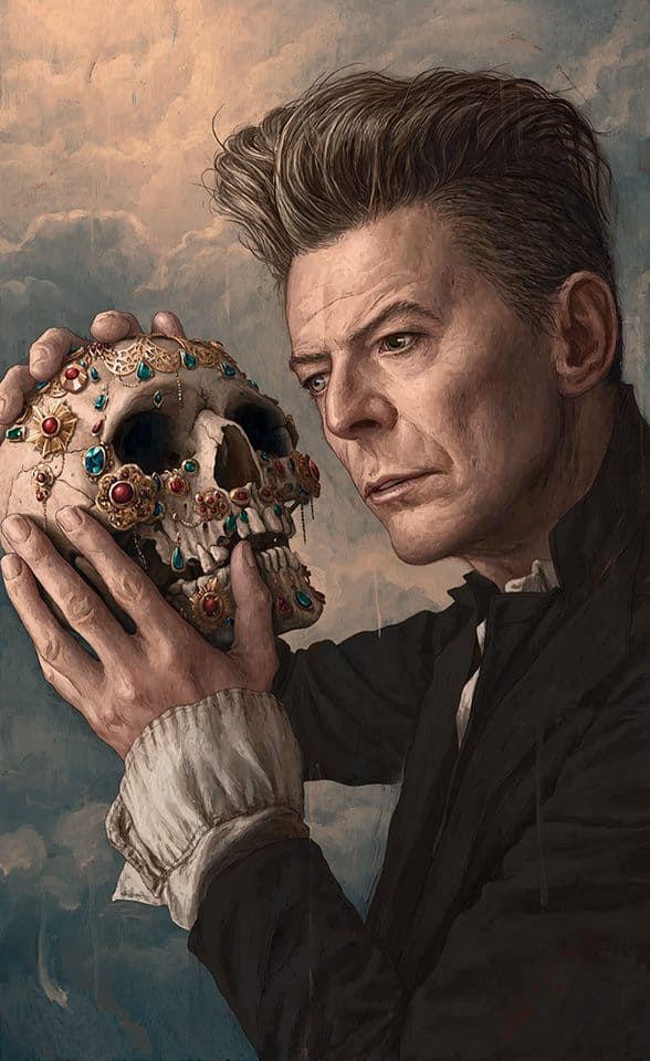
David Bowie illustration by Rory Kurtz for Rolling Stone
CJ: A lot of early interviews and articles on you focus on the ‘self-taught’ aspect of your career. Do you feel that you’ve outgrown that designation?
RK: Yeah, certainly. I think it’s something that writers sort of grabbed onto earlier as most illustrators tend to come out of art institutes, and it seemed a bit peculiar that I hadn’t had a formal art school education. No art director or client has ever asked about my educational background, so it’s a moot point when actually hunting work down as a professional. And at my age, it’s just not as relevant, if it ever was, to begin with.
In your 2013 Communications Arts feature, it’s mentioned you left a career in photography to pursue illustration. Was that in 2010? What sort of photography were you doing? It’s interesting to leave the world of photography to make a go at the equally risky world of illustration.
Yeah, I had been working as a photographer in Milwaukee, WI for local magazines and shooting commercial properties for larger companies marketing needs. But the short and simple was that the recession came and gutted most marketing budgets and smaller publications, so that work dried up.
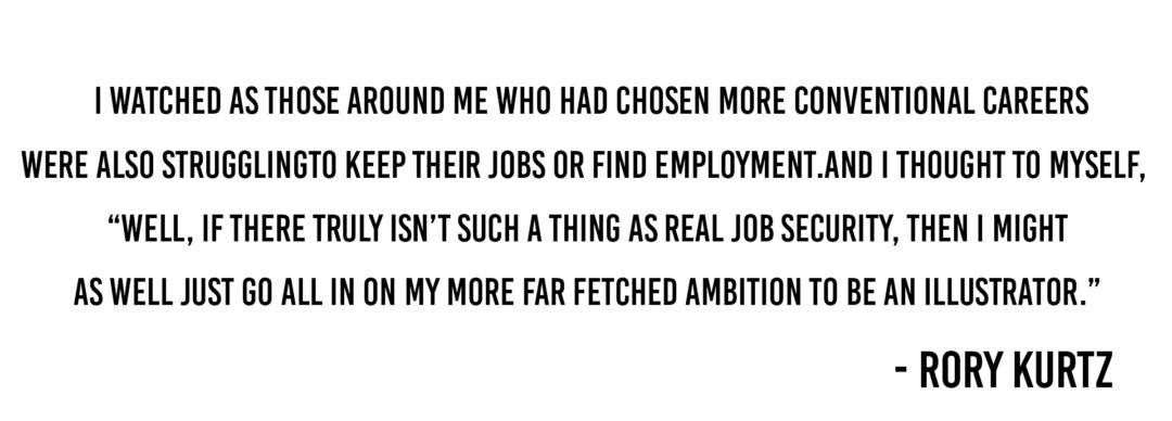
It was a difficult time, but I’m fortunate, in a strange way, that it happened. I watched as those around me who had chosen more conventional careers were also struggling to keep their jobs or find employment. And I thought to myself, “well, if there truly isn’t such a thing as real job security, then I might as well just go all-in on my more far fetched ambition to be an illustrator.” It helped that my wife was understanding, and ultimately pushed me to commit even further to it.
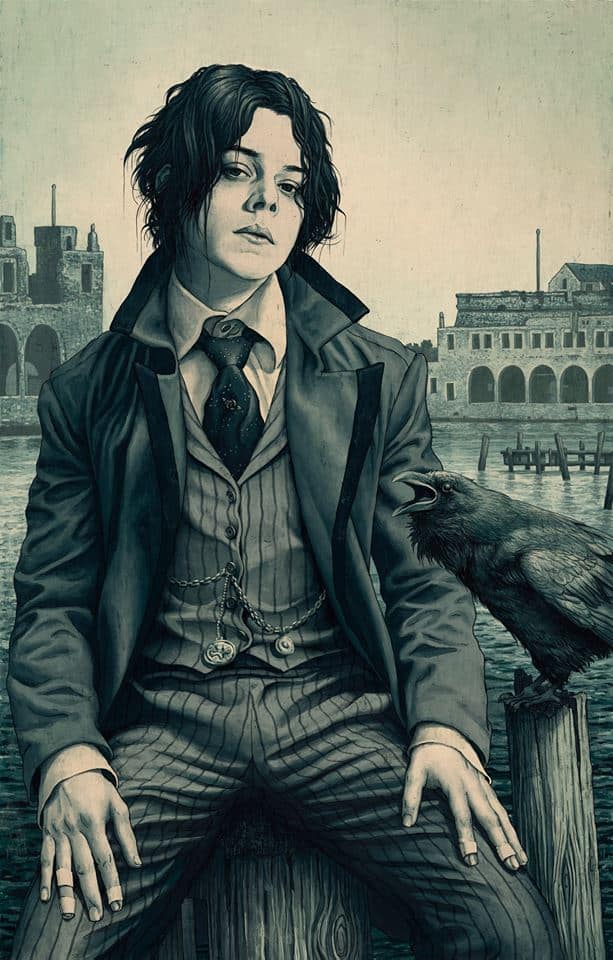
Jack White illustraton by Rory Kurtz for Rolling Stone
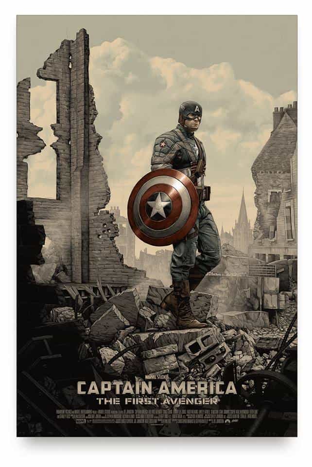
‘Captain America: The First Avenger’ by Rory Kurtz
‘Captain America: The First Avenger’ bypasses the comic book elements and the fantasy to focus on the lonesome struggle behind Steve Rogers’ heroism. It’s remarkably poignant – he’s a captain of no army. It’s a fairly brave take on the film, especially given that it debuted at San Diego Comic Con. It really pushes against the norm for what comic based art is and can be in an exciting and fresh way. Do you think of the audience at all when starting a piece?
Yes and no. I mean, I don’t think so much about the audience at large, but I do consider myself a part of the audience as a fan of these films, and a collector of alternative film posters, so in that sense I’m very much thinking of the audience, lol.
I guess that I work hard to create an image that connects with my thoughts on the film in question, and then hope that there are other like-minded collectors who will feel similarly towards the film. That’s all you can really do at the end of the day. No two people are ever going to have an identical reaction to a movie, each will make there own personal connections as they would toward a novel, or a piece of music, etc., so there is no way to encapsulate everyone’s perspectives in the same poster.
With Captain America, I was inspired by old black and white photographs of the destruction left behind in all those war torn European cities and the haunted looks on the faces of the soldiers standing amidst the rubble. All these other takes on Cap have always given us a larger than life fantastic take on battle, and heroism. I wanted to show him after the dust settled, alone with his thoughts. He’s a man who exists on separately from his fellow soldiers.
His abilities, especially in the days before all the other super-powered individuals showed up, sets him apart from everyone. He carries a lot on his shoulders because of this and Cap questions things. He is a patriot, but not blindly. So his expression had to evoke that sort of reflection on his acts and, of course, the glory of these hero films is that there’s room for all these different artistic takes, the colorful and bold and the quiet alike.
‘Captain America’ was your first print, correct? Was it difficult to visualize how it would look at the final poster size?
Yeah, I’ll say. My wife kept commenting on how small Cap looked in the environment when I was work on it early in the process. I had to keep reminding her, and myself, that he’d appear much more heroic in scale once printed at full size. So there’s definitely been a learning curve adjusting to poster dimensions but it’s so damn cool to see the work at that size. Especially coming from years of editorial work, where the final printed scale is rarely ever larger than 8 1/2” x 11” at it’s biggest.
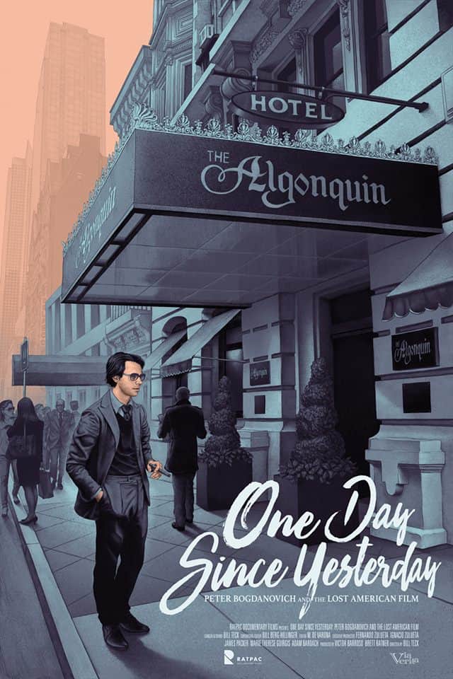
‘One Day Since Yesterday’ by Rory Kurtz
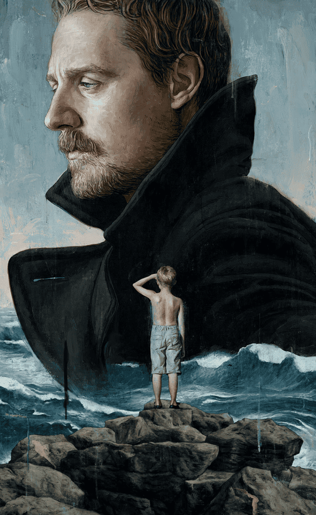
‘Sturgil Simpson: A Sailor’s Guide to Earth’ by Rory Kurtz for Rolling Stone
I have quite a few magazine subscriptions I read mainly to see the illustrations – even the smallest of articles or reviews will have at least a black and white spot illustration. Your work with Rolling Stone and other magazines is highly detailed, and with your move into the limited edition poster world, your work is now being screen printed into 24” x 36” posters — two entirely different end-users. A magazine will end up in the recycle bin at some point as where the poster will live on in a frame, in someone’s home. Does that change your thinking on a project?
The value of the illustration isn’t affected by the end application. Some people may clip out a magazine illustration and tack it up on their wall for years, or maybe they’ll buy a poster and grow tired of it quickly and let languish unseen in a tube.
The real value is in the personal connection the viewer makes to the illustration, not necessarily the size or surface it’s printed on. If you’re a big fan of a particular musician, you’re going to see more worth in a portrait done of that musician for a magazine rather than a poster for a movie you’ve never seen, no matter how well printed and vice versa. My goal is just to do my best to make something worth connecting with.
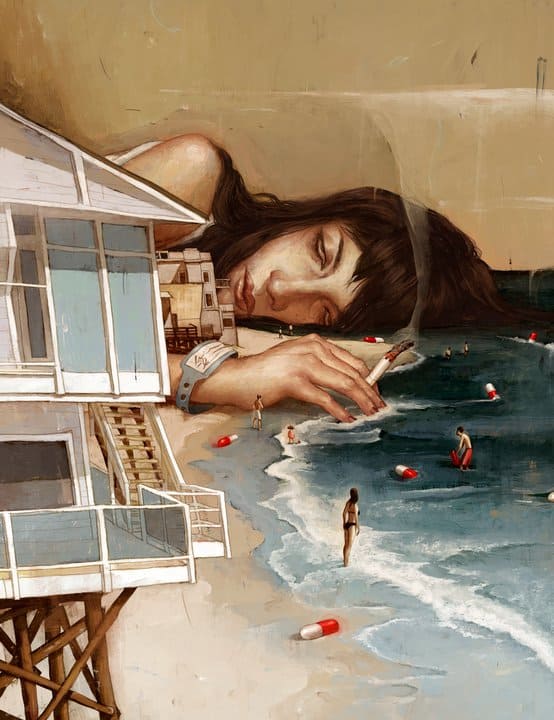
Untitled illustration by Rory Kurtz for Malibu Monthly
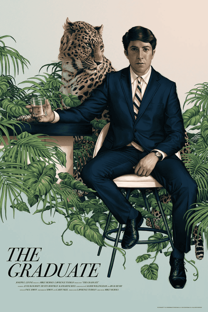
‘The Graduate’ by Rory Kurtz for Mondo
Your illustration for ‘The Graduate’ captures an exact likeness of Dustin Hoffman, yet it’s a not photo-real depiction like a Chuck Close painting. This is something you do often in your portraits, in trying to pin down exactly what it is I’m seeing I realized it’s this – from the facial expression to the posture, the portrait captures the entire scope of who Benjamin Braddock is during the first act.
Most commentary on the film focuses on the sexual nature of his relationship with Mrs. Robinson and the overall thrill of that scenario, but your piece shows who young Braddock is, over-educated and incredibly young and awkward. It sets him as prey for Mrs. Robinson rather than just a horny 20 something. How many drafts did you go to find exactly what you wanted to say about the film? How involved were Mondo in your process?
Many drafts, actually. I normally work on concepts while simultaneously assembling reference material. It’s no good to come up with an idea that I don’t have the materials to convincingly produce, so that process goes a bit hand in hand.
I did know early on that I wanted him a bit wide-eyed and vulnerable. I remember that moment in my life, when I was sort of lost trying to understand what the hell it meant to shift from youth into adulthood. Everyone expects you to have a plan worked out, and a goal in mind. I spent most of my twenties just trying to avoid the question, lol. I was Braddock diving into the pool trying to stay underwater.
That understanding made it easier for me to choose an approach for him. I worked on several alternative ideas, but only ever showed Mondo the rough for this particular idea, and they were for it early on, so the further concepts were never sent. I try to only show my best first, the one I’m most excited to spend weeks painting. If that doesn’t do it, I usually start all over as opposed to showing concepts I had previously discarded.
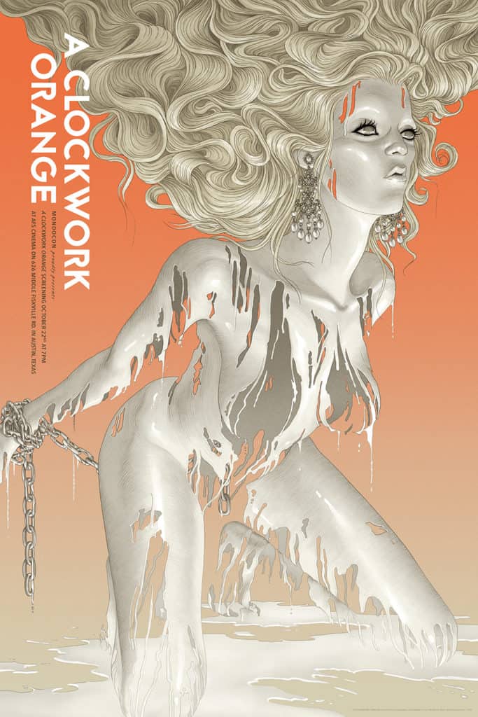
‘A Clockwork Orange’ (Regular Edition) by Rory Kurtz for MondoCon 2016
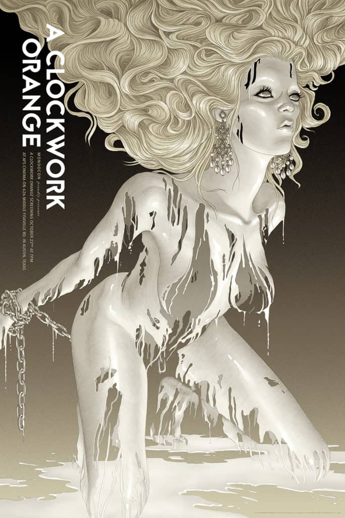
‘A Clockwork Orange’ (Variant Edition) by Rory Kurtz for MondoCon 2016
Kubrick’s ‘Clockwork Orange’ has seen a good number of posters and illustrations, and like your take on ‘The Graduate,’ you still found a way to stay true to the text while also commenting in a unique way. There is sex and violence – but you highlight the entertainment value of it all. Like ‘The Graduate,’ it’s a visually rich piece of art – the figure is restrained and beneath the flowing milk, she is invisible. A ghost. Non-existent. These films have been around since the ‘70s, long enough to be well absorbed into modern society.
Compared to something new like ‘Captain America’ or an editorial piece, is it a benefit to you as an artist to have a history with your subjects, like ‘Clockwork’ or ‘The Graduate’? If you had just seen ‘Clockwork Orange’ for the first time do you think it would have been the same piece?
That’s difficult to say. With a poster like ‘The Graduate,’ it was a benefit to have had such a long history with the film. I already had this idea of what I wanted to get across with little difficulty. However, with ‘A Clockwork Orange’ the challenge was to break away from my preconceived idea of what the poster should look like. So a lengthy history with the film can go both ways. It can be a benefit, or it can be a setback. Depends on the film really.
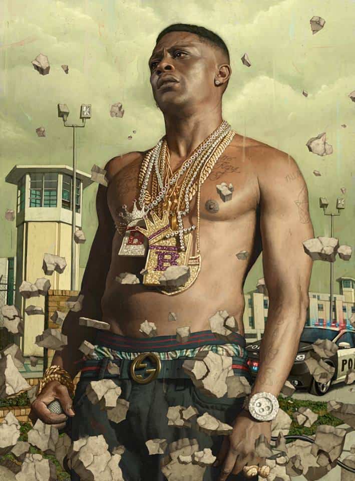
Lil Boosie illustration by Rory Kurtz for Playboy
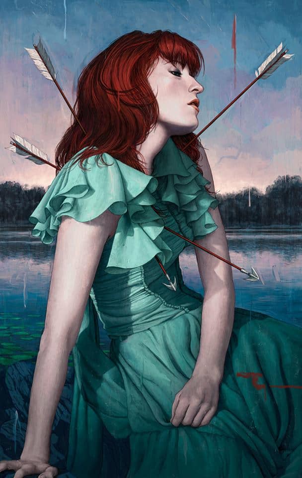
Florence and The Machine illustration by Rory Kurtz for Rolling Stone
You tend to stay in the portrait world in terms of composition. Is that approach based on your comfort level skill-wise or what you find yourself attracted to, idea-wise?
I’m a figurative artist. Always have been. Always will be. Especially when it comes to these film posters, where you have all these emotionally rich characters to choose from.
I’m not saying that all my posters will feature life-size figures front and center. I may use them more like a smaller compositional element in a larger idea. But I will likely always come back to the human figure as a key element. There’s so much a figure can say in an expression, or in posture, or body language and so forth, that would be impossible to articulate with inanimate objects. And since most films focus on the human condition in one way or another, it seems to make the most sense to approach it figuratively.
Magnifico