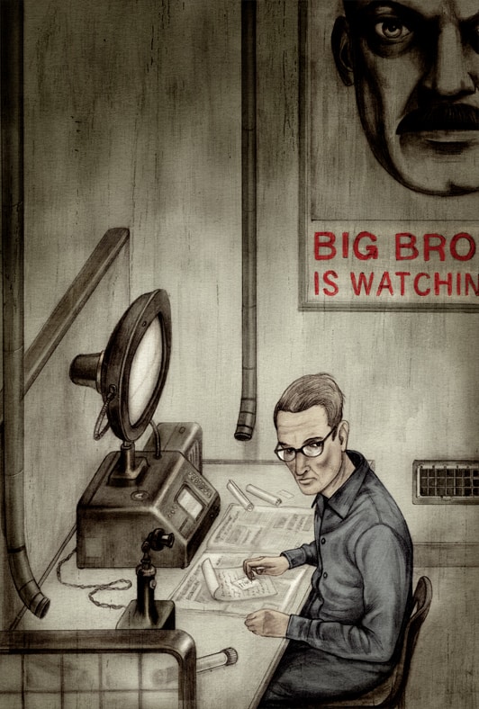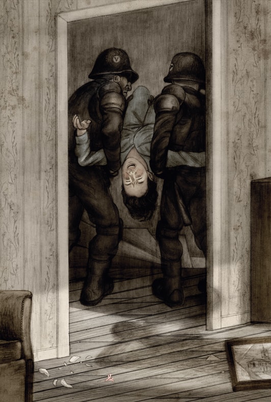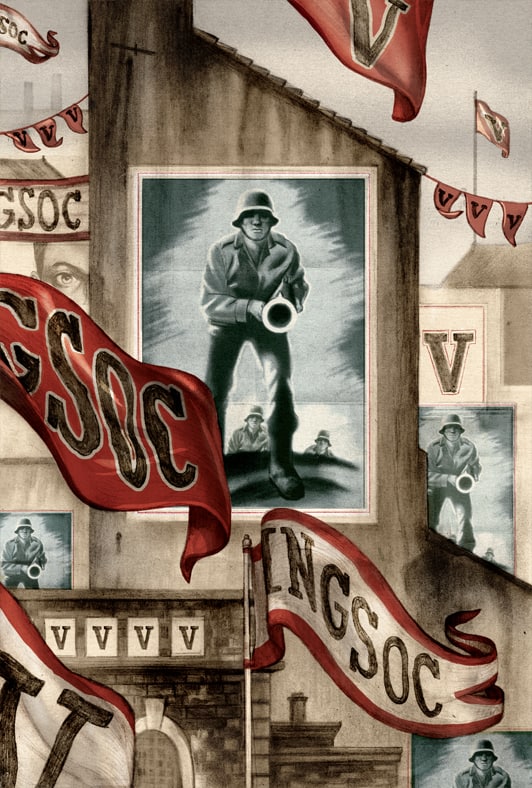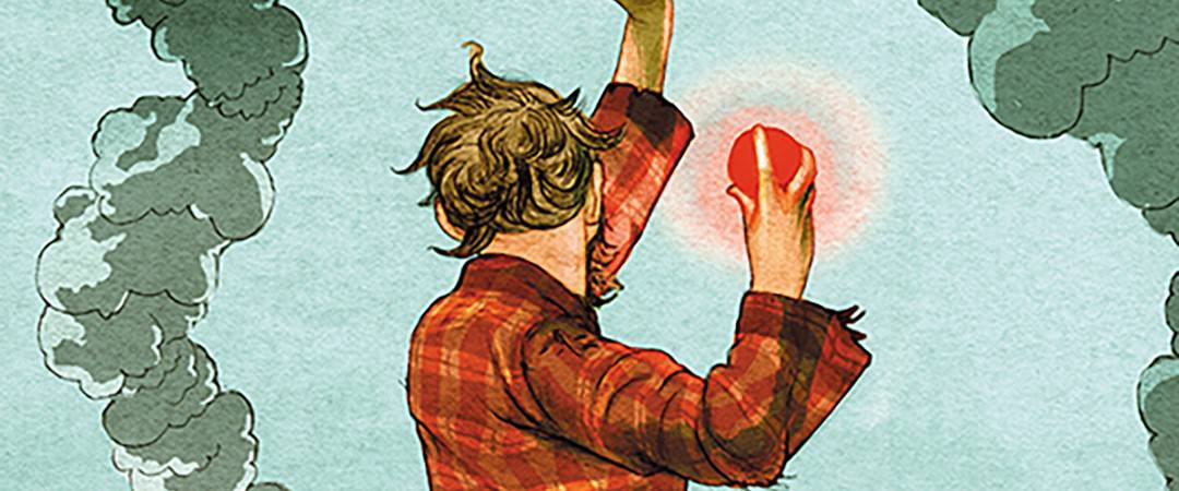
There is a wonderful intelligence at play in the work of illustrator Jonathan Burton. In his work for George Orwell’s classic novel ‘1984,’ Burton stays true to the author’s vision with a historian’s accuracy and the thoughtful touch of the human hand. His deft compositions sharpen the soft focus of the viewer, highlighting the intrinsically internal nature of the novel’s concepts.
With ease, Burton also showcases action with a sense of whimsy. There’s a cultured silliness to Burton’s work, no matter how macabre or somber. His award-winning editorial and book illustrations have lead him to work with print galleries such as Nautilus Art Prints and Mondo, bringing his stunning work to the large format canvas of the screenprinted poster.
CJ: George Orwell’s novel ‘1984’ is known for its portrayal of Big Brother, a society under the watchful eye of a strict government. ‘1984’ has huge concepts but some might say it falls short on offering tantalizing visuals for an illustrator to pull from. The opposite of ‘1984’ is ‘Hitchhiker’s Guide,’ a text full of strange characters and alien landscapes and ideas. As the illustrator did you see these two projects on opposite ends of a spectrum when you began? Is it my lack of imagination that sees one as more visually rich than the other?
JB: It’s true that the world the ‘Hitchhiker’s Guide’ presents is visually insane and Douglas Adams’s imagination is an absolute gift to an illustrator. The author comes from a very absurdist background being very good friends with the Monty Python team at their height. The surreal juxtapositions and eccentric characters are brilliant to draw and sparks my imagination.
‘1984’ evokes a very different world based more on a dull and dirty colourless and oppressive atmosphere based on a war-torn dystopian London. The restriction of that makes it very interesting to illustrate and basically follows one character’s emotional reaction to this world. The book is very internal and personal, but full of ideas that have stuck with me and scare me more now than when I first read it. It’s my favourite book of all time and was a dream job to illustrate.
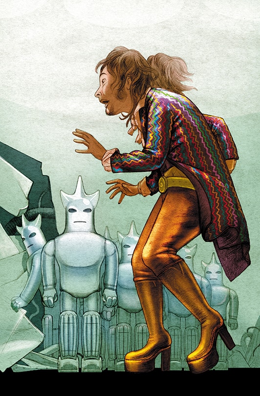
Jonathan Burton illustration for the Folio Society edition of Douglas Adams’ ‘Life, the Universe and Everything’
Both ‘1984’ and ‘Hitchhiker’s Guide’ only have a handful of illustrations. Did Folio Society approach you with specific moments in each book they wanted you to illustrate? What determined the number of pages you worked on?
One great thing about working for The Folio Society is that they let the illustrator choose which scenes they feel would work best within the book. Choosing the specific moments is a complex balance between the things I would really enjoy drawing and the responsibility to the story and the reader.
Folio determines the amount of illustrations based on the length of the book and of course, the scenes have to be equally spread throughout which can also be very tricky to negotiate. It’s a challenge I relish though.
(note: Burton wrote an article for Folio Society on his ‘1984’ work that is worth a read. You can find that HERE.)
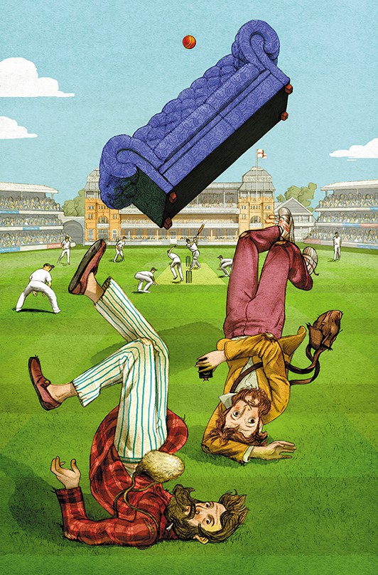
Jonathan Burton illustration for the Folio Society edition of Douglas Adams’ ‘Life, the Universe and Everything’
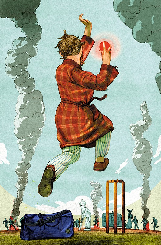
Jonathan Burton illustration for the Folio Society edition of Douglas Adams’ ‘Life, the Universe and Everything’
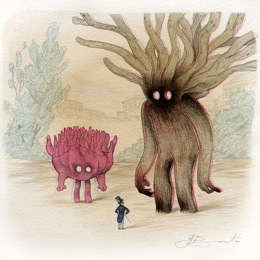
Your piece ‘Face Your Demons’ has this wonderful vibrancy to it – that simple red outline on the giant demon gives him a blur effect that feels odd yet familiar, like looking at a 3D image without glasses.
There’s a hint of that technique in your ‘Japanese Legends’ print. With such a huge body of work behind you, do you see certain ‘tools’ you use or can count on to make a piece feel complete? Would you avoid using a red silhouette since you’ve already used it so effectively in the past?
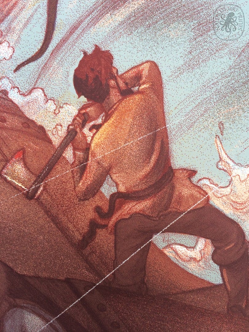
That red line comes from studying Victorian lithographs and noticing the printing errors. Misaligned colours can be beautiful so I sometimes use the effect to put it into a certain period and give them an energy and playfulness. Playing around after all is where the most interesting things happen. I suppose the technique is a ‘tool’ but I’m aware also that it could become a ’trick’ which is best avoided and once you start using it on everything you’ve stopped being open-minded.
It was incredible to have you be a part of the ‘In Reference’ show and see how you took the initial photographs to make something unique and special. Your illustrations, especially in the Douglas Adams books, have very interesting angles and figures in wonderfully odd positions (like falling from the sky). Are you using reference images on a regular basis for figures or architecture?
I use a lot of reference for the figures as I suppose my work is quite realistic particularly on hands and folds in the clothes which I really enjoy drawing. I model myself mostly but rope in my family and friends to pose for photographs too. The architecture is usually secondary to the figures in my compositions and the reference is much looser for this which means I end up inventing much more for the surrounding elements.
You start with pencil drawings that seem pretty close to final. Are you taking those original drawings and coloring them digitally, or are the pencil drawings merely a guideline so you can re-create them digitally?
I color the drawing digitally and I keep the original linework in the finished piece. For me, the first drawing is the soul of the illustration and removing or redrawing it always loses some of the energy and character.
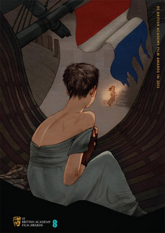
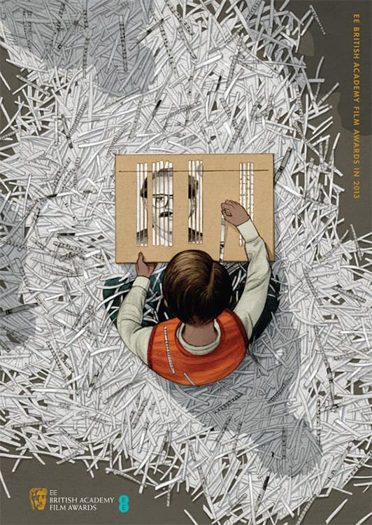
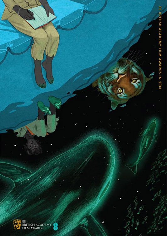
Your series of posters for the 2013 BAFTA awards are all incredibly striking. They’re brilliant designs that get the viewer on board without the aid of any text spelling out what they are. What sort of time frame were you given to complete all five illustrations? How involved was BAFTA in the process?
BAFTA choose one illustrator a year to create the posters / brochure covers for the 5 best film nominations. The announcements are made in February and the illustrator has two weeks to create the work. Once BAFTA agree on the sketches I basically had 10 days to create 5 posters! It was hard work but liberating at the same time. Such an intense period of work sharpens the senses and it was an exciting project to work on. I didn’t get much sleep though.
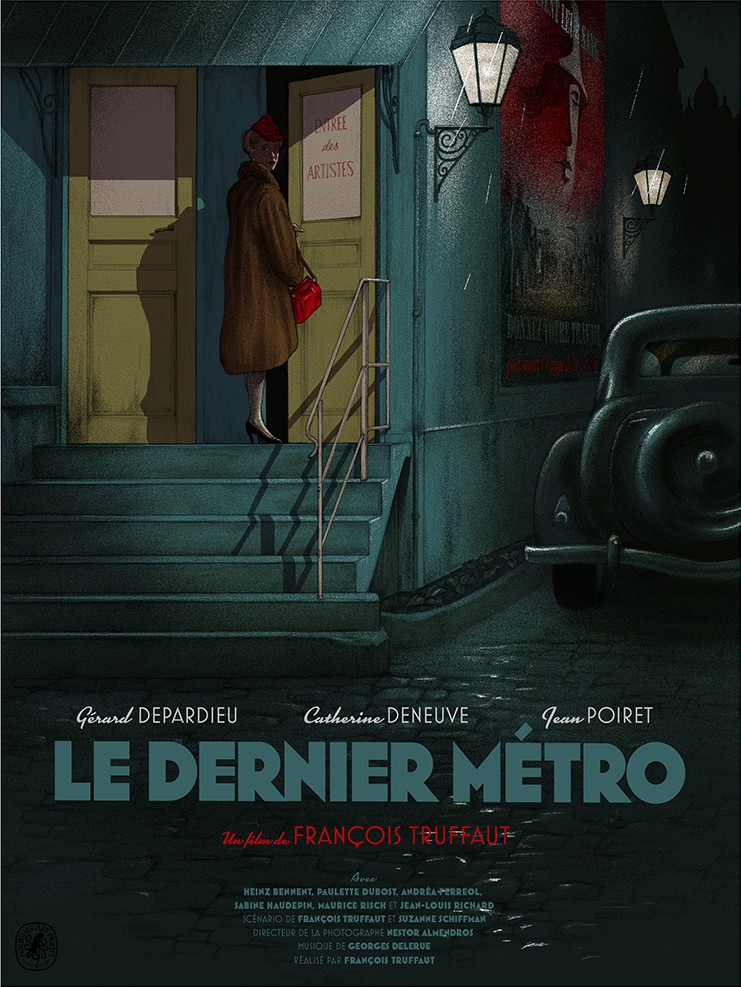
For your ‘Le Denier Metro’ print for Nautilus, Jack Durieux handled the typography. What stage of your process did Jack get on board? I can almost see the original being larger and may be cropped to place the title block, but it’s so well focused I doubt that. Do you prefer to not work with text, or at least have someone to assist?
I had several suggestions for the title on ‘Le Dernier Metro’ but Jack presented an idea that was varied in the balance of fonts and arrangement and it fit the period really well. He is so good at typography that it’s given me a kick up the backside to try and find an interesting solution rather than a basic one. I pay a lot of care to the illustrations so it’s important to treat the typography the same and use it playfully and stylishly because after all it can make or break a poster.
Your ’20,000 Leagues’ print with Nautilus Art Prints put you in front of the eyes of poster collectors and quickly became a favorite. You even have a print with Mondo under your belt. Was the world of collectible posters something that was on your radar before Nautilus contacted you?
Working on the BAFTA prints gave me a taste for working to a film brief and I became aware of the alternative poster scene around the same time. I think the first poster I really noticed was Laurent’s (Laurent Durieux) ‘Jaws’ and it made me wonder who Mondo were and how their posters managed to sell out in only a few minutes! It was something I thought would be interesting to do but honestly didn’t know how to go about it. Being busy with illustration I didn’t really pursue the idea but when Nautilus gave the opportunity to work on a poster I dropped everything and leapt at it.
Were you aware of Laurent and his brother Jack Durieux prior to them getting you on board to do ‘20,000 Leagues’?
I knew of Laurent’s work for Mondo prior to Nautilus contacting me. It was a big motivation to know that he was involved and I really enjoyed meeting and getting to know the three brothers involved in Nautilus Art Prints. A very dedicated and talented family!
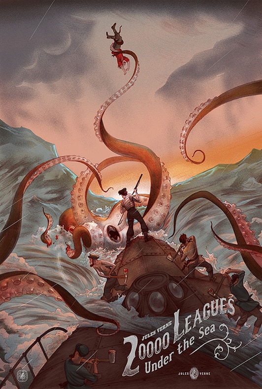
Was your Nautilus Art Prints ’20,000 Leagues Under the Sea’ poster your first experience working on a 24” x 36” screenprint? Does the approach change from editorial work to a piece of that size, where the end goal is a piece of art to be hung on a wall?
‘20,000 Leagues’ was my first screen printed poster and the process was a big learning curve. I had chats with Nautilus Art Prints about what process would be best to recreate the look of my usual work. It’s a technical exercise but once it ‘clicked’ it was a fascinating thing to create. I love the process. The restrictions of colour leads to interesting ideas about balancing out the piece. I’m learning more about mixing opaques, transparents, glow in the dark and metallic inks to achieve different effects. I’m discovering screen printing to be a very rich and beautiful process that is much more than the drawing itself.
The sheer size of these posters motivates me to be more ambitious about the amount of detail I can add and also try to include references that aren’t immediately obvious. It’s a privilege to make it onto someone’s wall and I like the fact that once the buyer has the actual screen print they will have a much better experience of it than as a small jpg on a screen.
Your take on ’20,000 Leagues Under the Sea’ captures the absolute zest for adventure and love of the sea that Verne’s novel achieves. Was there a conversation with Nautilus Art Prints between a strictly book based interpretation versus the Disney film version?
The brief was very open and was left for me to interpret so I ended up using both the book and film as inspiration. I listened to the ‘20,000 Leagues’ audiobook whilst working on, coincidentally, a picture book of Jules Verne’s ‘Around the World in 80 Days’!
You had two Jules Verne projects going on at the same time?
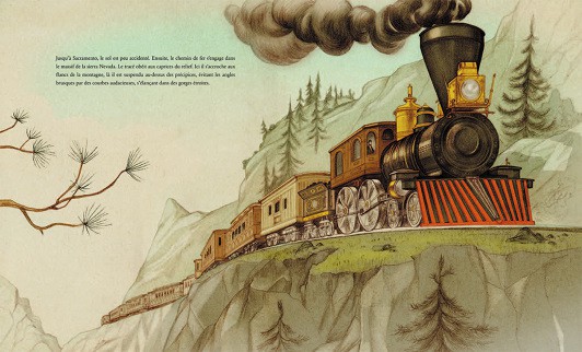
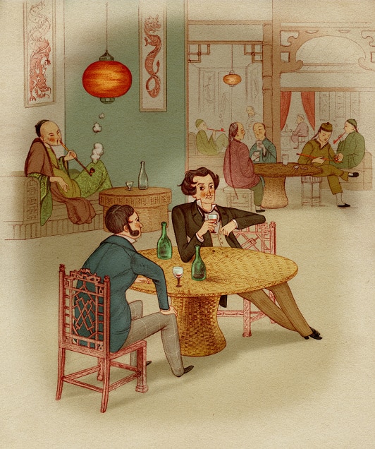
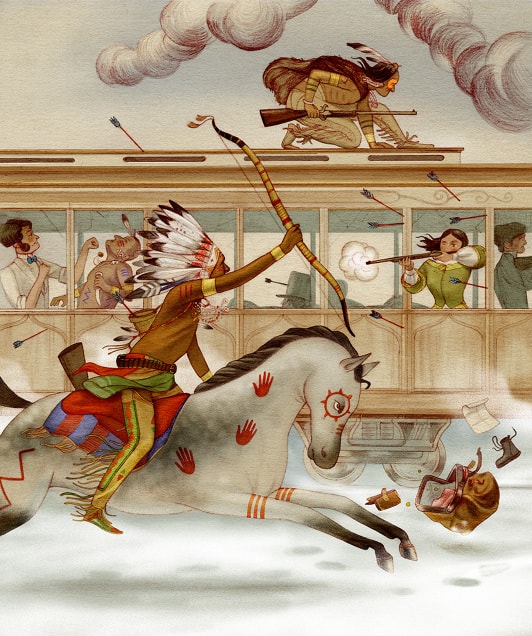
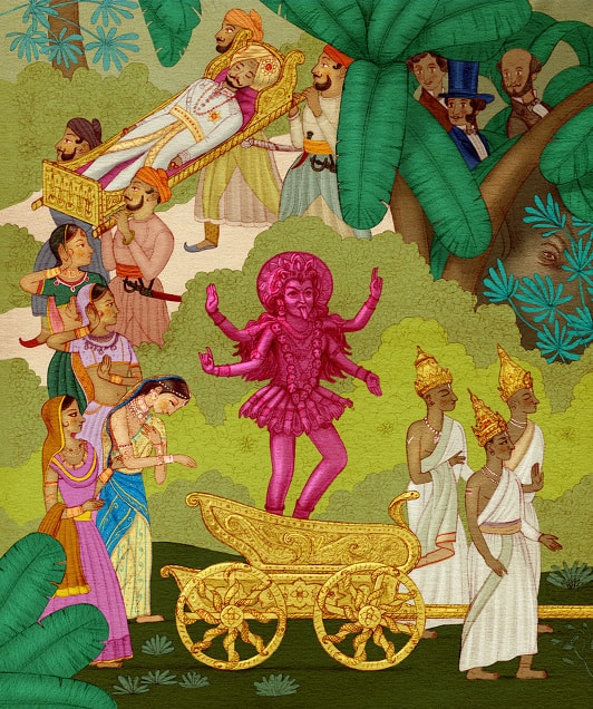
I was illustrating the book ‘Around the World in 80 Days’ (released by Milan) at the time that Nautilus contacted me. So I listened to ‘20,000 leagues’ on audiobook for inspiration whilst finishing ’80 Days.’
For ‘20,000 Leagues,’ did you use the Disney film or any other incarnations as reference?
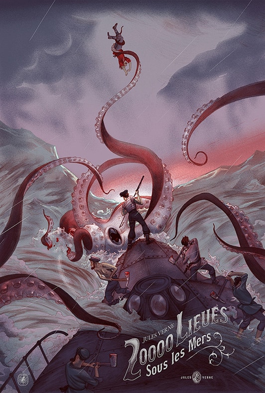
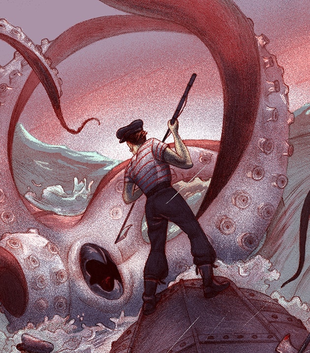
Studying Alphonse de Neuville‘s illustrations for ‘20,000 Leagues’ were very helpful in realizing the kind of clothes the crew would wear and also gave me an idea of the design of the Nautilus. I enjoy the research stage and pick elements from as many sources as I can in which to reference. For example, the Disney film had a famous ‘sunset scene’ that ended up being cut from the original and was reshot to take place at night in the rain. The two variants are a little nod to that, one is at sunset with a storm on the way and the other is at sunrise after a night of fighting.
That’s a brilliant solution — using the regular and variant to reference that little footnote in the film’s history. What’s your work flow for a large piece like ’20,000 Leagues’? Do you do a string of rough sketches for approval? Did you start with thumbnail sketches?
Many thumbnail sketches! Such visually rich text made it hard to decide on which scene to illustrate, but I ended up showing (Nautilus) three different propositions. We all agreed that the Octopus attack worked best and to be honest it had to be that scene. It’s iconic and one that I, as a fan, would really want to see.
It’s definitely a moment that is hard to top. In your composition, you put the viewer on the Nautilus with the rest of the crew, in the middle of the battle. Verne’s novel is full of inspiring visuals, and you delivered a piece that captures the excitement of one of the greatest moments in literature.
Being a property that has been illustrated and re-imagined repeatedly since it was first published, did you feel any pressure when taking on ’20,000 Leagues’ to do something new?
Looking at other interpretations was an advantage in that I could reference some of those ideas but show them in a new way. The pressure I feel is that which I put on myself and rather than holding back I wanted something to really get my teeth into. From early on I decided to tackle it with a very complex dynamic with several characters, a rough sea and twisting tentacles from every direction. It was a challenging composition but a joyful one to get lost in.
You’ve done a fair share of prints, but up to this point they’ve been giclee prints – did your design process change knowing ’20,000 Leagues’ was going to a screenprint?
It’s not hugely different from how I work normally with many Photoshop layers, but on a technical level, I learned a lot about preparing for such a large scale screenprint. With Jack and Laurent Durieux at Nautilus, we discussed ways of achieving the effect of my normal work using transparent inks for example. With this, I could really start to get some interesting effects going on and the finished result looks like hand-painted line work. It’s a really lovely process and I’m hooked!
Did Captain Nemo, Ned Land, or Aronnax show up in any of your early drawings?
Alphonse de Neuville drew Captain Nemo as quite understated and the bearded man on the right of the poster could possibly be him though I haven’t made a conscious effort to represent everyone. Whereas the main focus is Ned Land holding the harpoon in centre. He’s a direct nod to how Kirk Douglas dressed in the Disney film: red striped tee-shirt, high loose trousers, ear-ring, and his large sailor’s cap. I don’t think it would have worked if I had dressed him low-key, it needed that slight caricature for it to hit home.
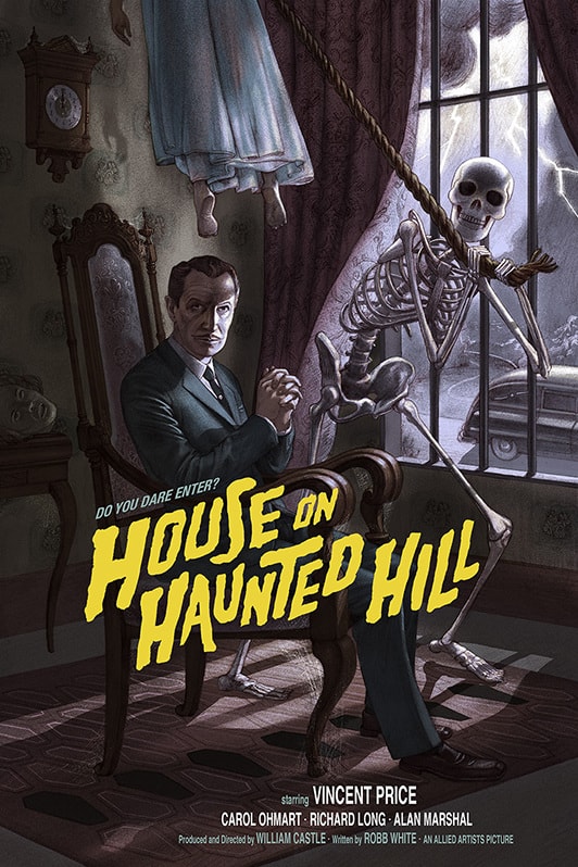
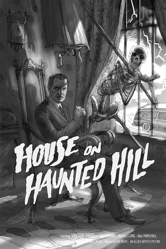
Your ‘House on Haunted Hill’ poster for Mondo is a wonderful throwback to that early horror feel — it’s fun and dark. Macabre. Vincent Price is drawn never losing your style, yet staying true to his appearance. Was this your first time dealing with a likeness? Was it ever considered to do an illustration without Vincent Price, like your ’20,000 Leagues’ only hinting at a specific character or actor?
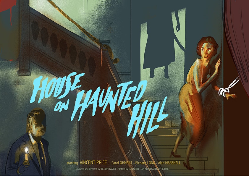
I’m not a huge fan of likenesses in posters as I prefer a narrative approach but Vincent Price has such a distinctive and unusual face that’s just lovely to draw. My first sketch had Vincent Price as a minor character in the scene and I tried hard to evoke a ‘B-Movie horror’ but the image was a bit ‘joyless’ so I scrapped it. One thing I’ve learned is to have more fun with the concept and not to feel too much of a slave to expectations. I thought it would be much more dynamic to show Vincent and the skeleton as a macabre team in charge of the horror which keeps the spirit of the film but the composition and their faces looking straight at us takes it one step weirder… 🙂
Did Mondo approach you with a specific property in mind, or give you their catalog to choose from?
Mondo came to me with House on Haunted Hill in mind and being a fan of old fashioned horror I thought it would be fun. Since then they have given me a wider choice of properties to look at so hopefully we can continue to chat about the kind of films I’m into and those that would be good for me to tackle.
Does it feel like a step-down, or a different type of work doing these film posters from you usual gigs doing books and editorials?
It feels different but not a step down at all. The size is new for me and knowing it might hang on a wall makes me take it very seriously. Also, posters have to have a ‘punch’ and be more graphic I think whereas interior book illustration has more room to breath and is best when it slowly reveals something. Book covers are a little like posters for the book in a way, they have to represent the spirit of the text but not in a literal sense. Bookwork is so nice to do though and I have a few things lined up. I have the last two Hitchhikers at the end of the year and a picture book about Homer’s Odyssey which should be a challenge.

Illustration by Jonathan Burton for a review of ‘Happy Moscow’ by Andrey Platonov set in 1930’s Russia for The New York Times
Previously on Evil Tender — Interview: The Beauty & Design of Laurent Durieux
Previously on Evil Tender — Interview: The Timeless Art of Laurent Durieux
Previously on Evil Tender — Interview: Jack Durieux of Nautilus Art Prints


