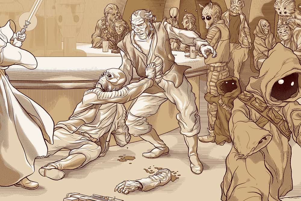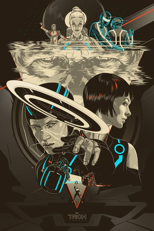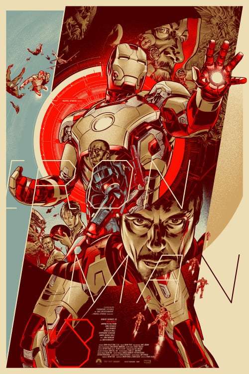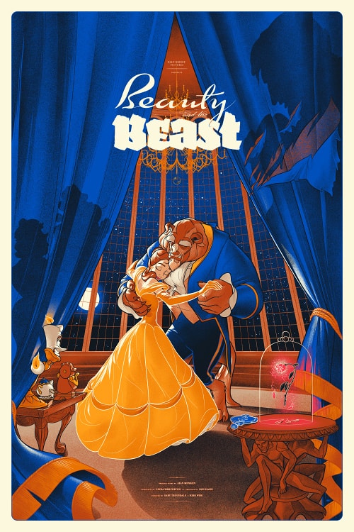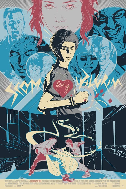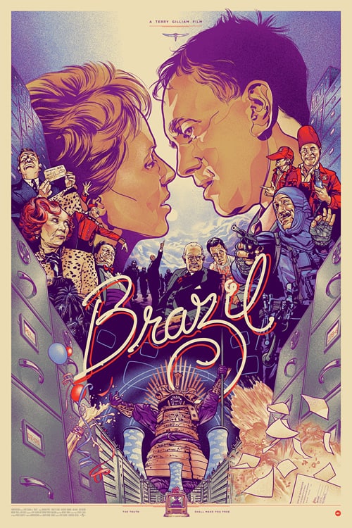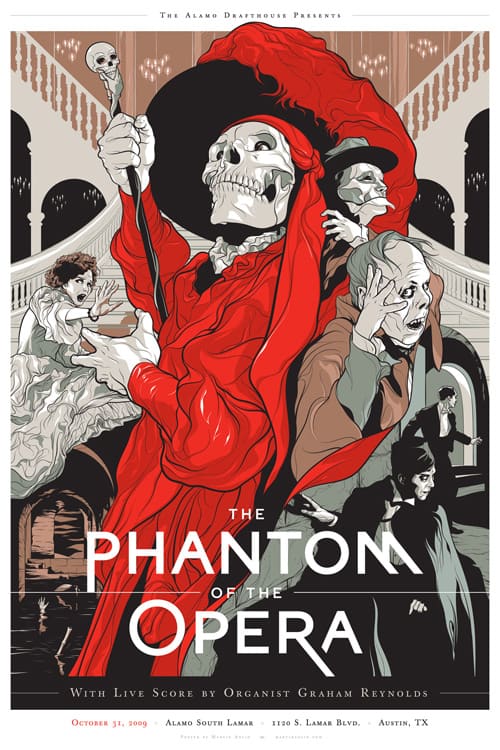
The work of illustrator Martin Ansin is direct and precise. There’s a perfection in Ansin’s craft — to imagine the work done any other way feels impossible. He’s carved away the useless, molded color and pixel into something divine. His designs are born in the computer — pure digital incubation. He uses his tools like any other craftsman. The painter creates the world in oils, Ansin creates his world in pixels. There is no attempt at mimicry, no filter to act as the texture of paper or hand-felt grit. Ansin pushes the medium and in doing so surprises the viewer, showing us the true depth of what software and an inspired mind can bring us.
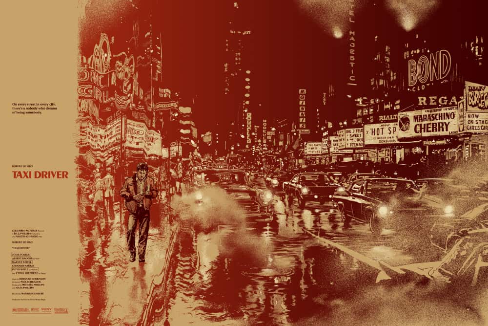
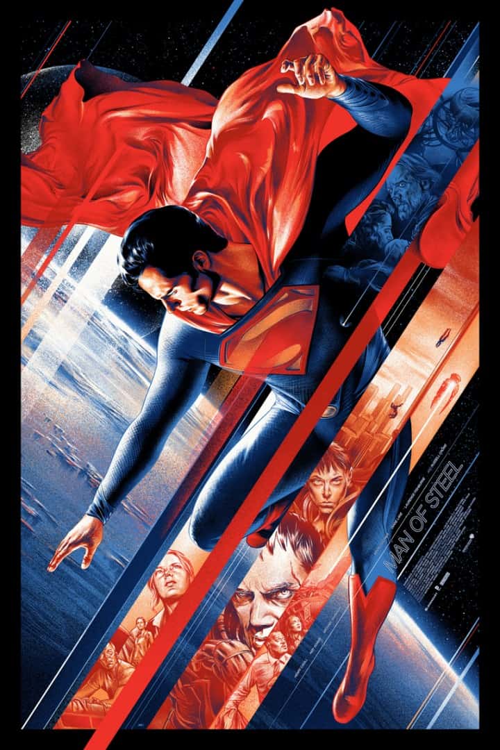
Born and raised in Uruguay, Ansin is well versed in the myths of Hollywood. His ‘Man of Steel‘ is powerful and heroic. Romantic. His ‘Taxi Driver‘ print becomes a portrait of Travis Bickle, the crowded night-scape of his New York City and his isolation. Ansin’s work is not a shout, but an intelligent song, sung sharp and crisp. Perfect.
CJ: Your catalog is full of amazing science fiction work — what you do that is so smart in those projects is to focus on the character, that human aspect of the science fiction that underlays all of the technology at play.
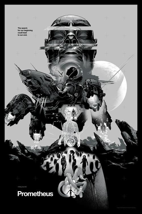
In your ‘Prometheus’ piece, the human characters are shown entering from the light to the dark, the exact opposite of what they’re hoping for. They’re searching for answers and get something else entirely. Your ‘Alien’ print is gorgeous in its depiction of the alien and its eventual devouring of the crew, of mankind.
I don’t think of you as a strictly ‘science fiction artist,’ not only because you do so much more outside of that genre, but also you treat all properties with the respect. What keeps you returning to science fiction?
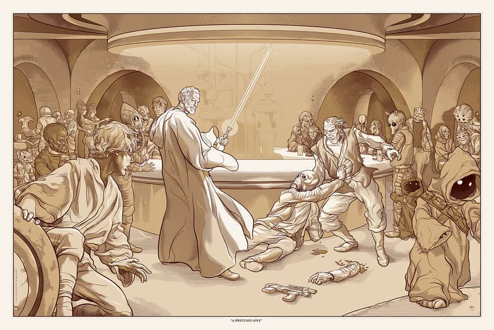
MA: I think it’s the hardware. Those sci-fi movies from the end of the seventies and the eighties had a common visual theme running through, that ‘lived-in universe’ look that started with ‘Star Wars.’
Those places in the future looked rusted and dirty, so as a kid I loved the notion that the characters that lived in them were probably just a small part in the long life of that city or spaceship. Little details to look at everywhere. Those sets were amazing, and they could all be part of the same universe for all I cared. It’s a style of the visual environment that I really enjoy, and I love to see some of that get used again in new films, like Duncan Jones’ ‘Moon‘ or Neil Blomkamp’s ‘District 9.’ I like sci-fi as a tourist destination I guess. I’d totally live in Sean Connery’s apartment in ‘Outland.’
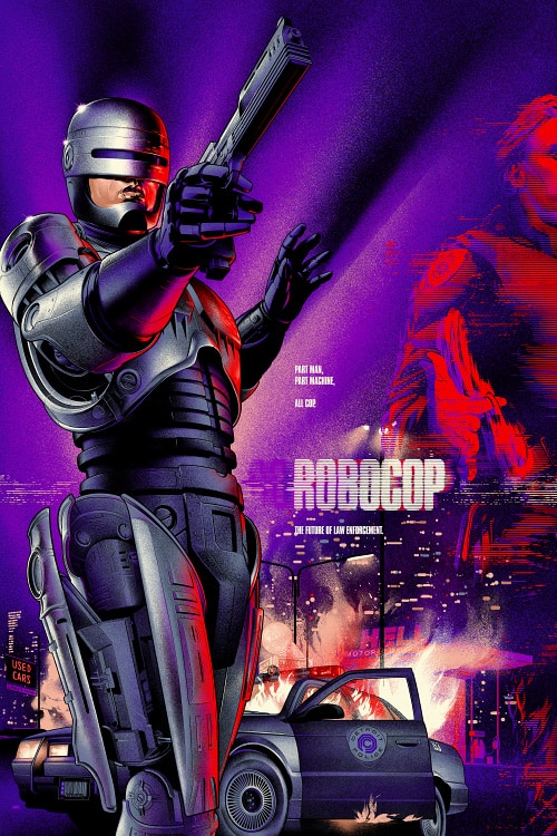
Your ‘RoboCop’ poster blends what fans love about the film with the detailed and thoughtful compositions you’re known for. You show ‘RoboCop’ the hero, as the audience was meant to see him. You created the same stylistic look of a VHS box cover but gave it a sophisticated makeover.
It reminds me of going to the video store to rent films like that – a very special feeling I totally forgot about. For your work with Mondo, how much of your film choices are driven by your own personal connection to the films?
A lot, thankfully most of the time. I think Mitch (Putnam), Rob (Jones) and Justin (Ishmael) at Mondo have a really good idea of what kind of stuff I like or would be good at, so that’s really great. Sometimes it’s very interesting to do something for a genre I’m not used to, but if you have a personal connection to the material it will come through. That’s what really interests me about the movie poster work, to share in the collective experience of watching a film.
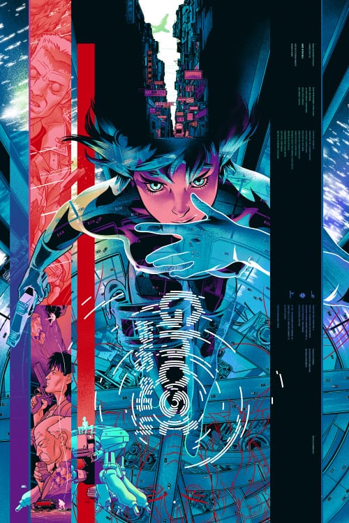
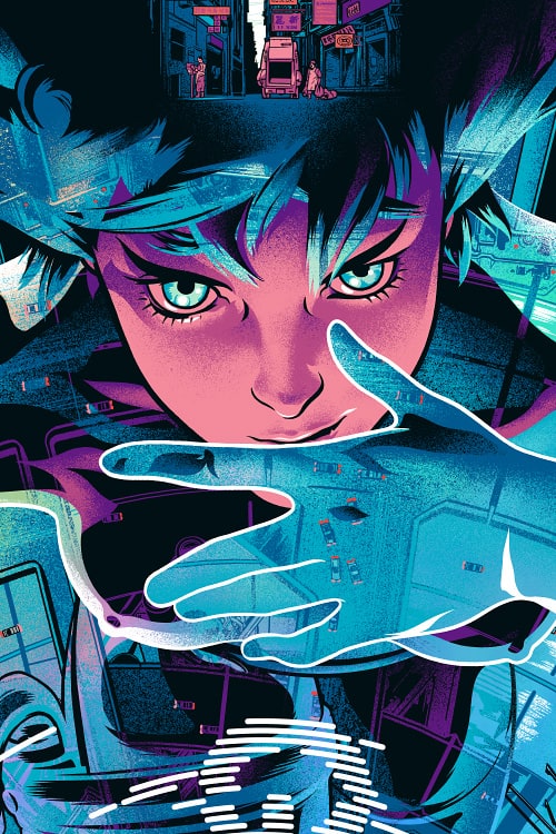
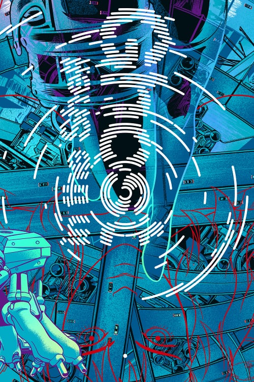
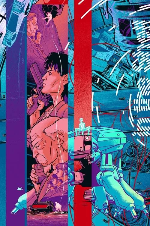
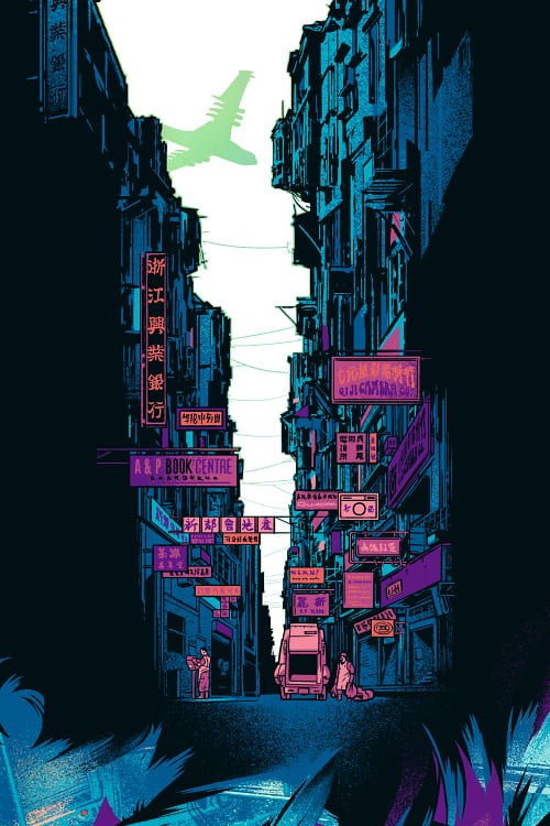
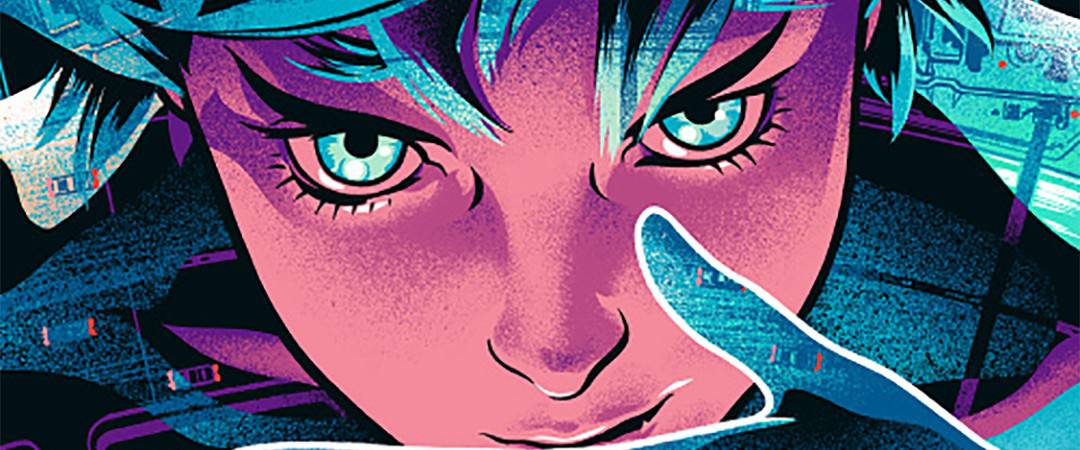
You took that concept to an amazing extreme with your ‘Ghost in the Shell’ poster. It’s just an incredible piece of work that encompasses the film so well, and to have it printed on foil adds so much more depth. Another layer that is wonderfully interactive. Did you have to approach designing for a foil print any differently that you would for a standard edition?
We usually do a standard and a variant version for any given poster, and I do the regular first. In the Ghost in the Shell print the standard is printed on a light blue paper stock, and I was using that color as part of the working palette of the print — so the bare paper stock was more involved in the artwork than what a regular white background would usually be. That was really helpful when doing the variant with the foil stock, because a lot of it would be visible.
There is so much precision to your compositions. They hum like clockwork. How many thumbnails are you doing to nail down the design? Do you start the final with the composition and colors all set?
I don’t do many thumbs or preparations, I usually do a black and white comp with the sketch and design as close to final as possible. Color I don’t get into until late in the final, sometimes not until after all the linework is done. I have a previous idea about the color in general, but it’s never really set until the final color separations.
Growing up in Uruguay’s capital city Montevideo, do Hollywood films and television shows have a huge impact on kids in Uruguay? Did you grow up with ‘RoboCop’? Are there original South American films, comics, or characters that you grew up with that you’d love to see reach a bigger audience?
Yeah, I think there’s always been a direct feed for most things. You take it for granted now with the internet and everything, but even back in the VHS days, the obscure stuff showed up. You’d find it if you knew where to look. I don’t know about the films, but there’s a lot of South American comics artists that put out amazing work for decades. Alberto Breccia’s comics work is astounding, the more experimental stuff he did in the ’70s is in a league of its own.
Most of your clients are in the United States, with not a lot of your work coming from local businesses in Uruguay. What keeps you in Montevideo? I know there’s more to life than work, but have you found your hometown puts you in the right mindset to work?
I get distracted easily. When you’ve got to get work done, Montevideo just gets out of the way.
You’ve visited Austin a few times for Mondo events as well as a trip to San Diego for Comic Con. Have you considered moving to the States at some point? Is it a better place to visit than to live?
I think it would be a great place to live, every time I visit Austin I like it better. I’m used to shorter distances, walking between places. I don’t even own a car. That’s a big adjustment right there.
Yeah, most American cities aren’t really designed with walking as a mode of transportation in mind.
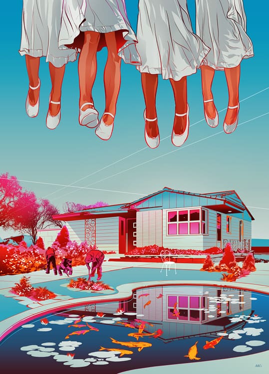
Martin Ansin’s illustration for George Saunders’ short fiction, ‘The Semplica-Girl Diaries.’ The New Yorker, October 15th issue, 2012.
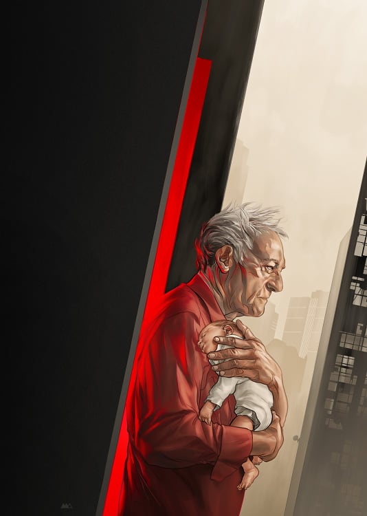
Martin Ansin’s illustration for Nicole Krauss’ short fiction, ‘Zusya on the Roof.’ The New Yorker, February 4th issue, 2013.
You’ve done quite a few illustrations for short stories and reviews featured in The New Yorker. Are you working with the writer on the design? The creative director? For something like a short story, how invested in the story or idea do you need to feel like you can be successful at the task at hand?
Editorial work is usually done with the publication’s art director, who hires you for the commission and sometimes already has an angle in mind for the piece. Sometimes you have total freedom to tackle the illustration, and sometimes you have to factor in other elements like the magazine’s page design for the article.
It’s a really interesting line of work, because you have to come up with an image that condenses the text and is interesting enough to draw the reader in, without giving away too much. Maybe it’s better to be less involved personally with the subject in this case, because sometimes your artwork needs to underline another person’s view.
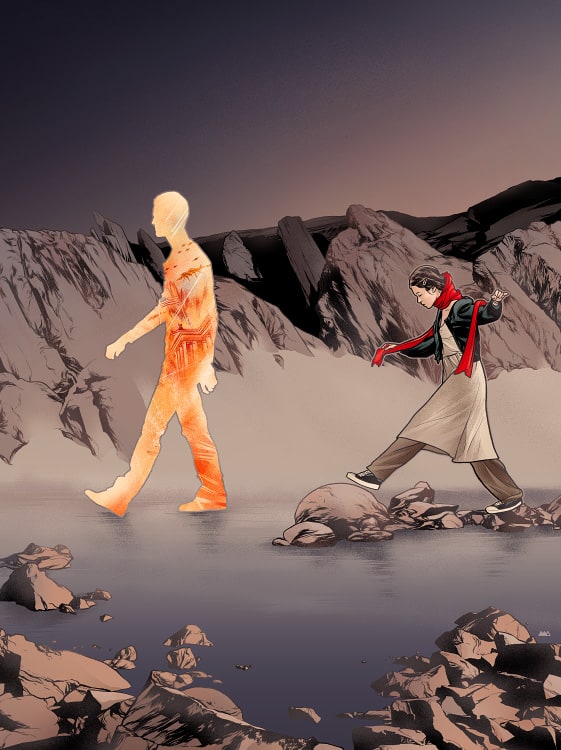
Martin Ansin’s illustration for Zadie Smith’s short fiction, ‘Meet the President!.’ The New Yorker, August 12th issue, 2013
Your process stays very close to 100% digital, I’ve heard you rarely do drawings or scan in drawings. The digital pipeline of your workflow gives the pieces a distinctly clean feel to it – it’s wonderfully crisp and any textures you add are not to emulate traditional tools. Were you always using only a digital workflow or was it an evolution from drawing and painting?
I used to work the old fashioned way, pencil, and ink on paper. Acrylics and watercolor too. Once the digital tools came in place I switched into them just because it’s a more predictable outcome. I was always making the mistake of trying to have physical media look like something else. Trying to lay down watercolor paint in flat tones, for instance. Total waste of time. I think it’s great that in digital you can have things look the way you need them to, but I don’t find that texturing or adding effects to make it look analog helps it at all, it’s just adding noise.
That’s a good point, digital does have a more predictable outcome that oils or charcoal. I think your mindset and approach to digital tools is what helps give your work such a unique and pristine look. Do you explore any other software outside of Photoshop and Illustrator? Any interest in using 3D software or more advanced technology?
Yes, I don’t know about 3D but there’s a bunch of digital things I’d like to find the time to try. Like Processing, for example. See what I can anchor to the more graphic side of my stuff, I guess.
Your ‘Man of Steel’ has an interesting look to it – the piece definitely looks like your work, but you also stay true to the classic tone of Superman. When working on such an iconic character and such huge film, how much direction are you getting from Mondo, DC, and the filmmakers? Were you able to keep your design ideas in the final piece?
I don’t think that there’s a more powerful, direct way to portray the Man of Steel than in Joe Shuster’s pose. It’s the shape of the icon, the form reflecting the meaning perfectly. Any other approach deviates from the source.
I think we were very lucky to have this concept for the poster approved all the way through.It was my first proposal. I see this one apart from the rest of my poster work.
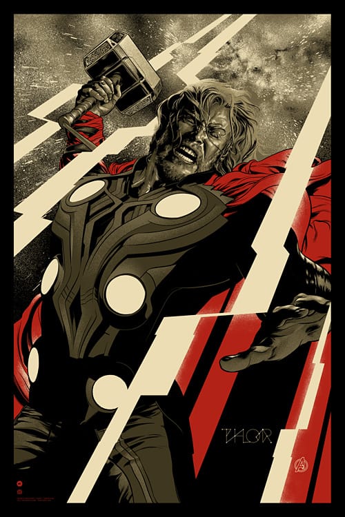
Your design for ‘Thor’ does an amazing job of bridging the gap between Thor’s comic book origin and his Hollywood cinematic equivalent. The realism in the face and the shift into a more comic look of his body is a brilliant and surprisingly subtle touch. The star map in the ‘Thor’ text on the bottom right is just brilliant too.
The whole design of the poster focuses on who Thor is – he’s strained yet angry, he’s the God of Thunder yet heaving that hammer does carry a certain amount of weight. You captured every angle of that character in one portrait.
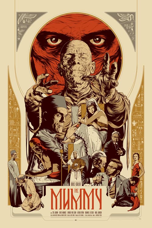
You have a few approaches to film posters, in something like ‘The Mummy’ where you compress the entire film to a poster, and in ‘Thor’ you compressed who the character is one image. When you start a project how do you decide which approach to take? In ‘Alien’ you didn’t do a character study of Ripley, which you could have, but rather the entire story. Is it a hard decision to make which direction to go?
These are all studio licensed, so sometimes we don’t have the option to use every actor’s likeness, and when we do, the actor usually has to approve his portrait before the poster can see the light of day. It can be hard to decide on an approach at first, but we shoot to represent the movie and the character as close as we can, with what’s available.
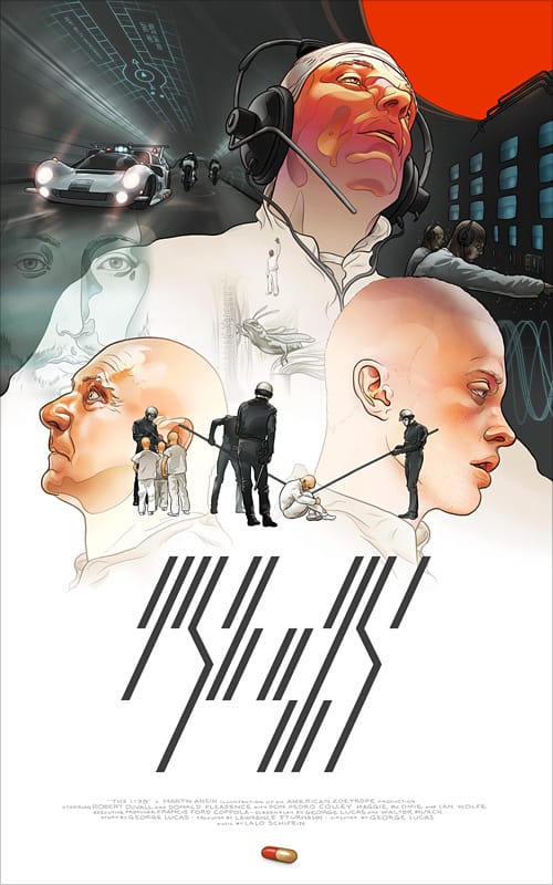
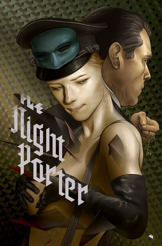
Two prints that show up as personal projects are your ‘THX’ and ‘The Night Porter’ designs. When you have free time away from client work, is your first instinct to do film posters you’d love to do? Is that decision based on your love of film posters, or is it a way to expand your portfolio for potentially more work?
If I’ve ever done any movie posters at all it’s because of that THX-1138 poster I did way back, because it got the attention of Mitch and the Mondo people. I want to do more of those soon if only as personal projects, to try out some new things.
It’s interesting to consider what might be my favorite of your work and how it might not be a particularly memorable piece to you. Is there a piece of yours that you’d say sums up exactly what you want to do as an artist?
I think each one is memorable to me, and is pretty much what I could do at the time. I’d like to work faster though, it’s strange to see older pieces that took a short time to do, while it’s taking longer to finish new stuff!
For more work from Martin Ansin follow these handy links —
Martin Ansin’s Store at InPrnt
