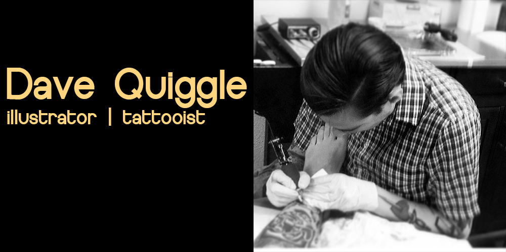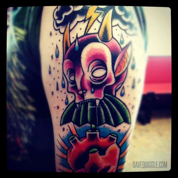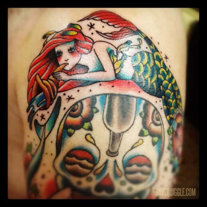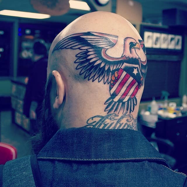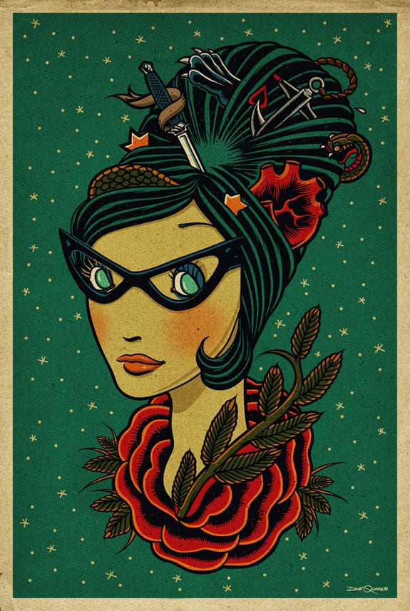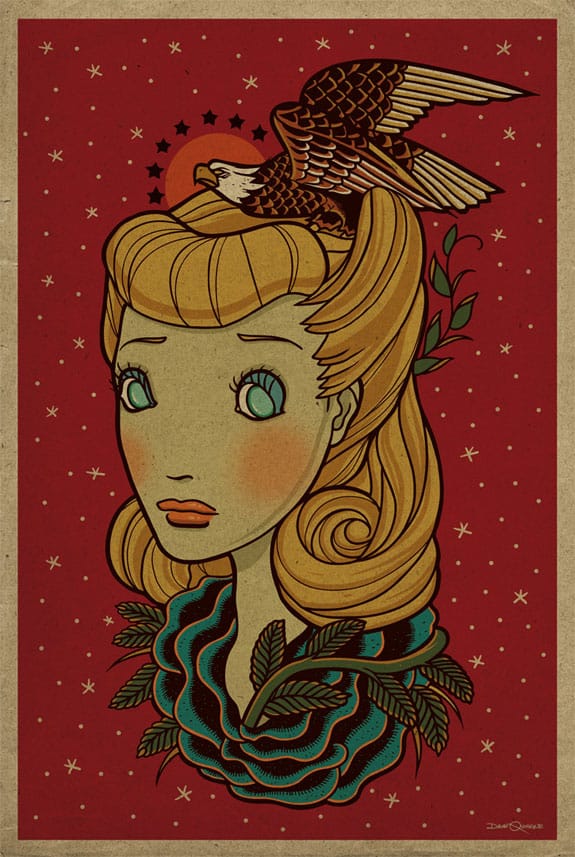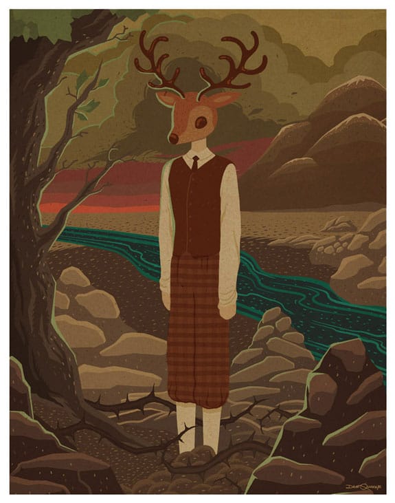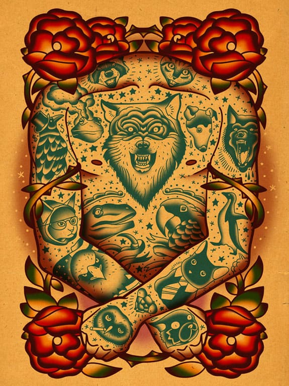
The work of Southern California’s Dave Quiggle is classic by nature and unique by design. His illustrations are rooted in the flash art popularized in tattoo parlors of the 1940s — designs both elegant and simplified, easily read on the bicep or chest of a sailor on leave. He makes this history his, taking the rules given by the genre and building on them, creating a visual fingerprint his own.
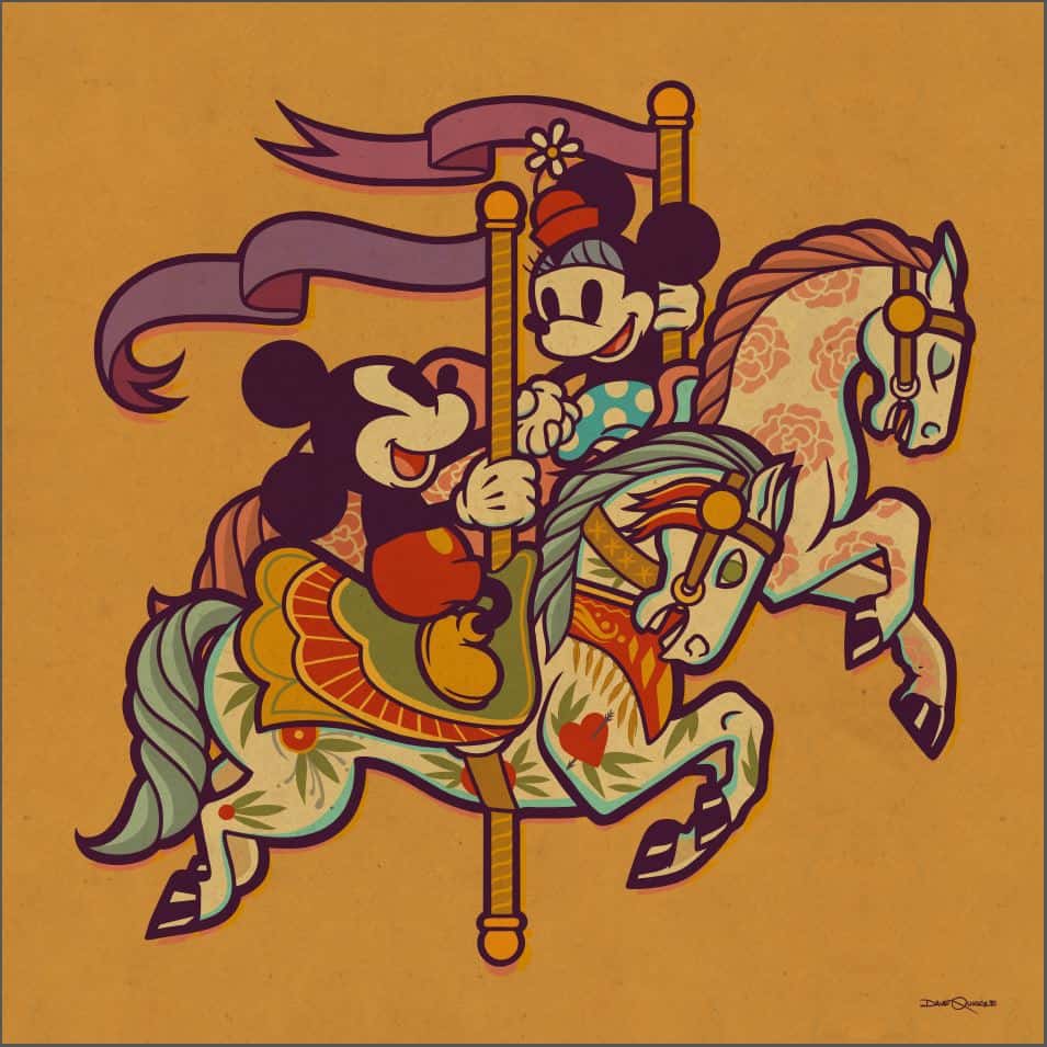
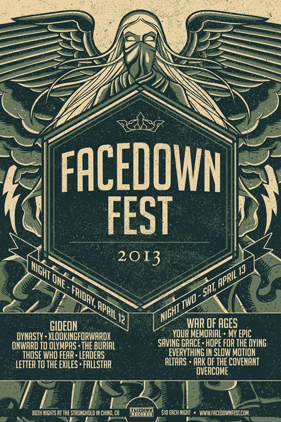
Quiggle splits his time between his role as an illustrator for Facedown Records, various bands, galleries, and as a sought after tattoo artist. His work has the bold graphic sense of tattoo design held in his modern grip. He’s appeared in the pop culture shows of Los Angeles’ Gallery1988 and Disney’s WonderGround Gallery, that latter giving Quiggle the full run of the Disney universe to play in.
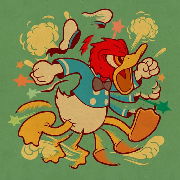
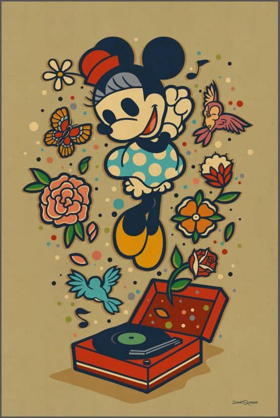
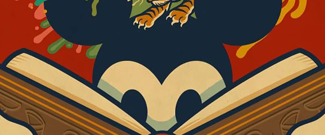
It’s in the Disneyverse that Quiggle first caught my attention — his take on Mickey Mouse, Donald Duck, and the gang was full of the truisms of that world re-imagined in his own contemporary take on classic flash art. There is definite brilliance to the range of Quiggle’s work — each project comes from a place of history and the desire to push against it, advance and experiment with what came before him.
CJ: I first saw your work at the WonderGround Gallery in Downtown Disney and loved your classic yet modern take on the Disney universe. It turns out I was already following you on Instagram, but didn’t connect your Disney work immediately with what I had been seeing. It’s not that you shifted stylistically, but content-wise. From your tattoo work, Black Rose District, and other illustrations, Disney would seem like an odd fit for you, but you nailed it.
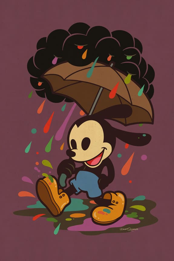
There’s a playful darkness to your work, but for something like ‘Oswald in the Rain’ you took that playfulness and went with it. I love where you took the characters. Was it a challenge to work in the Disney style while still being true to what you do?
DQ: Yes, it was a bit of a challenge. There’s an intent to keep a stylistic thread going throughout my work but I also wanted to avoid letting that motive tie me down too much. My preference is for the lens that I see things through to be more organic and less constructed so I approached these Disney pieces as if I didn’t already have a body of work out there that contrasted against it.
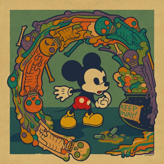
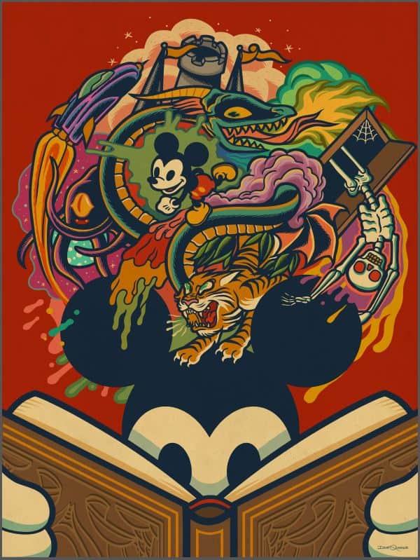
I’d like to think that whatever connectivity between the Disney work and my other work is more or less natural and not something I was too conscious of. Except of course for the Mickey piece with the skeletons.
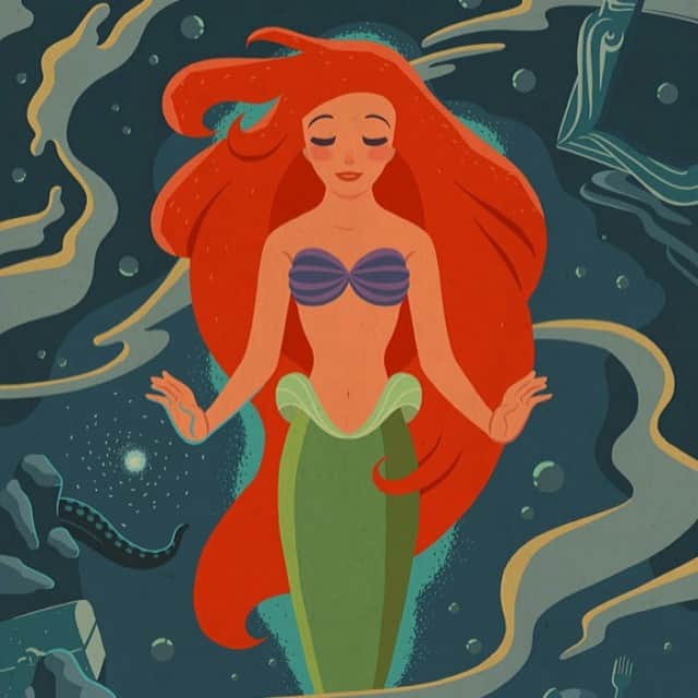
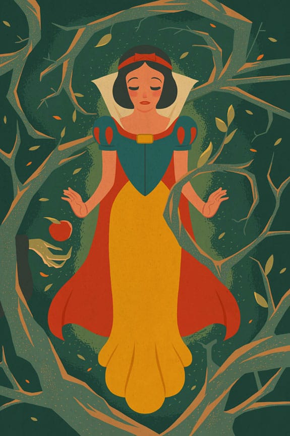
For the Disney princesses Snow White and Ariel you took a different approach than you did for Donald, Mickey, and Oswald. The male characters are cast in these cute little moments where the princesses are depicted head on, like angels. It’s an interesting separation of the characters and adds variety to your showing at the gallery. Was that something you set out to do or was it suggested to you by the gallery? How closely involved were they in your final designs?
The gallery isn’t really involved too heavily in the concept work other than when ideas are initially pitched. They either approve or pass on an idea. Once they approve then they really remain pretty ‘hands-off’ until they are seeing the final project. Really easy going considering how massive Disney is.
Anyway, concerning the styles between the male and female characters, that was something that came about naturally. I just had this picture in my head of Snow White in an almost religious icon sort of way. Soft though, unlike something like stained glass with thick edges. The way that I see the image in my head informs the choices I make to execute that art. Even if it makes the piece less consistent with the others, my hope is that there is some organic quality that connects.
How many designs did you do for the WonderGround Gallery? Do you get a head-up when a new print is coming out or what they’ll be putting on a tee shirt or mug?
So far, I’ve done around ten or so pieces spread out over the past year. Three of which have yet to be seen but are being released on September 13th. In general, I know when prints are released because there is usually a signing event that I attend. Some items, such as tee shirts, I’m aware of because I assist with adjusting the art for that type of product. Usually, though, I find out the art formats and special art uses when I visit the Gallery and see them with my own eyes.
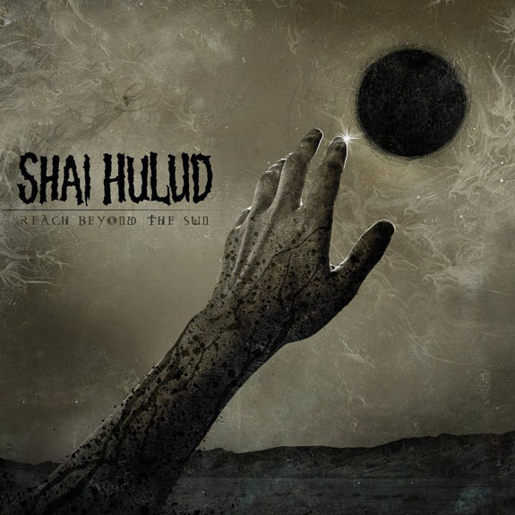
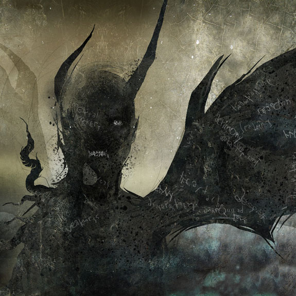
In your work with bands you’re able to adjust your style pretty drastically – from ‘Today Forever’ which has your distinctive color palette and figure work to your Shai Hulud album art, a totally awesome display of macabre madness. How much of that is dictated by the band? Are you given free reign to explore and try new things?
I’d say it’s usually a good mix of band direction and free reign. With the example of Shai Hulud, I spent a long time talking with the band to get an idea of the feel and the lyrical concepts they were working with.
When it came time to create the art for it, there was no physical direction such as, ‘paint this or draw that.’ It just has to fit the feel and mood of the band and the record. A lot is interpretive on my part. Other times a band will have something more direct in mind. I like both balances for different reasons.
How do you approach the design of a tattoo when what you’re working on is pliable skin — it moves, bends. Stretches. Do you need to know where the tattoo is going before you start? Understand the underlying anatomy to follow muscles and bones? Does your design process change from paper, tee-shirt, to tattoo?
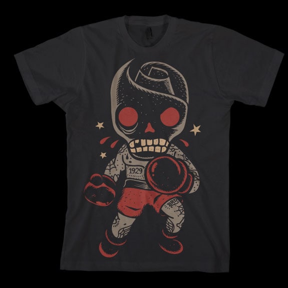
Yes to all of those questions. Each process is its own animal. They have things in common with each other but I really need to customize my art for each kind of application. T-shirts, for example, I have to think about a limited number of colors, halftones, etc. I don’t have to think about those things with a tattoo design but I do have to think about location and flow of the body like you mentioned. When someone wants one of my shirt designs or prints as a tattoo, I will often have to re-draw and re-color to make it suited for a good traditional tattoo.
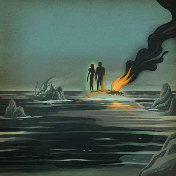
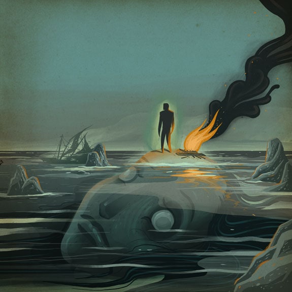
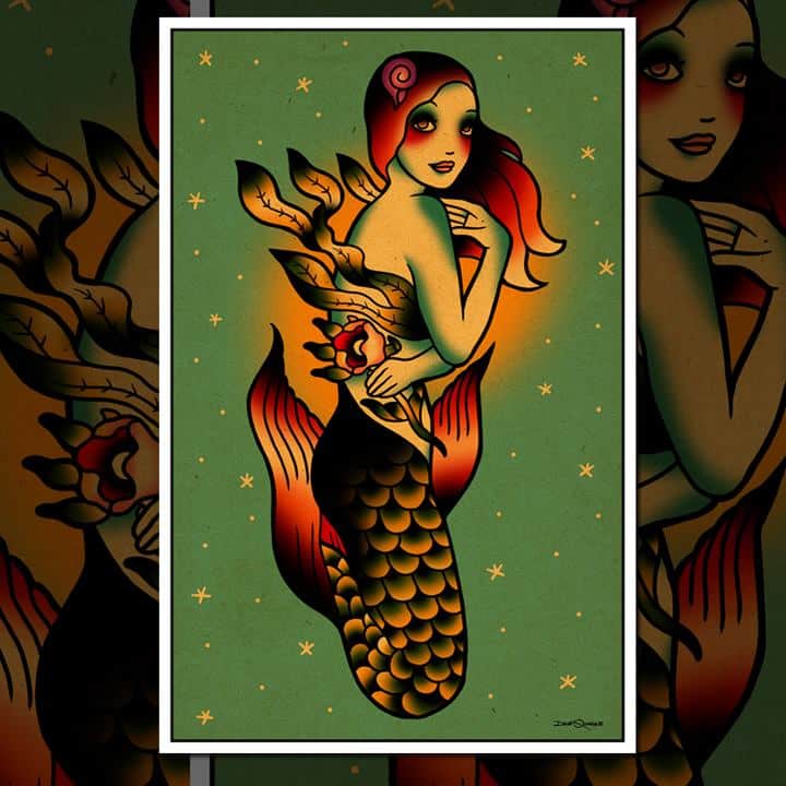
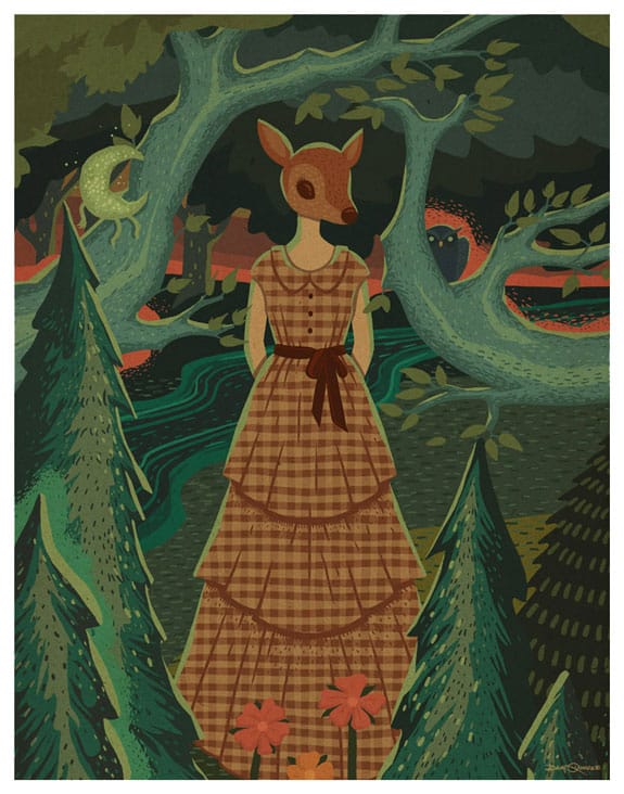
Your work has strong elements of tattoo flash art to it, but you’ve taken that style and made it your own in wonderful ways. It’s an art style that has a culture attached to it, and something like your ‘Mermaid’ print fits solidly in that classic tattoo culture.
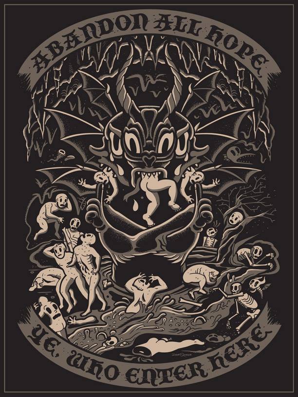
Your ‘Dante’s Inferno’ print is total genius. It takes a story that is usually depicted in neo-classical paintings and etchings and placed it in a twisted cartoon world that has elements of a flash style to it, but you’ve pushed it in an interesting direction. Was your style always as well defined as it is now? Did you start with your tattoo work and grow from that or the other way around?
Since I was a kid, my goal was to always be an illustrator or work in comic books. Comics and cartoons were the basis for everything that I did. Later on, in high school and college, I became interested in American Traditional tattoo art and that started to influence me.
At this time I was creating shirt designs for my band and for my friend’s bands and that more ornamental style seemed to translate well. It was definitely rough though and to answer your other question: no, my style wasn’t always refined. It’s been a constant process and I aim to continue improving. Tattooing came along a few years after I had already been working as a freelance illustrator. So both tattooing and illustration sort of weaved together simultaneously in a way.
There’s an incredibly strong professionalism and purposefulness to your illustrations. They’re tight and peerless in their execution. Have you spent time in commercial design firms? Have you always been freelance?
Other than a current long term working relationship with Facedown Records as their in-house art guy, I’ve been solely freelance. The unique mix of freelance, tattooing and record label projects somehow works and keeps things fresh and interesting for me.
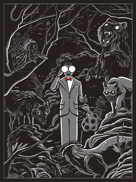
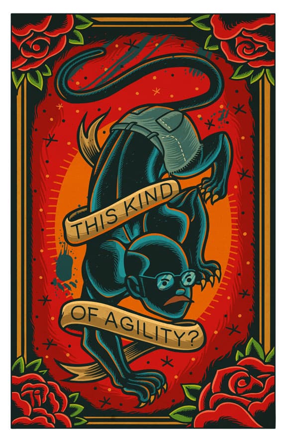
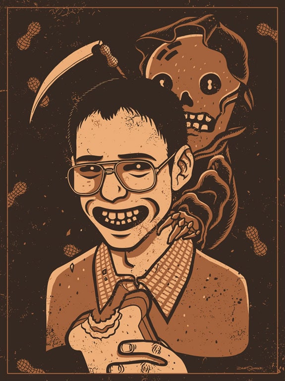
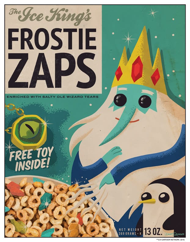
You’ve had a lot of success working with pop culture properties – Adventure Time, Arrested Development, Pee Wee Herman, and Freaks & Geeks to name a few. Is that a challenging arena to work in as opposed to original characters and themes? Is that work you seek out or does it find you?
A few years ago I saw that Gallery1988 in LA was doing these pop culture shows and they really seemed like fun. They invited me to participate in a few of their shows and it was such a new experience for me after working primarily in the music scene for so long. The change of pace was nice and of course, every project is challenging in some way.
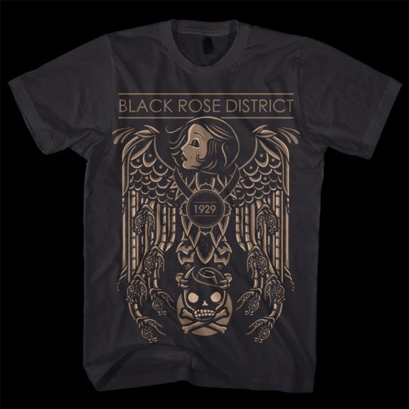
Black Rose District is your own line of apparel. The line has it’s own specific style, no matter how the designs vary. It’s an awesome feat. What lead to you doing a line of tee shirts? Are other artists involved?
That started because I wanted to create designs that, in my mind, didn’t fit a lot of the clients I had at the time. So I did a few designs here and there under the name Black Rose District and they did really well. Better than I expected actually.
I never really wanted it to become a fully-fledged brand with seasons and trade shows and all of that because that’s not how I want to spend my time. But it’s a great creative outlet and I still have a lot of ideas for it. I’m excited about where it’s going.
Do you take your work on the road to events like Flatstock or any other festivals and fairs? I found your work online through Tumblr or Instagram and then Disney – how conscious are you of going out to reach new audiences? Is that something to worry about or just let happen?
No, I don’t really make the time to travel and promote my work like that. Promoting myself and my art is really my least favorite aspect of what I do. I love creating the work and I love for people to see it and enjoy it, but I don’t like the actual act of promoting it.
I do what’s necessary because I DO want to expose people to my art, but it’s just not in my personality to go out there and stand behind a table or something. I guess I’m incredibly lucky I live in the age of Instagram. I spent quite a few years in a touring band that traveled the US and Europe multiple times and got the full spectrum of traveling, staying in hotels, etc. so those things don’t have the same allure that they might have otherwise.
