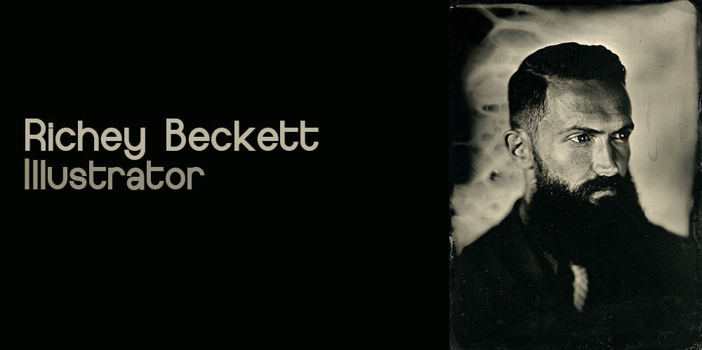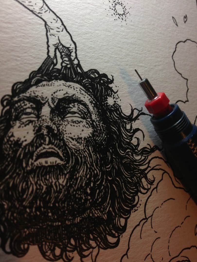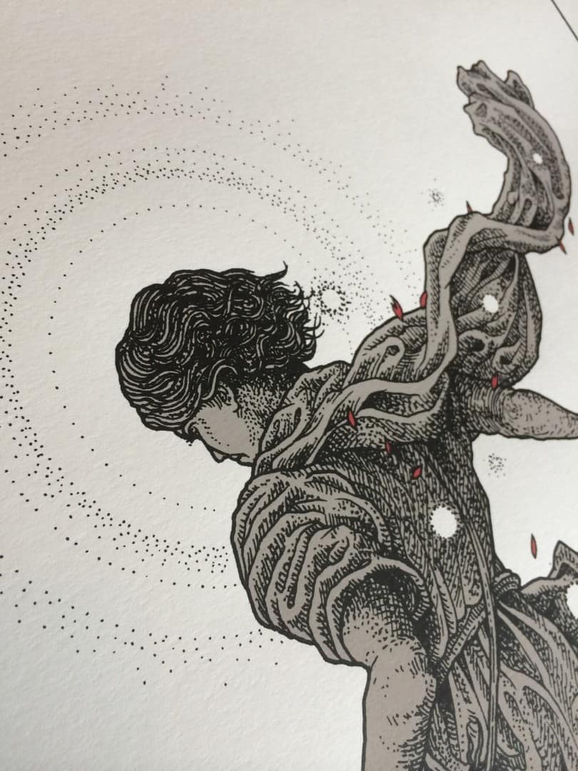
The work of UK based artist Richey Beckett is calm and thoughtful. There’s no rush or hurry to what he does — his intricate drawings are dense with ideas. An organic world for the viewer to get lost in. Beckett is the perfect artist to illustrate stories of heroics — epic tales that go beyond our modern world. He has tackled Tolkien’s ‘The Lord of The Rings’ and Martin’s ‘Game of Thrones’ with designs that puts on display both the history and depth of those narratives.
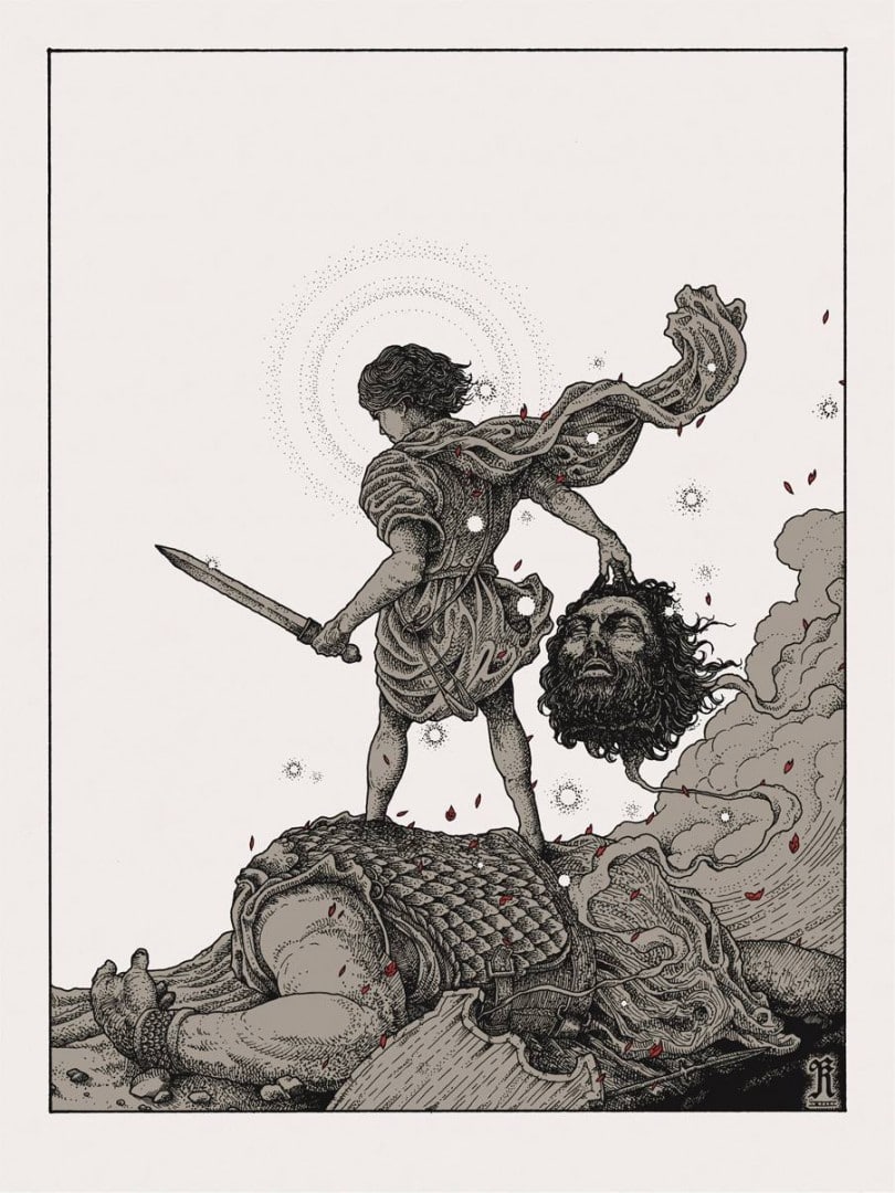
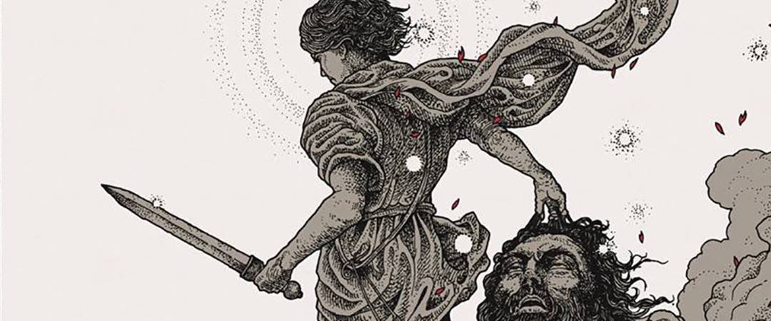
Beckett has recently moved into editorial work, his first being for New Republic‘s article on Malcom Gladwell‘s book ‘David and Goliath: Underdogs, Misfits and the Art of Battling Giants.’
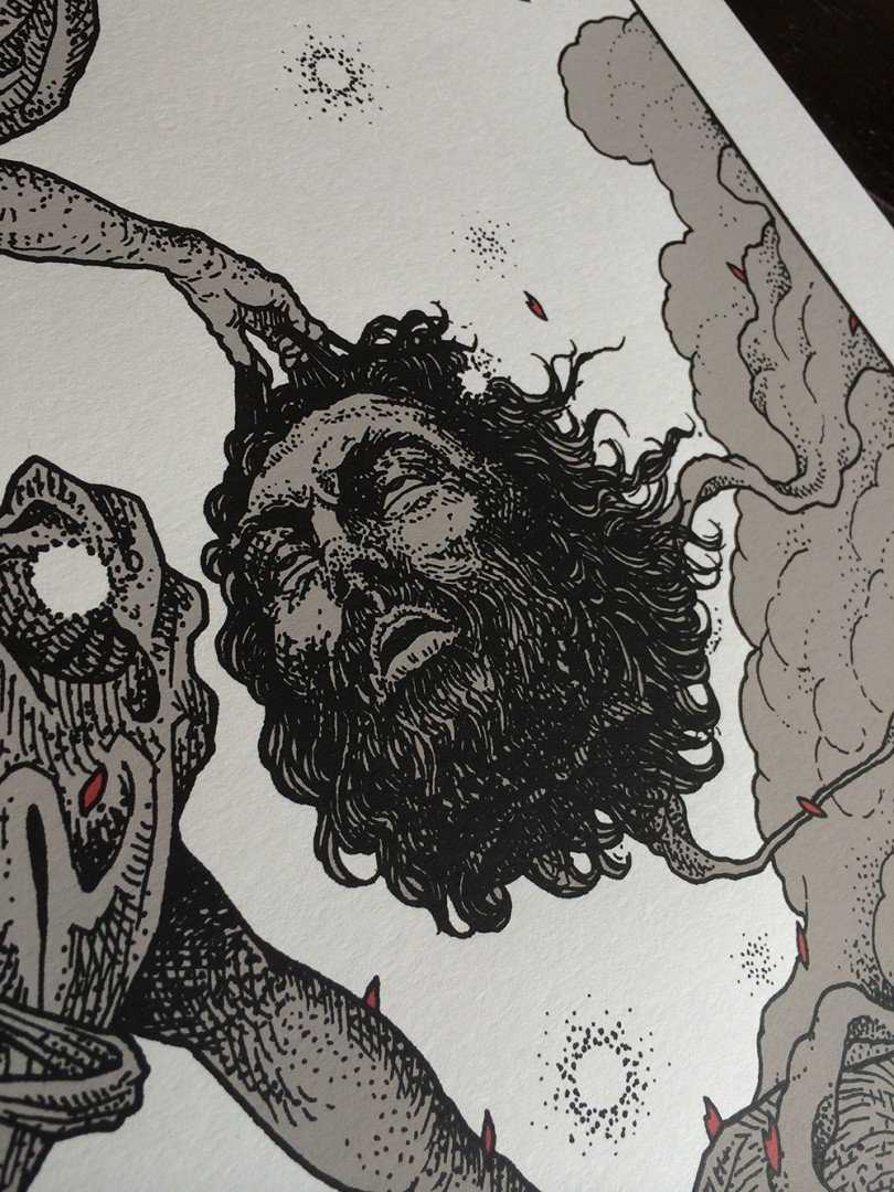
On August 20th at 6PM BST he will release a limited edition of 100 hand numbered, signed, and embossed prints of ‘David & Goliath‘ through his online store. Beckett’s work is known for selling out in a matter of minutes, and this won’t be any different.
I reached out to Richey to talk about his first foray into editorial work, the influence of Gustave Doré on his drawings, and his recent prints for ‘The Wicker Man‘ and ‘The Walking Dead.’
____________________________________________________________________________________________________________________________________________________________________________________________
ETDC: You mentioned this was your first time working with a more traditional outlet, outside of a bands and films. How did the art director find you? Were you seeking out the job?
RB: I think when you’re growing up, you think of ‘an illustrator’ as someone who illustrates books, magazines and newspapers. At least, that’s how I always saw it.
Although I was always very attracted to that kind of work, it didn’t necessarily line up with what I wanted to do artistically — I like to invest a lot of time in each piece (too much, some might say) and I could never see myself keeping up with the quick turnover, unforgiving deadline projects. Somehow, working on record covers I’ve found a niche that really works well for me, as bands will often start planning cover art before they even begin recording, so usually things are scheduled in several months, or as much as a year in advance.
I’ve been very happy working on those kind of projects, and although I’ve been approached to illustrate books several times, they’ve always been too expansive in their scope, always wanting a bewildering number of illustrations. So, when New Republic contacted me about working on a one off piece to illustrate an article, it was a unique opportunity and a fun challenge.
I’m not sure how they became aware of my work, but they were very complimentary and I was flattered to be asked, knowing the history of the magazine and contributors.
For ‘David & Goliath’ did you need to submit rough sketches for approval? How involved were the folks at New Republic?
Absolutely, although my rough sketches are always very rough indeed. I always hope that whoever receives it can visually piece together what I see as the final image, knowing my style and translating that from the rough sketch.
To me, it seems obvious, but then occasionally you’ll find someone who just can’t see it. For example, they’ll say they thought it should have more colour, or more detail, and of course these are things that I’d only think about once the line work is down — at that point I’m just trying to communicate a layout/concept idea.
In this case I was given pretty much free reign as to what I drew — the illustration was to accompany an article about Malcolm Gladwell’s new book ‘David and Goliath: Underdogs, Misfits and the Art of Battling Giants’ — which discusses the story in a practical sense (as opposed to a ‘Biblical’ one) and explores its relevance to the challenges of modern life.
I could have gone for an abstract/metaphorical image due to the scope of the book but to be honest, I really wanted to take the opportunity to indulge my Gustav Doré influence and work on something classical and literal, which they were totally happy about.
Is book illustration something you’d want to take on? Follow in Doré’s footsteps and do a few classics? What would it take for you to do a book? Do you work well under tight deadlines?
It is something that I would love to do, absolutely, and I’ve actually been invited to do a few recently (although I haven’t yet taken any on).
I think the problem for me right now is that I’m working on so many different projects at once, I’ve got so much lined up that I want to do in the immediate future and I want to keep the momentum, so I don’t feel that I could set aside the time necessary to work on a fully illustrated book.
My time management is terrible already, and although I think I do work a little better under tight deadlines, I also feel that I’d like to continue to invest time into each piece.
If you look at the number of Bible illustrations Doré completed, it’s absolutely outrageous. The sheer volume of work is mind-boggling — especially taking into account his other work like ‘The Divine Comedy’ and ‘The Fables.’
Or Bernie Wrighton’s ‘Frankenstien’ — it was a labour of love and took him almost a decade to complete. Not saying that I’d have to work on anything that grand or expansive, but either way it’s going to be a long project. If I became confident working in a more immediate, looser style, then maybe it’d make more sense to me, and that is something I’m very open to.
I would love to illustrate a good book and to see it published. It has the potential to become something incredibly special, and something that could represent you forever.
Was your process the same for this job as it would be for the drawing of an album cover? What sort of deadline did you have?
It was very different — I had less than two weeks from the day I received the email, whereas I’d usually spend a week on planning alone before even starting a piece, and then around 3 weeks on illustration.
I already had other projects running at the same time, so in fact I had just a few days to complete it. So you might notice that the style is a bit looser and less finely detailed than a lot of my usual work. I felt that given the timescale, but also given the function of the piece in the magazine — a more bold and spontaneous style was appropriate.
I’d certainly like to work on more in this way, under pressure to put a piece of work together and as such having to refine and take a more direct approach.
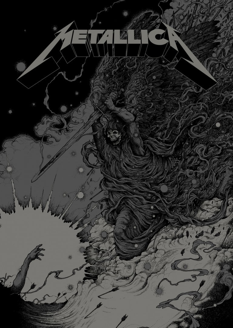
Your take on ‘David & Goliath’ shows David after killing the giant. The moment is all his. In something like your ‘Phantom Lord’ print, were we only see the hand of the victim of the raised sword. It’s all about the heroic (or anti-heroic) figure. There’s a specific ‘solitary traveler’ theme to your work.
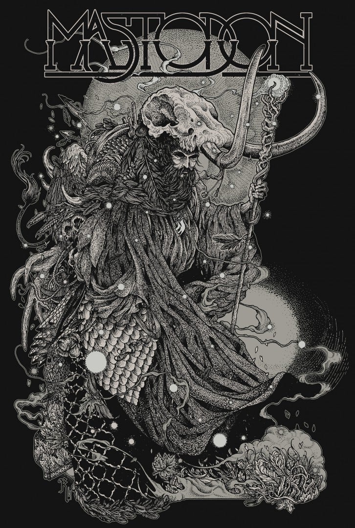
Your Mastodon piece ‘The Hermit’ is a beautifully rendered literal take on the traveling sage / hermit. I know we spoke before about your own hermit-like qualities and how it aids in the actual drawing of your work, but we didn’t really touch on how it affects the imagery you’re drawn to. David and Goliath could have been shown in the middle of the battle. You brought out the solitary element of the David’s heroic moment.
I know for the New Republic job and Metallica the subject matter is dictated by the client, but do you find gigs that play into that or is it more that you find that angle to each design?
It’s certainly something to do with my own instinct, for how I like an illustration to tell a story (or suggest one), and I think that clients have since approached me and asked for pieces with a similar feel, so it’s developed into a theme.
I don’t want to sound too pretentious about it — it’s a lot simpler really, more like illustrating the cover of a fairytale storybook. I like the idea that the image tells a tale, so in these cases, we’re piecing together what has happened and speculating on what will happen next. If you can capture a moment like that, then the image takes on a life of it’s own and becomes something greater in peoples minds.
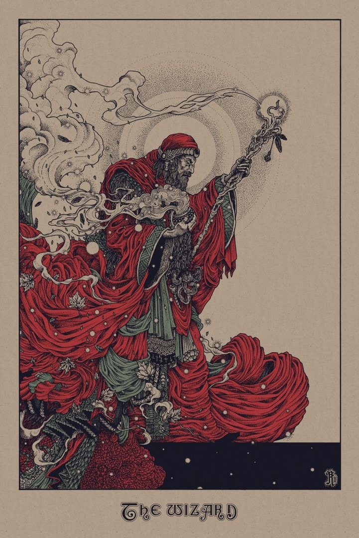
You had a string of incredible releases – ‘The Wicker Man’ 40th anniversary, ‘The Wizard’ for the Black Sabbath show and ‘Holy Light’ for the official show for AMC’s ‘The Walking Dead.’ Each one shows off a different side of your work.
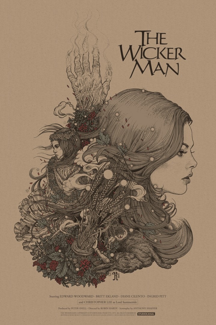
‘The Wicker Man’ might be the softest piece of yours yet. The drawing of Britt Ekland is gorgeous and differs stylistically from your other female characters. You even got approval from the actress herself on it. At the other end ‘Holy Light’ is incredibly dark, in both subject and technique. Are you purposely pushing your work in new directions or is it dictated by the job?
I’m always trying to push forward with what I do, not necessarily in new directions as such, but more refining my style and finding the balance between working in my own ways and fulfilling the scope of a project.
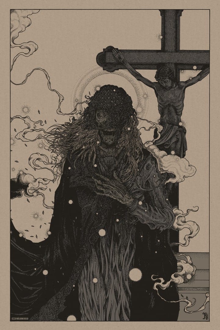
Of course, the outcome is dictated by the job to an extent, but I have to admit I’m quite selfish when it comes to the finished piece — in as much as I don’t want to create something that doesn’t represent me, or that I’m not fully behind. So with something like ‘The Walking Dead’ piece for example, I really had to search pretty hard to find something in the series that felt appropriate for me to draw.
I didn’t feel that any of the lead characters really suited my style, and I didn’t really want to draw a ‘traditional’ zombie — but that scene in the church with the zombie wearing the mourning veil, with the crucifix behind her, although it’s such a fleeting moment, it had all the elements I was looking for in terms of putting together what is hopefully a dramatic piece with some dark undertones.
I probably shoot myself in the foot with this approach — as I could’ve gone for a popular key character, which would’ve lead to the poster gaining a lot more recognition from fans. A lot of fans of the show didn’t even know what my piece was supposed to be about.
It’s more important to me to create a piece that I’m passionate about, no matter how it’s perceived, rather than shoot for a quick buck and go for the most commercially viable. Or maybe I just make really bad decisions!
With ‘The Wicker Man’ piece, the first thing I decided from the off was that it wouldn’t included the ‘wicker man’ in the image. To me, I always hated that it was included in all of the publicity for the film. It’s nearly as bad as the Statue Of Liberty being used in ‘The Planet Of The Apes’ cover/poster art. Why would anyone think that revealing the conclusion to a movie on the cover was a good idea? The POTA example completely baffles me. I guess it’s not as bad as that one.
Anyhow, when my ideas were being relayed to the film company who were handling licensing on the record, they said that Anthony Shaffer, who wrote the screenplay, had always felt the same and opposed the wicker man being used on the cover. So that was encouraging. So for me, that project was a good exploration of layout, subjects and balance. A nice little test.
I started out with a sheet full of sketches of what I might include — there are so many good characters, costumes and motifs in the movie, there was a wealth of visual ideas to work with. As it turned out, after a lot of refining, even Christopher Lee (in drag) ended up on the cutting room floor, along with all of the animal outfits that I initially thought would be my obvious choice to illustrate.
The movie isn’t about the wicker man, or Christopher Lee (in drag), it’s about deception, paranoia, and religion. So I liked the idea that initially you were drawn to the beautiful face of Britt Ekland as the dominant image, but as you looked closer you’d see the missing girl Rowan, the sacrificial march hare and the burning ‘hand of glory.’
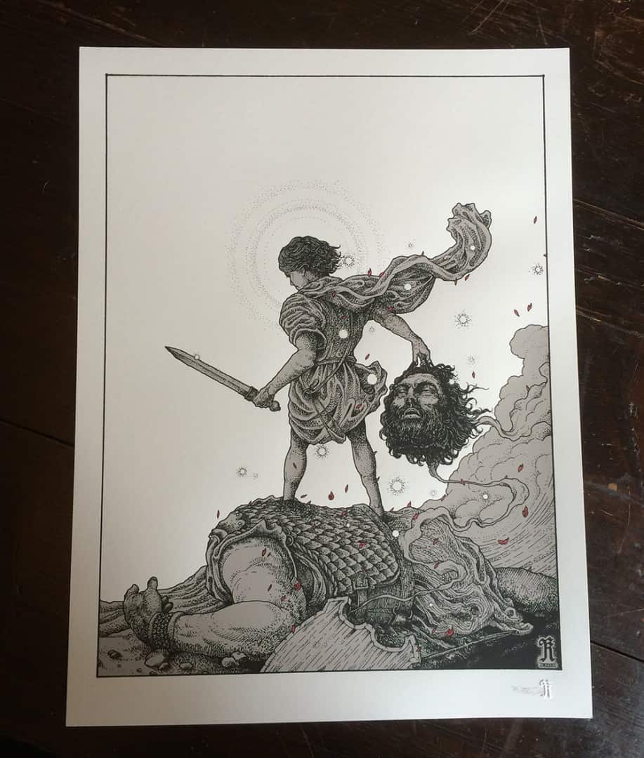
‘David & Goliath’ limited edition of 100 hand numbered, embossed, and signed prints from Richey Beckett
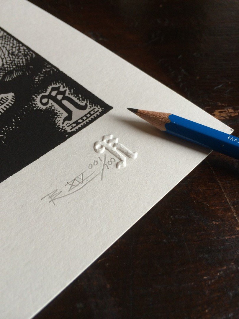
‘David & Goliath’ limited edition of 100 hand numbered, embossed, and signed prints from Richey Beckett
Richey Beckett’s ‘David & Goliath’ goes on sale Wednesday August 20th at 6PM BST at his online store.
Previously on Evil Tender — Of The Dirt, Of The Wood: Interview with Artist Richey Beckett
