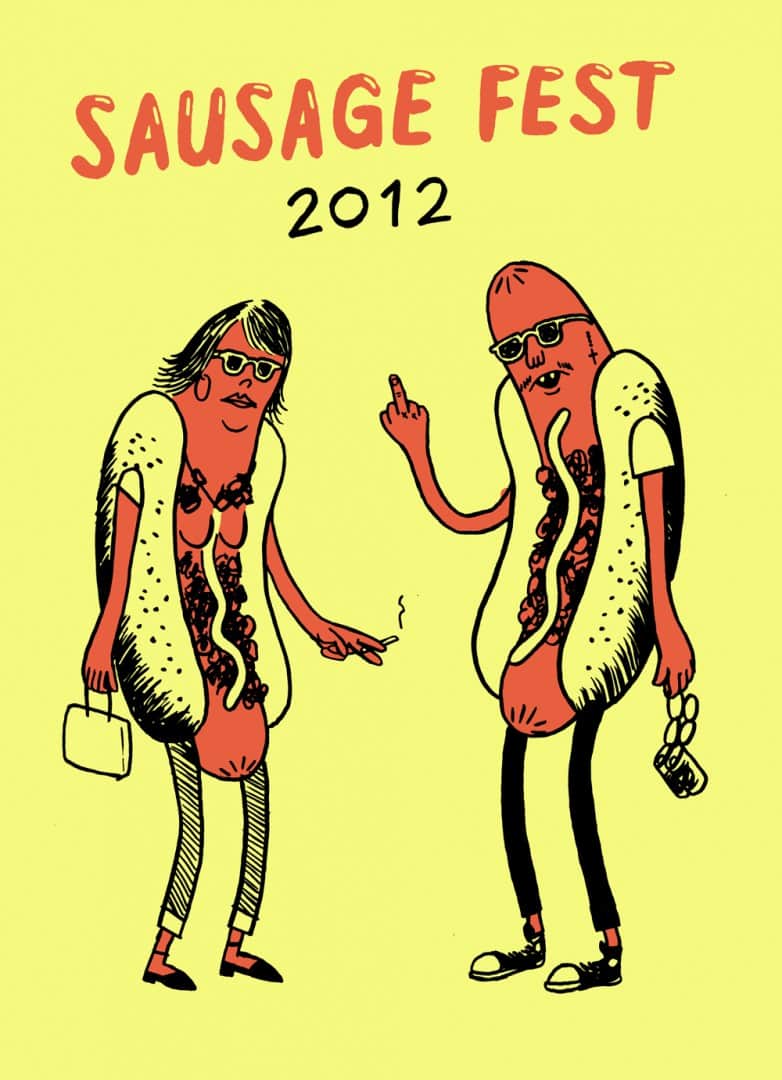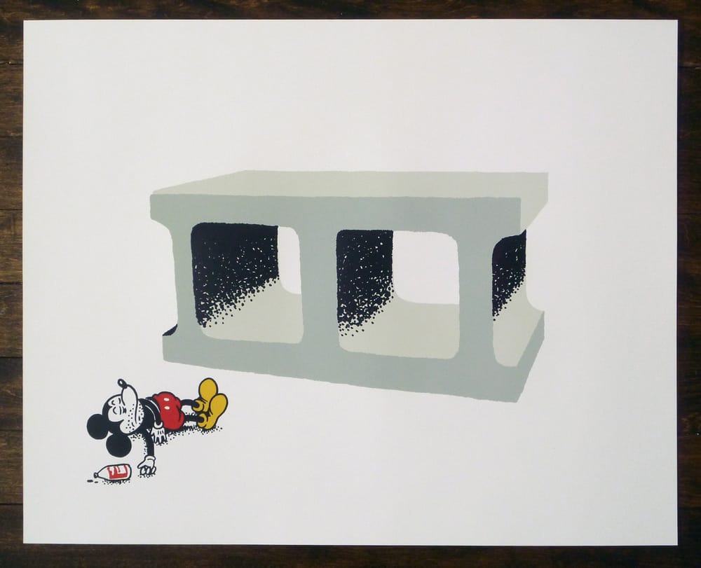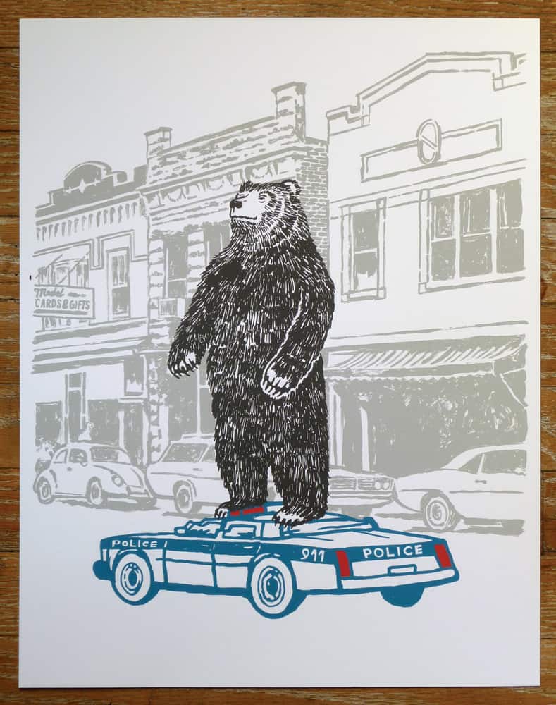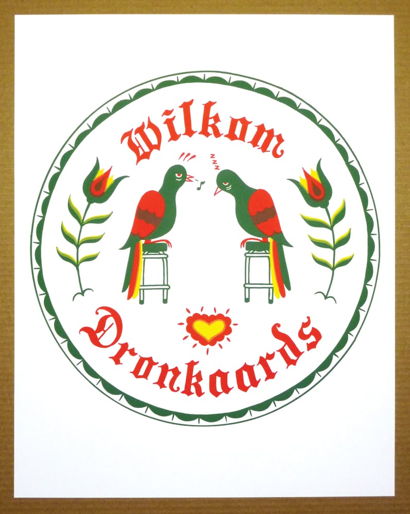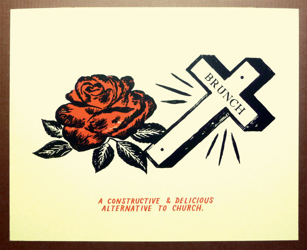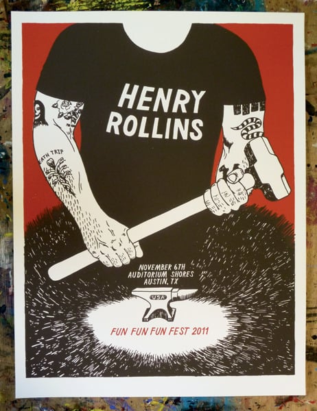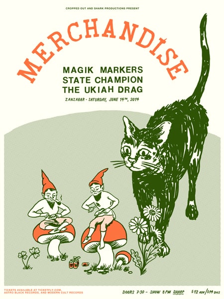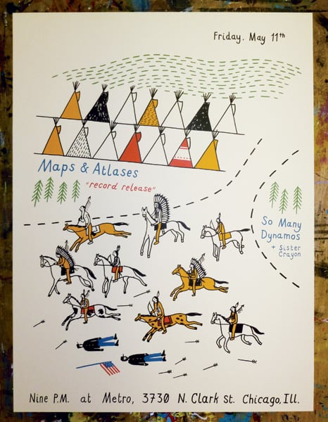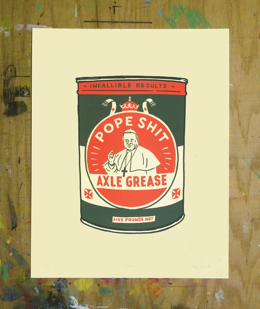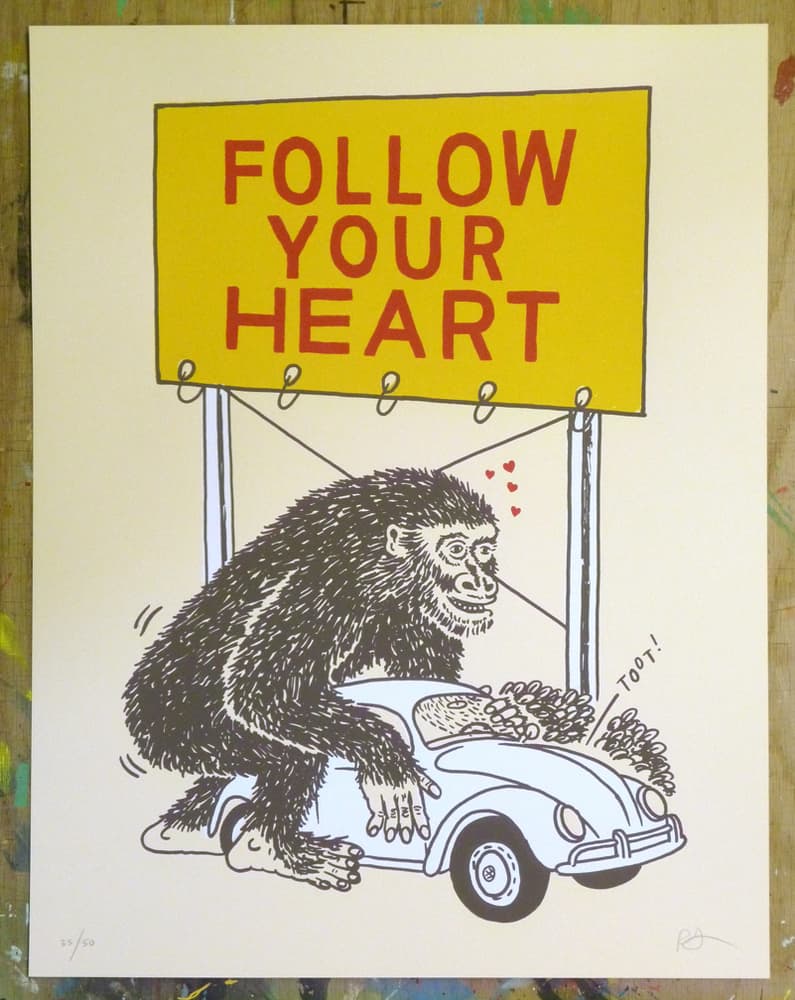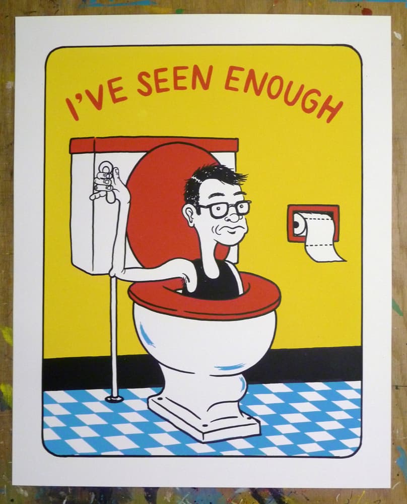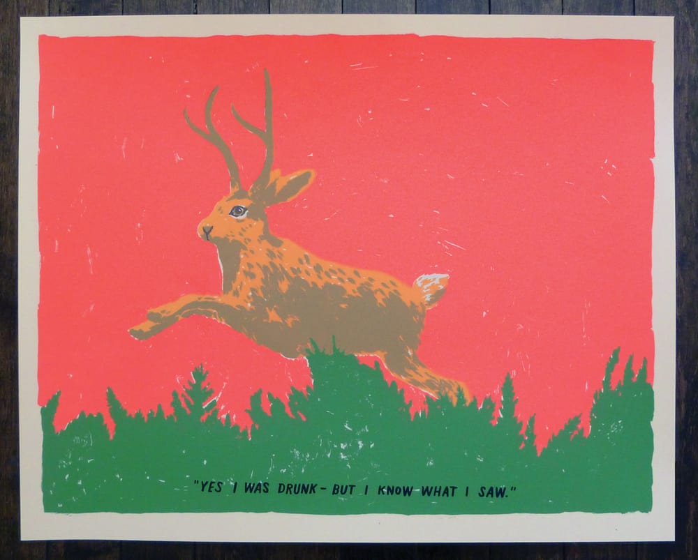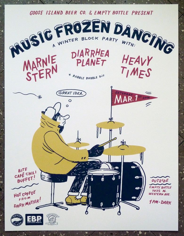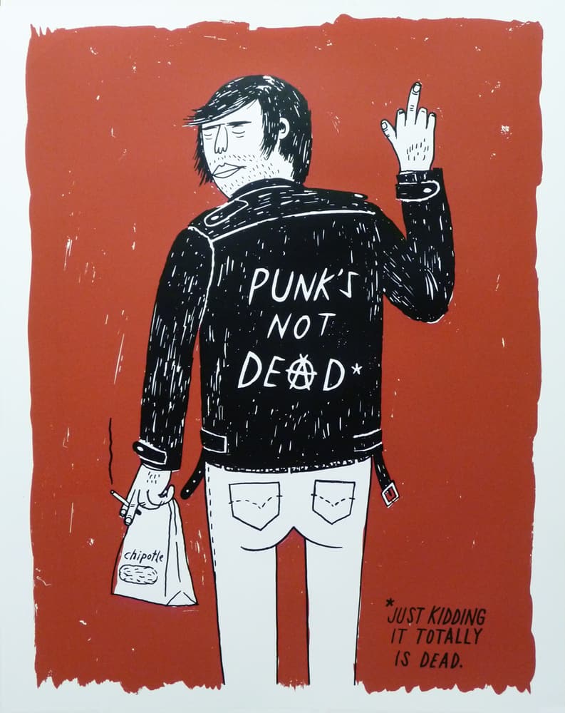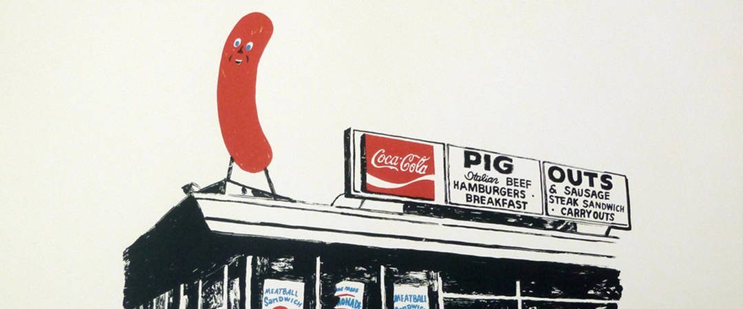
Illustrator Ryan Duggan‘s work is simple and straightforward — bold shapes, a dash of color. Direct. His drawings have a sneering enthusiasm to them, Hilarious and child-like. Duggan’s posters are all gut — punk rock and honest.
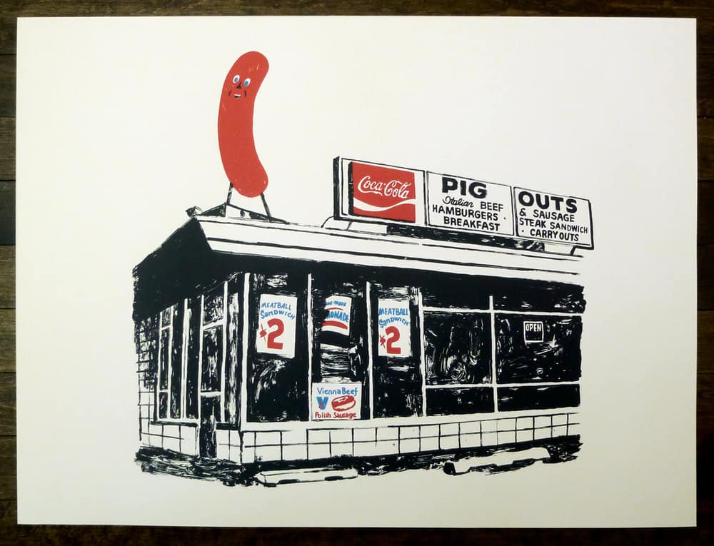
There is history to his designs — ghosts of old diner signs and menus, classic advertising and packaging tropes polished and given a new sense of life. His work updates the photocopies stapled to streetlights of major and minor cities advertising bands and venues that most of the public wants to avoid.
There’s an incredibly clear vision behind Duggan’s work, and what he’s able to do with a few colors printed on a piece of paper is awe-inspiring.
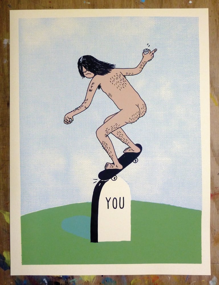
What hit me first about your work is the fun – the gut-level humor. There’s a true giddiness to something like my personal favorite, ‘Skatebutt 2013’ – it’s dark and bitter, but the humor doesn’t get in the way of the sentiment. Your posters never go the way of one-note jokes or cheap irony.
As funny as ‘Skatebutt’ is, it also holds this memory, a memory that isn’t entirely real of being a teenager and feeling like, ‘fuck this! Fuck that! Death doesn’t scare me and neither do you.’ For me, there’s total brilliance in your designs. Is the balance of humor and truth (or whatever you’d call it) something you think about when starting a project? Am I just reading too much into ‘Skatebutt’ for my own good?
I definitely enjoy using humor in my work. I don’t like to ‘be funny’ for no reason though — it has to accomplish something or work on more than one level. The funniest things are true.
There’s a brush quality to a lot of your posters. Those negative spaces where the ink doesn’t quite fill in evenly. It gives your work a handmade quality, which it is.
Yes! I have been using more and more of that in recent years. The funny thing is I’ve been using it as much for its aesthetic as for its health benefits. I draw my separations by hand, I don’t scan and print them with a computer.
Most of my linework is done with paint markers containing Xylene which will be responsible for my inevitable brain damage, but I started painting in large areas with a water-based bulletin enamel.
I love the streaks that show though, it adds a great texture. Also, it will cut down on the years I have to wear an adult diaper.
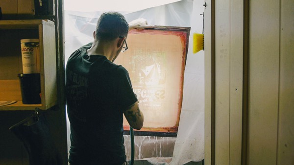
In a recent video, you showed a bit of your process, where you drew directly onto a sheet of transparent paper before making the screen. Being the artist as well as the printmaker and having so much control over the entire process, do you leave room for spontaneity, or is it a rigid process from idea to final product?
I plan out most everything but I definitely leave room for spontaneity with the fill layers and color choices. I change my mind on the fly with color pretty regularly.
Your work is very hands-on — you do your own printing and your sculpture work keeps its handmade aesthetic. Even your prints that take on the style of old signage is re-creating an era when signs and advertising were all handmade.
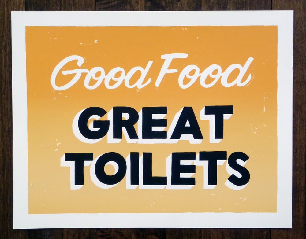
Something like your ‘Good Food Great Toilets’ poster could have come from a diner in the ‘20s or ‘30s, stylistically speaking. With such a loose style, do you even bother with software like Photoshop or Illustrator for any part of the printing or design process?
I use those programs for design work but if I’m printing posters I never even touch a computer. It first started out of necessity (not owning a printer) and then it became a part of my style. I really like keeping my hands in it.
You keep the prices of your prints incredibly affordable and accessible. That fits along with the DIY punk rock attitude your prints tend to have. Did your work as Drug Factory Press start with any sort of central idea or goal? Was it a fully formed business plan? How were you able to transition from working for someone else to working for yourself?
Definitely no business plan or goals. I have always had friends in bands and been in bands myself so I started making posters (again) out of necessity. I basically had a full-time job aside from my poster / design work and would just work all hours/days.
I am very lucky to have reached a point at which I had so much ‘art’ work coming in I could quit my day job. That was after about 7 years of working like a crazy person.
Being based in Chicago has to have its benefits to a printmaker – so many bands and venues that need gig posters. Your catalog of gig posters is a mind-boggling wealth of insanely creative ideas. Your style is consistent throughout but no idea is repeated, no theme or visual element reused. Well, there are more than a few skeletons, but not enough to say Ryan Duggan is the ‘skeleton guy.’
Your style seems perfect for gig posters, where you’re free to do anything. Was the gig poster world something you sought out or did it happen naturally? Are gig posters the bulk of your paying work?
It was a very natural progression. At certain times of the year they’re the bulk of my workload, but it fluctuates. I think making posters is my favorite work to do but I’m glad to have the variety.
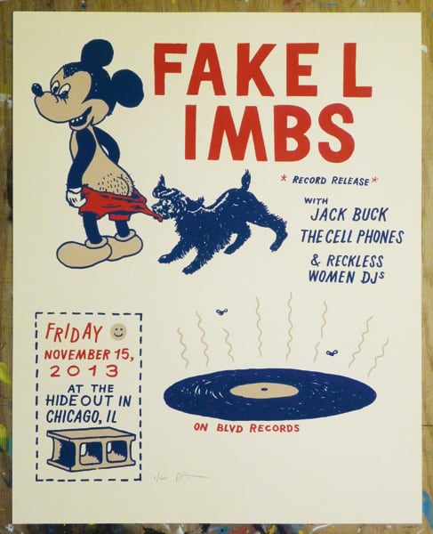
Your gig poster for the Fake Limbs record release brings in various visual elements into one cohesive design. You’re able to give a design weight with simple colors and shapes floating on the paper. You’re not afraid of white space. For as free and loose as your posters feel, there’s also a strong design sense behind. They’re sophisticated in their simplicity.
Your prints hit this point where I can see a quick and rebellious design sense, but also a steadied and educated hand behind it. Not that formal education is important, but did you have any formal illustration training?
I didn’t have any illustration training but I did go to school for advertising. It’s hilarious but I think I actually may have benefitted from hours of classes on how to layout advertisements. Thankfully I’m selling live music, not dishwashers.
A great stream of punk rock / DIY attitude runs through your work. You spent some time in the corporate design world — was that element of your work always there, or did going solo bring it out? How did your style fit into the 9-5 world of illustration?
I’ve always been a big punk rock fan. Raymond Pettibon and the SST catalog had a big influence on my teenage self. Also Frank Zappa’s music and artwork/DIY approach was a big deal for me.
My 9 – 5 jobs were always straight-up design positions doing magazine layout. Some room for creativity but not really any illustration.
What was your day job before going full-time freelance?
I was a senior designer for a trade publication company called Guerrero Howe.
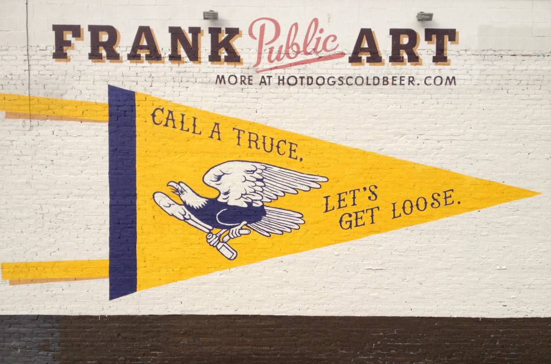
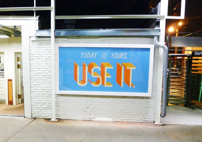
You’ve done a handful of murals and other public works. Does your process change with projects where you’re collaborating with other artists or have a specific environment to fit your work into? Do you adjust your approach at all for a mural, gig poster, or editorial piece?
I think my approach is generally the same but most of the collab work I’ve done has been sort of a ‘submit some pieces to be collaged together’ type of thing.
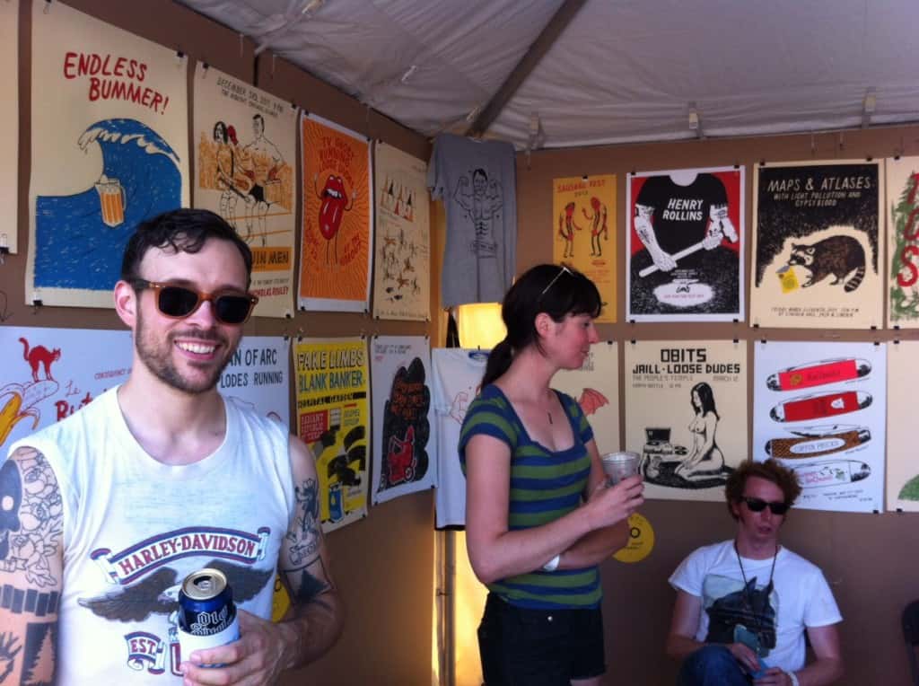
You’ve had booths at the poster convention Flatstock before, but this year you came to SXSW with your band rather than as a printmaker. What role do events like SXSW, Flatstock, Renegade Craft Fair, and other public events play in your career? When you’ve done events like those, are they more social than business?
Flatstock is great. They’re like reunions where you see your printmaker friends from all over the country and also make some money.
Renegade is less like summer camp but it’s great for getting your work out there and making money.
You threw a huge challenge onto your own back with your ‘Poster of the Week’ project. At this point, you’re at week #9.
Looking at the nine that you’ve done, none repeat and a few expand on images you used for gig posters, but overall each is a brilliantly simple design. Do you have each week pre-planned, or is each poster spontaneous? What made you decide to take on such a huge project?
Totally spontaneous. I start thinking about the poster around Tuesday. I get a drawing going on Wednesday and print them Thursday. It’s a great exercise in creativity and efficiency, haha.
I’m still less than a year into working for myself so I came up with the idea as both a forced weekly artistic endeavor and a way to make a little extra dough. It’s been awesome! Some weeks have been a little hectic but I am enjoying the project a lot so far.
Your posters have such a wonderful dark zaniness to them that it doesn’t even seem like they could be called ‘work.’
Are your gig posters and art prints close to what you would make for yourself? Personal work versus work for hire? Are there other mediums or styles you’d explore if you had the time?
I think my gig posters and other work are absolutely what I would make for myself, I’m just lucky enough to have someone giving me money to do it! I’ve always kept a rule of pleasing myself first and I think that’s what has helped me carve out a recognizable style over the years.
I would love to do some animation work but I don’t know where to begin with it. If I had the time I’d probably put it there.
For more of Ryan Duggan’s work check out these handy links —
Drug Factory Press Online Store
