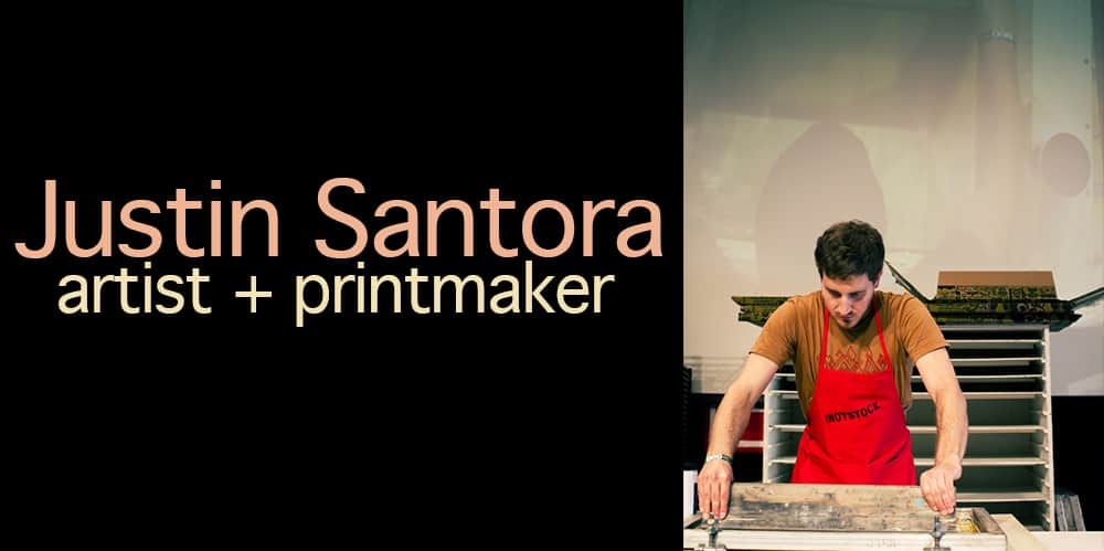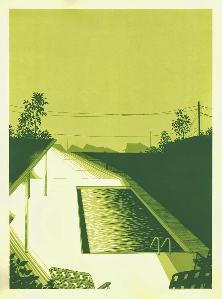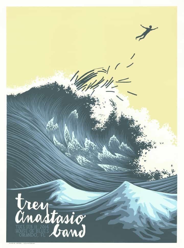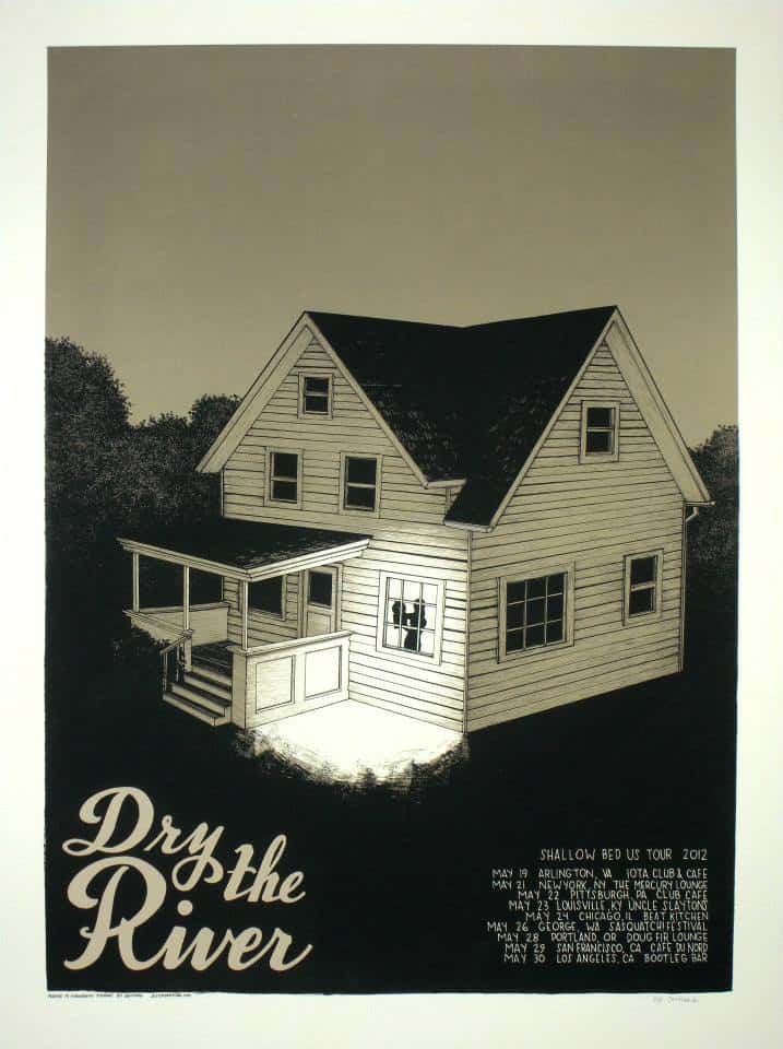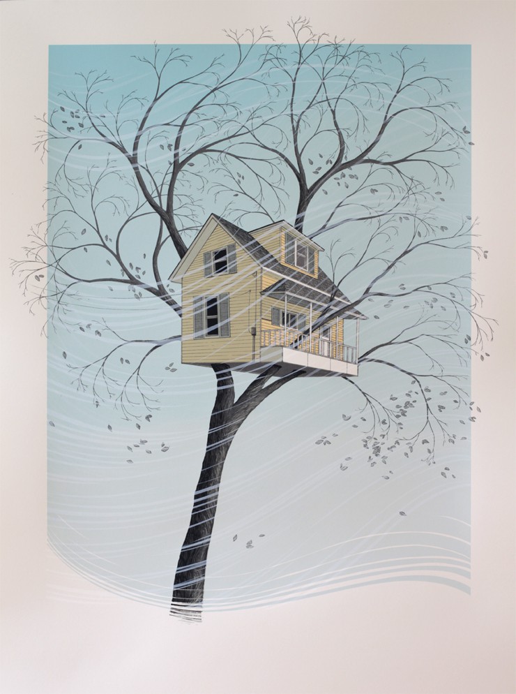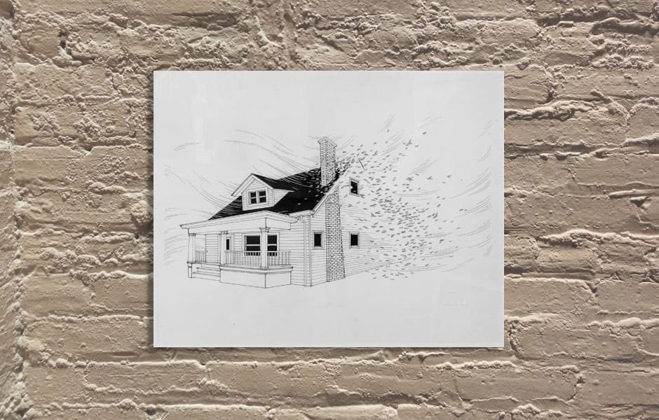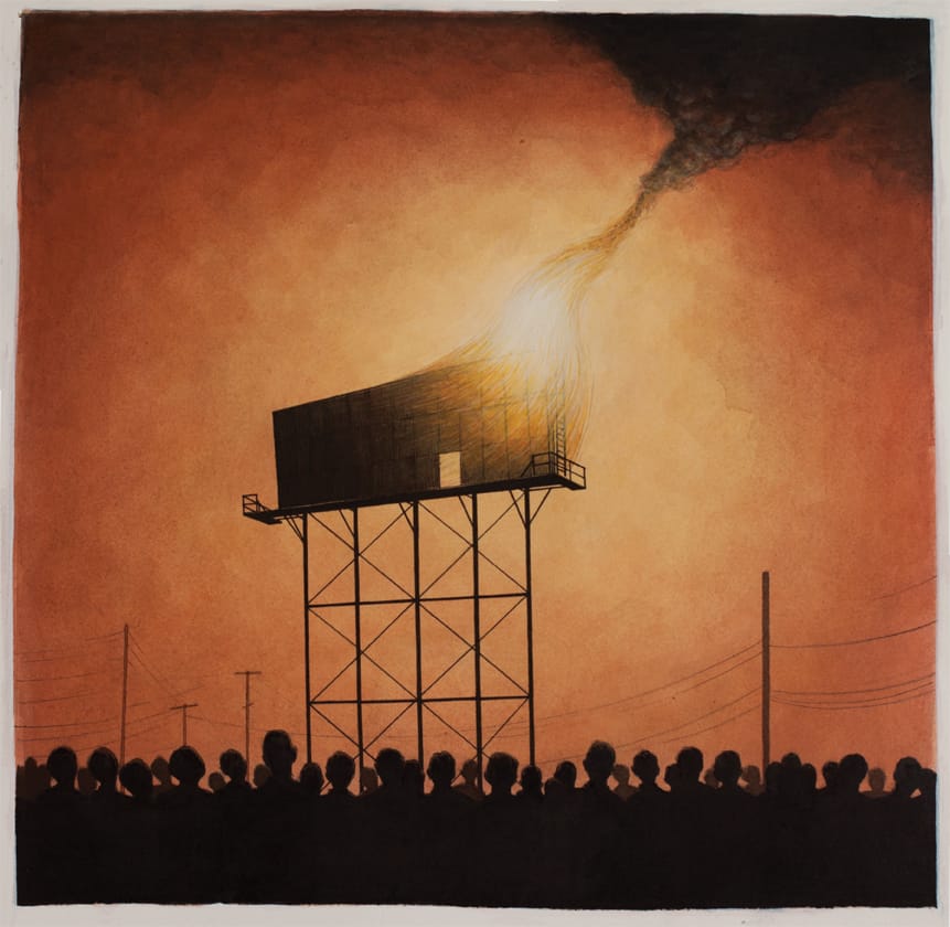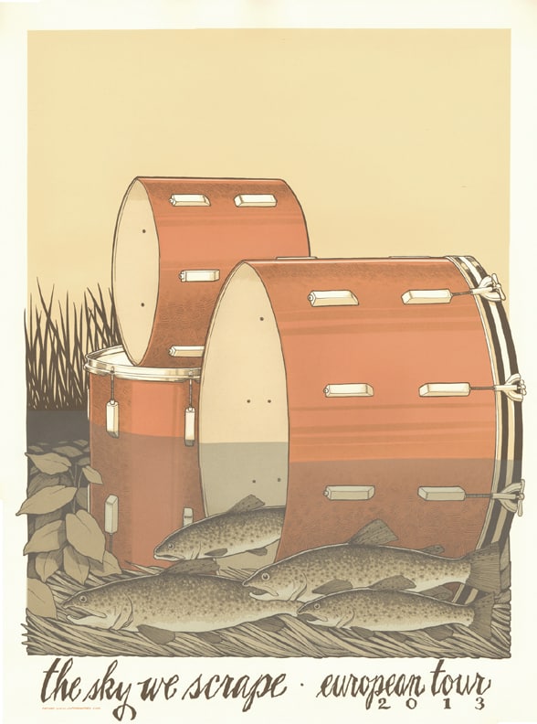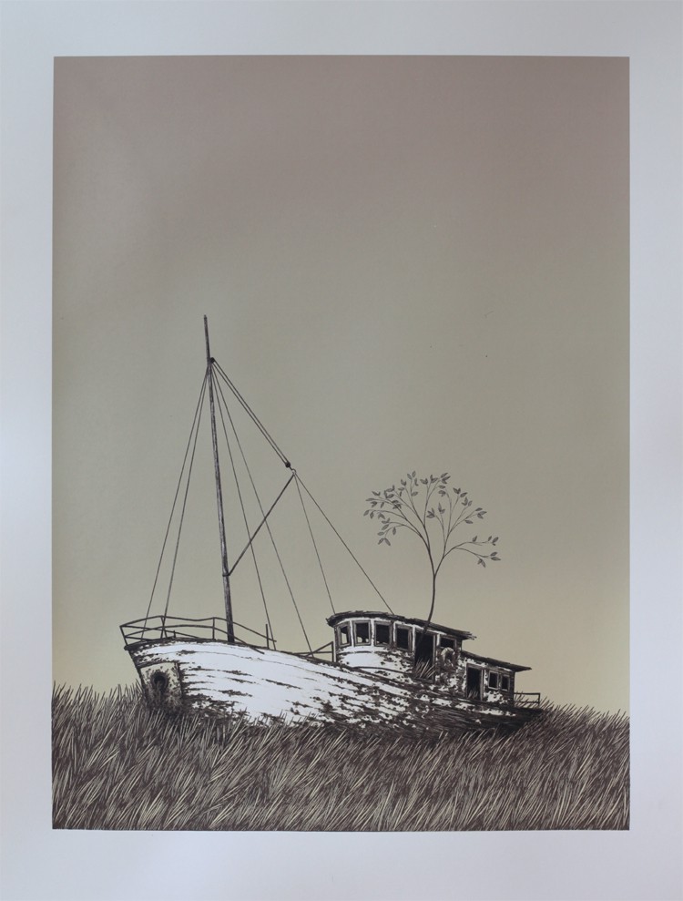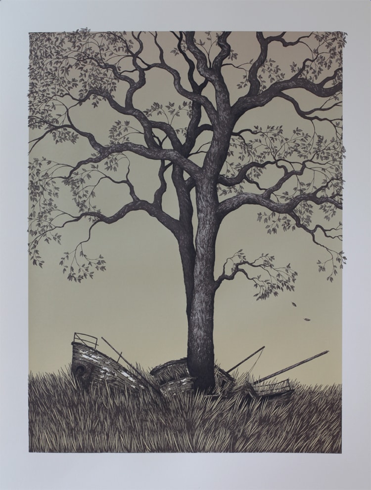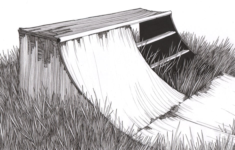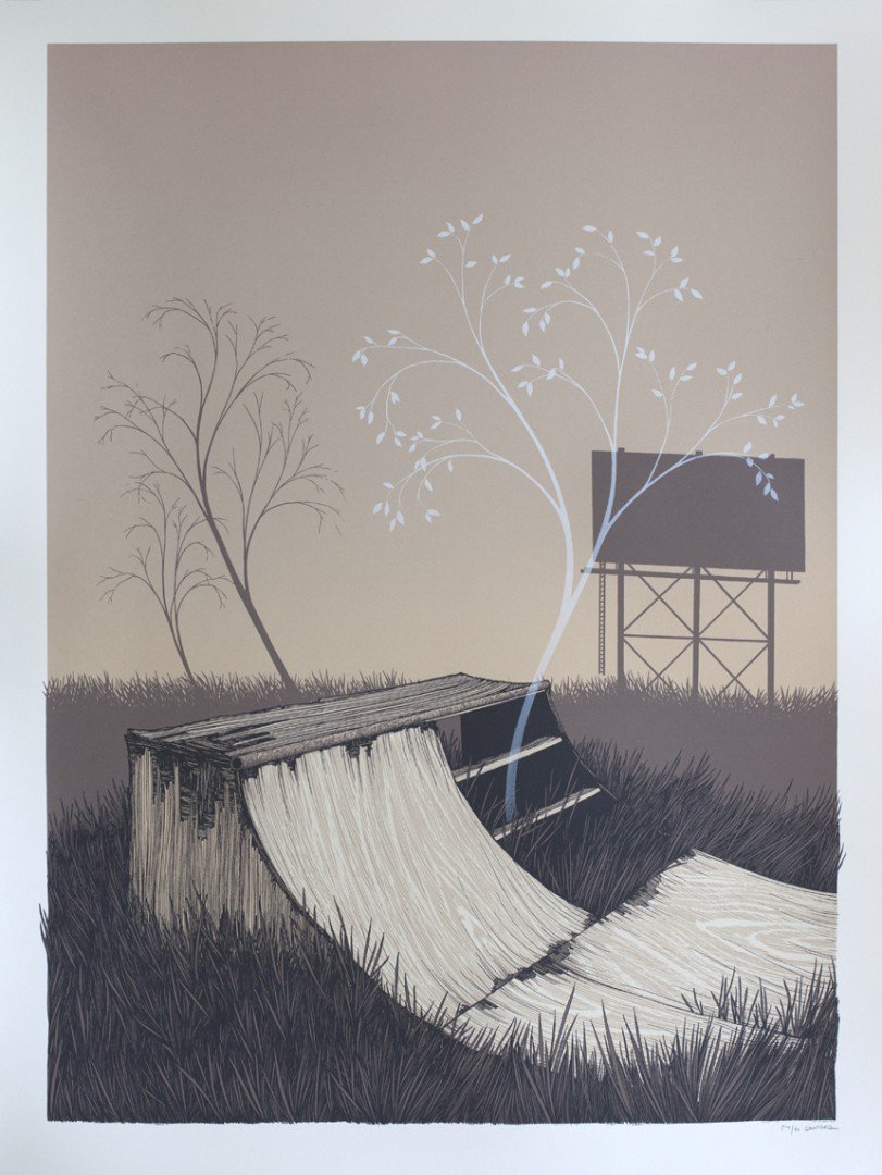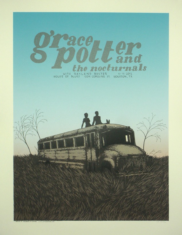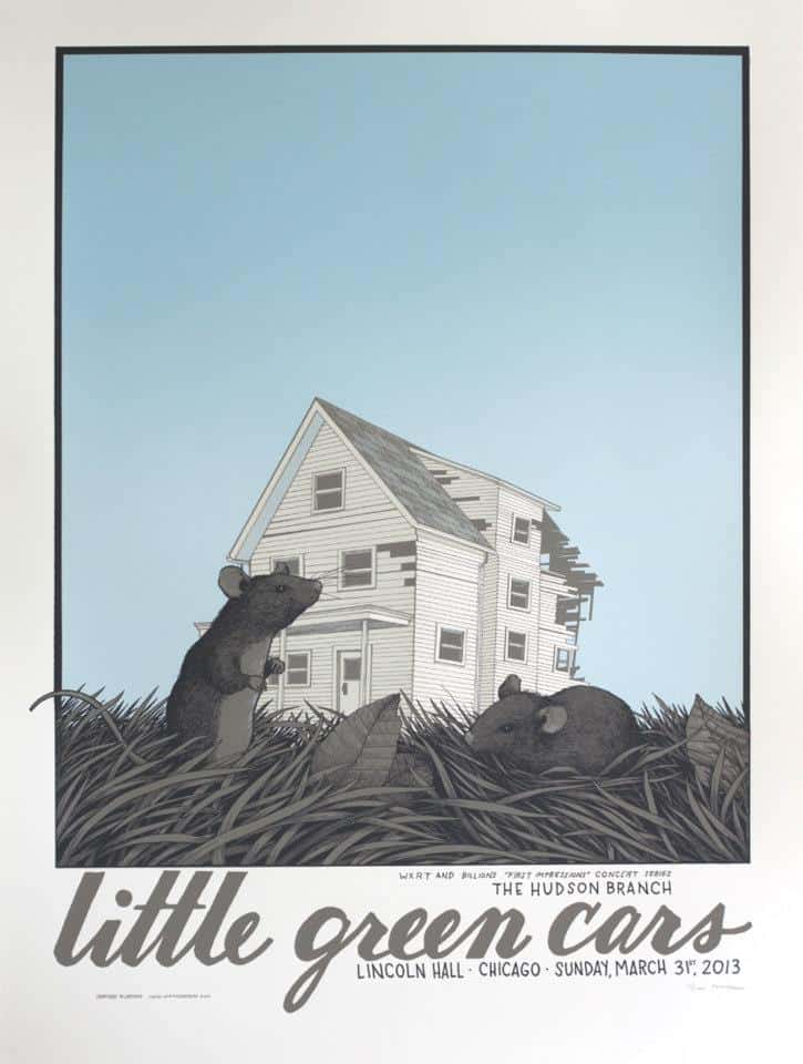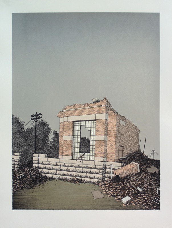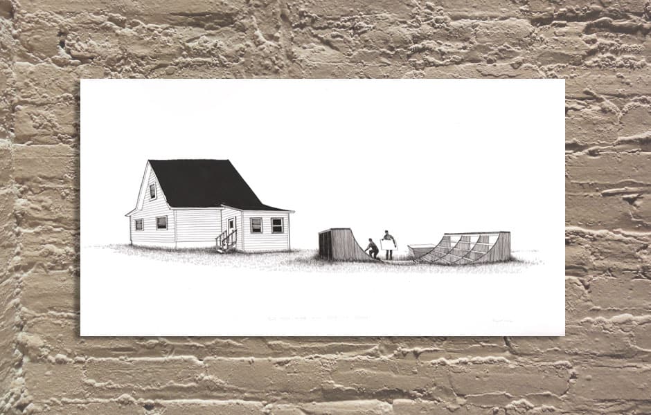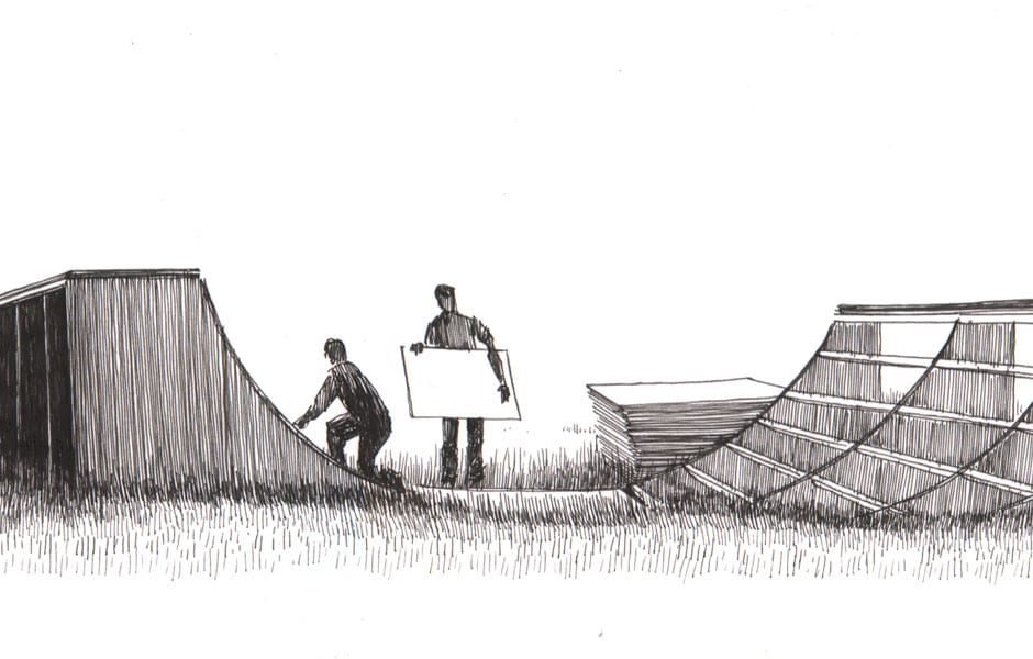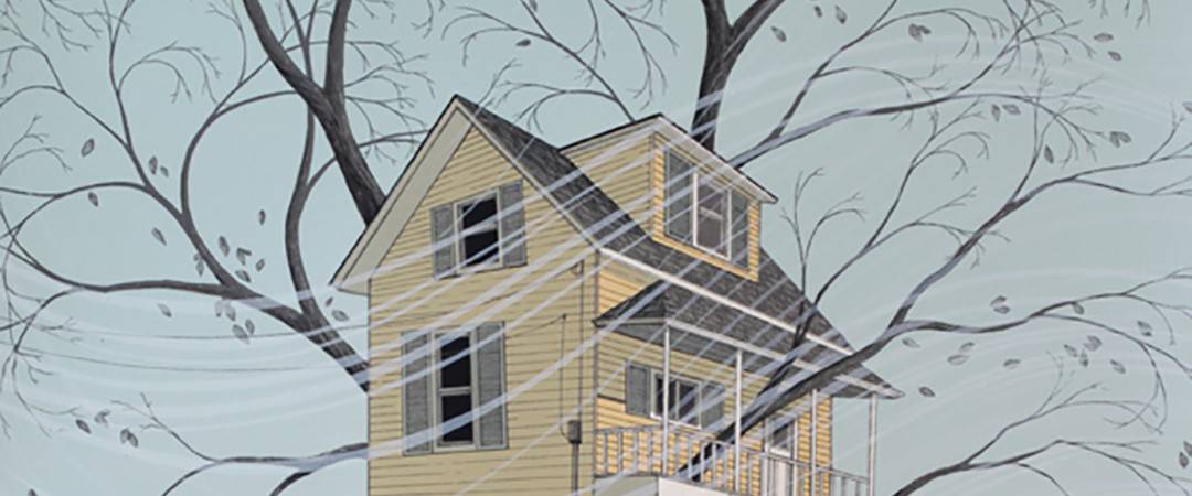
Artist Justin Santora‘s posters have a meditative quality to them. He depicts ethereal moments — tone poems in a monochromatic state. There’s a subtleness in them that seems at odds with the modern world.
Santora’s landscapes have a ‘Wizard of Oz’ like magic in the glow of his color palette. He shows us these little human non-moments, caught from the perfect vantage point. Caught in perfect light. His art is a looking back, a reminiscence without the pain of longing.
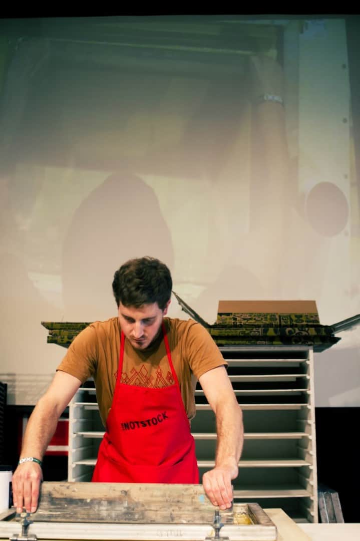
His approach to printmaking is hands on and always evolving — his tools change as he learns more and experiments. There’s something optimistic about Santora’s work, about the artist himself. He throws himself into the process at every step and it shows up in his incredibly focused prints.
__________________________________________________________________________________________________________________________________________________________________
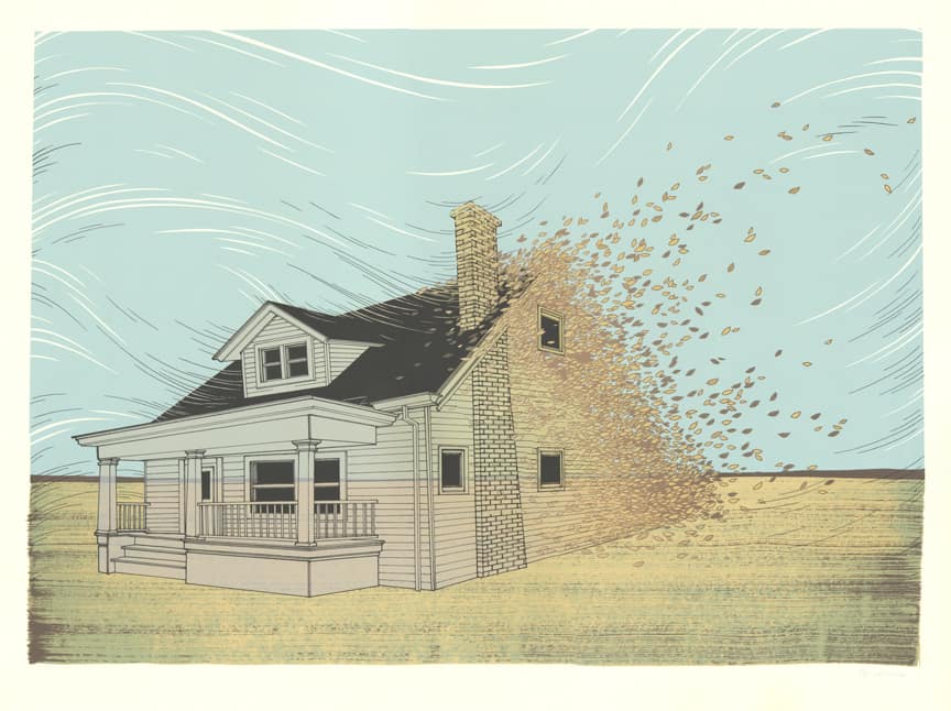
ETDC: Your work has a meditative tone – there’s a zen quality to a scene like what you depict in ‘Weltschmerz,’ you tend to capture these moments where all seems right with the world. Even your color palette plays into the meditation – they stay within this comforting and calm zone of pale yellows, greens, and grays.
It’s incredible to see how much varying shades of a single color you can get into swath of sky, with minor touches of detail that, although gets lost on a tiny .jpg, is awesome to see in person.
I would love to see your work on a larger scale, like a gigantic Mark Rothko-esque color field. Most of your posters stay in the 18″ x 24″ or smaller category. Have you considered working larger? Does the size of your work come from a printing limitation or a preference?
JS: I’d actually love to try making some huge prints one day. I’m somewhat limited in terms of size, though I have printed larger than 18×24″.
I can’t print any wider than about three feet on my press. I think it’s more for practical reasons that I do a lot of 18×24″ prints; it’s an easy size to manage in terms of inventory, it’s pretty painless to travel with prints that size, and people tend to like having prints that will fit in a prefabricated 18×24″ frame.
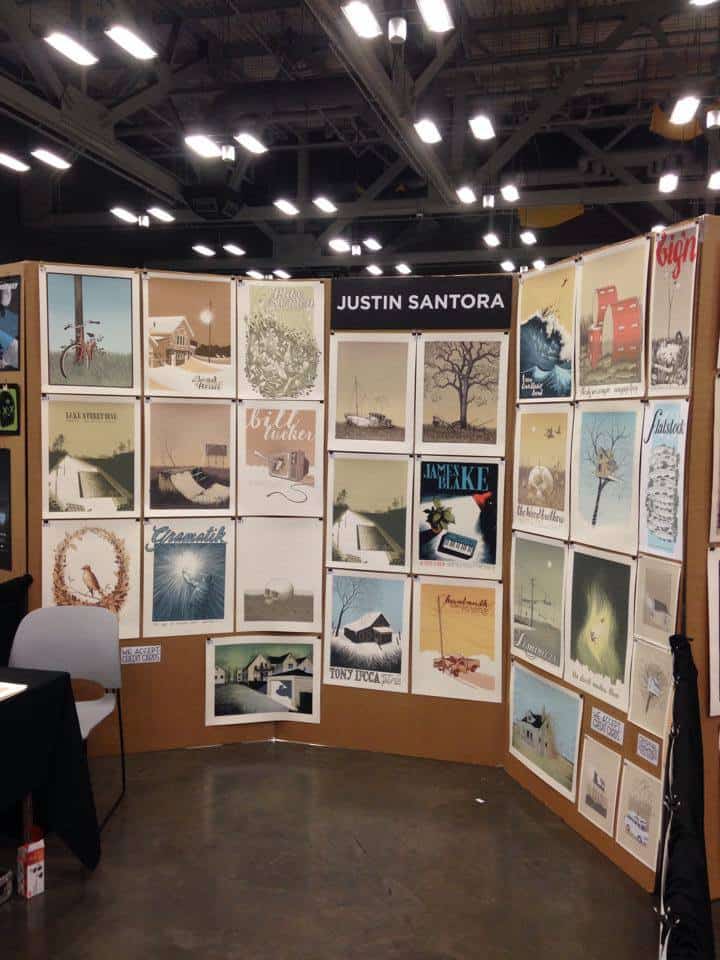
Also, for exhibiting works at trade shows like Flatstock, I can fit a lot of prints on the walls in my booth, and it’s much easier to hang things neatly when they’re all the same size. It’s a great size because you have room to accomplish quite a bit in a print without going so large that it becomes difficult to manage.
I get a kick out of working on long, narrow compositions sometimes. They can be quite challenging. I’m glad you brought this up, though, because I absolutely hope to eventually do something like a 4’x6′ print! I’d just need access to equipment that could print that large.
I like to try and depict calm little scenes, or to make each composition a little world in itself. I think going huge in size would add a really a great new depth to that.
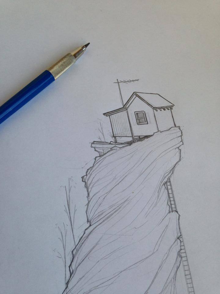
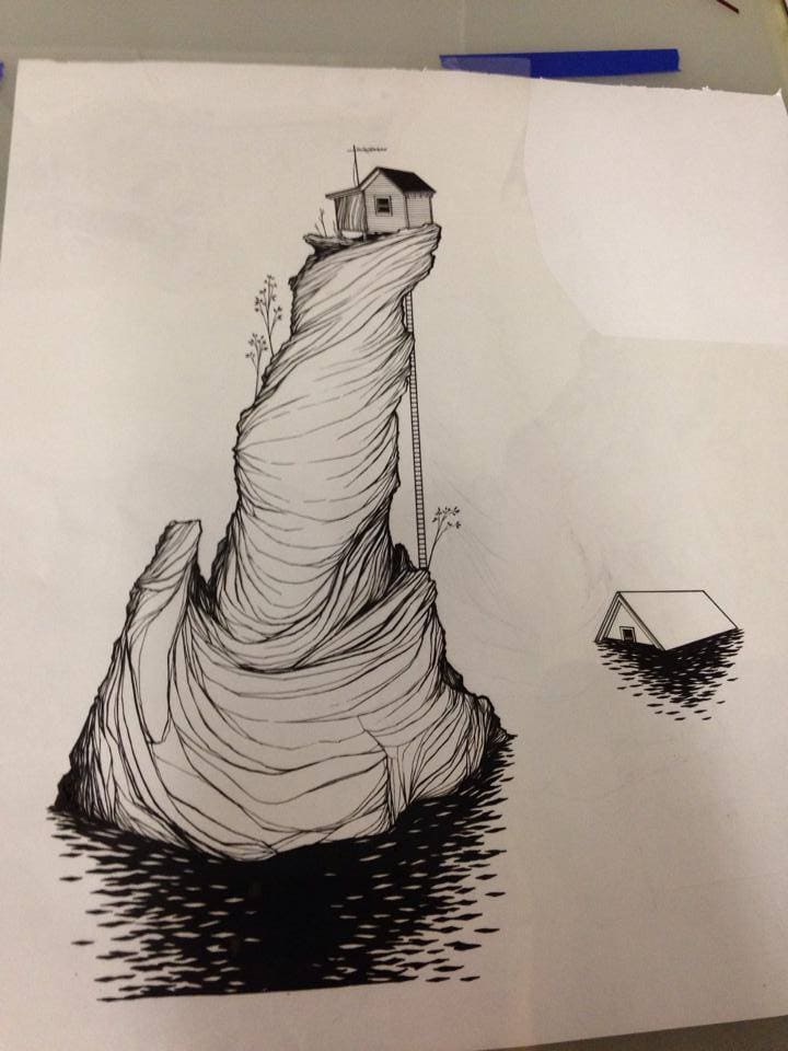
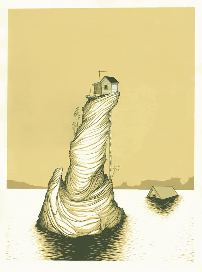
You tend to stay within a very specific palette, each print dominated by a single color. Your poster ‘One Million Shareholders Can’t Be Wrong!’ is an eight color print, with it being made up of varying shades of yellow. It gives your prints a magical quality and an overall unique voice. You’re able to get so much depth and detail out of seemingly so little. Is the minimal color palette a conscious choice, or something that grew out of your earlier work?
The monochromatic stuff has been a more recent development, actually. Color has become a bit of a stumbling block for me, and I feel like I’ve started to really over think color when approaching a new print.
Monochromes are one way around that, and they lend themselves nicely to the moody, nighttime, or dreamlike quality that I try to go for. Sometimes they just work too well to pass up. I’m trying to find a balance with that because while I think it can be rather effective, it’s not the only thing I want to do. I don’t want to be ‘the monochrome guy,’ you know?
For a poster that I’m working on this week, I’ve resolved that it’s probably going to have to be at least six screens because there’s no way a singular color is going to work for it.
You do something that seems unique for a gig poster artist – you have the gig poster but you also make the poster without the bands and gig information, and have those available as art prints. Was that an easy decision to make?
It’s actually sort of rare that I do both an art print version and a gig poster version of the same image, but it definitely happens. In instances where the band retains the rights to the image, doing an art print version would obviously be out of the question.
But occasionally, I’ll come up with something that I think also would work well as an art print because whatever sentiment I was trying to convey for the band/artist hits pretty close to the things I think about when approaching an art print.
Sometimes an image just works as both. I’ve been asked if I would do art print version of this gig poster or that gig poster. Sometimes I think it’s better to leave an image in the context of a rock poster, so it’s a decision I make on a pretty case by case basis. As a general rule, though, I try to just complete an image, print it, and move on to the next one. Just keep developing and trying to progress.
You do traditional painting as well as your own screenprinting. Did becoming a printmaker come from a need to print your own work? Do you see your paintings and prints as two separate processes? Two separate parts of the same job?
Funnily enough, I got interested in printmaking specifically because I couldn’t paint! I took a painting course or two in college, and I always wanted to learn, but I just never could figure it out. Towards the end of undergrad, I started getting into painting again, but it was really goofy paint-by-numbers looking enamel stuff with a faux keyplate drawn or painted on top — I was trying to make it look screen printed.
After I’d been screenprinting for a while, and some people were getting interested in my prints, I would occasionally get approached by people for private commissioned paintings. I took them on, and then later agreed to produce new paintings for a small solo show in Chicago in 2010 at the now defunct Fillintheblank Gallery.
I remember being just completely frustrated and watching painting tutorials on the internet trying to figure out how to make it work. I’m still slowly learning, but the biggest turning point was when I decided to start approaching each painting as a screenprint, particularly the idea of layering colors. When I found out about transparent acrylic glazes, I remember thinking, ‘Wait. This is just like printing! I can do this!’
I just got one of those fancy tablet monitors, and I started learning a bit about digital painting. I actually pretty recently completed album artwork that was done entirely in Photoshop. You can get some very convincing looking digital paintings if you know what you’re doing. It’s pretty crazy! I think I’ll always do most of my painting the traditional way, though.
After being a fan of yours for a while now, it was awesome to finally get to meet you at Flatstock during SXSW. As a collector it was overwhelming seeing so much great work in one giant space – seeing your work next to so many amazing posters artists was a total thrill. Are there any exchanging of ideas at events like that? Are you able to walk around and meet your peers and share ideas Are you able to still learn new things about posters and printmaking?
A big part of Flatstock is meeting other artists. I have friends who I mostly see at events like that, and I look forward to seeing them every time. Since we are all doing the same thing, it’s natural that we talk about things like process, running a business, drawing, typography, printing, etc.
There’s a lot of common ground, but everyone does things a little differently and we come from different backgrounds. Some artists are more designers, some more illustrators, and each person has different influences. There’s a lot you can learn by talking shop with one another and just seeing each other’s work up close. It’s also just really cool to meet the man/woman behind posters you’ve seen online.
The only bummer is that we can often get pretty busy running our booths, and it can be hard to say hi or introduce yourself to everyone you want.
At Flatstock you mentioned that you had gone to Barcelona for a poster event. How did your work go over in Barcelona? Are you actively trying to introduce your work to new audiences?
I went to Barcelona in 2012 for the first ever Spanish Flatstock. It went about as well is it could have for the first time the festival hosted one. I think sales were on the slow side for most exhibitors that weekend, which I think had a lot to do with the fact that most people there had never seen that kind of poster show before, whereas Flatstock’s presence in other cities is already well established.
This was also shortly after the Spanish economy was hit with a big recession and the people of Spain had called a general strike to protest austerity measures, so it might not have been the best timing either. By the end of the weekend, it became apparent that poster events like this can and will be totally viable in Spain, though.
I haven’t been able to get back and try Barcelona again, but I’ve heard it’s getting better every year. I was stoked just to go and see a country I’d never been to.
I typically participate in the Hamburg Flatstock every year. I recently showed some work in Hong Kong, though I didn’t go there myself. I’ll also be doing a print release with a publishing company / gallery in France later this year.
I’m pretty much interested in working with anyone who is interested in working with me, and while I haven’t explicitly sought contacts in specific areas, I’m always excited to have opportunities to get my prints or drawings out to a new audience. It’s a big world.
When you took your work overseas, what was the response? Do you think they were open to your work? Is the audience the same as here in the States?
The response has always been very positive overseas, especially in Germany. I’ve also found receptive audiences in the Netherlands and Belgium. I have been sending prints all over the world via mail order pretty much since I starting making my work available and got featured on OMGPosters.com.
But for as long as I have been making posters (which admittedly isn’t that long in the big scheme of things), Germany especially has been fertile ground for rock posters and screen prints.
A lot of that has to do with a Flatstock being hosted in Hamburg every year since 2006, Ralf Kruger of Feinkunst Kruger Gallery lending support by hosting shows and sponsoring Flatstock every year, and several artists putting on events in Dresden, Munich, and other cities.
Much of the positive reception in Europe is due to poster artists over there working tirelessly to heighten the public profile of gig posters. I’ve also found that each time I return, I find people who remember my work, even asking if I have specific prints with me for sale, and so on.
I was incredibly excited to be part of a two man show with Jay Ryan in Hamburg in 2011 and have people buy my work. A few of them are people I still see at Flatstock every year when I go back over there.
I think there are several things that make foreign audiences different, but I think the general appeal is the same.
I’ve found certain prints sell better in Europe than they tend to in the US, and I think it’d be hard to pin down exactly why that is. It’s been amazing watching the scene grow overseas.
You do gig posters, but the majority of your work is in the art print world. Your designs lean towards the fine art mindset, with a certain David Hockney approach to scene. Do you put your work in different camps? From’ just a job’ to a personal work?
I think there’s a lot of overlap between the two. With a gig poster, I’m trying to come up with imagery that fits the band or expresses something that is consistent with what the band is all about. However, when I’m reading up on a band and checking out their music and coming up with ideas for the poster, my interpretation of certain themes and ideas plays the same role that it does when I’m processing the world around me and regurgitating it as little sketches, paintings or art prints.
Both gig posters and art prints, however different in function, pass through that same filter. That’s why I think an artist will produce work that is sometimes thematically consistent between a poster or an art print. Therefore, it’s hard to really separate the two when you get down to it.
I’m typically allowed so much freedom with the illustration and typography I do for gig posters that they often do feel like my personal work, even if I am managing the external influences of client work.
I’ve heard that you don’t use the computer for your prints at all. Are you anti-technology or has using something like Photoshop never seemed necessary? Is your current process pretty streamlined? Is it the same routine from sketch to final print?
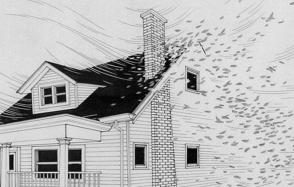
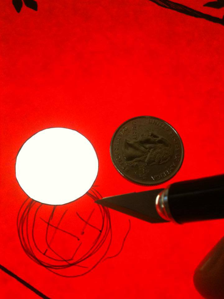
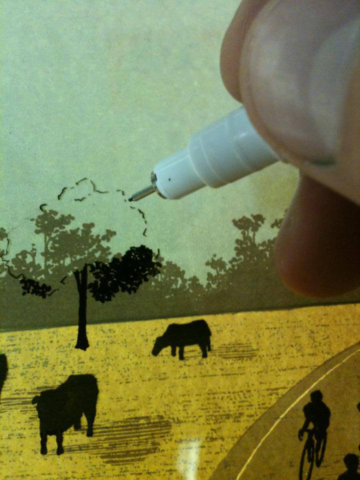
I’m glad you asked this! Up until about four months ago, I did everything by hand from the drawing, the color separations, and the printing. I was taking ink drawings to Kinko’s and enlarging them onto film with their blueprint printer and cutting my other colors out of rubylith. However, I have been going more digital lately. I’m using a 19 inch tablet monitor and Photoshop as a digital light table, essentially.
I still separate my colors basically the same way, but now I just do it directly on a screen, and I’m able to experiment with different color combinations and try things that would be much more difficult to undo on a physical film. It’s taken some getting used to, but I actually really enjoy it.
I was never anti-technology. In fact, while I’d be drawing or cutting films by hand, I’d often have my laptop cued up with reference photos. I’ve also been using Photoshop for years to format album artwork and things like that.
I think my biggest hang up about using a computer for my own screen prints was that I was afraid I would lose the organic feel that is inherent to an analog process. This fear was totally misguided, as I found that using things like a tablet monitor feel pretty much just as natural and intuitive as working analog.
In a lot of ways, I don’t feel like my process has changed at all, but the specific means certainly have. I mostly still do the final ink drawing by hand the old fashioned way, but I’ve even ‘inked’ the art for a handful of recent prints with Photoshop brushes I designed myself.
In fact, the main drawing for the print you mentioned, ‘One Million Shareholders Can’t be Wrong!’ was done all in Photoshop, drawn right on the screen. I ended up improvising a subtle accent layer out of rubylith while printing that one, but the other seven colors in that print were meticulously drawn right on my tablet monitor.
I feel like there are a lot of things I can do with this new tool, and I’ve just scratched the surface. It’s pretty exciting.
When did printmaking and poster work become your main gig? Are gig posters your main source of income? What other sort of illustration work are you doing?
I have been doing posters and illustrating full time since the spring of 2009. It’s hard to say specifically what my main source of income is, but gig posters are definitely a big part of it, and it can vary from year to year.
In addition to gig posters, I also do or have done artwork for album art, beer labels, book covers, skateboard decks, and t shirts.
I love making gig posters and I always will, but it has been really fun to branch out a bit and do art for other things. I honestly just get a charge out of making things. It’s awesome!
__________________________________________________________________________________________________________________________________________________________________
For more of Justin Santora’s work, visit these handy links —
Justin Santora’s Original Art Work On Sale At Galerie F
