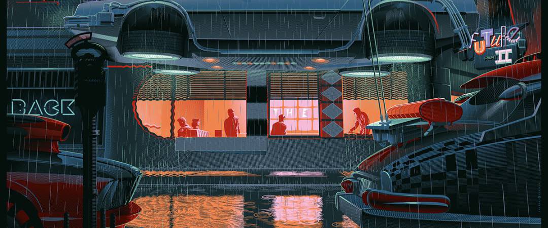
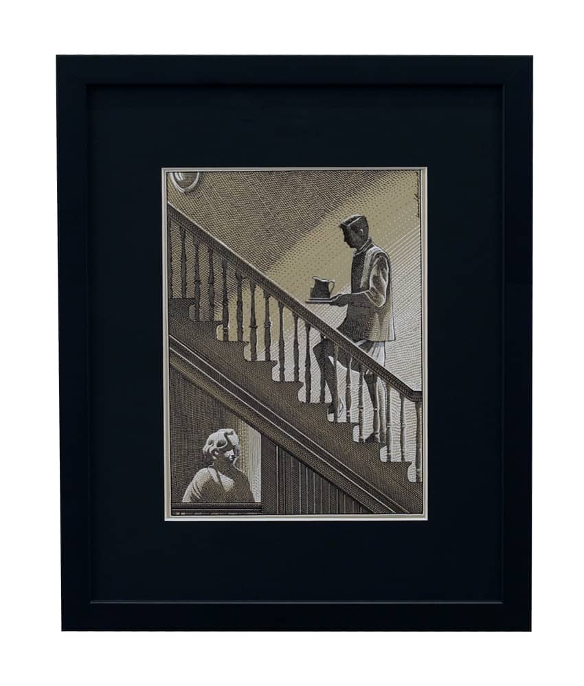
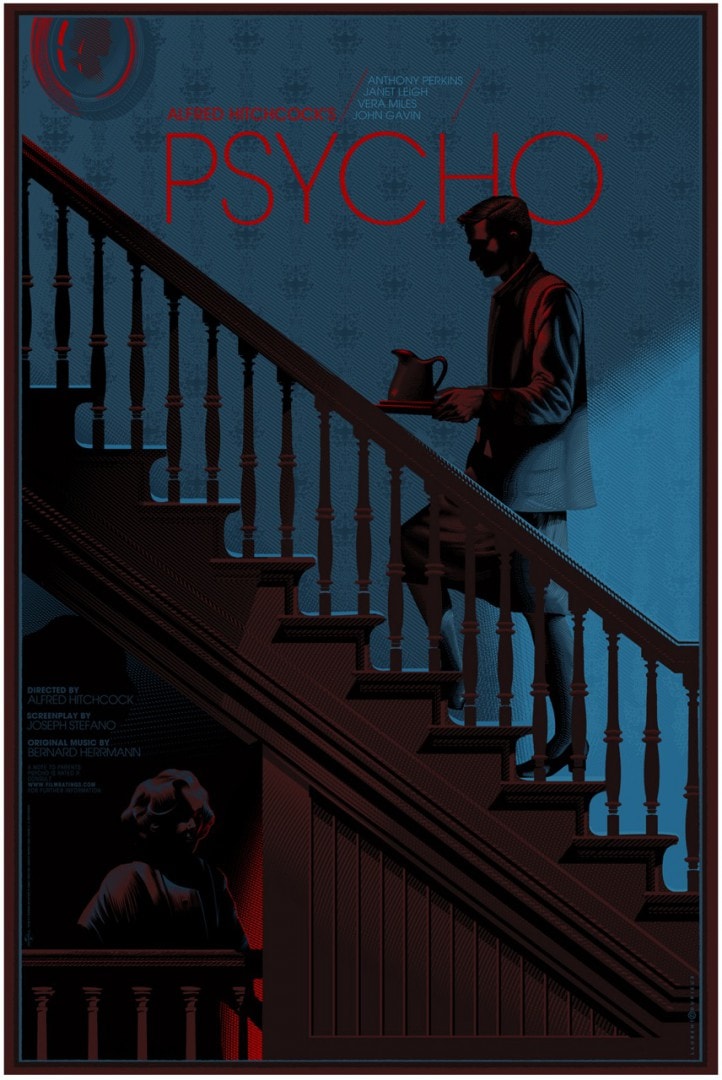
Belgian illustrator Laurent Durieux has a careful eye. His illustrations reveal the foundations of his subject. His take on the Alfred Hitchcock classic film Psycho is a mannered study of the deranged character Norman Bates. The skirt. The heels. Mother’s portrait cast down on her murderous son — politeness positioned alongside evil and mental illness. Durieux has a graceful approach that is classic and fresh — original. His is a style and skill that is designed to endure. He’s willing to show the darkness and the beauty, humor, and horror, all through his timeless lens.
Laurent and I first spoke in our March 2013 interview and after attending his solo show at Mondo in Austin I asked if he’d be up for playing along with another interview. Thrilled to say he agreed.
CJ: You recently had a solo show at the Mondo Gallery in Austin. My fandom drove me to fly in from San Francisco to see the show and it was totally worth it. It was an incredible experience. The enthusiasm for your work from those in line was intense. Everyone was so excited to have you in town. How long had the show been in the works? What sort of preparation did you do before the show? What was your week leading up to the show like?
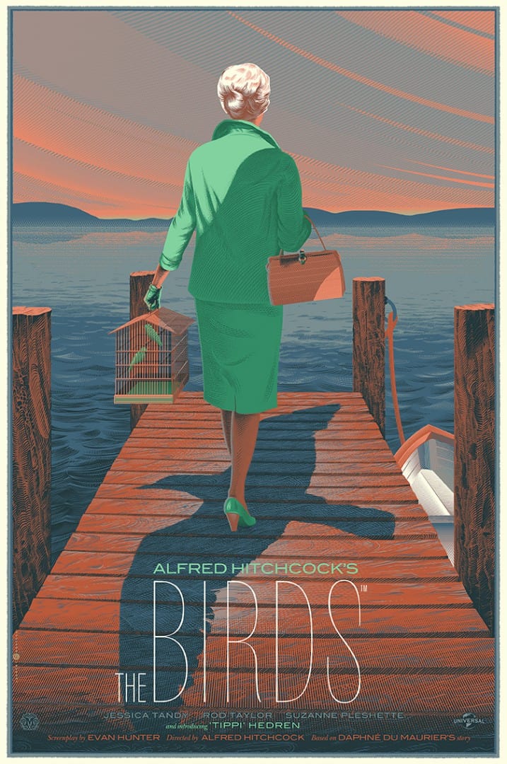
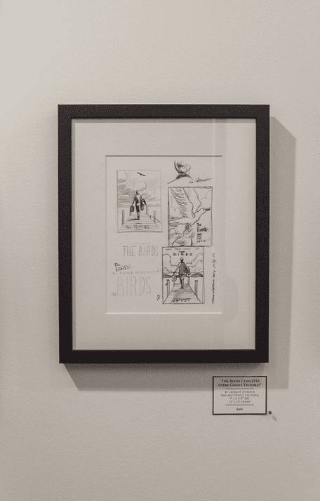
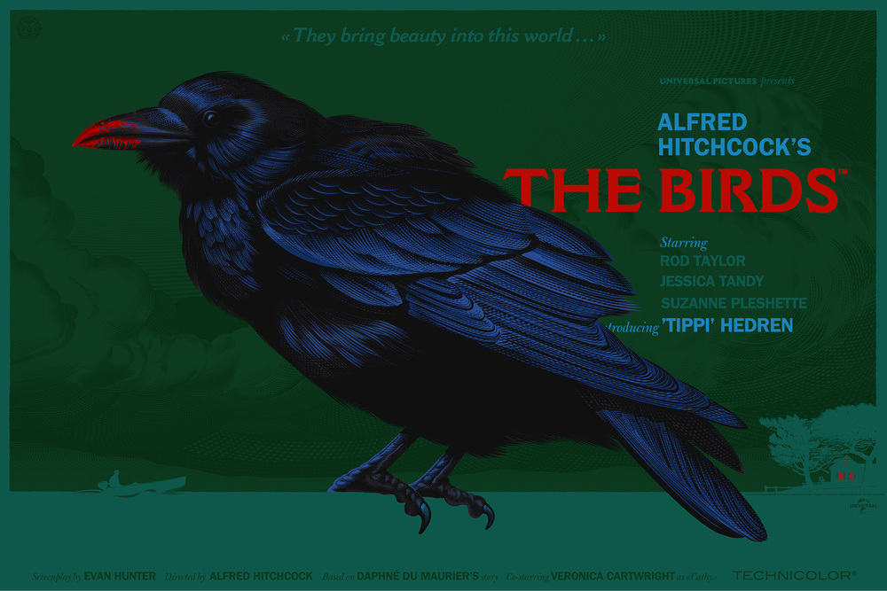
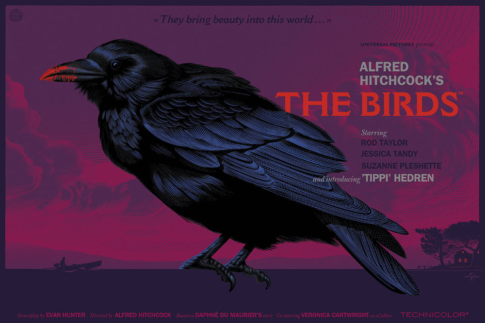
LD: I started working on my very first piece (The Birds, Here Comes Trouble, known as The Pier) when I was on holiday in Finland in July 2013, so basically I’ve been working non-stop for about 7 months until one week before the opening in Austin. I’ve had to turn down covers for Marvel magazine and Fortune magazine because I just didn’t have any time available for anything but my solo show. But I have no regrets, to see the wonderful reaction from the fans and collectors has been my true reward for this show. The week before the opening, I was basically still drawing and sketching originals and of course a couple of days before the opening, I had to sign the 5,000 prints at the Mondo gallery. That was an interesting experience which I hope not to do any time soon, let me tell you that!
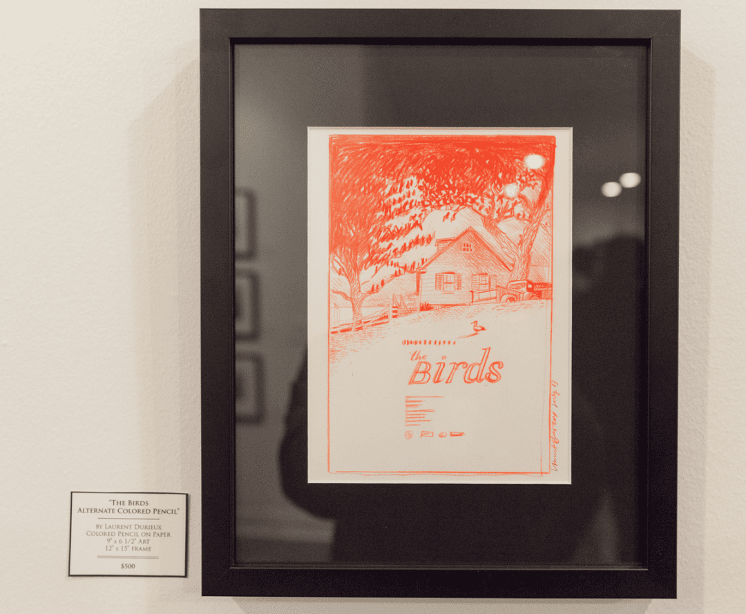
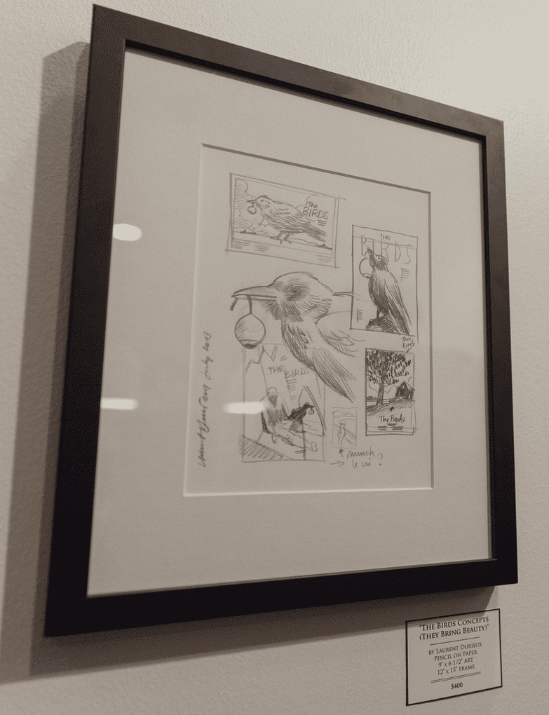
One of the highlights of the show for me was to see your original sketches – it’s a thrill to see how something like The Birds evolved. What will become of those unused designs? Did you explore any designs that you felt proud of that you might store later for another project?
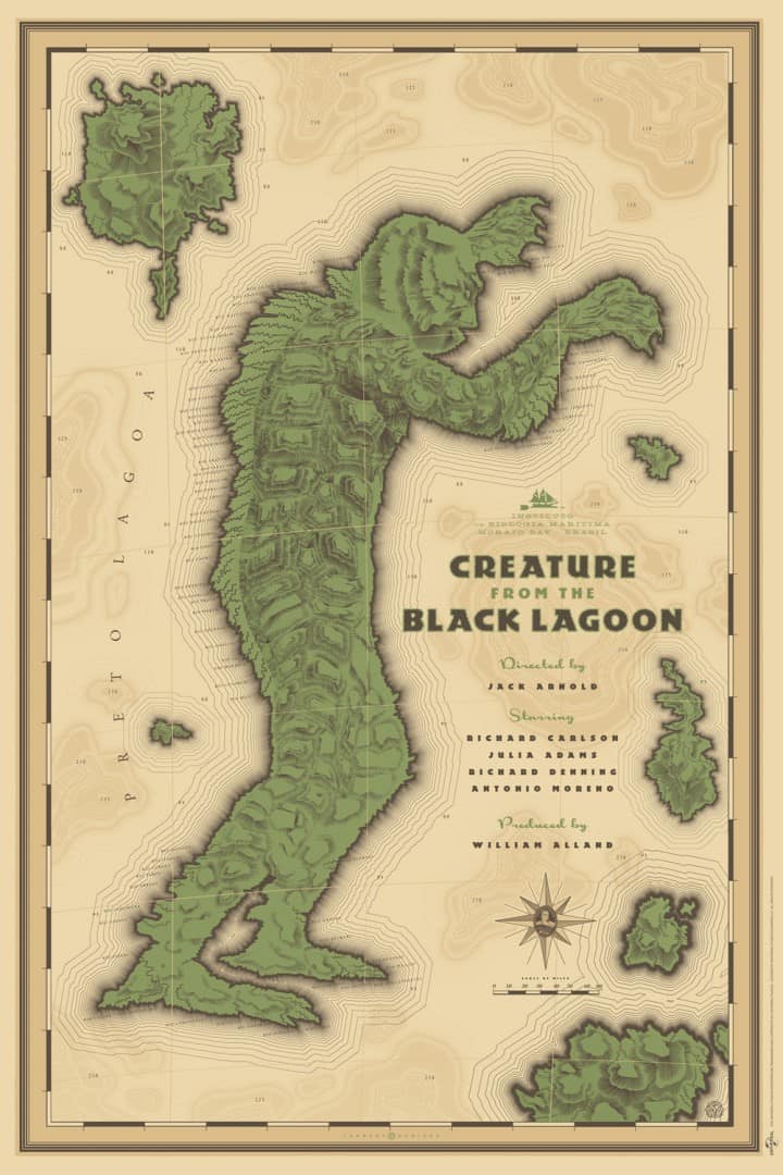
Who knows what will become of them? Like the new version of Creature from The Black Lagoon which was originally a discarded project from the Universal Monster show. But I think it’ll be hard to work on The Birds again as I’ve already come up with two different versions which I’m very happy with.
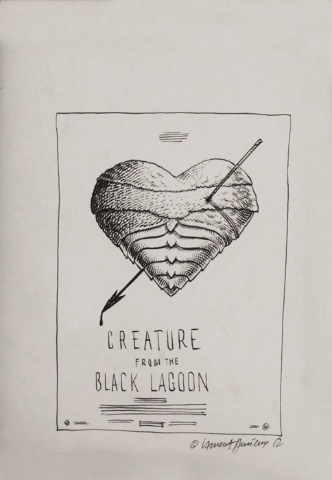
‘Creature from the Black Lagoon’ sketch my Laurent Durieux that appeared in Mondo’s ‘In Progress’ show.
Your original drawings come up for sale every so often, and at the show all the sketches on display were for sale. Do you hold onto any of your original drawings? Is there any drawing that you would never get rid of?
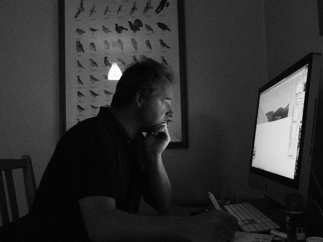
Not really, maybe I should but for me, sketches are not meant to be kept. I usually do very rough sketches to see where I’m going and then, throw them away. Lord, I’ve thrown so many drawings away over the years, the collectors would go insane! I’ve never considered them to have any sort of value on the market until now. I’m talking about sketches mind you, not the more detailed inks the gallery have put up for sale for my solo show, those were done specifically for the gallery to ‘fill the walls’ sort of thing. I hardly if not at all do any originals anymore, I draw digitally on my little cheap Bamboo drawing pad. It’s embarrassing really. When I told this to Mike Mitchell, his jaw dropped, he couldn’t believe me, well, that made my day, hahaha!
Your twin brother Jack is an accomplished illustrator as well and helps you out with some of your projects. I’ve heard he handles the text as well as the final layer separation for printing – is that right? What’s his role in your work?
Jack is so very important in the process of creation of my posters, he knows me so well (he is my twin after all), he knows when I’m bored with an image or when I can do better, so he tells me when that happens. He coaches me to make things better, he is the only critic that I don’t feel like slaughtering when telling me I fucked up. He knows his shit. And then, of course, he handles the typography on most of my posters, not all of them but most of them, and does all the tedious yet so very important job of layer separation and trapping in order to make sure my images will turn out nice and ‘clean’ once laid on the paper. Finally, he handles all communication with the clients, the fans, the galleries, etc. He is my PR on top of it all.
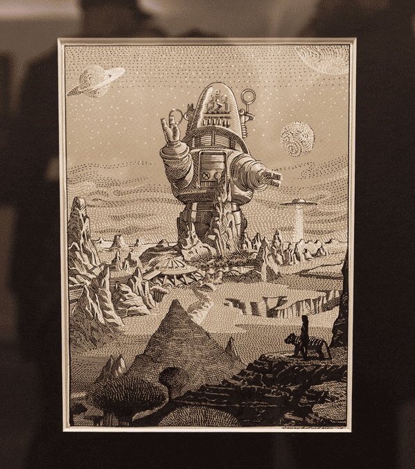
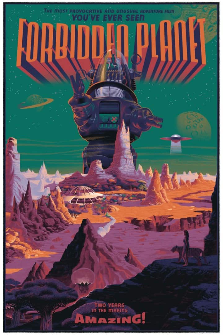
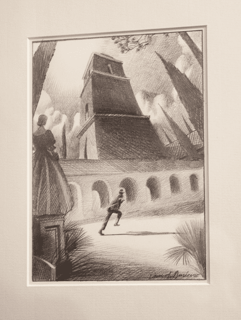
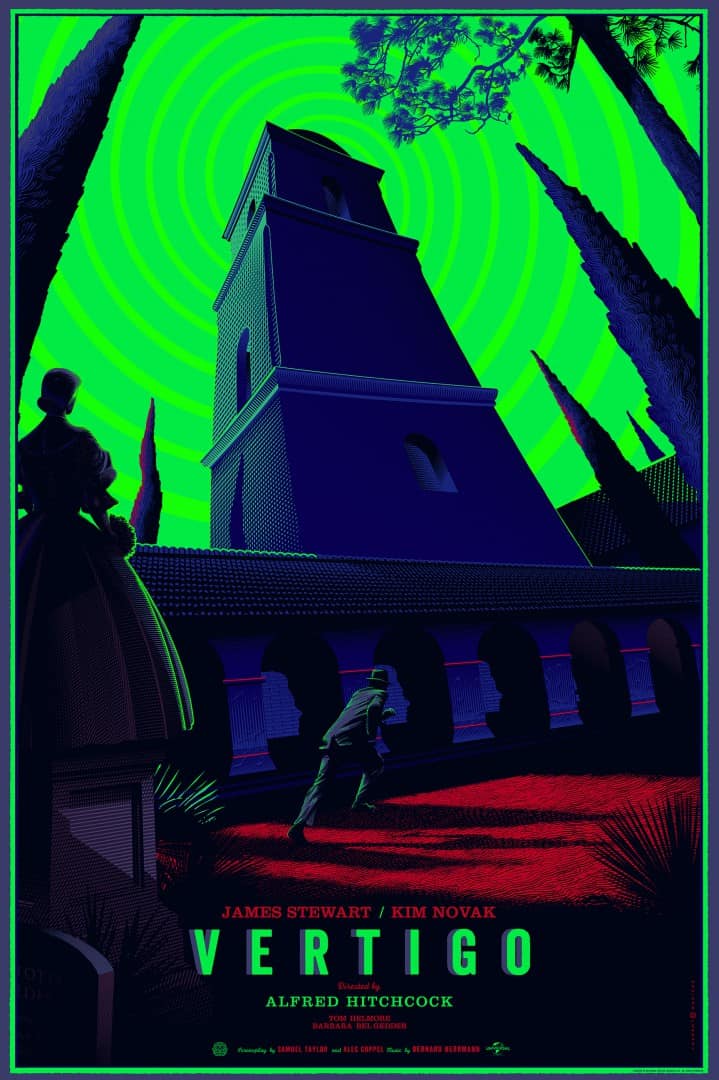
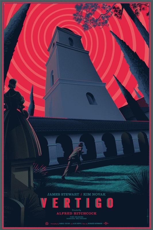
Your pencil sketches for ‘Forbidden Planet’, ‘Vertigo,’ and ‘Psycho’ all appear to be final compositions. I know your final work is done in Photoshop, but are you re-drawing them completely digitally or scanning in your final drawings to trace and color?
Like I said, I draw everything directly on my bamboo drawing pad, and sometimes, I draw some bits and pieces on paper which I end up scanning and redrawing on Photoshop. That’s it. The ‘nice looking’ pencil and ink originals that were shown at the show, were done after the ‘inking’ / tracing for the posters had been finished and were mainly used as light and shadow studies. I drew a few extra sketches a couple of weeks before heading to Austin.
You’ve mentioned in the past that Blade Runner was one of your favorites, I was surprised to not see it represented in the show, but assumed it was a licensing issue. Was it difficult determining what films would make the cut for the show? How closely did you work with Mondo on the final choices?
Yep, licensing issue. Not even sure if it’s available at all. Choosing was not hard at all, Rob Jones sent me a list of all the movies they have the license for and all I had to do was pick my 8 -10 favorites. Rob Jones, Mitch Putnam, and Justin Ishmael are so easy to work with, as a matter of fact, apart from when there is an issue with the studios (which rarely happens — at least with me), I hardly hear from them during the whole process. I usually hear from them when I submit a couple of ideas as they tell me which one to go for and then when it’s finished when they tell me they love it. That’s it! I have never worked with such easy people before (and hope it will stay that way — fingers crossed) and that’s probably due to the fact that they know their trade (or are too busy which I know they are!) They have the experience and imagination to foresee the final rendering when I submit a very rough sketch. Also, I think that once they have chosen to work with an artist, they trust him and stand by him whatever choice he makes and that is just wonderful.
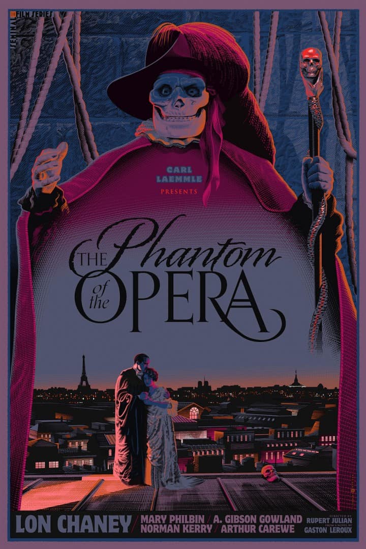
You’ve done two posters so far in Dark Hall Mansion’s ‘Seminal Films’ series, Metropolis and Phantom of the Opera. Your work for Mondo can be seen as an extension of that theme with the Hitchcock and other pieces. Does your approach change when doing Casablanca or a character from Transformers? Do you prefer a property has weight, either historically or emotionally for you? Does that matter?
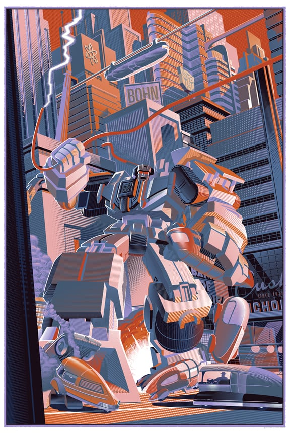
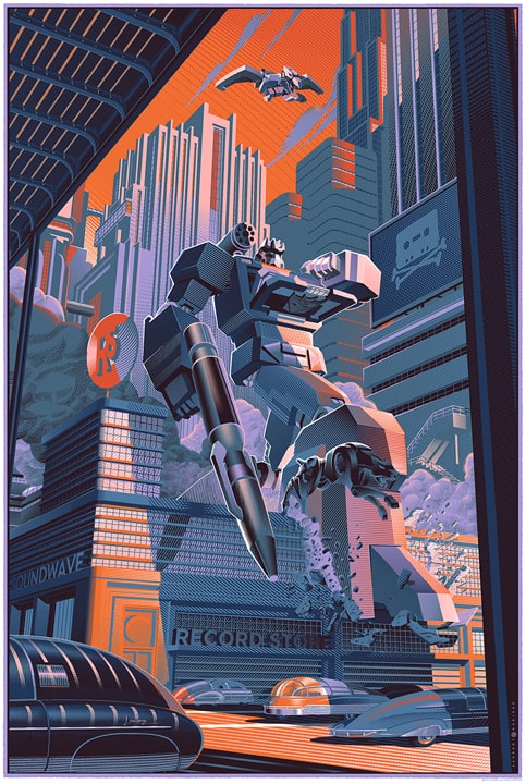
I do prefer when a property has weight, of course, because that means popularity and most of the times quality, however, I put the same energy and labour of love in every poster I work on. If I didn’t commit to my posters fully, then I would get bored and you would see it immediately in the quality of my images. This being said, I am not at all a Transformers fan, nor the toy, animated series or the movie. I did it because I was interested to go where I wouldn’t have gone normally, get out of my comfort zone and see if this would still work, I think it does. This also offered me the possibility to do a duo piece (diptych) which I thought was cool. There are so many great opportunities that present themselves now, especially since my solo show, with titles that I really relate to that I don’t think I will ever do Hasbro related stuff.
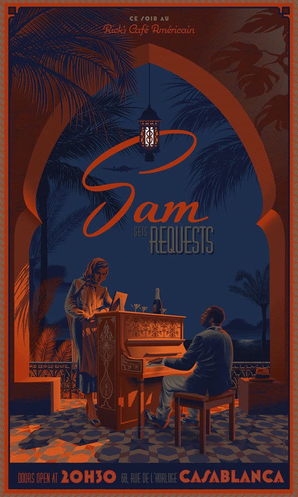
I truly enjoy working on classic movies. They don’t have to be from the ’40s and ’50s though. Since you’re mentioning Casablanca, I am quite surprised to see that this poster, which I love so much and in which I had high hopes on, didn’t sell so well (there are still plenty available on Phonebooth Gallery’s website). I think the concept was very interesting, create a gig poster within the movie itself. People would have probably preferred seeing the actual title Casablanca and Bogie in there, but I thought not having Bogie in on the poster was much more powerful emotionally. This is still one of my favorite pieces and I hope one day fans and collectors will get it.
I picked up your Casablanca Sam Takes Requests print. It’s beautifully subtle work. I appreciate that Humphrey Bogart isn’t pictured, that would have too easy, too obvious. Your design goes deeper into the film. For me Casablanca is about lost love and running away, hiding. About the person who’s NOT there. Your design matched what I love about the film and I think it’s going to find plenty of space on the walls of fans and collectors. If you could go back and re-do that poster, would you?
To make it short, YES! I would. But since no one did release a licensed poster of Casablanca, I suspect this license is not available or you can’t use any of the actor’s likenesses, which would be pointless.
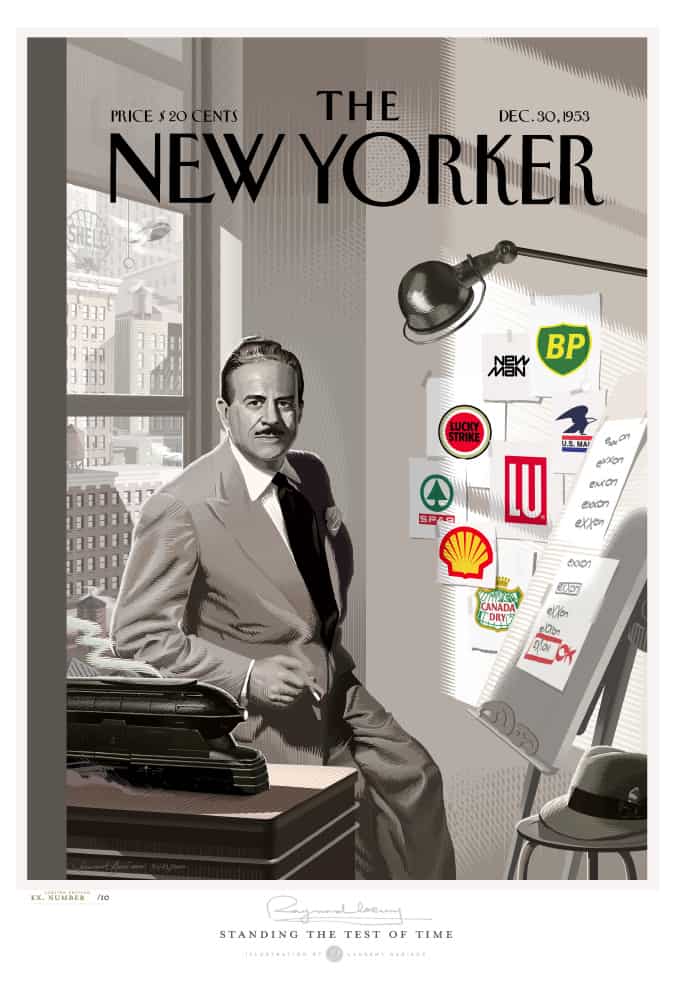
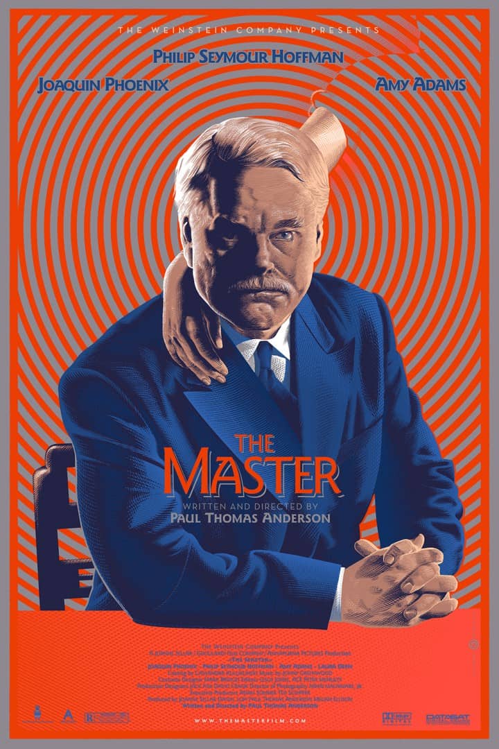
Your design for Paul Thomas Anderson’s film The Master is one of my favorites. It’s an interesting design, as it puts the viewer in the spot of Joaquin Phoenix’s character from the film – we’re being mesmerized and locked in on The Master himself. The woman, his wife, hidden in the hypnotic spiral is so brilliant. That simple touch sums up their relationship perfectly. It feels different than the work that preceded it. It’s reminiscent of your New Yorker cover tribute to Raymond Loewy, a man, and his life’s work – but in The Master, there’s a darker impulse. What was your design process behind that piece? Did you ever toy with including Joaquin Phoenix’s character or the yacht? Was it always going to be about Philip Seymour Hoffman’s character?
Wow, you got it spot on! It’s exactly that. I did contemplate the idea of having Joaquin’s character instead of Philip Seymour Hoffman’s, but then I went for more literal imagery, the title The Master refers to Philip Seymour Hoffman’s character and I am such a fan of the late Philip Seymour Hoffman. So that was a no brainer for me. I found out about his passing when waiting in the 2 hours line at JFK on my way to Austin for the show. I decided right then that I would have my screenprint on display as a tribute to him. He will be missed.
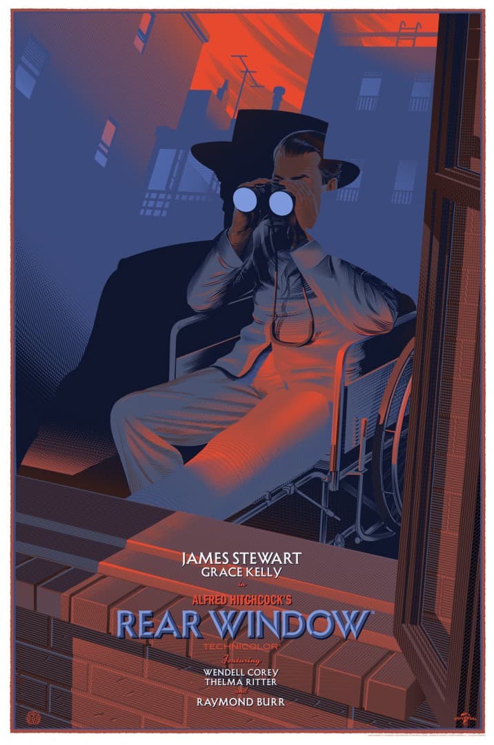
Your Peter And Wendy poster is so warm — I want to live in that house. I want to have that adventure those kids are about to go on. Your Jaws design is a stunning feat of problem-solving and just brilliant thinking, but with Peter And Wendy you took those two elements and focused it on something so human – so beautiful. For me that poster is full of magic. That wonderful Hook moon is an amazing touch. Your compositions have a lot of those hidden treasures – the faces in the pillars in Vertigo, the binoculars to eyes overlay in Rear Window. When you’re in the middle of a project are you looking for ways to include those special moments? Do they occur naturally or are you trying to find them at the sketch stage?
I am always trying to make the image as interesting as possible, with multiple layers of interpretations. I’ve always loved hiding things in my images when possible. Talking about Jaws, I love the fact that people first hated it, I remember reading something like ‘What is this granny travel poster?’ That changed from the moment they saw the fin in the umbrella, which they, for the most of them, hadn’t seen which is amazing for me!
To me it was so obvious, like the nose in the middle of the face, the only black patch is used for the fin and is right in the center of the poster, yet many people didn’t catch it, this filled me with so much enthusiasm and joy, to have been able to fool them all! However I do not wish to make it a systematic gag, I’ll do it if it brings something to the poster and is relevant. People even find hidden treasures I hadn’t originally designed, like the Big Ben in the background in my Peter & Wendy piece which they were certain it was the crocodile seen from above (Now that I think of it, that’s a jolly good idea, I wish I had thought of it), oh well.
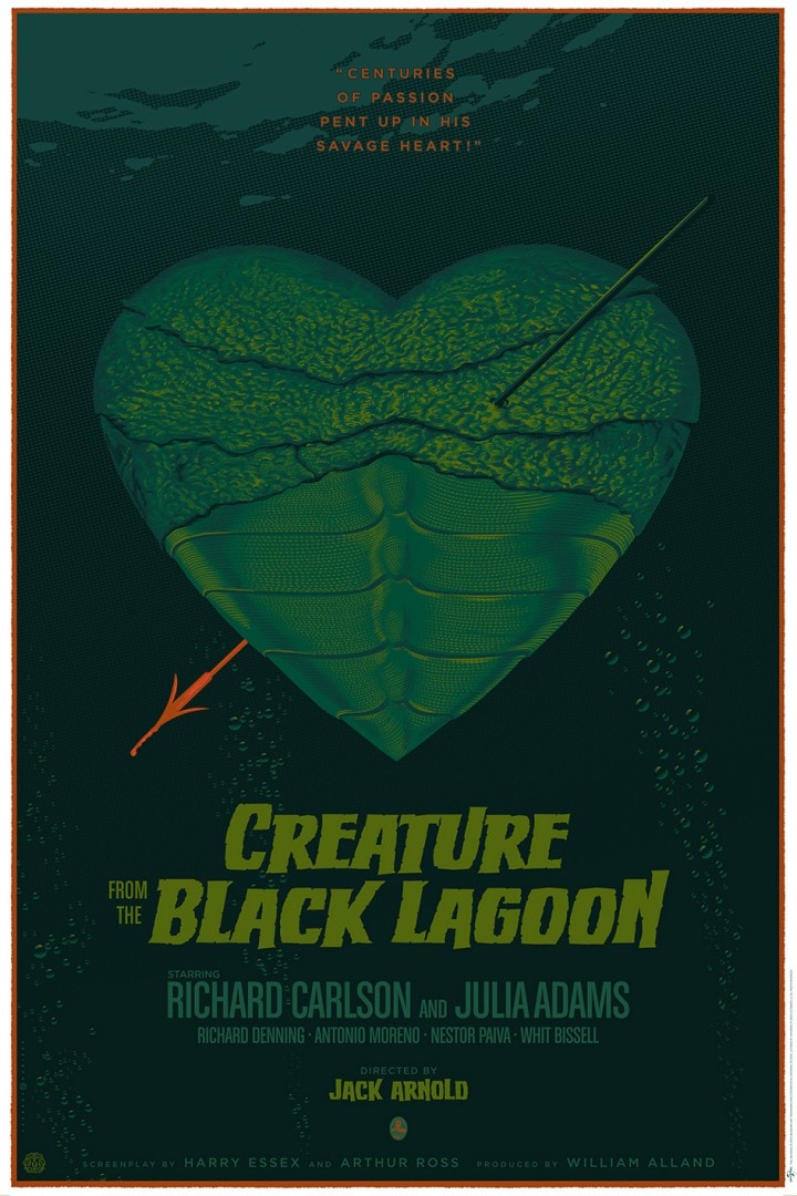
You’ve done two different designs for Creature From The Black Lagoon, and both are as different than the other as they are from the rest of your work. What draws you to that film and inspired two totally different approaches?
Well, what happened is that for the Universal Monsters show Mondo held a year or so ago, I had done the ‘map’ poster and amongst my earlier projects that I had put aside was this conceptual idea which was this cupid’s arrow project. It was shown in the ‘In Progress’ exhibition at the Mondo Gallery and remained unsold. The sketch was shipped back to Belgium and we kept it at our studio ever since and it grew on us. We thought that this would make a great poster, possibly even better than the previous one, indeed quite different from what I usually do as it’s not so much a detailed moody illustration, but more a concept image, more simple and probably more effective as a poster.
I’m a new father and it’s so strange to feel how much things change, perspective and goals. You’re a father as well – did that change your approach to work, to illustration? Did maturity and fatherhood adjust your goals?
Congratulations! For my part, I can’t say it did. What did change my perspective and goals though is me getting older, I’m probably way past half my lifespan now so I really want to get things moving a little bit quicker. I’ve wasted way too many years working for advertising and petty things. I do wish to create a strong body of work.
Are you and Jack still teaching graphic design? What’s your main source of work these days?
Yes, we are though we have less and less time available for that now. My main source of work has always been my illustration and still is today. Almost all of my time goes to movie posters and I am quite happy with this.
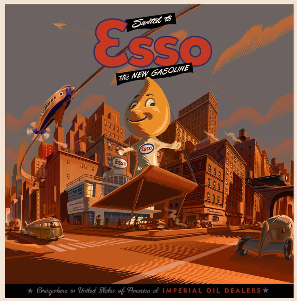
You have a strong love of retro design – architectural and industrial. In pieces like Switch to Esso, U.S. to Europe by Air, and Felix the Cat there are strong design elements from classic science fiction vehicles and buildings. The flying cars in Felix the Cat are such a great throwback to how visionaries thought we’d be traveling to work and doing everyday errands. Are you drawing upon specific designs or from a general aesthetic?
A bit of both. For the architecture, I make it up from my head and sometimes some retro-futuristic vehicles are completely created as well (like the U.S. To Europe by Air) and some other times I use models, internet documentation, blueprints, whatever material I can find.
Do you keep track of what posters sell out and what they’re going for on the secondary market? ‘Jaws’ is going for around $1,000 and ‘he Birds (Here Comes Trouble) is looking to reach that level of demand. Does this add to the pressure when creating a poster, or are you able to block out the audience? When starting a piece, how aware are you of what your collectors would want from you?
From time to time, Jack checks that out and sees how many posters of mine there is on eBay and at what price, just saw a Jaws being sold for $2,500!! All that’s left to do now is finding the sucker. That doesn’t really add any pressure, I put enough pressure on myself already so when I finish a piece, I’m pretty comfortable with what I have done not to worry about what people might say. I am not really taking into consideration what collectors would want, it goes the other way, the collectors like what I do because I do what I want. However we are aware of the wish list from many fans and collectors and we concur with most of them, all they have to do now is wait for someone to offer me the license.










2 thoughts on “Interview: The Timeless Art of Laurent Durieux”