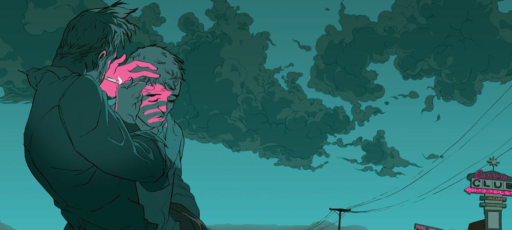
Illustrator Tomer Hanuka‘s work encompasses a varied mindset — that of the entrepreneur and the focused businessman. The deliberate storyteller and the insightful artist. He constantly explores the boundaries of the single frame narrative — shifting perspectives, finding the personal in the iconic. Digging the bone from the fat. His work is fluid — the figures he constructs are languid, bowed, fragile. It’s all part of the narrative he is building. That of mankind’s struggles, internal or otherwise.
Hanuka was born in Israel in 1974 and now lives and works in New York City. Outside of illustration, he’s also an award-winning cartoonist, works include The Placebo Man, Meathaus S.O.S. and cover illustration for Vertigo’s The Un-Men. His work is playfully twisted and carnal, serious and thoughtful. He strikes an incredibly calm balance between the chaotic and the peaceful. Hanuka is a craftsman in control of his tools — both mental and physical. He can sway a moment into the frightful, the dangerous, the humorous, or the erotic. The markings of a storyteller. And it can be said more than once, Tomer Hanuka is a storyteller, and a damn fine one.
Photo by Oscar Estrada
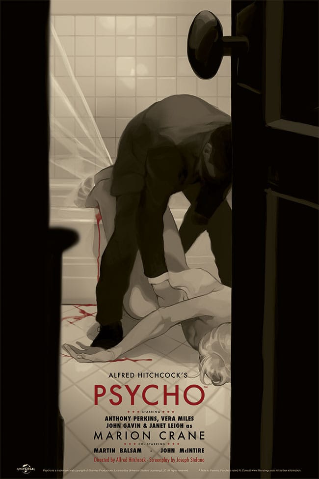
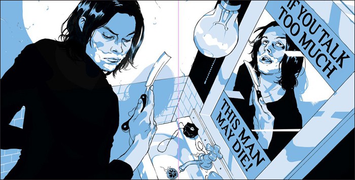
CJ: Your Psycho print for Mondo is sleek and subtle – there’s a gorgeous noir elegance to it. A beauty of simple and straightforward design. What struck me about it is the moment in the story you chose – that moment after the film’s most iconic scene in the shower. This is a different perspective on the seminal cinematic psycho — it shows the film in a new light. It feels human.
In all your pieces there’s a stellar level of unique composition. Even for a piece like Old Moab for Playboy that has very few elements to it, there’s a smart perfection involved. When dealing with narrative work like this, how do you choose the moment to depict? Are there rounds of rough sketches? A breakdown of visual story elements, or do you run on instinct and spontaneity of your first idea?
TH: My biggest problem is that I’m a super-fan. I want to create an altar that celebrates the work I’m illustrating. So I’m always, it feels like, working against my inner super-fan. Because there is a natural instinct to just go with the spirit, and then there is a more critical, questioning stance that wants to understand why it’s so compelling.
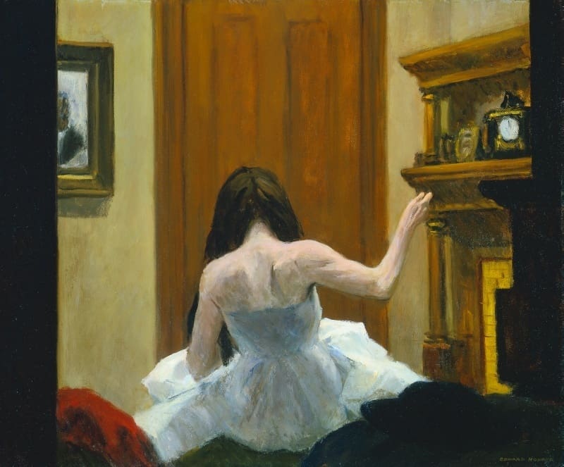
For me, Psycho clicked with New York painter Edward Hopper and I thought it’d be interesting to think how would Hopper translate Psycho. Isn’t there, at the center of it all, just a desperate sort of loneliness, a beautiful melancholy? Sure, there’s a warm corpse there, but the poetry of his predicament is just so modern and moving.
Getting the chance to see your reference images is a fascinating peek at where you are at when you begin a piece. It’s a clear model of that saying you hear in art school, ‘art isn’t made in a vacuum.’ Are reference images a usual part of your illustration process?
If art is communication, this is my way of staying in a dialogue.
That’s an interesting point, art as conversation even between artist and audience. My wife and I just had our first child, and I’m constantly thinking of what art, films, books, paintings, etc. I want to introduce her to, works that speak beyond their visual beauty. Is there a piece of yours that you feel communicates who you are the most, or is the clearest you’ve spoken as an illustrator?
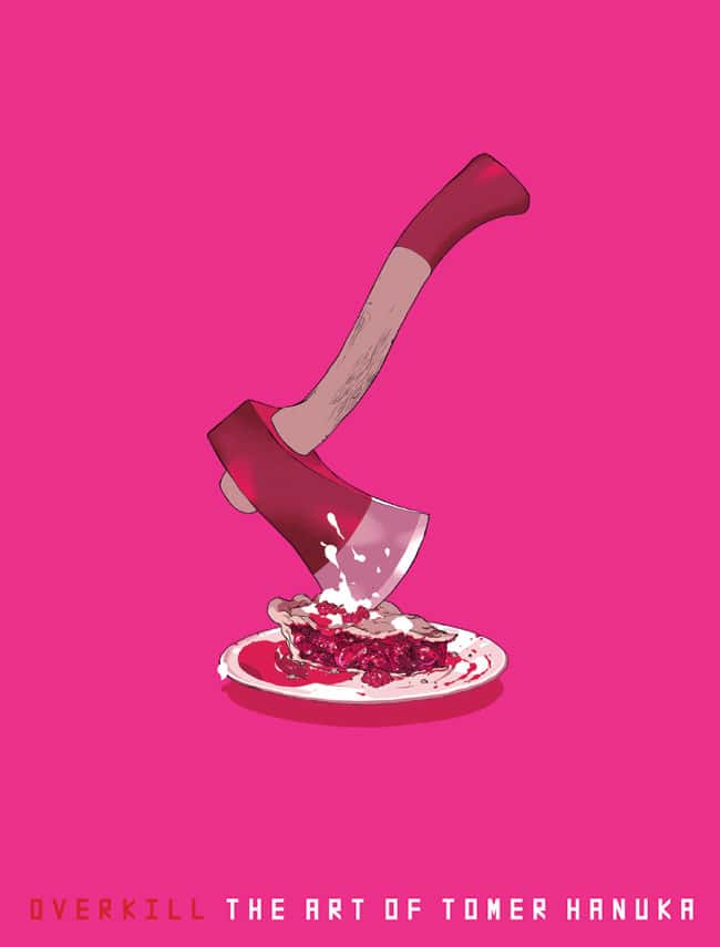
Man, that’s a heavy responsibility, seriously. You’re essentially sculpting her inner world. Be gentle! I think the cover for Overkill pretty much sums my approach.
Yeah, I don’t take it lightly. She’ll respond to whatever works for her though. She may end up really digging something like Justin Bieber and that is totally fine, but I’d like to at least expose her to your work and others, broaden her horizons a bit.
You mentioned being a super-fan of the work you illustrate — does the illustration process encourage the fandom for you? Working with an unknown work, something that you likely didn’t know of before, like a piece for the New Yorker, does doing the job create the super-fandom in you? Do you seek out jobs like Psycho, where your love of the work already exists?
I only take on poster gigs for films I admire. Fandom is a mental starting point which I need to work against and try to come out on the other end with something worthwhile to say / show. Editorial work is different, it brings in new and exotic materials to play with. It’s less about a personal relationship with the text, nostalgic or otherwise.
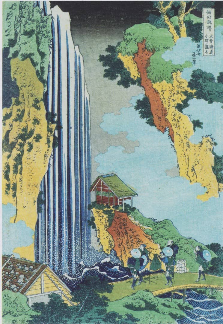
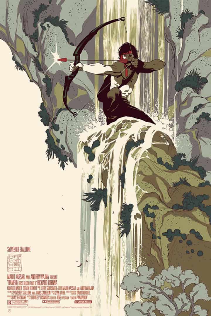
‘Ono Waterfall on the Kisokaido Road’ by Katsushika Hokusai used as reference for Tomer Hanuka’s ‘Rambo II’ illustration.
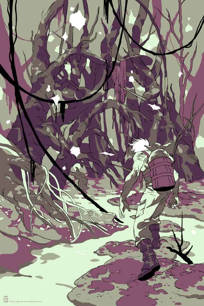
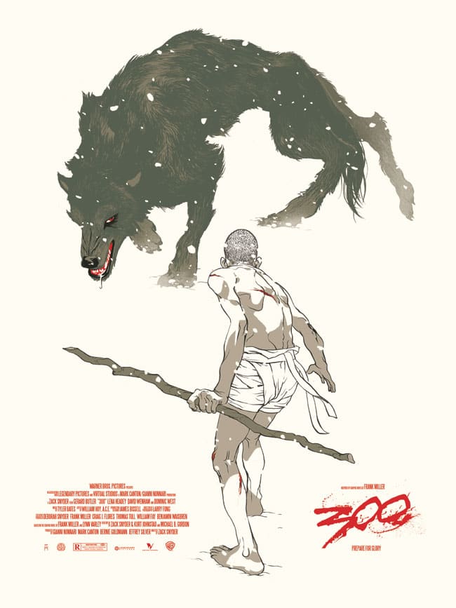
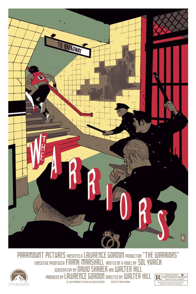
You’ve done quite a few pieces that are based on popular material, but Psycho, Rambo II, The Warriors, 300, and Star Wars all share a common thread – you don’t show the face of the most recognizable characters. In the end it doesn’t matter, the viewer still knows that it’s John Rambo. We see Star Wars once Darth Vader’s helmet emerges from the trees and vines.
It’s a remarkable stance you took on these illustrations – you’ve really put the focus on the story and not specific characters. Darth Vader isn’t Star Wars, but Luke’s relationship to him and the darkness and unknown that he represents is a major part of that mythology. What pushed you try new ground with these existing worlds?
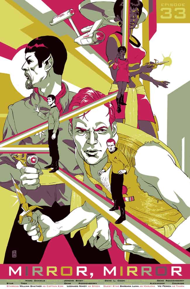
Okay, let’s look at the ‘classic‘ formula for a film poster — big head of our hero in the center, next to it another big (if slightly smaller) head of the #2 person, and a bit of action at the bottom. This diagram of importance reflects what sells movies, i.e. celebrities, and also delivers the personality temple, which movies have become (aka ‘vehicles’ for celebrity) — none of that interest me. On the other hand the stories themselves can be amazing, and in them exist endless mystery and potential for powerful visuals. I try to get lost in the story and look for a visual that works on two levels –
a). Being a high mark in the narrative
b). A metaphor or a core idea in the story
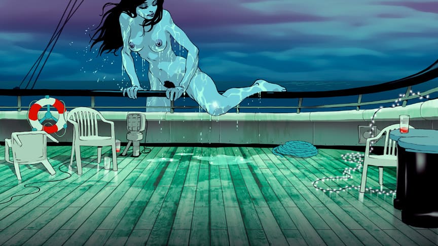
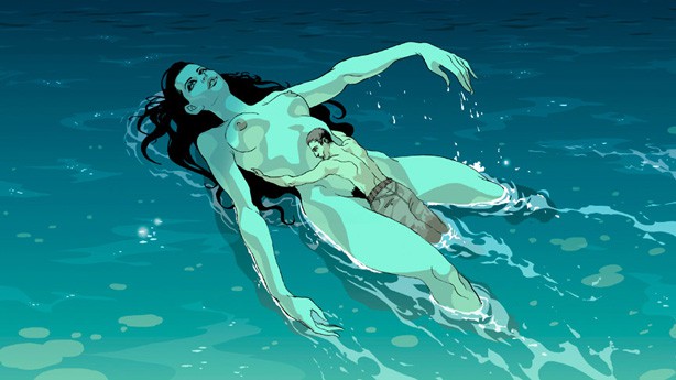
Ari Folman’s 2008 animated documentary Waltz with Bashir is a beautifully constructed and enlightening look at the Lebanon War, something that I knew very little about. For me the film drifts like a poem, with a strong focus on the characters and their internal struggles and discoveries. It’s tied very near to the heart of humanity to explore how violence occurs and affects all those involved. At that point you had been successful with your comics, but had never done film work before. How did you get approached for the project? Was film work something you were eager to be part of?
Apart from Folman, who’s a force of nature, the two other principals were David Polonsky who art directed and Yoni Goodman who animated. I’ve known the art director David for many years, and was honored when he invited me to take part. Working on animation is very much a team effort. One needs to be flexible. I knew that the work I’d sent in was in good hands to say the least.
Waltz with Bashir had a small budget of, from what I’ve read was roughly two million. The art team was relatively small. Working within the story that Ari was trying to tell, how much artistic control did you have? How closely did you work with Mr. Folman about his approach to the subject matter?
I was provided a storyboard for my section, and a script. Also from David, the ideas, atmosphere etc. it was like working on an illustration project essentially, only that you have to keep the file in layers.
For Bashir you only worked on the nude woman in the sea sequence, but for most people (like me) it’s assumed that you worked on the entire film. That’s the interesting part of filmmaking though — you’re given credit for the whole just by being involved at some level. How did you end up working on that scene specifically? Was it a time restraint on your part or was that simply the job — that single sequence?
Illustrators, much like actors, are cast to ‘act’ certain ‘parts’ based on their ‘persona’. David Polonsky (the art director on Bashir) felt the surreal scene, a dream sequence with a naked amazon in the ocean — would be a good fit for me. It’s nice to have a niche, because you want to attract the projects that will click with your taste. It can also be a death trap if your niche gets too narrow, where you end up drawing the same image over and over. As long as there is experimentation, even failure, I feel I’m on the right track.
Illustration can be a very solitary career. Do you feel at ease working as a duo with your twin brother Asaf Hanuka and with a team for project like Waltz with Bashir? Is there a preference?
We’ve done quite a few projects together. We’ve been developing a TV show for Canal Plus (a sort of French HBO) where, like in Bashir, there was quite a large group of other creatives as well. We’re currently working on The Divine, a graphic novel written by Boaz Lavie. That’s a small group — just the three of us and we’re all close and in the same headspace.
I feel very natural creating visuals with Asaf (Hanuka). We grew up drawing together, so it’s connected to a sense of play, and we have a very similar sensitivity in terms of tone. Growing up as a twin makes you competitive but when I’m inside the twinhood, the ego falls away.
Did the Oscar nomination for Bashir affect your career in any way? You worked on a fragment of the film, but when an actor gets an Oscar nomination they’re in every film the following year, I’d like to think that the same would go for those folks in the art department. Did that open any interesting doors for you?
It was a fantastic project that paid very little but all the pieces fell musically into place. I was another knob in a very big machine, and yes, it probably gave me some animation cred.
For illustrations in magazines like Playboy and the New Yorker, the work exists on a smaller scale – a few inches of visual space tossed away. A magazine is a disposable medium to most. Is there a different approach to illustrating a small article or story in a magazine?
I’d say it’s counter-intuitive — as the size of the format is much larger in animation (i.e. a movie screen), the image itself needs to be simpler to work in motion and still be readable. In print illustration, you can pack a great amount of detail and go crazy with the forms, and it’d still make perfect sense.
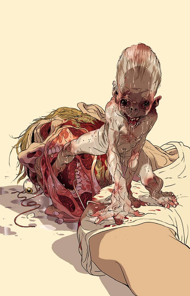
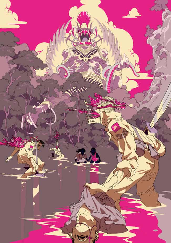
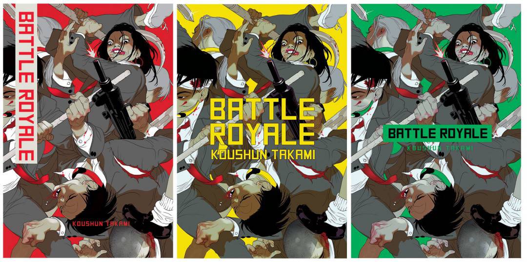
Your treatment of violence is quite dynamic and human. Even with your illustration ‘Jaw Breaker,’ where there is a great amount of blood and accuracy in the carnage, it’s not for a joke or shock value. In your work there is no glory in death. No heroism. It’s raw and it’s real. Your piece ‘From God’s Mountain IV’ for The Divine has that level of violence you hear about in war – pieces flying. Organs you cannot recognize. The human body torn in impossible ways. There’s a delicate touch to the way you illustrate these moments. A true fragility to the human body is on display.
When you start on a project that involves violence are you concerned with how it’s portrayed? If the viewer finds a message or point of view in the illustration, is that coming from you the artist or from the content (book, story, film) you’re illustrating?
This is the height of hypocrisy but I can honestly only stomach violence as a metaphor, or an esthetic act. True violence, like in a war, or even getting socked at the playground horrifies me. I don’t know why I always end up drawing guts, maybe it’s the color; a wall between worlds collapses, the inside is outside. It’s the tension that’s in every story, waiting for meaning to surface.
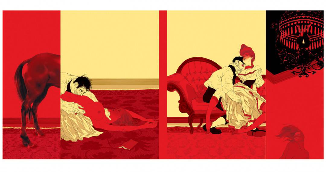
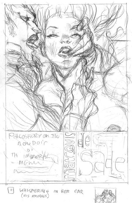
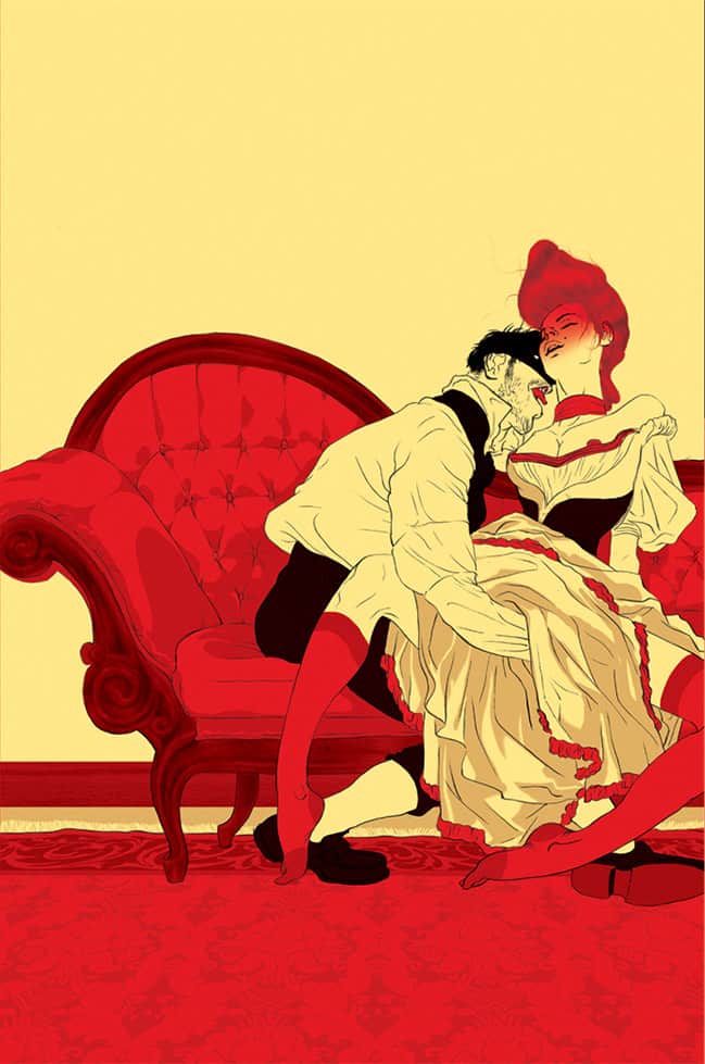
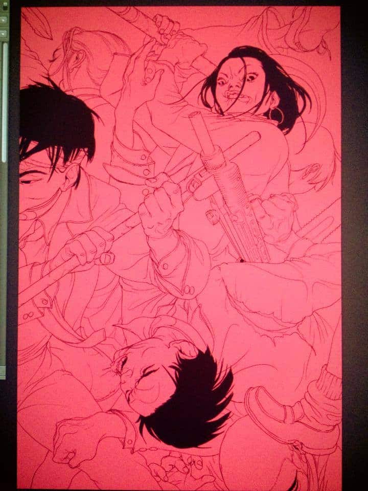
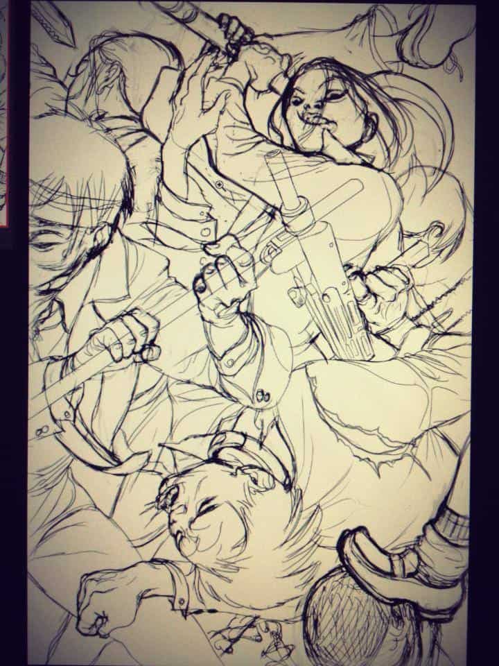
Tomer Hanuka’s final cover for Marquis De Sade’s ‘Philosophy in the Boudoir: Immoral Mentors’ from Penguin Classics
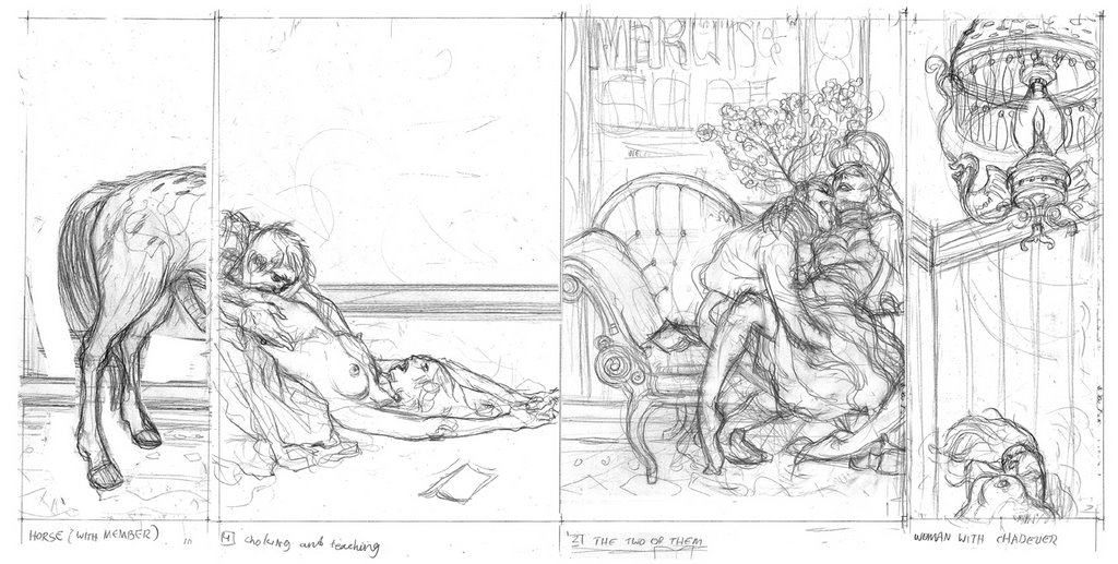
Your illustrations for Marquis De Sade’s Philosophy in the Boudoir are as lurid and wonderfully filthy as the book. I already have a copy of the book, but I’m a collector at heart so I’ve bought this one too. It’s just a fun book to look at. An amazing cover can elevate a thing – a record sounds better with a cover you can just stare at and adore. As an illustrator do you concern yourself with the quality of the work you’re hired to create illustrations for? Is there a line between wanting to work on projects you enjoy versus just doing a job?
You have to be into it (i.e. the subject) to make the art any good. But, being a pro means finding yourself in things that are not directly in the limited ratio of your hobbies. You have to be curious about the world and have something to say. Not arguing a point with the writer, but making a formal/visual statement. If you can represent something AND undermine it at the same time, then you get a prize. If the client is happy you get to do the next job. If you’re still excited, you’ve avoided burn out.

Reblogged this on afishinthehat and commented:
One of the most prominent illustrators around the world, and also inspiring one. Reading this article, make me feels a bit nostalgic, firs time I saw and knew about him, back on when I was only 15; yes my sister’s friend gave me this book entitled with ‘Philosophy in the Boudoir’. She asked me to read this book, and told her what kind of book and the following story,I, myself, wasn’t and avid reader especially in heavy novels such as philosophy, art philosophy, and sex. I was 15, clearly had no slightest idea about that. But the cover really attracted me, and those bold, strangely, I didn’t look that as “vulgar”, knowing everything in such erotical approached. I just liked the colours and I did try reading one to five pages, then I stopped. Feeling oddly, not saying this wasn’t the right time to read. Wonder, where is the book now?