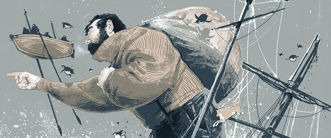
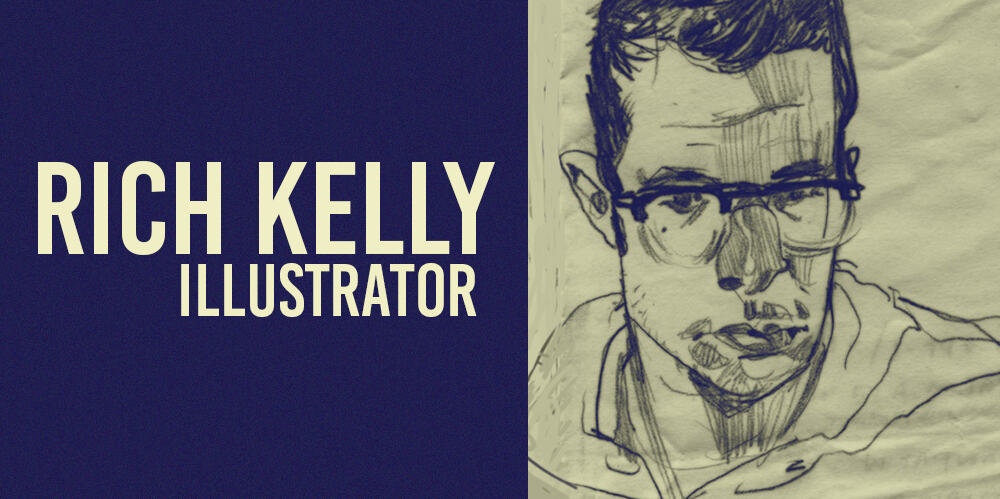
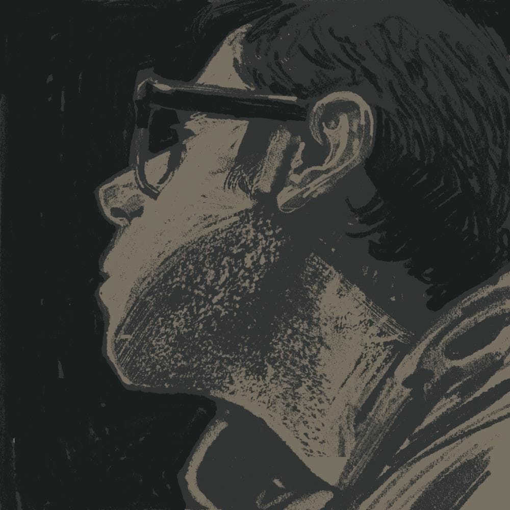
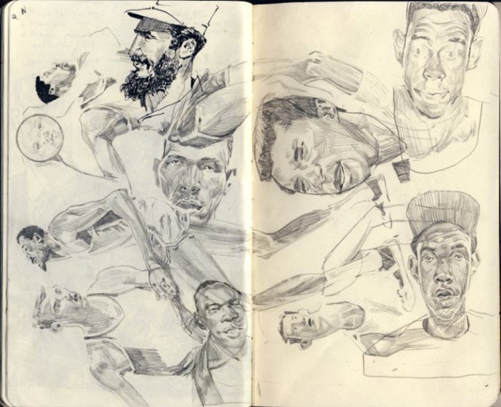
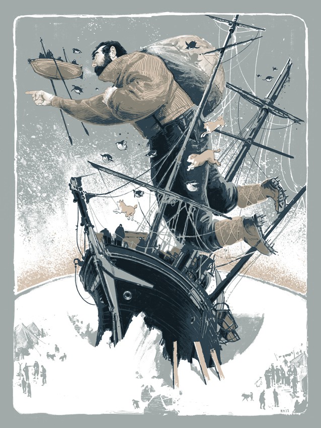
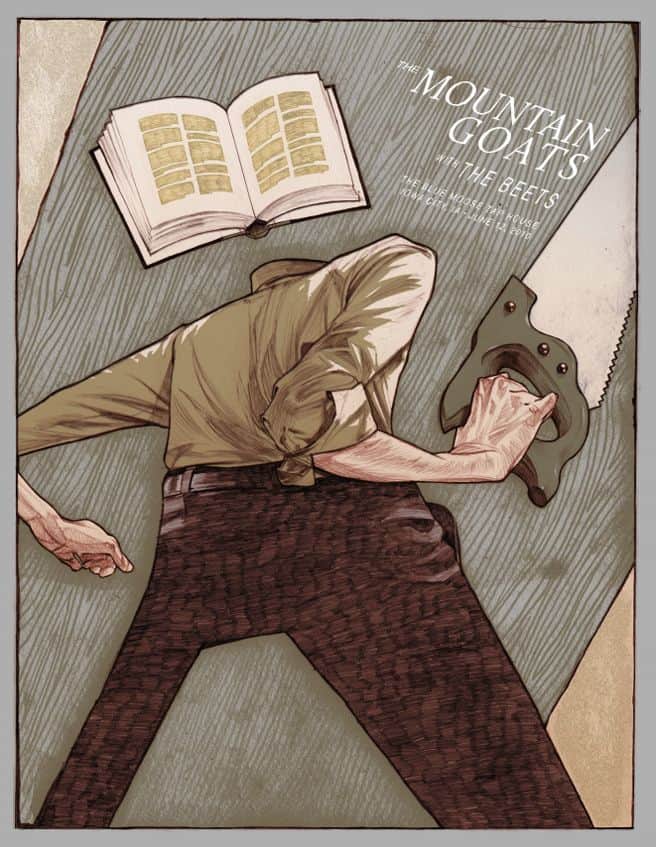
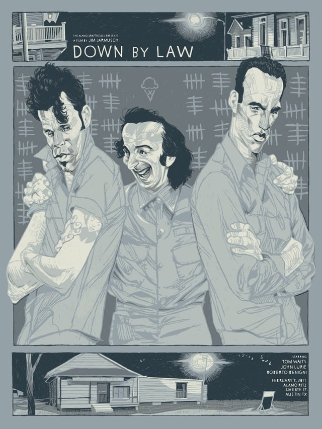
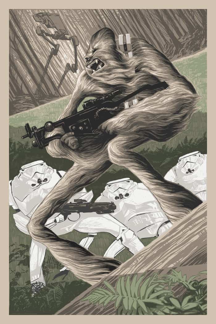
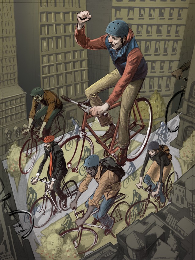
Rich Kelly is an illustrator. A craftsman. He’s diligent with a workman-like approach to his art. When you see his work there’s a care fee looseness to them. His drawings are swathed in a summer haze, dreamlike with warm and patient hues, loose and robust in composition.
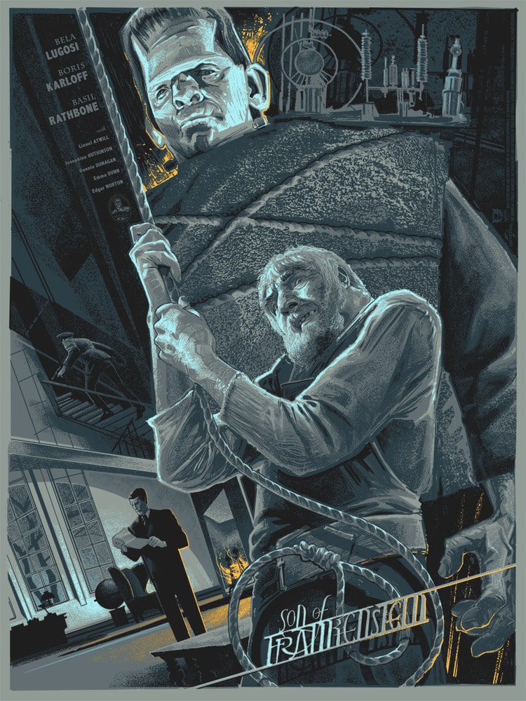
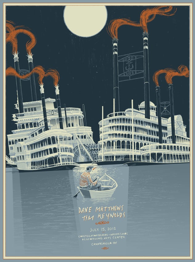
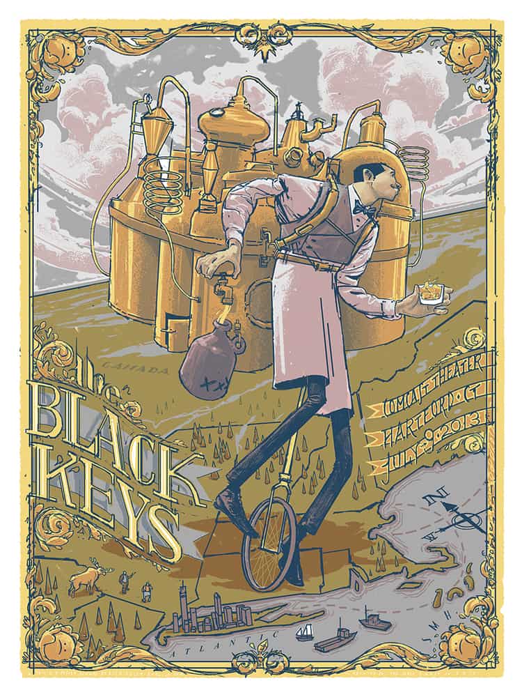
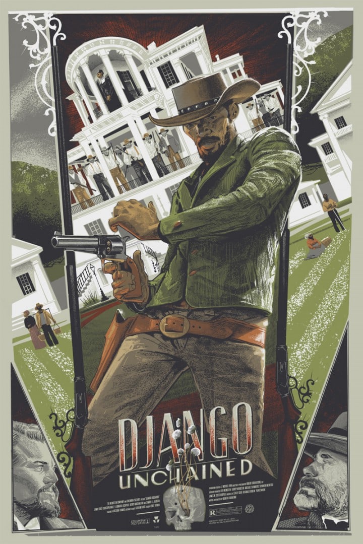
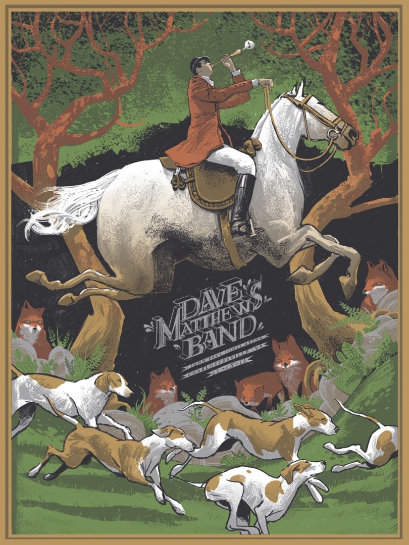
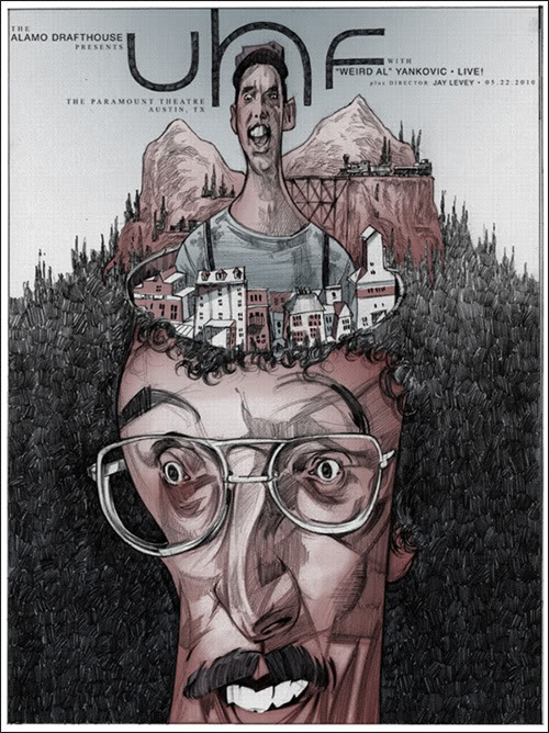
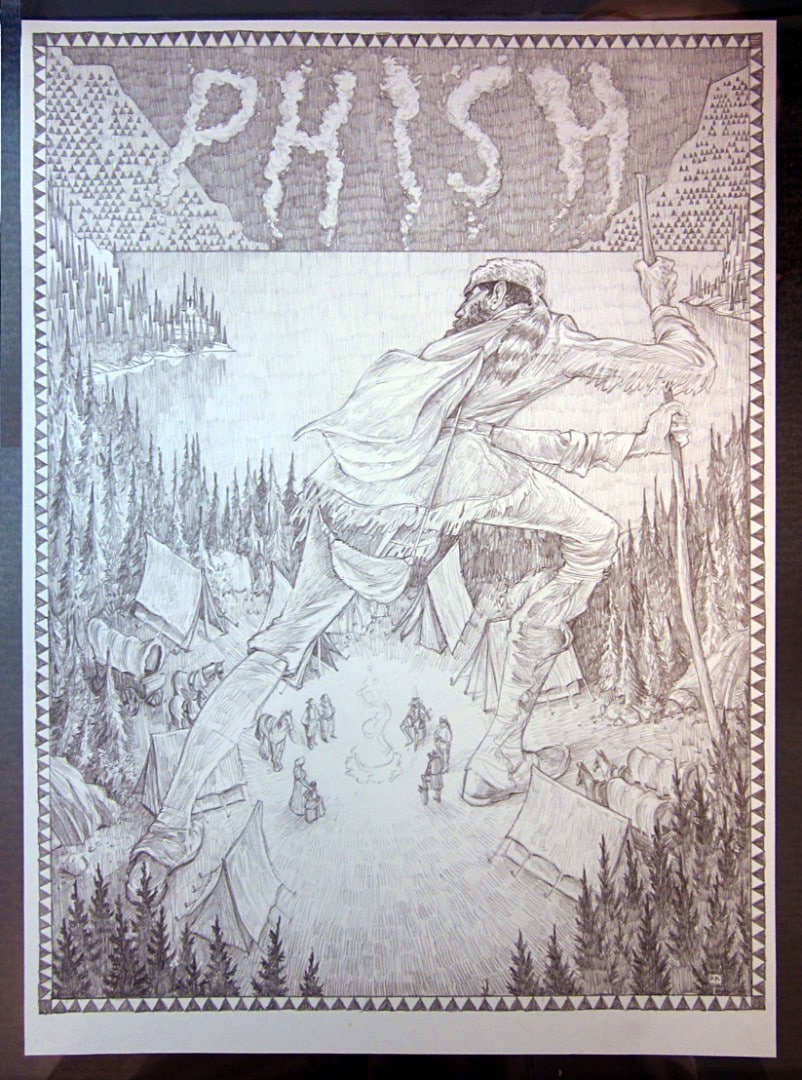
Kelly’s drawings have the sudden feel of a bar napkin sketch – tossed off, someone riffing, a drunken night sketching faces distorted and harsh. Except they’re so precise. Except the shadow and light however skewed, has the core of his subject. His drawings betrayed by his confident and patient hand. Rich Kelly has created posters for Mondo (‘Django Unchained’, ‘Adventure Time,’ ‘Son of Frankenstein’, and ‘Beasts of the Southern Wild‘), for Sony (‘Breaking Bad‘) and bands like Phish, Dave Mathews Band, and The Black Keys. If you took the text off of any of these posters you would still have an incredible piece of art from one of my favorite illustrators working.
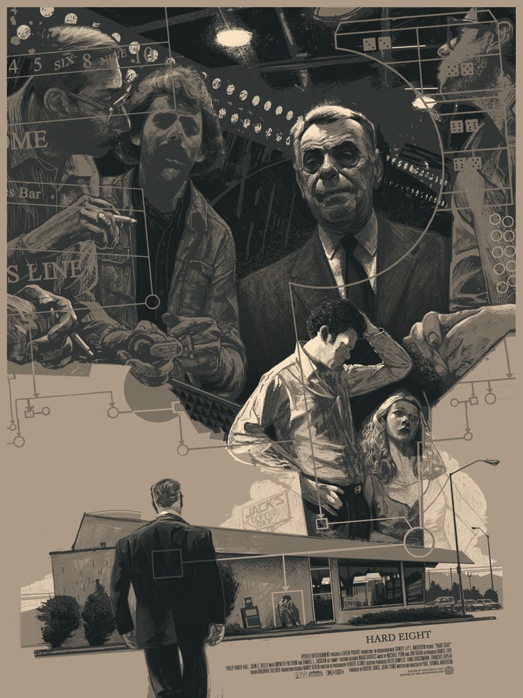
ET: What struck me first about your work is the color palette. The diluted hues give a lot of your prints a dream-like quality. Your ‘Son of Frankenstein’ and ‘Hard Eight’ posters both found a great deal of variation with a limited palette. Do you have the colors in mind or chosen before you start a piece?
RK: I only recently began trying to take bolder steps when approaching color. When I typically start a project, color is the last thing on my mind. As I put my ideas down on paper and start to sketch out possible compositions, I try to place a lot of importance on value and contrast, but only when I start to render the final art do I start to think about color.
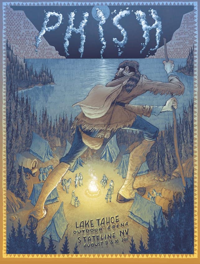
The diluted hues are unfortunately a result of my lack of understanding of the power of color. With recent gig posters for Primus, The Black Keys, and Phish, I forced myself to get out of my comfort zone and use bold, bright(er) colors.
Your designs feel very deliberate, but your technique is loose and playful. How much preparation goes into your prints?
There is an obscene amount of drawing that goes into each finished print. Working and reworking sketches allows me to fine-tune the designs to at least create a pleasant composition. After the overall composition is figured out, there’s a fine line between keeping the loose, playful feel that you mentioned and tightening up to where the energy is completely lost. I’ve noticed that when I feel pressure to really capture a likeness of, for example, a character from a movie, I will obsess about all of the little details and the final picture usually suffers.
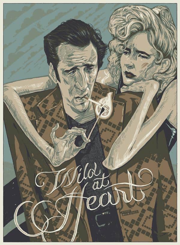
A good example is an old print I did for ‘Wild at Heart.’ I let myself get kind of silly with Nicolas Cage’s character and as a result, I love the way he turned out. On the other hand, when I tried to really nail down Laura Dern’s likeness, I just kept redoing it and feel like I never really captured her.
I’m starting to notice a pattern, almost a formula when I draw people. The first three tries are complete garbage and must be shown to no one. The fourth one miraculously is perfect, and each and every sketch after that gets worse and worse.
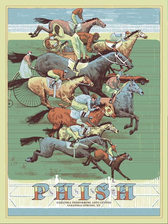
There’s a good sense of play in your pieces. The poster for Phish’s dates at the Saratoga Performing Arts Center depicts a horse race – both the drawing and composition are quite serious and tense in tone, but then you catch the horses of different sizes, a car – a woman on a bike. A tuba player.
You have a great way of filling your designs with that sense of play and whimsy while keeping them away from being too clever or joke-filled for their own good. Are the qualities of fun and play in your mind when you begin a piece? Are you concerned with balancing a serious tone with lighter elements?
I’ve never been comfortable getting too wacky with my drawings. There are a lot of people who do that extremely well, but it never came naturally to me. Recently I’ve been trying to inject a little more “weird” into my images if only to keep from repeating myself or making boring pictures.
Of course, my sense of ‘weird’ is extremely tame compared to others but for me, it’s enough. I think the subtlety that you mentioned is a result of the way my drawing style has developed over time. When I was younger I took art classes and we were always trying to draw and paint realistically, and for a long time, that’s what I aimed to do, capture reality. When I got to college I quickly became bored with that, and as a result, let my drawings veer slightly off-kilter. Again, tame as hell compared to others, but exaggerated enough to where I was pleased with the mix of referencing reality and clearly extending beyond it.
You work with paints and inks as well as digital painting. You do an interesting thing and use the digital tools like you would analog tools. I’ve seen some of your process shots and it’s hard to tell what’s been physically painted versus what’s digital. What made you go the digital route in your work? How often are you still working with traditional paints?
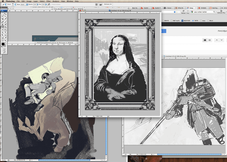
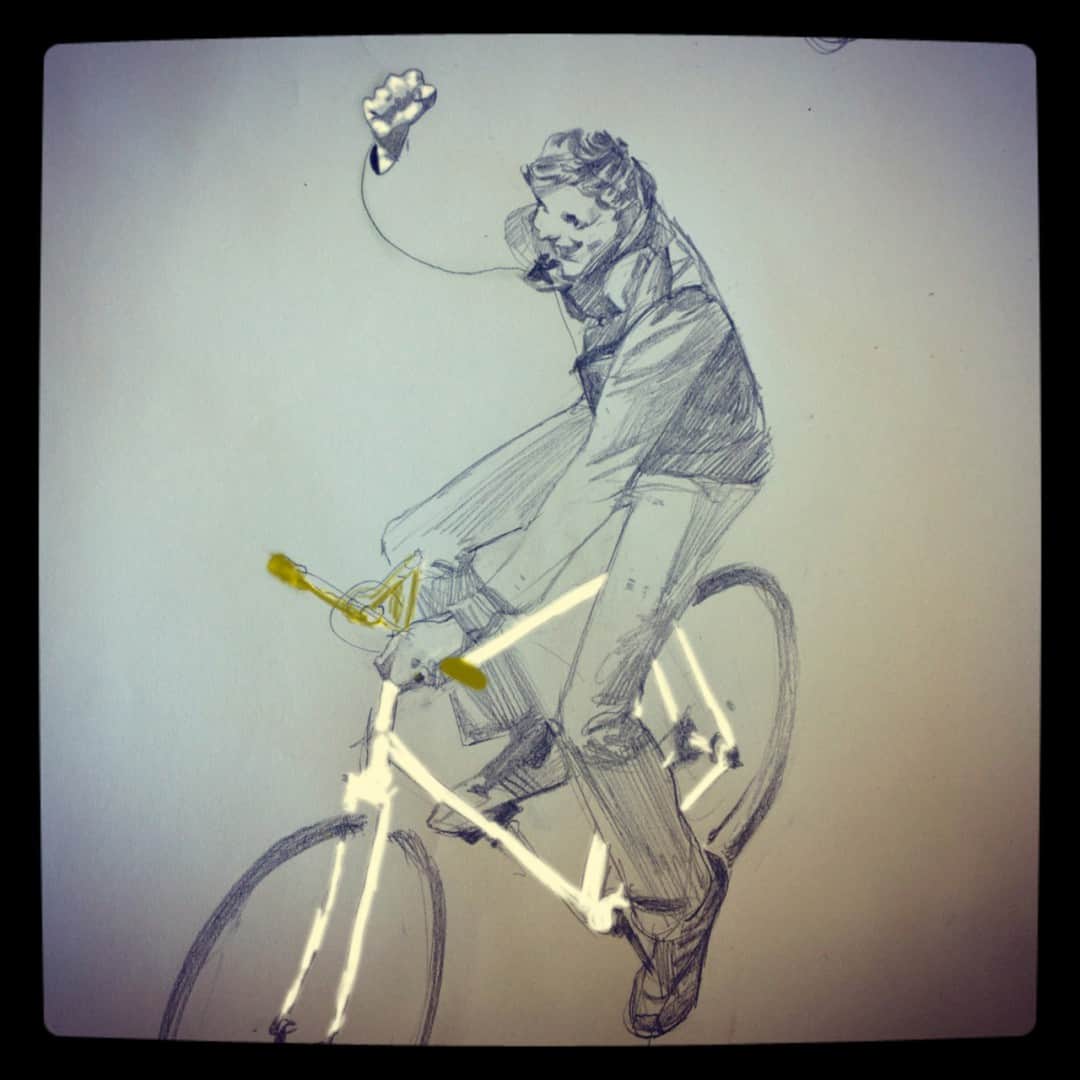
Using digital tools has simply allowed me to increase my output. I’m able to work faster and just get more done. I do treat those tools like you mentioned as if I’m using a pencil or chalk or paint because that’s really just the media that I like. The process is very much a matter of laying down broad strokes of color, erasing out highlights, cutting out large pieces and pasting in others. It very much feels like creating something with analog tools.
However, I can easily edit an image, changing colors, size and a hundred other variables in the blink of an eye. I sometimes will paint when participating in a show at a gallery, but it certainly is rare. I definitely haven’t developed my ability to paint as much as I focused on simply drawing, so I kind of shy away from actually painting when I can. I would definitely like to experiment more and get better, but of course, there’s never really enough time.
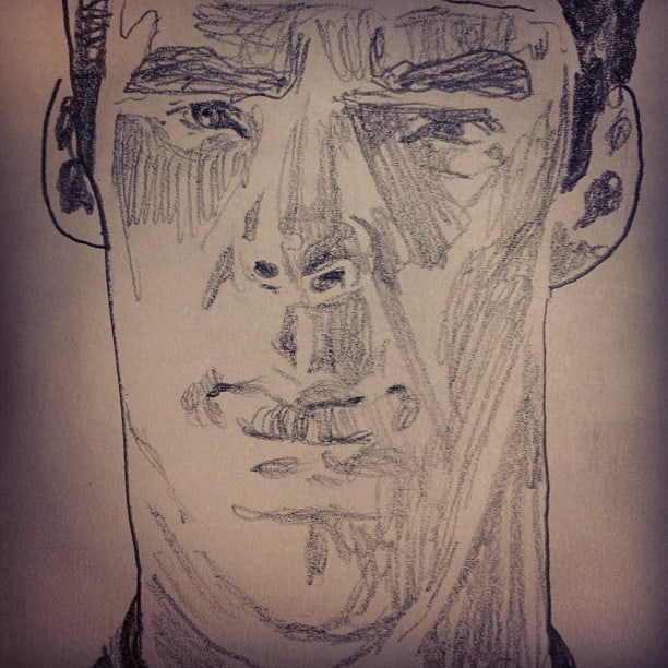
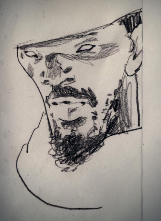
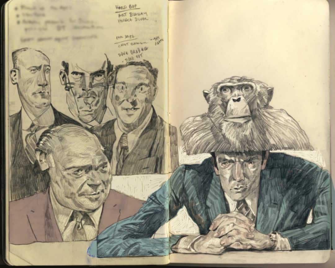
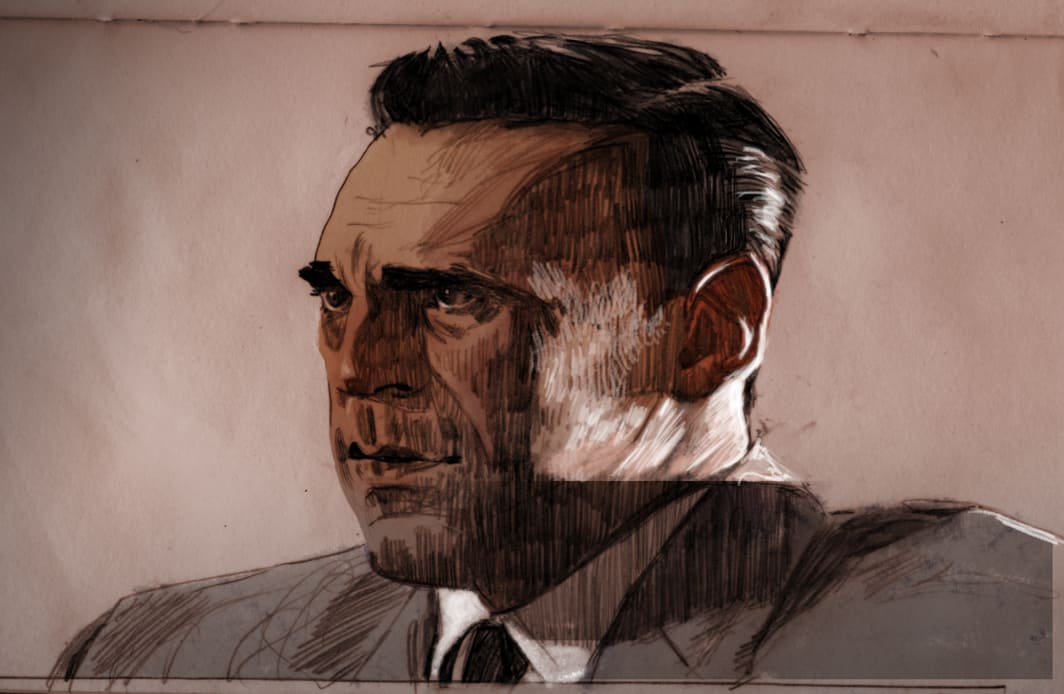
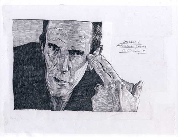
You have an incredible knack for creating simple portraiture with a rush of pencils lines and smudges. Your sketch of Benedict Cumberbatch is made of light flurries of graphite, but you instantly recognize his face. When drawing someone that you want the audience to recognize, where do you begin? What part of a person’s face makes it their ‘face’?
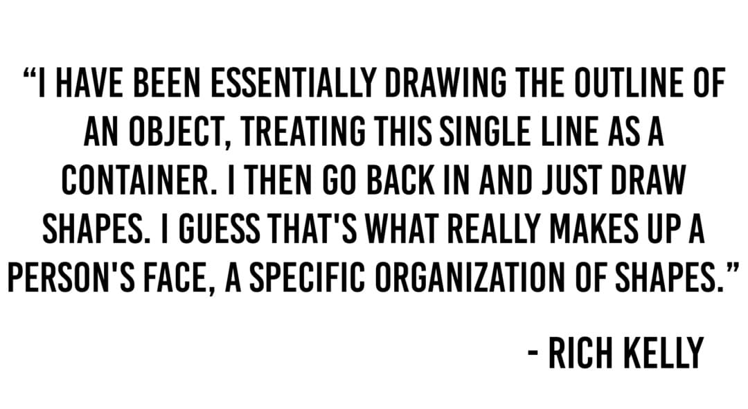
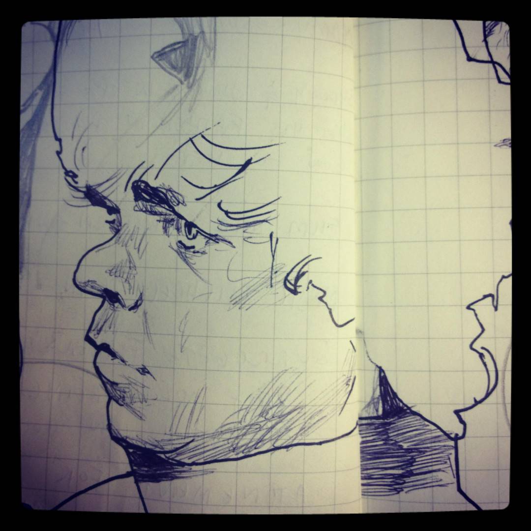
I wish I had an answer for what makes the essence of a person’s face. Lately, I have been essentially drawing the outline of an object, treating this single line as a container. I then go back in and just draw shapes. I guess that’s what really makes up a person’s face, a specific organization of shapes. Like I mentioned before if you saw the first three attempts at Benedict Cumberbatch you would have no idea who I was drawing. Then I let go of that thing in everybody’s head that says “ok, this is where the eye goes and this is what an eye looks like,” turning off that “autopilot” and just draw the shapes that I see. It sounds silly but I almost don’t even think while I’m doing it, I just let my brain tell my hand what to do. When it’s completed I’m always surprised, and like I said, when I try and do it again it turns to garbage.
I love the sense of experimentation in your illustrations. Each piece has a new take on how skewed and distorted you can depict people and still get away with it. I wouldn’t call them caricatures because that’s too simple – your figures are squished or pulled, broad yet totally real and always interesting to look at. How did you land on your particular style?
Very early on I knew I wanted to ride a fine line between caricature and reality, exaggerate features while at the same time putting in just enough to keep it from looking cartoony.
I know that this was a result of looking at some illustrators as a student who did that exact thing, guys like Sterling Hundley and Gary Kelley, and even painters like Lucien Freud and a professor I was lucky to study under, Jerome Witkin.
As a result, my style straight out of school was a bit derivative of those guys, but a combination of forcing myself to draw intuitively and simply expanding the scope of art I looked at, I was able to find my own voice, which of course, is an impermanent thing.
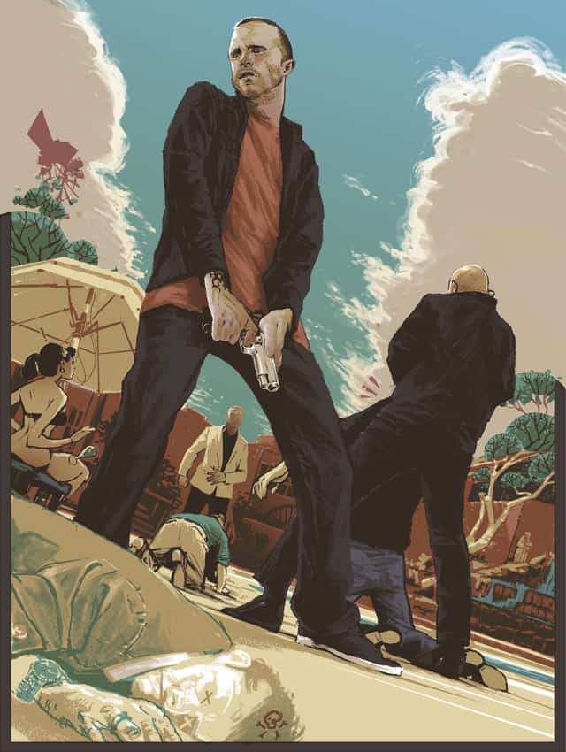
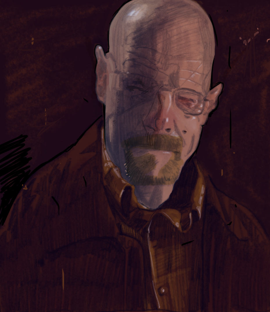
You can see that in your work, the way you’re trying to expand. Grow. It especially shows up in the ‘Breaking Bad’ piece. That’s one aspect of your work I immediately responded to — the sense of exploration.
Even with the delightfully skewed faces and proportions of your characters, you have done more straight forward figures. Jesse in your piece for ‘Breaking Bad’ is quite literal, but then the body on the ground faces the audience with Xs on his eyes. It’s a great blend of the serious and silly.
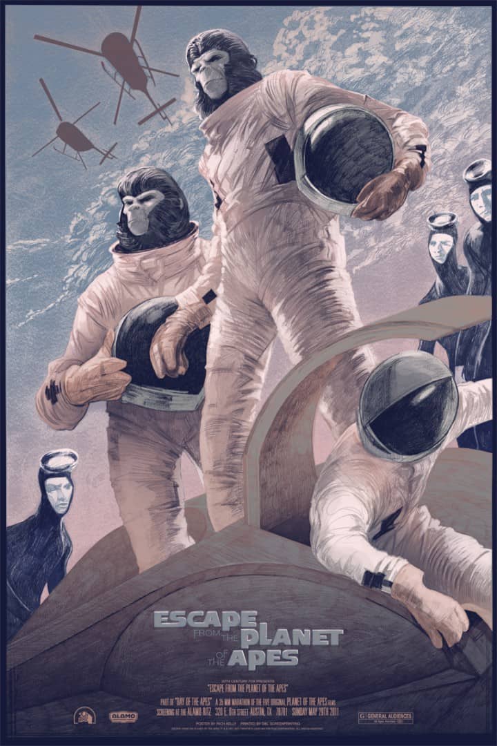
In your ‘Escape from the Planet of the Apes’ piece, the Apes themselves are heroically drawn, and in the background, we get these very odd and distorted scuba men. What’s your approach to your designs? How did you choose to show Jesse and the Apes like stoic heroes?
Working with properties that everyone is familiar with and has a connection to, there’s an expectation to deliver on at least some kind of likeness. It’s not something that comes naturally to me, so I will force myself to deal with it when it’s needed, as in the case of Jesse, and then allow myself to get silly with the other bits. The x’s over the poisoned guy’s eyes are my favorite part of that picture.
The choice to portray the apes and Jesse as stoic heroes is simply a result of the material I was working with. The apes come to this planet innocently and become victims of suspicion and fear. And in that episode of Breaking Bad Jesse really has to step up and take his role seriously. I know that it was really about Gus getting revenge, but I was really intrigued by Jesse’s character as he transforms from this caricature into a real person.
Do you mentally separate your art into categories like ‘work’ and ‘fine art’? Do some pieces mean more to you than others, based on the impetus for creating it?
It’s all work to me. I remember in college having these silly thoughts about illustrators as artists who have sold out. If I could go back and talk to myself I’d be like “stop trying to sound cool, you’re going to have to make a living someday, you idiot.”
I think I’ve been doing this freelance thing for about four years now, and it’s been an education in itself of how to run a business as a sole proprietor. A client pays you money to make a product. Nowadays I embrace that role completely and am proud to call myself a “commercial” artist. This might not be the direction in which you were going with the question, but I always laugh when I hear people talk about artists or musicians “selling out.” How the hell is anyone supposed to live without getting paid? Especially if you want to own a home or start a family (not to say that’s what everyone should strive for.) That said, some pieces certainly mean more to me than others, but that’s only because I feel like some are more successful than others.
‘Selling out’ is an odd term anyway. It’s admirable that you’re able to wrap your brain around treating your art as work, or really, as a business. I’ve seen a lot of artists struggle with figuring that out.
That was one big part of college that was lacking, teaching us anything about business. There’s also a lot to be said for just trial by fire though. I learned everything just by doing it.
You’ve done quite a few concert posters for Phish and other bands. Do they tend to give you free reign to do whatever you want, or is the band or someone else guiding the design?
Each band/client is different. Sometimes they’ll say “we want some kind of nautical theme” or something general like that. I’ve been lucky in that a lot of the bands I’ve worked with have given me a lot of freedom to follow my own intuition and come up with something that means something to me (and hopefully to the band and their fans.)
When you released your ‘Son of Frankenstein’ and ‘Hard Eight’ posters both sold out quickly. Actually, all of your posters are currently sold out in your store. Do you feel any pressure to make sure your next work will sell out too? I guess that might come down to who you put your attention on — who is your audience? The collectors, the clients, yourself?
There was a time when I put a lot of pressure on myself to have a quick sellout. So much so that I was feeling intense anxiety about how fast posters were moving and whether or not they lasted throughout the day. I would be fretting over whether or not I priced them correctly, could I be reaching a larger audience, was the time of day ideal, etc. In an industry where a huge chunk of my income is coming from poster sales, it’s definitely something that I have to think about.
These days, however, I’ve backed off and am just happy to see posters sell, no matter how long it takes for them to do so. Having people like an image enough to want to give me their hard-earned money for it is one of the greatest feelings. So in that respect, I do hold myself to a high standard; for the people who buy my stuff. Before that step, however, is pleasing the client and that’s my number one priority.
With illustration being your job, how often do you get to draw just for yourself?
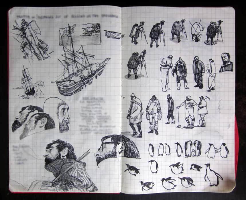
Not enough. I do try and start each day by “warming up” and drawing whatever comes to mind. I guess these little sketches aren’t for anyone but myself and oftentimes it’s a rewarding experience, but I can’t remember the last time I just sat in a room and drew what was in front of me, or went to sit in on a figure drawing session, or drew on a bus or train. I definitely need to be doing more of that.
Is there such a thing as a ‘typical work day’ for you? How do balance the unstructured schedule of an illustrator with family and friends?
No two days are the same. However, I do approach each day by writing down my goals for that day and then just tackling them one by one. I’m one of those people who finds intense gratification from a fully crossed off to-do list (this interview was on that list for way too long, haha, you can delete that if you want.)
When I was starting out I just worked off and on whenever I wanted, oftentimes late at night. Now that I live closer to family and am three and a half years into an amazing relationship (we’re getting married in September) I treat it more as a nine to five job.
It’s really challenging at times to “turn-off” because I’ll always be thinking about deadlines and projects I’m having a hard time with, and I’m lucky to have a supportive cast around me who is cool with me pulling an all-nighter if I have to. But for the most part, I’m able to balance it all somewhat successfully.
That’s awesome. It’s totally important to have folks who support you, something it takes some of us a while to learn. What’s next for you? Any upcoming projects?
There’s always something around the corner! More posters for the usual suspects (fingers crossed that people don’t get sick of ’em.)

Hey Chris! Thank you for posting this interview. 🙂 I am following Rich’s works for a while now and I am still stunned every time I come across his splendid artworks. Cheers!
Thanks for checking it out! His work is so great.