
In high school, my wardrobe was full of tee shirts. Sepultura. Ministry. Metallica. If it was a metal band, I had the tee shirt to go along with it. This was the ’90s and Brian Schroder, aka Pushead, was the main artist in the world of metal tees, and heavy metal in general. At a young age, I found a certain magic in the metal tee shirt — you could even call it an allure.
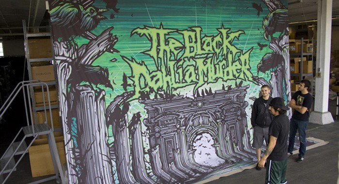
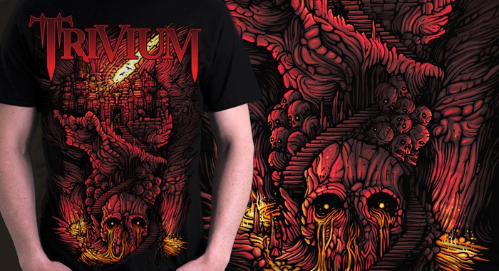
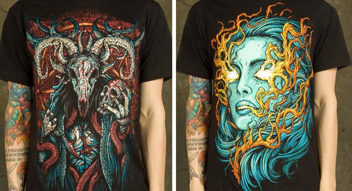
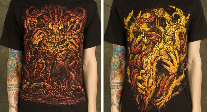
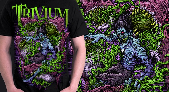
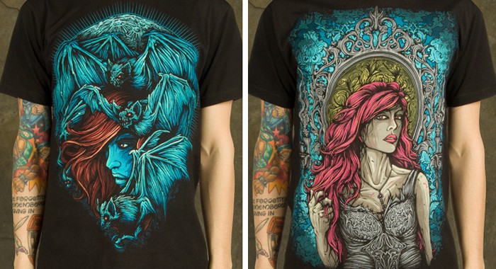
When I see the work of London based illustrator Dan Mumford I’m placed back in high school again. Mumford has become the go-to artist for bands like Trivium, Protest The Hero, The Black Dahlia Murder, and A Day To Remember for album covers and tee shirts. His tee shirt designs aren’t just graphics to toss on a shirt and forget about — his designs, full of bold contrast and vibrant color, are wild and detailed. He’s done something that I love, he’s turned the tee shirt into a collectible. An item to pore over.
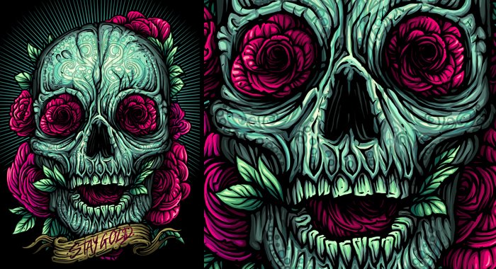
Mumford’s crisp linework and strong upfront designs at times have the feel of the Mexican folk art that surrounds Dia De Los Muertos ran through the modern world of heavy metal. He’s not afraid of color. To be bold. In your face.
ET: You’ve done a ton of work for bands like The Black Dahlia Murder, Gallows, and A Day to Remember. When a band approaches you for artwork, how important is it for you to have listened to the album or be familiar with their music? Do you need (or want) to find something in the music to pull from?
DM: I always like to know and understand who I am working for definitely. When a band I am unfamiliar with contacts me I always check them out online and try and find a bit out about them. It obviously helps massively if I am also a fan of the music, but that’s not essential. More important for me is that the band has a great idea and is passionate about getting this artwork created.
It crushes me when a band really doesn’t care what they put out on a tee or even more amazingly a record cover (this has happened several times with clients). In those situations its really hard for me to get excited about something, I could give them anything ‘demonic’ or ‘evil’ and they would happily slap their logo on it, and that’s just not a fun process.
The perfect job though is definitely one where I can identify with the music and also the people themselves that I am working with. As far as actually taking stuff from the music itself, lyrics always help in that respect and it’s always nice to have that to work with as well as the bands thoughts.
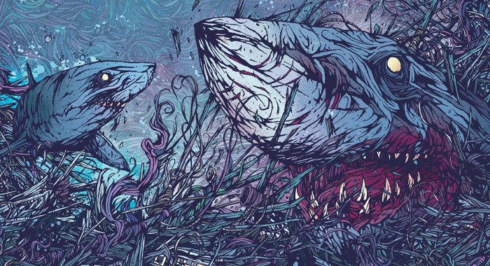
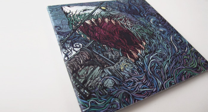
Your illustration for the single for Gallows’ ‘In The Belly Of A Shark’ is incredible. It totally matches the spastic energy of the song – tightly wound, spiraling into itself. Just a great piece of work for a killer band. When you create a piece that’s meant for a band, are you able to make prints of it to sell on your site? Do the bands control the work?
Yeah, that Gallows piece is probably still my most recognised work, it was a strange one as I was working on it at the same time as my final dissertation essay for university and my final show that was going up, and I worked on it in the evenings to relax over a couple of weeks, it was a very organic piece to create, quite hazy memories as it was a very busy period of my life.
Unfortunately though with nearly everything I have ever done for a band, once It’s finished and sent over, that’s pretty much where it ends for me, when its been handed over I kind of let it off into the wild for the band to do what they want with. With something like the Gallows piece that is especially true as contracts are signed and so forth.
I think the line between work for a band and art prints is starting to blur for me though, it very much used to be a clear cut sort of thing, but I’m finding myself wanting to create art prints from the band work I do more and more, so I could see myself trying to work that into some agreements in the future.
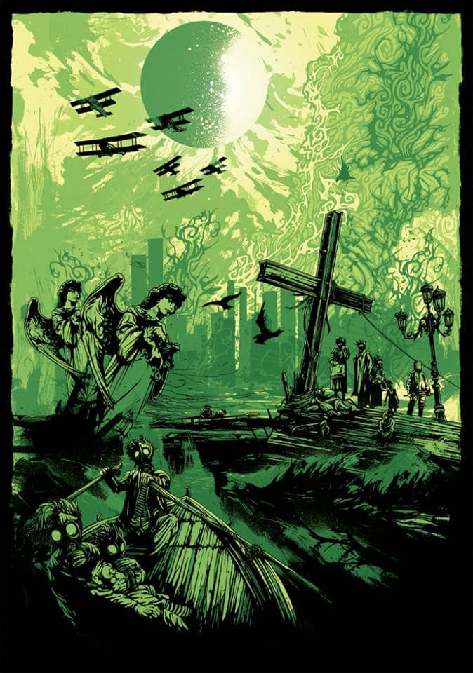
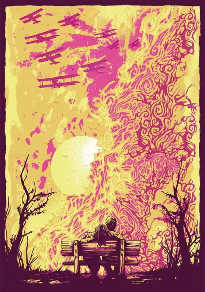
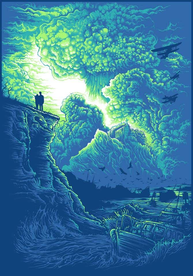
The series of prints ‘Nuclear Sunset,’ ‘Nuclear Sunrise,’ and ‘Radiant Dawn’ all have this narrative flow, an apocalyptic moment as planes fly overhead. At first I figured the planes were there to drop bombs, violent somehow – but then the more I took the pieces in, I’m at a place now where I see them as there to rescue, just looking for a place to land to pick up survivors. How much of a story did you have going into these prints? Were they sparked by a single image?
Well, these three pieces are very close to my heart. The first one, ‘Nuclear Sunrise’ was created as a kind of screenprint test back in 2007 when I was at university, I was just playing around with printing and trying to learn the craft as it was something I was interested in working with. At the same time I worked on the sister piece ‘Nuclear Sunset.’
Both of them share elements and have the same narrative, they are essentially two takes on the same idea! As far as what that story is, I really like the idea of it being quite a personal thing to each person looking at it. The general idea behind the two was to make something quite destructive beautiful, or finding a moment of serenity before complete destruction.
I think the initial spark came from a single black and white photo of a mushroom cloud, and I found myself getting lost in the smoke forms. Like yourself, I actually think at the time those planes were dropping bombs, but I now look at it in a far more hopeful way.
The original prints of these were limited to around 10 each, so I reprinted them digitally in 2013 as a pre-cursor to ‘Radiant Dawn’. I had wanted to pick up where I left off with those ideas for a long time, and ‘Radiant Dawn’ is a natural evolution from the first two, and the start of a new series dedicated to this idea of beautiful scenes of destruction, trying to find elegance in these forms such as a mushroom cloud, and at the same time trying to weave a slightly post apocalyptic narrative of acceptance in the face of such monumental power.
The idea of a post-apocalypse world fascinates me, so as my work becomes more personal I expect that to work its way in more and more.
I love how your work fits perfectly in the history of the heavy metal t-shirt – dark and vibrant, like the Pushead illustrations for Metallica or any of the Roadrunner bands from the late ‘80s and through the ’90s. As a kid I was always excited to find a new Pushead designed t-shirt or album cover.
There were a few artists that treated band artwork like collectables, like art. You seem to treat your work the same way. Is there a difference to you between doing something that’s ‘art’ versus ‘work’?
I think that for me it really depends on the client. When I’m working for a band that has a really cool vision or idea then I get super into it and have a great time bouncing ideas off of them till we get to a really great place with the artwork.
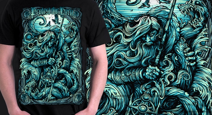
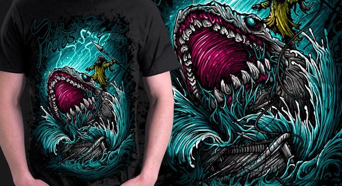
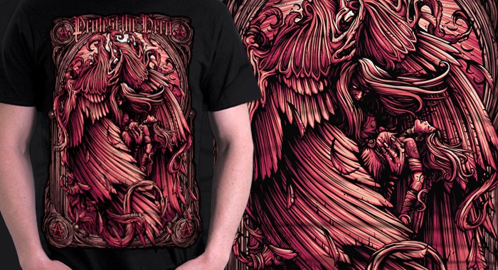
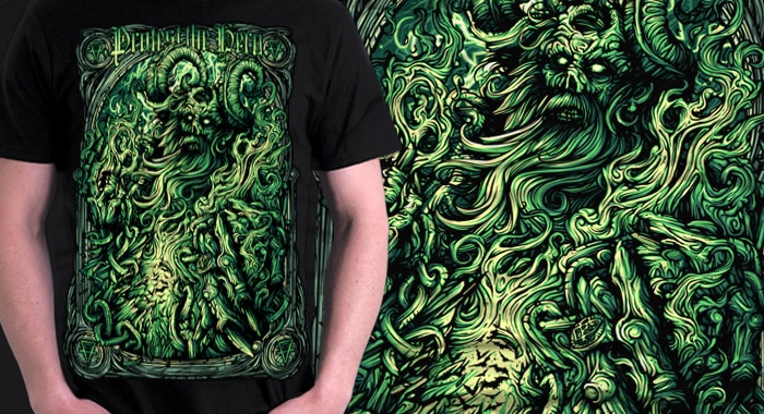
I just created artwork for the new Protest The Hero album (see images below), and that was really fun as Luke from the band kept coming back to me with some really strange yet cool ideas, and it meant we could really work into it, much more like a painting than spending a single day creating a tee or something.
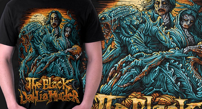
Not to say I don’t think the tee’s I do are ‘Art’, but it’s far easier to spend time working on a record cover when you don’t have to keep in mind printing restrictions. But saying that, my work with The Black Dahlia Murder has been a lot of fun, I think i have created around 25 designs for them now, it feels nice to have such a cool collection with such a great band!
And I do get a few guys collecting my stuff, and they buy nearly everything I put out, and hunt on eBay for tees and so forth, and I am forever thankful to them as it really makes me happy to see them enjoy my work so much, and helps push me forward to keep creating more.
How do you choose what jobs to take? With such a distinct style, I can’t imagine somebody commissioning you for something only to ask you to do something totally different from what you do. Does that ever happen?
I generally take what suits me at the time. I love working with smaller clients as well as bigger ones, more than anything if it’s a fun idea or something new I will generally take the job, and I’ve recently been working on motorcycle helmets, which is a completely new realm for me!
I do get people asking me to do some weird stuff that doesn’t suit my style. It started to happen less over the last year or so, but I just think in that situation it’s generally someone has not really looked at my portfolio and probably blanket emailed quite a few people in the hope someone says yes.
It’s interesting going through your work because you have a specific voice that can be seen throughout; monsters and gore, unnatural colors and bold designs that feel very influenced by horror and science fiction, but then you also have work like ‘Sisters’, ‘Fear’, or your awesome ‘Death of Summer’ series. They are all still very much Dan Mumford designs, but they inhabit a totally different world than, say, your design for ‘Plug Your Holes.’
When you sit down to create something just for yourself, no client involved and the only audience is you, what do you gravitate to, design wise?
I think the distinction here comes from a point around 2 years ago when I decided I had had enough of just drawing for clients, it had been around 4 years of working mainly for other people and taking other peoples direction, and I needed to break out of that cycle.
There are only so many gore based monster designs you can draw without it getting to you, and it was really getting me down. So I think the first two that really pulled me out of that head space were ‘Grey Skye’ and ‘Everything Happens for a Reason’. Simply black and white pieces where I wanted to create something beautiful and simple.
Nearly everything that has been up in my store or currently is on sale all stems from that moment where I wanted to create artwork that I enjoyed and that wasn’t dictated by anyone apart from me, and at the same time sort of show another side to my work that was perhaps under-developed or unknown to most people.
At the same time it’s a great way for me to develop ideas and techniques that I wouldn’t otherwise have a chance to, and more than anything, there’s no deadline, it’s all on my schedule. At the end of the day I really enjoy creating beautiful artwork, the subject matter can go either way, but it’s really about being able to spend time on things and just enjoy creating artwork.
As an artist who makes a living selling your work, how aware are you of what your audience wants? Is that something you’re concerned about when you start a design, the question of ‘how will I sell this?’
I try not to think too much about it. I mean as far as tees/record covers go within the alternative industry, I know what sort of thing kids are into or what colours work etc, it’s second nature by now.
So when I’m working for a band/client, I generally put that thought out of my mind and think more about the client and what they want as opposed to the audience they will then be selling it to. Sometimes I will think a colour-way or some element within a design is wrong on a fundamental ‘this looks like crap’ level, but we are too far down the process to pull out completely and I let the client go the way they want, as essentially it’s their money they are spending and if they want to make that mistake then that’s fine, I can only voice my opinion strongly and hope they listen.
When it’s a piece for me to sell as a print or tee, then I am 100% receptive to what people/the audience want, as they are what keep me going, I couldn’t be doing half the things I am at the moment without the support of everyone that buys from my store. But i try not to focus on it too much, I think as long as it follows the trend of my work then I know most people will be behind it, which is great to know.
Are you 100% freelance these days? Have you ever worked for a design agency?
Yeah 100% since the day I left university unbelievably. I got a great couple of jobs just as I was leaving and they set me up for a few months in London, and I never looked back!
I have thought about what it would be like to work at an actual company, or if I missed out by not doing a year or so to start out, but to be honest I’m pretty glad with where I am at now, and I have learnt a ton over the years working at it on my own.
I made mistakes and had some odd business ventures, but it was really nice having to build up from working in my bedroom to having a great studio space with tons of storage and being able to make a living selling my artwork. It’s a really weird yet amazing job when I think about it.
Your compositions feel incredibly deliberate. How much time do you spend sketching an idea before you start?
You know, probably not as much as I should! I tend to create the idea and composition in my head for a few days before I start a piece, I nearly always have a mental image of what the design/image will look like before I get started, which means when I get to start a rough sketch it’s quite an easy process for me to get my ideas down.
Of course it isn’t always as smooth as that, but I’m definitely at a point now where it’s quite a natural process. When I get to the actual sketching process I tweak and play with the composition until it feels right, until all the shapes work and compliment each other. I don’t really focus too much on detail at this stage, it’s all about the shape and flow of everything, if it works on a fundamental level like that I know that when I move forward and work with more detailed line work it will most likely come out like I want it to.
I also add colour in to my sketches and try and get all the right colours down before I move forward, as that can dictate a lot of the lighting and shadows that i lay down in the image.
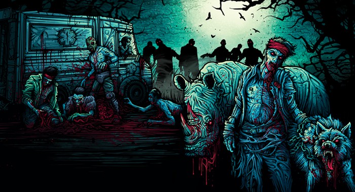
‘Send More Paramedics’ by Dan Mumford.
Artwork and layout for the special 50th In At The Deep end records release.
You went to school for illustration and I’m curious to know how your style developed. Was your style, your taste, close to where it is today? Did you work through different methods and styles until you got to the point where you were like, ‘This is it! This is what I do!’
It was a very strange process actually. I was at university for 3 years studying illustration and before that 1 year doing a foundation course. So over those 4 years I had plenty of opportunity to experiment and play with ideas. On the degree course at university we were very much encouraged to keep moving and play with various mediums, we weren’t really taught in the academic sense like you would in a classroom, more shepherded into thinking about art and illustration in different ways, and if you needed the support to help find what you enjoy doing then they were there for that.
Over those years I was creating ink drawings, pen drawings, paintings, collages, spray paint stencils, all these different things that you would not in any way associate with my work now. Around the end of my third year of university before we were set to graduate I started to play with a more stylised black line work. I was looking at stained glass window designs and Mucha quite a bit, and I also introduced my work to Photoshop.
I think the point I sort of found my style was when I was using the paint bucket tool to fill in little segments of my drawings in Photoshop, sounds archaic and very sloppy, but my work developed from there. Alongside that I was gaining an understanding of screenprinting and it all meshed together.
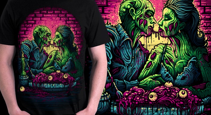
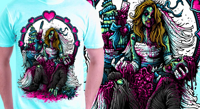
Your work has a wonderful classic comic feel to it. Your monsters and creatures are relatives to the illustrations you’d find in old issues of ‘Famous Monsters,’ where there’s gore and violence, but it’s bold, fluorescent, with a healthy touch of fun in there. When it comes to your creature work like ‘Plug Your Holes’ or your t-shirts for ‘Zombie Liquorice’, it’s gore – but also accessible. You could say ‘kid friendly’ even. Is that something you try for or is it a natural instinct, driven by your personal taste?
I think it comes from my love of comics growing up. It definitely influenced how it seemed correct to portray these ideas and images to a mass market, without offending anyone I suppose. I don’t really want to draw or create anything that someone could look at and be turned off by or actually find disturbing.
Obviously I have created some designs that are pretty gorey, but its always got a bold graphic style to it, it’s never real.
At the same time colour plays a massive part in that, and at the end of the day with tee designs for example, it’s great to make the designs pop off the tee with really nice contrasting colours. I used to work solely in black and white for a while, I didn’t really understand colour or how it should work, so I learned to love using it, and that’s why I like to make quite colourful designs now.
The more I work on personal work though I do tend to move more towards the beautiful side of imagery as opposed to gorey subject matter. I do love a good demon or two though.
You did a print through Warpaint Press, and have ventured out into doing Mumford Clothing, which I think you did with IndieMerch, right? Any plans for more collaboration like that?
Absolutely. It’s always nice to work with new people on things like that, be it galleries or print presses, small businesses, etc.
The Warpaint Press thing was more of a client/artist relationship for that one print, which came out great. Really nice to work with those guys as they have released some great prints this year.
Mumford Clothing was something that myself and Karim at IndieMerch put together. We had worked a ton on The Black Dahlia Murder tee designs when he was their tour manager, and when he moved to IndieMerch we started the project up. It was great and a really fun thing to do, I was given complete freedom with their backing to basically just do what I wanted, within reason!
After 3 lines that went down really well it slowed down a bit, other things got in the way and the brand as a whole has essentially ceased to exist for now, which is a shame, but my focus is on prints for the time being, tees and apparel will come second to that.
Your color palette is so electric, not afraid to be in your face, like psychedelic a gig poster from the ‘60s. When you have your design at the black and white level, how do you choose your colors?
I guess I touched on this earlier, but it essentially came from a fear of colour. I became very safe and comfortable working in black and white, and I started to screenprint as a way to introduce colour to my black and white images. I would do a print with my drawings on top and one colour underneath. Then I would start to realise how the white of the paper could be used to light the image by popping segments out from that colour, and then I would add another colour for shadow, and I just sort of built up this technique for creating images with minimal colour.
So whenever I draw or colour a design in Photoshop, I work as a screenprinter. I create the colours in layers and pop out bits for lighting and shadow. It’s a slightly strange way of doing it, but it forces me to think about lighting.
As far as choosing my colours, I don’t really have a set way to do it. I like my bright colours, my pastels, my bright greens with hot yellows, I just have a few sort of mental colour wheels that I use. Nowadays I don’t really think too much about what colour it should be, it all sort of flows very naturally, and that’s because I forced myself to understand colour and what colour works with another, how to accentuate something, how opposites work great against each other. It’s all a learning process, and at this point I’m really glad I forced myself to learn how to use colour properly.
It’s hard to believe that you were ever afraid of color. Your use of color and color choices is so spot on great.
When you’re stuck, or needing a little push on a design, what do you turn to for inspiration?
I generally try to not look at any artwork for inspiration. In fact as terrible as it may seem, I don’t look at much artwork through out my week. I stay abreast of what’s happening and my peers and how they are getting on via the various social networks, but when it comes to actually looking for inspiration I look to other realms of creativity.
A big one for me is film, sci-fi and horror from the 80’s-90’s is pretty much it for me, that was when I was growing up and everything I watched back then was etched in my brain as being completely awesome. So that’s what I like, and that’s what i try and portray with my work.
That and comics, Marvel and DC comics in every way are a big influence. Growing up I just tried to draw what I saw in the comics. Now it’s no different really, that’s the stuff I love and look to when I need a bit of a kick. I also like to play epic soundtracks from movies, Vangelis or Zimmer etc, makes me think of epic things and huge scenes.
To be honest I haven’t had a big inspiration void for a long time, I have a ton of projects I want to get going that could take me up to the middle of next year at the moment, so I’m pretty happy about that at the moment! It’s a rare thing.
The catalog of work you’ve done is incredibly impressive. You seem to be constantly working on new projects; prints, t-shirts, artwork for bands. How do you maintain a normal life with your career? It’s always been admirable to artists such as yourself who can do the work they love, be paid for it, and still have a regular life. Do you keep a tight work schedule to fit in friends and family?
I actually work a fairly straight forward week, which is probably quite different from most freelancers!
I rent space in a studio with several other designers, so I treat my day as anyone going to work would. I get up around 8:30, have some breakfast, go for a swim, get to the studio around 10:30, get on with my day, go home around 7-9, and I generally don’t work weekends!
I think maintaining that quite strict regime has been really healthy for me, it’s meant I get to spend time with my girlfriend/friends/family at weekends, go out in the evenings and also gives you that space and time away from work to think about things.
Going back to what I said earlier about sketching ideas out in my head, that’s when it happens, I get all my better ideas out of the studio. I make a little note of it and then get on with it when I’m back the next day.
I rarely even put pen to paper when I’m out of the studio, which is strange, but again, I think it helps keep me sane. And not working at the weekends is amazing, by Sunday evening I am raring to get back in the studio, and I’ll do some of my best work on Monday and Tuesday because I’ve had that time away from it.
As far as the workload goes, I try and keep on top of everything, not let anything hang and make sure emails are replied to promptly, I’m a little OCD about stuff like that, which probably helps. All my emails in my browser have to have a replied to icon or be deleted.
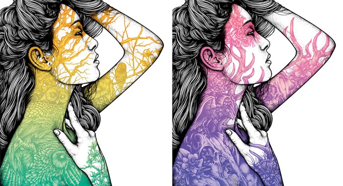
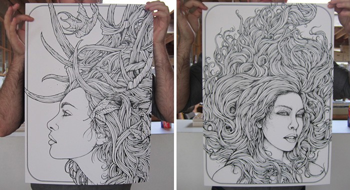
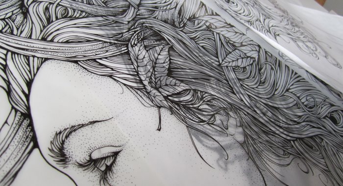
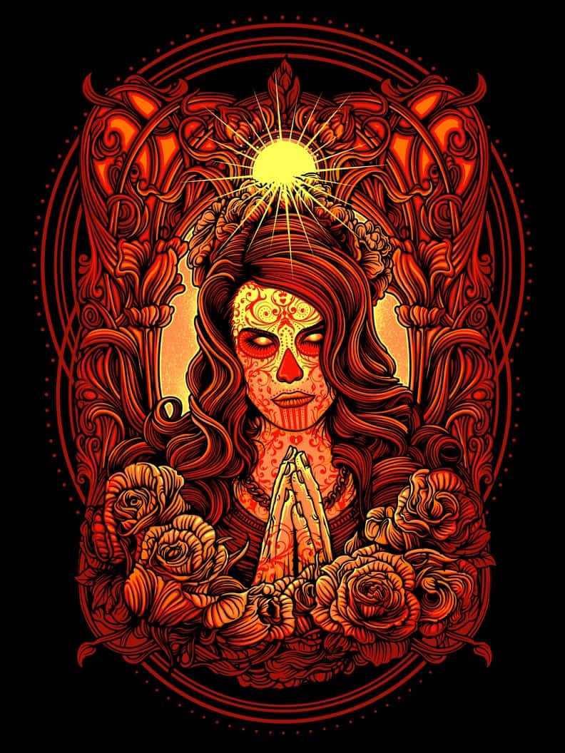
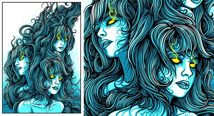
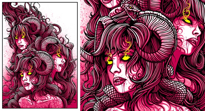
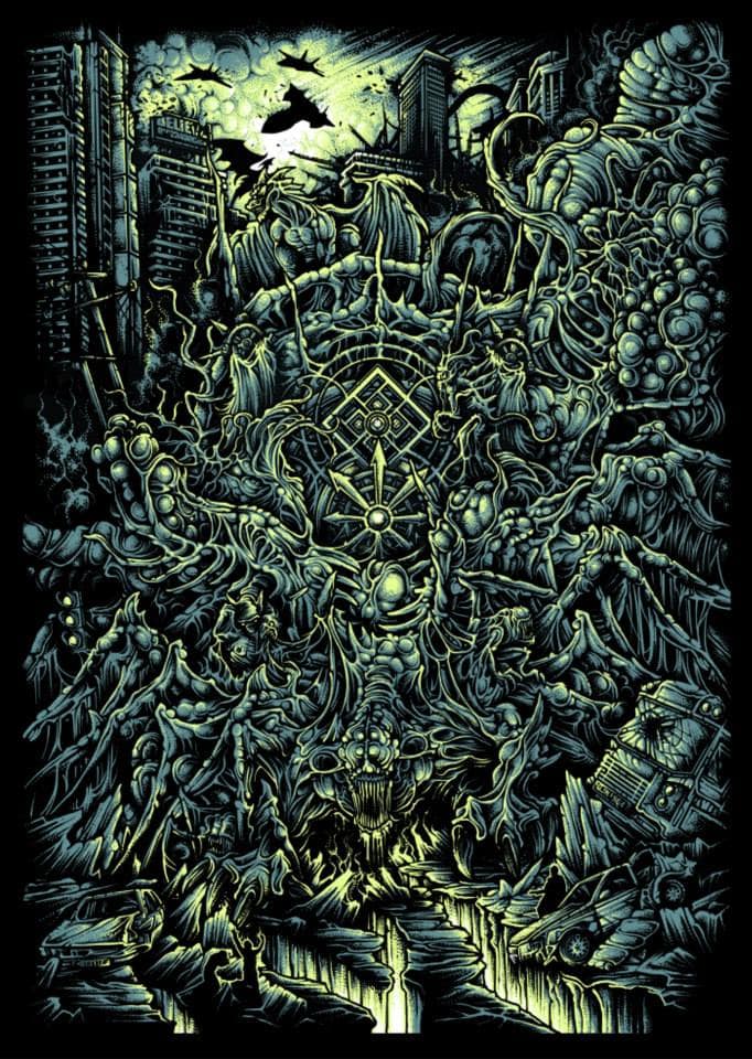
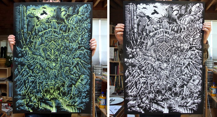

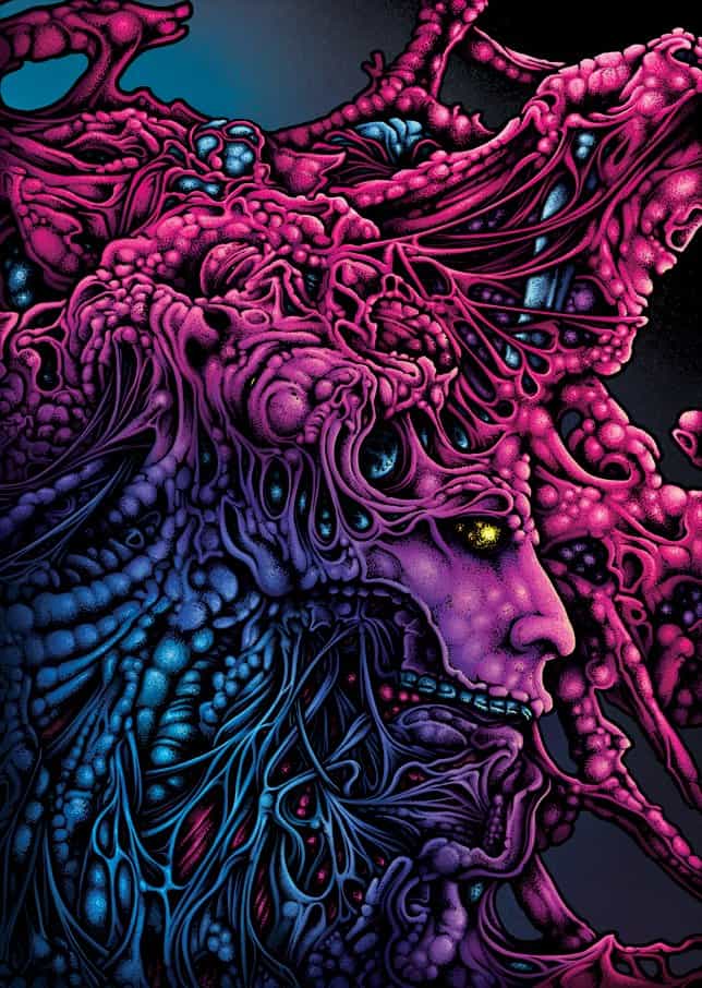
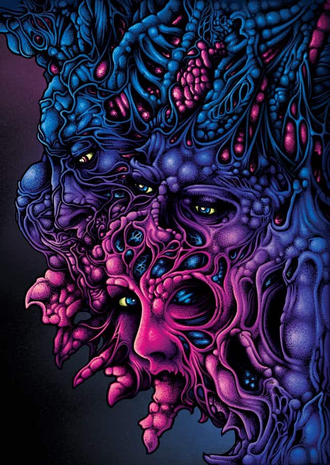
As a fan and a follower of Dan Mumford’s style. I am really glad to have known you more. Through out all the prints that I make, I never deny to people that my inspiration was Dan Mumford. I may not be as good as him but I’m really glad to have known such person and I am proud to say that the origin of my style is Dan Mumford’s Illustrations…
Cheers!
Dan’s one of the best!
Great interview, fun to read and very interesting.