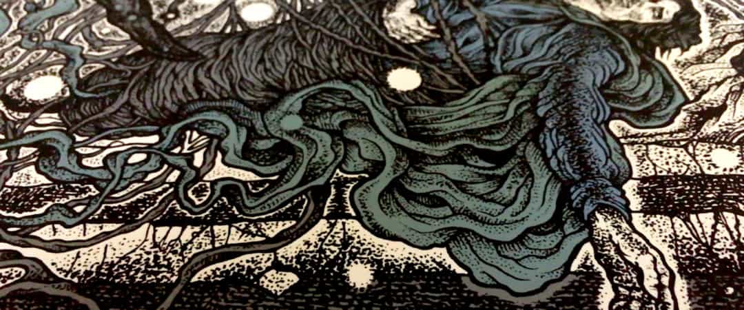
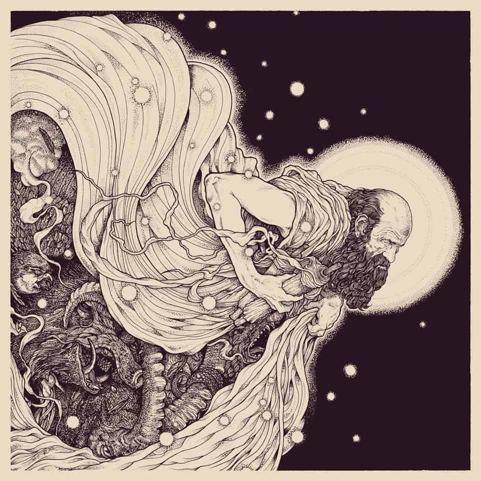
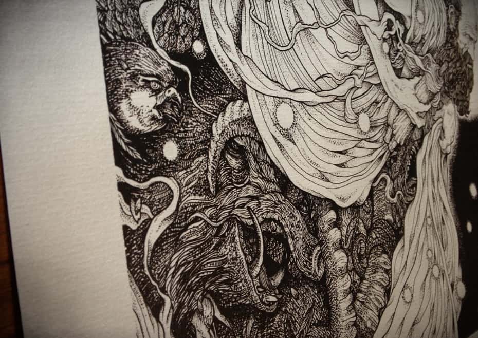
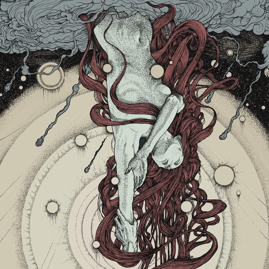
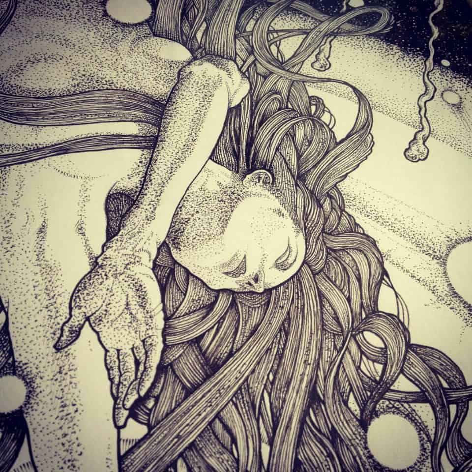
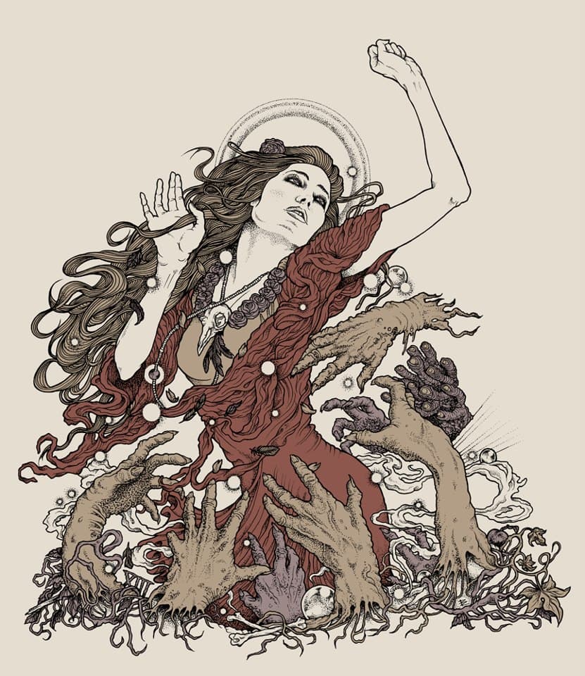
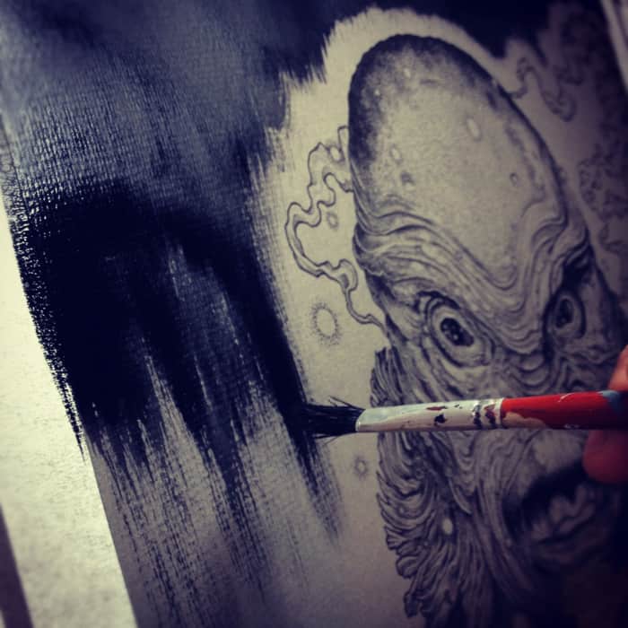
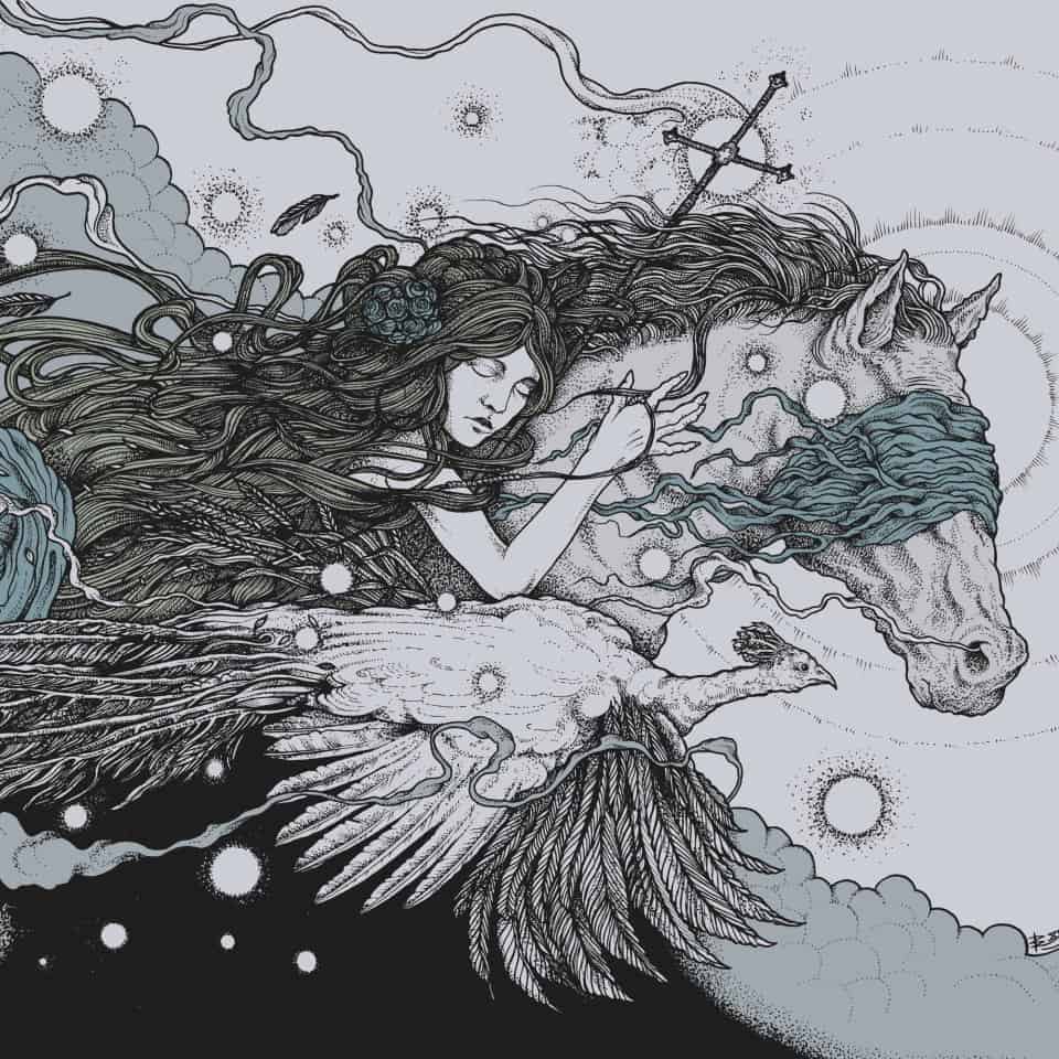
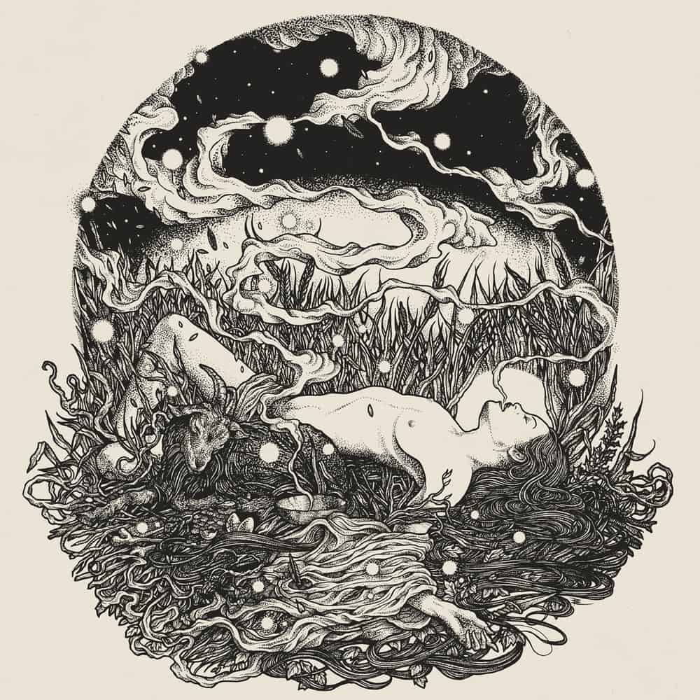
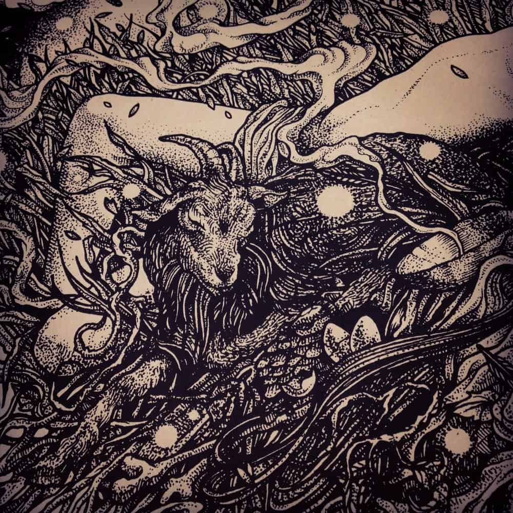
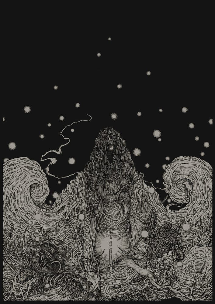
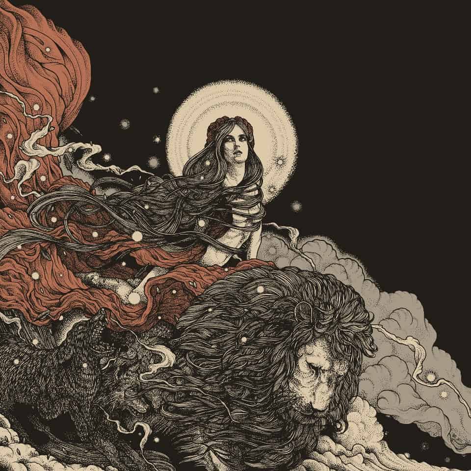
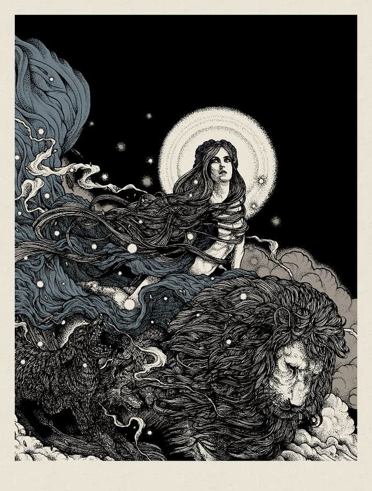
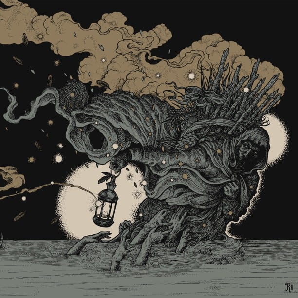
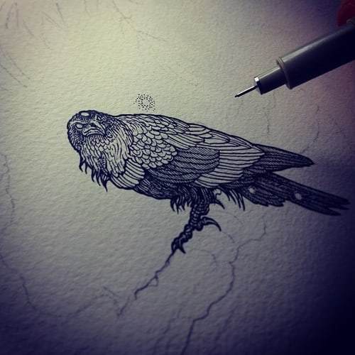
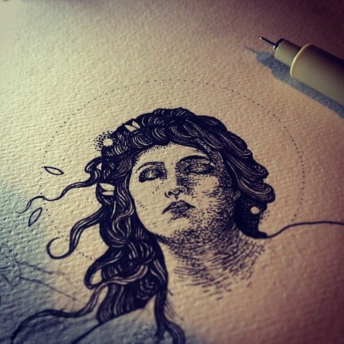
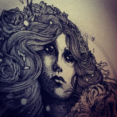
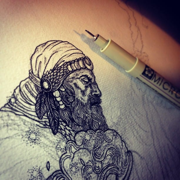
UK based artist Richey Beckett‘s tools are paper and pen. Pencil. Eraser. Nothing more. Yet with those simple things he is able to construct drawings of intricate depth. His work feels ancient — like lost etchings or drawings in an illuminated book. His style is deliberate. Impeccably crafted. Beckett’s work is all-consuming. His drawings take time to fully see.
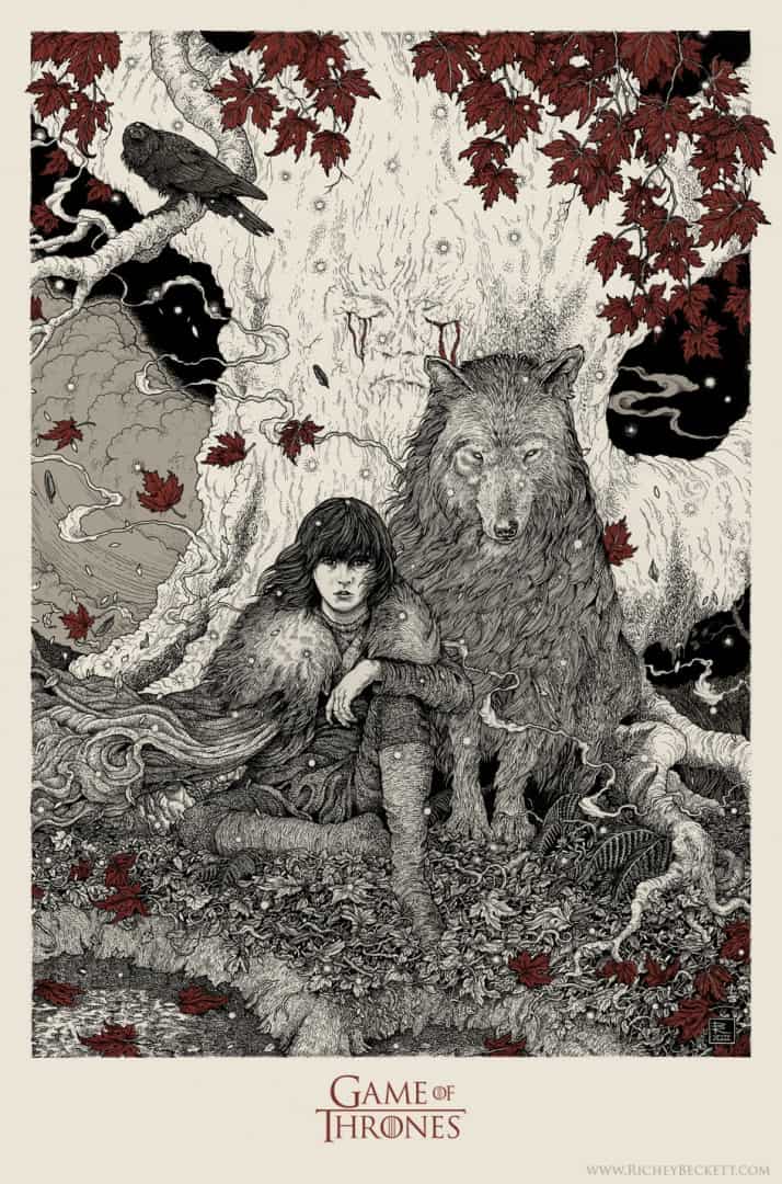
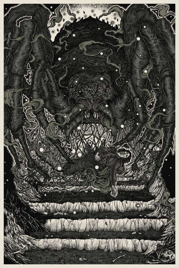
His drawings have fully realized the dread and horror of Frodo’s capture by the spider-beast Shelob from J.R.R. Tolkien’s ‘The Lord of the Rings‘. He’s brought George R.R. Martin’s young Bran Stark under the Weirwood tree of ‘Game of Thrones‘ to life. His drawings feel organic — pulled from the dirt and inked in a sprawl of leaves, limbs, webs, and fog. Richey Beckett accomplishes something that great art should do — it draws you in and leaves you in awe. He’s an artist with a strong sense of what it is he wants to do and how he wants to do it.
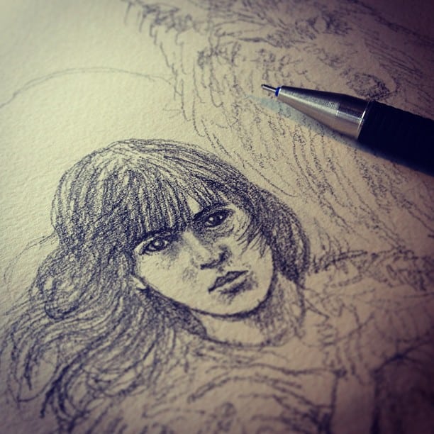
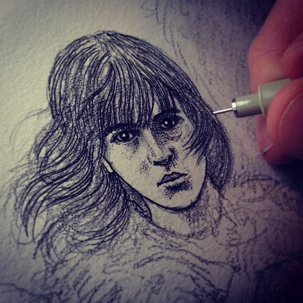
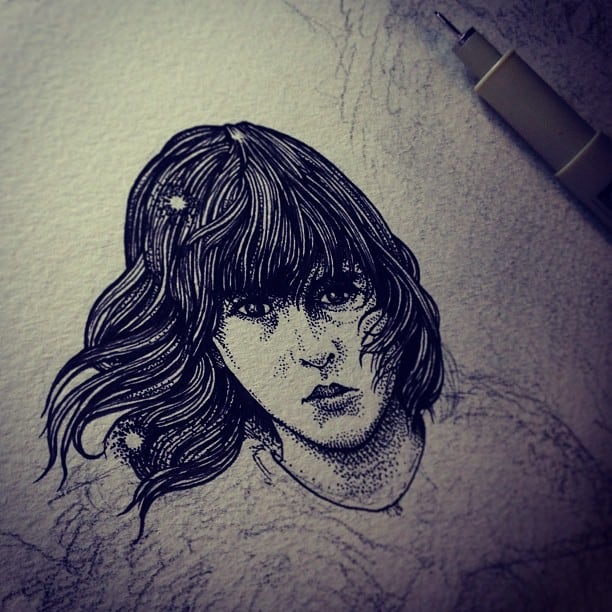
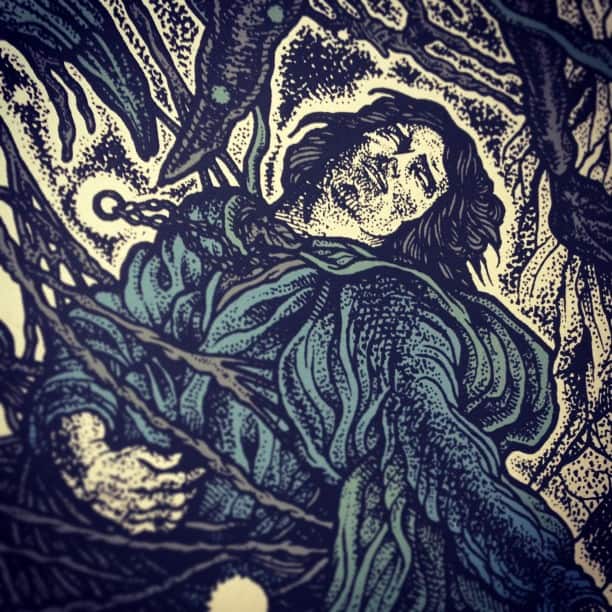
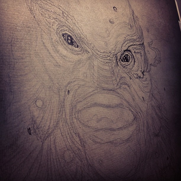
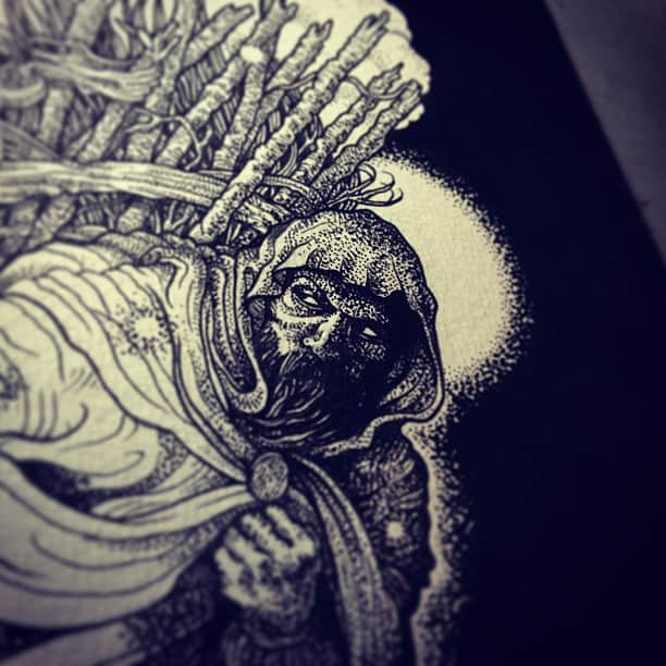
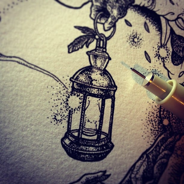
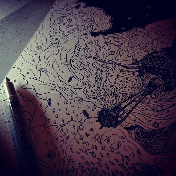
CJ: I was looking at your process photos for your ‘Bran Stark’ piece you did for the Mondo ‘Game of Thrones’ show. I was surprised to see how little pencil work you begin with. It seems all of your intricate detail work is built up. It’s an incredible way to work, considering that these days you can use Illustrator or Photoshop with their ability to infinitely erase and re-do your work. Once you draw a line, it’s there and there’s nothing you can do about it. What’s the process like when you begin a drawing? How much is planned or spontaneous?
RB: I try to keep a good mix of the two. I plan the overall layout quite meticulously, using photo reference and sketches – I’ll typically spend a couple of days on this before I transfer it to a pencil layout. Planning is very important, in fact, I wish I had more time to spend on it, but every job has a deadline and you know when you need to move on and get to work on the real thing. Which is exactly why I don’t spend too much time on the pencil either.
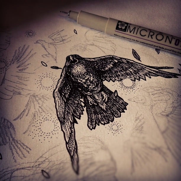
I mean, it’s only going to get rubbed out anyway so as long as there’s enough of a guide down for proportions then I’m happy to get to work with the ink. I wish I could spend more time on the pencil stage really, but a combination of impatience and limited time pushes me on. If I’m struggling with a certain area or not quite confident with what I’m going to do, then I’ll work on it in pencil midway through the drawing. I always focus on small areas at a time. As you say, there’s no erasing the pen – so you just have to go for it, and inevitably mistakes will be made, you just have to embrace them. My work is littered with mistakes, but hopefully only I would notice them. In fact, when I finish any piece ALL I see are the mistakes, but when I come back to it, later on, I’ve forgotten where they were.
Going back to your comments on planning, it really is critical to get the layout right at the planning stage, otherwise, it’ll bite you on the ass later on. It’ll come back to haunt you. Once those pen lines start going down, there’s no turning back – and I’m very committed to the premise of the physical piece being the final piece. As in, I refuse to edit, correct or manipulate the image digitally, unless it’s absolutely necessary. I find it strange that a lot of people now are so impressed by this way of working, when to me it’s just ‘drawing’, in it’s most simple and traditional form.
Your work is very earthy and organic. It feels classic – ancient even. How did you land on your style? Did you struggle with finding your ‘voice’ as an artist?
‘Earthy and organic’ is something I really like. Recently I’ve really tried to loosen up with my strokes and general feel, stepping away from trying to make everything perfectly neat or clean. If my work can be described as ‘earthy/organic/classic/ancient, then that makes me very happy.
I think it’s only now, very recently, that I’m really stopping to question what I’m doing and more intentionally trying to find my voice. The one thing that I’m confident in, is that this is the most natural way for me to work, and I’ve effectively drawn in this style since a very young age. I remember my father and my cousin, who are both excellent artists, showing me how to crosshatch, and how to shade an object and understand basic principles of light and shadow.
I’d always drawn in black and was never interested in colour, and as soon as they passed on this golden knowledge of cross-hatching and mark-making, very dynamic use of simple black lines – it just really spoke to me. It was a language I immediately understood and adopted. Of course, my influences are very classic and retrospective, so I do really want to find a way of embracing all of this and making it something of my own. I still feel like I’m a long way off but every now and again I might do something which feels right and I can think ‘that’s mine’. Some little trick or technique.
The other aspect is subject matter – I can understand you finding that organic feel in my illustrations because you’ll notice that there’s very little in the way of industrial items or locations. You won’t find a skyscraper or a toaster in there. I think the closest I’ve come is a church building. I have an instinct about what should appear or, without wanting to sound too pretentious, what fits into my ‘world’. If I’m asked to work on an image that I just don’t feel right about, or that just simply doesn’t fit for me, then I’ll always try to find a way of representing the same thing but in my own language.
Have you ever been tempted to use digital tools?
Not at all. I’ve been advised by others that it’s a good way to go, I’ve asked them about it, but I’ve never tried it. I’m a bit of a technophobe in general, I’m terrible with computers, but more than that I like my artwork to exist in simple terms, pen and paper, ink and fingerprints, two dimensions. For me, when it comes to computer generated or assisted artwork, there are just too many questions.
I can’t handle the idea of the artwork not ‘existing’ in a tangible physical form – but being a file name, or multiple filenames in a digital domain. Which one is the original once you’ve saved it more than once? Beyond that, when so many artists are using tablets and digital brushes, it’s in danger of all looking very similar stylistically. Every stroke is immaculately delivered and can be edited or deleted, or moved to another layer.
To me, it’s exactly the same as ‘auto-tune’ and Pro Tools for recording voice and music. Maybe I’m just digging my heels in and not embracing these exciting new tools, but I just can’t get my head around it. If I’m working on any illustration, I spend longer staring at it than I do actually drawing – studying it, trying to figure out which parts I need to draw in which order, because the foreground has to be drawn in first, any pieces that overlap or intertwine have to be drawn exactly right. There’s no erasing, or duplicating leaves, or pushing pieces around in layers, or changing line weights. Saying all of this makes me think I should get into it! I’d certainly get ten times the amount of work done.
I want to point out here that I’m not outright condemning the use of digital tools, or the digital art in general. There are so many incredible artists out there, significantly more skilled than I could ever be, creating wonderful work in this way. There are those who’ve really embraced this new way of working, and have made it their own, creating their own tools and recognisable style. No matter how much auto-tuning goes on, the great artists will still stand out.
Do you do any of your prints yourself? Have you tried your hand at any type of etching?
When it comes to screen printing, I’d much rather leave it in the hands of professionals! I’m not particularly gifted when it comes to that kind of hands-on work. I just get confused and make an incredible mess. I’ve lent a hand in some DIY style screenprint operations, and I did think about setting up my own print shop in my basement and garage, but in the long run I’d rather invest my time in drawing and let those with a passion and skill for printing take care of that part of the process.
As for etching/engraving, those methods have always fascinated me – naturally due to my interest in the origins of illustration and ancient print work – so it’s something on my very extensive ‘to-do list’…or more so a ‘to explore the possibilities of’ list. I hope that one day I’ll have things a bit more under control and will have time to experiment with different mediums, especially of that nature. I’m already looking into letterpress, embossing and other new ways of printing and colouring my work.
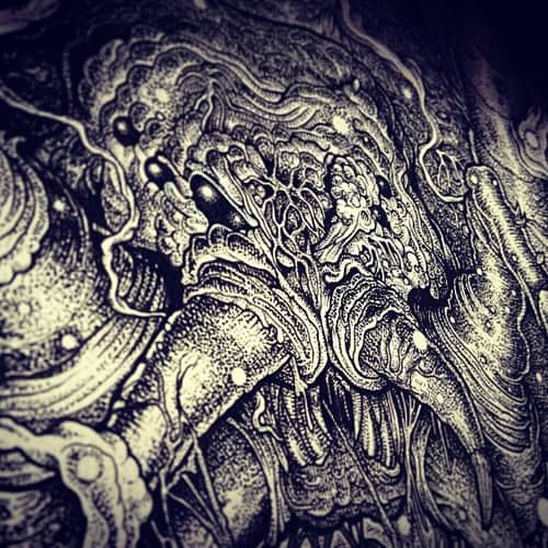
I find your drawings totally hypnotic. I’m surprised that with such intricate detail in your work that your drawings don’t feel chaotic, just the opposite – there’s something calming to them, like pacing through one of those cathedral labyrinths. I imagine that when you’re in the process of inking, really getting in there, there’s a risk of losing the overall scope of the piece. How do you manage so many details? Like in ‘Shelob’s Lair’, did you ever have to stop and step back and go, ‘Is this a leg or a web I’m drawing?’
Hah, there’s definitely a lot of that going on. I spent a fair bit of time just staring and studying sections, making decisions on what to tackle next and trying not to mistake a tree branch for a bit of smoke. There’s definitely a risk of losing the focus of a piece by overworking or over complicating it, and I think the only thing that stops me from doing this is deadlines. That’s the saving grace that holds me back, otherwise, I’d just work on a piece forever. I find it very hard to stop work and say ‘it’s done!’
I’m flattered that you find them hypnotic, thank you, and I’m glad you think they’re calming rather than chaotic – that’s certainly what I would hope. I think what it comes down to, is that I’m a very laid back person. It takes a lot to make me angry and I like to take my time. I like bird spotting and country music. So I think that even if I tried really hard to make something chaotic or aggressive, it would still end up with a calm flow to it. If you’re working on a drawing for a length of time, then it’s going to always represent you in the end, so it’s best not fight it. I can’t pretend to be a tortured soul. That’s why I’m always surprised when people say how ‘dark’ my work is, because I don’t really see it that way at all.
How big are you working at? Your work almost demands to be seen on a large scale. Any plans to do any larger pieces?
People are usually deceived by the size of my work – they expect me to be working on a huge canvas on an easel or something, but in fact, I very rarely work larger than A3. As most of my work is for record covers, the majority of which will be printed at 12x12cm, then the final piece is still going to be viewed at around a quarter of its original size, so it makes sense to work at this scale.
Also, I use extremely fine nibs, so if I worked larger I’d have to scale everything up – otherwise it’d take me months to finish each piece. It is something I’ve been considering a lot lately though, just to see what happens if I work larger, make my finest pen a 01 instead of a 005, and see how it translates. I’ll let you know how it works out!
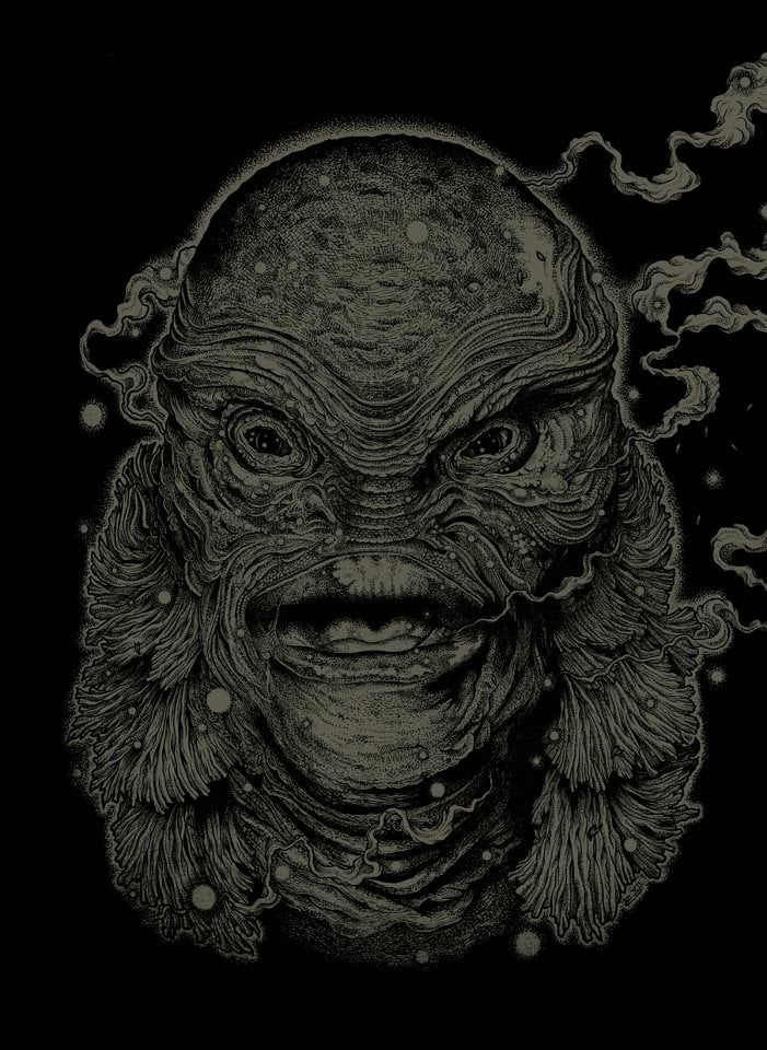
As a big fan of monsters, I have to say you do amazing creatures and monsters. Your ‘Creature from the Black Lagoon’ for Mondo is a favorite of mine. How did you get hooked up with Mondo? Have you made it out to Austin for any of the shows you’ve been in?
I’d been a big fan of Mondo for some time, having picked up one of their Tyler Stout ‘The Thing’ prints about 5 years ago. ‘The Thing’ was always my favourite movie, and so that was the catalyst for me first stumbling upon them. Once I’d seen this piece I followed everything that Tyler and Mondo put out.
The incredible part for me is that my first job for Mondo was actually a shirt design as part of a series curated by Tyler. So one day I just received an email from Tyler, I thought it was just a regular mailing list mail from him, but in fact, he’d selected me to work alongside four other (incredible) artists on a new shirt series for Mondo. These included Arik Roper (who’s done amazing artwork for High On Fire and Sleep), and Boneface (who recently did the QOTSA artwork).
I’ve no idea how he found me, or that he was even aware of my work, but in this day and age, people with the same passions do tend to gravitate together. Naturally, I was absolutely thrilled to have been asked to take on this project. Following on from that, I was invited to contribute a piece to the first art show at the Mondo Gallery (Sci-fi themed), and quite appropriately I did a piece based on The Thing.
Since then I’ve also contributed to the Universal Monsters show, and created posters for LOTR and Game Of Thrones. And I’m still absolutely thrilled and excited every time I work with Mondo, I have a huge amount of respect for the wonderful thing that they’ve created.
Drawing is something I do off and on — I pick it up and get frustrated, so I stop and that just repeats itself. Seeing your work and process shots made me fall in love with it again and got me excited and inspired to pull out the old micron pens and doodle. Hitting up the art supply store it’s crazy how many options you have for pens and paper of all sizes, textures, and tints. Do you have gear that you can’t live without? What has to be at your drawing desk before you can even begin?
Well, I’m so pleased to hear that my work inspired you! Thank you. It’s definitely the right way to approach it, if you’re feeling frustrated or you hit a wall, then take some time to seek out some inspiration and take a fresh shot at it. Pretty much every day I take time first thing to look through some books, artworks, photography, or anything that might give me a spark of inspiration to fuel me through the day. I collect a lot of books, particularly for this reason. Regarding materials – my opinion is that it’s nowhere near as important as people seem to think it is. I get asked pretty much every day ‘what pens do you use’ and ‘what paper do you use’ – and I’m always very happy to share and answer, but my honest answer is ‘it doesn’t really matter.’
The paper I use is very standard Daler cartridge paper. I’m sure there’s better paper out there, but it’s not going to change my work very much at all. I use Sakura Microns mostly, but Copics, Steadtlers and Pilots are all great. I think the time people spent deliberating over materials could be much better spent drawing. When I post up a piece of work, and immediately get asked ‘what pens did you use??,’ it’s as if I’ve just eaten a bowl of cornflakes and been asked ‘what spoon did you use??.’ It doesn’t really matter, one spoon might feel a little nicer, but the cornflakes will taste the same. My essential materials are literally pencil, pen, and paper. I use blue tack as both an eraser and also to stick my paper and reference pieces to the drawing board. Blue tack is very versatile!
Yeah, that’s so true. Out of all of the pens and pencils I’ve tried, none have made me draw any better. I think part of why people would ask what you use is to just to ask you something — to be a part of what you’re sharing.
Do you work from a home studio? How does a workday go for you? Do you keep a rigid 9AM – 5PM schedule?
Yes, I do – I share a flat with my fiance Fiona, and the spare room in our flat is my studio room. It’s a box room with a little balcony, but it has everything I need, laid out just how I want it. I keep a rigid 10am-6pm schedule. Fiona owns and runs a tattoo parlour so I match her working hours. My working day usually consists of admin for a couple of hours (responding to emails, a bit of promotion here and there, taking care of business), a bit of research/inspiration depending on the current project, and then I draw for the rest of the day.
Do you have to be inspired to work, or do you approach each drawing as more of a job, a task that needs to get done?
Every piece in itself is inspiring, otherwise, I wouldn’t start work on it in the first place – it has to be something that I’m excited about. I enjoy the majority of it – but of course, there’s likely to be a time during each piece when it does become a bit of a chore. Only if I’m working on a really time-consuming and monotonous area. It’s like if you eat all the best parts of your dinner first and then have all the boring stuff left – I do tend to draw all of the interesting parts first and then get bogged down in the backgrounds and areas of repetitive detail.
I bring it all on myself, I would never complain about it! I’ll often put on an audio documentary to listen to whilst I’m working if I’m on auto-pilot. Maybe I should start to learn some new languages whilst I work using those audio instructional tapes.
At what point in the process do you approach color for pieces like ‘Shelob’s Lair’ or ‘Bran Stark’?
This is always a tricky one for me. It’s taken me a long time to figure out how to apply colour to my black ink illustrations, and I still feel like I’m a long way off getting it right. In most cases, I don’t give too much thought to the colour during the initial stages, although sometimes I have a clear simple idea.
I take a lot of inspiration from the old German ‘Jugend’ magazines – these were printed in a primitive way and they had limitations on the colours – this really pushed them to find interesting ways to use a very limited palette of maybe two or three colours, on a background colour. I like to employ this same mentality, so I’ll give myself a limited palette and see what I can achieve with these colours.
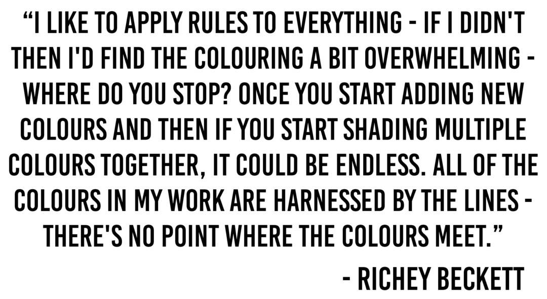
In general, I like to apply rules to everything – if I didn’t then I’d find the colouring a bit overwhelming – I mean, where do you stop? Once you start adding new colours and then if you start shading multiple colours together, it could be endless. All of the colours in my work are harnessed by the lines – there’s no point where the colours meet. With the Bran Stark piece, I knew straight away that the only significant colour would be the red of the leaves in the Weirwood tree. I would’ve been quite happy to leave the illustration monotone, but I think the leaf colour is so iconic that it really needed to be used.
On your site, you have illustrations that are sold out in your store that I’m pretty bummed about. How do you decide the amount to do for a run of prints? Something like ‘Life Exposed’ had a pretty short run of 85 prints. Would you ever do more prints of an image?
I approach each print as a stand-alone project, and once it’s done it’s left behind. I would never consider reprinting any of the images – I know that some artists will do a ‘limited edition’ run of prints and then a year later print the same piece with a different colour scheme. I want to keep all of mine limited to one single run – I’ll always be creating new work and I want to keep pushing forward. As for the print numbers, I just try to create an amount that will satisfy the majority of the demand. I don’t think I’m well known enough to do particularly extensive runs, but every print set that I’ve put on sale has sold on the same night, so I think the numbers are about right.
Your work seems as at home being an album cover or poster as it does being a gallery piece. Is there anything that you haven’t tried, or haven’t been asked to do, that you’d love to do?
I get approached with all sorts of commission ideas, book illustration, logo design, various merchandise, and apparel. But once again, I like to give some focus to my work rather than just become a drawing machine. So right now, I predominantly create record covers, occasionally shirts for bands (but not clothing companies), and a small number of posters (such as for Mondo).
To me, there’s enough to explore in the record covers alone, and I feel that I have a very long way to go in developing my style and ideas just within that realm. Poster design is a huge and sensitive field that I’ve really only scratched the surface of, and I know I have a long way to go with the shirts too. So really, I’m quite happy with the challenges presented by this trio, without taking on any more. Really for me, it’s about having these individual projects as a vehicle to push my work forward and to give me ongoing subject matter and themes, and then using this to explore new methods and especially new ways of printing. That’s really the side I want to push. I’m currently working on pieces that are a combination of screen print and hand colouring, to give the prints a more personal touch.
Your work leans towards completely original images – meaning, you don’t use pop culture or pre-existing media in your work. There may be a ‘wizard-type’ character in one of your drawings, but it’s not Harry Potter or someone specific like that. You’ve managed to have a huge following based solely on your original work. What’s kept your drawings free of pop culture or pre-existing characters?
This is a really interesting subject, and I’m glad that you’ve brought it up. It was only really when it came to doing the Mondo pieces that I even noticed this about my work. I realised that a lot of people rely on these images, and in fact, it can be used as a sort of ‘trump card’ to get recognition and exposure. For example, if I’d decided to draw a picture of Gremlins or The Lost Boys, post it up and tag it, then I can guarantee that those images, no matter how good or bad, are going to be shared, distributed and exposed heavily across the internet.
This never really occurred to me before, and I always wanted to create original work for record covers, but I suppose overall I just like to create my own characters rather than rework someone else’s. I also like to cook my own food from scratch – it’s the same thing. I absolutely love working with Mondo, and I certainly want to create more movie based posters for them – but I feel that it’s important for me to choose the right ones, themes, and characters that work in my style. The fact that all of the Mondo pieces are fully licensed and approved makes it a very different proposal to just pushing out unlicensed pieces of pop culture fan art.
You referred to yourself as a ‘hermit’ before and it got me thinking – does an artist’s style come from their personality? Your work takes a great deal of time and patience, someone with a short attention span would have trouble doing the work you do so you’d almost have to be a hermit to do something like ‘Phantom Lord’ for Metallica’s anniversary for Kill ‘Em All. Did your personality dictate your drawing style, or did your drawing style affect your personality?
I think this has to be true. I do often refer to myself as a ‘hermit’, half-jokingly, but the truth is I do spend a lot of time by myself, obviously on a day to day basis. In the future I’d love to open a large studio for myself and bring in other illustrators to work alongside, I think it would create a wonderful environment where like-minded people can inspire one another. But for now, working in isolation seems to be working pretty well.
As for the artwork representing my personality, I think this is definitely the case. I’ve always felt more at home in the country or woodland than the town or city – and there are very rarely any ‘urban’ elements in my illustrations. I often draw characters who appear to be travelers, who’ve picked up natural objects and fed from the land around them, animal parts, feathers, and plants, who are self-sufficient. This all certainly feels very representative of my life and my upbringing.
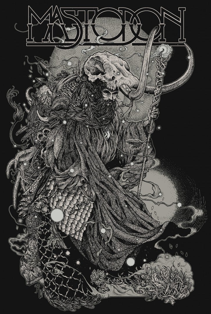
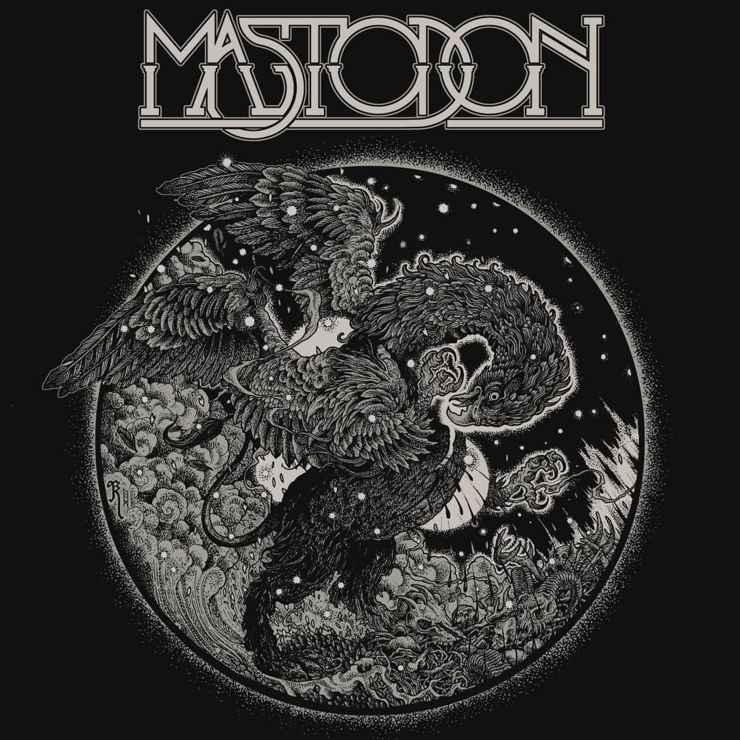
You recently did some work for two of my all-time favorite bands, Mastodon and Metallica. How did that come about? Was it just a coincidence that the projects were back to back or are they somehow linked? Any bands that you’re dying to work with?
They weren’t linked in any way – I actually received an email from Brann Dailor and one from James Hetfield both in the same week. One hell of a week! I already had work scheduled in for the whole rest of the year, so I had to shuffle and squeeze a few things around to fit these in. I certainly enjoyed seeing these two scheduled in as my next two projects!
Mastodon has always been my number one band who I wanted to work with – I actually found an interview I did several years ago when I was asked this same question, who would I love to work for, and my answer was Mastodon. I think I said something about Paul Romano having that wrapped up, so of course, I didn’t think it would happen. Metallica are absolute legends, and even more than their incredible history as a band I’ve always been fascinated and inspired by the Pushead illustrations. They’ve always associated themselves with great artists. It means a lot to me that it was the band members who got in touch and not just their merch group, and it’s a testament to them for maintaining this personal approach and creative control when they’re operating on such a large scale.
As for bands that I’d love to work with…I don’t really know. Of course, there are many who I love and would be honoured to represent, but I feel like the right bands and artists will always be drawn together, the right ones will find each other. I had a small list of goals laid out last year and they were all fulfilled within the first two months of this year. So I’m excited to see what happens next!
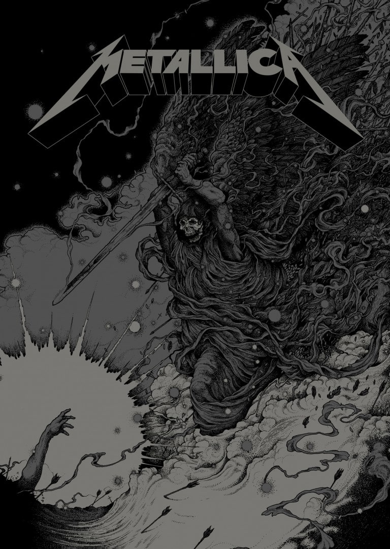
‘Phantom Lord’ by Richey Beckett for the 30th anniversary of Metallica’s debut album ‘Kill ’em All’.
Previously on Evil Tender Dot Com —
A Brief Look: Richey Beckett’s ‘Shelob’s Lair’
Richey Beckett interview from Crack Magazine —
Richey Beckett Interview
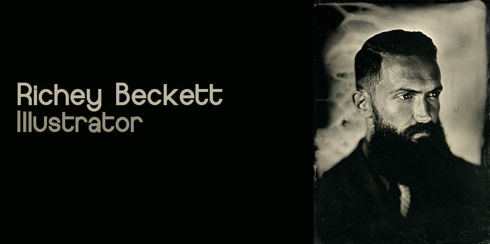
Richey Beckett collodion portrait Gareth Jarvis Photography
Check out Richey Beckett on these wonderful platforms —
Tumblr

Beautiful! I can’t imagine how much time each of these takes to make.
I know. Patience, man. A total virtue. That and a load of skill.
i love his work! he’s a must follow on instagram where i discovered him!
Thanks for reading Jorge! Yeah, Richey posts a ton of great updates of his work on Instagram. One of the reasons I even bother to log in over there!