2014 is coming to an end and my walls are full of new art. My storage packed high with posters, prints, drawings, and books, so I created a list. The list I’ve assembled are my favorites in no specific order — there is no ‘ranking’ because there is no best, just a snapshot of the print work that was released during the twelve months of 2014 that struck me.
A rough baker’s dozen of posters that I’m not done with — done thinking about. Done writing about.
And here we go…
‘Turiyaya’ by Ruben Ireland
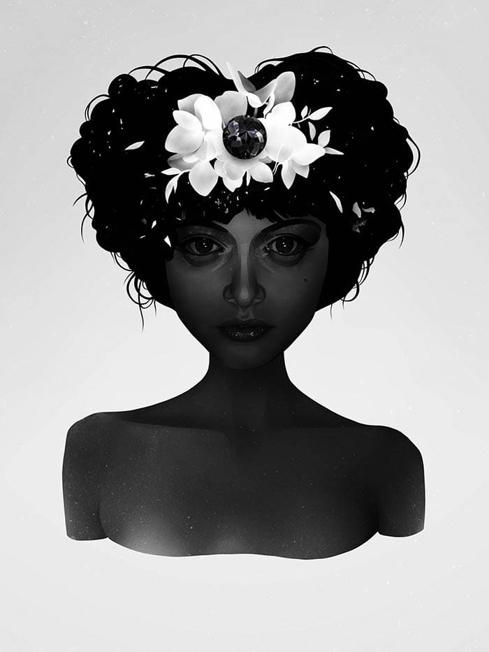
‘Turiyaya’ by Ruben Ireland
UK based artist Ruben Ireland focuses on all strains of beauty, his main canvas being his women. They’re young and strong — penetrating mystics.
2014 saw Ireland make his first trip to the States to attend his show ‘Out of Body‘ at Gauntlet Gallery. Ireland is an artist who has a definite aesthetic, one that evolves with each new piece. With ‘Turiyaya‘ Ireland muted the figure but she still glows, lit internal. In her hair, a strange jewel. Ireland’s design is bold in it’s dark and limited palette, so much could be lost but he holds it together, creating a wonderfully quiet portrait.
Previously on Evil Tender — Interview: Serene & Stoic, The Art of Ruben Ireland
‘The Wanton Sea’ by Jes Seamans
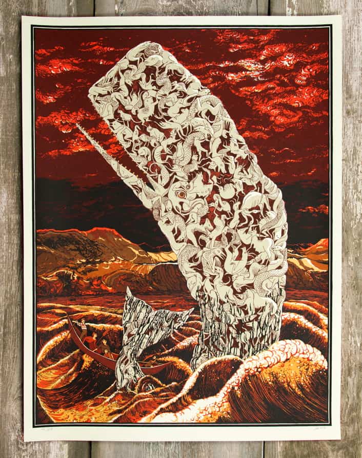
‘The Wanton Sea’ by Jes Seamans for The Vacvvm
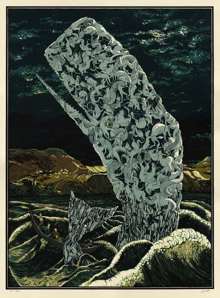
‘The Wanton Sea’ Blue Variant by Jes Seamans released by Landland
Late in 2014, Mitch Putnam (OMG Posters, Mondo) and artist Aaron Horkey teamed up to create The Vacvvm, a collective of artists set to release unique prints. One of those was ‘The Wanton Sea‘ from Jes Seamans of Landland fame.
‘The Wanton Sea’ is enigmatic and terrifying, but there is beauty in that. The whale appears carved of porcelain — animals and man trapped inside the body.
Seamans use of texture is one of the strongest I’ve encountered — with wisps and twirls she creates a boiling sea. Seamans and fellow Landland compatriot Dan Black do all their own printing and the depth of understanding of the process is always clear in their work, and with ‘The Wanton Sea‘ you get incredible color shifts with developed depth. Just an incredibly rich print.
Previously on Evil Tender — Interview: Jes Seamans talks ‘The Wanton Sea’
Previously on Evil Tender — Interview: Dan & Jes and the Art of Landland
‘The Face on the Mask is the Same as the Face Under the Mask’ by Rob Jones
‘The Face on the Mask is the Same as the Face Under the Mask’ by Rob Jones
Rob Jones‘ solo show ‘Grief‘ was an absolute highlight of 2014. ‘Grief‘ found Jones harnessing his vast intellect and wit into over one hundred self portraits with the famed Charles Schultz character Charlie Brown in his stead.
The show was a unique experience. A body of work that was straightforward — simplified portraits, each with a single story to tell. Here was an artist exploring his own spirit-level truth. Each portrait acted as Jones’ own iconography — ‘here is my worst nightmare,’ ‘here is my failure’ — ‘here is my hope.’
For an artist most known for his gig poster work for Jack White and his creative director output with Mondo and Criterion, ‘Grief’ was an open book, the historical text of one man’s life.
The headlining portrait was ‘The Face on the Mask is the Same as the Face Under the Mask,’ Jones’ summation of his relationship to the most classic of losers, Charlie Brown. At the core of this portrait is a man displacing his faults onto a character, one fit to take on the trouble.
Previously on Evil Tender — Interview: Illustrator Rob Jones Dreams of Pakistani Goats
‘Trypophobia II’ by Nikita Kaun
‘Trypophobia II’ by Nikita Kaun
There’s a rugged edge to the work of St. Petersburg Russia’s Nikita Kaun. The canvas is abrasive — the beauty of his work tarnished with physical hardship and human oil.
‘Trypophobia II‘ softens the blow into a drift-like dream. The piece was created for the band Brunt‘s self-titled vinyl release. Here, Kaun creates textures of wood and stone — bejeweled and acidic.
Previously on Evil Tender — A Brief Look: The Gig Posters of Nikita Kaun
‘Ghost in the Shell’ by Martin Ansin
‘Ghost in the Shell’ by Martin Ansin
Martin Ansin‘s ‘Ghost in the Shell‘ was a surprise treat for that those saw the film at the Marchesa Theater at Mondo Con this year.
At 24″ x 36″, Ansin takes full advantage of the canvas and pushes the viewer’s eye inward, tilting the focal point in and out, up and down — left and right.
Ansin is a master of design and with ‘Ghost in the Shell‘ he moves his poster work, and all poster work, forward.
Previously on Evil Tender — Composing the Ideal: Interview with Illustrator Martin Ansin
‘A Midsommer’s Night Dreame’ by Ann Benjamin

‘A Midsommer Night’s Dreame’ by Anne Benjamin
Illustrator and printmaker Anne Benjamin made a beauty of print with her ‘Midsommer Night’s Dreame‘ poster. The colors glow and flutter. Her drawing style is loose and lyrical, child-like perhaps but not entirely — it’s perfect and human.
In Benjamin’s ‘A Midsommer Night’s Dreame‘ you see the moon, heavy above. It lights the sky and lights the print itself. That’s the brilliance of the print, Benjamin’s control of color and composition and using that to create something uniquely hers.
Previously on Evil Tender — Interview: The Playful Prints of Illustrator Anne Benjamin
‘Batman: Black Mirror’ by Jock
‘Batman: Black Mirror’ by Jock
This poster is 36″ x 24″. One color — black printed on white paper. As a premier artist of the ‘Batman‘ franchise, Jock has the character down. He also nails the emotion and daring of the character.
This poster was originally a single panel of a Batman comic that Jock decided to make a poster of, and at this huge size the dynamism and bold adventurism of Batman comes to life.
This poster hangs in my office — it’s a drawing with intense perspective and Jock’s frantic and grounded ink work. This poster is a glorious stiff armed punch in the face.
Evil Tender Presents — Movies, Comics & Batman: An Interview with Illustrator Jock
‘20,000 Leagues Under the Sea’ by Jonathan Burton
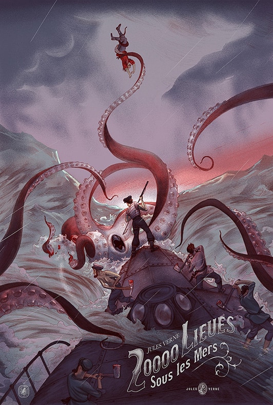
‘20,000 Leagues Under the Sea’ Variant Edition by Jonathan Burton
Thank God for Nautilus Art Prints for introducing me and countless others to the work of illustrator Jonathan Burton.
Burton’s illustrations have a lineage of centuries. His work fits in with the original Verne drawings of the 1800s. For his take on Jules Verne’s ‘20,000 Leagues Under the Sea‘ Burton incorporates Verne’s original novel with Disney’s filmed version of the tale, building on the history of adventure, fantasy, and the craft of illustration itself.
Nerdlocker Interview: Chris Jalufka talks with Jonathan Burton about ‘20,000 Leagues Under the Sea’
‘Remy Adrift’ by Aaron Horkey
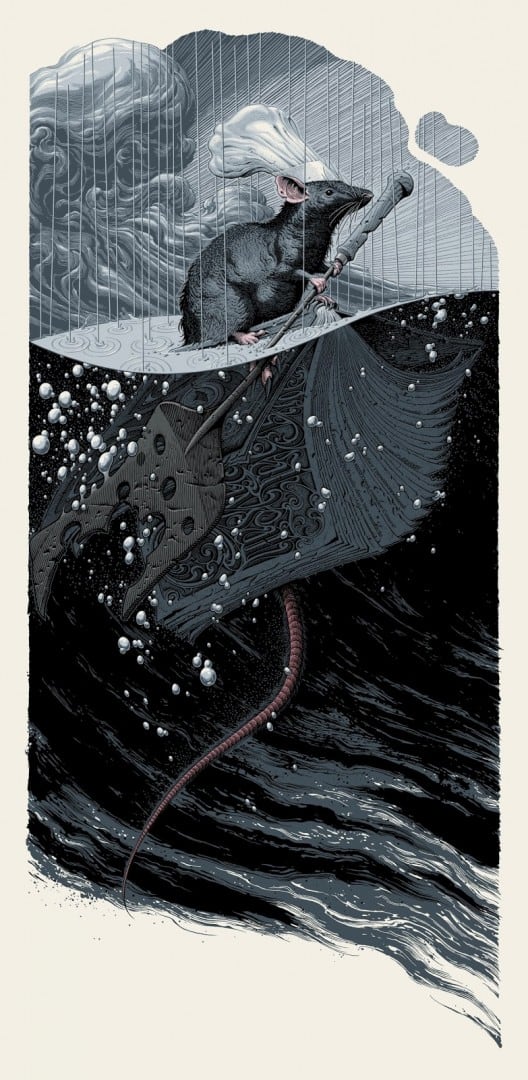
‘Remy Adrift’ by Aaron Horkey for the Mondo + Disney show ‘Nothing’s Impossible’
The characters in ‘Ratatouille’ are cartoonish — puffed, wide-eyed and stylized, but the rest of the film is decidedly photo-real. The restaurant and its inner-workings are exact. Precise.
For the Mondo Gallery and Disney exhibit ‘Nothing’s Impossible‘ artist Aaron Horkey tackled ‘Ratatouille’ in his piece ‘Remy Adrift.’ Horkey imagined a realistic Remy the rodent chef, applying the rules established by Bird and his Pixar team to the lead rat.
Horkey re-created an early scene from the film that is overwrought with animated drama — the waves oversized for the little rat, lost at sea after his family escaped the storm, leaving Remy on his own. Horkey finds the loss and sadness in the moment while keeping the humor of the film firmly front and center — a rat afloat on a cookbook with an oar of cheese.
It’s difficult to deconstruct ‘Remy Afloat’ and lay out all of its working parts to see what makes it a beautifully somber yet fun work. Horkey, known and loved for his decorative text design uses very little of that here. There are no titles on the canvas, just a nod to his expertise on the cookbook. By leaving out his popular and elaborate script the focus stays with Remy and his ordeal.
The film itself is not known for having a heart like other Pixar films like ‘Up’, ‘Finding Nemo’, or ‘Toy Story,’ yet that’s exactly what Horkey is able to find in ‘Remy Adrift.’
‘A Field in England’ by Jay Shaw
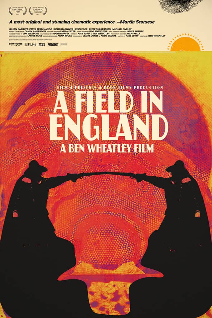
‘A Field in England’ by Jay Shaw
When I’m looking to explore and find new music or film, I turn to Jay Shaw. Ben Wheatley’s film ‘A Field in England‘ does not let the viewer down — it’s a strange sprawl of psychedelia and Shaw gives Wheatley’s film the poster it deserves.
Previously on Evil Tender — Interview: The Strange Magic of Designer Jay Shaw
Previously on Evil Tender — Interview: ‘Blue Sunshine’ & Beyond with Jay Shaw
‘Polyopic Fragments: For He Is the Man of Sin, the Son of Perdition’ by Randy Ortiz
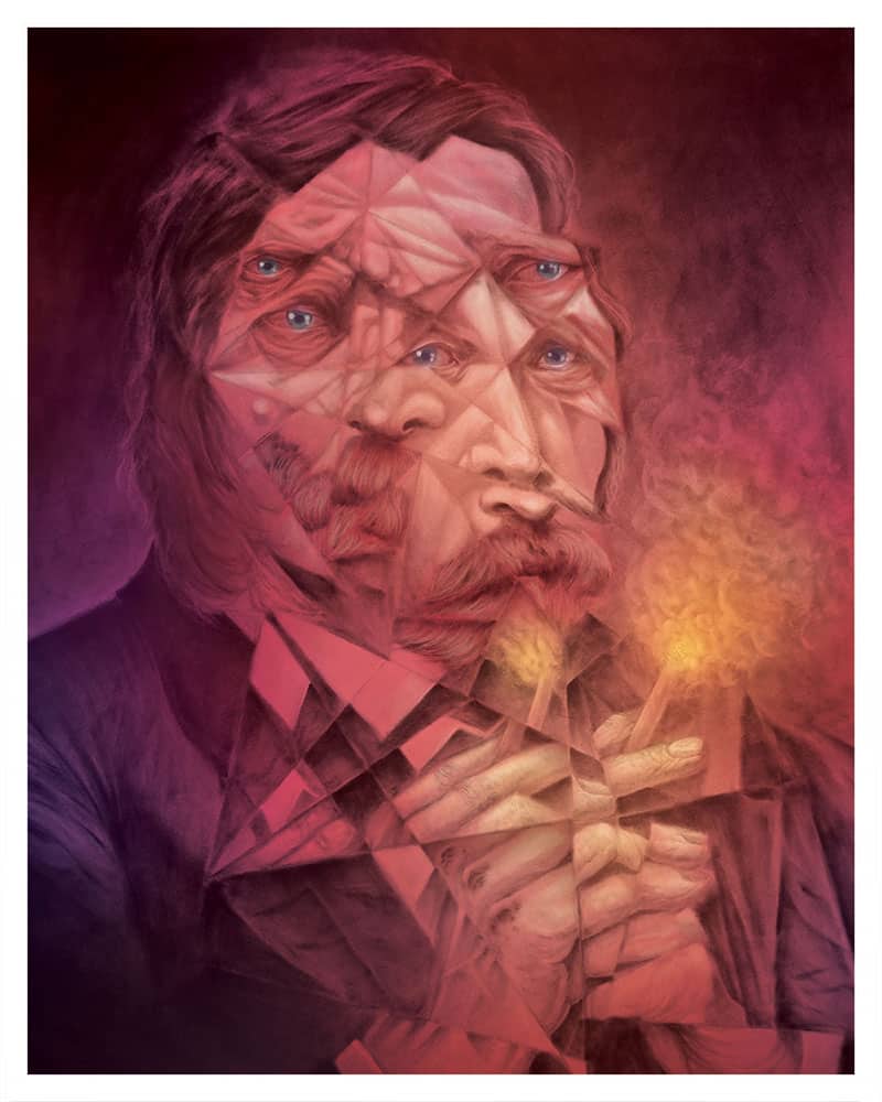
‘Polyopic Fragments: For He Is the Man of Sin, the Son of Perdition’ by Randy Ortiz
Illustrator Randy Ortiz‘s ‘For He is The Man of Sin, the Son of Perdition‘ is an insane display of everything Ortiz does best — the charcoal base is muted and ghost-like, the digital coloring unreal. Ortiz divides the figure into horrific fragments, alive at each angle, all seen at the same time.
Ortiz is an incredibly skilled craftsman with an undeniably inquisitive mind, always exploring, unafraid of any challenge.
Previously on Evil Tender — Charcoal & Pixels: Interview with Randy Ortiz
‘Prometheus’ by We Buy Your Kids
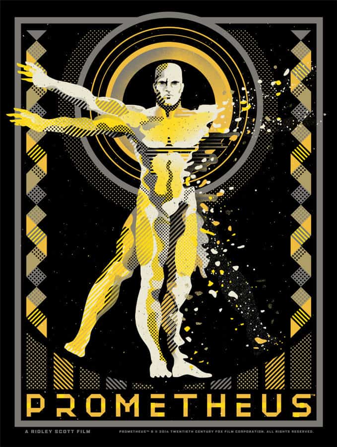
Prometheus’ by We Buy Your Kids
Sonny Day and Biddy Maroney of We Buy Your Kids spent some time in Austin this year for their second Mondo show ‘Harsh Majical,’ an exhibition that yielded this print for Ridley Scott’s ‘Prometheus.’ The film itself is a bit clumsy in it’s attempt at ‘saying something,‘ but the WBYK design nails it all with one simple image. Engineer as Da Vinci’s ‘Vitruvian Man,’ the classic drawing that connected mankind and science — mankind to nature. The Engineer creates and connects mankind, but also destroys.
We Buy Your Kids have an innate ability to find the truth in their subject. The core thought that makes it what it is and they’ve done it again with ‘Prometheus.’ Ridley Scott take note.
Previously on Evil Tender — Interview: The Visceral Design of We Buy Your Kids
‘The Planet Chamber’ by Kilian Eng
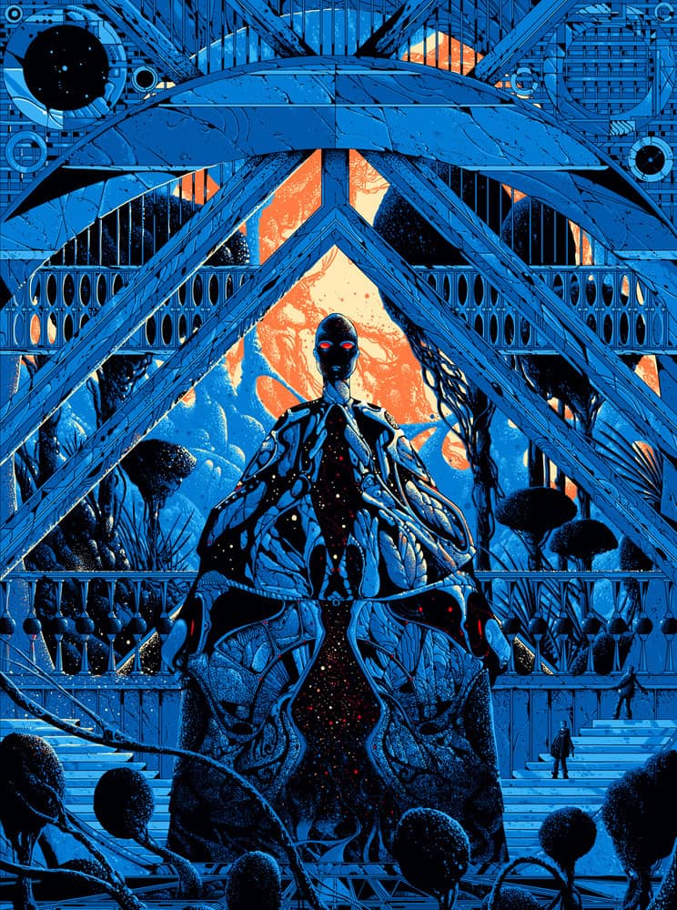
‘The Planet Chamber’ by Kilian Eng
This might be cheating. Kilian Eng‘s ‘The Planet Chamber‘ is the first print in the Evil Tender Presents series, but all of these picks are personal, this one just a bit more so.
Eng’s work goes beyond simple design. He crafts environments of such richness they’re easy to get lost in. With ‘The Planet Chamber‘ he gives us an alien landscape and front and center sits a strange old God –under his skeletal frame is the entire universe. It’s frightening and gorgeous.
Previously on Evil Tender — Interview: The Inspired Future of Artist Kilian Eng